Introduction
Green and Navy Color Combinations | Green and navy can look sophisticated together, but choosing the right combination is not always as simple as picking two attractive paint colors. A green that looks fresh on a sample card may appear muddy beside the wrong navy, while two beautiful shades can compete when their undertones, brightness, and intensity are too similar.
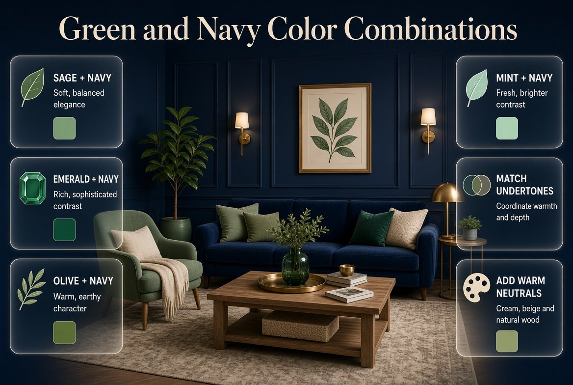
The secret to successful green and navy color combinations is understanding how different shades interact and which supporting colors bring out their best qualities. Sage creates a softer pairing, emerald adds richness, olive introduces earthy warmth, and mint produces a brighter contrast. Cream, beige, warm white, and natural wood can then help connect these colors into a balanced palette.
Whether you’re selecting paint, coordinating fabrics, choosing a color scheme for your home, or exploring the classic aesthetic associated with Preppy Room, this guide will help you make informed decisions. You’ll learn which shades complement each other, how to compare undertones, which accent colors work best, and how to avoid combinations that look too dark, flat, or visually disconnected.
What Are Green and Navy Color Combinations?
Green and navy color combinations pair a green shade with deep blue to create a palette that can feel classic, natural, modern, or dramatic. The final effect depends on the specific green, the depth of the navy, the amount of contrast, and the supporting colors. Lighter greens generally create a fresher appearance, while darker greens produce a richer, more traditional palette.
Green and navy are particularly versatile because they can share cool undertones without looking identical. Navy provides a stable, deep blue foundation, while green introduces variation through its yellow, gray, blue, or earthy undertones.
For example, sage green and navy create a restrained, sophisticated pairing. Emerald and navy feel more luxurious, while olive and navy introduce a warmer, more grounded character.
The combination can be adapted to paint colors, textiles, clothing-inspired palettes, graphic design, and interior color schemes. The same principles apply across these uses, although the proportions and materials will differ.
Why Do Green and Navy Work Together?
Green and blue are neighboring colors on the traditional color wheel, so many combinations between them feel harmonious. Navy adds depth, while green creates a visual connection to natural landscapes, foliage, and other organic colors.
However, the relationship depends on the exact shades.
A blue-based green may blend naturally with a cool navy. A yellow-based olive may need a warmer neutral to connect it with a cooler blue. Emerald can provide strong contrast because its saturation makes it more noticeable than a muted green.
Three factors explain most successful pairings:
- Hue: The basic color family, such as sage, emerald, or olive.
- Value: How light or dark the shade appears.
- Chroma: How vivid or muted the color looks.
Understanding these three properties helps you choose a combination for a particular purpose instead of relying on color names alone.
What Are the 25 Best Green and Navy Color Combinations?
The best palette depends on whether you prefer a soft, earthy, classic, or dramatic appearance. These 25 combinations offer different levels of contrast and warmth, from pale green with navy to deep forest green with almost-black blue.
The hexadecimal values below are illustrative digital references, not guaranteed paint matches. Actual colors can look different on screens, printed materials, fabrics, and painted surfaces.
| No. | Color combination | Approximate hex references | Overall effect |
|---|---|---|---|
| 1 | Sage and navy | #A3B09A + #233A59 | Calm and balanced |
| 2 | Emerald and navy | #087F5B + #203653 | Rich and elegant |
| 3 | Olive and navy | #85834B + #23374F | Earthy and grounded |
| 4 | Mint and navy | #B9E4D0 + #203653 | Fresh and playful |
| 5 | Forest green and navy | #234F3C + #1D3049 | Deep and traditional |
| 6 | Seafoam and navy | #A9D8C7 + #233A59 | Airy and coastal |
| 7 | Moss green and navy | #78865A + #263B55 | Natural and understated |
| 8 | Eucalyptus and navy | #A0B5A1 + #253B58 | Soft and contemporary |
| 9 | Hunter green and navy | #28523B + #1D3049 | Formal and classic |
| 10 | Kelly green and navy | #35A853 + #233A59 | Energetic and confident |
| 11 | Pistachio and navy | #C7DDA6 + #233A59 | Light and cheerful |
| 12 | Jade and navy | #279B80 + #243A56 | Cool and polished |
| 13 | Celadon and navy | #B7C9A8 + #233A59 | Gentle and refined |
| 14 | Chartreuse and navy | #A6B82F + #233A59 | Bold and high-contrast |
| 15 | Blue-green and navy | #438C83 + #223752 | Coordinated and modern |
| 16 | Lime green and navy | #A8D43D + #213650 | Bright and energetic |
| 17 | Gray-green and navy | #929F91 + #253950 | Subtle and sophisticated |
| 18 | Fern green and navy | #4F8059 + #223650 | Organic and versatile |
| 19 | Bottle green and navy | #14513B + #1E3049 | Deep and dramatic |
| 20 | Apple green and navy | #91C45A + #243A59 | Fresh and lively |
| 21 | Pale green and navy | #D6E5C9 + #243A59 | Light and comfortable |
| 22 | Teal-green and navy | #247E73 + #21364F | Rich and cool |
| 23 | Avocado and navy | #8A9850 + #233A59 | Warm and earthy |
| 24 | Laurel green and navy | #A5B59B + #263B55 | Muted and classic |
| 25 | Deep jade and navy | #167B65 + #1E3049 | Bold and sophisticated |
Which combinations are best for beginners?
Start with sage and navy, eucalyptus and navy, or pale green and navy. These combinations provide enough contrast to distinguish the two colors without relying on extremely saturated or unusually dark shades.
If you prefer a stronger statement, emerald and navy are excellent starting points. Olive and navy are better when you want warmth, particularly alongside natural materials.
You don’t need to memorize all 25 combinations. Choose three that fit your preferred mood, then compare them with the other colors already present in your space or design.
Which Shade of Green Looks Best With Navy Blue?

Sage, emerald, olive, forest green, and mint are among the most useful greens to pair with navy. Sage is a versatile everyday option, emerald creates a richer contrast, olive introduces earthy warmth, forest green produces a deep traditional effect, and mint adds brightness.
1. Sage Green and Navy
Sage is a muted green that often contains gray undertones. It works well when you want a balanced combination without strong visual competition.
The softness of sage allows navy to retain its definition, making this pairing suitable for both classic and contemporary palettes.
Sage and navy are particularly effective when a design needs to feel composed rather than dramatic. Cream, pale oak, and warm white can help the colors feel connected.
Best supporting colors: Cream, ivory, beige, pale oak, and muted brass.
Watch out for: Extremely gray sage paired with a cold, nearly black navy. The combination may look flat unless another color or material adds warmth.
2. Emerald Green and Navy
Emerald is more saturated than sage, so it creates a stronger visual presence. Navy gives emerald a deep blue counterpoint without introducing a completely unrelated color family.
This combination is especially useful when the palette needs a confident focal color.
Cream and warm white provide contrast, while brass and warm wood can add richness. If you prefer a more contemporary interpretation, keep the supporting colors simple.
Best supporting colors: Warm white, cream, brass, walnut, and pale stone.
Watch out for: Using emerald and navy at equally high intensity across every major surface. A clear hierarchy helps the colors remain distinct.
3. Olive Green and Navy
Olive contains yellow or earthy undertones, which give it a warmer appearance than most blue-based greens.
It pairs naturally with navy when the palette includes warm neutrals or natural materials. Beige, cognac, terracotta, and medium-toned wood can help connect olive with a cool blue.
Olive and navy are particularly useful when a palette feels too cold and needs more warmth without introducing a bright accent.
Best supporting colors: Beige, walnut, warm cream, cognac, and terracotta.
Watch out for: Olive shades that look muddy next to a navy with strongly cool or violet undertones. Test the two together before making a final decision.
4. Forest Green and Navy
Forest green and navy create a deep, low-contrast combination. Because both shades can be dark, they work best when their surroundings provide enough variation.
The result can feel formal, classic, and grounded.
Use lighter shades to separate the colors when necessary. Cream, warm white, pale wood, and soft gray-green can all introduce useful contrast.
Best supporting colors: Ivory, warm white, natural wood, brass, and soft beige.
Watch out for: Assuming that two dark shades will automatically create an elegant result. Without sufficient contrast, their individual qualities may become difficult to distinguish.
5. Mint Green and Navy
Mint is lighter and generally more playful than sage. Its brightness creates a clear distinction from navy, making the combination feel fresh.
This pairing works particularly well in cheerful palettes, contemporary graphics, and youthful interiors.
White and pale wood can reinforce the lightness, while a small amount of cream helps prevent the overall effect from feeling too cool.
Best supporting colors: White, cream, pale wood, and restrained blush accents.
Watch out for: Extremely bright mint combined with an almost-black navy and several other saturated colors. Too many strong contrasts can make the palette feel restless.
6. Seafoam Green and Navy
Seafoam has a noticeable blue influence, so it creates a natural bridge between green and navy.
It works well when you want a coastal or airy appearance without relying entirely on light blue.
Warm white, sandy beige, and pale wood can support the palette. These colors introduce warmth while preserving the connection between the two main shades.
Best supporting colors: Warm white, sand, cream, pale oak, and muted gray.
Watch out for: Using only cool blue-green shades in a room with cool lighting. A warm neutral can prevent the result from feeling sterile.
How to Select the Right Green and Navy Preppy Color Palette
Choosing a green and navy color palette is an important step in creating a preppy interior that feels coordinated, timeless, and welcoming. Although these colors complement each other naturally, the final result depends on selecting the right shades and balancing them with suitable neutral tones. Forest green paired with deep navy creates a rich, traditional atmosphere, while sage green and softer blue tones can make a room feel lighter and more relaxed. Cream, ivory, and white are useful supporting colors because they introduce brightness and prevent darker shades from dominating the space. You can establish your palette through larger elements, such as walls, bedding, rugs, or upholstered furniture, before adding smaller details like cushions, lamps, curtains, and artwork. Patterns also play an important role in preppy decorating. Stripes, plaid, gingham, and subtle floral prints can add character when they share colors that complement the overall scheme. Rather than introducing every shade and pattern at once, choose a dominant color, a supporting shade, and one or two accent colors to maintain visual consistency. If you need more inspiration for selecting complementary shades and combining them effectively, explore our guide to the green and navy preppy color palette. Understanding how these colors interact can help you make thoughtful decorating choices and create a polished interior that reflects the classic appeal of preppy style.
What Colors Complement Green and Navy Best?
Cream, warm white, beige, natural wood, brass, and muted terracotta are reliable partners for green and navy. They either create brightness, introduce warmth, or add a controlled contrast that makes the main colors easier to distinguish.
The right supporting color depends on the green you select and the effect you want to achieve.
| Supporting color | What it contributes | Best green and navy pairings |
|---|---|---|
| Cream | Soft brightness | Forest, emerald, sage |
| Warm white | Clean contrast | Mint, sage, emerald |
| Beige | Warmth and softness | Olive, moss, forest |
| Pale wood | Natural lightness | Sage, mint, seafoam |
| Walnut | Traditional depth | Olive, emerald, forest |
| Brass | Warm metallic contrast | Emerald, navy, forest |
| Terracotta | Earthy color contrast | Olive, sage, moss |
| Dusty pink | Gentle warmth | Sage, emerald, mint |
| Pale blue | A lighter blue connection | Sage, seafoam, mint |
| Soft gray | Subtle neutrality | Eucalyptus, sage, blue-green |
Why Does Cream Work So Well?
Cream is less stark than pure white, so it can soften the contrast between navy and green without removing their depth.
For example, cream can connect a cool navy with an earthy olive or provide a lighter background for emerald. It is also useful when the surrounding materials include wood, brass, or warm-toned fabrics.
Choose cream with a suitable undertone. A very yellow cream may look disconnected beside a cool blue-green palette, while a neutral cream can work across several combinations.
When Should You Use White Instead?
White is useful when the palette needs a sharper, brighter contrast. It can make mint appear fresher and help navy stand out clearly.
Warm white usually feels softer than a very cool white. Compare the two options against the green and navy rather than selecting a white based on its name alone.
Can Pink Work With Green and Navy?
Yes. Dusty pink or muted blush can soften a green-and-navy palette, particularly when the green is sage or emerald.
The best approach is to introduce pink as a supporting accent rather than automatically making it a third dominant color.
For example, a palette of sage, navy, cream, and dusty pink can feel balanced because each color has a distinct role. A vivid pink combined with saturated emerald and dark navy will create a much stronger, more energetic result.
Can Yellow Work With Green and Navy?
Yellow can introduce warmth and brightness, but its intensity matters.
Soft butter yellow works well with sage, navy, and cream. Mustard is a stronger partner for olive and warm wood. Bright lemon yellow creates more contrast and is best used selectively.
When using yellow, consider whether it should provide a small highlight or become a major part of the palette. The answer will determine how much of it you should introduce.
How to Create a Balanced Green and Navy Preppy Color Palette
Choosing the right combination of green and navy can make a room feel elegant, comfortable, and visually balanced. These two colors work beautifully together because green introduces a natural, refreshing element, while navy adds depth and a classic touch. The key is to select shades that complement your furniture, lighting, and decorative accessories rather than using too many competing colors. For example, sage green and navy can create a softer atmosphere, while forest green paired with deep navy offers a richer, more traditional preppy appearance. You can also introduce cream, white, beige, or natural wood accents to soften the darker tones and create a more harmonious interior. Stripes, plaid, gingham, and subtle floral patterns can further enhance the look when used thoughtfully across bedding, cushions, curtains, and other decorative details. If you want to explore more ways to combine these shades successfully, our guide to green and navy preppy color palettes provides additional inspiration for selecting complementary colors and creating a cohesive design. Understanding how different shades interact can help you make more confident decorating decisions and develop a timeless preppy interior that reflects your personal style.
How Do You Match Green and Navy Undertones?
Matching undertones means identifying the subtle warm, cool, or neutral qualities within a color and selecting shades that relate to each other. Two greens can both look green but behave differently beside the same navy because one may lean yellow while the other leans blue or gray.
This is one of the most important steps when choosing paint, upholstery, curtains, or other materials.
What Are Warm Green Undertones?
Warm greens often contain more yellow, olive, or earthy qualities. Olive and some moss shades are common examples.
These colors tend to work well with warm cream, beige, natural wood, and cognac.
A cool navy can still work with a warm green, but the palette may need a neutral that connects the two.
What Are Cool Green Undertones?
Cool greens often lean toward blue or have a noticeable gray influence.
Examples include some seafoam, blue-green, and eucalyptus shades.
These greens can coordinate naturally with cool navy, pale blue, and cool white. Adding warm wood or cream can prevent the overall palette from becoming too cold.
How Can You Test Undertones Properly?
Follow this practical process:
- Place the green and navy samples beside each other.
- Add the intended neutral, such as cream or white.
- View the samples under daylight.
- Compare them again under your evening lighting.
- Place them next to permanent finishes, including flooring and existing furniture.
- Remove any combination that consistently looks muddy, excessively cold, or visually disconnected.
Expert tip: Never judge a paint color solely by how it looks on a phone or computer. Screen settings can alter the appearance of both hue and brightness. Physical samples provide a more reliable basis for a final decision.
How to Plan a Cohesive Green and Navy Room Color Scheme
Creating a well-coordinated green and navy room starts with understanding how these colors work together and how to distribute them throughout the space. Navy can provide a strong foundation through furniture, bedding, rugs, or accent walls, while green introduces freshness through cushions, curtains, plants, and decorative accessories. The overall effect depends on the shades you choose, the amount of natural light in the room, and the supporting colors used to balance the design. For example, sage green and cream can soften the richness of navy, while forest green and deeper blue tones create a more traditional and sophisticated atmosphere. You can also incorporate stripes, plaid, and subtle floral patterns to introduce visual interest without making the room feel overcrowded. To understand how these elements can work together, explore our guide to the green and navy room color scheme, which can help you plan a more balanced and consistent interior. By selecting complementary shades and repeating them thoughtfully across different elements, you can create a timeless preppy room that feels inviting, coordinated, and full of character.
How Do You Balance Light and Dark Green and Navy Shades?

A balanced palette gives each color a clear visual role. If navy is very dark, a lighter green can create separation. If both colors are deep, lighter neutrals and differences in material texture become more important.
The aim is not necessarily to make one color occupy a specific percentage of every design. It is to ensure that the colors remain distinguishable and that the overall result suits the intended mood.
Use Contrast to Create Clarity
Consider three possible approaches:
High contrast: Mint and deep navy. The difference in brightness makes each shade easy to identify.
Moderate contrast: Sage and medium navy. The colors remain distinct but produce a softer overall effect.
Low contrast: Forest green and very dark navy. The palette feels deep and restrained, but it needs more careful handling.
None of these approaches is inherently better. The right one depends on whether you want a lively, balanced, or dramatic result.
What Is the 60-30-10 Color Rule?
The 60-30-10 rule is a common decorating guideline that divides a palette into a dominant color, a secondary color, and an accent. It can be adapted to green and navy, but it should be treated as a starting point rather than a strict mathematical requirement.
For example:
- 60% cream or warm white
- 30% navy
- 10% sage green
Another possibility is to make sage the dominant color and use navy for a smaller, more defined contrast.
The rule is useful because it encourages a clear hierarchy. It does not mean every room needs to follow exactly the same proportions, nor does it account perfectly for the visual weight of every material.
A large dark sofa may have more impact than many small accessories, even if the accessories occupy more individual objects.
When Is an All-Dark Palette Appropriate?
A dark green-and-navy palette can be effective when a rich, dramatic effect is intentional.
Forest green and navy may be used together with walnut, brass, and warm cream. The contrast can come from the materials and lighter details rather than from making either main color bright.
If the room has limited natural light, introduce more light-colored surfaces and use layered lighting. Do not assume that a small space must avoid dark colors altogether; focus instead on how much of the visual field those colors occupy.
How to Combine Green, Navy, and Cream for a Timeless Preppy Look
Combining green, navy, and cream is an effective way to create a preppy interior that feels classic, balanced, and welcoming. Each color contributes something different to the overall design: green brings a natural touch, navy adds depth and sophistication, and cream softens the combination with warmth and brightness. The key is to distribute these shades thoughtfully instead of giving every color equal attention. For example, navy can anchor the room through bedding, upholstered furniture, or decorative accents, while green can appear in cushions, curtains, patterned fabrics, and artwork. Cream works particularly well on walls, rugs, bedding, and larger surfaces where a lighter backdrop helps the deeper shades stand out. You can also introduce stripes, gingham, plaid, or subtle floral prints to strengthen the traditional preppy aesthetic without overwhelming the space. If you are looking for more ideas on balancing these three complementary shades, explore our guide to the green, navy, and cream color palette. It can help you understand how to coordinate the colors and choose combinations that suit different decorating styles, room sizes, and lighting conditions. With a thoughtful balance of color, pattern, and texture, you can create a cohesive interior that remains stylish and comfortable over time.
Which Green and Navy Color Combinations Feel Most Modern?
Modern green and navy palettes generally benefit from clear color hierarchy, restrained accents, and simple relationships between shades. Sage and navy with warm white feel contemporary, while emerald and navy with pale stone can create a more dramatic modern look.
The distinction between modern and traditional styling often comes from how the colors are used rather than the colors themselves.
Modern and Minimal
Try sage, navy, warm white, and pale oak.
The palette uses a muted green, a defined dark blue, and a light neutral. Its simplicity allows the differences in color and material to remain visible.
Modern and Dramatic
Try emerald, navy, cream, and a small brass accent.
Emerald provides the stronger visual statement, while navy adds depth. Cream creates contrast and prevents the palette from becoming uniformly dark.
Modern and Earthy
Try olive, navy, beige, and walnut.
This combination emphasizes warm materials and earthy colors. It is especially useful when a cool blue palette feels too formal or impersonal.
Modern and Coastal
Try seafoam, navy, warm white, and pale wood.
The lighter green softens navy while the neutral surfaces reinforce the airy appearance.
For more design inspiration, Green and Navy Preppy Room Ideas explores how this color relationship can be applied to a specific room style. This guide, by contrast, focuses on selecting and comparing the colors themselves.
How to Build a Harmonious Green and Navy Color Scheme
Creating a harmonious green and navy interior involves more than simply choosing two complementary colors. The shades you select, the balance between light and dark tones, and the way you distribute each color throughout the room all contribute to the final result. Navy blue adds depth and a classic, sophisticated feel, while green introduces a natural quality that can make the space feel fresh and inviting. For a traditional preppy look, consider pairing deep navy with forest green, striped fabrics, plaid cushions, and timeless furniture. If you prefer a softer atmosphere, sage green combined with navy and cream accents can create a more relaxed and balanced appearance. White, beige, and natural wood finishes can also help prevent darker colors from making the room feel visually heavy. Try repeating each shade in different elements, such as bedding, curtains, rugs, artwork, and decorative accessories, to establish a consistent design without making everything look identical. For more inspiration on selecting complementary shades and coordinating them throughout your space, explore our guide to the green and navy color scheme. With careful color placement and a thoughtful mix of textures and patterns, you can create a timeless preppy interior that feels cohesive, comfortable, and suited to your personal decorating style.
Which Green and Navy Combinations Look Most Traditional?
Forest green and navy, emerald and navy, and olive and navy are especially useful for traditional palettes. Their depth works well with cream, walnut, brass, and classic color relationships.
Traditional does not have to mean old-fashioned. The palette can remain timeless when the colors are chosen carefully and the supporting finishes are consistent.
Forest Green, Navy, and Ivory
This is a deep, restrained combination.
Forest green contributes natural depth, navy creates a strong blue foundation, and ivory provides a softer contrast than bright white.
It is useful when you want a formal palette that does not rely on vivid accent colors.
Emerald, Navy, and Brass
Emerald introduces richness, navy provides structure, and brass adds warmth.
Keep brass to selected details if you want the two main colors to remain the focus.
Olive, Navy, and Walnut
Olive and walnut share warm, earthy qualities, while navy supplies contrast.
This combination can feel comfortable and grounded without needing a bright accent.
To see how classic green-and-navy colors are interpreted through coordinated patterns and accessories, explore Green and Navy Preppy Decor. The focus there is decorative application; here, the emphasis remains on understanding the color relationships and choosing compatible shades.
How Does Lighting Affect Green and Navy?
Lighting can change the perceived brightness, undertone, and saturation of green and navy. Daylight often reveals color differences more clearly, while warm artificial lighting can make some greens look yellower and alter the appearance of navy.
A palette that looks balanced in a showroom may look noticeably different at home.
Natural Daylight
Daylight varies by time, weather, window direction, and surrounding surfaces.
A room receiving abundant daylight may support deeper shades more comfortably. A room with limited daylight may benefit from lighter greens, warm neutrals, or a smaller amount of dark navy.
However, there is no universal rule that one shade must be used in a particular direction-facing room. The actual conditions matter more than a simple label.
Warm Artificial Lighting
Warm bulbs can emphasize yellow or earthy undertones. Olive may appear warmer, and some cool greens may look less blue.
If the palette includes olive, cream, and navy, this warmth may be helpful. If it relies on a precise cool relationship between seafoam and navy, test the lighting carefully.
Cool Artificial Lighting
Cool lighting can make a palette feel sharper and may emphasize blue or gray undertones.
If the room begins to feel cold, try warmer neutral materials before introducing an unrelated accent color.
How to Test Colors Before Committing
Use large samples of the green, navy, and neutral shades together. View them in daylight and under the actual evening lighting you intend to use.
If you’re selecting paint, test it on a movable board or a suitable sample area. If you’re coordinating fabric, compare the actual materials rather than relying only on online photographs.
Common mistake: Choosing each color separately under different lighting conditions. A green that looks perfect in one store and a navy selected from a digital image may not work as well together in the finished space.
What Are the Most Common Green and Navy Color-Matching Mistakes?
The most common mistakes include ignoring undertones, pairing shades with insufficient contrast, using too many saturated accents, and choosing supporting neutrals that clash with the main colors. Each problem can be avoided by testing the complete palette instead of judging every shade independently.
Mistake 1: Assuming Every Green Works With Every Navy
Why it happens: Green and blue seem naturally related, so the combination may appear safe without further testing.
Why it causes problems: A yellow-based olive can look disconnected beside a navy with very cool undertones. Two muted shades can also become muddy if they have similar values.
How to avoid it: Compare the actual samples and add a suitable neutral when needed.
Mistake 2: Choosing Two Colors With Almost Identical Brightness
Why it happens: Both colors look attractive individually, but their visual relationship is overlooked.
Why it causes problems: The shades may blend together instead of creating a clear distinction.
How to avoid it: Compare their lightness. Pairing a light sage with a deep navy creates more visible separation than pairing two equally dark shades.
Mistake 3: Adding Too Many Accent Colors
Why it happens: Every color looks appealing when viewed separately.
Why it causes problems: The original green-and-navy relationship becomes less clear, and the palette loses its identity.
How to avoid it: Start with one or two neutrals and one accent. Add another color only when it solves a specific problem or contributes something useful.
Mistake 4: Ignoring Existing Materials
Why it happens: New paint or fabric is selected before considering the floor, furniture, and other permanent finishes.
Why it causes problems: The new colors may clash with existing warm or cool undertones.
How to avoid it: Include the actual surrounding materials in your sample comparison.
Mistake 5: Treating a Digital Hex Code as a Paint Specification
Why it happens: Hex codes are convenient and precise for digital design.
Why it causes problems: A hex value describes a digital color, not a guaranteed physical paint match. Pigments, finishes, lighting, and screens can all change the result.
How to avoid it: Use hex codes for initial digital planning, then choose physical samples for paint and fabric decisions.
Mistake 6: Assuming More Contrast Always Means Better Design
Why it happens: Strong color contrast is easy to notice.
Why it causes problems: Excessive contrast can make a palette feel sharp or restless when a softer effect is intended.
How to avoid it: Decide on the mood first. Use mint and navy for stronger contrast, or sage and navy for a more restrained relationship.
What Do Professionals Recommend When Choosing Green and Navy?
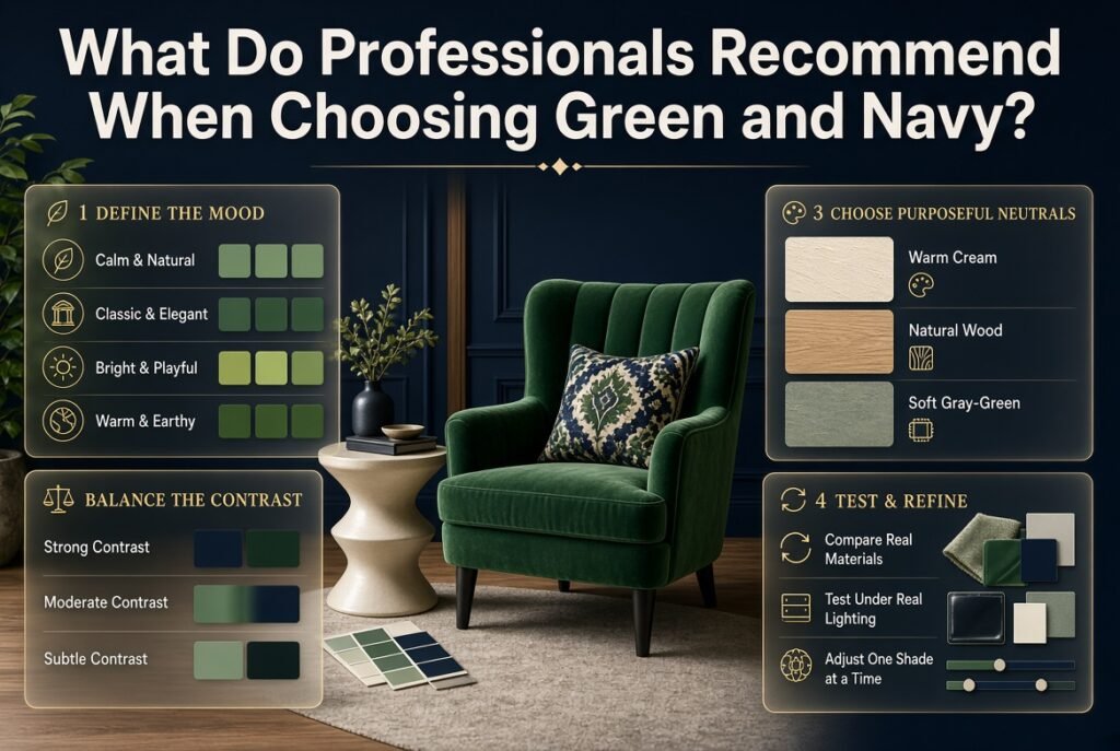
A reliable color-selection process begins with the intended mood, considers the existing materials, and tests the complete palette before a final decision. Professionals do not rely on color names alone; they compare undertones, brightness, and the effect of real lighting.
Start With the Desired Mood
Choose three words that describe the result you want.
For example:
- Calm, soft, and natural
- Classic, deep, and elegant
- Bright, fresh, and playful
- Warm, earthy, and grounded
These words help narrow the shade choices. If you want a calm palette, sage may be more suitable than bright Kelly green. If you want a dramatic effect, emerald may be more appropriate than pale mint.
Choose the Main Color Relationship
Select the green and navy first, then decide whether you want strong, moderate, or subtle contrast.
Do not introduce additional colors until the two main shades work together.
Add a Neutral That Solves a Problem
Use cream or warm white if the palette feels too dark. Use beige or wood tones if it feels too cold. Use a soft gray-green if the relationship needs to feel more restrained.
Every supporting color should have a clear purpose.
Compare Real Materials
Paint, upholstery, curtains, rugs, and decorative finishes can reflect light differently. A matte painted surface will not necessarily look the same as a glossy finish in a similar color.
Compare the materials you actually intend to use. This is especially important when a large area of the room will be covered by one color.
Make Changes Gradually
If the combination almost works, change one variable at a time.
Try a slightly lighter green, a warmer neutral, or a navy with a different undertone. Changing all three colors simultaneously makes it difficult to understand which adjustment improved the palette.
How Can You Build a Green and Navy Palette Step by Step?
The easiest method is to select the main shades, identify the desired contrast, introduce a neutral, and test the complete palette under real conditions. This process works for both interior color planning and other projects where several colors must work together.
Step 1: Select the Green
Choose sage, emerald, olive, mint, or another green based on the intended mood.
Don’t begin with a long list of every possible green. Narrow the selection to two or three candidates.
Step 2: Select the Navy
Decide whether the navy should be a soft, medium-dark blue or a very deep, almost-black shade.
A slightly lighter navy can preserve more visible blue character. An extremely dark navy will create a more dramatic effect.
Step 3: Compare Undertones
Place the samples together and look for obvious clashes.
If the green appears too yellow beside the navy, try another green or introduce a warmer neutral. If the palette feels too cool, compare it with cream or natural wood.
Step 4: Choose a Supporting Neutral
Decide whether the palette needs brightness, warmth, or a subtle transition.
Cream is often a flexible starting point, but white, beige, pale stone, and gray-green can also work.
Step 5: Decide How Much Contrast You Want
For a fresh palette, use a light green with deep navy. For a restrained palette, choose muted shades with moderate contrast. For a dramatic result, use deep green and navy with lighter materials providing separation.
Step 6: Add One Accent Color
Only add an accent if the palette needs it.
Brass can add warmth, terracotta can strengthen an earthy direction, and dusty pink can soften the relationship.
Step 7: Test the Full Palette
Review all selected colors together, not just the two main shades.
Check them under daylight and artificial lighting. Consider existing furniture, flooring, and other fixed finishes before making a final commitment.
Step 8: Remove Unnecessary Colors
If the palette looks busy, remove the least useful accent rather than adding another color to compensate.
A well-edited palette often feels more intentional than one containing many attractive but unrelated shades.
What is the best green shade to pair with navy blue?
Sage green is one of the most versatile shades to pair with navy blue because its muted appearance balances the depth of navy without creating too much contrast. However, emerald, olive, forest green, and mint can also work beautifully depending on the atmosphere you want to create.
For a sophisticated palette, combine sage and navy with cream or warm white. If you prefer a richer look, emerald and navy pair well with brass accents and natural wood. Olive and navy are particularly effective when you want a warm, earthy color scheme.
Professional tips:
Choose sage for a soft, balanced appearance.
Use emerald for a rich, dramatic palette.
Choose olive when you want warmth and natural texture.
Test both colors under your room’s lighting before making a final decision.
What colors complement green and navy blue the best?
Cream, warm white, beige, natural wood, and brass are excellent complementary choices for green and navy blue. These colors help balance the depth of navy and prevent darker greens from making the overall palette feel too heavy. The best accent depends on the green’s undertones and the mood you’re trying to achieve.
For example, cream and pale oak work well with sage and navy, while walnut and terracotta complement olive and navy. Emerald and navy can benefit from warm white and subtle brass details that enhance their richness without competing with the main colors.
Professional tips:
Use cream or warm white when the palette needs brightness.
Add beige or natural wood to introduce warmth.
Choose brass for a refined, traditional accent.
Use terracotta sparingly when working with earthy greens.
How do you balance green and navy in a color scheme?
The best way to balance green and navy is to give each shade a clear role and introduce a neutral color when the combination feels too dark or visually crowded. The 60-30-10 decorating rule is a useful starting point: use a dominant color for the main background, a secondary color for contrast, and a smaller accent for additional interest.
For example, cream can occupy the largest visual area, navy can provide the main contrast, and sage can appear in selected details. Alternatively, sage can become the dominant color while navy creates stronger definition. The proportions should reflect the shades, materials, and overall effect you want.
Professional tips:
Decide which color should be most noticeable before selecting accessories.
Use lighter neutrals to separate two deep shades.
Repeat the main colors in different places to create visual continuity.
Avoid introducing several unrelated accent colors without a clear purpose.
Can green and navy color combinations look modern and timeless?
Green and navy can create both modern and timeless palettes because the combination adapts to different shades, materials, and styling approaches. Muted green with navy and warm white creates a clean, contemporary appearance, while emerald or forest green with navy and walnut can produce a more traditional, sophisticated effect.
The key is to avoid relying entirely on short-lived decorating trends. Choose shades that work with your existing finishes, introduce texture through natural materials, and keep the color relationships consistent. You can then update smaller accessories without replacing the entire palette.
Professional tips:
Combine sage, navy, and pale wood for a contemporary look.
Pair forest green, navy, and cream for a classic palette.
Use emerald and navy when you want a stronger visual statement.
Prioritize compatible undertones and balanced contrast over exact matching.
How do you choose the right green and navy shades for a room with limited natural light?
In a room with limited natural light, begin by testing lighter greens, such as pale sage or muted eucalyptus, alongside navy accents. Cream, warm white, and reflective finishes can help create contrast and keep the palette from feeling too enclosed. However, dark green and navy can still work if you intentionally want a dramatic atmosphere.
Before choosing paint or fabric, compare samples under the room’s actual lighting. Warm bulbs may make some greens appear yellower, while cooler lighting can emphasize blue or gray undertones. The complete combination matters more than the appearance of any single sample.
Professional tips:
Use lighter green on larger surfaces if you want a brighter appearance.
Introduce navy through selected furniture, textiles, or accessories.
Test samples in daylight and under evening lighting.
Add cream, pale wood, or warm white where additional contrast is needed.
Conclusion: Create a Balanced Look with Green and Navy Color Combinations
Green and navy color combinations offer a versatile way to create interiors that feel elegant, balanced, and full of character. From soft sage green paired with deep navy to rich emerald combined with classic navy blue, each pairing creates a different atmosphere. The key is to choose shades that complement each other and suit the room’s lighting, size, and overall design style.
For a timeless look, use navy as a grounding color and introduce green through furniture, accent walls, cushions, curtains, or decorative accessories. Warm neutrals such as cream, beige, natural wood, and brass can soften the contrast, while white and lighter blue tones create a fresher, more modern appearance.
Before committing to a complete color scheme, test paint samples and observe how they look throughout the day. Consider the balance of dark and light surfaces, the textures in the room, and the amount of natural light available.
Whether you prefer a classic, modern, cozy, or preppy interior, thoughtful green and navy pairings can help you create a space that feels coordinated without looking overly designed. Explore more inspiration at PreppyRoom and discover practical ideas in our guides to green and navy preppy room ideas and green and navy preppy decor. With the right shades and carefully chosen accents, this timeless color combination can bring lasting style and personality to your home.