Introduction
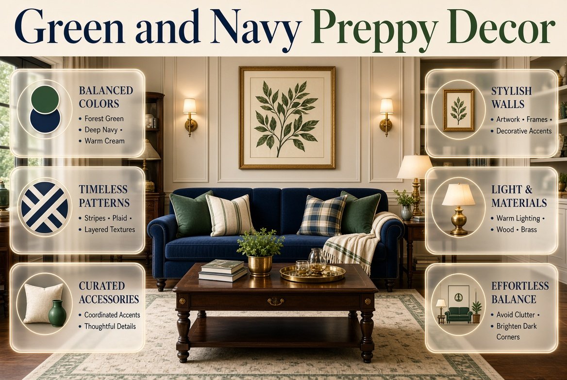
Green and Navy Preppy Decor | Green and navy can transform an ordinary interior into a space that feels classic, polished, and full of personality. However, choosing beautiful colors is only the beginning. The real challenge is knowing which decorative pieces to combine, how to mix traditional patterns, and how to create a coordinated look without making the room feel dark, crowded, or overly matched.
Green and navy preppy decor brings together rich green shades, deep navy blue, timeless patterns, attractive textures, and carefully selected accessories. Unlike decorating with a single color, this approach gives you opportunities to create contrast, introduce character, and express your personal style through smaller details.
Whether you’re refreshing an existing room, decorating on a limited budget, or choosing accessories for a more sophisticated interior, the right decorating strategy can make the process much easier.
This guide focuses on the practical side of decorating with green and navy, including accessory selection, pattern coordination, wall styling, materials, lighting, furniture finishes, budget-friendly updates, and professional decorating techniques. You’ll also learn which mistakes to avoid and how to build a cohesive color scheme without buying unnecessary items.
What Is Green and Navy Preppy Decor?
Green and navy preppy decor is a decorating approach that combines green and navy blue with traditional patterns, polished accessories, classic materials, and coordinated decorative details. It commonly features stripes, plaid, gingham, botanical prints, brass finishes, natural wood, and light-colored textiles.
The style takes inspiration from classic collegiate interiors and traditional decorating, but it can also work in modern homes. Its defining feature is the balance between structured patterns and comfortable, personal details.
Unlike a strictly minimalist interior, preppy decor allows decorative personality. However, unlike an unplanned maximalist room, it relies on color relationships, repetition, and visual organization to keep everything connected.
For example, a room might feature navy-striped cushions, green botanical artwork, a cream rug, wooden furniture, and a brass-finish lamp. Each item has a different function, yet the repeated colors and complementary materials create a unified appearance.
What Makes This Decorating Style Different?
Three elements make the style recognizable.
First, it uses classic color relationships. Navy provides depth, while green introduces freshness. Cream, white, beige, and wood prevent the combination from becoming visually heavy.
Second, it incorporates recognizable patterns. Stripes, checks, plaid, and botanical prints provide the traditional character associated with preppy interiors.
Third, it balances decoration with structure. Accessories are arranged thoughtfully, colors appear in more than one place, and patterns have different levels of visual importance.
The result can be traditional, playful, sophisticated, or modern depending on the shades and materials you choose.
Which Green and Navy Color Palette Should You Choose?
The most effective palette is one that complements your existing furnishings and the amount of natural light in your space. Before buying decorative items, decide whether you prefer a soft, relaxed atmosphere or a richer, more traditional appearance.
Forest Green and Navy for Classic Decor
Forest green and navy create a deep, traditional combination. Both colors have considerable visual weight, making them useful for statement accessories and substantial furnishings.
Consider forest-green cushions, navy curtains, ivory textiles, walnut furniture, and brass-colored decorative details.
This palette works particularly well when you want the room to feel established and sophisticated. However, use cream or warm white to prevent the darker shades from dominating every surface.
Sage Green and Navy for a Softer Appearance
Sage green is a versatile option because its muted appearance balances the depth of navy.
Use sage in cushion covers, ceramic accessories, curtains, small upholstered pieces, or botanical artwork. Combine it with navy stripes, warm white textiles, and light wood for a relaxed result.
This combination is particularly helpful when you want classic preppy character without an overly formal atmosphere.
Olive Green and Navy for Natural Warmth
Olive green has earthy undertones that complement natural materials.
Pair it with navy, beige, warm cream, walnut, woven textures, and muted brass finishes. The resulting palette feels grounded and works especially well with traditional wooden furniture.
Olive is also useful if you prefer a room that feels collected and comfortable rather than highly polished.
Emerald Green and Navy for Bold Accents
Emerald green adds stronger color and visual drama.
Instead of distributing emerald across every decorative item, use it as a focal accent. An emerald cushion, decorative vase, upholstered chair, or framed artwork can create enough impact when surrounded by navy and cream.
This approach lets you enjoy a rich palette without making every part of the room compete for attention.
Mint Green and Navy for a Fresh, Playful Style
Mint green creates a lighter contrast with navy and can give preppy decor a youthful appearance.
Use mint through small cushions, gingham fabrics, artwork, or decorative accessories. White and pale wood help maintain a bright atmosphere.
Mint is particularly useful when you want the classic navy-and-green combination to feel less formal.
A Practical Color Comparison
| Palette | Supporting colors | Decorating effect |
|---|---|---|
| Forest green and navy | Ivory, walnut, brass | Traditional and rich |
| Sage and navy | Cream, light oak, white | Soft and balanced |
| Olive and navy | Beige, warm wood | Earthy and relaxed |
| Emerald and navy | Cream, gold-toned accents | Bold and sophisticated |
| Mint and navy | White, pale wood | Fresh and playful |
Pro Tip: Choose one green shade as your primary green rather than purchasing several unrelated greens. Small variations are fine, but a clear dominant shade makes the decorating process much easier.
How Should You Balance Green, Navy, and Neutral Colors?
A coordinated room needs both contrast and breathing space. Green and navy establish the theme, while neutral colors help the decorative details remain visible.
A useful starting point is the 60-30-10 color rule:
- Approximately 60% dominant background color.
- Approximately 30% supporting color.
- Approximately 10% accent color.
For green and navy decor, a practical example is 60% cream, 30% navy, and 10% green. Another option is 60% warm white, 25% sage, and 15% navy.
These proportions are flexible guidelines rather than strict requirements. Existing furniture, flooring, and wall colors may already contribute substantially to the overall balance.
How to Apply the Color Rule to Accessories
Imagine that your room already has cream walls and wooden furniture.
You could introduce navy through a pair of cushions, a striped throw, and a framed print. Green might appear in a botanical cushion, a small vase, and a decorative plant.
The colors would be repeated throughout the room without requiring large purchases or major changes. For more inspiration, explore these green and navy preppy accessories to discover how complementary accents and classic patterns can help create a coordinated look.
If the room already contains a navy sofa or dark headboard, you may need less navy in the smaller accessories. Instead, use green and cream to provide contrast.
Common Mistake: Trying to make every accessory contain both green and navy. Individual items can be solid green, solid navy, or neutral. The overall arrangement creates the relationship between the colors.
Which Patterns Work Best With Green and Navy Preppy Decor?

Patterns give preppy interiors their distinctive character. They introduce movement and personality while allowing a relatively small color palette to feel varied.
The key is choosing patterns that complement one another rather than compete for attention.
Stripes for a Timeless Look
Navy-and-white stripes are among the easiest patterns to use.
They work well on cushions, throws, table linens, curtains, lampshades, and upholstered accessories. Narrow stripes often feel subtle, while wider stripes create a stronger statement.
If your room already has a bold plaid pattern, use stripes in a smaller area. This gives the eye a quieter surface between stronger patterns.
Plaid and Tartan for Traditional Character
Green-and-navy plaid combines the two main colors in a single pattern.
Use it for a throw, cushion, small upholstered stool, or decorative textile. Plaid is especially effective when the surrounding accessories are relatively simple.
For example, a forest-green plaid cushion can sit beside a plain navy cushion and a cream throw. The solid colors allow the plaid to become the focal point.
Gingham for a Cheerful Accent
Gingham introduces small checks that feel relaxed and approachable.
It works well in cushion covers, decorative bedding, fabric storage baskets, and casual table accessories. Green-and-white gingham can also balance a stronger navy pattern.
Because gingham has a repeated geometric structure, it often looks best alongside a softer pattern or a solid fabric.
Botanical Prints for Natural Contrast
Botanical artwork and printed fabrics connect the green palette with nature.
Choose leaf illustrations, floral patterns, or understated botanical motifs. These designs can soften the straight lines of stripes and checks.
A botanical cushion beside navy-striped curtains is a practical example of mixing traditional and natural elements.
How Many Patterns Should You Combine?
Start with two or three patterns, each with a different visual scale.
| Pattern role | Example | Purpose |
|---|---|---|
| Dominant | Large navy stripe | Establishes the main pattern |
| Supporting | Medium botanical print | Adds softness and variation |
| Small accent | Green gingham | Introduces detail |
| Neutral surface | Plain cream fabric | Creates visual breathing room |
Not every room needs all four elements. If your main textile already contains several colors and patterns, two patterns may be sufficient.
Expert Tip: Compare patterns from a distance, not just close up. If they merge into one busy visual area when viewed from the doorway, simplify the arrangement.
How Can You Decorate Walls With Green and Navy?
Wall decor connects the color scheme to the vertical surfaces of the room. It also gives you an opportunity to repeat green and navy without adding more cushions or furniture.
Create a Coordinated Gallery Wall
A gallery wall can include botanical prints, traditional illustrations, landscape artwork, framed photographs, and simple abstract designs.
The frames don’t all need to match. Instead, choose a consistent direction, such as natural wood, navy, black, or brass-colored finishes.
For example, three botanical prints in wooden frames can sit beside a navy-and-cream illustration. The common colors provide cohesion even though the artwork is different.
Before hanging the pieces, arrange them on the floor and photograph the layout. This makes it easier to adjust spacing and proportions before committing to a final arrangement.
Use Mirrors to Reflect Light
Mirrors are useful when darker colors make a room feel visually heavy.
A simple mirror with a wooden, black, or brass-colored frame can complement the palette while reflecting available light.
Position it where it reflects a window or a well-lit part of the room. A mirror placed directly opposite a cluttered shelf may simply draw attention to the clutter.
Choose Decorative Wall Shelves Carefully
Wall shelves can display a small collection of books, framed prints, decorative boxes, and a few meaningful objects.
Avoid filling every shelf from end to end. Leave some open space so the displayed items remain visible.
A practical arrangement might include a small stack of books, one framed botanical print, and a navy decorative object. A second shelf could feature a green ceramic piece and a small basket.
The colors are connected, but the arrangement still feels natural.
Should You Use Green or Navy Wallpaper?
Patterned wallpaper can strengthen the traditional character of preppy decor, but it should relate to the rest of the room.
If you choose navy-striped wallpaper, use simpler textiles nearby. If you prefer a green botanical print, introduce navy through solid accessories and understated patterns.
For renters or anyone who wants flexibility, removable wall decor and framed artwork may be easier to update than permanent wallpaper.
How to Style Green and Navy Wall Decor
Green and navy wall decor can add depth, personality, and a refined preppy character to a room when the colors and decorative elements are carefully coordinated. Consider combining framed botanical prints, classic artwork, striped patterns, or a thoughtfully arranged gallery wall to introduce visual interest without overwhelming the space. Navy frames can create a defined, elegant look, while green artwork brings a fresh, natural touch. For a balanced arrangement, incorporate cream or white backgrounds and leave enough space between decorative pieces so the walls feel organized rather than cluttered. You can also coordinate wall art with existing bedding, cushions, curtains, or accent furniture to create a consistent color scheme throughout the room. Explore our guide to green and navy wall decor for more ideas on selecting artwork, arranging decorative accents, and creating a cohesive preppy-inspired interior.
Which Accessories Make the Biggest Difference?
Accessories are often the most practical way to introduce green and navy because they can be moved, replaced, or rearranged without changing major furnishings.
The best accessories combine decorative value with a useful purpose.
Cushions and Throws
Cushions and throws can establish the color scheme quickly.
A balanced arrangement might include two solid navy cushions, one green plaid cushion, and a cream throw. Alternatively, use sage cushions with navy stripes and a neutral blanket.
Adjust the quantity to the size of the furniture. A small chair doesn’t need the same number of cushions as a large sofa.
Choose fabrics that suit how the furniture is used. Washable cotton covers are practical for frequently used spaces, while textured or velvet fabrics can add richness to a decorative chair.
Decorative Trays and Boxes
A tray can group smaller items on a table or dresser, making them look more intentional.
Choose wood, navy, cream, or brass-colored finishes. Place only a few useful objects on the tray, such as a small vase, a book, or a decorative container.
Boxes are also helpful for storing small belongings while maintaining a tidy appearance.
Lamps and Lighting Accessories
Lighting affects how the green and navy palette appears.
A brass-finish lamp with a cream shade can introduce warmth. A navy ceramic base can reinforce the blue, while a green glass or ceramic base can provide a subtle accent.
Think about the color and the function of the lamp. A reading light should provide suitable illumination, while a decorative lamp may serve primarily as an accent.
If the room feels too dark, improve the lighting before buying more decorative objects.
Vases, Bowls, and Small Decorative Objects
Small objects provide opportunities to introduce green and navy without making permanent changes.
Consider a forest-green vase, navy bowl, cream ceramic piece, or wooden decorative object. Choose items that complement the existing materials rather than purchasing a large matching collection.
A few thoughtfully arranged pieces generally create a more polished appearance than many unrelated objects.
Plants and Natural Details
Plants introduce living greenery and connect the palette with natural textures.
Choose plants according to the light available and the amount of care you can provide. A small plant on a shelf or desk may be sufficient.
If live plants are impractical, botanical prints, natural wood, or woven materials can provide a similar visual connection without requiring plant care.
Which Materials Complement Green and Navy Decor?
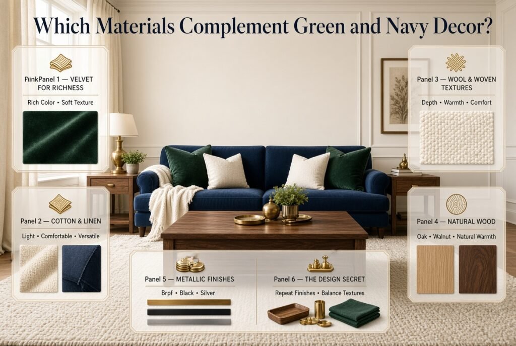
Materials affect how colors feel. The same green and navy combination can appear formal, cozy, modern, or relaxed depending on the textures surrounding it.
Velvet for Richness
Velvet adds depth and a soft surface that works particularly well with forest green, emerald, and navy.
Use it for a cushion, accent chair, or small upholstered piece. If the room already contains several strong patterns, choose solid velvet rather than another print.
Cotton and Linen for Everyday Comfort
Cotton and linen work well for cushions, bedding, throws, and curtains.
Their relatively simple appearance balances traditional patterns and makes the room feel comfortable rather than overly formal.
Cream linen curtains, navy cotton cushions, and sage bedding can create a cohesive combination without requiring elaborate decoration.
Wool and Woven Fabrics for Texture
Wool throws and textured rugs add depth, especially when the main colors are relatively dark.
A cream woven rug can lighten a room containing navy furniture. A muted green throw can soften a structured sofa.
Choose textures based on comfort, maintenance, and the intended use of the space.
Wood for Warmth
Natural wood is a useful bridge between green and navy.
Light oak can create a fresh appearance, while walnut and medium brown finishes provide traditional warmth.
Repeat the same general wood tone in a few places, such as a table, frame, or decorative tray. Exact matching isn’t necessary, but too many unrelated finishes can make a small space feel less coordinated.
Brass, Black, and Silver Finishes
Brass and antique-gold finishes complement traditional green and navy palettes by adding warmth.
Black finishes can create a more contemporary appearance. Silver or chrome may work well with cooler shades of blue and green.
Choose one primary metal finish and repeat it in a few accessories. You can mix metals, but doing so deliberately is more effective than introducing several finishes without a clear reason.
How Do You Style Green and Navy Decor on a Budget?
A polished room doesn’t require replacing all the furniture or purchasing a complete set of accessories.
The most economical approach is to work with the items you already own and introduce the color scheme gradually.
Step 1: Audit Your Existing Decor
Before shopping, examine your furniture, textiles, artwork, lamps, and storage items.
Identify which pieces already work with the palette. Cream bedding, wooden furniture, white frames, and neutral rugs may be useful even if they weren’t purchased specifically for a preppy room.
Move suitable items into the same space and see how they look together.
Step 2: Choose One High-Impact Update
Select one item that can establish the palette.
This might be a navy throw, green cushion covers, a patterned rug, or botanical artwork.
Avoid purchasing several small accessories before deciding how the main color relationship will work.
Step 3: Repeat the Colors in Smaller Details
Once the main item is in place, add one or two supporting accessories.
For example, navy cushions could be connected to a framed print, while a green throw could relate to a small vase or botanical illustration.
This creates repetition without requiring identical products.
Step 4: Rearrange Before Buying More
Sometimes the room needs better placement rather than additional decoration.
Try moving a lamp, reducing the number of objects on a shelf, rearranging cushions, or changing the position of artwork.
Photograph the room before and after the changes. This can help you identify which arrangement feels more balanced.
Step 5: Replace Only What Doesn’t Work
If an existing accessory clashes with the palette, decide whether it can be moved elsewhere rather than automatically discarding it.
Spend money on the pieces that make the greatest difference, especially those used frequently.
Budget Tip: Cushion covers, throws, artwork, and small decorative objects are often easier to update than large furniture. Prioritize items that can be reused in other rooms or adapted to future color schemes.
What Are the Most Common Decorating Mistakes?
Even attractive colors can produce an unbalanced result when patterns, proportions, and accessories aren’t considered together.
Mistake 1: Using Too Much Dark Color
Why it happens: Navy and forest green are classic choices, so decorators may use both across nearly every surface.
Why it can be a problem: The room can feel heavy, especially when dark flooring and furniture are already present.
How to avoid it: Add cream, warm white, lighter textiles, or pale wood. Keep some large surfaces relatively light and use the darker colors selectively.
Mistake 2: Combining Too Many Strong Patterns
Why it happens: Stripes, plaid, gingham, and florals all suit preppy interiors.
Why it can be a problem: Several large patterns may compete for attention, making it difficult to identify a clear focal point.
How to avoid it: Choose one dominant pattern, one supporting pattern, and solid fabrics. Introduce a smaller third pattern only if the arrangement still feels balanced.
Mistake 3: Buying Accessories That Almost Match
Why it happens: Similar colors seem like an easy way to coordinate a room.
Why it can be a problem: Different undertones can clash, particularly when a cool blue-green sits beside a very warm olive shade.
How to avoid it: Compare samples in the room’s lighting. Look at the accessories beside your existing furniture rather than evaluating each item individually.
Mistake 4: Making Every Item Identical
Why it happens: Matching sets appear organized and easy to purchase.
Why it can be a problem: The room may feel artificial or overly staged.
How to avoid it: Coordinate through colors and materials while varying patterns, textures, and shapes.
Mistake 5: Ignoring Lighting
Why it happens: Colors are often chosen from online pictures or under store lighting.
Why it can be a problem: A shade that looks bright on a screen may appear much darker in your room.
How to avoid it: Test samples in daylight and evening lighting. Use suitable lamps and avoid adding more dark accessories when the real issue is insufficient illumination.
Mistake 6: Decorating Without Considering Function
Why it happens: Appearance takes priority over everyday use.
Why it can be a problem: Too many cushions, poorly positioned tables, or oversized accessories can interfere with comfort and movement.
How to avoid it: Measure before purchasing and choose items that suit the way the room is used.
Professional Techniques for a More Polished Result
Professional-looking decor usually comes from decisions about proportion, repetition, placement, and restraint rather than the number of accessories.
Repeat Colors Across Different Heights
Distribute green and navy throughout the room instead of placing every item at the same level.
For example, navy might appear in a rug, a cushion, and framed artwork. Green could appear in a chair, a throw, and a decorative vase.
This creates a visual connection from the floor to the furniture and walls.
Create a Clear Focal Point
Choose one area that attracts attention first.
It might be a patterned cushion arrangement, a framed artwork collection, a decorative lamp, or a striking upholstered piece.
Let the surrounding objects support that feature instead of competing with it.
Balance Visual Weight
Large dark objects attract more attention than small light-colored accessories.
If one side of a room contains a dark chair, balance the other side with a suitably placed lamp, artwork, or grouping of objects. The items don’t need to be identical; their overall visual impact simply needs to feel balanced.
Leave Some Empty Space
Not every shelf, table, or wall needs decoration.
Empty space allows important objects to stand out and helps the room feel more organized. It also gives you flexibility to change accessories later without redesigning the entire space.
Test the Room From Different Viewpoints
Look at the room from the doorway, from the main seating position, and from the opposite side.
Ask yourself:
- Is one color dominating too much?
- Do the patterns compete?
- Are the decorative objects evenly distributed?
- Is there enough light?
- Does the room remain comfortable and practical?
These simple checks often reveal problems that aren’t obvious when you’re standing close to a single accessory.
How to Style Green and Navy Bedroom Decor
Creating a stylish green and navy bedroom starts with balancing rich colors, comfortable textures, and carefully selected decorative details. Navy can provide a strong foundation through bedding, an upholstered headboard, or curtains, while green introduces freshness through cushions, botanical artwork, accent furniture, or soft furnishings. To keep the bedroom from feeling too dark, incorporate cream or white bedding, natural wood furniture, and warm lighting. Classic patterns such as stripes, plaid, and gingham can add a distinctive preppy touch when combined with simpler fabrics and understated accessories. For a cohesive result, choose one dominant color, repeat the second color in a few well-placed details, and leave enough neutral space to maintain visual balance. Explore our guide to green and navy bedroom decor for more inspiration on coordinating colors, choosing complementary patterns, and creating a polished bedroom that reflects your personal style.
How to Style Green and Navy Room Decor
Green and navy room decor offers a timeless way to create a balanced, polished interior with a distinctive preppy character. Start by choosing one color as the foundation and use the other for carefully placed accents through cushions, curtains, rugs, artwork, or decorative accessories. Navy adds depth and definition, while green introduces freshness and a natural element to the space. To prevent the combination from feeling too heavy, incorporate cream, white, or natural wood finishes that soften the contrast and bring warmth to the overall design. Classic patterns such as stripes, plaid, and botanical prints can add personality when balanced with solid-colored fabrics and simple furnishings. For a cohesive result, repeat each color in a few different areas rather than concentrating everything in one corner. Explore our guide to green and navy room decor for practical inspiration on coordinating colors, selecting complementary decorations, and creating a harmonious preppy-inspired room.
How Can You Keep Green and Navy Decor Looking Fresh?
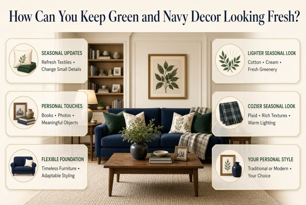
A classic palette can remain attractive for years when the foundational pieces are flexible and the decorative details are easy to update.
Change Small Accessories Seasonally
Keep the main furniture and color scheme consistent while changing smaller textiles.
Lighter cotton fabrics, botanical prints, and softer shades can create a fresh appearance during warmer months. Plaid throws, richer textures, and warmer lighting can make the room feel cozier when the weather is cooler.
You don’t need to replace every accessory. Changing a few pieces is usually enough to alter the atmosphere.
Introduce Personal Details
Books, photographs, artwork, meaningful collections, and handmade objects prevent the room from looking like a generic display.
Choose personal items that fit comfortably within the palette, but don’t feel obliged to make everything green, navy, or cream.
A few contrasting details can make the room more individual.
Avoid Depending Entirely on Trends
Green and navy are versatile enough to support different decorating directions.
If you later prefer a modern appearance, simplify the patterns and introduce cleaner-lined accessories. If you prefer a traditional look, emphasize plaid, brass, and wood.
A flexible foundation makes these changes easier and less expensive.
A Practical Green and Navy Decorating Plan
If you’re unsure where to begin, follow this simple sequence.
Step 1: Choose your green. Decide whether sage, forest, olive, emerald, or mint best suits your preferred atmosphere.
Step 2: Assess the navy already in the room. Consider existing furniture, rugs, bedding, or curtains before purchasing more.
Step 3: Select a neutral foundation. Cream, white, beige, or light wood can create balance.
Step 4: Choose one dominant pattern. A stripe, plaid, or botanical print can establish the decorative direction.
Step 5: Add a complementary pattern. Select a smaller or softer pattern that shares at least one color with the first.
Step 6: Introduce varied textures. Use a combination of cotton, woven materials, wood, or velvet where appropriate.
Step 7: Repeat the main colors. Distribute green and navy through several parts of the room.
Step 8: Add functional accessories. Lamps, trays, baskets, and artwork should serve a purpose as well as contribute to the design.
Step 9: Review the lighting. Check whether the darker colors still feel balanced during the evening.
Step 10: Edit the arrangement. Remove unnecessary objects and keep only the pieces that contribute to the overall result.
For broader decorating inspiration beyond accessories, visit Preppy Room. You can use the wider design ideas to explore how color, furniture, and decorative details work together while keeping this article’s focus on styling and decor.
How do you style green and navy preppy decor without making a room look too dark?
The best way to style green and navy preppy decor is to balance the rich colors with lighter neutrals, natural textures, and carefully selected accessories. Navy and forest green provide depth, but using them across every large surface can make a room feel visually heavy. Cream walls, ivory textiles, light wood furniture, and warm lighting help maintain a comfortable, polished appearance.
For a coordinated look, choose one dominant color, use the second as a supporting shade, and introduce lighter elements to create contrast. You can incorporate the darker colors through cushions, plaid throws, striped fabrics, artwork, and decorative lamps rather than covering every surface.
Practical styling tips:
Use cream or warm white for larger surfaces to keep the room feeling open.
Introduce navy through striped cushions, framed artwork, or selected accessories.
Add forest green or sage through throws, decorative vases, and botanical prints.
Choose light wood and warm lighting to soften the overall appearance.
Test your color combination in natural and evening light before purchasing accessories.
Which patterns work best with green and navy preppy decor?
Stripes, plaid, gingham, and botanical prints are excellent choices for green and navy preppy decor because they combine traditional character with visual variety. The key is to mix patterns of different sizes instead of allowing every fabric to compete for attention. A large plaid design, for example, can look attractive alongside narrow navy stripes and a smaller botanical print when the colors remain connected.
Start with one dominant pattern and use a second pattern to support it. Add a third only if the room still feels balanced. Solid-colored fabrics are equally important because they provide visual breathing space between decorative prints.
Practical pattern combinations:
Classic: Navy-and-white stripes with forest-green plaid and cream bedding.
Soft and relaxed: Sage gingham with subtle navy stripes and ivory textiles.
Traditional: Green tartan with botanical artwork and natural wood.
Modern preppy: Simple geometric patterns with solid navy and muted green accessories.
How can you decorate with green and navy on a budget?
You can create an attractive green and navy preppy interior without replacing your furniture or purchasing an entire matching decor collection. The most effective approach is to use existing furnishings as your foundation and introduce a few accessories that establish the color scheme. Cushion covers, throws, framed prints, decorative trays, and small lamps can make a noticeable difference without requiring major changes.
Before shopping, identify the colors already present in your room. Neutral furniture, wooden shelves, white walls, and simple bedding can often work perfectly with green and navy accessories. Spend money only where a new item improves the overall balance or serves a practical purpose.
Budget-friendly decorating ideas:
Reuse existing cream, white, or wooden furnishings.
Change cushion covers instead of buying new cushions.
Introduce one plaid throw or striped textile as a focal point.
Create a gallery wall using coordinated prints and affordable frames.
Rearrange existing accessories before purchasing additional decorations.
Choose versatile items that can be reused if you change your color palette later.
What colors and materials complement green and navy preppy decor?
Cream, ivory, warm white, beige, natural wood, and brass finishes complement green and navy particularly well. These supporting elements soften the darker colors and create a more complete design. The best choices depend on whether you prefer a traditional, cozy, or contemporary appearance.
Materials also influence the overall effect. Velvet adds richness, cotton and linen create a relaxed atmosphere, woven fabrics introduce texture, and wood brings natural warmth. Brass-colored accents work especially well with forest green and navy, while black finishes can create a cleaner, more modern appearance.
Recommended combinations:
Traditional: Forest green, navy, walnut, ivory, and brass.
Cozy: Sage, navy, cream, textured fabrics, and light wood.
Modern: Muted green, navy, warm white, and simple black accents.
Fresh and bright: Mint green, navy, white, and pale wood.
Choose two or three supporting materials and repeat them naturally throughout the room. This creates consistency without making every accessory look identical.
How do you make green and navy preppy decor look professionally designed?
A professionally styled room depends on color balance, pattern coordination, thoughtful placement, and restraint. Rather than filling every shelf or table with decorative objects, establish a clear focal point and build the surrounding decor around it. This could be a patterned textile, a collection of botanical prints, a distinctive lamp, or a carefully arranged group of cushions.
One useful technique is to repeat each main color in several places. For example, navy might appear in a cushion, a picture frame, and a decorative tray, while green appears in artwork, a throw, and a vase. These repeated details help the room feel connected without relying on a matching set.
Professional styling checklist:
Choose one dominant green shade and a complementary navy.
Balance bold patterns with solid-colored fabrics.
Mix textures such as cotton, velvet, wood, and woven materials.
Distribute colors throughout the room rather than concentrating them in one corner.
Leave some empty space on shelves and tables.
Check the room from the doorway to identify areas that feel too dark or crowded.
Prioritize comfort and function alongside visual appeal.
The most successful green and navy preppy decor feels coordinated but not forced. When colors, patterns, materials, and accessories support one another, the room looks polished while still reflecting your personal style.
Conclusion
Green and navy preppy decor is a beautiful way to create a space that feels classic, polished, and full of personality. By combining rich navy accents with green textiles, traditional patterns, natural textures, and carefully chosen accessories, you can achieve a balanced look that feels both timeless and fresh. The key is to use each color with purpose rather than allowing dark shades or busy patterns to overwhelm the room.
For the best results, start with a simple foundation and gradually introduce decorative details that reflect your personal style. Keep these practical tips in mind:
- Balance the colors: Pair deep green and navy with white, cream, or light beige to maintain a bright, welcoming atmosphere.
- Mix patterns thoughtfully: Combine stripes, plaid, gingham, or botanical prints while keeping a consistent color palette.
- Choose meaningful accessories: Add decorative pillows, lamps, framed artwork, ceramic pieces, and tasteful metallic accents.
- Layer different textures: Incorporate cotton, linen, velvet, woven baskets, and natural wood for added depth.
- Personalize your space: Select pieces that complement your lifestyle instead of following every decorating trend.
Whether you are refreshing a bedroom, styling a reading corner, or updating your living space, green and navy offer plenty of opportunities for creative expression. Explore more inspiration through our green and navy preppy room ideas and discover how to coordinate these colors in a green and navy preppy bedroom.
With thoughtful color choices, coordinated patterns, and well-placed accessories, you can create green and navy preppy decor that feels inviting today and remains stylish for years to come.