
Introduction
Green and Navy Room Color Scheme| A room can have beautiful furniture and carefully chosen accessories yet still feel unfinished because the colors don’t work together. Green and navy offer a practical solution: green introduces a natural, refreshing quality, while navy adds depth, contrast, and a timeless sense of style. The challenge is choosing the right shades, deciding which color should dominate, and creating enough balance to keep the room comfortable.
A green and navy room color scheme combines these two versatile colors to create interiors that can feel modern, traditional, cozy, elegant, or playful. The combination works in living rooms, bedrooms, home offices, guest rooms, and many other spaces when the shades, materials, and proportions are carefully selected.
If you’re beginning a decorating project, Preppy Room offers a broader starting point for exploring color palettes, interior styles, patterns, and decorating ideas.
In this guide, you’ll learn how to select complementary green and navy shades, coordinate walls and furniture, introduce accent colors, work with different lighting conditions, decorate on a budget, and avoid mistakes that can make a room feel too dark or visually crowded.
What Is a Green and Navy Room Color Scheme?
A green and navy room color scheme combines green’s nature-inspired character with the depth and structure of navy blue. Green can create a soft, earthy, or dramatic atmosphere depending on its shade, while navy adds contrast and visual definition. Cream, white, natural wood, and selected metallic finishes help balance the combination.
The palette is flexible because neither color has to cover an entire wall. You can introduce green through upholstery, textiles, artwork, or paint and use navy through furniture, curtains, rugs, or decorative details.
Why Do Green and Navy Work Well Together?
Green and navy have related cool undertones, but they create different visual effects. Green often feels organic and refreshing, whereas navy feels grounded, structured, and traditional.
Their contrast allows each color to stand out without necessarily competing for attention.
The combination works particularly well for four reasons:
- Visual balance: Green softens navy’s formal appearance, while navy gives green a more defined presence.
- Design flexibility: Muted sage and soft navy suit relaxed interiors, while forest green and deep navy create a richer atmosphere.
- Material compatibility: Both colors work with wood, linen, cotton, velvet, woven materials, and many natural finishes.
- Long-term versatility: You can update the room by changing smaller accessories instead of replacing every major item.
For example, a living room with a navy sofa, sage cushions, cream walls, and an oak coffee table can feel coordinated without requiring every object to contain both colors.
Which Decorating Styles Suit This Palette?
The same colors can create different results depending on furniture shapes, patterns, and finishes.
Modern interiors: Use muted green, a navy accent, simple furniture, and uncluttered surfaces.
Traditional interiors: Combine forest green, deep navy, warm cream, wood furniture, and restrained brass details.
Preppy interiors: Introduce stripes, plaid, gingham, tailored cushions, and classic furniture.
Cozy interiors: Use olive or forest green with navy textiles, warm lighting, and soft natural textures.
Minimal interiors: Keep the walls and large surfaces neutral, then introduce green and navy through a few carefully selected elements.
The most important decision is not which style is currently popular. It’s whether the colors, furniture, and materials suit the room’s purpose and your preferences.
Which Shades of Green Work Best With Navy?
The best green shade depends on how much contrast you want, the amount of daylight the room receives, and the colors of your existing furniture and flooring. Sage is a useful choice for a softer look, forest green creates a traditional atmosphere, olive introduces warmth, and emerald makes a stronger statement.
Sage Green and Navy
Sage is a muted green with gray undertones. Its restrained appearance makes it a practical option for rooms where you want color without an overly dramatic effect.
Use sage for painted walls, curtains, bedding, upholstered furniture, or decorative accessories.
A useful combination is sage walls, navy cushions, warm white bedding, and light oak furniture. The lighter materials prevent the darker blue from becoming the dominant feature.
Sage is particularly helpful when you’re introducing green and navy for the first time. You can begin with cushions or a throw, assess the result, and add more green if needed.
Forest Green and Navy
Forest green is deeper and more saturated than sage. It creates a traditional, grounded appearance that suits rooms with classic furniture and layered textiles.
Forest green works well with:
- Warm white and ivory.
- Walnut and medium-toned wood.
- Navy upholstery or curtains.
- Cream rugs and lampshades.
- Small brass or antique-style accents.
Because forest green and navy can both appear dark, avoid placing them across every large surface without considering the room’s lighting.
A forest-green accent wall with navy furniture may look balanced when surrounded by lighter textiles and flooring. In a dim room, however, a lighter green or more generous neutral background may be easier to live with.
Olive Green and Navy
Olive has an earthy quality that often works beautifully with natural materials. Depending on its undertones, it can feel warm, muted, or slightly golden.
Pair olive with navy, beige, warm cream, walnut, and woven textures for a comfortable, collected appearance.
For example, an olive accent chair can sit beside a navy sofa with a cream rug and a wooden coffee table. The chair introduces green without requiring additional painted surfaces.
Olive is also useful when your existing room contains warm wood or beige finishes that might feel disconnected from a cooler green.
Emerald Green and Navy
Emerald is a more saturated green that creates a stronger visual statement. Rather than using it everywhere, consider introducing it through a chair, cushion, lamp base, artwork, or patterned fabric.
Emerald works especially well when the rest of the room has a restrained palette.
A navy wall, emerald accent chair, cream upholstery, and brass details can create a rich interior without overwhelming every surface with strong color.
Mint Green and Navy
Mint is lighter and more playful than forest or emerald green. It can work well in bright rooms, youthful interiors, guest rooms, and spaces where you want a fresh interpretation of the palette.
Combine mint with medium navy, white, pale wood, and simple patterns.
If you prefer a more mature appearance, limit mint to a few details and use cream or neutral upholstery to connect the colors.
How Should You Choose Between These Greens?
| Green shade | Overall character | Suitable applications |
|---|---|---|
| Sage | Soft and understated | Walls, bedding, curtains |
| Forest green | Deep and traditional | Accent walls, upholstery |
| Olive | Earthy and warm | Chairs, cushions, accessories |
| Emerald | Rich and expressive | Accent furniture, artwork |
| Mint | Fresh and playful | Textiles, decorative details |
Expert tip: Don’t choose a green shade simply because it looks attractive in an inspiration photograph. Compare it with your navy fabric, flooring, and wall color under the lighting conditions of your own room.
Which Navy Shade Should You Use?

Navy is not one fixed color. Some versions look almost black, while others have softer gray undertones or a clearer blue appearance.
The right choice depends on whether you want a strong focal point or a more subtle supporting color.
Soft Navy
Soft navy has a less intense appearance than very dark midnight blue. It can be useful for bedding, cushions, rugs, and upholstery when you want the color to remain noticeable without dominating the room.
Classic Navy
Classic navy creates a familiar, traditional look. It works well with white, cream, forest green, sage, wood, and many classic patterns.
Use it for sofas, upholstered beds, curtains, accent walls, or larger accessories.
Midnight Navy
Midnight navy is extremely deep and can appear nearly black under certain lighting conditions.
It can look dramatic on an accent wall or a piece of furniture, but the surrounding materials become particularly important. Pale bedding, lighter wood, cream upholstery, and effective lighting can help preserve contrast.
Gray-Toned Navy
A gray-toned navy often feels restrained and contemporary. It can work well in modern rooms with sage green, neutral upholstery, simple furniture, and understated accessories.
Before selecting a paint color, compare samples at different times of day. The same shade may look different in natural daylight and under warm artificial lighting.
How Do You Balance Green and Navy in a Room?
The easiest approach is to assign each color a role rather than spreading both colors equally across every surface. Choose a dominant color, a supporting color, and one or more neutral finishes. This creates a visual hierarchy and makes decisions about furniture, textiles, and accessories much easier.
How Does the 60-30-10 Rule Work?
The 60-30-10 rule is a common decorating guideline that divides a color scheme into a dominant color, a secondary color, and an accent color.
For a green and navy room, you could adapt it like this:
- 60% neutral: Walls, larger rugs, or substantial upholstery in cream or warm white.
- 30% green: Curtains, bedding, an accent chair, or selected painted surfaces.
- 10% navy: Cushions, lampshades, artwork, or decorative details.
Alternatively, navy could become the secondary color and green the dominant color.
These percentages are approximate. They don’t need to be measured precisely, and they shouldn’t override the practical needs of your room.
The purpose is to stop either dark color from taking over unintentionally.
Which Color Should Dominate?
Consider the existing furniture before deciding.
If you already own a large navy sofa, navy may naturally become the main visual anchor. Introduce green through cushions, a chair, artwork, or curtains.
If you have a green upholstered bed, navy can appear through bedding details, a rug, or smaller accessories.
If neither color is already present, begin with a neutral foundation and add the colors gradually.
| Room condition | Suggested approach | Reason |
|---|---|---|
| Small room with limited daylight | Neutral walls, sage accents, controlled navy | Preserves a lighter appearance |
| Bright living room | Navy upholstery with green details | Creates contrast without relying on dark walls |
| Traditional study | Forest green with navy accessories | Supports a classic atmosphere |
| Large bedroom | Green feature and navy textiles | Allows stronger colors to coexist |
| Minimal room | Neutral foundation with small green and navy accents | Keeps the design uncluttered |
Common mistake: Using forest-green walls, navy curtains, dark furniture, and a dark rug without enough contrast. Even when each item looks attractive individually, the combined effect may feel heavy.
Introduce lighter surfaces or change the distribution of the colors before buying more decorations.
Finding the Perfect Green and Navy Shades for a Preppy Room
The right combination of green and navy can give a preppy room a distinctive character while keeping the overall design balanced and inviting. These colors work well together because navy provides a timeless foundation, while green adds a refreshing natural element. The key is to choose shades that complement your existing furniture, lighting, and preferred decorating style. Deep navy paired with forest green creates a rich, traditional atmosphere, whereas sage green and muted navy offer a softer and more relaxed appearance. Cream, ivory, and white can help balance these darker tones, making the room feel brighter without taking away its classic appeal. You can introduce the colors through larger elements such as bedding, rugs, curtains, or upholstered furniture, then repeat them in smaller details like cushions, lampshades, artwork, and decorative accessories. Traditional preppy patterns, including stripes, plaid, gingham, and subtle florals, can add visual interest when used alongside simpler fabrics and neutral surfaces. Before purchasing new decor, consider how the shades look together under your room’s natural and artificial lighting. For additional inspiration on selecting complementary tones and creating a consistent design, explore our guide to the green and navy preppy color palette. With careful shade selection and a thoughtful balance of colors and patterns, you can create a polished interior that feels comfortable, coordinated, and timeless.
What Neutral Colors Complement Green and Navy?
Neutrals provide the visual space that allows green and navy to work together comfortably. Cream, warm white, beige, and natural wood are particularly useful because they soften the transition between the two colors without making the room feel disconnected.
Green, Navy, and Cream
Cream is an excellent choice when pure white feels too sharp or creates excessive contrast.
It works well on walls, bedding, rugs, curtains, and upholstery. Warm cream is particularly compatible with olive, forest green, and warm wood.
A practical combination is sage-green cushions, navy upholstery, cream walls, and pale oak furniture.
For a dedicated look at how a third neutral changes the palette, explore the Green Navy and Cream Color Palette.
This article focuses on the overall relationship between green and navy; that related guide can provide additional direction for readers who specifically want to build a three-color scheme around cream.
Green, Navy, and White
White creates a cleaner, brighter contrast. It works particularly well with clear navy, sage, mint, and simple contemporary furniture.
Consider white walls, navy upholstery, sage textiles, and a light rug.
However, not every white is identical. Some have cool undertones, while others appear warmer. Compare your chosen white with the flooring and fabrics rather than assuming that any white will work.
Green, Navy, and Beige
Beige introduces warmth and can connect the palette to existing brown or tan finishes.
It is useful when a room already contains wood furniture, beige upholstery, or a warm neutral carpet.
For example, a navy sofa, olive cushions, beige rug, and walnut coffee table create a coordinated scheme without relying on bright white surfaces.
Green, Navy, and Natural Wood
Wood contributes material contrast as well as color. Light oak can make a room feel fresher, while walnut creates a richer and more traditional appearance.
You can use wood through bedside tables, coffee tables, shelves, picture frames, desks, and flooring.
The wood doesn’t have to match perfectly throughout the room. A consistent overall warmth is often more useful than selecting furniture in exactly the same finish.
Can You Add Brass, Pink, or Terracotta?
Yes. Additional colors can make the scheme more personal, provided they’re used intentionally.
- Brass: Adds a warm metallic detail through lamps, handles, or frames.
- Dusty pink: Softens the palette through cushions or small decorative items.
- Terracotta: Adds an earthy note, especially alongside olive green.
- Mustard: Introduces stronger contrast through a cushion, artwork, or patterned textile.
Choose one additional accent if the room already has several strong patterns or materials. A limited palette is easier to coordinate than one containing many equally prominent colors.
How Do You Choose Colors for Walls, Furniture, and Textiles?
The order in which you make decorating decisions matters. Large fixed elements are often expensive to change, so they should guide your choices rather than being treated as an afterthought.
Start With the Existing Room
Before selecting paint, examine:
- Flooring and its undertones.
- Large furniture pieces.
- Existing upholstery.
- Window coverings.
- Natural and artificial lighting.
- Architectural details that will remain.
If the flooring is warm brown, an earthy green may connect naturally with it. If the room has cool gray finishes, a more muted green and gray-toned navy might be a better starting point.
These are guidelines, not rigid rules. Sample testing is more reliable than making assumptions based on color names.
Choose the Largest Color Surfaces First
Walls, sofas, beds, and rugs occupy considerable visual space.
Decide which of these should establish the room’s overall appearance. Once that is clear, smaller choices become easier.
For example, if you want a navy sofa to be the focal point, avoid selecting several equally dark items that compete with it. Let green provide the contrast and use cream or wood to balance the composition.
Select Textiles That Connect the Colors
Textiles are useful because they can introduce green and navy without permanent changes.
Consider bedding, cushions, curtains, throws, rugs, and upholstered chairs.
You don’t need every textile to contain both colors. A navy cushion, sage throw, and cream rug can work together even when each item has a different pattern or texture.
Review the Room Before Adding Accessories
Arrange the larger items first. Then step back and identify where the room needs more color, contrast, or warmth.
If the room already contains navy in the sofa and rug, adding more navy accessories may be unnecessary. A green cushion or botanical artwork might solve the problem more effectively.
The aim is to fill genuine gaps rather than decorate every available surface.
Which Patterns Work Best With Green and Navy?
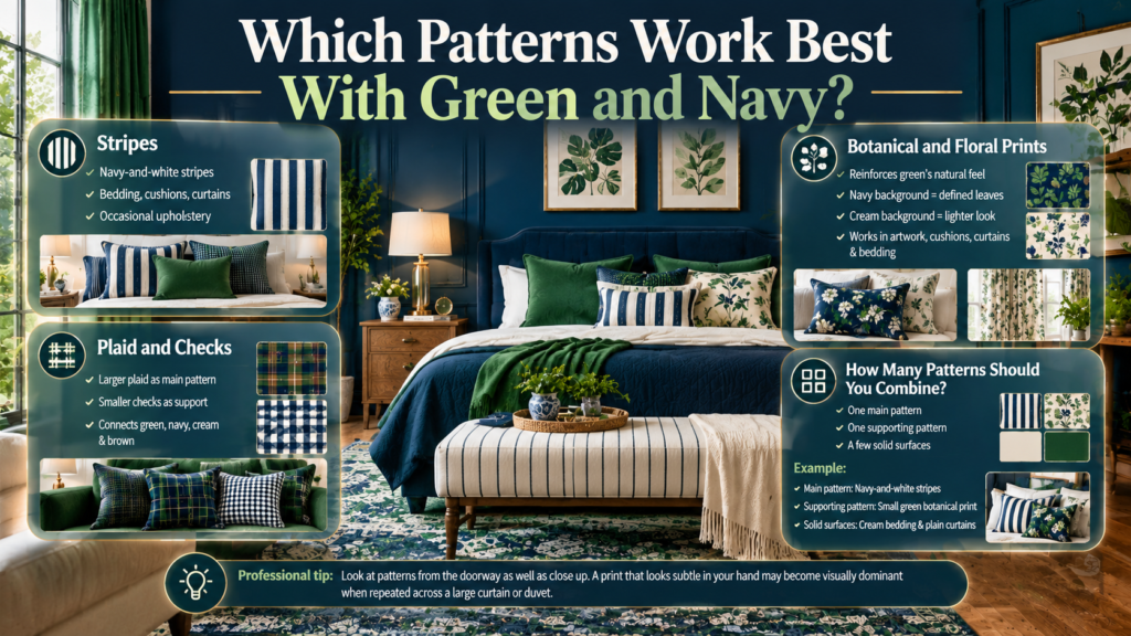
Patterns add movement and help a color scheme feel more individual. Stripes, plaid, gingham, florals, and botanical prints can all complement green and navy, but they should have different visual roles.
Stripes
Navy-and-white stripes create a classic, tailored appearance.
They work well on bedding, cushions, curtains, and occasional upholstery. If the stripes are bold, keep nearby textiles relatively simple.
Plaid and Checks
Plaid can combine several related colors in one fabric, making it useful for connecting green, navy, cream, and sometimes brown.
Gingham provides a simpler checked appearance and can make a room feel more relaxed.
Use a larger plaid as the main pattern and smaller checks as a supporting detail, rather than choosing several equally prominent checks.
Botanical and Floral Prints
Botanical prints reinforce green’s connection to nature. A navy background can make green leaves appear more defined, while a cream background can create a lighter appearance.
These patterns work well in artwork, cushions, curtains, and bedding.
How Many Patterns Should You Combine?
Start with one main pattern, one smaller supporting pattern, and a few solid-colored surfaces.
For example:
- Main pattern: Navy-and-white stripes.
- Supporting pattern: Small green botanical print.
- Solid surfaces: Cream bedding and plain curtains.
The difference in scale allows the patterns to coexist without making the room feel crowded.
Professional tip: Look at patterns from the doorway as well as close up. A print that looks subtle in your hand may become visually dominant when repeated across a large curtain or duvet.
How Do You Use Green and Navy in Different Rooms?
The best distribution depends on how the room is used. A living room needs a comfortable arrangement for everyday activities, while a home office benefits from visual organization. A bedroom may need softer textures and a more restrained atmosphere.
How Do You Decorate a Green and Navy Living Room?
A living room benefits from a clear focal point, often the sofa or a prominent piece of furniture.
If your sofa is navy, introduce green through an accent chair, cushions, artwork, or curtains. Add a cream rug or light wood coffee table to balance the darker surfaces.
If your sofa is green, navy can appear through cushions, a rug border, or selected decorative details.
Before buying anything, identify which large pieces already establish the palette. Repeating those colors in a few smaller locations is often enough.
How Do You Use Green and Navy in a Bedroom?
A bedroom should feel comfortable and visually settled.
Try warm white walls, a navy upholstered headboard, sage bedding, and natural wood bedside tables. A striped cushion or botanical print can add pattern without overwhelming the room.
If the bed frame is already navy, you don’t need to buy additional large navy furniture. Use green in the bedding or curtains and reserve the remaining navy for smaller details.
For readers who specifically want to develop a preppy bedroom, Green and Navy Preppy Room Ideas offers a more focused direction for bedroom styling and classic patterns.
The distinction is important: the present guide covers color distribution across different room types, while the linked article focuses on the preppy room concept and its styling elements.
How Do You Design a Green and Navy Home Office?
A home office should feel organized without becoming visually distracting.
Use a sage accent wall, navy chair, light wood desk, and neutral storage. Alternatively, keep the walls neutral and introduce the two colors through a chair, artwork, desk accessories, and textiles.
If the workspace is small, avoid placing several bold patterns directly around the desk. A restrained palette can create a more settled visual environment.
How Do You Decorate a Guest Room?
Guest rooms benefit from combinations that feel welcoming without being overly personal.
Warm white walls, navy bedding accents, sage cushions, and natural wood create a versatile foundation. A green throw can introduce color without requiring a permanent change to the walls.
Prioritize comfortable bedding, accessible surfaces, and adequate lighting. Decorative accessories should support the room’s purpose rather than reduce its practical space.
How Does Lighting Affect Green and Navy?
Lighting can change how both colors appear, so the same palette may look different from one room to another. A deep navy may appear nearly black in a shaded corner, while a saturated green may look more vivid in direct daylight.
Consider Natural Light
Rooms with limited daylight often benefit from lighter neutral surfaces and more controlled use of dark colors.
Bright rooms may accommodate deeper green and navy more easily, but strong daylight can also make some saturated colors appear more intense.
The direction of the windows, surrounding buildings, curtains, and existing finishes all influence the result.
Choose Artificial Lighting Carefully
Warm and cool artificial lights can affect the appearance of green, navy, cream, and wood.
Use the lighting you normally rely on when evaluating paint and fabric samples. If the room is used mostly in the evening, daylight alone won’t give you an accurate impression.
Test Paint and Fabric Together
Before committing to a large purchase:
- Obtain samples of the proposed green and navy.
- Place them beside the existing flooring and furniture.
- Observe them in daylight and under evening lighting.
- Check whether the neutral finishes connect the colors.
- Make adjustments before painting or ordering large items.
This simple process is more reliable than choosing shades from separate photographs.
How Can You Create a Green and Navy Room on a Budget?
You don’t need to replace all your furniture to introduce a new color scheme. Begin with what you already own, identify the missing color, and use smaller changes to establish the relationship between green and navy.
Step 1: Assess What You Already Have
Identify the colors in your existing sofa, bed, rug, curtains, furniture, and artwork.
If navy is already prominent, focus on introducing green. If you have a green chair or bedspread, navy cushions or a small rug may be sufficient.
Step 2: Choose One Dominant Color
Decide whether green or navy should be the main visual feature.
This helps prevent unnecessary purchases and reduces the chance of creating a room in which several items compete for attention.
Step 3: Start With Reversible Changes
Cushion covers, throws, bedding, small rugs, and artwork can all introduce color without permanent alterations.
These are particularly useful when you’re unsure which shade will work best.
Step 4: Repeat the Colors
Once you’ve introduced green and navy, repeat each color in another part of the room.
For example, if green appears in the curtains, repeat it in a cushion or artwork. If navy appears in the sofa, introduce it in a lamp base or a small patterned textile.
Step 5: Make Permanent Changes Last
Only consider painting walls or replacing major furniture after you’re confident that the palette works.
| Budget priority | Suggested change | Main benefit |
|---|---|---|
| Minimal commitment | Cushion covers | Easy to change |
| Bedroom refresh | Bedding or throw | Changes a prominent surface |
| Living room update | Curtains or rug | Helps establish the color balance |
| More permanent change | Paint | Creates a consistent background |
| Final styling | Artwork and accessories | Adds detail and repetition |
Quick tip: Before purchasing new accessories, rearrange your existing items. You may find that a different cushion placement, a moved lamp, or a more visible artwork already improves the balance.
What Are the Most Common Decorating Mistakes?
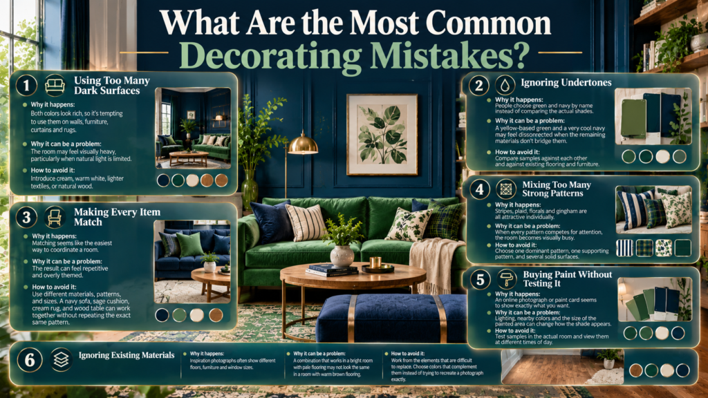
Most problems arise when people choose individual items without considering how they will look together. A color that looks beautiful on its own may become too strong when repeated across several large surfaces.
Mistake 1: Using Too Many Dark Surfaces
Why it happens: Both colors look rich, so it’s tempting to use them on walls, furniture, curtains, and rugs.
Why it can be a problem: The room may feel visually heavy, particularly when natural light is limited.
How to avoid it: Introduce cream, warm white, lighter textiles, or natural wood. You can retain the rich colors while improving contrast.
Mistake 2: Ignoring Undertones
Why it happens: People choose green and navy by name instead of comparing the actual shades.
Why it can be a problem: A yellow-based green and a very cool navy may feel disconnected when the remaining materials don’t bridge them.
How to avoid it: Compare samples against each other and against existing flooring and furniture.
Mistake 3: Making Every Item Match
Why it happens: Matching seems like the easiest way to coordinate a room.
Why it can be a problem: The result can feel repetitive and overly themed.
How to avoid it: Use the same colors in different materials, patterns, and sizes. A navy sofa, sage cushion, cream rug, and wood table can work together without repeating the exact same pattern.
Mistake 4: Mixing Too Many Strong Patterns
Why it happens: Stripes, plaid, florals, and gingham are all attractive individually.
Why it can be a problem: When every pattern competes for attention, the room becomes visually busy.
How to avoid it: Choose one dominant pattern, one supporting pattern, and several solid surfaces.
Mistake 5: Buying Paint Without Testing It
Why it happens: An online photograph or paint card seems to show exactly what you want.
Why it can be a problem: Lighting, nearby colors, and the size of the painted area can change how the shade appears.
How to avoid it: Test samples in the actual room and view them at different times of day.
Mistake 6: Ignoring Existing Materials
Why it happens: Inspiration photographs often show different floors, furniture, and window sizes.
Why it can be a problem: A combination that works in a bright room with pale flooring may not look the same in a room with warm brown flooring and limited daylight.
How to avoid it: Work from the elements that are difficult to replace. Choose colors that complement them instead of trying to recreate a photograph exactly.
What Professional Decorating Principles Make This Palette Work?
A successful color scheme is not just a collection of attractive shades. It also depends on visual hierarchy, proportion, material variation, and how people use the room.
Begin With the Fixed Elements
Flooring, existing cabinetry, large furniture, and architectural finishes often determine which shades will work most naturally.
If your room has warm wooden flooring, olive green and warm cream may connect the existing finishes with navy. If your room has pale floors and white furniture, sage and a clearer navy may feel more natural.
The purpose is not to follow a rigid formula but to make the new colors work with what already exists.
Create a Clear Focal Point
Choose one element that establishes the room’s visual direction.
It might be a navy sofa, a green accent wall, a patterned bedspread, or a piece of artwork containing both colors.
Let the remaining elements support that feature rather than competing with it.
Repeat Colors Without Repeating Everything
Color repetition helps the eye connect different parts of a room.
For example, navy may appear in the sofa, a picture frame, and the border of a rug. Green may appear in a cushion, artwork, and a decorative object.
The colors remain connected, while different textures and sizes keep the room from looking like a matching set.
Adjust the Scheme to the Room’s Purpose
A living room may need a more flexible arrangement of textiles and furniture. A bedroom may benefit from softer fabrics and a quieter contrast. A home office may require a simpler background and fewer decorative distractions.
The best palette is the one that supports the way you use the room.
How Do You Build a Green and Navy Color Scheme Step by Step?
If you’re starting from scratch, follow a clear order instead of choosing every item independently.
Step 1: Identify the existing finishes. Record the main colors of the flooring, furniture, walls, and window coverings.
Step 2: Choose your green. Select sage, forest, olive, emerald, or mint based on the atmosphere you want.
Step 3: Select a compatible navy. Compare the actual shade against your green and existing materials.
Step 4: Establish the neutral background. Choose cream, white, beige, or another suitable neutral for the surfaces that need visual breathing room.
Step 5: Decide which element will dominate. Choose a wall, sofa, bed, or another focal point.
Step 6: Introduce supporting textiles. Add curtains, bedding, cushions, or a rug that connects the colors.
Step 7: Add texture and pattern. Use one main pattern and a quieter supporting design, along with solid fabrics.
Step 8: Review the result. Check the room in different lighting conditions and remove any items that compete unnecessarily for attention.
For readers comparing different ways to combine the two colors across a wider range of interior styles, the dedicated Green and Navy Color Combinations guide provides a more focused reference for exploring individual pairings.
The distinction is useful for keeping your decorating decisions organized: this article explains how to plan a complete room scheme, while the related guide focuses on exploring combinations of the colors themselves.
What Colors Go Best With a Green and Navy Room Color Scheme?
Cream, warm white, beige, and natural wood are some of the most versatile colors to pair with green and navy. They soften the contrast between the two main shades and help create a balanced interior. For a warmer appearance, olive green, navy blue, and walnut furniture work well together. For a lighter, more contemporary room, try sage green, navy accents, white walls, and pale oak furniture.
Practical tips:
Use cream or warm white on larger surfaces to prevent the room from feeling too dark.
Add natural wood through coffee tables, bedside tables, shelving, or picture frames.
Introduce brass accents through lamps or handles if you want a warmer, more refined finish.
Keep additional accent colors limited when your room already contains several strong patterns.
How Do You Balance Green and Navy in a Room Without Making It Look Too Dark?
The most effective approach is to control how much of each color appears on large surfaces. Deep navy and forest green can create a rich atmosphere, but using both extensively in a room with limited daylight may make the space feel visually heavy. Start with a lighter neutral background, select one dominant color, and use the second color for contrast through furniture, textiles, or accessories.
Practical tips:
Try cream walls with navy furniture and sage-green cushions.
Use a pale rug to create contrast against dark flooring or upholstery.
Choose lighter curtains when the room receives limited natural light.
Test paint samples during both daytime and evening lighting before committing to a darker shade.
Which Shade of Green Works Best With Navy Blue for Interior Decorating?
The best shade depends on the mood you want to create and the existing finishes in your room. Sage green is suitable for a soft, understated appearance, while forest green creates a richer traditional look. Olive adds an earthy quality, emerald introduces a stronger decorative accent, and mint offers a lighter, fresher effect. Each can complement navy when the undertones and proportions are considered carefully.
Practical tips:
Choose sage for relaxed bedrooms, modern living rooms, and understated interiors.
Use forest green when you want a deeper, classic appearance.
Consider olive if your room already contains warm wood or beige finishes.
Introduce emerald through a chair, cushion, or artwork rather than automatically using it across every wall.
Compare actual green and navy samples beside your flooring and furniture before making a final decision.
Can You Use Green and Navy in a Small Living Room or Bedroom?
Yes, a green and navy palette can work in a small room when the colors are distributed thoughtfully. You don’t have to avoid dark shades altogether. Instead, use lighter colors across larger surfaces and reserve navy or deeper green for selected focal points. This approach adds personality and contrast while helping the room maintain a visually open appearance.
Practical tips:
Keep the walls cream, warm white, or another suitable light neutral.
Introduce green through cushions, bedding, a small accent chair, or artwork.
Use navy in a few coordinated details rather than covering every large surface.
Choose furniture that suits the available floor space and avoids unnecessary visual clutter.
Check how the colors look in the room’s actual lighting rather than relying exclusively on inspiration photographs.
How Can You Decorate a Green and Navy Room on a Budget?
You can create a coordinated green and navy room without replacing all your furniture or repainting every wall. Begin with the pieces you already own, identify which color is missing, and introduce it through affordable textiles and accessories. Cushion covers, throws, bedding, artwork, and small decorative objects can establish the palette before you invest in larger changes.
Practical tips:
Reuse existing furniture and coordinate new accessories with its current finish.
Change cushion covers or bedding before purchasing expensive upholstered furniture.
Rearrange existing artwork and decorative objects to improve the room’s color balance.
Choose one main pattern and combine it with simpler fabrics to avoid unnecessary purchases.
Test paint samples before buying enough paint for an entire room.
A gradual decorating approach allows you to evaluate each change, avoid unsuitable purchases, and build a green and navy color scheme that feels cohesive without exceeding your budget.
Conclusion
A green and navy room color scheme offers a timeless way to create an interior that feels sophisticated, comfortable, and full of character. The combination works across different decorating styles, from classic and preppy interiors to modern, cozy, and minimalist spaces. The key to achieving a balanced result is choosing shades that complement each other and distributing them thoughtfully throughout the room.
Start with the room’s existing features, including natural light, flooring, furniture, and wall finishes. Use green to introduce freshness and personality, navy to add depth and definition, and cream or other soft neutrals to maintain visual balance. Natural wood, warm metallic accents, layered textiles, and carefully selected patterns can bring the entire palette together without making the space feel overcrowded.
Remember that there is no single formula for using these colors successfully. A bedroom may benefit from soft green walls and navy bedding, while a living room might look more inviting with a neutral foundation, green upholstery, and navy decorative accents. Test paint samples in different lighting conditions, build the palette gradually, and focus on creating a cohesive atmosphere rather than matching every item perfectly.
For more inspiration, explore Preppy Room and discover practical ideas for creating a space that reflects your personal style. With thoughtful color choices and well-balanced details, a green and navy room can become a beautiful, functional interior that remains appealing for years to come.