
Introduction
Green and Navy Preppy Color Palette | A room can have beautiful furniture, carefully chosen accessories, and attractive wall colors yet still feel unfinished when the colors don’t work together. A green and navy preppy color palette offers a practical solution by combining the freshness of green with the depth of navy blue. The result can be traditional, sophisticated, relaxed, or playful, depending on the shades and materials you choose.
The beauty of this palette is its flexibility. Sage green and navy create a calm atmosphere, emerald and navy introduce richness, and olive and navy bring warmth to traditional interiors. Add cream, classic stripes, plaid, natural wood, and thoughtfully selected accessories, and you can create a room that feels coordinated without looking overly decorated.
At Preppy Room, the goal is to make classic interior styling easier to understand and apply. This guide explains how to select compatible shades, balance colors, coordinate patterns, decorate different rooms, avoid common mistakes, and develop a practical decorating plan that suits your space and budget.
What Is a Green and Navy Preppy Color Palette?
A green and navy preppy color palette combines shades of green and deep blue with complementary neutrals, traditional patterns, and coordinated decorative details. It draws on the classic character of preppy interiors, where stripes, plaid, tailored fabrics, balanced furniture, and carefully repeated colors create a polished yet comfortable appearance.
The palette does not require every item to match. Instead, the colors should work together while different textures, patterns, and finishes give the room personality.
Why Does Green Work So Well With Navy?
Green and navy create a balanced relationship because they offer different visual qualities. Green introduces a natural element, while navy provides depth and structure. When used together thoughtfully, they create a room that feels established rather than temporary.
The combination also supports several decorating styles within the broader preppy aesthetic.
- Traditional preppy: Navy upholstery, green accents, striped fabrics, and polished wood.
- Modern preppy: Clean furniture, simple color blocking, and limited decorative patterns.
- Cute preppy: Mint green, navy gingham, playful cushions, and white furniture.
- Cozy preppy: Olive or sage, warm lighting, textured blankets, and natural materials.
- Minimal preppy: Restrained colors, uncluttered surfaces, and a few carefully chosen patterns.
These variations allow you to personalize the palette without losing its defining character.
When Should You Choose This Color Scheme?
Green and navy are particularly useful when you want a room to feel coordinated but don’t want to depend on bright, short-lived trends.
Consider this palette if you are decorating a bedroom, updating a living room, arranging a study, refreshing a dorm room, or choosing textiles for an existing neutral interior.
It can also be useful when you already own navy furniture or green accessories and want to make them feel connected. Instead of replacing everything, introduce a supporting color and repeat selected shades in a few strategic places.
Which Shades of Green and Navy Should You Choose?
The best combination depends on your preferred atmosphere, available light, existing finishes, and the size of the surfaces you intend to decorate. Sage and navy offer a softer appearance, emerald and navy create a richer statement, and olive and navy bring warmth to traditional rooms.
Before selecting paint or large textiles, compare the colors together rather than judging each shade separately.
1. Sage Green and Navy Blue
Sage green is a muted shade that can have gray or earthy undertones. When paired with navy, it creates a restrained, versatile combination that works particularly well in bedrooms and living spaces.
Use sage on walls, cushions, an upholstered chair, or bedside furniture. Introduce navy through bedding, curtains, a rug, or selected decorative details.
This combination is especially useful if you prefer a classic interior that feels relaxed rather than dramatic.
Example: A bedroom with cream walls, sage cushions, navy striped bedding, and medium-toned wood furniture can feel coordinated without requiring numerous accessories.
2. Emerald Green and Deep Navy
Emerald green provides greater color intensity and can create a more dramatic interior. Deep navy supports its richness, while cream, white, or lighter wood tones prevent the combination from feeling too heavy.
You can use emerald on a feature chair, velvet cushions, decorative bedding, or a selected wall. Navy can appear in upholstery, curtains, or a headboard.
The main consideration is proportion. If both colors cover large surfaces, provide enough contrast through lighter elements and thoughtful lighting.
3. Olive Green and Navy Blue
Olive green has an earthy quality that works well with natural wood, beige, cream, and warm metallic finishes.
This combination is suitable for reading corners, traditional bedrooms, studies, and living rooms where you want a grounded, comfortable atmosphere.
Try olive cushions on a navy sofa, or combine olive curtains with cream upholstery and navy decorative accents.
Avoid assuming every olive shade will work with every navy. Compare the undertones, particularly when one color looks strongly yellow while the other appears cool and blue.
4. Mint Green and Navy Blue
Mint green creates a lighter, fresher variation of the palette. Its brightness contrasts with navy and makes it useful for smaller bedrooms, dorm rooms, and cheerful preppy interiors.
Use mint in bedding, decorative cushions, desk accessories, or small furniture pieces. White furniture and cream textiles help maintain a clean appearance.
For a youthful but coordinated look, combine navy stripes with mint gingham and a few solid white or cream surfaces.
5. Forest Green and Navy Blue
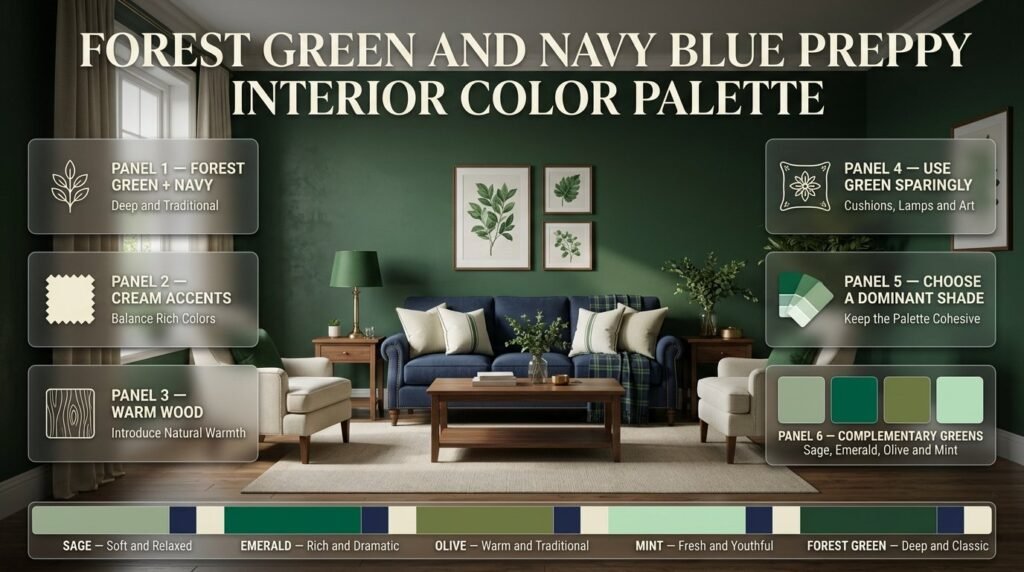
Forest green creates a deep, traditional appearance. It can be effective in a study, library-inspired corner, or living room with warm wood furniture.
Because both forest green and navy can be visually strong, avoid concentrating them on every large surface. Cream upholstery, a light rug, or warm wood can provide a useful counterbalance.
Forest green also works well in small quantities. A pair of cushions, a decorative lamp, or framed artwork may be sufficient to establish the color without repainting the room.
Quick Comparison of Green and Navy Combinations
| Green shade | Overall effect | Suitable applications | Helpful supporting colors |
|---|---|---|---|
| Sage | Soft and relaxed | Bedrooms, living rooms | Cream, light oak |
| Emerald | Rich and dramatic | Accent walls, upholstery | White, warm beige |
| Olive | Warm and traditional | Studies, reading corners | Wood, cream |
| Mint | Fresh and youthful | Dorm rooms, small bedrooms | White, pale gray |
| Forest green | Deep and classic | Studies, traditional interiors | Beige, warm wood |
Professional tip: Choose one primary green shade and use other greens sparingly. A room can contain several related shades, but a clear dominant color helps the entire scheme feel intentional.
How Do You Balance Green and Navy in a Room?
Balance green and navy by assigning each color a specific role and introducing a neutral that provides visual breathing room. One color can dominate the textiles or furniture, while the second appears in supporting accents. This arrangement creates contrast without making every surface compete for attention.
How Does the 60-30-10 Rule Work?
The 60-30-10 rule is a useful decorating guideline that divides a palette into three approximate proportions: 60% dominant color, 30% supporting color, and 10% accent color.
For a green and navy interior, you could begin with the following arrangement.
| Color role | Approximate proportion | Example |
|---|---|---|
| Dominant | 60% | Cream walls, pale neutral bedding |
| Supporting | 30% | Navy curtains, upholstery, or bedding |
| Accent | 10% | Green cushions, artwork, decorative details |
These percentages are not strict measurements. They are a way to visualize the relative presence of each color across a room.
You can also reverse the arrangement. Sage walls, navy furniture, and cream accessories can work well if you want green to play a larger role.
The important point is to avoid giving every color equal visual weight automatically. If the room already contains a dark navy sofa, you may need more light-colored surfaces rather than additional navy furniture.
How to Style a Green and Navy Patterned Bedroom
Patterns can bring personality, depth, and a classic preppy character to a bedroom when they are used thoughtfully. Green and navy work particularly well together in striped bedding, plaid cushions, gingham fabrics, floral curtains, and decorative accessories. The key is to create a balance between bold patterns and simpler surfaces so the room feels coordinated rather than overcrowded. For example, navy-and-green plaid bedding can become the main focal point, while solid cream pillows and a neutral rug help soften the overall look. If you prefer a more subtle design, introduce small patterns through cushions, lampshades, artwork, or window treatments instead of covering every surface with prints. You can also repeat the same shades across different materials to connect the bedding, furniture, and wall decor without making the room look overly matched. Before choosing your fabrics, consider the bedroom’s size, natural lighting, and existing furniture to determine which patterns and color combinations will work best. For more inspiration on combining prints and complementary shades, explore our guide to the green and navy patterned bedroom. With a thoughtful mix of patterns, textures, and solid colors, you can create a bedroom that feels inviting, visually balanced, and timelessly preppy.
Should Green or Navy Be the Dominant Color?
Choose the dominant color according to the room’s lighting, existing furniture, and the atmosphere you prefer.
| Decorating goal | Recommended approach |
|---|---|
| Keep a small bedroom visually open | Cream or sage walls with navy accents |
| Create a dramatic focal point | Navy feature wall with lighter green textiles |
| Build a traditional study | Olive green, navy upholstery, warm wood |
| Decorate a cheerful dorm room | Mint, navy stripes, white furniture |
| Create a relaxed living room | Sage upholstery, navy accents, cream walls |
If you are uncertain, begin with neutral walls and introduce the two main colors through textiles. This makes it easier to adjust the palette without undertaking a major renovation.
How Can You Prevent the Colors From Competing?
Give the eye a place to rest. A large navy surface can be balanced with a cream rug, while saturated green accessories can be separated by neutral furniture.
Repeat each color in a few places rather than placing all green items on one side of the room and all navy items on the other.
For example, a navy bedspread can be connected to a navy picture frame and a small patterned cushion. Sage cushions can relate to a plant, a lampshade, or artwork elsewhere in the room.
The repeated colors create continuity without requiring identical objects.
Which Colors Complement Green and Navy?
Cream, white, beige, natural wood, and selected metallic finishes can support a green and navy palette. These additional elements soften strong contrasts, introduce warmth, and connect the larger pieces of furniture with smaller decorative details.
Choose supporting colors according to the undertones of your main shades.
Green, Navy, and Cream
Cream is one of the most flexible additions because it softens the contrast between green and navy without creating the sharp appearance of pure white.
It works well for bedding, walls, upholstered furniture, rugs, lampshades, and curtains.
For example, sage cushions on cream bedding can connect a navy headboard with lighter bedroom furnishings. The result feels layered without needing another prominent color.
Explore the Green, Navy, and Cream Color Palette for additional ideas about using a neutral shade to balance the two main colors.
Green, Navy, and White
White creates a crisp, high-contrast appearance. It is particularly suitable for classic striped bedding, white-painted furniture, bright bedrooms, and interiors that use simple patterns.
However, a room containing only bright white, dark navy, and saturated green can sometimes feel stark.
If this happens, introduce natural wood, a textured throw, or softer off-white textiles. These elements add warmth without changing the overall palette.
Green, Navy, and Beige
Beige introduces warmth and works particularly well with oak furniture, woven baskets, neutral upholstery, and natural-looking rugs.
It can also help connect green and navy when the existing floor or furniture already contains warm undertones.
Choose a beige that complements the green rather than one that makes the entire scheme appear unexpectedly yellow. Compare samples in the room before purchasing large items.
Green, Navy, and Brass
Brass is best treated as a decorative finish rather than a third dominant color.
It can provide a polished detail through drawer pulls, lamp bases, picture frames, or small decorative trays.
Use it selectively. A few repeated brass details can connect the room, while too many competing metallic finishes may distract from the main color scheme.
Can You Add Pink or Yellow?
Small amounts of pink or yellow can work if you want a more playful preppy interior.
Soft blush can complement navy and muted green in cushions, artwork, or a patterned throw. Pale yellow can bring brightness to a room with sage and navy.
Keep these additional colors secondary. If pink or yellow becomes equally prominent, the room may start to follow a different palette rather than maintaining green and navy as its main focus.
How to Incorporate Green and Navy Gingham Decor
Gingham is a timeless pattern that adds a charming, traditional touch to a preppy interior. When styled in green and navy, this classic checkered design can create a coordinated look that feels both fresh and sophisticated. You can introduce gingham through bedding, throw pillows, curtains, table accessories, or small decorative accents, depending on the room’s existing colors and overall style. For example, green and navy gingham cushions can complement solid navy bedding, while a cream duvet cover provides a lighter background that keeps the combination from feeling too busy. If you prefer a more subtle approach, use gingham in smaller details and balance it with plain fabrics, natural wood finishes, and neutral accessories. Mixing gingham with stripes or delicate floral prints can also enhance the traditional preppy aesthetic, provided the patterns share complementary colors and vary in scale. Before adding multiple prints, decide which pattern will serve as the focal point and allow the remaining elements to support it. For more decorating inspiration, explore our guide to green and navy gingham decor, which can help you discover ways to incorporate this distinctive pattern into a cohesive interior. By combining gingham with thoughtful color placement and simple textures, you can create a welcoming space that feels classic, balanced, and full of personality.
How Do You Create a Green and Navy Preppy Bedroom?
A green and navy preppy bedroom combines coordinated bedding, classic patterns, balanced furniture, and a restrained selection of accessories. The easiest approach is to choose the main colors first, select one noticeable pattern, and then repeat the colors through smaller textiles and decorative details.
Start With the Bedding
Bedding is a practical starting point because it occupies a large, visible area and can establish the entire color scheme.
Consider these arrangements:
- Cream sheets with a navy duvet and sage cushions.
- Navy striped bedding with a solid green throw.
- White bedding with an emerald accent blanket and navy pillows.
- Sage bedding with cream pillowcases and a small navy plaid detail.
The best arrangement depends on the room’s existing furniture and how much contrast you prefer.
If your bed already has a navy headboard, lighter bedding may be more useful than another large navy textile.
Choose a Headboard That Supports the Palette
A navy upholstered headboard creates a strong focal point, especially when the walls and bedding are lighter.
A cream headboard offers greater flexibility if you want to experiment with green and navy textiles over time. Natural wood can also work well, particularly with olive or sage.
You do not need a matching bedroom furniture set. A coordinated color relationship between the bed, bedside tables, textiles, and wall finishes is usually enough.
Introduce Green Through Smaller Elements
Green can appear through cushions, a throw blanket, artwork, a lampshade, or a small painted furniture piece.
If you are working with a limited budget, these are often easier to change than paint or upholstered furniture.
A few repeated green details can make the room feel planned. For example, sage cushions can relate to a botanical print and a small decorative object on the bedside table.
Use Patterns With a Clear Purpose
Preppy interiors often include stripes, plaid, gingham, and traditional botanical prints.
Choose one dominant pattern, such as striped bedding, and support it with a smaller print or solid fabric. This creates variety without making the bed look crowded.
For further inspiration, visit Green and Navy Preppy Room Ideas. Use those ideas to explore styling possibilities while keeping this article’s focus on selecting and balancing the color palette itself.
Finish With Lighting and Accessories
Warm lighting can make navy and green textiles feel more inviting. Bedside lamps, fabric shades, and soft ambient lighting are useful additions.
Keep decorative surfaces functional. A lamp, a small tray, and a framed print may be more effective than filling every available space with accessories.
Quick tip: Before buying more decorations, remove a few items and view the room from the doorway. Sometimes the palette becomes clearer when there is more space around the furniture and patterns.
How Can You Use Green and Navy in a Living Room?
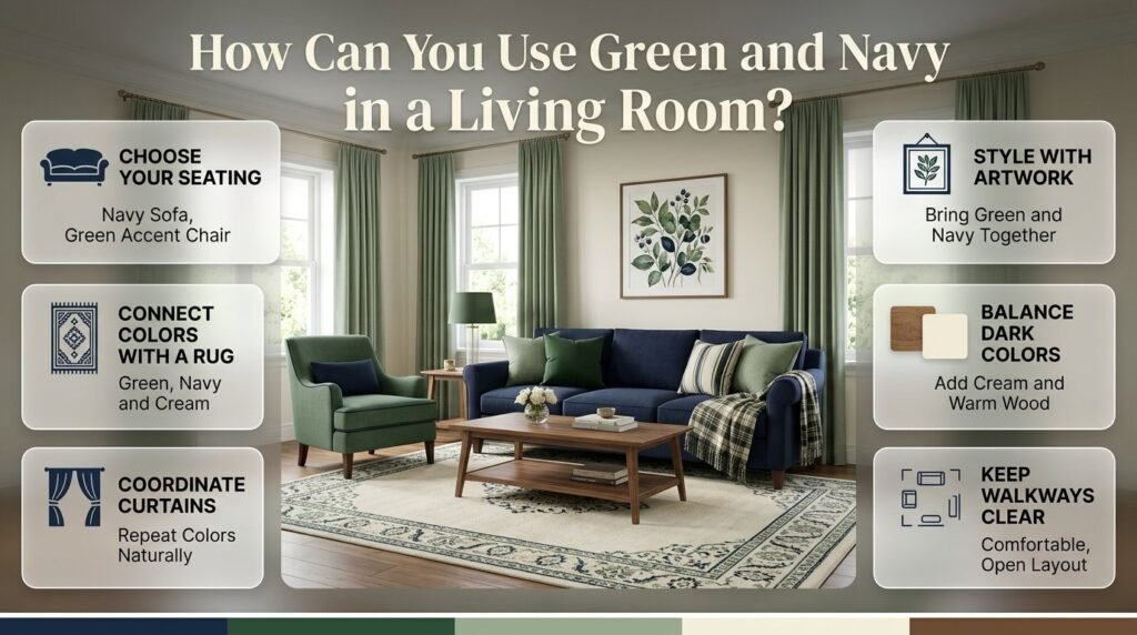
A green and navy living room works best when the colors connect the main seating, rug, curtains, and decorative accessories. You can use a navy sofa with green cushions, a green accent chair with navy details, or neutral furniture supported by coordinated textiles.
Choose the Right Sofa and Accent Chairs
A navy sofa can anchor a living room while allowing green cushions, cream walls, and a lighter rug to provide contrast.
Alternatively, a green armchair can introduce the dominant green shade while navy appears in artwork, curtains, or a patterned cushion.
If your current sofa is beige, cream, or gray, there is no need to replace it simply to establish the palette. Use textiles to connect the existing furniture with your preferred colors.
Select a Rug That Connects the Colors
A rug can bring several colors together in one place. Look for a design that includes green and navy alongside cream, beige, or another neutral.
Traditional stripes, understated botanical prints, and restrained geometric designs are all suitable options.
If the rug contains a strong navy pattern, consider lighter curtains rather than repeating the same dark color across another large surface.
Coordinate Curtains and Artwork
Curtains can repeat a color from the rug or upholstery without matching it exactly.
For instance, navy seating may work with sage curtains and artwork that contains both colors. This creates a visual connection across the room.
Artwork can also introduce the green shade you want without requiring painted walls or new furniture.
Keep the Furniture Arrangement Comfortable
A cohesive color palette cannot compensate for an awkward layout.
Make sure the main walking paths remain clear and the seating arrangement supports normal conversation. Avoid placing several bulky, dark items together if doing so makes one side of the room feel crowded.
In smaller living rooms, distributing navy across cushions, frames, and selected textiles can be more effective than using it on every large piece.
How to Decorate a Room With Green and Navy Stripes
Stripes are a classic choice for preppy interiors because they introduce structure, visual movement, and a sense of timeless style. When combined in green and navy, they can make a room feel coordinated and distinctive without relying on excessive decoration. You can incorporate striped patterns through bedding, curtains, area rugs, cushions, wallpaper, or upholstered furniture, depending on the look you want to achieve. For example, navy and green striped bedding can become the main feature of a bedroom, while cream walls and solid-colored accessories help maintain a balanced appearance. Wider stripes often create a stronger visual statement, whereas finer stripes offer a more understated and traditional effect. To keep the design cohesive, repeat the same shades in smaller details such as lampshades, artwork, decorative cushions, or throws. You can also combine stripes with plaid, gingham, or subtle floral patterns, provided the prints complement one another and do not compete for attention. If you are looking for more inspiration on using this timeless pattern, explore our guide to green and navy striped room ideas. It can help you discover different ways to incorporate stripes into your decorating plans while maintaining a consistent color palette. With thoughtful pattern placement and a suitable mix of solid fabrics and textures, you can create a stylish preppy room that feels inviting, balanced, and visually appealing.
How Do You Decorate a Small Room With Green and Navy?
In a small room, lighter surfaces and carefully placed navy accents can preserve a sense of openness while retaining the character of the palette. Cream walls, pale sage textiles, and a few navy details provide contrast without requiring every surface to be light.
Keep the Largest Surfaces Relatively Light
Cream walls, light bedding, and pale upholstery can create a flexible foundation.
You can still use navy prominently, but consider whether the room has enough natural and artificial light to support a dark wall or large navy furniture piece.
A small room with a navy headboard may feel balanced when the bedding and surrounding walls are light.
Use Vertical and Open Storage
Shelves, wall-mounted organizers, and furniture with open space beneath it can help reduce visual clutter.
Choose storage pieces that support the color scheme rather than introducing several unrelated finishes.
A white bookcase with navy accessories and a few green decorative details may provide the required storage while maintaining a clear palette.
Repeat Colors Instead of Adding More Objects
A common mistake in small rooms is buying additional decorations to make the color scheme more noticeable.
Instead, repeat the existing colors through a few functional items. A navy cushion, navy lamp base, and small framed print may provide enough continuity.
The goal is to make the palette recognizable without filling every available surface.
How to Style Green and Navy Plaid in a Preppy Room
Plaid is a classic pattern that brings warmth, structure, and traditional character to a preppy interior. The combination of green and navy works especially well because it blends the natural richness of green with the depth and sophistication of navy blue. You can introduce plaid through bedding, throw pillows, blankets, curtains, upholstered accents, or framed fabric artwork, depending on the room’s existing decor. For example, green and navy plaid bedding can create an attractive focal point in a bedroom, while cream sheets, solid-colored cushions, and neutral flooring help balance the pattern. In a living space, plaid cushions or a decorative throw can add a traditional touch without overwhelming the furniture arrangement. The scale of the pattern also matters: larger checks create a bolder statement, while smaller plaid designs often feel more subtle and understated. To achieve a cohesive look, repeat the green and navy shades in a few carefully selected accessories and combine the plaid with simpler textures or complementary patterns, such as narrow stripes. If you want to explore more ways to incorporate this timeless print into your decorating plans, take a look at our guide to green and navy plaid room ideas. By balancing patterned fabrics with solid colors, natural materials, and thoughtful decorative details, you can create a welcoming room that reflects the enduring appeal of classic preppy style.
How Do You Combine Preppy Patterns Without Making the Room Busy?
Combine patterns by varying their scale, assigning one design a dominant role, and repeating a limited number of colors. A large stripe, a smaller plaid, and a solid green textile can work together because each element contributes something different.
Which Patterns Work Best?
| Pattern | Suitable uses | Best approach |
|---|---|---|
| Stripes | Bedding, curtains, upholstery | Use as the main structured pattern |
| Plaid | Throws, cushions, blankets | Repeat colors from the main design |
| Gingham | Small cushions, accessories | Choose a scale that suits the room |
| Botanical prints | Artwork, cushions, wallpaper | Balance organic shapes with simpler fabrics |
| Geometric prints | Rugs, accent textiles | Keep the colors coordinated |
Follow a Simple Three-Part Pattern Formula
Start with one prominent pattern, one smaller supporting print, and one solid fabric.
For example, navy and cream striped bedding can serve as the main design. A small green gingham cushion introduces variety, while a solid sage throw provides a quiet connection between the two.
This approach allows you to use recognizable preppy patterns without making every textile compete for attention.
How Can You Tell When There Are Too Many Patterns?
Stand at the doorway and observe the room as a whole.
If your attention jumps between numerous equally strong designs, remove one pattern or replace it with a solid color. If the furniture, bedding, and curtains each have a prominent print, consider simplifying one of those areas.
Pattern mixing should make the room feel layered, not visually confusing.
How Do You Build a Green and Navy Preppy Color Palette Step by Step?
Develop the palette by assessing existing finishes, selecting compatible shades, assigning each color a role, testing materials, and adding accessories gradually. This process helps prevent expensive mistakes and gives you a clear plan before you commit to paint, furniture, or new textiles.
Step 1: Assess the Existing Room
Identify the elements that are difficult or expensive to change, including flooring, large furniture, window frames, and permanent finishes.
Observe whether the room receives direct sunlight, indirect daylight, or limited natural light.
Why it matters: The palette should work with the room you actually have.
Step 2: Select Your Main Green and Navy Shades
Choose a combination that supports your preferred atmosphere.
Sage and medium navy can provide a softer appearance. Emerald and deep navy create a stronger statement. Olive and navy work well with warmer traditional materials.
Compare samples together rather than choosing each color from a separate photograph.
Step 3: Choose a Supporting Neutral
Select cream, white, beige, or another neutral that complements both main colors.
Check the undertones carefully. A cream with a strong yellow appearance may behave differently beside a cool sage than it does beside an earthy olive.
The supporting neutral should connect the main colors rather than introduce an unwanted contrast.
Step 4: Assign Each Color a Role
Decide where each shade will appear before buying accessories.
A simple plan might look like this:
- Cream: walls and primary bedding.
- Navy: duvet, curtains, or upholstered furniture.
- Sage: cushions, artwork, and a small accent piece.
- Brass: selected hardware and lighting.
This plan gives every color a purpose and reduces unnecessary purchases.
Step 5: Test Paint and Fabric Samples
View the samples in the actual room during morning, afternoon, and evening lighting.
Artificial lighting can change how colors appear, so compare the materials under the bulbs you normally use.
If you are choosing paint, test a sample area instead of relying entirely on a small color card. Allow the sample to dry fully before judging its appearance.
Step 6: Introduce Patterns and Textures
Once the main colors work together, select a dominant pattern and add supporting textiles.
For example, navy striped bedding can be paired with a smaller green plaid cushion and a solid cream throw.
Use different textures to add interest without introducing too many additional colors.
Step 7: Review Before Making Further Purchases
Look at the room from different angles and ask:
- Is one color dominating too much?
- Do the green and navy shades look compatible?
- Is there enough contrast between dark and light surfaces?
- Are the patterns competing?
- Does the room feel comfortable in daylight and evening light?
Make small adjustments before buying additional furniture or repainting large surfaces.
What Are the Most Common Green and Navy Decorating Mistakes?
The most common mistakes include using too much navy, choosing incompatible green undertones, combining too many patterns, and purchasing accessories before establishing the main palette. These problems often occur when individual products look attractive separately but haven’t been evaluated as part of the complete room.
Mistake 1: Using Too Much Navy
Navy is a versatile color, so it can be tempting to use it for walls, curtains, bedding, and furniture.
The problem is that several large dark surfaces can make a room feel visually heavy, particularly when natural light is limited.
How to avoid it: Introduce cream, pale sage, white, or light wood between darker surfaces. You can keep navy prominent without allowing it to dominate every part of the room.
Mistake 2: Choosing Green Shades That Clash
Green can have gray, yellow, blue, or earthy undertones.
A yellow-leaning olive may look disconnected beside a cool blue-green if there is no supporting color to bring the arrangement together.
How to avoid it: Compare actual samples and select a dominant green. Introduce additional green shades only when they complement the main choice.
Mistake 3: Matching Every Item Exactly
Matching sets may seem like the easiest route to a coordinated interior.
However, identical shades, patterns, and finishes can make the room feel flat or overly staged.
How to avoid it: Mix related shades and textures. Pair navy stripes with solid sage cushions, cream upholstery, and warm wood rather than repeating the same print everywhere.
Mistake 4: Using Too Many Patterns
Preppy decorating encourages classic prints, but that doesn’t mean every surface needs a pattern.
Too many prominent designs can distract from the furniture and make the room feel unsettled.
How to avoid it: Choose one main pattern, one supporting print, and a few solid textiles. Keep the colors connected even when the patterns differ.
Mistake 5: Ignoring Lighting
A paint sample may look bright in a store but appear much darker in a room with limited sunlight.
The same issue can affect green fabrics, which may look grayer or more yellow depending on the lighting.
How to avoid it: Test samples at different times of day and under your regular light bulbs before making a large purchase.
Mistake 6: Buying Accessories Before Planning
Small decorative objects can be inexpensive individually, which makes it easy to accumulate too many of them.
The result may include unrelated colors, competing patterns, and cluttered surfaces.
How to avoid it: Establish the palette first. Buy accessories only when they fill a clear role, such as repeating a color, introducing texture, or providing useful lighting.
What Do Interior Decorating Professionals Recommend?
A successful green and navy interior depends on coordination, contrast, texture, and the relationship between the colors and the room’s existing features. Rather than buying every item at once, develop the palette in layers and adjust it as the room comes together.
Prioritize Undertones Over Color Names
Two products labeled sage green may look very different beside the same navy fabric. One might have a gray undertone, while another appears warmer.
Compare the actual materials whenever possible, particularly for large purchases such as curtains, rugs, upholstery, and paint.
Use Texture to Add Interest
When a palette contains two main colors, texture helps prevent the room from looking repetitive.
Consider linen curtains, cotton bedding, woven throws, velvet cushions, ceramic lamps, and natural wood furniture.
These materials introduce variety without requiring a long list of additional colors.
Repeat Colors at Different Heights
A balanced room often repeats its main shades in several locations.
Navy might appear in a rug, a cushion, and a framed print, while green appears in an armchair, a decorative textile, and artwork.
This distributes the colors around the room instead of concentrating them in one area.
Make One Intentional Statement
Choose one feature that gives the room personality. It might be a navy upholstered headboard, an emerald accent chair, striped bedding, or botanical wallpaper.
Let that feature guide the supporting details rather than making every item equally prominent.
Work With Existing Furniture
You do not need to purchase a completely new furniture set to create a coordinated interior.
Neutral furniture can support the palette through cushions, throws, lampshades, artwork, and rugs. If the room feels unfinished, first consider whether it needs better color repetition or contrast rather than more objects.
For a closer look at how different proportions and supporting colors affect a room, explore the Green and Navy Color Scheme and Green and Navy Room Color Scheme guides. Use them as related references when comparing possible arrangements, while keeping the main focus of this article on selecting and balancing the palette.
What colors go best with a green and navy preppy color palette?
Green and navy work particularly well with cream, white, beige, and natural wood tones. These supporting colors balance the depth of navy and the richness of green, helping a room feel coordinated rather than visually heavy. Cream creates a softer, traditional appearance, while white offers a crisp contrast. Beige and natural wood introduce warmth, making them useful for bedrooms and living rooms with darker furniture or textiles.
For a classic preppy interior, consider these combinations:
Green, navy, and cream: Ideal for timeless bedrooms, striped bedding, and traditional furniture.
Green, navy, and white: Suitable for bright, fresh interiors with clean lines.
Green, navy, and beige: Works well with warm wood, woven textures, and comfortable upholstery.
Green, navy, and brass: Adds a refined touch through lamps, drawer handles, and picture frames.
The best supporting color depends on your existing finishes and the atmosphere you want to create. Test the shades together before committing to paint or large furniture purchases.
How do you balance green and navy in a preppy bedroom without making it look too dark?
The most effective approach is to distribute the darker colors across the room and balance them with lighter surfaces. Navy provides depth, while green adds character, but using both extensively on walls, bedding, curtains, and furniture can make a bedroom feel visually crowded, particularly when natural light is limited.
Start with cream or light-colored walls, then introduce navy through the duvet, headboard, or curtains. Add sage or emerald through cushions, throws, artwork, or a small decorative piece. This creates a clear color hierarchy without requiring every item to match.
Practical ways to maintain balance include:
Use cream or white bedding to break up large areas of dark color.
Choose lighter wood or white-painted bedside tables.
Introduce texture through cotton, linen, woven fabrics, or velvet.
Use warm bedside lighting to make the room feel more inviting.
Test navy paint samples under both daylight and evening lighting.
A navy feature wall can still work beautifully in a small bedroom. The key is to consider the room’s lighting and surrounding surfaces rather than avoiding dark colors entirely.
Which shade of green looks best with navy blue for a classic preppy interior?
Sage, emerald, olive, and forest green can all complement navy blue, but each creates a different effect. Sage is a versatile option for relaxed spaces, emerald creates a richer statement, olive adds warmth, and forest green supports a traditional, deeper color scheme. The right shade depends on your existing furniture, natural light, and preferred decorating style.
Consider these options when choosing your palette:
Sage green and navy: Best for calm bedrooms, neutral living rooms, and understated preppy decor.
Emerald green and navy: Suitable for statement chairs, accent cushions, and sophisticated traditional interiors.
Olive green and navy: Works well with warm wood, beige upholstery, and brass finishes.
Forest green and navy: Useful for studies, reading corners, and rooms with a classic, tailored appearance.
Before selecting a shade, compare actual paint or fabric samples beside your navy item. Green undertones can vary considerably, and a combination that looks harmonious online may appear different in your room’s lighting.
How can you decorate a living room with green and navy without buying new furniture?
You can create a coordinated green and navy living room by updating the textiles, artwork, and small accessories around your existing furniture. A neutral sofa, wooden coffee table, or cream-colored rug can provide an excellent foundation. Instead of replacing large items, introduce the palette through carefully selected details that repeat the colors around the room.
For example, place sage cushions on a navy or beige sofa, add a patterned throw, and choose artwork that includes both colors. If your existing rug contains navy, use green through curtains or an accent cushion to connect the arrangement.
Start with these practical changes:
Cushions and throws: Introduce green and navy in different textures.
Curtains: Repeat one of the main colors without necessarily matching the sofa.
Artwork: Choose prints that connect the palette with the existing wall color.
Lamps and accessories: Use a few coordinated pieces rather than decorating every surface.
Rugs: If your current rug is neutral, keep it and use smaller textiles to introduce color.
This approach is budget-friendly because you can make changes gradually. It also makes the room easier to update later without committing to a completely new furniture scheme.
How do you combine stripes, plaid, and other preppy patterns with green and navy?
The best way to combine preppy patterns is to vary their scale and give each design a specific role. Stripes can establish a structured foundation, plaid can add a traditional layer, and smaller botanical or gingham prints can introduce variety. The colors should connect the patterns, while solid fabrics provide visual breathing room.
For example, a bedroom might feature navy and cream striped bedding, a small green plaid cushion, and a solid sage throw. Each element contributes a different texture or pattern, but the shared colors keep the arrangement cohesive.
Follow these principles for a polished result:
Choose one dominant pattern: Use stripes or plaid as the main visual feature.
Vary pattern scale: Combine a larger design with a smaller, quieter print.
Repeat shared colors: Make sure the patterns have at least one compatible shade in common.
Include solid fabrics: Cream bedding or plain sage cushions can balance busier designs.
Review the room as a whole: If several patterns compete for attention, replace one with a solid textile.
Preppy decorating does not require every fabric to match. A successful combination feels coordinated because the colors, proportions, and patterns work together—not because every item is identical.
Conclusion: Create a Timeless Green and Navy Preppy Color Palette
A green and navy preppy color palette offers a beautiful balance of classic elegance, freshness, and personality. Navy brings depth and sophistication, while green introduces natural warmth and visual interest. Together, these colors create a versatile foundation for bedrooms, living rooms, study areas, and other interiors that benefit from a polished yet comfortable atmosphere.
The key to a successful palette is choosing shades that complement each other and using them in the right proportions. Sage and navy create a softer, more relaxed look, while emerald and navy deliver a richer, more dramatic effect. Olive and navy offer an earthy, traditional character, and mint paired with navy produces a brighter, more playful preppy style. Cream, warm white, natural wood, and carefully selected metallic accents can help balance the combination and prevent the darker shades from overwhelming the room.
For the most cohesive result, establish a dominant color, introduce the second shade through furniture or textiles, and finish with coordinated accessories and classic patterns such as stripes, plaid, and gingham. You do not need to replace every item to achieve a fresh look. Updating cushions, bedding, curtains, artwork, or decorative accessories can make an existing space feel more intentional and visually connected.
Ultimately, the best green and navy combination is one that reflects your personal style while maintaining balance, comfort, and functionality. By selecting complementary shades, controlling pattern placement, and incorporating lighter accents, you can create a timeless preppy interior that feels refined today and remains appealing for years to come.
Think
To pick up a draggable item, press the space bar. While dragging, use the arrow keys to move the item. Press space again to drop the item in its new position, or press escape to cancel.