
Introduction
Blue and Cream Accessories | A room can have beautiful blue walls, comfortable furniture, and a carefully chosen cream color scheme and still feel like something is missing. Usually, the problem isn’t another large piece of furniture. It’s the finishing layer.
That finishing layer comes from accessories.
The right blue and cream accessories can connect furniture, soften strong colors, add texture, introduce personality, and make a room feel complete without making it look overly decorated. But choosing them isn’t simply a matter of buying everything in blue and cream.
You need to consider shade, proportion, texture, pattern, material, lighting, and the existing furniture in the room. A navy sofa needs a different accessory strategy from a pale-blue bedroom, while a traditional preppy room needs different details from a minimalist space.
This guide explains how to choose and style blue and cream accessories throughout a home. You’ll learn which accessories make the biggest difference, how to combine different shades of blue, what materials work best, how to mix patterns without creating visual clutter, and how to build a cohesive look without buying unnecessary decor.
If you’re creating the overall style of your room rather than choosing accessories alone, you can also explore the broader ideas and decorating inspiration on the Preppy Room homepage.
What Are Blue and Cream Accessories?
Blue and cream accessories are decorative or functional items that introduce blue, cream, ivory, or closely related neutral shades into a room. They include pillows, throws, rugs, curtains, lamps, artwork, vases, books, trays, baskets, bedding, ceramics, frames, and small decorative objects.
The purpose of accessories isn’t simply to add color.
Good accessories perform several jobs at once. They can repeat an important color, introduce a new texture, balance a large piece of furniture, create a focal point, or connect separate areas of a room.
For example, imagine a living room with a navy sofa and cream walls.
The sofa already establishes blue as an important color. Instead of adding five more navy objects, you might introduce a cream textured throw, dusty-blue pillows, a blue-and-cream rug, natural wood, and one brass lamp.
Now the room has repetition without looking copied.
That’s the difference between coordinating accessories and simply matching accessories.
Why Are Accessories So Important in a Blue and Cream Room?
Accessories are important because large furniture and architectural elements establish the foundation, while smaller objects create visual continuity.
Without accessories, a blue and cream room can sometimes feel disconnected. You may have a cream wall on one side and a blue sofa on the other, with no visual relationship between them.
Accessories create those connections.
A blue detail in artwork can repeat the sofa color. A cream pillow can connect with the walls. A natural wood tray can warm both colors. A brass lamp can add contrast.
The result feels intentional.
Accessories also allow you to change the appearance of a room without replacing expensive furniture.
If your main furniture is neutral, changing pillows, throws, artwork, and small decorative pieces can completely change the mood.
Accessories Can Also Control the Mood
The same blue-and-cream palette can create very different styles.
For a classic look:
- Navy
- Warm cream
- Brass
- Traditional patterns
- Dark wood
For a relaxed look:
- Dusty blue
- Soft cream
- Linen
- Natural wood
- Woven materials
For a modern look:
- Blue-gray
- Cool cream
- Simple shapes
- Glass
- Minimal artwork
For a preppy look:
- Navy
- Cream
- Stripes
- Gingham
- Plaid
- Brass
- Classic artwork
This flexibility is one reason the palette works so well.
How Do You Choose Blue and Cream Accessories?
Choose accessories based on the colors already present in the room rather than starting with individual products. Identify the dominant color, choose one supporting shade, add cream or another neutral for balance, and then introduce texture and small accent colors.
A simple design formula is:
Dominant color + supporting shade + neutral + texture + accent
For example:
- Dominant: navy
- Supporting shade: dusty blue
- Neutral: cream
- Texture: woven fabric
- Accent: brass
This gives every accessory a role.
Step 1: Look at What You Already Own
Before buying anything, examine the room.
Ask:
- What color is the largest piece?
- Are the walls warm or cool?
- Is there already a pattern?
- Which materials are visible?
- Does the room feel too dark?
- Does it feel too plain?
- Does it already have enough decoration?
This prevents unnecessary purchases.
Step 2: Choose a Dominant Blue
Blue can range from almost-white pale blue to extremely deep navy.
You don’t need to use several strong shades.
Choose one blue as the main color.
For example:
Navy + cream
or
Dusty blue + cream
or
Blue-gray + warm cream
Then introduce smaller amounts of another blue only when necessary.
Step 3: Let Cream Create Breathing Room
Cream should not necessarily appear in every accessory.
Its main job is to balance the stronger color.
If you already have cream walls and a cream rug, you might use more blue in smaller accessories.
If the room already has a lot of blue, cream pillows, curtains, throws, and ceramics can visually lighten it.
40+ Blue and Cream Accessories to Consider
You don’t need all of these accessories. The list is designed to help you choose the pieces that actually suit your room.
1. Blue Throw Pillows

Throw pillows are one of the easiest ways to introduce blue.
A navy pillow can create a strong anchor, while dusty blue creates a softer effect.
Don’t use identical pillows across the sofa.
Instead, combine different textures or patterns.
For example:
- Navy solid pillow
- Cream linen pillow
- Blue-and-cream stripe
- Small geometric pattern
This creates variation while maintaining a clear palette.
2. Cream Throw Pillows
Cream pillows are especially useful when the sofa or chair is blue.
They prevent the furniture from looking visually heavy.
Textured cream fabric works particularly well because the color remains simple while the surface adds interest.
3. Blue Throws
A blue throw can repeat the color of a sofa, rug, artwork, or curtains.
For a dark sofa, choose a lighter blue if you want contrast.
For a cream chair, navy or medium blue can create a stronger focal point.
4. Cream Throws
A cream throw is a useful softening element.
Choose chunky knit, woven cotton, linen, or another tactile fabric.
The goal isn’t simply warmth. Texture makes the room visually richer.
5. Blue Area Rugs
A blue rug can anchor the entire room.
If your furniture is mostly cream or beige, a blue rug can provide definition.
For rooms with patterned furniture, however, consider a rug with a quieter pattern.
6. Cream Rugs With Blue Details
A cream rug with subtle blue motifs provides a softer alternative to a predominantly blue rug.
This works especially well in smaller rooms where a dark rug might feel visually heavy.
7. Blue Curtains
Blue curtains create a noticeable vertical color element.
Navy curtains can feel traditional and dramatic.
Dusty blue can create a calmer appearance.
Pale blue is useful when you want the room to feel airy.
8. Cream Curtains
Cream curtains are ideal when your room already has strong blue furniture.
They allow natural light to remain visually important while providing softness around windows.
9. Blue-and-Cream Artwork
Artwork can connect several parts of a room at once.
Instead of searching for artwork that exactly matches your sofa, choose pieces that contain related shades.
A painting containing navy, dusty blue, cream, beige, and muted green can connect the room more naturally than a piece containing only one exact blue.
10. Blue Picture Frames
Blue frames are a subtle way to repeat the palette.
Navy frames suit classic spaces.
Pale blue or blue-gray can work better in softer modern interiors.
11. Cream Picture Frames
Cream frames are useful when the room already contains enough blue.
They can blend into a cream wall while still providing structure around artwork or photographs.
12. Blue Ceramic Vases
Ceramic vases are useful because they combine color with texture.
Choose one substantial blue vase instead of several tiny decorative objects if you want a cleaner look.
13. Cream Ceramic Vases
Cream ceramic provides a quiet visual break.
A textured ceramic vase can work particularly well against a blue console, shelf, or side table.
14. Blue Decorative Bowls
A small blue bowl can add color to:
- Coffee tables
- Consoles
- Shelves
- Dressers
- Entry tables
Keep the shape simple if other accessories already have strong patterns.
15. Cream Decorative Bowls
Cream bowls are excellent for creating soft, neutral layers.
They can also hold keys, small objects, or decorative items.
16. Blue Table Lamps
A blue lamp can act as a functional accessory and a color statement.
If the lamp has a strong blue shade, keep the surrounding objects quieter.
17. Cream Table Lamps
Cream lamps are particularly useful in rooms with dark blue furniture.
They visually soften the area around a sofa, bed, desk, or console.
18. Brass Lamp Bases
Brass adds warmth to the cool quality of blue.
A brass lamp base with a cream shade is particularly effective with navy.
Use brass selectively rather than repeating it on every surface.
19. Natural Wood Trays
Natural wood is one of the best supporting materials for blue and cream.
A wooden tray can organize several smaller objects while adding warmth.
For example:
Wood tray + cream candle + blue ceramic + small brass object
creates one cohesive arrangement.
20. Woven Baskets
Woven baskets introduce natural texture.
Rattan, seagrass, and similar materials work especially well with warm cream and muted blue.
They are also useful for storing:
- Blankets
- Books
- Toys
- Magazines
- Small household items
21. Blue Decorative Boxes
A decorative box can add color while providing practical storage.
Use one on a desk, dresser, shelf, or console.
22. Cream Storage Baskets
Cream storage baskets keep practical items visually quiet.
They’re particularly useful when you want a room to look organized without introducing another strong color.
23. Blue Coffee-Table Books
Books can become part of the decor without looking artificial.
Choose covers containing navy, pale blue, cream, beige, or muted neutrals.
24. Cream Coffee-Table Books
Cream books are useful for creating visual balance beside darker blue objects.
Stacking two or three books can create height.
25. Blue Glass Accessories
Blue glass catches and reflects light differently from ceramic.
A blue glass vase or bowl can therefore introduce color without feeling visually heavy.
26. Cream Candles
Cream candles are simple, versatile, and easy to combine with almost any version of the palette.
Use them in groups of different heights.
27. Brass Candleholders
Brass candleholders can add warmth and a classic detail.
Pair them with cream candles instead of adding another strong color.
28. Blue Planters
A blue planter can introduce color while supporting greenery.
Green plants are especially useful because they bridge the coolness of blue and warmth of cream.
29. Cream Planters
Cream planters create a quieter appearance.
They’re useful when your room already has several blue accents.
30. Blue Decorative Trays
A blue tray can create a stronger focal point on a cream coffee table or console.
Use it to group small accessories rather than spreading them across the entire surface.
31. Cream Table Linens
In dining rooms, cream napkins, table runners, and placemats can create an elegant foundation.
Then blue plates, glasses, flowers, or artwork can provide contrast.
32. Blue Napkins
Blue napkins are a simple way to introduce the palette without permanently changing the room.
Navy linen or cotton napkins can create a particularly classic appearance.
33. Blue-and-Cream Bedding
In bedrooms, bedding often becomes the largest accessory layer.
A balanced combination could include:
- Cream duvet
- Navy accent pillow
- Dusty-blue pillow
- Blue-and-cream patterned lumbar pillow
- Cream textured throw
34. Blue Bedside Accessories
A blue lamp, blue ceramic object, or blue artwork can repeat the color around the bed without requiring blue furniture.
35. Cream Bedside Accessories
Cream lamps, trays, ceramics, and textiles can keep the bedroom calm.
36. Blue Desk Accessories
For a home office, blue can be introduced through:
- Pen holders
- Notebooks
- Desk trays
- File boxes
- Small artwork
The accessories should support organization rather than create clutter.
37. Cream Desk Lamps
A cream desk lamp provides functional lighting while blending into the room.
38. Blue Sculptural Objects
One sculptural blue object can create a focal point on a shelf or console.
Choose an interesting shape instead of collecting many small objects.
39. Cream Sculptural Objects
Cream sculptures can provide shape without introducing additional visual color.
40. Blue-and-Cream Floral Arrangements
Flowers can combine the palette naturally.
Consider blue flowers with white or cream flowers and green foliage.
41. Natural Branches
Natural branches or dried stems can introduce height and texture without adding another strong color.
They work particularly well with cream ceramics and muted blue.
42. Blue Decorative Plates
Decorative plates can work on walls, shelves, or dining-room displays.
Traditional blue-and-white ceramics can create a timeless appearance.
How Do You Mix Different Shades of Blue With Cream?
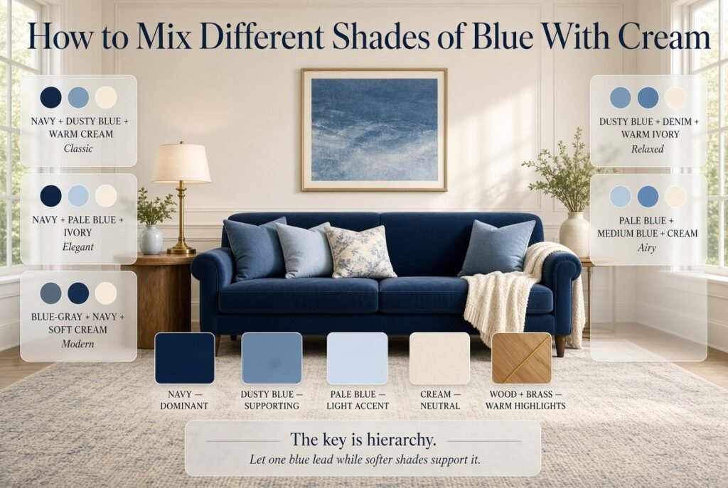
Different shades of blue can work beautifully with cream when each shade has a clear purpose. Use one dominant blue, one supporting blue, and a lighter or muted shade only where needed. Cream then acts as the neutral background that keeps the combination connected.
Consider these combinations:
| Dominant Blue | Supporting Blue | Cream | Overall Feel |
|---|---|---|---|
| Navy | Dusty blue | Warm cream | Classic |
| Navy | Pale blue | Ivory | Elegant |
| Blue-gray | Navy | Soft cream | Modern |
| Dusty blue | Denim | Warm ivory | Relaxed |
| Pale blue | Medium blue | Cream | Airy |
The important principle is hierarchy.
If every blue is equally strong, the eye doesn’t know which one should lead.
Example: Navy Living Room
Imagine:
- Navy sofa
- Cream walls
- Cream rug
- Dusty-blue pillows
- Blue artwork
- Natural wood table
- Brass lamp
Navy remains dominant.
Dusty blue provides variation.
Cream creates breathing room.
Wood provides warmth.
Brass adds a small highlight.
Every element has a role.
What Materials Work Best With Blue and Cream?
Color is only half of the design.
Materials determine how the palette feels.
Linen
Linen gives blue and cream a relaxed, natural character.
Use it for:
- Curtains
- Pillow covers
- Throws
- Bedding
Velvet
Velvet adds richness.
A navy velvet pillow or chair can make the room feel more formal.
Use it sparingly because too much velvet can make the space feel heavy.
Natural Wood
Wood adds warmth and prevents blue from feeling too cool.
Light wood generally creates a casual look, while darker wood creates a more traditional atmosphere.
Brass
Brass provides warm metallic contrast.
It is particularly effective with navy and warm cream.
Rattan and Woven Fibers
These materials add texture and a relaxed quality.
They’re excellent for baskets, trays, lampshades, and occasional furniture.
Ceramic
Ceramic adds tactile interest.
Matte or handmade-looking finishes generally feel more layered than having every object glossy.
Glass
Glass can make accessories feel lighter.
Blue glass is especially useful when you want color without visual heaviness.
Complete the Look With Blue and Cream Accessories
Once you have established the main decorating direction, the smaller details can make the room feel complete and intentional. From decorative pillows and rugs to lamps, artwork, ceramics, and tabletop accents, the right accessories can strengthen the blue and cream color scheme without making the space feel overly coordinated. For more practical ideas on choosing and arranging these finishing touches, explore our guide to blue and cream accessories. It will help you choose complementary pieces, balance blue and cream throughout the room, and add texture and personality while keeping the overall look cohesive.
How Do You Make Blue and Cream Accessories Look Expensive?
A sophisticated room doesn’t require every accessory to be expensive. What matters more is proportion, restraint, texture, material coordination, and the quality of the overall arrangement.
Start by reducing visual noise.
Instead of placing seven small objects on a coffee table, try:
- One tray
- Two books
- One ceramic piece
- One small plant
This gives each object room to be noticed.
Use Texture Instead of More Color
If the room already has enough blue, don’t add another blue object just because a surface looks empty.
Add texture.
A woven basket, linen pillow, ceramic vase, or natural wood tray can make the room more interesting without changing the color balance.
Use Repetition Carefully
Repeat materials or colors across the room.
For example:
Navy sofa → navy artwork → navy detail in rug
or:
Brass lamp → brass frame → brass tray
But don’t make every item identical.
How Do You Accessorize a Blue Sofa With Cream Walls?
A blue sofa and cream walls provide an excellent starting point because the main contrast is already established.
The accessory strategy should create connections between them.
Try:
- Cream pillows on the sofa
- Dusty-blue accent pillow
- Natural wood coffee table
- Blue-and-cream rug
- Cream throw
- Blue artwork
- Brass lamp
- Woven basket
This arrangement repeats both main colors while introducing warmth and texture.
If the sofa is very dark navy, avoid covering it with many additional dark-blue accessories.
Instead, use lighter blue and cream to create contrast.
How Do You Accessorize a Cream Sofa With Blue Accents?
A cream sofa gives you more freedom.
You can use stronger blue accessories because the sofa acts as a neutral foundation.
Try:
- Navy pillows
- Blue-and-cream stripe pillow
- Dusty-blue throw
- Blue ceramic vase
- Blue artwork
- Natural wood
- Brass details
This creates a stronger color story without making the room feel dark.
Blue and Cream Accessories for the Bedroom
Bedrooms benefit from softer textures and fewer hard decorative objects.
Start with bedding.
A cream duvet can become the neutral foundation while blue pillows create contrast.
For example:
Cream duvet + navy lumbar pillow + dusty-blue pillows + textured cream throw
Then repeat blue elsewhere.
A blue ceramic lamp or blue artwork can create enough continuity without adding blue to every surface.
Keep bedside tables relatively simple.
A lamp, small tray, book, and one decorative object may be enough.
For a broader bedroom-focused design direction, you can use the bedroom ideas available through Blue and Cream Preppy Room as a starting point, then adapt the accessory layer to your own furniture and space.
Blue and Cream Accessories for a Living Room
Living rooms can support more layers because they typically contain larger furniture arrangements.
Focus on five accessory groups:
Soft Textiles
Pillows and throws.
Floor Elements
Rugs and baskets.
Wall Elements
Artwork and mirrors.
Surface Decor
Vases, books, trays, and bowls.
Lighting
Lamps and decorative lighting.
Don’t add equal amounts from every group.
A room with patterned pillows, patterned rug, patterned curtains, and busy artwork may become overwhelming.
Instead, decide which element should make the strongest statement.
Blue and Cream Accessories for a Home Office
An office needs a stronger balance between decoration and function.
Blue can encourage a focused, structured visual environment, while cream prevents the space from feeling too dark.
Useful accessories include:
- Blue desk tray
- Cream lamp
- Blue notebook
- Natural wood organizer
- Cream storage basket
- Blue artwork
- Small green plant
Keep decorative items away from the primary working area if they interfere with productivity.
Blue and Cream Accessories for a Dining Room
Dining rooms are ideal for introducing the palette through temporary accessories.
Try:
- Blue napkins
- Cream runner
- Blue-and-white ceramics
- Natural wood serving boards
- Brass candleholders
- Cream candles
- Blue artwork
- Green foliage
This allows you to change the look seasonally without replacing major furniture.
How Do You Mix Patterns in Blue and Cream Accessories?

Pattern mixing works best when patterns have different scales and levels of visual strength.
A simple formula is:
Large pattern + medium pattern + small pattern + solid
For example:
- Large blue-and-cream stripe
- Medium floral
- Small geometric
- Solid cream
Don’t put three equally bold patterns beside each other.
Why Pattern Scale Matters
The eye needs hierarchy.
If every pattern is large and contrast-heavy, nothing feels like the main pattern.
If one pattern is dominant and the others are quieter, the combination feels deliberate.
This is particularly important in preppy interiors where stripes, plaid, gingham, and traditional patterns often appear together.
Blue and Cream Accessories for a Preppy Style
Blue and cream naturally support preppy decorating because classic interiors often rely on navy, white or cream, traditional patterns, and polished details.
Consider:
- Navy stripes
- Gingham
- Plaid
- Cream linen
- Brass
- Dark or natural wood
- Classic artwork
- Traditional ceramics
But don’t make every accessory patterned.
One strong stripe can establish the style.
The surrounding solid pieces then allow that pattern to stand out.
If you’re developing the complete decorating direction rather than just accessorizing, the Blue and Cream Decor Ideas guide can help you understand how accessories fit into a broader room design.
How Can You Add Warmth to Blue and Cream Accessories?
Blue can sometimes feel visually cool, particularly when combined with bright cream or cooler lighting.
Warm materials solve this problem.
Add:
- Natural wood
- Rattan
- Tan leather
- Brass
- Warm beige
- Soft brown
- Green plants
You don’t need another major color.
Often one wooden tray or woven basket is enough to warm the arrangement.
How Can You Make a Blue and Cream Room Feel More Modern?
Use fewer accessories and choose simpler shapes.
Modern styling often benefits from:
- Blue-gray
- Soft cream
- Minimal artwork
- Simple ceramic
- Glass
- Light wood
- Clean-lined lamps
Avoid filling shelves with many small decorative objects.
One large vase can look more modern than six small ornaments.
How Can You Make Blue and Cream Feel Cozy?
Texture is more important than adding more color.
Use:
- Chunky cream throws
- Linen pillows
- Woven baskets
- Soft rugs
- Natural wood
- Warm lighting
- Blue-gray textiles
The combination of soft materials and muted colors makes the room feel comfortable without becoming visually busy.
How Can You Make Blue and Cream Feel More Elegant?
Use controlled contrast.
Navy, warm cream, brass, dark wood, velvet, and structured artwork can create a more formal appearance.
Keep the number of decorative pieces relatively low.
Elegant rooms often depend on quality of arrangement rather than quantity of objects.
Common Blue and Cream Decorating Mistakes
Using Too Much Navy
Navy is powerful.
If you use navy furniture, navy curtains, navy pillows, navy artwork, and a navy rug, the room can quickly become visually heavy.
Balance dark blue with cream, pale blue, and natural materials.
Matching Every Accessory
Exact matching can make a room feel like a showroom.
Instead of matching every blue, coordinate the shades.
Ignoring Undertones
Warm cream and cool blue can work together, but the supporting materials need to bridge them.
Natural wood and muted colors can help.
Using Too Many Patterns
A patterned rug plus patterned curtains plus several patterned pillows can become overwhelming.
Give the eye some solid surfaces.
Filling Every Surface
Empty space is useful.
Not every shelf, table, or corner needs decoration.
Buying Accessories Before Understanding the Room
This is one of the most common beginner mistakes.
People see an attractive blue vase and buy it without considering whether the room needs more blue.
Always decorate according to the room, not according to individual products.
Ignoring Scale
A tiny vase can disappear on a large console.
A huge sculpture can overwhelm a small bedside table.
Match the accessory to the furniture.
Choosing Color Without Considering Light
Blue and cream can change dramatically under different lighting.
Always test important colors in the actual room.
How Do You Know When a Room Has Enough Accessories?
The room probably has enough accessories when every additional object starts to feel repetitive rather than useful.
Try this simple test:
- Look at the room from the doorway.
- Identify the first three things your eye notices.
- Check whether blue is distributed naturally.
- Look for areas that feel crowded.
- Remove one or two unnecessary pieces.
- Reassess the balance.
If the room looks better after removing something, it probably wasn’t needed.
Common Mistake: Don’t assume an empty surface means you need another decorative object. Sometimes the empty space is what makes the existing accessories look better.
A Practical Blue and Cream Accessory Formula
If you’re starting from scratch, use this simple structure.
Layer 1: Foundation
Choose:
- Sofa
- Bed
- Rug
- Curtains
- Major furniture
Layer 2: Color Repetition
Add:
- Pillows
- Artwork
- Lamps
- Small textiles
Layer 3: Texture
Introduce:
- Linen
- Wood
- Woven materials
- Ceramic
- Velvet
Layer 4: Personality
Add:
- Books
- Art
- Plants
- Decorative objects
- Personal items
Layer 5: Editing
Remove anything that:
- Repeats unnecessarily
- Doesn’t fit the scale
- Creates clutter
- Introduces an unrelated style
- Competes with the focal point
This last layer is often the most important.
Blue and Cream Accessories: Quick Decision Table
| If the Room Feels… | Add More Of… | Avoid Adding Too Much Of… |
|---|---|---|
| Too dark | Cream, pale blue | Navy |
| Too cold | Wood, woven texture | Cool gray |
| Too plain | Pattern, artwork | Random colors |
| Too busy | Solid cream | More patterns |
| Too formal | Linen, rattan | Extra metallics |
| Too casual | Brass, structured pieces | Too many soft textures |
| Too empty | Larger accessories | Many tiny objects |
| Disconnected | Repeated blue and cream | Unrelated colors |
How to Style a Blue and Cream Coffee Table
A coffee table is a small area, so it benefits from restraint.
Start with a tray.
Then add:
- Two or three books
- One blue or cream ceramic
- One small natural element
- Optional candle
For example:
Natural wood tray + cream books + blue ceramic bowl + small green plant
This creates height, color, texture, and organization without filling the table.
How to Style Blue and Cream Shelves
Shelves need more variation because several objects are visible at once.
Use a mixture of:
- Books
- Artwork
- Ceramics
- Small plants
- Baskets
- Decorative boxes
Don’t line everything up at exactly the same height.
Create visual movement by placing some objects vertically and others horizontally.
Use cream objects to break up groups of blue.
How to Style a Blue and Cream Bedroom Nightstand

Keep it simple.
A practical arrangement could include:
- Cream or brass lamp
- Small blue ceramic
- Book
- Small tray
If the lamp is already visually large, reduce the number of other objects.
Bedrooms benefit from calm arrangements rather than elaborate displays.
How to Style a Blue and Cream Entryway
The entryway creates the first impression of the home.
A simple arrangement might include:
- Cream or natural console
- Blue artwork
- Brass mirror or frame
- Small blue vase
- Natural wood tray
- Woven basket underneath
Keep practical items organized so the space remains welcoming rather than cluttered.
How Can You Keep Blue and Cream Accessories Cohesive Across the Home?
You don’t need every room to look identical.
Instead, repeat certain design elements.
For example:
Living room: navy + cream + brass
Bedroom: dusty blue + cream + natural wood
Office: blue-gray + cream + light wood
The rooms feel related because the underlying palette remains connected, but each space has its own personality.
This is a better strategy than using the exact same accessories throughout the house.
For broader ideas about creating a complete home around the palette, see Blue and Cream Home Decor. Use it as the larger design framework while this article focuses specifically on the accessory layer.
How Can Blue and Cream Accessories Work With Wall Decor?
Wall decor should be considered part of the overall accessory plan.
If the room already has a large blue artwork, you may not need several additional blue objects on nearby shelves.
Instead, use cream, wood, or brass around it to let the artwork remain the focal point.
For ideas specifically focused on creating a coordinated wall treatment, explore Blue and Cream Wall Decor.
The important principle is that wall accessories and surface accessories should support one another rather than compete.
Expert Tips for Choosing Better Accessories
Buy for the Room, Not the Product
A beautiful object can still be wrong for your room.
Always consider the existing composition first.
Use the 3-Point Color Repetition Rule
If blue is important, repeat it in at least three visually separate locations.
For example:
- Sofa
- Artwork
- Rug
This creates cohesion.
Combine Hard and Soft Materials
Pair:
soft pillow + hard ceramic
or:
woven basket + smooth glass
or:
linen + brass
Material contrast creates depth.
Create One Focal Point
Choose one element that gets more attention.
It could be:
- Artwork
- Rug
- Sofa
- Statement lamp
- Large vase
The other accessories should support it.
Step Back Regularly
Don’t judge the room only from close range.
Walk to the doorway.
Look at it from another side.
Take a quick photograph.
A camera often reveals visual clutter that isn’t obvious while you’re standing inside the room.
What accessories go best with blue and cream decor?
The best accessories for blue and cream decor are those that add texture, contrast, and visual connection without making the room look overly matched. Start with practical pieces such as cushions, throws, rugs, curtains, lamps, and artwork, then add smaller decorative elements such as ceramic vases, trays, books, baskets, and candleholders.
For a more polished result, don’t make every accessory blue or cream. Natural wood, woven materials, brass, beige, and muted green can act as supporting elements and make the main palette feel more layered.
A well-balanced combination can include:
Navy or dusty-blue cushions
Cream linen or knitted throws
Blue-and-cream artwork
Natural wood trays or frames
Woven baskets
Ceramic vases
Brass lamps or small decorative accents
The goal is to create repetition without exact matching. When the same colors appear through different materials and at different scales, the room feels thoughtfully designed rather than decorated from a single matching collection.
How do you make blue and cream accessories look elegant instead of too busy?
The key is restraint and hierarchy. Blue and cream can look sophisticated when one color clearly leads, while the other provides balance. Problems usually start when every pillow, rug, curtain, vase, and artwork uses a strong pattern or the same shade of blue.
Choose one main focal point first. It might be a navy sofa, patterned rug, large artwork, or statement curtains. Then select quieter accessories around it.
For a more elegant arrangement:
Use one dominant pattern instead of several competing patterns.
Combine solid cream with patterned blue.
Mix smooth and textured materials.
Leave some surfaces intentionally empty.
Repeat important colors in different areas of the room.
Use brass or natural wood as a controlled supporting accent.
A sophisticated blue-and-cream room doesn’t need more accessories. It needs better relationships between the accessories already there. Giving each piece enough visual space often makes the entire room feel more expensive and intentional.
What accent colors work best with blue and cream accessories?
The strongest accent colors depend on the mood you’re trying to create, but natural wood, brass, beige, soft green, and muted brown are especially versatile with blue and cream. These colors support the main palette without taking attention away from it.
For a classic or preppy room, brass and warm wood work particularly well with navy and cream. For a relaxed room, choose rattan, light wood, beige, and soft green. For a modern space, blue-gray, cream, light wood, and restrained black accents can create a cleaner appearance.
Consider these combinations:
Navy + cream + brass: classic and polished
Dusty blue + cream + light wood: relaxed and welcoming
Blue-gray + cream + black: modern and structured
Pale blue + cream + natural beige: light and airy
Navy + cream + green: fresh and traditional
Keep the third color relatively controlled. Its purpose is to support the blue-and-cream foundation rather than create a completely new color scheme.
How do you mix different shades of blue with cream without making the room look mismatched?
Use a clear color hierarchy instead of treating every blue shade equally. Choose one dominant blue, one supporting blue, and optionally a lighter blue for small details. Cream then acts as the neutral element that visually connects the different shades.
For example, a navy sofa can be supported by dusty-blue pillows, pale-blue artwork, and a cream rug. The shades don’t need to match perfectly because they belong to the same color family.
A professional approach is to:
Use navy as the dominant shade.
Introduce dusty blue through textiles.
Use pale blue sparingly in artwork or accessories.
Repeat cream across larger surfaces.
Add natural wood or brass to bridge the colors.
Avoid introducing several highly saturated blues at equal levels. When too many strong shades compete for attention, the room can lose its sense of hierarchy. Subtle variations usually create more depth than exact color matching.
How can you choose blue and cream accessories for a small room?
In a small room, choose accessories that provide color and texture without creating visual heaviness. Cream should generally remain prominent on larger surfaces, while blue can be introduced through smaller, strategically placed accessories.
Instead of using a dark-blue rug, dark curtains, and several navy furniture pieces, consider a cream rug with blue detailing, pale-blue textiles, and a few navy accents.
For a small room, prioritize:
Light cream curtains
Pale or dusty-blue cushions
One or two navy accents
Small ceramic accessories
Light natural wood
Mirrors or reflective surfaces
Slim, simple lamps
Minimal but meaningful artwork
Scale is equally important. Several tiny decorative objects can make a small room feel more cluttered than one well-proportioned piece. Choose accessories that have a clear purpose and leave enough empty space around them.
The best small-room strategy is to create visual repetition without visual overload. Repeat blue in three or four locations, keep the larger background surfaces light, and allow the accessories to provide the personality.
Conclusion
Blue and cream accessories are one of the easiest ways to create a room that feels polished, comfortable, and thoughtfully designed without making the space look overly coordinated. The key is not to fill every surface with matching pieces, but to use accessories to create balance, texture, color depth, and visual connection throughout the room.
Start with a clear color hierarchy. Let cream provide the soft foundation, then introduce blue through pillows, rugs, artwork, curtains, ceramics, bedding, or smaller decorative accents. If you want a more sophisticated look, combine different blue shades such as navy, dusty blue, blue-gray, or pale blue instead of relying on one identical tone.
Materials also make a major difference. Linen, velvet, natural wood, woven textures, ceramic, glass, and brass can give a simple blue and cream palette much more character. A few carefully selected accessories often look more intentional than a large collection of unrelated decorations.
Whether you are refreshing a living room, bedroom, study area, or complete home, the best approach is to choose pieces that support the room’s existing furniture, lighting, architecture, and personal style. For more inspiration, explore Preppy Room and discover more ideas for creating beautifully curated spaces.
Ultimately, the most successful blue and cream room is one that feels natural rather than forced. Choose a balanced mix of practical and decorative accessories, repeat your colors thoughtfully, add different textures, and leave enough visual breathing room. With the right combination, blue and cream accessories can transform an ordinary room into a welcoming, timeless, and stylish space.