Introduction
Blue and Cream Wall Decor | A room can have beautiful furniture, attractive flooring, and carefully chosen colors, yet still feel incomplete when the walls don’t have a clear design direction. Empty walls can make a room feel unfinished, while too many unrelated decorations can make it feel crowded. The challenge is finding the middle ground where every wall feels intentional without looking overdone.
That’s where blue and cream wall decor can make a significant difference.
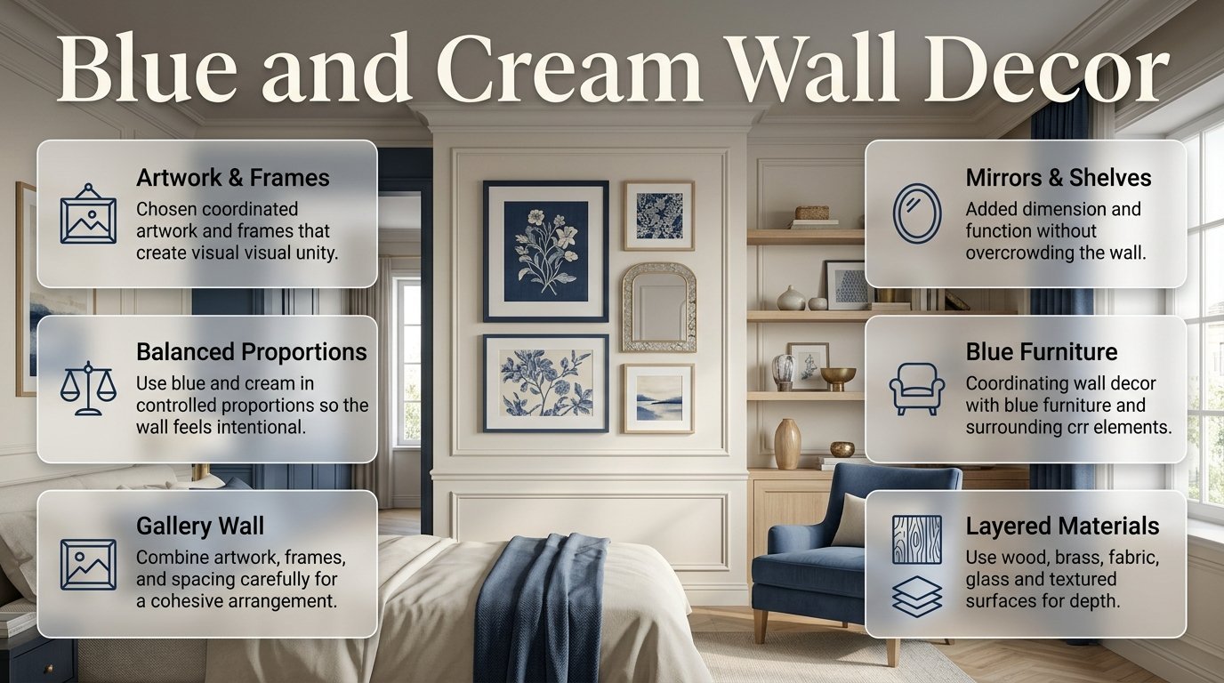
Blue brings depth, personality, and visual contrast, while cream adds softness and warmth. Together, they create a flexible combination that can work in classic, preppy, traditional, coastal, modern, cozy, or transitional interiors. The key isn’t simply putting blue and cream objects on a wall. It’s choosing the right proportions, artwork, textures, frames, patterns, and placement for the room.
This guide explains how to decorate blue and cream walls from the ground up. You’ll learn which wall colors work best, how to choose artwork, how to build a gallery wall, where to use mirrors and shelves, how to decorate around blue furniture, which materials complement the palette, and how to avoid the mistakes that make a carefully planned room look cluttered.
If you’re developing a complete preppy interior rather than focusing only on the walls, you can also explore the broader ideas on Preppy Room homepage and then return to this guide for the wall-specific details.
What Is Blue and Cream Wall Decor?
Blue and cream wall decor refers to the use of blue, cream, ivory, and closely related neutral elements across a room’s walls. These can include artwork, gallery walls, mirrors, shelves, wall molding, wallpaper, decorative plates, textile art, framed prints, and painted accent walls.
The strongest designs don’t necessarily use equal amounts of blue and cream. Instead, one color usually acts as the foundation while the other provides contrast and visual interest.
For example:
- Cream wall + navy artwork
- Navy wall + cream frames
- Pale blue wall + ivory gallery wall
- Cream wall + blue decorative plates
- Blue accent wall + natural wood and cream artwork
- Cream wall + dusty blue textile art
The combination works because blue gives the eye something deeper to focus on, while cream prevents the overall composition from becoming too dark or visually intense.
Why does the combination work?
Blue and cream have different visual roles.
Blue creates:
- Contrast
- Depth
- Character
- Calmness
- Visual focus
Cream creates:
- Warmth
- Lightness
- Breathing room
- Soft contrast
- A neutral background
The result can feel sophisticated without requiring an excessive number of decorative objects.
How Do You Choose Between Blue Walls and Cream Walls?
The first decision is whether blue or cream should dominate the wall itself.
There isn’t one universally correct choice. The right option depends on natural light, room size, furniture color, ceiling height, and the mood you want.
Choose cream walls when you want flexibility
Cream is usually the easier foundation because it allows stronger blue decoration to stand out.
A cream wall can support:
- Navy artwork
- Blue gallery frames
- Blue-and-cream prints
- Decorative mirrors
- Natural wood shelves
- Blue botanical artwork
- Brass accessories
This is especially useful if you frequently change artwork or accessories.
Choose blue walls when you want drama
A blue wall creates an immediate focal point.
Navy can work beautifully behind:
- A cream sofa
- A bed
- A console
- A reading area
- A desk
- A dining table
However, darker blue requires more balance. If the room already contains a blue sofa, blue curtains, and a blue rug, another large blue surface may make the room feel heavy.
Consider a soft blue instead of navy
If you’re unsure about a dark accent wall, dusty blue, muted blue, powder blue, or blue-gray can provide color without dominating the room.
These softer shades can be particularly effective in bedrooms, home offices, and smaller spaces.
40+ Blue and Cream Wall Decor Ideas
1. Create a Large Blue-and-Cream Artwork Focal Point
One large artwork piece can completely change the appearance of a blank wall.
Instead of hanging many small prints, choose one substantial piece containing blue, cream, beige, and perhaps a small amount of another muted color.
This approach works especially well above:
- Sofas
- Beds
- Consoles
- Dining tables
- Sideboards
The artwork should have enough visual weight to relate to the furniture below it.
A small print above a large sofa can disappear, while an appropriately scaled piece makes the furniture and wall feel connected.
Pro Tip: Before buying artwork, measure the wall and the furniture underneath it. Think about the entire composition rather than choosing artwork based only on whether you like the picture.
2. Build a Classic Blue and Cream Gallery Wall
Gallery walls are one of the most flexible ways to use this palette.
You don’t need every piece to contain both colors. Instead, create a relationship between the pieces.
For example, combine:
- One navy abstract print
- One cream botanical illustration
- One blue landscape
- One neutral photograph
- One small mirror
- One textured cream piece
The frames can be natural wood, cream, brass, black, or a controlled mixture.
The goal is to make the collection look intentionally gathered rather than purchased as one matching set.
How to arrange it
Start with the largest piece.
Then place medium pieces around it and use smaller artwork to fill visual gaps.
Keep the spacing relatively consistent.
Before making holes in the wall, arrange everything on the floor.
Take a photograph of the arrangement from a distance. Sometimes a composition that looks attractive up close feels unbalanced when viewed from across the room.
3. Use Cream Artwork Against a Navy Wall
A navy wall already provides strong color, so cream artwork can create beautiful contrast.
Look for:
- Ivory backgrounds
- Cream botanical drawings
- Neutral landscapes
- Beige abstract paintings
- Vintage-inspired prints
- Cream textile art
Natural wood frames can make the combination warmer.
Brass frames can make it more traditional and refined.
Black frames can make it more contemporary.
The same navy wall can therefore support very different styles simply by changing the artwork and frame material.
4. Hang Blue Artwork on a Cream Wall
If you want a lighter room, reverse the formula.
Keep the wall cream and introduce blue through artwork.
This is one of the easiest approaches because the cream background doesn’t compete with the decorative pieces.
You can use:
- Navy line art
- Blue botanical prints
- Blue landscapes
- Abstract blue paintings
- Blue-and-white illustrations
- Blue geometric artwork
This approach also makes seasonal changes easier.
5. Add a Cream-Framed Mirror to a Blue Wall
Mirrors are useful when a blue wall feels visually heavy.
A cream or ivory frame introduces a light border around the reflective surface, while the mirror itself helps bounce light around the room.
Try placing it:
- Across from a window
- Above a console
- Beside a doorway
- Above a dresser
- In an entryway
A large mirror can also become the primary focal point, meaning you don’t need to add several additional wall decorations.
6. Use Natural Wood Frames for Warmth
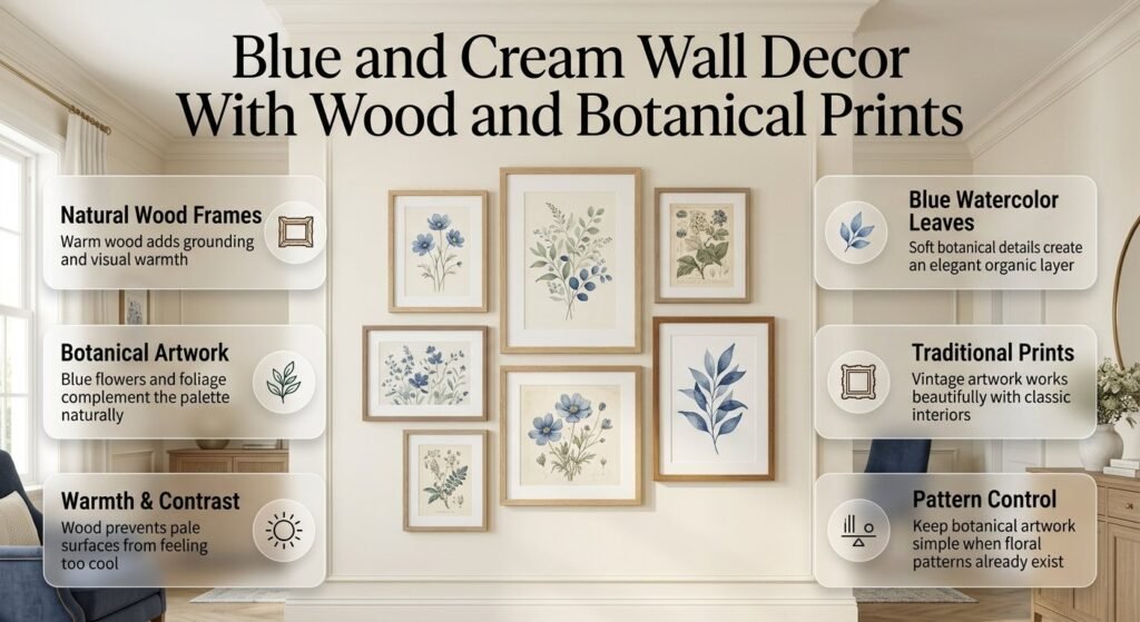
Blue and cream can occasionally feel too cool when every surface is smooth and pale.
Natural wood solves that problem.
Choose oak, light walnut, medium wood, or another warm natural finish depending on the furniture.
Wood works particularly well around:
- Botanical artwork
- Blue landscapes
- Family photographs
- Traditional prints
- Abstract art
The combination of blue, cream, and natural wood feels grounded because the wood introduces a visual element that isn’t dependent on color.
7. Try Blue-and-Cream Botanical Prints
Botanical artwork is a natural fit for this palette.
Choose illustrations featuring:
- Blue flowers
- Green foliage with blue accents
- Cream backgrounds
- Vintage botanical drawings
- Blue watercolor leaves
Botanical prints work particularly well in bedrooms, hallways, dining rooms, and traditional living spaces.
If the room already contains floral upholstery or curtains, keep the botanical artwork simpler to avoid pattern overload.
8. Decorate With Blue Decorative Plates
Decorative plates can give a wall a traditional or collected appearance.
A collection of blue-and-cream plates can work particularly well in:
- Dining rooms
- Breakfast areas
- Kitchens
- Traditional living rooms
Don’t automatically arrange them in a perfect grid.
A more organic composition can feel like a collection gathered over time.
However, keep the overall color family consistent so the wall doesn’t become visually chaotic.
9. Add Floating Shelves
Floating shelves are useful when you want wall decoration that can change over time.
On cream walls, try:
- Navy books
- Blue ceramics
- Cream vases
- Natural wood objects
- Small framed prints
On blue walls, reverse the balance:
- Cream ceramics
- Ivory books
- Light wood
- Brass objects
- Neutral artwork
Don’t fill every inch of the shelves.
Empty space allows individual objects to stand out.
10. Layer Artwork on a Shelf
You don’t always need to hang every frame.
Place a larger piece against the wall and layer smaller pieces in front.
For example:
Large cream print → smaller blue frame → ceramic vase → stacked books
This creates depth.
It also gives you the ability to change the display without putting additional holes in the wall.
11. Use Blue and Cream Textile Wall Art
Textile wall art adds something framed artwork can’t: physical texture.
Consider:
- Linen panels
- Woven wall hangings
- Embroidered pieces
- Fabric art
- Tapestry-inspired designs
Cream linen with blue detailing can make a bedroom feel particularly soft.
In a modern room, choose a simpler textile design with minimal pattern.
In a more traditional room, a detailed textile can become the focal point.
12. Add Wall Molding for Architectural Interest
If your walls feel plain, decorative molding can create interest without introducing another strong color.
Picture-frame molding painted cream can look elegant against a blue wall.
Alternatively, cream walls with subtle blue-painted paneling can create a more distinctive effect.
Molding is especially useful when you want the room to feel architectural rather than heavily decorated.
The important thing is restraint.
If the wall already has strong molding, you may need less artwork.
13. Try Blue-and-Cream Wallpaper
Wallpaper can provide both color and pattern at once.
Good choices include:
- Blue botanical wallpaper
- Small-scale blue floral
- Blue-and-cream stripes
- Traditional motifs
- Subtle geometric patterns
- Toile-inspired designs
Wallpaper is particularly useful when a plain painted wall feels too simple.
However, remember that wallpaper itself is a strong visual element.
Don’t automatically add a large gallery wall on top of a highly patterned wallpaper.
14. Use Stripes for a Preppy Look
Stripes are one of the easiest ways to create a structured blue-and-cream wall.
You can use stripes through:
- Wallpaper
- Framed textile art
- Fabric panels
- Artwork
- Decorative banners
- Architectural detailing
Navy and cream stripes can create a classic preppy appearance without needing many accessories.
If you use strong stripes on the wall, keep nearby patterns quieter.
15. Add Blue-and-Cream Plaid Artwork
Plaid can bring warmth and personality to a wall.
It’s especially suitable for:
- Bedrooms
- Studies
- Cozy living rooms
- Traditional interiors
Plaid artwork works best when the rest of the wall is relatively simple.
Don’t combine several large plaid pieces with equally strong floral patterns unless you intentionally want an eclectic look.
16. Use a Blue Accent Above the Bed
The wall behind a bed is naturally a focal point.
You can emphasize it with:
- Navy paint
- Blue wallpaper
- Blue-and-cream artwork
- A large cream textile
- Blue molding
- A gallery arrangement
If the bedding is already heavily patterned, keep the wall design simpler.
If the bedding is mostly cream, the wall can carry more blue.
17. Create a Blue and Cream Reading Corner
A reading corner doesn’t need a large amount of decoration.
A cream wall with:
- One blue artwork piece
- A natural wood shelf
- A small brass lamp
- A few books
can create a complete composition.
The goal is to make the wall support the function of the corner rather than simply decorate it.
18. Use a Large Mirror in a Small Room
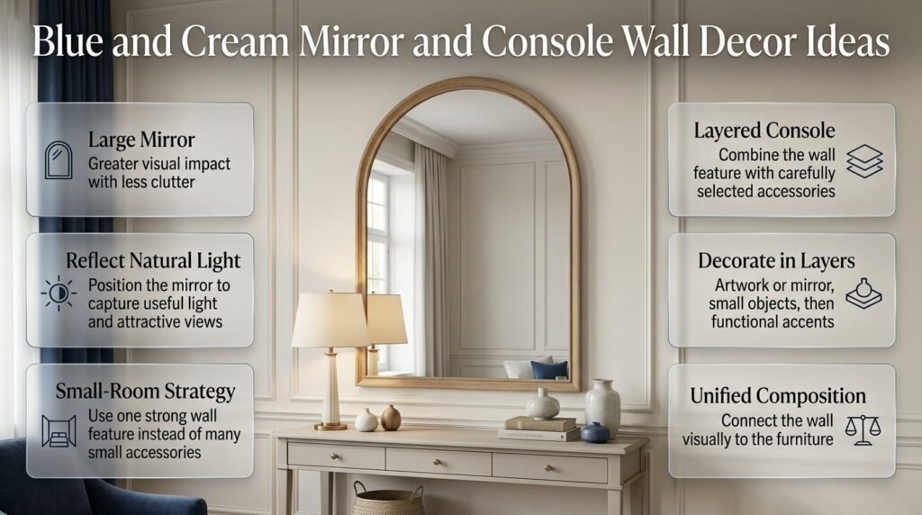
When decorating a small room, don’t automatically add lots of small wall accessories.
A large mirror can provide greater visual impact with less clutter.
Try a:
- Cream-framed mirror
- Natural wood mirror
- Thin brass mirror
- Arched mirror
- Traditional framed mirror
Position it where it can reflect natural light or an attractive part of the room.
19. Create a Blue-and-Cream Console Wall
A console wall is ideal for layered decoration.
Above the console, use:
Large artwork or mirror
Then add:
Two small decorative objects
Then connect the wall to the console with:
A lamp, books, ceramic, or natural material
The wall and furniture should read as one composition rather than two separate decorating zones.
20. Use Blue Trim Instead of a Blue Wall
If you don’t want a full blue accent wall, use blue on architectural details.
Try:
- Blue window trim
- Blue door trim
- Blue built-ins
- Blue shelving
- Blue picture rails
- Blue wainscoting
Keep the main wall cream.
This provides color while maintaining a lighter overall appearance.
How Should You Decorate a Blue and Cream Living Room Wall?
The living room usually has the largest wall surfaces and the most furniture, so scale becomes especially important.
If you have a cream sofa, stronger blue artwork can create contrast.
If you have a navy sofa, cream artwork or a lighter gallery wall can balance it.
A useful arrangement is:
Blue sofa
↓
Large cream/blue artwork
↓
Natural wood or brass accent
This gives the eye a clear vertical relationship.
Avoid placing multiple tiny frames above a large sofa unless you’re deliberately creating a dense gallery wall.
What works particularly well?
- Oversized artwork
- Large mirrors
- Gallery walls
- Blue botanical prints
- Cream textile art
- Natural wood shelving
- Blue-and-cream decorative plates
If the living room is small, prioritize fewer pieces with better scale.
How Do You Decorate a Blue and Cream Bedroom Wall?
Bedrooms benefit from softer wall decoration.
A bedroom should generally feel calmer than a living room, so avoid making every wall a focal point.
For the wall behind the bed, consider:
- Soft blue paint
- Navy accent wall
- Cream wallpaper
- Two large matching prints
- One oversized artwork
- Textile wall hanging
- Simple molding
If you have a blue headboard, cream artwork can create a clean contrast.
If the headboard is cream, blue artwork can provide the necessary depth.
For broader room-level inspiration, Blue and Cream Preppy Room can complement this wall-specific guide without replacing it.
How Can You Style a Blue and Cream Dining Room Wall?
Dining rooms can handle more decorative character.
Consider a collection of blue-and-cream plates, traditional artwork, botanical prints, or a large mirror.
A dining wall can also be a good place for wallpaper because the room usually has less soft furniture competing with the wall pattern.
If you have a dark blue dining wall, cream artwork and warm lighting can prevent it from feeling too formal.
Natural wood furniture is especially useful because it introduces warmth between the blue and cream surfaces.
What Works on a Blue and Cream Home Office Wall?
A home office needs decoration that supports concentration instead of distracting from work.
Choose:
- One large artwork
- A small gallery wall
- Floating shelves
- Blue-and-cream prints
- A pinboard
- Architectural drawings
- Botanical artwork
If the desk is positioned against a cream wall, a navy artwork piece behind it can create a defined background for video calls without requiring a complicated wall arrangement.
Keep practical items organized so the decorative wall remains visually calm.
How Do You Make Blue and Cream Wall Decor Look Expensive?
An expensive-looking wall isn’t necessarily filled with expensive objects.
The appearance usually comes from:
Scale
Choose appropriately sized artwork.
Spacing
Give pieces enough room to breathe.
Materials
Natural wood, linen, ceramic, glass, and quality-looking metal finishes create texture.
Repetition
Repeat blue and cream subtly around the room.
Editing
Remove objects that don’t contribute to the composition.
Lighting
Warm, layered lighting can make cream and blue surfaces feel richer.
The biggest mistake is assuming that more decoration equals more luxury.
Often, the opposite is true.
A carefully selected oversized artwork can look more sophisticated than ten unrelated small pieces.
How Do You Mix Blue Shades on One Wall?
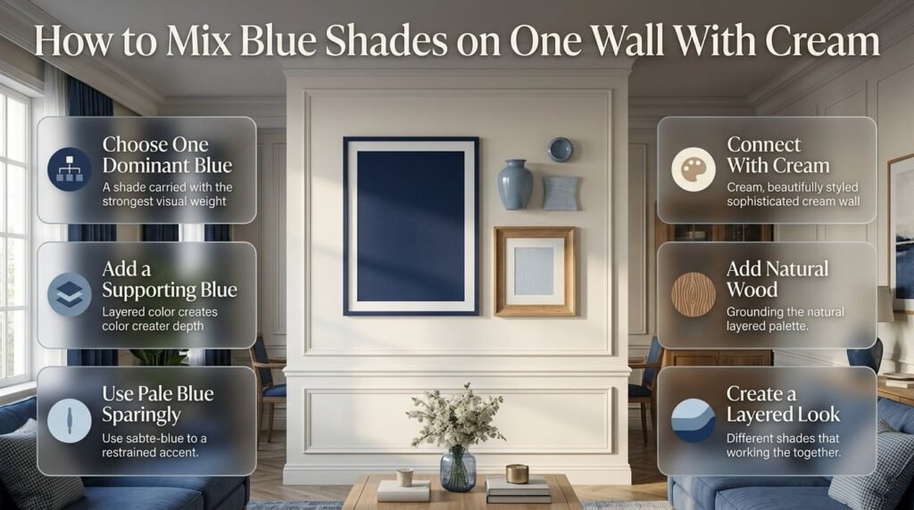
You don’t have to use exactly one shade of blue.
In fact, multiple blue tones can create more depth.
For example:
Navy + dusty blue + pale blue + cream
The important thing is hierarchy.
Choose one dominant blue.
Use the second blue as a supporting shade.
Use the lightest blue sparingly.
Then use cream to connect everything.
Example
Imagine a cream wall with:
- Navy artwork
- Dusty-blue ceramic
- Pale blue textile
- Natural wood frame
The colors don’t match exactly, but they belong to the same visual family.
That’s what creates a layered look.
How Do You Add Warmth to Blue and Cream Walls?
If your wall feels cold, don’t immediately introduce several new colors.
Start with texture.
Add natural wood
Wood frames and shelves immediately introduce warmth.
Add woven materials
Woven wall art, baskets, and natural fibers soften smooth painted surfaces.
Use warm metals
Brass or aged metallic details can provide subtle warmth.
Choose warmer cream
A warm cream can feel more inviting than a stark white.
Improve lighting
A wall that looks cold during the evening may simply need warmer lighting.
The balance between cool blue and warm cream becomes much easier when the room includes natural materials.
How Do You Choose Wall Decor for Different Blue Shades?
| Blue Shade | Best Wall Decor | Overall Mood |
|---|---|---|
| Navy | Cream artwork, brass, wood | Classic and dramatic |
| Dusty blue | Linen, botanical prints | Soft and relaxed |
| Powder blue | White, cream, light wood | Airy and gentle |
| Blue-gray | Black, cream, brass | Modern and refined |
| Cobalt | Neutral artwork | Energetic |
| Muted teal-blue | Natural textures | Rich and relaxed |
| Pale blue | White, cream, light wood | Fresh and open |
The shade of blue should influence not only the artwork but also the frame material and amount of decoration.
Explore More Blue and Cream Decorating Ideas
Accessories are important, but they are only one part of creating a beautiful blue and cream space. The overall look of a room also depends on how you combine wall colors, furniture, lighting, textiles, patterns, and decorative details. If you would like more inspiration on bringing all of these elements together, explore our collection of blue and cream decorating ideas. You’ll find practical ways to use different shades of blue, choose the right cream tones, layer textures, and create a balanced color scheme that works in bedrooms, living rooms, study spaces, and other areas of the home. These ideas can help you turn simple accessories and decor pieces into a cohesive design that feels comfortable, stylish, and easy to live with.
How Do You Combine Blue and Cream With Other Wall Colors?
Blue and cream don’t have to exist completely alone.
A small supporting color can make the palette more sophisticated.
Blue + cream + natural green
This combination works beautifully with botanical artwork and plants.
Blue + cream + warm beige
This creates a softer neutral environment.
Blue + cream + brass
This is ideal for classic or refined interiors.
Blue + cream + black
Use black sparingly for stronger contrast.
Blue + cream + soft pink
A small amount of muted pink can create a softer, more playful appearance.
The rule is simple: blue and cream should remain the dominant relationship.
How Do You Use Pattern Without Creating Wall Clutter?
Pattern needs hierarchy.
If you have:
Large floral wallpaper
then choose:
Simple artwork
If you have:
Plain cream wall
you can introduce:
Patterned artwork
If your wall has:
Blue-and-cream stripes
keep nearby decorative objects relatively simple.
A common mistake is choosing every pattern independently.
Instead, think about the wall as one composition.
A practical pattern formula
Use:
1 dominant pattern
1 supporting pattern
Solid neutral space
This gives the eye somewhere to rest.
How Do You Create a Balanced Gallery Wall?
A balanced gallery wall doesn’t necessarily mean perfect symmetry.
There are two major approaches.
Symmetrical gallery wall
Use matching frames and evenly sized pieces.
This works well for:
- Traditional rooms
- Hallways
- Dining rooms
- Formal spaces
Organic gallery wall
Mix sizes and shapes.
This works well for:
- Eclectic rooms
- Preppy interiors
- Cozy spaces
- Collected interiors
Neither approach is automatically better.
Choose based on the personality of your room.
Bring Your Blue and Cream Room Together
Once the main elements of your room are in place, the smaller decorative details can make a noticeable difference in how the space looks and feels. Accessories give you an easy way to repeat your blue and cream color palette, add texture, and introduce personality without changing the larger furniture or wall finishes. You can use cushions, throws, rugs, lamps, artwork, vases, trays, books, and other decorative pieces to create a more connected and inviting look. If you are unsure which pieces work best together, take a look at our guide to blue and cream accessories. It covers practical ways to choose, combine, and arrange accessories so your colors feel balanced rather than overly matched. This can also help you decide where to add stronger blue accents and where to keep cream tones dominant for a softer and more comfortable overall design.
What Are the Most Common Blue and Cream Wall Decor Mistakes?
Mistake 1: Using too much blue
A navy wall, navy artwork, navy curtains, and navy furniture can become overwhelming.
Better approach
Use cream and natural materials to break up the blue.
Mistake 2: Using tiny artwork above large furniture
Small artwork can disappear above a large sofa or bed.
Better approach
Choose one larger piece or create a properly scaled grouping.
Mistake 3: Matching everything exactly
Perfectly matching blue shades can make a room look artificial.
Better approach
Use related shades and repeat them naturally.
Mistake 4: Filling every empty space
People often assume an empty wall needs something.
It doesn’t.
Better approach
Treat negative space as part of the design.
Mistake 5: Ignoring frame material
The frame changes the character of the artwork.
A navy print in a brass frame feels different from the same print in a black frame.
Better approach
Choose frames according to the room’s overall material palette.
Mistake 6: Using too many patterns
Several bold patterns can compete for attention.
Better approach
Choose one dominant pattern and keep supporting patterns quieter.
Mistake 7: Ignoring natural light
Dark blue can behave very differently in bright and dim rooms.
Better approach
Test paint samples at different times of day before committing.
Mistake 8: Hanging artwork without considering furniture
A beautiful piece can look wrong if it’s disconnected from the furniture below.
Better approach
Treat the furniture and wall decoration as one visual unit.
What Wall Decor Should You Avoid?
You don’t have to avoid specific products or styles completely, but certain approaches frequently make a blue and cream wall feel less sophisticated.
Be careful with:
- Too many unrelated quotes
- Excessive matching accessories
- Several competing gallery walls
- Too many tiny decorative pieces
- Random colors that don’t appear elsewhere
- Extremely similar artwork
- Overfilled shelves
- Decorations that don’t relate to the room’s function
Current interior styling discussions also increasingly emphasize warmth, texture, and personality over overly coordinated or sterile rooms.
The goal isn’t to follow every design trend. It’s to create a wall that feels personal and coherent.
A Professional Step-by-Step Method for Decorating a Blue and Cream Wall
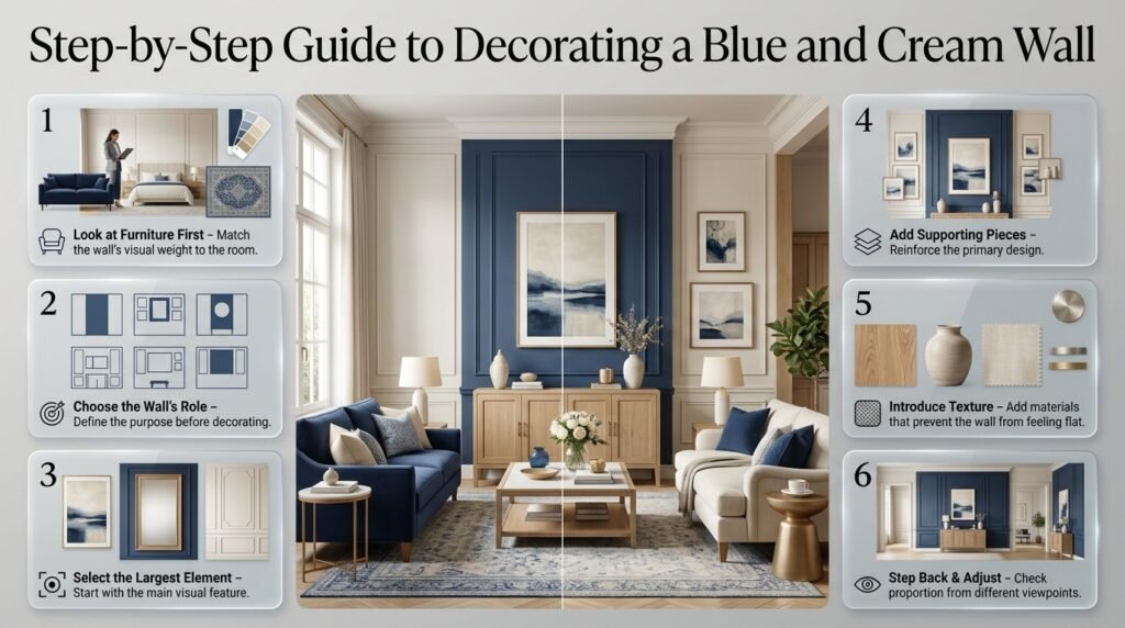
Step 1: Look at the furniture first
Before decorating the wall, identify the strongest color already present.
Is it:
- Navy sofa?
- Cream bed?
- Blue rug?
- Natural wood furniture?
- Patterned chair?
This determines how much visual weight the wall should carry.
Why it matters
Wall decoration shouldn’t fight with the furniture.
Step 2: Choose the wall’s role
Decide whether the wall will be:
- A focal point
- A supporting wall
- A gallery wall
- A functional storage wall
- A quiet background
This decision prevents random decorating.
Step 3: Select the largest element
Start with:
- Artwork
- Mirror
- Wallpaper
- Molding
- Shelving
Don’t begin with tiny accessories.
The largest element establishes the visual hierarchy.
Step 4: Add supporting pieces
Once the main piece is selected, add one or two supporting elements.
These should reinforce the primary design.
Step 5: Introduce texture
Use wood, ceramic, linen, woven materials, or metal.
Texture prevents the wall from looking flat.
Step 6: Step back
Look at the wall from the doorway.
Then look from the opposite side of the room.
If one object immediately looks too dominant or too small, adjust it.
Blue and Cream Wall Decor Decision Table
| If Your Room Feels… | Try This |
|---|---|
| Too dark | Cream artwork and mirrors |
| Too plain | Blue artwork or patterned wallpaper |
| Too cold | Natural wood and warm cream |
| Too busy | Remove smaller pieces |
| Too modern | Add traditional artwork or brass |
| Too traditional | Use simple abstract artwork |
| Too empty | Add one large focal piece |
| Too cluttered | Create more negative space |
| Too flat | Introduce texture |
| Too mismatched | Repeat one blue shade |
This kind of decision-making is more useful than simply copying a finished room because it helps you solve the actual problem in your own space.
How Can Renters Use Blue and Cream Wall Decor?
You don’t need to repaint the walls to create this palette.
Try removable or low-commitment options such as:
- Framed artwork
- Mirrors
- Textile wall hangings
- Floating displays where permitted
- Decorative plates
- Large removable wall pieces
- Blue-and-cream photography
- Leaning artwork
A cream wall can become the perfect neutral background for blue artwork.
This also makes it easier to change the style later.
How Can You Decorate Blue and Cream Walls on a Budget?
You don’t need to buy an entire collection at once.
Start with one important piece.
Budget approach
Step 1: Choose one large artwork.
Step 2: Add one mirror or frame.
Step 3: Introduce a natural material.
Step 4: Add one small blue accessory.
Step 5: Stop and evaluate.
This prevents unnecessary purchases.
You can also reuse frames you already own by replacing the artwork inside them with blue-and-cream prints.
How Can You Make a Blue and Cream Wall Feel More Personal?
The most attractive wall isn’t necessarily the one that looks like a showroom.
Include something meaningful.
For example:
- A travel photograph
- A family photograph
- A vintage print
- A painting you personally enjoy
- A collected ceramic piece
- A meaningful textile
- A favorite botanical illustration
Personal objects work particularly well when the surrounding colors are controlled.
The palette provides consistency while the personal objects provide character.
Should Blue and Cream Wall Decor Be Symmetrical?
Not always.
Symmetry creates order.
Asymmetry creates a more relaxed, collected feeling.
Use symmetry when:
- The room is formal
- You want a classic look
- There is a bed or sofa centered beneath the wall
- You are using matching artwork
Use asymmetry when:
- You want a casual look
- You’re creating a gallery wall
- The room contains collected objects
- You want more visual movement
The important thing is balance, not perfect symmetry.
How Can You Keep Wall Decor From Looking Overdecorated?
Use the remove-one-piece test.
Once the wall seems finished, remove one decorative item.
Then look at it again.
If the wall looks cleaner and stronger, keep the item removed.
If the wall feels incomplete, put it back.
This simple method helps prevent the common habit of continuing to decorate simply because empty space feels uncomfortable.
Good design needs visual rest.
Expert Tips for Better Blue and Cream Wall Styling
Expert Tip 1: Start with the largest visual element
Don’t begin with small accessories.
Start with the artwork, mirror, wallpaper, or architectural detail that will define the wall.
Expert Tip 2: Repeat colors, not objects
If your artwork contains navy, repeat navy somewhere else in the room.
You don’t need five navy objects.
Expert Tip 3: Use texture to create depth
When the palette is limited, texture becomes even more important.
Wood, linen, ceramic, woven fibers, and metal all help.
Expert Tip 4: Let the wall breathe
A little empty space makes carefully selected pieces more noticeable.
Expert Tip 5: Consider the room from multiple angles
A wall that looks perfect directly in front of you may feel too crowded from the doorway.
Always consider the entire room.
Blue and Cream Wall Decor Ideas by Design Style
Classic
Use:
- Navy
- Warm cream
- Brass
- Traditional artwork
- Natural wood
- Decorative molding
Keep the composition structured.
Preppy
Use:
- Navy
- Cream
- Stripes
- Plaid
- Gingham
- Botanical prints
- Brass
- Traditional frames
The style can be playful, but maintain a clear color hierarchy.
Modern
Use:
- Blue-gray
- Soft cream
- Minimal artwork
- Black accents
- Simple frames
- Clean shelves
Keep the number of decorative pieces limited.
Coastal
Use:
- Pale blue
- Warm cream
- Natural wood
- Linen
- Soft botanical or landscape artwork
Avoid relying too heavily on obvious nautical symbols. Natural materials and subtle color are usually enough to communicate the mood.
Cozy
Use:
- Dusty blue
- Warm cream
- Wood
- Linen
- Woven pieces
- Soft artwork
- Warm lighting
Texture should be the priority.
What wall decor looks best with blue and cream?
The most effective wall decor combines blue and cream through artwork, mirrors, gallery walls, natural wood frames, shelves, and textured pieces rather than making every decorative item exactly the same color. A cream wall provides an excellent background for navy or dusty-blue artwork, while a dark blue wall can be softened with cream frames, ivory artwork, mirrors, and warm natural materials.
The best choice also depends on the room’s existing furniture. A navy sofa may need lighter wall decor, while a cream sofa can handle stronger blue artwork. Scale matters just as much as color. One large, well-proportioned artwork piece can create a more sophisticated appearance than several small decorations scattered across the wall.
Practical points:
Use large artwork above large furniture.
Choose cream or ivory pieces to soften dark blue walls.
Add natural wood when the palette feels too cool.
Use mirrors to reflect light and create visual space.
Keep some empty wall area so the design doesn’t feel crowded.
How do you decorate a navy blue wall with cream?
A navy blue wall already has strong visual impact, so the most successful approach is to introduce lighter elements rather than adding more dark colors. Cream artwork, ivory frames, light wood, linen wall pieces, and mirrors can create the contrast needed to keep the wall elegant instead of visually heavy.
For a sophisticated arrangement, start with one dominant element such as a large cream-and-blue artwork or an oversized mirror. Then add only a few supporting details if the wall still feels empty. Warm lighting and natural materials can further soften navy and make the space feel more inviting.
Professional styling approach:
Start with one large focal piece.
Use cream or ivory as the secondary color.
Introduce natural wood for warmth.
Add brass sparingly for a refined touch.
Avoid filling every section of the navy wall.
Check the wall under both daytime and evening lighting.
What colors go well with blue and cream wall decor?
Blue and cream already create a balanced foundation, so additional colors should support rather than compete with them. Natural wood is one of the easiest additions because it brings warmth without disrupting the palette. Brass can add elegance, while muted green works particularly well with botanical artwork and natural textures.
For a stronger contemporary appearance, small amounts of black can provide definition. Soft beige can create a warmer neutral transition between blue and cream. The important point is to keep blue and cream as the dominant relationship and use additional colors selectively.
Good supporting combinations include:
Blue + cream + natural wood: warm and timeless
Blue + cream + brass: polished and classic
Blue + cream + muted green: natural and relaxed
Blue + cream + beige: soft and sophisticated
Blue + cream + black: modern and higher contrast
How do you make blue and cream wall decor look expensive?
A polished wall usually comes from good proportion, spacing, materials, and editing rather than expensive decorations. The first priority should be scale. Oversized artwork, a well-proportioned mirror, or a carefully planned gallery wall generally looks more intentional than a collection of very small pieces.
Material selection also makes a major difference. Natural wood frames, linen, textured artwork, ceramic pieces, glass, and subtle brass details add depth. Keep the color palette controlled and avoid filling every empty section of the wall. Negative space gives important decorative pieces more visual importance.
To create a more refined look:
Prioritize scale over quantity.
Choose frames that coordinate with the furniture.
Use natural textures such as wood and linen.
Keep blue shades visually related.
Leave intentional negative space.
Avoid excessive matching.
Use layered lighting to enhance texture and color.
How do you create a blue and cream gallery wall without making it look cluttered?
A successful blue and cream gallery wall needs a clear visual system. The artwork doesn’t have to match, but it should share certain characteristics such as color, subject, framing, or overall style. Begin with one larger piece and build the arrangement around it rather than placing small pictures randomly across the wall.
Before hanging anything, arrange the artwork on the floor. Mix large, medium, and small pieces while keeping the spacing reasonably consistent. Natural wood, cream, brass, or black frames can be combined, but one frame finish should usually dominate to keep the collection cohesive.
A professional gallery-wall checklist:
Select a limited color palette.
Begin with the largest artwork.
Mix artwork sizes for visual hierarchy.
Keep spacing relatively consistent.
Repeat at least one frame or material.
Include some quieter pieces between stronger designs.
Step back frequently to evaluate the whole arrangement.
Leave enough surrounding wall space so the gallery doesn’t feel cramped.
Conclusion
Blue and cream wall decor offers one of the easiest ways to create a room that feels polished, welcoming, and timeless without becoming overly formal. The combination works because blue brings depth and personality, while cream adds warmth, softness, and visual balance. Whether you prefer navy and cream for a classic look, soft blue with warm cream for a relaxed atmosphere, or a layered combination of several blue shades, the key is to create harmony rather than fill every wall with decoration.
The most successful approach is to build your walls gradually. Start with the room’s main color balance, then introduce artwork, mirrors, gallery arrangements, shelves, molding, wallpaper, or textured pieces where they genuinely improve the space. Natural wood, brass, woven textures, and carefully chosen patterns can add character while keeping the blue-and-cream palette cohesive.
Most importantly, your wall decor should support the way you use the room. A bedroom may benefit from calming artwork and subtle textures, while a living room can handle larger statement pieces or a more structured gallery wall. Small spaces often look better with fewer, appropriately scaled decorations rather than numerous small accessories.
For more inspiration on creating a cohesive blue-and-cream interior, explore the ideas throughout Preppy Room and consider how wall decor can connect with your furniture, textiles, lighting, and overall room style.
With thoughtful color placement, proper scale, and a balance between decoration and empty space, blue and cream walls can become one of the most distinctive features of your interior. The goal is not simply to decorate the walls, but to make every element feel intentional, connected, and naturally part of the room.