Introduction
Blue and Cream Home Decor | Blue and cream home decor has a quality that makes a room feel finished without making it look over-designed. It can be warm, traditional, relaxed, modern, coastal, or distinctly preppy depending on the shades, furniture, patterns, and materials you choose. But there is a common problem: simply putting blue and cream objects into the same room doesn’t automatically create a cohesive interior.
The difference comes from how the colors are distributed.
A navy sofa against a cream wall creates a very different impression from navy walls with cream furniture. Pale blue linen gives a completely different feeling from a deep blue velvet chair. Even the same cream can look warmer or cooler depending on the lighting and surrounding materials.
That’s why successful blue and cream home decor starts with a plan rather than a shopping list.
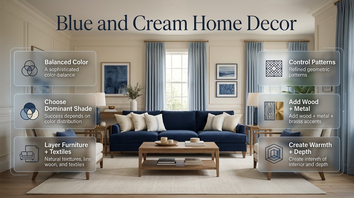
In this guide, you’ll learn how to choose the right shades, decide which color should dominate, combine furniture and textiles, use patterns without creating visual clutter, decorate different rooms, add warmth through wood and metals, work with small spaces, and avoid the mistakes that commonly make a blue-and-cream interior feel disconnected.
If you’re building a broader decorating style around classic, polished, and thoughtfully coordinated interiors, Preppy Room is also a useful place to explore for additional room and color inspiration.
What Is Blue and Cream Home Decor?
Blue and cream home decor is an interior color approach that combines different shades of blue with warm or soft cream neutrals to create contrast, depth, and visual balance.
The palette can range from pale blue and ivory to navy and warm cream. The final appearance depends on the proportions, undertones, textures, patterns, furniture styles, and accent materials used throughout the room.
The important thing is that blue and cream don’t need to appear in equal amounts.
In fact, they usually look more sophisticated when one color has a clear role.
For example:
- Cream walls + navy sofa
- Cream bedding + blue headboard
- Blue curtains + cream upholstery
- Cream rug + blue accent chairs
- Navy cabinetry + cream backsplash
- Pale blue walls + warm cream furniture
Each arrangement creates a different atmosphere.
The palette is therefore less about following a strict formula and more about understanding visual hierarchy.
Why Does Blue and Cream Work So Well Together?
Blue and cream work because they balance coolness and warmth.
Blue naturally brings depth and visual definition. Depending on the shade, it can feel calm, sophisticated, traditional, fresh, or dramatic.
Cream does something different. It softens the room and gives the eye a lighter area to rest.
This relationship is especially useful when you want color without creating an overly bright or aggressive interior.
Blue Provides Depth
Dark blue can act almost like an architectural anchor.
Navy can define a sofa, headboard, built-in cabinet, accent wall, or dining chair. Medium blue can add personality without becoming too heavy, while pale blue can create a softer atmosphere.
Cream Provides Breathing Room
Cream is particularly effective across larger surfaces.
It can be used for:
- Walls
- Rugs
- Curtains
- Bedding
- Upholstery
- Cabinetry
- Larger decorative pieces
Because cream occupies visual space without demanding as much attention as saturated colors, it allows blue elements to stand out.
Pro Tip: Don’t think of cream as the “boring” color. In a well-designed room, cream creates the visual breathing space that allows stronger blue elements to look intentional.
How Do You Choose the Right Blue for Your Home?
Choosing the right blue is one of the most important decisions you’ll make.
The best shade depends on your room’s natural light, size, existing furniture, flooring, and desired atmosphere.
Navy Blue
Navy is the strongest classic choice.
It works particularly well with:
- Warm cream
- Ivory
- Natural wood
- Brass
- Traditional furniture
- Stripes
- Plaid
- Classic artwork
Navy is especially useful when you want the room to feel sophisticated and established.
However, it has visual weight.
If you use navy on walls, furniture, curtains, and accessories simultaneously, the room may start feeling darker than intended.
Dusty Blue
Dusty blue is softer and more muted.
It works well when you want a relaxed interior rather than a dramatic one.
It pairs beautifully with:
- Warm cream
- Beige
- Natural wood
- Linen
- Soft gray
- Muted green
Dusty blue is particularly useful for bedrooms and comfortable living spaces.
Pale Blue
Pale blue can make a room feel lighter and more open.
It is useful for:
- Bedrooms
- Guest rooms
- Small rooms
- Bathrooms
- Reading corners
- Relaxed living areas
Pair it with cream rather than an extremely bright white if you want a softer result.
Medium Blue
Medium blue provides a useful middle ground.
It has more presence than pale blue but doesn’t have the visual weight of navy.
It works well through:
- Accent chairs
- Cushions
- Artwork
- Curtains
- Rugs
- Decorative accessories
Blue-Gray
Blue-gray is particularly effective in contemporary interiors.
It can create a sophisticated appearance when paired with warm cream, natural wood, and simple furniture.
If your goal is modern rather than traditional, blue-gray may be easier to work with than a highly saturated blue.
How Should You Balance Blue and Cream?

A useful starting point is to make cream the larger visual foundation and blue the defining accent.
You can loosely follow a 60-30-10 approach:
| Visual Role | Approximate Share | Examples |
|---|---|---|
| Main neutral | 60% | Cream walls, rug, upholstery |
| Main color | 30% | Blue sofa, bedding, curtains |
| Supporting accent | 10% | Wood, brass, green, black |
These percentages aren’t rules.
They simply help prevent the room from becoming visually chaotic.
A large navy sofa has much more visual impact than a small navy cushion. Similarly, a cream rug can balance several smaller blue accessories.
So think about visual area, not the number of objects.
Example of a Balanced Room
Imagine a living room with:
- Cream walls
- Cream rug
- Navy sofa
- Two blue cushions
- One cream textured cushion
- Natural wood coffee table
- Brass lamp
- Blue artwork
Blue appears repeatedly, but cream still controls the overall visual atmosphere.
That is usually more successful than buying equal quantities of blue and cream accessories.
Should Your Walls Be Blue or Cream?
Both options can work, but they create different results.
Cream Walls
Cream walls are the most flexible option.
They allow you to change furniture, artwork, rugs, and textiles without having to redesign the entire room.
Choose cream walls when:
- The room is small
- Natural light is limited
- You want flexibility
- Your furniture already contains strong blue
- You prefer a softer atmosphere
Cream walls also work particularly well with natural wood.
Blue Walls
Blue walls create stronger character.
A pale blue wall can feel fresh and relaxed, while navy can create a dramatic traditional effect.
If you’re considering a dark blue wall, test the color first.
Look at it during:
- Morning
- Afternoon
- Evening
- Artificial lighting
- Cloudy weather
A blue that looks elegant in bright daylight may feel significantly deeper at night.
Expert Tip: Always test large paint samples against your actual flooring, curtains, furniture, and lighting. Color doesn’t exist in isolation.
Create a Balanced Blue and Cream Room
If you’re planning to decorate your space with this timeless color combination, it helps to look beyond individual furniture pieces and think about the room as a complete design. Our guide to blue and cream decorating ideas explains how to balance different shades, choose complementary furniture, layer textures, introduce patterns, and use blue and cream across living rooms, bedrooms, offices, and smaller spaces. It also covers practical ways to combine natural wood, linen, rugs, artwork, and warm metallic accents so the final room feels cohesive rather than overly matched. Exploring these ideas before choosing your main furniture and accessories can make it much easier to create a polished blue and cream interior that feels comfortable, stylish, and thoughtfully designed.
How Do You Create a Blue and Cream Living Room?
The living room is one of the best places to use this palette because there are many opportunities to distribute the colors across furniture, textiles, artwork, and accessories.
Start with the largest pieces.
A balanced arrangement might include:
- Cream walls
- Navy sofa
- Cream or beige rug
- Natural wood coffee table
- Blue-and-cream cushions
- Cream curtains
- Blue artwork
- Brass lighting
The important point is to avoid putting all the blue in one corner.
Instead, repeat it around the room.
For example:
Navy sofa → blue cushion → blue artwork → small blue decorative object
This creates a visual path.
Choosing the Sofa
A blue sofa can become the room’s focal point.
Navy is especially effective when the walls and rug are cream.
If you already own a cream sofa, you can introduce blue through:
- Accent chairs
- Cushions
- Throw
- Curtains
- Rug
- Artwork
This approach is often cheaper than replacing large furniture.
Choosing the Rug
The rug should connect the furniture rather than simply fill an empty floor.
A cream rug with subtle blue patterning is an easy choice because it combines both main colors.
A solid cream rug can also work if the room already contains enough blue.
Avoid choosing a very small rug just because it has the right colors.
Common Mistake: Prioritizing color over scale. A beautiful blue-and-cream rug can still look wrong if it’s too small for the furniture arrangement.
Explore More Blue and Cream Decor Ideas
Choosing blue and cream is only the first step; the real difference comes from how you use these colors throughout the room. From furniture and soft furnishings to wall treatments, artwork, rugs, curtains, and smaller decorative accents, each element can affect how balanced and inviting the overall space feels. If you are looking for practical inspiration before choosing specific pieces, explore these blue and cream decor ideas for a broader look at how this versatile color combination can be styled in different areas of the home.
The guide also helps you understand how to keep blue from feeling too dominant while using cream to create warmth, brightness, and visual balance. Whether you prefer a classic, modern, cozy, or more sophisticated interior, these ideas can help you choose complementary textures, materials, patterns, and accessories with greater confidence. Instead of adding colors randomly, you can use the examples to build a more cohesive room where every decorative element works naturally with the blue-and-cream foundation.
How Can You Decorate a Blue and Cream Bedroom?
Blue and cream are particularly effective in bedrooms because they can create a calm atmosphere while still providing enough contrast to make the room interesting.
Start with the bed because it usually occupies a large amount of visual space.
For example:
- Cream duvet
- Navy or dusty-blue pillows
- Blue-and-cream striped cushion
- Cream textured throw
- Navy bench or headboard
- Natural wood bedside tables
- Brass or warm-metal lamps
The bed becomes a layered focal point without requiring excessive decoration.
Use Bedding as Your Main Color Tool
Bedding is one of the easiest ways to experiment.
If you aren’t sure whether you want a permanent blue feature, start with removable textiles.
You can test:
- Navy
- Pale blue
- Blue-gray
- Stripes
- Plaid
- Gingham
- Small floral patterns
Once you know which direction works, you can introduce the color into larger elements.
For a more specifically preppy interpretation of this palette, see Blue and Cream Preppy Room.
How Can Blue and Cream Work in a Dining Room?
Dining rooms benefit from stronger contrast because the furniture itself often provides visual structure.
Consider:
- Cream walls
- Natural wood dining table
- Navy or blue upholstered chairs
- Cream curtains
- Blue-and-cream artwork
- Brass or warm-metal lighting
If the dining chairs are navy, don’t automatically add navy curtains and a navy rug.
Let the cream and natural wood balance the stronger color.
A single blue statement element can often look more sophisticated than several matching pieces.
How Do You Decorate a Blue and Cream Home Office?
A home office needs to look attractive without becoming distracting.
Use cream for the larger background surfaces and blue for focused visual details.
For example:
- Cream walls
- Natural wood desk
- Blue-gray office chair
- Blue artwork
- Cream rug
- Navy desk accessories
- Brass or warm-metal lamp
Blue-gray is particularly useful if you want a professional, understated appearance.
Avoid filling the desk with decorative objects just because they match the color palette.
Function should remain the priority.
Complete the Look With Blue and Cream Accessories
Once the main blue and cream color scheme is established, carefully selected accessories can help bring the entire room together while adding personality, texture, and visual interest. Instead of filling the space with too many decorative pieces, focus on accessories that support the existing color palette and complement the furniture, walls, and overall room style. For practical inspiration, explore our guide to blue and cream accessories, where you can find ideas for pillows, throws, lamps, rugs, artwork, ceramics, trays, curtains, and other decorative accents. It also explains how to combine different textures and patterns without making the room feel busy or mismatched. Whether you are refreshing a bedroom, living room, study area, or another space, choosing accessories thoughtfully can make the blue and cream palette feel more layered, cohesive, and professionally styled.
How Do You Use Blue and Cream in an Entryway?
An entryway is a good place to introduce a smaller version of the palette.
Try:
- Cream wall
- Navy console
- Blue artwork
- Cream or natural runner
- Brass mirror frame
- Woven basket
- Natural wood accessories
Because the entryway is usually smaller than a living room, one strong blue element may be enough.
Can Blue and Cream Work in a Small Room?

Yes. In fact, the combination can be particularly useful in small rooms when the colors are distributed carefully.
Use cream across the larger surfaces and blue in controlled areas.
Good choices include:
- Cream walls
- Blue bedding
- Small blue rug
- Blue artwork
- Cream curtains
- Natural wood furniture
Lighter blues can make the space feel more open.
Navy can still work, but it should be balanced with enough light-colored surfaces.
A Simple Small-Room Formula
Cream background + one medium blue focal point + smaller repeated blue details + warm natural material
This is usually more effective than using several different blue shades.
What Materials Pair Best With Blue and Cream?
Color creates the palette, but materials determine how the room feels.
Natural Wood
Natural wood is one of the easiest ways to warm up blue and cream.
Oak can create a lighter, relaxed atmosphere.
Walnut can produce a richer, more traditional appearance.
Medium wood works well across many styles.
Linen
Linen works beautifully with cream.
It adds subtle texture without making the room look overly decorated.
Try linen for:
- Curtains
- Bedding
- Cushions
- Upholstery
Woven Materials
Rattan, cane, jute, and woven baskets can soften the formal quality of navy.
They are especially useful if your room feels too polished or cold.
Velvet
Blue velvet can create a richer, more luxurious appearance.
Use it selectively.
A navy velvet chair or headboard can be enough.
Ceramic
Cream ceramics can add subtle texture and shape without introducing another strong color.
What Accent Colors Go With Blue and Cream?
Blue and cream can stand on their own, but supporting colors can add depth.
Sage Green
Sage is one of the easiest accent colors.
It connects naturally with plants, wood, and botanical artwork.
Tan and Beige
Tan can make the room warmer.
It works particularly well with navy.
Brass
Brass is technically a finish rather than a dominant color, but it can add warmth and refinement.
Use it for:
- Lamps
- Handles
- Frames
- Mirrors
- Small decorative objects
Black
Black provides sharper definition.
Use it sparingly through:
- Picture frames
- Furniture legs
- Hardware
- Lighting
Soft Blush
A muted blush can soften a navy-heavy palette.
Keep it limited so the room remains primarily blue and cream.
How Do You Use Patterns Without Making the Room Busy?
Pattern is one of the most useful tools in blue and cream home decor, but it needs hierarchy.
Popular choices include:
- Stripes
- Gingham
- Plaid
- Floral
- Checks
- Geometric designs
- Botanical patterns
The safest method is to vary pattern scale.
For example:
Large stripe + medium floral + small check
This is easier to manage than three large patterns competing for attention.
Choose a Dominant Pattern
One pattern should normally lead.
Suppose you have a bold blue-and-cream striped rug.
Then your cushions can use:
- One small floral
- One subtle check
- One solid blue
- One textured cream
The room feels layered without becoming chaotic.
Quick Tip: When you’re unsure whether you’ve used too many patterns, remove one patterned item and replace it with a solid or textured piece. The room will often immediately feel calmer.
How Do You Mix Stripes, Plaid, and Gingham?
These patterns can work together because they have different visual structures.
A useful combination is:
- Large stripe on curtains
- Small gingham cushion
- Subtle plaid throw
Keep the colors connected.
The patterns don’t need to be identical.
They simply need to share the same blue-and-cream relationship.
For more focused ideas around choosing and combining shades, you can naturally continue with Blue and Cream Color Combinations.
How Can You Make Blue and Cream Decor Look More Expensive?

An expensive-looking room isn’t necessarily created by expensive products.
It usually comes from proportion, consistency, texture, and editing.
Focus on these details:
1. Use Fewer Better-Selected Accessories
Instead of filling every shelf, choose a few objects with different heights and textures.
2. Choose Appropriate Furniture Scale
Oversized furniture can overwhelm a small room.
Tiny furniture can make a large room feel unfinished.
3. Layer Lighting
Use more than one light source where practical.
4. Mix Textures
Combine smooth, woven, soft, and natural surfaces.
5. Repeat Colors
Repeat blue and cream in different places without making everything identical.
6. Keep Surfaces Edited
A clear tabletop often looks more sophisticated than one covered with decorations.
Add Character With Blue and Cream Wall Decor
Once your main furniture and larger decorative elements are in place, the walls offer an excellent opportunity to strengthen the blue and cream color scheme and add more personality to the room. Wall decor can help fill empty areas, create visual balance, and introduce patterns or artwork without taking up valuable floor space. If you are looking for practical inspiration, explore our guide to blue and cream wall decor, which covers different ways to use framed artwork, gallery walls, mirrors, decorative accents, and other wall treatments within this classic palette. The key is to choose pieces that complement the existing shades and furniture rather than competing with them. With the right combination of scale, placement, texture, and color, blue and cream wall decor can make a bedroom, living room, study, or cozy corner feel more complete, balanced, and thoughtfully designed.
How Do You Create a Cozy Blue and Cream Interior?
If your room feels too formal, don’t necessarily add more decoration.
Add texture.
Use:
- Soft rugs
- Chunky throws
- Linen
- Upholstered furniture
- Natural wood
- Woven baskets
- Warm lamps
- Cushions
Warm cream is particularly helpful for cozy interiors.
It prevents the space from feeling stark.
Blue can then provide the visual structure.
How Do You Create a Classic Blue and Cream Interior?
For a traditional look, use:
- Navy
- Warm cream
- Natural or dark wood
- Brass
- Stripes
- Plaid
- Floral patterns
- Framed artwork
- Traditional furniture shapes
Symmetry can also help.
For example:
Lamp → artwork → bed → artwork → lamp
or
Chair → table → chair
Symmetry creates order, which works naturally with classic decorating.
How Do You Make Blue and Cream Feel Modern?
Modernizing the palette doesn’t require removing all traditional elements.
Instead, simplify them.
Use:
- Clean-lined furniture
- Warm cream
- Blue-gray
- Medium blue
- Minimal accessories
- One or two patterns
- Natural wood
- Simple artwork
Avoid filling every surface with traditional decorative objects.
A single striped cushion can retain the classic reference while clean furniture keeps the overall appearance contemporary.
How Can You Create a Softer Blue and Cream Room?
If navy feels too strong, move toward:
- Pale blue
- Dusty blue
- Blue-gray
- Warm cream
- Ivory
- Light wood
Then use texture rather than stronger color for interest.
For example:
Cream linen + dusty-blue cushion + pale-blue artwork + light wood + woven basket
This creates visual variety without increasing color intensity.
How Can You Use Blue and Cream Across an Entire Home?
The colors don’t need to be identical in every room.
In fact, using the exact same blue everywhere can make a home feel repetitive.
Instead, maintain the relationship while changing the proportions.
Living Room
Navy + cream + natural wood
Bedroom
Dusty blue + cream + soft beige
Study
Blue-gray + cream + walnut
Dining Room
Medium blue + warm cream + brass
Guest Room
Pale blue + cream + light wood
The home still feels coordinated because the basic color family remains connected.
How Do You Know Which Color Should Be Dominant?
Use your existing room as the starting point.
If you already have:
- Dark flooring
- Dark furniture
- Limited natural light
cream may need to dominate.
If your room already has:
- Light flooring
- Cream furniture
- Large windows
you may have more freedom to use stronger blue.
A useful question is:
Which element needs more visual attention?
If the room already has a strong architectural feature, keep the color scheme quieter.
If the room lacks a focal point, blue can provide one.
Common Blue and Cream Home Decor Mistakes
Using Too Many Blues
A room with navy, cobalt, turquoise, royal blue, powder blue, and blue-gray can lose visual direction.
Choose one dominant blue.
A second related shade can support it.
Making Every Item Match
Perfect matching can make a room feel artificial.
Coordinate colors without buying everything from one collection.
Using Too Much Navy
Navy has strong visual weight.
If you already have navy furniture, introduce cream and natural materials generously.
Ignoring Undertones
A yellow-based cream may look strange beside a very cool blue-gray.
Always consider the relationship between undertones.
Choosing Accessories Before Furniture
Accessories are easier to replace.
Start with the largest pieces.
Ignoring Scale
A tiny rug or oversized chair can damage the room’s proportions even if the colors are perfect.
Overusing Patterns
Patterns should create interest, not compete for attention.
Forgetting Texture
A room using only flat painted surfaces and smooth fabrics can feel unfinished.
Neglecting Lighting
Blue and cream can look dramatically different in natural and artificial light.
A Step-by-Step Plan for Decorating With Blue and Cream
Step 1: Assess the Room
Look at:
- Natural light
- Flooring
- Existing furniture
- Room size
- Ceiling height
- Architectural features
Don’t choose colors before understanding the room.
Step 2: Choose the Cream
Decide whether you need:
- Warm cream
- Soft ivory
- Neutral cream
- Slightly cooler cream
Step 3: Select the Main Blue
Choose one:
- Navy
- Dusty blue
- Pale blue
- Medium blue
- Blue-gray
Step 4: Identify the Focal Point
Choose one major element for blue.
It might be:
- Sofa
- Headboard
- Rug
- Curtains
- Accent chair
- Cabinetry
- Feature wall
Step 5: Repeat the Blue
Use the same color in smaller areas.
Step 6: Add Warmth
Introduce:
- Wood
- Brass
- Woven textures
- Warm lighting
- Tan
Step 7: Add Pattern
Choose one dominant pattern.
Then add quieter supporting patterns only if needed.
Step 8: Layer Texture
Mix:
- Linen
- Cotton
- Wool
- Wood
- Woven materials
- Ceramic
- Upholstery
Step 9: Edit
Remove objects that don’t contribute to the room.
This final step is often what separates a coordinated interior from a crowded one.
Blue and Cream Home Decor Ideas by Room

| Room | Main Blue | Cream Application | Best Supporting Material |
|---|---|---|---|
| Living Room | Navy | Walls and rug | Natural wood |
| Bedroom | Dusty blue | Bedding and curtains | Linen |
| Dining Room | Medium blue | Walls and textiles | Brass |
| Home Office | Blue-gray | Walls and rug | Walnut |
| Guest Room | Pale blue | Bedding and upholstery | Light wood |
| Entryway | Navy | Wall and runner | Woven texture |
| Reading Corner | Medium blue | Chair and rug | Wood |
This approach keeps the palette connected while allowing every room to have its own personality.
How Can You Refresh an Existing Room Without Replacing Everything?
You don’t need to start over.
Begin with removable elements.
Low-Commitment Changes
- Cushions
- Throws
- Curtains
- Artwork
- Lampshades
- Decorative objects
- Small rugs
Medium Changes
- Accent chair
- Headboard
- Larger rug
- Side table
- Console
Major Changes
- Sofa
- Cabinetry
- Flooring
- Wall color
- Built-ins
Start with the low-commitment options.
They allow you to test the palette before making expensive changes.
How Can DIY Projects Work With Blue and Cream Decor?
DIY doesn’t mean making every item yourself.
Simple changes can create a coordinated result.
For example:
- Add blue trim to a cream cushion
- Reframe existing artwork
- Paint a small side table
- Create simple blue-and-cream artwork
- Add coordinated fabric to a bulletin board
- Refinish a small wooden accessory
- Create a simple patterned tray
The key is repetition.
If the same blue appears in three or four small DIY details, the room can feel more cohesive without looking manufactured.
Expert Advice for Getting the Proportion Right
A professional-looking room usually isn’t the result of following one magic color ratio.
It comes from understanding visual weight.
Dark colors feel heavier.
Large objects have more visual impact.
Strong patterns attract attention.
Highly reflective materials catch the eye.
Therefore, if you have a large navy sofa, you don’t necessarily need another large blue element.
Instead, distribute smaller blue details around the room.
Think of the room as a visual triangle:
Blue focal point → secondary blue detail → small blue detail
This guides the eye around the space.
The same principle can be applied to cream.
For example:
Cream wall → cream rug → cream curtains
Now both colors have continuity.
What Colors Go Best With Blue and Cream Home Decor?
Blue and cream already create a balanced foundation, so the best supporting colors are usually warm, muted, or natural rather than highly saturated. Natural wood, sage green, tan, beige, brass, and soft gray can all complement the palette without competing with the main colors. The right choice depends on the atmosphere you’re trying to create. For a warm traditional room, wood and brass work beautifully, while sage and light wood create a softer, more relaxed appearance.
The important thing is to keep blue and cream visually dominant. Supporting colors should enhance the room rather than turn it into a completely different color scheme.
Practical ways to add supporting colors:
Use natural wood for furniture to introduce warmth.
Add brass through lamps, handles, mirrors, or small accessories.
Use sage green through cushions, plants, artwork, or small decorative pieces.
Introduce tan or beige through leather, rugs, baskets, or upholstery.
Use black sparingly for picture frames, hardware, or lighting when you need stronger definition.
Professional Tip: If the room already contains a strong navy sofa or blue feature wall, don’t introduce several additional accent colors. One supporting color plus natural materials is usually enough to keep the design sophisticated.
Is Navy Blue and Cream a Good Combination for a Living Room?
Navy blue and cream are particularly effective in living rooms because they create strong contrast while maintaining a comfortable and timeless appearance. Cream works well on walls, rugs, curtains, or larger upholstery, while navy can define the sofa, accent chairs, cushions, artwork, or other focal elements.
The combination becomes more successful when you introduce warm materials. Natural wood, brass, linen, woven textures, and warm lighting can prevent navy from making the room feel too dark or formal.
For example, a navy sofa against cream walls can become the main focal point, while a cream rug and natural wood coffee table soften the contrast. Small blue details elsewhere in the room then create repetition and visual continuity.
A balanced living-room combination could include:
Cream walls
Navy sofa or accent chairs
Cream or neutral rug
Blue-and-cream cushions
Natural wood coffee table
Brass lighting
Blue artwork
Linen or woven textures
Common Mistake: Don’t use navy on every major surface simply because it looks good individually. A navy sofa, navy curtains, navy rug, and navy walls can quickly make the room visually heavy. Let cream provide enough breathing space around the darker blue.
How Do You Make Blue and Cream Home Decor Look Elegant and Expensive?
An elegant blue and cream interior isn’t created simply by buying expensive furniture. The more important factors are proportion, material quality, texture, lighting, furniture scale, and visual restraint. A room can contain affordable pieces and still look sophisticated when everything has a clear relationship.
Start with the largest elements and build the room gradually. Cream can establish the background, while blue creates focal points. Then introduce natural wood, brass, linen, wool, velvet, or woven materials to create depth.
Pattern should also be controlled. Instead of covering the room with matching blue-and-cream prints, choose one dominant pattern and support it with solids and textures.
To create a more refined appearance:
Choose furniture that is correctly scaled for the room.
Use a properly sized area rug.
Combine several textures instead of relying only on color.
Repeat the same blue in different areas.
Keep decorative surfaces relatively edited.
Use warm, layered lighting.
Introduce natural wood or subtle brass.
Choose artwork that complements the palette rather than matching every object.
Expert Tip: The most expensive-looking rooms often have fewer decorative items, not more. Leaving some visual space around important furniture and accessories allows the eye to recognize the focal pieces.
How Do You Use Blue and Cream in a Small Room Without Making It Feel Dark?
The key is to make cream the dominant background and use blue selectively. Cream walls, curtains, bedding, or larger furniture surfaces can help maintain a lighter visual environment, while blue can be introduced through one focal piece and several smaller repeated details.
You don’t have to avoid navy completely in a small room. A navy headboard, chair, cabinet, or feature wall can actually give the space character. The problem occurs when several large dark-blue surfaces are placed together without enough contrast.
Lighting is equally important. Natural daylight should be considered before selecting the exact shade of blue or cream because darker colors can appear significantly deeper in rooms with limited light.
For a small room, consider this combination:
Cream walls
One blue focal piece
Light or medium wood furniture
Cream curtains
Blue-and-cream cushions or artwork
Light-colored rug
Warm layered lighting
Minimal visual clutter
Quick Professional Rule: If the room feels too dark after adding blue, don’t immediately remove the blue. First increase the amount of cream, improve lighting, and introduce lighter textures. Often the problem is the overall balance rather than the blue itself.
How Do You Mix Blue and Cream Patterns Without Making the Room Look Too Busy?
Successful pattern mixing depends more on scale and hierarchy than on matching every design. Stripes, plaid, gingham, floral, and geometric patterns can all work together when they share a controlled blue-and-cream palette.
The easiest method is to choose one dominant pattern, one supporting pattern, and one subtle pattern. For example, a large blue-and-cream stripe can become the dominant pattern, while a small gingham cushion and understated floral accent provide secondary interest.
Don’t put equally bold patterns on every large surface. If the rug has a strong pattern, keep the nearby upholstery and curtains relatively simple. If the furniture is plain, you have more freedom to introduce patterned cushions or artwork.
A professional pattern hierarchy might look like:
Dominant: Large blue-and-cream stripe
Supporting: Medium-scale floral or plaid
Subtle: Small gingham or geometric print
Solid: Cream and navy textiles
Texture: Linen, wool, velvet, or woven material
Common Mistake: Choosing several patterns simply because they contain the same colors. Matching colors alone doesn’t guarantee harmony. The scale, density, and placement of each pattern still need to work together.
Expert Tip: When you’re unsure whether you’ve gone too far, replace one patterned item with a solid or textured piece. If the room immediately feels calmer while retaining its personality, you’ve found a better balance.
Conclusion
Blue and cream home decor offers a timeless way to create a home that feels polished, comfortable, and thoughtfully designed without becoming overly complicated. The combination works because cream provides a calm foundation while blue adds depth, contrast, and personality.
The most successful approach is to focus on balance rather than trying to make every item match. Choose one main shade of blue, use cream across larger surfaces, and then build depth with natural wood, brass, linen, woven textures, and carefully selected patterns. Stripes, plaid, gingham, and floral designs can add character when their scale and placement are controlled.
Whether you’re decorating a living room, bedroom, dining area, office, or small space, start with the room’s natural light, existing furniture, and proportions. Use darker blues such as navy as intentional focal points and lighter blues when you want a softer atmosphere. Most importantly, leave enough visual breathing room so the colors and furniture can work together naturally.
A beautiful blue and cream interior doesn’t depend on following a strict formula. It comes from making thoughtful choices, repeating colors with purpose, and knowing when to stop adding more. With the right balance of color, texture, pattern, and warmth, this versatile palette can create a home that feels elegant today and remains appealing for years to come.