
Introduction
Green and Navy Preppy Room Ideas | A green and navy room can look effortlessly stylish when you see the right inspiration, but recreating that look in a real bedroom is a little more complicated. A navy bed may look perfect in a showroom, while a forest-green cushion may look beautiful on its own, yet putting both into the same room can sometimes make the space feel too dark or visually crowded.
That’s why choosing green and navy preppy room ideas isn’t simply about finding two colors that look good together. The real challenge is learning how to balance their depth, decide which color should dominate, choose supporting neutrals, mix patterns without creating clutter, and add enough warmth to make the room feel comfortable.
The good news is that green and navy are extremely versatile. They can create a traditional preppy bedroom, a modern space, a cozy retreat, a youthful room, or a sophisticated interior depending on the shades, furniture, patterns, lighting, and accessories you choose.
In this guide, we’ll walk through the entire process—from choosing the right green and navy shades to decorating small and large bedrooms, selecting furniture, layering patterns, using neutral colors, creating different moods, avoiding common mistakes, and building a cohesive room step by step.
If you’re still exploring the overall decorating style, start with Preppy Room for a broader look at the colors, patterns, furniture, decor, and design principles that make a room feel genuinely preppy rather than simply colorful.
Why Are Green and Navy Such a Good Combination for a Preppy Room?
Green and navy work particularly well because they combine two colors with strong visual character without requiring an overly complicated palette. Navy brings depth, structure, and a traditional feel, while green introduces freshness, nature-inspired warmth, and visual variation.
This combination also fits naturally into the classic vocabulary of preppy interiors.
Think about:
- Navy stripes
- Green botanical prints
- Plaid bedding
- Gingham accents
- Brass hardware
- Traditional furniture
- Natural wood
- Tailored upholstery
- White or cream foundations
These elements can be combined in many different ways without making the room feel disconnected.
The important thing is that green and navy don’t have to compete for attention.
A successful room usually gives one color the leading role while allowing the other to support it.
For example, a navy upholstered bed can become the visual anchor while sage-green pillows and curtains provide softer contrast. Alternatively, sage-green walls can establish the atmosphere while navy appears through bedding, a rug, artwork, and smaller accessories.
This is why the combination works across several interpretations of preppy design.
A Classic Approach
Use:
- Deep navy
- Forest green
- Ivory
- Brass
- Medium or dark wood
This creates a sophisticated traditional atmosphere.
A Fresh Approach
Use:
- Sage green
- Soft navy
- White
- Light wood
- Natural fabrics
This creates a lighter and more relaxed room.
A Youthful Approach
Use:
- Mint green
- Medium navy
- Crisp white
- Simple patterns
- Playful accessories
This keeps the room cheerful without abandoning the preppy color foundation.
💡 Pro Tip: Before buying anything, decide which color should be visually dominant. This one decision will make almost every later decorating choice easier.
What Does a Green and Navy Preppy Room Actually Look Like?
A green and navy preppy room doesn’t have one fixed appearance. The defining quality comes from the relationship between the colors and the supporting design elements.
A room might have:
- Navy bedding with sage accessories
- Green walls with navy furniture
- Navy and green plaid
- Botanical green prints with navy stripes
- Cream walls with green and navy textiles
- Natural wood furniture with green upholstery
- Navy curtains and green decorative accents
The room doesn’t need every item to contain both colors.
In fact, that can sometimes create the opposite of the desired effect.
A sophisticated interior allows colors to appear independently while still belonging to the same visual family.
For example, a navy headboard can stand alone. A sage-green curtain doesn’t need navy stripes. A cream rug doesn’t need green details.
The connection comes from repeating those colors throughout the room in different forms.
That is what makes the space feel coordinated instead of artificially matched.
How Do You Choose the Right Green for a Navy Room?
The word “green” covers an enormous range of shades. Sage, olive, mint, forest, hunter, emerald, moss, and eucalyptus can all produce very different results.
Your choice should depend on the mood, lighting, furniture, and size of the room.
Sage Green and Navy
Sage green is one of the easiest choices for beginners.
Its muted appearance allows navy to remain strong without creating an overly dramatic room.
Sage works particularly well for:
- Walls
- Bedding
- Curtains
- Upholstered chairs
- Accent cushions
- Decorative accessories
Pair it with warm white or cream if you want the room to feel relaxed.
Pair it with crisp white if you want a fresher modern appearance.
Why Sage Works
Sage contains enough gray and softness to prevent the combination from becoming excessively saturated.
This makes it particularly useful for bedrooms where comfort is more important than dramatic impact.
Forest Green and Navy
Forest green creates a deeper, more traditional effect.
It works especially well when paired with:
- Ivory
- Cream
- Natural wood
- Brass
- Tan
- Soft white
Because both forest green and navy are dark, you need lighter surfaces around them.
A forest-green wall with navy furniture can look beautiful in a well-lit room, but the same combination can become heavy in a room with limited daylight.
Olive Green and Navy
Olive green has a warmer and earthier quality.
It pairs beautifully with:
- Warm cream
- Beige
- Walnut
- Tan
- Brass
- Natural fibers
Olive is particularly effective if you want your preppy room to feel less formal and more relaxed.
Instead of a highly polished traditional bedroom, the result can feel collected, comfortable, and naturally sophisticated.
Mint Green and Navy
Mint provides much more contrast against navy.
It can work well in:
- Youthful rooms
- Small bedrooms
- Bright spaces
- Cute preppy interiors
- Fresh modern designs
Because mint is lighter, it naturally creates more breathing room around navy.
If you want playful styling, mint can also be combined with white and small amounts of pink or yellow.
For additional inspiration in a playful direction, explore Cute Preppy Room ideas.
Emerald Green and Navy
Emerald is more saturated and dramatic.
Rather than using it across every large surface, consider treating emerald as an accent.
For example:
- Emerald velvet cushion
- Emerald chair
- Small artwork
- Decorative vase
- Patterned throw
- Accent textile
Navy can then provide the stable foundation.
This creates a stronger focal point without making the entire room visually intense.
Should Green or Navy Be the Main Color?
There is no universal rule, but choosing a dominant color is one of the easiest ways to prevent visual competition.
Choose Navy as the Main Color If You Want:
- A traditional appearance
- A tailored look
- More visual depth
- A sophisticated atmosphere
- Stronger classic preppy character
Choose Green as the Main Color If You Want:
- A softer atmosphere
- A nature-inspired room
- More visual freshness
- A relaxed appearance
- A lighter interpretation of preppy design
You can also use a neutral as the dominant foundation.
For example:
60% cream + 25% navy + 15% green
or:
60% white + 25% sage + 15% navy
These aren’t strict decorating formulas. They’re simply useful starting points.
The room should ultimately be judged visually rather than mathematically.
How Much Green and Navy Should You Use?
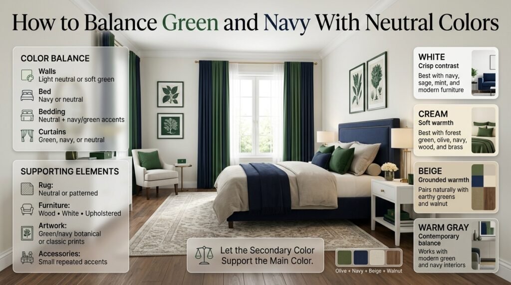
One of the most common mistakes is assuming that a green and navy room needs large amounts of both colors.
It doesn’t.
A room can clearly communicate the palette through relatively small accents.
Consider this structure:
| Design Element | Suggested Role |
|---|---|
| Walls | Light neutral or soft green |
| Bed | Navy or neutral |
| Bedding | Neutral with navy/green accents |
| Curtains | Green, navy, or neutral |
| Rug | Neutral or patterned |
| Furniture | Wood, white, or upholstered |
| Artwork | Green/navy botanical or classic prints |
| Accessories | Small repeated accents |
The purpose of the secondary color is to support the main color rather than compete with it.
If navy is already present in a large headboard and rug, you may only need green cushions, artwork, and curtains to establish the relationship.
What Neutral Colors Work Best With Green and Navy?
Neutral colors give the eyes somewhere to rest.
This is especially important when both primary colors are relatively strong.
White
White creates the crispest contrast.
It works particularly well with:
- Navy
- Sage
- Mint
- Blue-green combinations
- Modern furniture
White walls can make a navy bed look more prominent without requiring additional decoration.
Cream
Cream is warmer and softer.
It’s particularly useful with:
- Forest green
- Olive
- Deep navy
- Natural wood
- Brass
If pure white feels too sharp, cream can make the entire palette more comfortable.
Beige
Beige introduces warmth and works particularly well with earthier greens.
Try:
Olive + navy + beige + walnut
This creates a grounded traditional palette.
Warm Gray
Warm gray can work when you want a more contemporary room.
Avoid excessively cool gray if the room already contains cool navy and green, because the result may feel flat.
If you want to understand how neutral palettes can support stronger colors, explore Neutral and Classic Tones.
How Can You Use Navy in a Green and Navy Preppy Bedroom?
Navy works especially well on large structural pieces.
Consider:
- Headboard
- Bed frame
- Bedding
- Curtains
- Area rug
- Accent chair
- Ottoman
- Lampshades
A navy upholstered headboard is particularly effective because it establishes a strong visual anchor.
You can then soften it with:
- Cream bedding
- Sage cushions
- Botanical artwork
- Light wood nightstands
Another effective option is navy-and-white striping.
Stripes immediately communicate a classic preppy feeling without requiring additional decoration.
If you particularly like navy-centered palettes, Navy and White Preppy Room Ideas can provide another useful color direction.
How Can You Use Green Without Overdoing It?
Green doesn’t need to appear on every surface.
Instead, distribute it through several smaller areas.
For example:
- Sage curtains
- Green botanical artwork
- One upholstered chair
- Two decorative pillows
- A small plant
- Green-patterned throw
The repetition matters more than the quantity.
If green appears in the curtains, artwork, and pillows, your brain recognizes it as part of the same palette.
You don’t need green furniture, green walls, green bedding, and green accessories all at once.
Think in Layers
A good room often uses:
Large green element → medium green elements → small green details
For example:
- Large: sage wall
- Medium: green chair
- Small: botanical cushion
This produces visual hierarchy.
How Do Patterns Make a Green and Navy Room Feel More Preppy?
Patterns are one of the strongest tools for creating preppy character.
A room can use the correct colors but still feel generic if there are no recognizable pattern relationships.
Good options include:
- Stripes
- Plaid
- Gingham
- Checks
- Botanical prints
- Geometric motifs
- Small traditional prints
The trick is not simply choosing patterns that contain green and navy.
The trick is choosing patterns with different visual scales.
For example:
Large pattern: navy-and-cream stripe
Medium pattern: green botanical print
Small pattern: green-and-white check
The patterns don’t need to match exactly.
They need to relate.
How Many Patterns Should You Use?
For a bedroom, three patterns can be enough to create a layered look.
A useful structure is:
One Dominant Pattern
This gets the most attention.
Example:
Large navy stripe on bedding.
One Secondary Pattern
This supports the dominant pattern.
Example:
Medium botanical curtains.
One Small Pattern
This adds subtle detail.
Example:
Small green check on a decorative pillow.
Everything else can remain solid.
⚠ Common Mistake: Using five or six equally strong patterns because all of them contain green and navy. Shared colors don’t automatically make competing patterns work together.
How Can You Coordinate Green and Navy Patterns?
Use at least one shared color.
For example:
- Navy stripe + green botanical + cream check
- Forest plaid + navy solid + ivory floral
- Sage check + navy stripe + cream geometric
You can also coordinate pattern shapes.
If one textile contains sharp geometric lines, introduce softer botanical forms elsewhere to create contrast.
The goal isn’t perfect matching.
The goal is controlled variation.
What Furniture Looks Best With Green and Navy?
Furniture can either lighten or intensify the palette.
White Furniture
White furniture keeps the room fresh.
It’s useful when:
- The room is small
- The walls are dark
- The palette already contains deep colors
- You want a youthful appearance
Light Wood
Light wood introduces warmth while keeping the room relaxed.
It works beautifully with:
- Sage
- Olive
- Navy
- Cream
- White
Medium Wood
Medium wood gives the room a more traditional appearance.
It pairs especially well with forest green and navy.
Dark Wood
Dark wood can look luxurious with deep green and navy, but the combination needs enough light surfaces.
If you already have dark flooring, dark furniture, navy bedding, and forest-green walls, adding even more dark elements may make the room feel heavy.
A Better Approach
Choose one or two dark anchors and keep the supporting furniture lighter.
How Should You Choose the Bed?
The bed is usually the visual center of a bedroom, so it deserves special attention.
A navy upholstered headboard can provide an instant preppy foundation.
A neutral upholstered bed allows the bedding to carry the green and navy relationship.
A wooden bed creates a warmer, more traditional feeling.
Consider your room as a whole.
If your walls are green, a navy bed can create useful contrast.
If your walls are neutral, either navy or green can become the bed’s accent color.
What Bedding Works Best With Green and Navy?
Bedding is one of the easiest places to experiment because it can be changed without replacing major furniture.
Option 1: Navy and White Bedding
Add green through:
- Pillows
- Throw
- Artwork
- Curtains
Option 2: Cream Bedding
Add:
- Navy duvet or blanket
- Sage pillows
- Botanical print
Option 3: Green Bedding
Use:
- Navy accent pillows
- White sheets
- Cream throw
- Neutral rug
Option 4: Patterned Bedding
Choose a pattern containing navy, green, and a neutral.
This creates an immediate connection between the colors.
What Curtains Should You Use?
Curtains can become one of the largest color fields in the room.
If your walls are already green, neutral curtains may be safer.
If your walls are white or cream, green or navy curtains can add stronger character.
Consider:
- Solid sage
- Navy stripe
- Cream linen
- Green botanical
- White with subtle pattern
Avoid choosing curtains solely because they match the bedding.
Instead, consider how they interact with the walls, flooring, and furniture.
What Rugs Work With Green and Navy?
A rug can connect multiple areas of the room.
Good options include:
- Cream with navy pattern
- Navy and ivory stripe
- Green botanical design
- Neutral geometric pattern
- Vintage-inspired rug with muted green and blue
If the room already contains several patterns, choose a quieter rug.
If the room is mostly solid colors, the rug can provide a more noticeable pattern.
This is a good example of why every design choice should respond to what already exists in the room.
How Can You Add Brass Accents?
Brass adds warmth to a palette dominated by cool green and navy.
Use brass in small repeated details:
- Bedside lamps
- Cabinet handles
- Mirror frames
- Picture frames
- Curtain hardware
- Decorative objects
The goal isn’t to make the room gold.
A few repeated brass elements are enough.
Natural wood can provide a similar warming effect if you prefer a less polished look.
Can Natural Wood Work With Green and Navy?
Absolutely.
Wood is particularly useful because it prevents the color palette from feeling overly manufactured.
Light oak can make sage and navy feel fresh.
Walnut can make forest green and navy feel richer.
Medium wood can create a traditional atmosphere.
Woven baskets, rattan details, and natural fiber rugs can also soften the room.
How Do You Make a Green and Navy Room Look Modern?
Modern preppy design is about simplifying the traditional elements rather than eliminating them.
Use:
- Clean-lined furniture
- Minimal accessories
- Controlled pattern
- Warm white
- Pale wood
- Simple artwork
- Matte or understated finishes
A strong combination might be:
Sage + deep navy + warm white + pale oak
Keep the number of decorative pieces low.
Instead of six small accessories, choose two or three larger pieces with stronger visual value.
For a broader look at this approach, see Modern Preppy Room.
How Do You Make Green and Navy Feel Cozy?
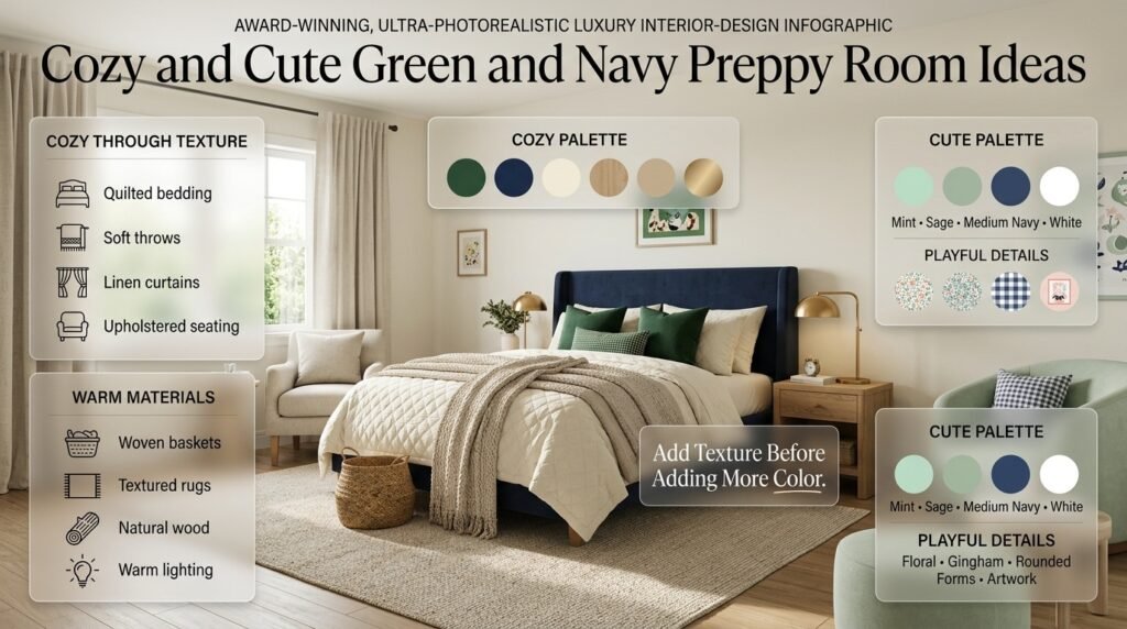
Color alone doesn’t create coziness.
Texture matters just as much.
Add:
- Quilted bedding
- Soft throws
- Linen curtains
- Upholstered seating
- Woven baskets
- Textured rugs
- Warm lighting
- Natural wood
Deep navy and forest green can create an especially inviting atmosphere when surrounded by cream and warm materials.
Don’t respond to a cold-looking room by adding more colors.
First try adding texture.
A cream knitted throw may make more difference than introducing another accent color.
For additional cozy styling ideas, explore Cozy Preppy Room.
Can Green and Navy Be Used in a Cute Preppy Room?
Yes.
The combination becomes more playful when you choose softer colors and lighter furniture.
Try:
- Mint green
- Sage
- Medium navy
- White
- Small floral prints
- Gingham
- Rounded furniture
- Playful artwork
You can also introduce small amounts of another soft accent such as blush.
The key is keeping navy controlled.
Too much dark navy can make a cute room feel more formal than intended.
How Can You Create a Classic Green and Navy Preppy Room?
A classic approach relies on traditional proportions and recognizable patterns.
Try:
- Deep navy
- Forest green
- Ivory
- Walnut
- Brass
- Stripes
- Plaid
- Traditional artwork
A navy upholstered bed with cream bedding and forest-green plaid cushions is a strong starting point.
Add a wooden nightstand, brass lamp, and botanical artwork.
The room doesn’t need to be filled with antiques.
Classic style is more about visual language than age.
If this is your preferred direction, compare the palette with Classic Preppy Room ideas.
How Can You Create a Minimal Green and Navy Preppy Room?
Minimal preppy design requires discipline.
Start with:
- Warm white walls
- Simple bed
- Cream bedding
- One navy accent
- One or two green accents
- Minimal artwork
- Light wood
For example:
Warm white wall + navy headboard + cream bedding + sage cushion + light wood
That’s enough to establish the palette.
You don’t need to fill every shelf.
Empty space is part of the design.
For more guidance, see Minimal Preppy Room.
Green and Navy for Small Bedrooms
Small rooms need careful color distribution.
This doesn’t mean you have to avoid dark colors.
Instead, keep the largest surfaces lighter.
A useful formula is:
Light walls + navy anchor + soft green accents + light furniture
For example:
- White walls
- Navy bed
- Cream bedding
- Sage curtains
- Light oak nightstand
- Small patterned rug
This creates strong color identity without making the entire room visually dark.
What to Avoid in a Small Room
Avoid combining:
- Dark green walls
- Navy bed
- Dark wood
- Black accessories
- Dark rug
all at once.
Any one or two of these can work.
Together, they may reduce the visual openness of the room.
Green and Navy for Large Bedrooms
Large rooms give you more freedom.
You can use:
- Forest-green accent wall
- Navy upholstered bed
- Large patterned rug
- Green curtains
- Darker wood
- Larger artwork
The extra space allows colors to be distributed across zones.
For example:
Sleeping Zone
Navy bed + cream bedding.
Reading Zone
Green upholstered chair + wood side table.
Window Zone
Green curtains + neutral rug.
Repeating the palette across zones creates unity.
How Does Natural Light Affect Green and Navy?
Natural light can dramatically change how colors appear.
A room with strong morning sunlight may make colors appear brighter.
A room with limited daylight can make deep green and navy feel much darker.
That’s why you shouldn’t choose paint or fabric colors solely from online photographs.
Place samples in the actual room.
Look at them:
- In morning light
- During midday
- In the evening
- Under artificial lighting
A color that looks perfect at noon may appear significantly different at night.
⭐ Expert Tip: Always test large color samples against the actual walls, flooring, and furniture. The surrounding colors can change how you perceive the shade.
What Lighting Should You Use?
Use layered lighting rather than relying on a single ceiling fixture.
Ambient Lighting
Provides general illumination.
Task Lighting
Useful beside the bed or in a reading area.
Accent Lighting
Creates atmosphere.
Warm lighting usually works particularly well with deep green and navy because it softens their cooler qualities.
Brass lamps can also reinforce the classic preppy character.
How Do You Decorate the Walls?
Wall decoration should support the color scheme without making it repetitive.
Good options include:
- Botanical artwork
- Traditional prints
- Framed maps
- Simple abstract art
- Navy-and-white artwork
- Green botanical illustrations
- Classic photography
You can also create a gallery wall using several pieces that share either the same frame finish or a common color.
Don’t make every piece contain green and navy.
A mostly neutral artwork collection can actually make the colored elements feel more intentional.
What Accessories Work Best?
Choose accessories based on function and visual balance.
Useful options include:
- Books
- Plants
- Decorative boxes
- Baskets
- Small lamps
- Framed artwork
- Vases
- Cushions
- Throws
- Mirrors
Repeat materials as well as colors.
For example:
Navy + brass + wood
can appear in several different objects without looking repetitive.
How Can Plants Improve a Green and Navy Room?
Plants can reinforce the green element naturally.
They also add:
- Texture
- Organic shapes
- Visual softness
- Natural color variation
The important thing is not to use plants merely because the room has green in its color palette.
Choose them because they suit the room and your lifestyle.
A single larger plant can sometimes create more impact than several tiny decorative plants.
How Can You Use Mirrors?
Mirrors are particularly helpful when working with deeper colors.
They can reflect:
- Natural light
- Windows
- Pale walls
- Lighter furniture
A brass-framed mirror can also reinforce the classic character of the room.
In a small bedroom, a strategically positioned mirror can help the room feel more visually open.
How Can You Use Green and Navy in a Teen or Youthful Bedroom?
The palette can be made more youthful by adjusting the shades and patterns rather than abandoning navy.
Try:
- Soft sage
- Mint
- Medium navy
- White
- Gingham
- Simple stripes
- Playful artwork
Keep the major furniture relatively timeless so the room can evolve as tastes change.
Accessories and bedding are easier to replace than a bed or wardrobe.
Green and Navy With Pink
Pink can soften the palette when used in small amounts.
For example:
Navy + sage + cream + blush
could work through:
- One pillow
- Small artwork
- Decorative object
- Throw blanket
Don’t let pink become a competing primary color unless you deliberately want a more colorful interior.
If you are interested in another light color combination, Pink and White Preppy Room Ideas provides a useful comparison.
Green and Navy With Red
Red creates a much stronger preppy contrast.
It can work particularly well with navy because both colors have traditional associations.
However, green + navy + red can become visually busy if all three are used heavily.
A safer approach is:
Navy + green foundation + small red accents
Use red through:
- Plaid
- Artwork
- Small pillows
- Books
- Decorative accessories
For another example of a stronger preppy palette, explore Red and Navy Preppy Room Ideas.
Green and Navy With Cream
Cream is one of the safest combinations for this palette.
It softens both colors without making the room feel colorless.
Try:
Forest green + navy + cream + brass
for a traditional room.
Or:
Sage + navy + warm cream + light wood
for a relaxed modern room.
Cream is particularly useful when you want the room to feel comfortable rather than stark.
Green and Navy With Blue
Because navy is already blue, you can introduce lighter blue tones without creating a completely new color family.
Try:
- Pale blue
- Dusty blue
- Powder blue
Use the lighter blue through:
- Bedding
- Artwork
- Small pillows
- Curtains
This can create a layered blue-and-green palette.
If you like softer combinations, compare this approach with Blue and Cream Preppy Room ideas.
Green and Navy With Cream Instead of White
Some rooms look better with cream because pure white creates too much contrast.
Cream is particularly effective when:
- Furniture is wooden
- Lighting is warm
- Green is olive or forest
- Navy is deep
- The room has traditional styling
The result feels softer and more established.
How Do You Use Green and Navy in Different Room Sizes?
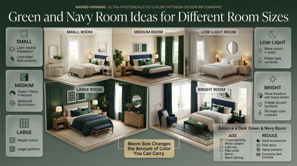
Room size should influence the intensity of the palette.
| Room Size | Recommended Approach |
|---|---|
| Small | Light neutral foundation, controlled dark accents |
| Medium | Balanced mix of green, navy, and neutral |
| Large | Deeper colors and larger patterns can work |
| Low-light | More cream/white and fewer dark surfaces |
| Bright | More freedom with deeper shades |
This isn’t a strict design law.
A small room can absolutely use dark green.
It simply needs more careful contrast and lighting.
How Do You Balance a Dark Green and Navy Room?
If your room already feels too dark, don’t immediately repaint everything.
Try removing or reducing dark elements.
Add:
- Cream bedding
- White curtains
- Light rug
- Pale wood
- Mirror
- Warm lighting
Reduce:
- Black accessories
- Dark decorative objects
- Heavy patterned textiles
- Excessive dark furniture
Sometimes replacing one large dark surface can change the entire room.
How Do You Know If the Color Palette Is Balanced?
Stand at the doorway and look at the entire room.
Ask:
Is there a clear foundation?
If not, add more neutral space.
Is navy dominating too strongly?
Introduce lighter or greener elements.
Is green appearing randomly?
Repeat it in two or three meaningful locations.
Are the patterns competing?
Remove one of them.
Is the room too dark?
Add lighter textiles, reflective surfaces, or better lighting.
Does the room feel unfinished?
Add texture before adding another color.
Balance isn’t about making everything equal.
It’s about creating a visual hierarchy.
How Can You Coordinate Colors Without Making Everything Match?
Coordination is different from matching.
Matching means:
- Same green curtains
- Same green pillows
- Same green rug
- Same green artwork
Coordination means:
- Sage curtains
- Navy bedding
- Botanical artwork
- Cream rug
- Natural wood
The colors relate, but the materials and patterns differ.
This produces a much more sophisticated result.
For more guidance on building related color combinations, see Coordinated Colors.
What Are the Most Common Green and Navy Decorating Mistakes?
Mistake 1: Using Too Much Navy
Navy can quickly become visually dominant.
Why It Happens
People see navy as a classic preppy color and assume more of it means more preppy style.
Why It’s a Problem
Too much navy can make a room feel heavy.
Better Approach
Use navy on one or two large anchors and repeat it in smaller details.
Mistake 2: Combining Too Many Dark Surfaces
Forest green + navy + dark wood + black can become overwhelming.
Better Approach
Introduce cream, white, light wood, or beige.
Mistake 3: Making Every Item Match
Perfect color matching can make a room look artificial.
Better Approach
Coordinate shades instead of duplicating them.
Mistake 4: Ignoring Lighting
A color may look completely different in different lighting conditions.
Better Approach
Test samples throughout the day.
Mistake 5: Using Too Many Patterns
A preppy room can contain patterns without every textile being patterned.
Better Approach
Use one dominant pattern, one secondary pattern, and perhaps one small pattern.
Mistake 6: Adding Another Strong Color Too Quickly
When the room feels slightly plain, it’s tempting to add pink, red, yellow, or another accent.
Better Approach
Try texture first.
Mistake 7: Forgetting the Floor
The floor occupies a large visual area.
A dark floor combined with dark furniture and dark walls can significantly change the appearance of the room.
Use rugs strategically to create contrast.
Mistake 8: Buying Accessories Before Establishing the Foundation
Small accessories cannot fix an unbalanced foundation.
Better Approach
Choose:
- Walls
- Bed
- Flooring/rug
- Major furniture
- Bedding
- Curtains
- Accessories
Build from large decisions to small decisions.
A Professional Step-by-Step Green and Navy Room Plan
Step 1: Define the Mood
Decide whether you want:
- Classic
- Modern
- Cozy
- Cute
- Minimal
- Traditional
This determines the intensity of your colors.
Step 2: Choose the Dominant Color
Decide whether green or navy will lead.
Don’t skip this step.
Step 3: Choose the Neutral Foundation
Select:
- White
- Cream
- Beige
- Warm gray
Use this on large surfaces where appropriate.
Step 4: Select Your Main Furniture
Choose the bed and major furniture before buying decorative accessories.
These pieces determine the room’s visual weight.
Step 5: Add the Secondary Color
Introduce the second color through bedding, curtains, upholstery, rugs, or artwork.
Step 6: Add One Main Pattern
Start with a stripe, plaid, check, or botanical print.
Don’t add multiple patterns immediately.
Step 7: Add Supporting Textures
Introduce:
- Linen
- Cotton
- Quilting
- Wood
- Woven materials
- Upholstery
Step 8: Add Warm Accents
Consider:
- Brass
- Natural wood
- Warm lighting
Step 9: Add Decorative Accessories
Only now should you add smaller objects.
Step 10: Edit the Room
Remove anything that doesn’t contribute.
A finished room isn’t necessarily a room with the most objects.
It’s a room where the objects work together.
A Sample Green and Navy Bedroom Formula
Here’s one practical example:
Walls
Warm white.
Bed
Navy upholstered headboard.
Bedding
Cream base with navy stripe.
Pillows
Two sage cushions and one small botanical print.
Curtains
Soft sage.
Nightstands
Light oak.
Lighting
Brass bedside lamps with warm bulbs.
Rug
Cream with a subtle navy pattern.
Artwork
Botanical prints with muted green tones.
Accessories
Small plant, books, and one woven basket.
This creates a recognizable green and navy palette without making every item contain both colors.
A Rich Traditional Formula
For a deeper room:
Walls
Warm cream.
Bed
Dark wood or deep navy upholstery.
Bedding
Ivory.
Curtains
Forest green.
Rug
Muted traditional pattern.
Accent
Navy plaid.
Furniture
Walnut.
Lighting
Brass.
Accessories
Botanical artwork and natural materials.
This combination is especially suitable for a classic interior.
A Soft Modern Formula
For a lighter room:
Walls
Warm white.
Bed
Simple navy frame.
Bedding
Cream.
Pillows
Sage and pale green.
Furniture
Light oak.
Curtains
White linen.
Rug
Soft neutral.
Artwork
Simple botanical or abstract pieces.
Accent
Small brass details.
The result is less formal while retaining the preppy color language.
How Can You Make the Room Look Expensive Without Overspending?
A polished room isn’t necessarily created by expensive products.
Focus on:
- Good proportions
- Consistent colors
- Quality-looking textiles
- Proper lighting
- Fewer decorative objects
- Coordinated hardware
- Well-positioned artwork
- Clean surfaces
One attractive lamp can make more visual difference than five random accessories.
Likewise, well-arranged bedding can make an inexpensive room feel much more considered.
Should Everything Be Symmetrical?
Symmetry works particularly well in preppy interiors because the style often has a tailored, organized quality.
For example:
- Matching bedside lamps
- Two cushions on each side
- Balanced artwork
- Similar nightstands
However, complete symmetry isn’t required.
You can maintain balance without making both sides identical.
A plant on one side can balance a lamp or chair on the other if their visual weights are similar.
How Can You Make the Room Feel Personal?
Avoid turning the room into a color-matching exercise.
Add items that mean something to you:
- Books
- Artwork
- Photographs
- Collections
- Travel-inspired objects
- Favorite textiles
- Handmade pieces
A room becomes more convincing when it looks lived in.
Preppy style is not simply about following a catalog.
It’s about creating an organized, intentional environment that still has personality.
Green and Navy Color Combinations to Try
Here are several tested starting palettes:
Palette 1: Soft and Fresh
Sage + Navy + White + Light Wood
Palette 2: Classic
Forest Green + Deep Navy + Ivory + Brass
Palette 3: Earthy
Olive + Navy + Beige + Walnut
Palette 4: Youthful
Mint + Medium Navy + White + Pale Wood
Palette 5: Elegant
Emerald + Navy + Cream + Brass
Palette 6: Relaxed
Muted Green + Soft Navy + Linen + Natural Wood
These are starting points rather than strict formulas.
Green and Navy Preppy Room Ideas for Different Design Personalities
For the Traditional Decorator
Choose:
- Forest green
- Deep navy
- Plaid
- Brass
- Walnut
For the Modern Decorator
Choose:
- Sage
- Deep navy
- Warm white
- Light oak
- Minimal patterns
For the Cozy Decorator
Choose:
- Olive
- Navy
- Cream
- Quilted textiles
- Warm wood
For the Playful Decorator
Choose:
- Mint
- Medium navy
- White
- Gingham
- Small colorful accents
For the Minimal Decorator
Choose:
- Muted sage
- Small navy accents
- Warm white
- Simple furniture
- Very limited accessories
What shades of green work best with navy in a preppy room?
Sage green, forest green, olive green, and emerald green can all work beautifully with navy, but each creates a different mood. Sage is usually the easiest choice because its muted appearance keeps navy from feeling too heavy. Forest and hunter green create a more traditional, sophisticated look, while olive brings warmth and emerald gives the room a stronger, richer accent.
The best shade depends on the amount of natural light, the size of the room, and how much navy you’re already using. A darker green doesn’t necessarily make the room look better just because it feels more luxurious. It needs enough cream, white, natural wood, or other lighter elements around it.
Practical points:
Sage + navy: soft, relaxed, and modern-preppy
Forest + navy: traditional and sophisticated
Olive + navy: warm and natural
Emerald + navy: rich and dramatic
Mint + navy: youthful and playful
Professional advice: If you’re decorating for the first time, start with sage and navy. It’s much easier to balance than two very dark shades, and you can introduce deeper green later through cushions, artwork, curtains, or a chair.
How do you balance green and navy without making a preppy room look too dark?
The easiest way to balance green and navy is to give the darker colors a lighter foundation instead of treating both as equal dominant colors. Navy and deep green have considerable visual weight, so covering the walls, furniture, bedding, and accessories in dark shades can make the room feel smaller and less comfortable.
A better approach is to choose one strong color as the anchor and surround it with lighter neutrals. For example, a navy upholstered bed can be supported by cream bedding, sage cushions, white or warm-neutral walls, light wood furniture, and brass lighting.
This creates contrast without removing the character of the palette.
A practical formula is:
Light neutral: walls, ceiling, or large bedding
Navy: major anchor such as bed, rug, or curtains
Green: secondary color through textiles, artwork, or upholstery
Wood/brass: warmth and material contrast
Current interior trends are also moving toward richer colors balanced by warm neutrals and natural materials rather than relying exclusively on pale, neutral interiors.
Common mistake: Adding black because the room still feels unfinished. Navy and dark green already provide depth, so try texture, lighting, or natural wood before introducing another dark color.
Can green and navy work in a small preppy bedroom?
Yes, and the key is controlling where the darker colors appear. A small bedroom doesn’t have to be completely white or neutral. In fact, a carefully placed navy or green element can give the room much more personality without making it feel cramped.
For a smaller room, keep the largest surfaces relatively light and use green and navy as intentional accents. A warm-white wall, navy headboard, cream bedding, sage cushions, light-wood furniture, and a subtle patterned rug can create a strong preppy identity while preserving visual openness.
You can also use pattern strategically. Instead of putting plaid, stripes, florals, and checks throughout the entire room, choose one noticeable pattern and let the other elements remain simpler.
For a small bedroom, consider:
Warm white or cream walls
One navy focal point
Sage rather than very dark green
Light or medium wood furniture
One main pattern
Mirrors to reflect light
Curtains that don’t visually overwhelm the windows
The goal isn’t to eliminate dark colors. It’s to control their visual weight.
Expert tip: Photograph the room from the doorway after decorating it. If the first thing you see is a collection of dark objects rather than the overall room, reduce or redistribute the darker elements.
What patterns look best with green and navy in a preppy room?
Stripes, plaid, gingham, checks, and botanical prints are some of the strongest choices for a green and navy preppy room. The important part isn’t simply choosing patterns that contain the right colors. You also need to control their scale and visual strength.
For example, you could use a large navy-and-cream stripe on the bedding, a medium botanical print on a cushion or curtain, and a small green check as a subtle accent. Because the patterns have different scales, they don’t all compete for attention.
This approach creates the layered appearance associated with preppy interiors while keeping the room organized. Current preppy design guidance also emphasizes disciplined pattern mixing rather than placing every possible print in the same space.
A professional pattern hierarchy can look like this:
Primary pattern: large navy stripe
Secondary pattern: medium green botanical
Small accent: gingham or check
Solid surfaces: cream bedding, plain curtains, or neutral furniture
Avoid: Using several large patterns with equally strong colors. Even if they technically match, they can make the room feel visually noisy.
A good preppy room isn’t necessarily the room with the most patterns. It’s the room where each pattern has a clear role.
How can you make a green and navy room look modern while keeping it preppy?
The best way to modernize green and navy is not to remove the classic preppy elements completely, but to simplify them. Use the traditional color relationship while giving the room cleaner furniture, more neutral space, fewer accessories, and more natural materials.
For example, try sage green + deep navy + warm white + light oak. A simple navy bed can become the main anchor, while sage appears through a cushion, chair, artwork, or curtains. Instead of several competing prints, use one carefully selected stripe or botanical pattern.
Modern preppy interiors tend to feel more intentional when the room has a clear hierarchy: one dominant neutral, one primary color, one secondary accent, and perhaps a small metallic or natural finish.
To create the look:
Choose clean-lined furniture.
Keep the background relatively calm.
Use navy as a structural accent.
Use sage or another green for softness.
Add natural wood for warmth.
Limit decorative objects.
Choose one or two recognizable preppy patterns.
Use brass sparingly rather than decorating everything with metallic finishes.
Conclusion
Green and navy can create one of the most timeless and versatile color combinations for a preppy room when the two shades are balanced thoughtfully. Green brings freshness and a natural feeling, while navy adds depth, structure, and classic character. Together, they can work across many decorating styles, from traditional and cozy spaces to modern and minimal bedrooms.
The key is not to make every element green or navy. Instead, choose one color as the main foundation, use the other as an accent, and allow lighter neutrals such as white, ivory, cream, or beige to create visual breathing room. Patterns such as stripes, gingham, checks, and subtle botanical designs can then add the personality that makes a preppy room feel complete.
Whether you prefer soft sage with navy, rich emerald with deep navy, or a lighter green paired with classic blue tones, the combination can be adapted to your room size, natural light, furniture, and personal style. Small changes such as green bedding, navy curtains, patterned pillows, brass accents, or natural wood furniture can completely refresh an existing space without requiring a full redesign.
Most importantly, a successful preppy room should feel intentional rather than overly coordinated. Start with your color palette, build around a few strong pieces, mix patterns carefully, and use neutral elements to keep the overall design comfortable and balanced. With the right proportions, green and navy can give your room a polished preppy identity while still making it feel warm, personal, and inviting.
Leave a Reply