
Introduction
Green and Navy Preppy Patterns | Green and navy preppy patterns offer a timeless way to bring structure, color, and personality into a bedroom, living room, study, or dorm. From traditional plaid and tailored stripes to gingham, geometric designs, and botanical prints, these patterns create a recognizable preppy look without requiring expensive furniture or a complete room makeover.
The challenge is knowing how to combine them. A green plaid duvet, navy striped cushions, and patterned curtains might look beautiful individually, but using them together without a clear plan can make a room feel crowded. The solution is to understand pattern scale, color balance, fabric texture, and the role each decorative element plays in the overall design.
At Preppy Room, the goal is to explore practical decorating ideas that combine classic character with fresh, comfortable interiors. This guide focuses specifically on green and navy preppy patterns, helping you choose the right prints, coordinate fabrics, avoid common decorating mistakes, and build a room that feels intentional rather than overly coordinated.
Whether you prefer traditional interiors or a more contemporary interpretation of preppy style, you will learn how to select patterns, combine different designs, and make confident decorating decisions.
What Are Green and Navy Preppy Patterns?
Green and navy preppy patterns are decorative designs that combine green and dark blue shades through recognizable motifs such as plaid, stripes, gingham, geometric grids, florals, and botanical prints. They are commonly used in bedding, cushions, curtains, upholstery, rugs, and decorative accessories to create a coordinated interior with a traditional foundation.
The appeal comes from the relationship between the two colors. Navy provides visual depth, while green introduces freshness and natural character. Patterned fabrics bring these colors together in a way that feels more detailed than using solid colors alone.
Preppy patterns can be traditional, modern, playful, or understated. A forest-green tartan has a different character from a sage-green geometric print, even when both incorporate navy.
Understanding these differences makes it easier to choose designs that suit your room rather than following a single decorating formula.
What Makes a Pattern Look Preppy?
Preppy patterns generally emphasize recognizable structure, balanced repetition, and a sense of coordination. They often borrow from classic textile traditions, including tailored stripes, heritage checks, orderly geometric motifs, and small-scale decorative prints.
Common characteristics include:
- Repeated lines, checks, diamonds, or symmetrical shapes.
- A coordinated combination of two or three principal colors.
- Clear visual structure rather than random decorative placement.
- A mixture of traditional patterns and contemporary furnishings.
- Fabrics that look appropriate for everyday use rather than purely decorative display.
Not every preppy pattern needs to look formal. Small gingham checks can create a relaxed atmosphere, while thin stripes can introduce a clean, contemporary appearance.
The key is to select patterns that contribute to the atmosphere you want to create.
Why Does Green and Navy Work So Well Together?
Green and navy are useful decorating partners because they can create contrast without requiring several unrelated colors. Their appearance changes according to the shades, backgrounds, lighting, and materials used.
Forest green with deep navy creates a rich, traditional effect. Sage green with a softer navy looks more relaxed, while emerald green and dark navy create a stronger visual statement.
Cream, ivory, and white are useful supporting colors because they provide breathing room between darker patterns.
For a wider understanding of the color relationship, explore the Green and Navy Preppy Color Palette. That topic focuses on selecting and balancing shades, while this article concentrates on the patterns themselves and how to use them effectively.
Which Green and Navy Preppy Patterns Should You Know?
The most useful green and navy patterns include plaid, stripes, gingham, geometric prints, botanical motifs, florals, and herringbone-inspired designs. Each pattern creates a different visual effect, so the best choice depends on whether you want your room to feel traditional, relaxed, sophisticated, or contemporary.
1. Green and Navy Plaid
Plaid is one of the most recognizable choices for a traditional preppy interior. It consists of intersecting horizontal and vertical lines that create repeated checks of different sizes and colors.
A plaid fabric may combine forest green, navy, cream, and narrow accent lines. The exact arrangement determines whether the pattern looks bold or subtle.
Plaid works particularly well on:
- Duvet covers and quilts.
- Decorative cushions.
- Upholstered benches.
- Throws and blankets.
- Accent chairs.
- Small fabric-covered accessories.
A large plaid duvet can become the main decorative feature in a bedroom. In a living room, a plaid throw can introduce the same character without dominating the entire space.
When selecting plaid, examine the size of the checks and the number of colors. Large checks attract attention more easily, while fine checks often work as supporting details.
Avoid assuming that every plaid must be dark. A design containing more cream or lighter green can appear softer than one dominated by navy and forest green.
2. Green and Navy Stripes
Stripes provide a more orderly appearance than many checked patterns. They can be narrow, broad, vertical, horizontal, or arranged in alternating bands.
Navy and green stripes are particularly useful when you want to introduce color without creating a complicated print.
Consider narrow striped pillowcases, a green-and-navy cushion, or striped fabric trim along the edge of a duvet.
Vertical stripes can create a sense of height when used on suitable curtains or wall treatments. Horizontal stripes emphasize width and can introduce a more relaxed appearance.
However, the visual effect depends on the size of the stripes and the surrounding furnishings. Broad stripes can become a strong focal point, while thin stripes usually contribute a quieter decorative detail.
For a balanced room, pair striped fabrics with a pattern that uses a different structure. Stripes and small botanical prints, for example, can complement each other without looking repetitive.
3. Green and Navy Gingham
Gingham is a repeated checked pattern typically created through the interaction of a colored grid and lighter sections of fabric.
Compared with many traditional plaids, gingham often looks more regular and visually straightforward. This makes it a practical option for casual bedrooms, dorm rooms, reading corners, and relaxed living spaces.
Green-and-navy gingham can be used for:
- Pillowcases.
- Small curtains.
- Cushion covers.
- Decorative table linens.
- Fabric storage baskets.
- Lightweight bedding accents.
For a soft appearance, choose gingham with white or cream sections. These lighter areas break up the darker colors and make the pattern easier to combine with other textiles.
Gingham can also support a more playful preppy style when paired with simple furniture and a few carefully selected accessories.
The main consideration is scale. Very small checks may look subtle from a distance, while larger checks create a more noticeable design.
4. Green and Navy Geometric Prints
Geometric patterns use repeated shapes such as diamonds, squares, grids, hexagons, and interlocking lines.
They are especially useful when you want a preppy color scheme with a contemporary appearance. Unlike some heritage-inspired prints, geometric designs can look equally appropriate with clean-lined furniture and minimalist accessories.
A green-and-navy diamond pattern can work on a cushion, rug, or upholstered accent chair. A simple grid can be used on bedding or curtains when the surrounding decor is relatively plain.
Look for designs with consistent spacing and a clear relationship between the colors. Complicated geometric prints may become visually dominant, especially when they cover large surfaces.
For a modern room, choose one geometric design and support it with solid fabrics or narrow stripes.
5. Green and Navy Botanical Patterns
Botanical patterns feature leaves, branches, vines, and other plant-inspired shapes.
They provide an organic contrast to the straight lines of plaid and stripes. This combination can make a room feel less rigid while maintaining a traditional color scheme.
Botanical prints are useful for:
- Accent cushions.
- Fabric artwork.
- Small upholstered pieces.
- Decorative bedding.
- Curtains in rooms with simple furniture.
- Lightweight throws.
A navy botanical design on a cream background can introduce green through surrounding cushions or accessories. Alternatively, a green botanical print can feature navy outlines or small blue details.
When selecting botanical patterns, consider the amount of empty space in the design. A print with separated leaves often looks lighter than a dense pattern covering nearly the entire background.
6. Green and Navy Floral Patterns
Floral prints use flowers, petals, and decorative arrangements to create a softer appearance.
Although florals can sometimes be associated with more traditional interiors, the effect depends on the design. Small, evenly distributed flowers may look delicate, while large stylized blooms can create a modern statement.
A floral cushion can work alongside plaid bedding when the colors are coordinated and the pattern scales are different.
For example, use a large green-and-navy plaid duvet, a small floral cushion, and solid cream pillowcases. The different structures help each item remain visually distinct.
Avoid combining several dense floral prints with large checks unless the room has enough neutral surfaces to balance the overall arrangement.
7. Herringbone and Linear Patterns
Herringbone-inspired designs use short, angled lines arranged in a repeated zigzag structure. Similar linear patterns may include narrow chevrons, broken stripes, and alternating bands.
These designs provide movement without introducing the full complexity of plaid.
They can be useful on rugs, blankets, cushions, and selected upholstery. A subtle navy herringbone fabric may work well with forest-green plaid because both designs use lines but arrange them differently.
When combining these patterns, compare their visual strength. A bold zigzag and a large plaid may compete, whereas a fine herringbone can act as a supporting detail.
How Do You Choose the Right Green and Navy Shades for Patterned Fabrics?
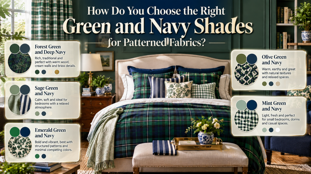
The most effective approach is to select one main green, one navy tone, and a supporting neutral before choosing the patterns. This gives different fabrics a common color foundation and reduces the risk of combining shades that look disconnected.
Forest Green and Deep Navy
Forest green and deep navy create a rich, traditional combination.
They work particularly well in rooms with warm wood furniture, cream walls, brass details, and textured fabrics.
This pairing is suitable for large plaid designs, traditional stripes, and heritage-inspired cushions. However, both colors can appear visually heavy when used across every major surface.
Balance them with lighter bedding, pale curtains, or a neutral rug.
Sage Green and Navy
Sage green provides a muted alternative to forest green.
It works well with narrow stripes, small checks, and botanical prints. Because sage is generally softer in appearance, it can be a practical choice for bedrooms where you want a calm, comfortable atmosphere.
Pair sage-and-navy patterned bedding with ivory sheets and simple furniture. A solid navy cushion can connect the colors without introducing another prominent print.
Emerald Green and Navy
Emerald green offers greater intensity.
It works best when the pattern has a clear structure and the surrounding decor does not introduce too many competing colors.
An emerald botanical cushion, for example, can add interest to a navy sofa without requiring an additional patterned surface.
For a more restrained look, choose emerald details against a cream background rather than covering every large textile in saturated color.
Olive Green and Navy
Olive green introduces a warmer, earthier character.
It can work with natural wood, beige fabrics, woven baskets, and muted navy. Olive is particularly useful when you want a preppy interior to feel relaxed rather than highly polished.
Try an olive-and-navy geometric cushion with a neutral throw and a simple rug.
Mint Green and Navy
Mint green creates a lighter and fresher appearance.
It can work well in small bedrooms, dorms, and casual spaces where dark navy provides definition without dominating the entire scheme.
Use mint in small checks, thin stripes, or simple geometric prints. Cream or white backgrounds can help the combination remain clear and balanced.
How Do You Mix Different Green and Navy Patterns?
Mixing patterns works best when each design has a distinct role. Choose one dominant pattern, add a smaller supporting print, and use a third pattern only if it contributes something different. Keeping the main colors consistent allows the patterns to vary without making the room feel disconnected.
Step 1: Select a Dominant Pattern
Begin with the item that will attract the most attention.
In a bedroom, this is often the duvet cover. In a living room, it might be a rug, accent chair, or group of cushions.
Choose a pattern that establishes the desired style. Large plaid feels traditional, while a geometric grid can create a more contemporary direction.
Step 2: Add a Pattern With a Different Scale
If your dominant pattern has large checks, choose a smaller print for the supporting fabric.
For example:
- Large plaid duvet.
- Narrow striped cushions.
- Small botanical print on one accent pillow.
The contrast in scale helps each design remain recognizable.
Step 3: Introduce a Different Pattern Structure
Scale is important, but the pattern’s structure also matters.
Plaid and gingham both contain checks, so using them together may create less contrast than combining plaid with stripes or botanicals.
This does not mean similar patterns can never work together. It simply means their differences need to be clear enough to create visual interest.
Step 4: Repeat Colors Across Several Items
Repeat navy in two or three places, such as cushions, curtains, and artwork. Then introduce green through bedding, a throw, or an accent chair.
Color repetition helps the room feel coordinated even when the prints are different.
Step 5: Add Solid Fabrics
Solid colors provide visual breathing room.
A plain navy cushion between a plaid cushion and a botanical cushion can make the arrangement feel more deliberate.
Cream, ivory, sage, and white are useful choices, depending on the room’s overall palette.
Step 6: Evaluate the Whole Room
Do not judge each fabric only by how it looks individually.
Step back and examine the arrangement from the doorway or another normal viewing position. If every pattern attracts attention equally, simplify one of the designs.
Professional tip: When in doubt, keep the largest pattern and remove the least useful supporting print. A smaller number of well-coordinated patterns usually looks more intentional than a collection of unrelated fabrics.
How Do You Use Green and Navy Patterns in a Bedroom?
Bedrooms are ideal places to experiment with patterned fabrics because bedding, cushions, curtains, and throws can introduce the palette without requiring permanent changes.
The most reliable strategy is to make one textile the focal point and allow the other fabrics to support it.
Start With Patterned Bedding
A green-and-navy plaid duvet can establish a traditional look immediately.
Keep the sheets relatively simple, especially if the plaid contains several colors. Cream, white, or a soft neutral can balance the darker sections.
If you prefer a lighter appearance, choose white bedding with a green-and-navy patterned border or use a striped duvet with solid pillowcases.
Coordinate Decorative Cushions
Cushions allow you to combine smaller prints without committing to another large patterned surface.
A useful arrangement includes:
- One plaid cushion.
- One solid navy cushion.
- One smaller botanical or geometric cushion.
You can adjust the order according to the bed’s proportions and the amount of decoration you prefer.
The aim is not to follow a rigid formula but to create a visible relationship between the patterns.
Choose Curtains Carefully
Curtains cover a relatively large surface, so their pattern can significantly affect the room.
If your bedding already features a prominent plaid, solid curtains may be the better choice. If the bedding is plain, narrow green-and-navy stripes or small gingham checks can introduce another layer of detail.
Also consider natural light. Dark patterned curtains may create a different atmosphere from lighter fabrics with a cream background.
Add a Throw or Bed Runner
A throw can connect the bedding to the rest of the room.
For example, a solid forest-green throw can complement navy plaid bedding without repeating the same pattern. A textured navy blanket can provide a similar effect.
Use the throw to introduce either a supporting color or a different fabric texture.
Consider the Headboard and Bed Frame
The bed frame does not need to match the patterned textiles.
Neutral upholstery, natural wood, and simple painted finishes can all work with green and navy fabrics.
If the headboard is already patterned, choose bedding with a simpler design. If the headboard is plain, you have more flexibility with the duvet and cushions.
How Can You Use Green and Navy Patterns in a Living Room?
In a living room, green and navy patterns can make plain furniture more distinctive while maintaining a consistent color scheme.
The best approach depends on whether you want the sofa, rug, curtains, or smaller accessories to become the main decorative feature.
Navy Sofa With Green Patterned Cushions
A navy sofa provides a strong foundation for green-and-cream cushions.
Choose one plaid design, one solid sage cushion, and one geometric print. This creates contrast while keeping the palette controlled.
If the sofa is large and dark, consider a lighter rug or curtains to balance its visual weight.
Green Accent Chair
A green accent chair can introduce the palette without requiring a new sofa.
Add navy through a small striped cushion, a throw, or nearby decorative accessories.
A solid chair is often easier to coordinate with multiple patterns than a chair already covered in a detailed print.
Patterned Rugs
A green-and-navy geometric rug can connect the sofa, side tables, and other furniture.
Before selecting a rug, consider the upholstery and flooring. A detailed rug may work best with plain furniture, while a subtle design can support a more heavily patterned room.
Check the rug’s size as well. A rug that is too small may look disconnected from the furniture arrangement, regardless of how well its colors match.
Curtains and Soft Furnishings
Striped curtains, botanical cushions, and plaid throws can introduce the palette gradually.
If the room already includes several patterns, choose one or two accessories rather than adding a print to every surface.
This keeps the interior comfortable and allows the most important decorative details to stand out.
How Do You Create a Classic Preppy Interior With These Patterns?

A classic preppy interior combines orderly patterns, thoughtful color repetition, traditional materials, and comfortable furnishings. Green and navy plaid, stripes, gingham, and botanical prints can support this style when paired with suitable furniture, restrained accessories, and a balanced mixture of solid and patterned fabrics.
Use Heritage-Inspired Patterns
Plaid and stripes provide a reliable foundation for traditional styling.
You can introduce them through bedding, cushions, throws, or a selected upholstered piece.
The patterns do not need to be identical. In fact, combining different structures often creates a more interesting result.
Introduce Natural Materials
Wood, cotton, linen, woven storage, and textured fabrics can soften the visual strength of green and navy.
For example, a forest-green plaid throw can work with a cream sofa and a wooden side table. A striped cushion can add detail without requiring more color.
Choose Decorative Finishes Carefully
Brass picture frames, traditional lamp bases, and simple ceramic accessories can complement a classic palette.
These details should support the patterns rather than compete with them.
You do not need a large collection of accessories to create a preppy atmosphere. A few well-chosen pieces are often sufficient.
Balance Traditional and Contemporary Furniture
Preppy patterns can work with both classic wooden furniture and modern, clean-lined pieces.
A simple bed frame with plaid bedding can look just as coordinated as a more traditional bed with similar textiles.
The contrast between classic prints and uncomplicated furniture can make the overall room feel current.
For broader decorating inspiration, explore the Preppy Room Ideas collection. Use that resource for general room styling, while this guide remains focused on selecting and combining green and navy patterns.
Which Green and Navy Patterns Work Best in Small Rooms?
Small rooms benefit from patterns that remain clear at the room’s normal viewing distance. Narrow stripes, small gingham, simple geometric grids, and selected botanical prints are useful options. Larger plaid can also work when it is limited to one focal item and balanced with lighter, simpler surfaces.
Choose Patterns With Clear Structure
A pattern with recognizable lines or shapes is often easier to coordinate than a dense design containing many different elements.
For example, narrow stripes can add detail to curtains without competing with patterned bedding.
A simple geometric cushion can provide interest while leaving the larger surfaces relatively calm.
Use Lighter Backgrounds
A green-and-navy print on a cream background may appear less visually dense than a design in which both dark colors cover most of the surface.
This can be helpful in rooms with limited natural light.
However, light backgrounds are not compulsory. A dark plaid cushion or navy patterned throw can still work as a single focal detail.
Limit Repeated Large Prints
A small bedroom may not need patterned bedding, patterned curtains, a patterned rug, and several patterned cushions.
Select the two or three elements that contribute most to the design. Keep the remaining surfaces simple.
Think About the Viewing Distance
Patterns that look delicate when viewed close up may appear much busier across a room.
Before purchasing fabric for curtains or bedding, examine the pattern at different distances. If the design becomes difficult to read or visually overwhelming, consider a smaller or less complex alternative.
How Do Fabric Texture and Pattern Work Together?
Pattern creates the visual design of a fabric, while texture affects its surface, appearance, and feel. Combining different textures can make a green-and-navy room feel layered even when you use only a few prints.
Cotton for Everyday Textiles
Cotton is a practical option for bedding, pillowcases, and cushion covers.
It works well with plaid, stripes, gingham, and botanical prints. Its suitability for everyday use depends on the specific weave, finish, and care instructions.
Linen for a Relaxed Appearance
Linen can introduce a natural, understated quality.
A solid sage or navy linen cushion can balance a more detailed patterned fabric elsewhere in the room.
This is especially useful when the overall design feels too formal or visually dense.
Velvet for Richness
Velvet introduces a soft surface and can make navy or forest green appear deeper.
A solid velvet cushion can support a patterned pillow without adding another competing print.
Use it where the material suits the room’s function and maintenance needs.
Woven Materials for Contrast
Woven throws, baskets, and textured rugs add visual interest without introducing another strong pattern.
This is useful when plaid, stripes, and botanical designs already provide enough decorative detail.
Build a Balanced Fabric Combination
A practical combination might include plaid bedding, striped cushions, a solid knitted throw, and a woven storage basket.
Each element contributes something different. The patterns create structure, while the textures provide variation.
How Can You Use Green and Navy Patterns in a Study or Home Office?
A study or home office can benefit from green and navy patterns because their orderly designs work well with traditional desks, bookcases, and simple furnishings.
However, the pattern should support the room’s purpose rather than dominate the main work area.
Use Stripes for a Tailored Look
Striped cushions, curtains, or an upholstered chair can create a clean, organized appearance.
Thin stripes are particularly useful when you want a subtle decorative detail.
Add Plaid Through Small Accessories
A plaid cushion or throw can introduce a heritage-inspired element without requiring patterned wallpaper or large upholstered surfaces.
Pair it with a simple desk, neutral storage, and restrained accessories.
Choose Geometric Prints for Contemporary Spaces
A geometric cushion, rug, or fabric-covered noticeboard can introduce green and navy while maintaining a modern appearance.
Keep the main desk surface relatively uncluttered so the decorative elements remain separate from the work area.
Consider Lighting and Practicality
Dark fabrics can appear different under warm and cool lighting. Test samples near the desk before choosing curtains or upholstery.
Also consider cleaning requirements and everyday use, particularly for desk chairs and frequently handled accessories.
How Do You Choose Patterns for a Dorm Room?
Dorm rooms often require flexible decorating choices because the space may be small, shared, or furnished with existing pieces. Green and navy patterns can introduce personality through bedding, cushions, lightweight throws, and removable decorative accessories.
Start With the Bedding
A patterned duvet or quilt can establish the color scheme without changing the room’s permanent features.
Choose plaid for a traditional look, gingham for a relaxed style, or stripes for a cleaner appearance.
Keep Supporting Patterns Small
Use one or two patterned cushions rather than introducing several large prints.
A solid navy pillow and a cream cushion can balance a green-and-navy plaid duvet.
Use Removable Accessories
Fabric storage baskets, cushion covers, throws, and small decorative items can be changed or moved easily.
This approach makes it possible to experiment with the palette without investing in major furniture changes.
Avoid Overcrowding Limited Surfaces
A small dorm room may already contain a desk, bed, shelves, and storage units.
Choose patterns that complement these existing elements instead of covering every available surface with decoration.
What Are the Most Common Mistakes When Decorating With Green and Navy Patterns?
The most common mistakes include combining patterns of similar scale, using too many dark surfaces, mixing greens with incompatible undertones, and overlooking the room’s existing furniture and lighting.
These problems usually arise when decorative items are selected individually instead of being evaluated as part of a complete scheme.
Mistake 1: Choosing Too Many Similar Patterns
Several medium-sized checks may blend together and create visual confusion.
How to avoid it: Combine different structures, such as large plaid, narrow stripes, and a small botanical print.
Mistake 2: Using Too Much Navy
Navy can create depth, but excessive use across bedding, curtains, furniture, and rugs may make a room feel heavy.
How to avoid it: Introduce cream, ivory, or lighter green through larger surfaces and use navy strategically.
Mistake 3: Mixing Incompatible Green Shades
A cool sage, yellow-toned olive, and vivid emerald may not automatically work together.
How to avoid it: Select one main green and introduce additional shades only when they connect naturally with the rest of the room.
Mistake 4: Ignoring Pattern Scale
A large plaid duvet, bold geometric curtains, and a dense floral rug can compete for attention.
How to avoid it: Allow one large pattern to dominate and use smaller prints or solid fabrics elsewhere.
Mistake 5: Forgetting Existing Furniture
A patterned fabric may look attractive on its own but clash with warm wood, colorful upholstery, or existing flooring.
How to avoid it: Compare samples with the actual furniture and finishes before purchasing.
Mistake 6: Buying Accessories Without a Plan
Collecting cushions, throws, and decorative pieces separately can create a disconnected result.
How to avoid it: Establish the main pattern and supporting colors first, then select accessories that serve a clear purpose.
Mistake 7: Using Every Pattern in the Same Proportion
When plaid, stripes, florals, and geometric prints all occupy equally prominent surfaces, the room can lose its visual hierarchy.
How to avoid it: Make one pattern the focal point, use another as a supporting detail, and introduce additional designs sparingly.
Mistake 8: Overlooking Fabric Care
Some decorative fabrics require special cleaning or may not suit frequent use.
How to avoid it: Check the manufacturer’s care instructions before selecting bedding, upholstery, or curtains.
What Do Interior Styling Professionals Recommend?

A well-coordinated room generally has a clear focal point, repeated colors, contrasting pattern scales, and enough quiet space for the eye to rest. Professional-style planning focuses on the relationship between the patterns, furniture, lighting, and practical requirements of the space.
Work From the Largest Surface Downward
Start with the bedding, sofa, rug, or curtains, depending on the room.
This establishes the strongest visual element before you choose smaller accessories.
Repeat Colors Rather Than Identical Prints
A green cushion, a green detail in the artwork, and a green throw can connect different areas without repeating the same design.
This creates coordination without making the room feel overly matched.
Evaluate the Background Color
A pattern with a cream background may be easier to use in a light room than one in which navy and green cover nearly the entire surface.
Consider how the background interacts with the wall color and the amount of natural light.
Check Samples in Different Lighting
Fabric colors can appear different under daylight, warm lamps, and cooler artificial lighting.
Place samples beside the existing furnishings and examine them at different times of day before making a final decision.
Keep Maintenance in Mind
Patterned textiles may help disguise some everyday marks, depending on their color, design, and material. However, appearance alone does not determine durability or ease of cleaning.
Choose fabrics according to their intended use and follow the manufacturer’s care guidance.
Prioritize Comfort Over Decoration
A visually attractive room still needs to work for everyday life.
In a bedroom, bedding should feel comfortable. In a living room, cushions should support seating rather than interfere with it. In a study, decorative elements should not crowd the workspace.
How Can You Plan a Green and Navy Pattern Scheme Step by Step?
A successful pattern scheme begins with the room’s existing colors and furnishings. Select a dominant green, choose a complementary navy, establish one main print, and add supporting patterns gradually. Finish with solid fabrics and suitable textures, then evaluate the complete arrangement before buying more accessories.
Step 1: Assess the Existing Room
Identify the wall color, flooring, furniture finishes, and any textiles you plan to keep.
These fixed elements influence which green and navy shades will work best.
For example, warm wood may complement forest green and cream, while a lighter contemporary interior may suit sage and softer navy.
Step 2: Select One Main Green
Choose the shade according to the atmosphere you want.
Forest green creates a traditional appearance, sage offers a softer effect, emerald introduces intensity, and olive provides an earthier quality.
Use the selected shade as the starting point for your dominant patterned fabric.
Step 3: Choose a Complementary Navy
Compare the navy with the green rather than selecting the colors independently.
A very dark navy may create a stronger contrast than a medium or muted blue.
The most appropriate choice depends on the existing finishes, natural light, and overall decorative style.
Step 4: Select the Dominant Pattern
Decide whether plaid, stripes, gingham, botanical prints, or geometric designs will lead the room.
For a bedroom, bedding is often a convenient starting point. In a living room, consider the rug, principal sofa, or accent chair.
Step 5: Introduce Supporting Patterns
Add one or two designs with different scales or structures.
If the dominant pattern is large plaid, try narrow stripes and a small botanical motif.
If the main print is a detailed floral, a simple geometric pattern or solid cushion may provide better balance.
Step 6: Add Solids and Textures
Introduce cream bedding, plain cushions, textured throws, or natural materials.
These elements help the patterns remain distinct and prevent the room from becoming visually crowded.
Step 7: Review the Complete Arrangement
Before purchasing additional items, ask:
- Is one pattern clearly dominant?
- Do the green and navy shades complement each other?
- Are the patterns different enough in scale or structure?
- Is there enough neutral space?
- Do the fabrics suit the room’s size and purpose?
- Will the materials be practical to maintain?
If the arrangement feels balanced, you may not need any additional decoration.
How Do You Mix Green and Navy Preppy Patterns Without Making a Room Look Too Busy?
Mixing green and navy preppy patterns successfully requires a balance between pattern scale, color repetition, and visual simplicity. Start with one dominant print, such as a forest-green and navy plaid duvet or a geometric rug, and introduce one or two supporting patterns with different structures. For example, narrow navy stripes and a small botanical print can complement a large plaid design without competing for attention.
The most important factor is giving each pattern a clear purpose. The dominant print should establish the room’s character, while smaller patterns add detail. Solid fabrics in cream, ivory, sage, or navy provide visual breaks and help the different designs feel connected.
Practical styling tips:
Choose one large or noticeable pattern as the focal point.
Combine different structures, such as plaid with stripes or botanicals.
Repeat green and navy across multiple decorative elements for consistency.
Use solid-colored cushions, bedding, or throws to balance detailed prints.
Check the complete arrangement from a distance before adding more patterns.
Which Green and Navy Preppy Patterns Work Best for a Bedroom?
Plaid, stripes, gingham, and botanical prints are all suitable for green and navy preppy bedrooms, but the best option depends on the atmosphere you want to create. Plaid bedding provides a traditional appearance, stripes introduce a cleaner and more structured look, and gingham creates a relaxed, classic feel. Botanical prints add softer shapes that balance the straight lines of checks and stripes.
For a coordinated bedroom, choose bedding as the starting point. A green-and-navy plaid duvet can work with cream sheets, solid navy pillowcases, and a small botanical cushion. If you prefer a lighter appearance, use white bedding as the foundation and introduce the palette through patterned cushions, a throw, or curtains.
Practical bedroom recommendations:
Use plaid bedding when you want a traditional preppy focal point.
Choose stripes for a neat, understated appearance.
Introduce gingham through pillowcases or smaller decorative fabrics.
Balance dark patterns with cream, white, or light neutral textiles.
Keep curtains relatively simple when the bedding already contains a bold print.
What Colors Complement Green and Navy Preppy Patterns the Most?
Cream, ivory, white, and pale beige are among the most useful supporting colors for green and navy patterns because they create contrast without competing with the main palette. The ideal choice depends on the green shade, the depth of the navy, and the room’s existing furniture and lighting. Warm wood can add natural warmth, while restrained brass details may complement a traditional interior.
The green shade also affects the result. Forest green and deep navy create a rich, heritage-inspired combination, whereas sage green and softer navy offer a more understated appearance. Emerald green introduces stronger color intensity, making neutral backgrounds particularly useful when the pattern is bold.
Color-coordination tips:
Pair forest green and navy with cream, warm wood, and subtle brass accents.
Combine sage and navy with ivory, white, or pale beige.
Use emerald and navy in controlled amounts when both shades are highly saturated.
Introduce olive green alongside natural textures for an earthy appearance.
Test fabric samples under the room’s usual lighting before purchasing coordinating accessories.
Are Green and Navy Preppy Patterns Suitable for Small Bedrooms and Dorm Rooms?
Green and navy preppy patterns can work well in small bedrooms and dorm rooms when their scale, contrast, and placement are carefully considered. Narrow stripes, small gingham checks, and simple geometric designs are practical choices because they introduce decorative detail without requiring several large patterned surfaces. Larger plaid designs can also work, particularly when used on one focal item rather than repeated throughout the room.
The key is not to eliminate bold patterns but to control how much space they occupy. A plaid duvet can provide the main decorative feature while solid curtains, simple bedding accessories, and a neutral rug help maintain balance. Removable items such as cushion covers and throws are especially useful when decorating a dorm or a room with existing furniture.
Small-space decorating tips:
Choose one dominant patterned item rather than decorating every surface.
Use lighter backgrounds to create contrast with dark green and navy.
Combine small prints with solid fabrics instead of several bold designs.
Introduce the palette through bedding, cushions, or removable accessories.
Consider existing furniture, available light, and the room’s layout before selecting large patterned textiles.
How Can You Create a Timeless Preppy Look With Green and Navy Patterns Without Making It Feel Outdated?
A timeless green and navy preppy interior combines traditional patterns with simple furnishings, coordinated colors, and varied textures. Plaid, stripes, gingham, and botanical prints can establish a classic foundation, while clean-lined furniture and restrained accessories keep the room from feeling overly formal. Instead of matching every decorative item, focus on repeating colors and allowing the patterns to complement one another.
For example, a navy sofa can be paired with forest-green plaid cushions, a simple cream rug, and one botanical accent. In a bedroom, traditional plaid bedding can work with an uncomplicated headboard and solid-colored sheets. These combinations preserve the character of preppy design while giving the space a more contemporary and adaptable appearance.
Professional styling recommendations:
Combine traditional patterns with simple, modern furniture.
Repeat colors rather than using the same print everywhere.
Mix smooth cotton, relaxed linen, woven materials, and selected velvet accents.
Limit decorative accessories when the main fabrics already contain detailed patterns.
Choose textiles that suit your daily routine, comfort needs, and maintenance preferences.
A timeless interior is not created by following every decorating trend. It comes from selecting patterns and materials that work together, suit the space, and remain enjoyable to live with over time.
Conclusion: Creating a Timeless Look With Green and Navy Preppy Patterns
Green and navy preppy patterns offer a versatile way to create interiors that feel classic, coordinated, and full of personality. From traditional plaid and crisp stripes to gingham, geometric prints, and subtle botanical designs, each pattern brings a different character to a room. The key to using them successfully is choosing patterns that complement one another rather than compete for attention.
A well-designed space begins with a clear color balance. Navy can provide depth and definition, while green introduces freshness and a connection to nature. Cream, white, and warm neutral shades help soften the combination, allowing patterned bedding, cushions, curtains, rugs, and decorative accessories to stand out without making the room feel crowded.
For the most cohesive result, start with one dominant pattern, introduce a smaller supporting print, and use solid-colored fabrics to create visual breathing room. Consider the room’s size, natural lighting, existing furniture, and overall purpose before selecting your patterns. These simple decisions can make the difference between a coordinated preppy interior and a space that feels visually overwhelming.
Whether you are refreshing a bedroom, styling a living room, decorating a dorm, or planning a complete interior update, green and navy patterns can adapt to different design preferences. Explore Green and Navy Preppy Room Ideas for broader styling inspiration, and use the principles discussed in this guide to create a look that suits your space and personal taste.
Ultimately, timeless preppy design is not about following every trend or filling a room with matching prints. It is about combining classic patterns, thoughtful color choices, comfortable textures, and carefully selected accents. With a balanced approach, green and navy preppy patterns can help you create an inviting, polished interior that remains stylish and enjoyable for years to come. For more classic interior inspiration, visit Preppy Room and continue exploring ideas that make your space feel distinctly yours.