
Introduction
Green Navy and Cream Color Palette | Choosing colors for a room can be surprisingly difficult. You might love the natural freshness of green, the timeless depth of navy blue, and the warmth of cream, but combining them in the right proportions takes a little planning. Too much navy can make a space feel heavy, while the wrong shade of green may clash with your furniture or flooring.
The green navy and cream color palette offers a versatile solution. It combines nature-inspired color, classic sophistication, and a soft neutral foundation that can work beautifully in traditional, modern, cozy, and preppy interiors. The key is understanding how the shades interact, how lighting affects their appearance, and where each color should be used.
At Preppy Room, color coordination is an important part of creating spaces that feel personal, comfortable, and visually connected. This guide focuses specifically on combining green, navy, and cream, from selecting compatible shades to planning color proportions, choosing finishes, and avoiding common decorating mistakes.
You’ll learn how to adapt this palette to different rooms, coordinate paint with existing furniture, choose suitable accent colors, and create a balanced design without spending money on unnecessary replacements. Whether you’re planning a complete room refresh or simply updating a few accessories, you’ll have a practical process to follow.
What Is a Green Navy and Cream Color Palette?
A green, navy, and cream color palette combines three colors with different visual roles. Green introduces a natural element, navy provides depth and definition, and cream softens the contrast with a warm, neutral background. Together, they create a flexible scheme that can look relaxed, traditional, polished, or contemporary.
The combination works particularly well because the colors don’t need to compete for attention. You can use cream across large surfaces, introduce green through furniture or textiles, and reserve navy for selected areas that benefit from stronger contrast.
Why Do Green, Navy, and Cream Work So Well Together?
Green and navy have a natural relationship because both belong to the cool side of the color spectrum, although individual shades can have warmer or cooler undertones. Cream adds a different quality: its warmth helps balance the depth of navy and the freshness of green.
Each color contributes a specific effect.
- Green creates freshness. Sage, olive, forest, and emerald green can connect an interior with nature while providing different levels of intensity.
- Navy creates structure. Deep blue adds visual weight and can make furniture, upholstery, artwork, and decorative details feel more defined.
- Cream creates balance. Warm off-white surfaces provide breathing room and prevent the darker colors from dominating the room.
The result doesn’t have to be formal or dark. A pale sage with soft navy and warm cream feels gentle, while forest green with deep navy and ivory creates a richer, more traditional appearance.
The important decision is not simply whether these colors match. It’s how you distribute them and which versions you choose.
What Interior Styles Suit This Palette?
This combination can support several decorating styles because its character changes with the shades, materials, and patterns.
| Interior style | Recommended combination | Overall effect |
|---|---|---|
| Classic | Forest green, deep navy, ivory | Rich and traditional |
| Modern | Muted sage, navy, warm cream | Clean and balanced |
| Preppy | Emerald or forest green, navy, cream stripes | Tailored and distinctive |
| Cozy | Olive, soft navy, warm cream | Relaxed and inviting |
| Minimal | Pale sage, restrained navy, light cream | Simple and uncluttered |
| Transitional | Sage, medium navy, beige-cream | Timeless but flexible |
You don’t need to follow a style perfectly. For example, a room with traditional navy upholstery can feel more contemporary when paired with simple furniture, plain cream walls, and restrained accessories.
The palette provides a foundation rather than a fixed decorating formula.
Which Green, Navy, and Cream Shades Should You Choose?
The best shades depend on your room’s natural light, existing finishes, and the atmosphere you want to create. Lighter greens and softer navies are useful for calm spaces, while forest green and deep navy provide stronger contrast in larger or well-lit rooms.
Before choosing paint, compare the shades with your flooring, upholstery, and curtains. A color that looks attractive by itself may appear different when placed beside another color with a conflicting undertone.
Which Green Shades Work Best?
Green has a wide range of appearances, so selecting the right variation is essential.
Sage green is muted and relatively soft. It works well when you want a relaxed interior that doesn’t feel overly colorful. Sage is particularly useful for bedrooms, curtains, upholstered chairs, and accent walls.
Olive green has an earthy, often yellow-based quality. It pairs naturally with warm cream, walnut, tan, and other materials with brown undertones. Choose olive when you want a grounded, comfortable atmosphere.
Forest green is deeper and more traditional. It can create a strong focal point through an accent wall, headboard, sofa, or curtains. Because it carries considerable visual weight, it benefits from lighter surrounding surfaces.
Emerald green is more saturated and noticeable. It can make an interior feel energetic and polished, particularly when used on a statement chair, cushions, or a decorative textile. Using it everywhere alongside deep navy may create excessive intensity.
Mint green is lighter and fresher. It works well in bright rooms or when you want the palette to feel youthful rather than formal.
A useful starting principle is to choose one main green instead of mixing several unrelated greens across large surfaces. You can introduce subtle variations later through plants, patterned fabrics, and small accessories.
Which Navy Blue Shade Is Most Suitable?
Navy also varies considerably. Some versions appear almost black, while others contain a softer gray or brighter blue undertone.
Deep navy provides a traditional, dramatic effect. It works well with ivory, forest green, dark wood, and brass details. However, it needs sufficient contrast if the room receives little natural light.
Medium navy is easier to use across a wider range of interiors. It still provides a clear contrast against cream but doesn’t necessarily feel as heavy as a nearly black blue.
Muted navy contains a softer, sometimes grayish quality. It can work particularly well with sage green, pale wood, and natural fabrics.
When selecting navy, consider its intended location. A dark navy sofa can look striking against cream walls, while navy walls may require lighter furniture, curtains, and bedding to maintain visual balance.
Which Cream Shade Should You Use?
Cream is not a single color. Some shades resemble pale ivory, while others lean toward yellow, beige, or a soft neutral white.
Warm cream works well with olive green, forest green, walnut, and warm wood finishes. It can make a room feel more comfortable and less stark than a bright white background.
Pale ivory provides a lighter appearance while retaining a little warmth. It is useful when you want a classic scheme that feels bright without becoming cold.
Beige-cream has more visible brown or beige undertones. It can connect the palette with natural stone, tan upholstery, and medium-toned timber.
Before selecting a shade, compare it with the room’s permanent elements. If the flooring has a strong orange undertone, a cream that is too cool may look disconnected. If the furniture is gray-toned, a very yellow cream may create an unwanted contrast.
How Can You Compare Shades Before Decorating?
Create a small sample board containing your proposed green, navy, cream, and one or two existing material samples.
Evaluate the colors:
- In natural daylight.
- In the evening under your usual lights.
- Beside the flooring and large furniture.
- Together rather than as separate color swatches.
- On more than one wall if the room receives uneven light.
Paint colors and fabrics can change noticeably with lighting. Digital color codes are helpful for planning, but they cannot guarantee an exact match with real paint, upholstery, or other materials.
Pro Tip: If you’re uncertain about the combination, begin with cream as the foundation and test green and navy through removable textiles. This lets you adjust the balance before making a larger commitment.
Planning a Coordinated Green and Navy Preppy Interior
A coordinated green and navy interior begins with choosing shades that complement one another and support the atmosphere you want to create. Navy brings a classic, structured quality to a room, while green introduces a natural element that works beautifully with traditional furniture, patterned fabrics, and decorative accents. For a rich and sophisticated look, consider combining deep navy with forest green and warm cream details. Alternatively, sage green paired with softer navy tones can create a lighter, more relaxed setting. Once you have selected your main shades, carry them throughout the room using bedding, curtains, cushions, rugs, artwork, and carefully chosen accessories. Classic patterns such as stripes, plaid, and gingham can strengthen the preppy aesthetic, especially when balanced with solid fabrics and neutral surfaces. It is also important to consider natural lighting, because darker shades may appear more intense in rooms with limited daylight. Testing fabric samples and paint colors together can help you understand how the palette will look before making larger decorating decisions. For further inspiration on choosing complementary shades and developing a consistent design, explore our guide to the green and navy preppy color palette. By combining thoughtful color selection with balanced patterns and textures, you can create a timeless interior that feels polished, welcoming, and distinctly preppy.
What Is the Best Color Ratio for Green, Navy, and Cream?

A useful starting point is the 60-30-10 decorating rule. Use cream for approximately 60% of the visual palette, green for 30%, and navy for the remaining 10%. This creates a light foundation, a noticeable natural color, and a smaller amount of strong contrast.
These proportions are guidelines rather than strict rules. The best balance depends on the size of the room, the darkness of your chosen shades, and how much visual weight each surface carries.
How Does the 60-30-10 Rule Work?
The rule helps you decide which color should dominate and which colors should support it.
| Color | Starting proportion | Suitable applications |
|---|---|---|
| Cream | 60% | Walls, rugs, bedding, large curtains |
| Green | 30% | Upholstery, accent furniture, selected textiles |
| Navy | 10% | Cushions, lampshades, artwork, decorative details |
Imagine a bedroom with cream walls, cream bedding, sage curtains, a green upholstered chair, and navy cushions. The cream keeps the space open, the green establishes its identity, and the navy adds definition.
Notice that the colors don’t have to appear in equal amounts. Navy may be the darkest color, so even a relatively small area can attract considerable attention.
When Should You Use a Different Ratio?
You can change the proportions to suit your design.
Cream-dominant palette: Use cream across the largest surfaces, green on selected furniture or textiles, and navy in smaller accents. This is useful for compact rooms or spaces where you want a bright, relaxed atmosphere.
Green-dominant palette: Use green on walls, curtains, or upholstery, then balance it with cream and controlled navy details. This works well when you want a nature-inspired interior.
Navy-dominant palette: Let navy lead through a sofa, cabinetry, headboard, or accent wall. Introduce enough cream to maintain contrast and use green to soften the overall effect.
Balanced three-color palette: Give each color a meaningful role without allowing any one shade to overwhelm the room. This can work in larger spaces where furniture, walls, and textiles provide several opportunities to distribute color.
An important distinction is that visual proportions are not always the same as the number of objects. A large navy sofa may have more visual impact than ten small navy accessories.
Expert Tip: If you use both forest green and deep navy, consider increasing the amount of cream or another light neutral. Two dark colors can work together, but they need enough contrast to remain distinct.
Should Green or Navy Be the Main Color?
Choose green as the main color if you want the room to feel natural, fresh, or slightly relaxed. Choose navy if you prefer a more tailored, classic appearance. You can also make cream the dominant color and use green and navy as supporting shades.
Consider these examples:
- Cream walls + green curtains + navy cushions create a light, layered interior.
- Green walls + cream upholstery + navy accessories create a more nature-inspired design.
- Navy furniture + cream walls + sage accents create a classic look with controlled contrast.
- Cream bedding + navy headboard + green cushions create a simple bedroom palette.
The best choice is the one that complements the existing room rather than forcing you to replace every item.
How Do You Use This Palette Without Making a Room Feel Dark?
A green, navy, and cream scheme can feel bright or dramatic depending on how you distribute the darker colors. To keep the room open, use cream on substantial surfaces, allow light to reach the darker elements, and avoid combining too many deep shades in the same visual area.
How Should You Decorate a Small Room?
Small rooms benefit from clear color hierarchy. Start with cream walls or other light surfaces, introduce green through curtains or textiles, and use navy in a few well-positioned accents.
For example, a small bedroom could have:
- Cream walls.
- A navy headboard.
- Sage cushions.
- Light wood bedside tables.
- A cream rug with a subtle navy pattern.
- Simple curtains in a muted neutral.
This arrangement provides enough color to create a recognizable style without making every surface compete for attention.
You can still use dark green in a small room. Instead of covering every wall, try a single accent wall or a substantial green textile against a lighter background.
What If Your Room Has Limited Natural Light?
Rooms with limited daylight need more careful shade selection. Deep navy and forest green may appear darker than expected, particularly in corners or behind large furniture.
Consider using warm cream on the largest surfaces and choosing a softer green with moderate saturation. Medium or muted navy can provide definition without creating the same intensity as nearly black blue.
Lighting also matters. A room with a single ceiling light may produce strong shadows that make dark furniture look heavier. Multiple light sources can help illuminate different areas more evenly.
However, don’t assume that every low-light room needs bright white. A carefully chosen warm cream can feel more comfortable while still providing a lighter foundation.
Can You Use Dark Green Walls With Navy Furniture?
Yes, but the surrounding finishes become particularly important.
If you choose forest-green walls and navy furniture, consider cream curtains, a light rug, pale artwork backgrounds, and natural wood. These elements introduce contrast and help the two darker colors remain visually distinct.
Before painting the entire room, test the wall color beside the upholstery. Green may look more yellow or more blue depending on the surrounding colors and the light.
A successful dark palette should feel intentional, not as though every available surface has simply been painted a darker shade.
How Can You Use the Palette in Different Rooms?
The same three colors can produce different results in bedrooms, living rooms, offices, and dining areas. The difference comes from the dominant shade, the furniture materials, the patterns, and the way each room is used.
How Do You Decorate a Green, Navy, and Cream Bedroom?
A bedroom usually benefits from a comfortable neutral foundation and a few carefully coordinated accents. Cream bedding, a green headboard or curtains, and navy details can create a layered look without requiring matching furniture.
For a softer bedroom, combine sage green with warm cream, navy piping, and light wood. This arrangement feels relaxed while retaining the contrast that makes the palette interesting.
For a more traditional bedroom, try forest green curtains, ivory bedding, a navy throw, and walnut furniture. Brass bedside lamps can introduce warmth without requiring another strong color.
If you prefer a preppy look, consider combining stripes, small checks, and botanical patterns. For example, navy-and-cream striped bedding can sit alongside a solid sage cushion and a small green botanical print.
The secret is to vary the pattern scale. If the bedding has strong stripes, choose simpler curtains and avoid adding several other large patterns.
For more specific room-styling inspiration, see Green and Navy Preppy Room Ideas.
How Can You Style a Living Room?
In a living room, distribute the colors across the sofa, rug, curtains, artwork, and smaller furnishings.
A cream sofa can provide a flexible foundation for green cushions and navy accents. Alternatively, a navy sofa can become the central feature against cream walls, with green introduced through a chair, throw, or artwork.
Natural wood helps connect these elements. Light oak makes the room feel more casual, while walnut supports a richer, traditional scheme.
Consider how the room looks from different viewpoints. If all the green is concentrated on one side and all the navy on the other, the design may feel disconnected. Repeating a few colors in different areas helps create continuity.
You don’t need to match every accessory. A navy cushion, a framed print with navy details, and a patterned rug can establish a relationship without making the room look overly coordinated.
How Do You Design a Home Office With These Colors?

A home office should feel organized and comfortable, with enough contrast to define the workspace.
Cream walls and a wood desk create a calm foundation. Add navy through the chair, desk accessories, or storage, and use green in a lamp, plant, or small decorative object.
If you prefer a stronger look, a muted green wall behind the desk can create a focal point. Keep the remaining surfaces relatively simple so that the space doesn’t become visually busy.
Consider practical requirements as well. A dark desktop may show dust differently from a lighter one, and textured fabrics may need more maintenance than smooth, easy-clean materials.
The goal is to create a workspace that suits your habits, not simply to reproduce a photograph.
Can This Palette Work in a Kitchen or Dining Room?
Yes. Green cabinetry, navy seating, and cream walls or surfaces can create a classic and inviting combination.
Sage or olive cabinets often work well with cream walls and natural wood. Navy can appear in dining chairs, bar stools, kitchen accessories, or a contrasting island.
In a dining room, consider cream table linens, green upholstery, and navy napkins or patterned tableware. This allows you to introduce color without committing to permanent finishes.
Pay attention to fixed materials. A cream countertop with a strong yellow undertone may look different beside a cool green cabinet than it would beside olive green. Test samples together before choosing expensive finishes.
How Can You Use the Palette in a Guest Room?
A guest room should feel welcoming without being too personal or visually crowded. Cream bedding and walls create a neutral foundation, while green and navy introduce character.
Use navy through a throw, a small upholstered bench, or decorative cushions. Add green with a bedside lamp, curtains, or artwork.
Keep storage and surfaces practical. A simple room with a coordinated palette often feels more comfortable than one filled with unnecessary accessories.
Which Materials, Textures, and Patterns Work Best?
Materials and patterns give the palette depth. Linen, cotton, wool, natural wood, ceramic, and brass can soften the contrast between green and navy, while stripes, checks, and botanical motifs introduce personality.
You don’t need to use every material or pattern. Choose a small group that suits the room’s purpose and repeats the main colors naturally.
Which Fabrics Complement Green, Navy, and Cream?
Linen creates a relaxed, slightly textured appearance. It works well for curtains, bedding, and cushion covers.
Cotton is versatile and suitable for everyday textiles. It can carry stripes, checks, and small botanical prints without making the room feel too formal.
Velvet adds depth to navy or forest-green upholstery. Because it has a rich surface, it can make a small accent chair or cushion feel more prominent.
Wool introduces softness through rugs and throws. A textured wool rug can connect cream upholstery with navy furniture without adding another strong color.
Woven materials add texture and warmth. Baskets, woven shades, and natural-fiber accessories can make a polished palette feel more relaxed.
When choosing materials, consider how they will be used. A delicate fabric may suit decorative cushions but be less practical for a frequently used seat.
Which Patterns Suit a Preppy Interior?
Stripes are a natural choice for this combination because they reinforce the classic relationship between navy and cream. They work particularly well on bedding, cushions, curtains, and smaller upholstered pieces.
Plaid and checks can add a traditional or collegiate character. Use them in a throw, a cushion, or a small accent chair rather than placing large checks on every surface.
Botanical patterns connect the green shades with nature. They can include leaves, flowers, or landscape-inspired details on a cream background.
Geometric patterns are useful when you want a cleaner, more contemporary result. A small-scale navy geometric print can complement solid green upholstery without competing with it.
A balanced pattern arrangement might include:
- One dominant navy-and-cream stripe.
- One smaller green check.
- One subtle botanical print.
- Plain cream fabrics to provide visual rest.
Common Mistake: Choosing several patterns with the same scale and intensity. If every surface contains a large, high-contrast design, the room can feel unsettled. Vary the pattern sizes and leave some surfaces plain.
Designing a Well-Balanced Green and Navy Room
A well-balanced green and navy room combines classic color choices with thoughtful decorating decisions to create a space that feels cohesive and inviting. Navy blue provides depth and structure, making it a suitable choice for bedding, upholstered furniture, accent walls, or decorative details. Green adds freshness and can be introduced through cushions, curtains, rugs, plants, and patterned fabrics. The shades you choose will influence the overall atmosphere: forest green with deep navy creates a rich, traditional look, while sage green with softer navy tones produces a more relaxed appearance. To prevent the darker colors from overwhelming the room, incorporate cream, ivory, or white through walls, bedding, and larger decorative surfaces. You can also introduce preppy patterns such as stripes, plaid, and gingham to add character while maintaining a consistent color scheme. A practical approach is to select the main colors first, then repeat them in smaller accessories to connect different parts of the room without making everything look identical. Before finalizing your choices, consider the available natural light, room size, and existing furniture so that the colors work harmoniously in the actual space. For more inspiration on combining these shades and planning a cohesive interior, explore our guide to the green and navy room color scheme. With a thoughtful balance of colors, patterns, and textures, you can create a timeless preppy room that feels comfortable, polished, and visually connected.
Which Furniture Finishes Complement This Palette?
Furniture finishes influence whether the palette feels relaxed, formal, or contemporary.
Light oak and pale wood pair well with sage, muted navy, and cream. They introduce warmth without competing with the main colors.
Walnut and medium-toned wood are useful for traditional interiors. They complement forest green and deep navy, particularly when cream is used to lighten the surrounding surfaces.
White or cream-painted furniture creates a crisp, bright effect. It can be especially useful in smaller rooms where dark upholstery already provides enough visual weight.
Black finishes can work as small accents, particularly in modern interiors. However, if the room already contains deep navy, dark green, and dark flooring, adding black everywhere may reduce the contrast between the main elements.
The best approach is to select finishes that support the overall palette rather than matching every furniture item to one color.
Should You Add Brass, Gold, or Natural Wood?
Brass and muted gold introduce warmth that can balance cool-looking greens and blues. They work well through lamp bases, cabinet handles, mirror frames, and small decorative details.
Natural wood creates a similar balancing effect but generally feels more organic. It can connect the palette with woven fabrics, cream upholstery, and green botanical details.
You don’t need to use both finishes extensively. If your room already has warm wood furniture, a few brass details may be enough. If the interior feels too polished, natural textures can soften it.
Which Accent Colors Work With Green, Navy, and Cream?
The three main colors are sufficient to create a complete scheme, but one additional accent can add personality. Warm wood, brass, muted terracotta, dusty pink, and beige are all potential options, provided they support rather than compete with the main palette.
| Accent | What it adds | Where to use it |
|---|---|---|
| Warm wood | Natural warmth | Furniture, flooring, frames |
| Brass | A warm, polished detail | Lamps, hardware, mirrors |
| Terracotta | Earthy character | Ceramics, small textiles |
| Dusty pink | A softer contrast | Cushions, artwork |
| Beige | A gentle neutral transition | Rugs, upholstery |
| Black | Strong definition | Frames, selected hardware |
Can You Combine Green, Navy, and Cream With Pink?
Yes. Dusty pink or muted blush can soften the traditional character of green and navy.
For example, cream walls, sage curtains, navy bedding, and one blush cushion can create a gentle, decorative appearance. The pink doesn’t need to appear in every part of the room; a small amount can provide enough contrast.
Avoid introducing a very bright pink unless you deliberately want a more energetic palette. Strong pink can become a competing focal point when combined with saturated emerald and deep navy.
Does Terracotta Work With This Palette?
Terracotta can work particularly well with olive green, warm cream, and natural wood. Its earthy character provides a different kind of contrast from navy.
Use terracotta in a ceramic vase, a small cushion, a planter, or a decorative bowl. If the room already contains many dark surfaces, a small earthy accent may be enough to add warmth.
How Can You Use White Alongside Cream?
White can be introduced when you want a cleaner contrast, but it should be chosen deliberately.
Warm white may blend easily with cream, while a very bright white can make the cream look more yellow by comparison. This isn’t necessarily a problem; the contrast can be attractive when it is intentional.
For example, white trim, cream walls, navy furniture, and sage textiles can create a layered neutral background. The main consideration is whether the difference between the whites looks deliberate rather than accidental.
How Do You Build a Green, Navy, and Cream Color Scheme Step by Step?
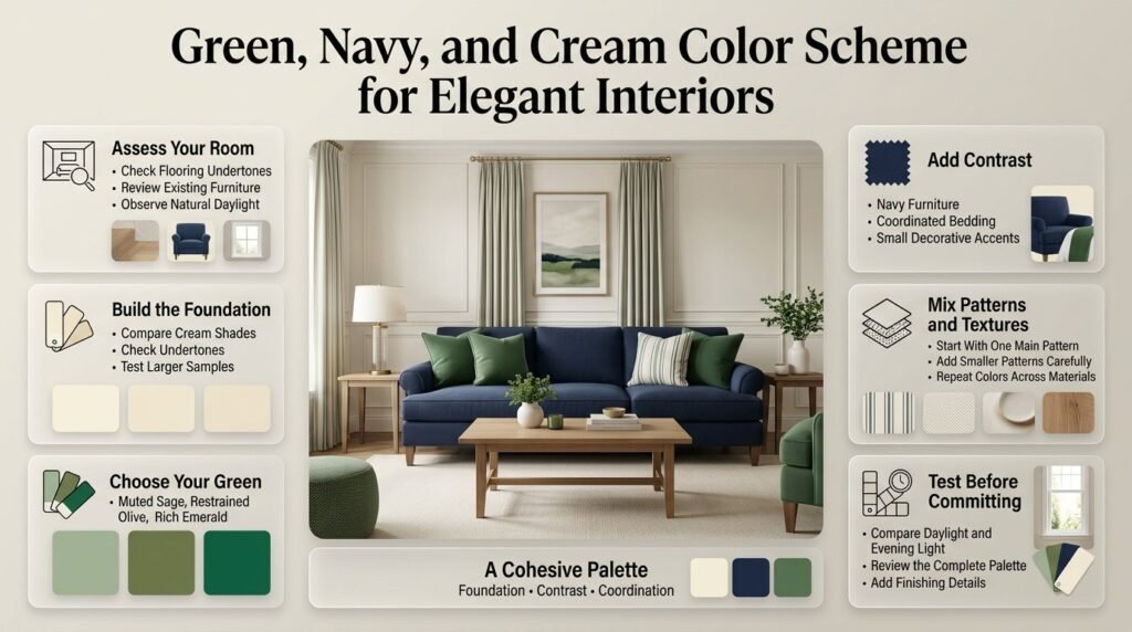
The easiest way to develop a cohesive palette is to work from existing finishes toward smaller decorative details. Identify the fixed elements, select compatible shades, establish a dominant color, and then add furniture, textiles, patterns, and accents in a controlled order.
Step 1: Assess the Existing Room
Before buying anything, identify the elements that are difficult or expensive to replace.
Look at:
- Flooring and its undertone.
- Existing furniture and upholstery.
- Wall color and trim.
- Window size and available daylight.
- Rugs, curtains, and large decorative pieces.
Why it matters: A palette should work with the room you actually have. Choosing paint before considering a large sofa or the flooring can lead to unnecessary changes.
For example, if you already own a navy sofa, you may not need another large navy furniture item. Green cushions and cream curtains could provide the balance you need.
Step 2: Choose the Foundation Color
Select the cream shade for your largest surfaces, especially if you want a flexible design.
Compare several samples with your flooring and furniture. Notice whether each shade appears yellow, pink, gray, or neutral under different lighting.
Professional advice: Don’t judge cream from a small sample alone. A larger sample area can reveal undertones that are difficult to notice on a small paint card.
Step 3: Select the Main Green
Decide what role green should play.
If it will cover a large wall, a muted sage or restrained olive may be easier to balance. If green will appear only in cushions or artwork, you have more freedom to choose a stronger emerald or forest shade.
Consider the visual effect of the green against the cream foundation and navy accent. The goal is to create a relationship between the colors, not to find three unrelated shades you like individually.
Step 4: Introduce Navy
Add navy where stronger contrast will be useful.
A navy chair can anchor a light living room. Navy bedding can provide definition in a cream bedroom. Navy artwork or accessories can create smaller points of contrast without requiring new furniture.
If navy is already the dominant color, introduce green through smaller elements and allow cream to balance the overall appearance.
Step 5: Coordinate Textures and Patterns
Once the main colors are established, introduce fabrics and materials.
Choose a dominant pattern first, then add one or two smaller patterns if needed. Repeat the main colors across the room, but vary the materials so the design doesn’t look artificially matched.
For example, navy might appear in a cotton stripe, a smooth ceramic lamp, and a small artwork detail. The color connects these elements even though their textures differ.
Step 6: Test the Complete Combination
Place your samples together before committing to paint, furniture, or expensive textiles.
Check them in daylight and under your normal evening lighting. Observe whether the cream becomes too yellow, whether the navy loses its blue appearance, or whether the green looks more saturated than expected.
Step 7: Add Finishing Details
Introduce brass, natural wood, plants, or one additional accent only if the room needs them.
Step back and evaluate the overall design. If one color feels too dominant, adjust a large or medium-sized element before buying several new accessories.
For more guidance on the relationship between green and navy, explore the Green and Navy Color Scheme.
What Are the Most Common Decorating Mistakes?
Most problems with this palette result from unsuitable undertones, poor color distribution, competing patterns, or a lack of contrast. These issues are easier to prevent when you evaluate the room as a complete design rather than choosing each item independently.
Mistake 1: Using Too Much Navy in a Low-Light Room
Deep navy can look almost black in dim areas, particularly when combined with forest green and dark wood.
How to avoid it: Keep cream prominent on the larger surfaces, test the navy in its intended location, and introduce adequate lighting.
Mistake 2: Choosing Greens That Clash
Two greens can have different undertones even when they appear similar in a store. A yellow-toned olive may not coordinate easily with a cool blue-green if both are used extensively.
How to avoid it: Compare the shades side by side. They don’t have to be identical in undertone, but their relationship should look intentional.
Mistake 3: Ignoring Existing Flooring
Flooring is a large visual surface that can influence how every other color appears. A cream shade that looks beautiful on its own may clash with a strongly orange-toned floor.
How to avoid it: Compare paint and fabric samples directly beside the flooring before making final decisions.
Mistake 4: Mixing Too Many Bold Patterns
Stripes, checks, and botanical prints can work together, but too many large patterns may create visual competition.
How to avoid it: Select one dominant pattern, one smaller supporting design, and plain fabrics for the remaining surfaces.
Mistake 5: Using Cream Without Checking Its Undertone
Cream may look distinctly yellow beside bright white or slightly pink beside another neutral. This can change the overall appearance of the palette.
How to avoid it: Test cream alongside the actual green, navy, flooring, and furniture instead of selecting it in isolation.
Mistake 6: Forgetting Texture
A room can feel flat when every surface is smooth and every accessory is the same type of finish.
How to avoid it: Combine a few contrasting materials, such as linen, wood, ceramic, and a textured rug. You can create depth without introducing additional colors.
Mistake 7: Buying Every Accessory at Once
Purchasing a complete collection of matching objects can make the room feel overly coordinated.
How to avoid it: Establish the main palette first. Add accessories gradually and keep only the items that improve the overall balance.
What Do Professionals Recommend for a More Cohesive Result?
A successful interior usually depends more on proportion, contrast, and coordination than on expensive furniture. Professional-looking spaces often repeat colors intentionally, combine different textures, and leave enough visual space for the main elements to stand out.
Repeat Colors Without Matching Everything
Repeat green, navy, and cream in different parts of the room. For example, a green cushion might connect with botanical artwork, while navy details in a rug can echo the upholstery.
The items don’t need to match exactly. Slight variations in shade, material, and pattern can make the room feel more natural.
Balance Visual Weight
A large navy sofa may dominate a room even if navy appears nowhere else. Balance it with lighter walls, a cream rug, and green accents distributed around the space.
You don’t need perfect symmetry. The objective is to avoid concentrating all the visual weight in one area.
Prioritize Practical Materials
A beautiful palette should still work for everyday life.
Consider whether the fabrics are easy to clean, whether the rug suits the room’s use, and whether the furniture finishes will remain practical over time. A washable cushion cover may be more useful than a delicate textile that requires constant care.
Avoid Making Decisions From Digital Colors Alone
Screens display color differently, and photographs are affected by lighting, editing, and surrounding materials. Use online examples to develop ideas, then test real samples in the intended room.
For additional inspiration focused on broader color pairings, see Green and Navy Color Combinations.
How do you balance green, navy, and cream in a room without making it look too dark?
The easiest way to balance green, navy, and cream is to use cream as the foundation, green as the main decorative color, and navy as a contrasting accent. This arrangement creates visual depth while keeping the room bright and comfortable. However, if your room receives plenty of natural light, you can use more forest green or navy without overwhelming the space.
For example, cream walls, sage-green curtains, and a navy sofa can create a sophisticated living room. In a bedroom, cream bedding, green cushions, and navy details provide a similar balance.
Practical tips:
Use cream on large surfaces when the room is small or receives limited daylight.
Introduce green through upholstery, curtains, accent walls, or decorative textiles.
Use navy selectively if you already have dark flooring or furniture.
Test the colors under both natural and artificial lighting before making a final decision.
Which shades of green work best with navy blue and cream?
Sage, olive, forest, and emerald green can all complement navy and cream, but each creates a different atmosphere. Sage is ideal for relaxed interiors, olive introduces an earthy character, forest green creates a rich traditional look, and emerald adds a stronger decorative statement. The best shade depends on your lighting, existing furniture, and preferred style.
For a calm bedroom, combine sage green with warm cream and muted navy. For a classic living room, forest green, deep navy, and ivory can create a more dramatic effect. Emerald works particularly well in smaller doses, such as an accent chair, cushions, or artwork.
How to choose the right shade:
Sage green: Best for soft, understated interiors.
Olive green: Works well with warm wood and beige-toned cream.
Forest green: Suitable for traditional spaces and statement features.
Emerald green: Ideal for bold accents and preppy decorative details.
Always compare the green with your chosen navy and cream together. Individual colors can look attractive on their own but behave differently when placed side by side.
What is the best color ratio for a green, navy, and cream color palette?
A practical starting point is the 60-30-10 rule: use approximately 60% cream, 30% green, and 10% navy. Cream establishes a neutral foundation, green gives the room its character, and navy introduces contrast. These proportions are flexible and should be adjusted according to the room’s size, lighting, and existing furnishings.
For example, a living room might have cream walls and a light rug, a green sofa or accent chair, and navy cushions or artwork. If you prefer navy furniture, reverse the arrangement by keeping the walls and larger textiles cream and using green in smaller decorative elements.
Ways to apply the ratio:
Use cream for walls, bedding, rugs, or other large surfaces.
Use green for curtains, upholstery, or selected furniture.
Introduce navy through cushions, lampshades, artwork, or furniture.
Adjust the proportions when one of the colors is already prominent in the room.
Remember that the darkest color often has the greatest visual impact, even when it occupies a relatively small area.
What accent colors and materials look best with green, navy, and cream?
Warm wood, brass, muted gold, terracotta, and dusty pink can complement a green, navy, and cream palette. These accents introduce warmth, texture, or a gentle contrast without taking attention away from the three main colors. The best choice depends on whether you want a traditional, modern, cozy, or preppy interior.
Natural oak and walnut are particularly useful because they connect the cooler green and navy shades with the warmth of cream. Brass handles, lamps, and mirror frames can create a more polished appearance, while linen, cotton, wool, and woven materials make the room feel more relaxed.
Recommended combinations:
Warm wood and linen: For a natural, comfortable atmosphere.
Brass and ivory: For a classic, refined appearance.
Terracotta and olive: For an earthy, grounded look.
Dusty pink and sage: For a softer, more decorative style.
Navy stripes and cream cotton: For a timeless preppy interior.
Choose one or two supporting accents rather than introducing every possible color. Repeating the same materials and finishes in different parts of the room helps the design feel connected.
How can you use a green, navy, and cream color palette in a small bedroom or living room?
A green, navy, and cream palette can work beautifully in a small room when you prioritize light surfaces, controlled contrast, and carefully selected furnishings. Cream walls and larger textiles help the space feel open, while green introduces personality and navy provides definition. You don’t need to avoid dark colors completely; you simply need to use them thoughtfully.
In a small bedroom, try cream bedding, a sage-green headboard, navy cushions, and light wood furniture. In a compact living room, cream walls and a light rug can balance a navy sofa, while green cushions or a small accent chair introduce freshness.
Practical decorating advice:
Keep the largest surfaces relatively light if the room has limited natural light.
Choose furniture that fits the room rather than overcrowding it with decorative pieces.
Repeat green and navy in a few places to create visual continuity.
Use mirrors and layered lighting to help brighten darker areas.
Select patterns carefully; a few coordinated stripes or botanical prints are usually more effective than many competing designs.
The goal is to create a room that feels balanced and functional, with enough color to establish its style without making the available space feel visually crowded.
Conclusion
A green, navy, and cream color palette offers a timeless way to create a room that feels balanced, elegant, and comfortable. Green introduces a natural element, navy adds depth and sophistication, and cream keeps the overall design warm and visually light. When these colors are selected carefully, they can work beautifully in bedrooms, living rooms, study areas, and other interior spaces.
The key is to choose shades that complement one another and use each color with a clear purpose. Cream works well as the foundation for walls and larger surfaces, green brings character through furniture, textiles, or decorative accents, and navy creates contrast through selected statement pieces. Natural wood, brass details, soft lighting, and carefully chosen patterns can further connect the three colors.
Before making major changes, consider your room’s natural light, existing furniture, and overall size. Test paint samples, compare fabric colors in different lighting conditions, and introduce the palette gradually rather than purchasing everything at once. These simple steps can help you avoid a room that feels too dark, overly busy, or unbalanced.
For more inspiration, explore these green and navy color combinations and adapt the ideas to your personal style. You can also discover more decorating inspiration at Preppy Room to find a look that suits your space.
Ultimately, the best green, navy, and cream interior is one that reflects your taste while maintaining harmony between color, texture, lighting, and function. With thoughtful planning, this versatile palette can create a polished interior that remains inviting and stylish for years to come.