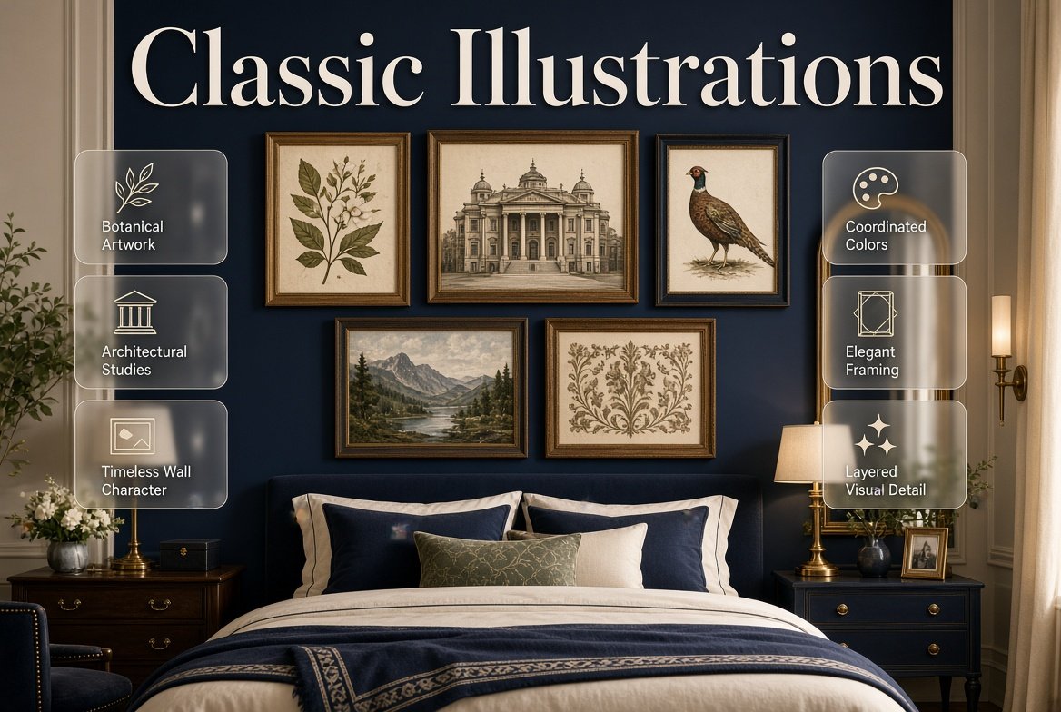
Introduction
Classic Illustrations | A room can have beautiful furniture, carefully chosen colors, and attractive bedding, yet still feel like something is missing. Often, the problem isn’t another piece of furniture or another decorative accessory. The walls simply need something that gives the room character.
That’s where classic illustrations can make a meaningful difference.
Unlike highly trendy wall decorations that may quickly feel dated, classic illustrations can introduce history, personality, detail, and visual interest in a way that works with many decorating styles. Botanical drawings, architectural studies, traditional animals, vintage-inspired objects, landscapes, fashion illustrations, scientific drawings, and carefully composed decorative artwork can all bring a room to life without overwhelming the rest of the design.
For a broader look at how different decorating elements come together, explore Preppy Room as a starting point. The overall preppy approach works particularly well with timeless artwork because it already values classic patterns, coordinated colors, layered details, elegant furniture, and carefully selected wall decoration.
The challenge is choosing illustrations that actually belong in your room.
A beautiful illustration can look disconnected if its colors fight with the bedding. A sophisticated print can feel too formal when surrounded by playful accessories. A gallery wall can become crowded when every frame competes for attention. And even a simple illustration can look awkward if it is placed at the wrong height.
This guide explains how to use classic illustrations successfully in a preppy room, including how to choose subjects, colors, frames, sizes, layouts, and combinations. You’ll also learn how to coordinate illustrations with furniture, mirrors, decorative prints, photographs, typography, patterns, and different preppy color palettes.
What Are Classic Illustrations?
Classic illustrations are decorative or artistic images based on timeless visual subjects, traditional drawing techniques, historical references, natural forms, or refined graphic compositions. They often have a detailed, collected, educational, botanical, architectural, or vintage-inspired appearance rather than relying on short-lived trends.
Classic illustrations can include:
- Botanical drawings
- Bird and animal illustrations
- Architectural drawings
- Vintage maps
- Scientific illustrations
- Fashion sketches
- Traditional landscapes
- Botanical studies
- Nautical artwork
- Historical objects
- Floral illustrations
- Decorative line drawings
- Antique-inspired book illustrations
- Traditional food or still-life studies
The word “classic” doesn’t necessarily mean that the artwork must actually be antique.
A newly printed botanical illustration can still have a classic visual character.
What matters most is the design language.
Classic illustrations usually have enough visual detail and restraint to remain useful across changing decorating trends. They can work in a traditional room, modern preppy room, cozy bedroom, study area, guest room, or even a minimal interior when selected carefully.
Why Do Classic Illustrations Work So Well in Preppy Rooms?
Preppy interiors naturally combine traditional and fresh elements. Existing PreppyRoom guidance emphasizes classic patterns, coordinated colors, framed artwork, decorative wall elements, and personal artwork as important parts of the overall aesthetic.
Classic illustrations support that approach because they can add visual personality without requiring an entire room makeover.
For example:
Cream walls + navy bedding + striped pillows + botanical illustration
can immediately create a more collected appearance.
Likewise:
White walls + light blue bedding + traditional furniture + architectural illustration
can feel polished without becoming overly formal.
The illustration becomes part of the room’s visual story.
Why Should You Use Classic Illustrations in Room Decor?
Classic illustrations do more than fill an empty wall.
They can help establish mood, connect colors, introduce a subject that reflects your interests, and create visual continuity between furniture and accessories.
1. They Add Character
A blank wall is neutral, but it doesn’t communicate much about the person using the room.
An illustration can.
A botanical print may suggest an appreciation for nature. An architectural drawing can introduce an academic or collected feeling. A nautical illustration may complement a coastal-inspired room.
The artwork gives the room something to say.
2. They Work With Multiple Decorating Styles
A good classic illustration isn’t limited to one exact aesthetic.
The same botanical artwork might work in:
- Classic preppy decor
- Modern preppy decor
- Cozy preppy decor
- Minimal preppy decor
- Cottage-inspired interiors
- Traditional bedrooms
- Study spaces
- Guest rooms
The surrounding elements determine how the illustration feels.
3. They Help Break Up Large Solid Areas
Large areas of plain wall, solid bedding, or simple furniture can sometimes feel visually flat.
An illustration introduces detail.
You don’t necessarily need a complicated gallery wall. One carefully selected print can be enough.
4. They Can Connect Different Colors
Suppose your room contains navy, cream, sage, and muted blue.
Instead of choosing artwork that introduces an entirely new color, look for an illustration containing two or three of those existing shades.
The artwork then becomes a bridge between different elements.
This is especially useful when building a coordinated room. For more guidance on connecting colors throughout an interior, explore Coordinated Colors.
What Types of Classic Illustrations Work Best?
There isn’t one universal subject that works for every room.
The best choice depends on your room’s personality, color palette, furniture, and the amount of visual detail already present.
Botanical Illustrations
Botanical illustrations are among the most flexible choices.
They can feature:
- Leaves
- Flowers
- Branches
- Herbs
- Trees
- Garden plants
- Detailed floral studies
They work particularly well when you want to add natural color without introducing a visually complicated scene.
A botanical illustration can also complement green, navy, cream, blue, pink, and neutral palettes.
For example:
Sage green + cream + botanical illustration + natural wood
creates a very different feeling from:
Navy + white + botanical illustration + brass
even though the artwork subject is similar.
Professional Tip
Don’t choose botanical artwork solely because it contains plants.
Look at the background, frame, line quality, color intensity, and scale.
A very colorful botanical print may dominate a room that already has patterned bedding.
A muted botanical drawing may be better for a room with stronger textiles.
Should You Use Floral Illustrations?
Floral illustrations are particularly useful when you want softness without relying entirely on floral fabrics.
They can be:
- Traditional
- Romantic
- Scientific
- Vintage-inspired
- Minimal
- Detailed
- Watercolor-based
A floral illustration doesn’t need to match the flowers in your bedding exactly.
In fact, exact matching can sometimes make the room feel overly coordinated.
Instead, repeat one color.
For example, if your artwork contains dusty pink flowers and green leaves, you might repeat the dusty pink through one pillow and the green through a small decorative accessory.
That creates a relationship without making everything identical.
Are Animal and Bird Illustrations Good for Preppy Rooms?
Yes, especially when the subject fits the room’s personality.
Traditional animal illustrations can add an academic or collected character.
Bird illustrations can work beautifully with:
- Navy
- Cream
- Soft blue
- Sage
- Natural wood
- Brass
Horse illustrations can complement a more traditional or equestrian-inspired room.
Butterfly illustrations can create a lighter, decorative appearance.
The important thing is restraint.
If the room already contains several strong patterns, one detailed animal or bird print may be enough.
You don’t need an entire wall of unrelated subjects.
What About Architectural Illustrations?
Architectural illustrations can create a particularly sophisticated appearance.
They may show:
- Historic buildings
- Houses
- Bridges
- European streets
- Gardens
- Doorways
- Interior spaces
- Architectural details
These prints can work especially well in:
- Bedrooms
- Study spaces
- Reading corners
- Home offices
- Hallways
An architectural drawing can also create a more mature feeling without requiring dark colors or heavy furniture.
For a classic room, pair it with traditional furniture and structured textiles.
For a modern room, place it inside a simple frame with plenty of surrounding space.
How Do You Choose the Right Classic Illustration?
The easiest mistake is choosing artwork in isolation.
Instead, look at the room first.
Ask:
- What colors are already present?
- Is the room traditional or modern?
- How much pattern is already being used?
- Is the wall large or small?
- Is the artwork supposed to be the focal point?
- What furniture will be nearby?
- Will the artwork sit alone or in a gallery wall?
This prevents the common situation where the artwork is attractive by itself but doesn’t belong in the room.
Start With the Color Palette
Color should usually be your first filter.
Suppose the room already contains:
- Navy
- White
- Cream
- Natural wood
A botanical illustration with green, cream, and muted blue may work beautifully.
But a highly saturated neon print may introduce too much contrast.
This doesn’t mean every color has to match.
It means the artwork should have a visual relationship with the surrounding space.
Quick Color Rule
Use artwork to repeat existing colors before introducing completely new ones.
This is one of the simplest ways to make wall decor feel intentional.
How Do You Choose the Right Illustration Style?
Think about the furniture before selecting the artwork.
Traditional Furniture
Traditional furniture generally works well with:
- Botanical studies
- Architectural drawings
- Historical illustrations
- Traditional landscapes
- Vintage-inspired artwork
Modern Furniture
Modern furniture can support:
- Simplified line drawings
- Minimal botanical artwork
- Clean architectural prints
- Restrained illustrations
Cute Furniture
For a playful room, consider:
- Floral illustrations
- Birds
- Butterflies
- Soft animal drawings
- Cheerful botanical prints
Cozy Furniture
Look for:
- Warm landscapes
- Botanical drawings
- Soft-toned illustrations
- Nature studies
The goal isn’t perfect stylistic matching.
It’s visual compatibility.
Classic Illustrations and Classic Preppy Rooms
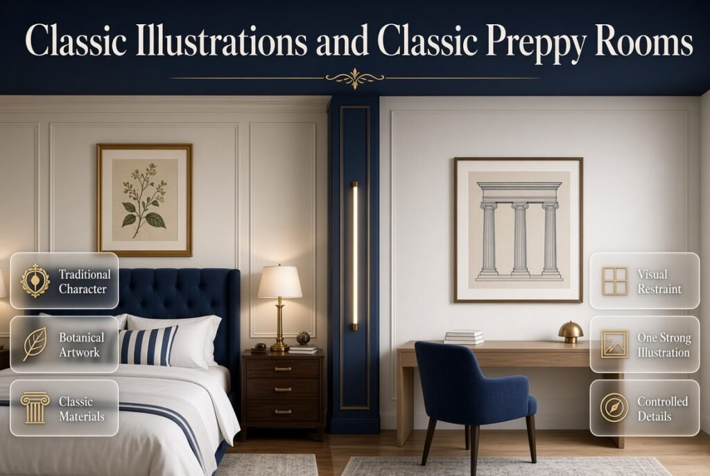
A classic preppy room usually benefits from artwork that feels collected rather than excessively trendy.
For a traditional direction, think about:
- Navy
- Cream
- White
- Wood
- Brass
- Stripes
- Botanical artwork
- Architectural prints
- Traditional frames
If you want to establish the wider style first, Classic Preppy Room can provide a useful foundation.
Classic illustrations can then become one of the wall elements supporting that design.
Example
Imagine a bedroom with:
- Cream walls
- Navy upholstered headboard
- White bedding
- Navy striped pillow
- Walnut nightstands
- Brass lamps
- Botanical illustration
The artwork doesn’t need to be large.
Its job is to reinforce the traditional character already established by the furniture and textiles.
Classic Illustrations in a Modern Preppy Room
Modern preppy design usually benefits from more visual restraint.
The artwork should therefore be carefully edited.
Choose one or two strong illustrations rather than filling every available wall.
A simple arrangement might include:
Warm white wall + navy chair + light wood desk + one architectural illustration
The result can feel current while still retaining traditional character.
For more ideas about this direction, explore Modern Preppy Room.
The Main Principle
Modern doesn’t mean removing all classic elements.
It means controlling them.
One beautiful traditional illustration can actually become more noticeable when the rest of the room is quiet.
Can Classic Illustrations Work in a Cute Preppy Room?
Absolutely.
The trick is selecting subjects and colors that support the playful side of the room.
Consider:
- Small botanical illustrations
- Floral drawings
- Birds
- Butterflies
- Charming animal artwork
- Soft watercolor-style illustrations
Use lighter frames and cheerful supporting colors if the room already has a youthful appearance.
For additional playful inspiration, see Cute Preppy Room.
You can also explore Cute Preppy Room Ideas when building a broader decorative plan.
The illustration should add personality without turning the wall into a collection of unrelated novelty images.
How Do Classic Illustrations Work in a Cozy Preppy Room?
Cozy rooms generally benefit from artwork that feels warm and approachable.
Good choices include:
- Botanical drawings
- Landscapes
- Soft floral illustrations
- Nature studies
- Warm-toned architectural drawings
Frame them with materials that complement the room.
Natural wood can make the artwork feel relaxed.
Warm metallic frames can make it more polished.
Cream or off-white mats can soften the composition.
If the room needs more softness overall, explore Cozy Preppy Room.
Can You Use Classic Illustrations in a Minimal Preppy Room?
Yes, but edit carefully.
Minimal preppy rooms usually don’t need many decorative elements.
One large illustration may be more effective than six small ones.
Choose:
- One subject
- One restrained color palette
- One simple frame
- Plenty of negative space
For more guidance, explore Minimal Preppy Room.
A minimal room gives the artwork more visual responsibility, so the quality and proportion of the piece become especially important.
How Do You Match Classic Illustrations With Preppy Color Palettes?
Classic illustrations are particularly useful because they can adapt to many color combinations.
Navy and White
Navy and white provides a traditional foundation.
Use:
- Navy botanical prints
- Blue architectural illustrations
- Navy-and-white animal artwork
- Neutral drawings with dark frames
You can find more ideas in Navy and White Preppy Room Ideas.
Avoid making every artwork blue.
A cream or natural-toned print can provide necessary visual breathing room.
Blue and Cream
Blue and cream creates a softer, warmer palette.
Architectural drawings, botanical studies, landscapes, and traditional illustrations can work especially well here.
The broader Blue and Cream Preppy Room approach shows how cream can provide warmth while blue supplies contrast and personality.
A useful formula is:
Cream background + blue artwork + natural wood frame
or:
Blue accent + cream mat + traditional illustration
Pink and White
Pink and white can be elegant rather than overly decorative when the artwork is carefully selected.
Consider:
- Botanical flowers
- Soft floral studies
- Architectural drawings with muted pink
- Vintage-inspired illustrations
- Botanical leaves with subtle blush details
For more palette-specific inspiration, see Pink and White Preppy Room Ideas.
The existing guide also uses classic illustrations alongside floral artwork, mirrors, framed photographs, and gallery walls as possible wall-decoration elements.
Green and Cream
Green and cream are naturally compatible with botanical illustrations.
Try:
- Fern studies
- Botanical leaves
- Garden illustrations
- Natural history prints
- Soft floral drawings
For a fuller palette approach, explore Green and Cream Preppy Room Ideas.
Red and Navy
Red and navy can create a stronger traditional appearance.
Classic illustrations may work particularly well when red appears as a small accent rather than dominating the artwork.
Try:
Navy wall + cream artwork + small red detail
or:
White wall + navy frame + illustration with muted red accents
Explore Red and Navy Preppy Room Ideas for more ways to build this color relationship.
Neutral and Classic Tones
Neutral rooms can benefit enormously from illustrations because artwork introduces detail without requiring strong wall colors.
Use:
- Beige
- Cream
- Taupe
- Warm white
- Soft gray
- Natural wood
- Muted green
The Neutral and Classic Tones approach is particularly useful if you want the room to feel calm and timeless.
Green and Navy
Green and navy create a richer palette.
Classic botanical illustrations can connect the two colors naturally.
Try:
Navy bedding + cream wall + green botanical illustration + brass frame
For additional inspiration, see Green and Navy Preppy Room Ideas.
Light Blue and White
Light blue and white creates a fresh foundation for illustrations.
Good choices include:
- Blue botanical drawings
- White-background artwork
- Soft landscapes
- Architectural studies
- Nautical illustrations
Explore Light Blue and White for more ideas around this lighter palette.
Multicolor Preppy Palettes
A multicolor room requires more caution.
The artwork shouldn’t introduce five completely unrelated colors.
Instead, choose a print that contains several colors already found elsewhere in the room.
For example:
Navy + pink + sage + cream
can work if the illustration contains small amounts of those same colors.
See Multicolor Preppy Palettes for a broader approach.
How Large Should a Classic Illustration Be?
Size depends on the wall, furniture, and surrounding negative space.
There isn’t one correct measurement for every room.
However, the artwork should generally feel proportional to the object below it.
A tiny illustration above a large bed can look lost.
A huge illustration above a narrow desk can overwhelm the area.
Use the Furniture as a Reference
Above a bed:
- One large piece can work
- A pair can work
- Three coordinated pieces can work
Above a small desk:
- One medium piece may be enough
Above a narrow nightstand:
- A smaller vertical print often works better
Expert Tip
Stand several feet away from the wall before deciding.
Artwork that looks large on the floor may look surprisingly small once mounted.
How High Should You Hang Classic Illustrations?
Artwork should generally be positioned so it feels connected to the furniture beneath it rather than floating high on the wall.
For artwork above furniture, consider the visual relationship between:
Artwork → wall space → furniture
The exact height depends on the room and furniture, but avoid automatically placing every piece near the ceiling.
A common mistake is decorating the wall according to the height of the person rather than according to the entire composition.
The artwork should feel like part of the furniture arrangement.
Should You Use One Illustration or a Gallery Wall?
Both approaches can work.
| Approach | Best For | Visual Effect |
|---|---|---|
| One large illustration | Strong focal point | Clean and confident |
| Two matching pieces | Symmetrical furniture | Balanced |
| Three coordinated pieces | Medium-large wall | Structured |
| Gallery wall | Collected look | Layered and personal |
| Small grouped illustrations | Desk or reading corner | Intimate |
Choose based on the room rather than following a trend.
If the bedding is already highly patterned, one artwork may be enough.
If the room has simple furniture and plain walls, a carefully arranged gallery wall can provide more visual interest.
How Do You Create a Classic Illustration Gallery Wall?
A successful gallery wall doesn’t require every piece to be identical.
It requires relationships.
Those relationships can come from:
- Frame color
- Artwork palette
- Subject matter
- Mat color
- Spacing
- Scale
- Overall composition
For example:
Botanical illustration + architectural drawing + personal photograph + small landscape
can work when the frames and colors create unity.
This is one reason Gallery Walls can be useful when planning a larger wall composition.
Can You Mix Classic Illustrations With Decorative Prints?
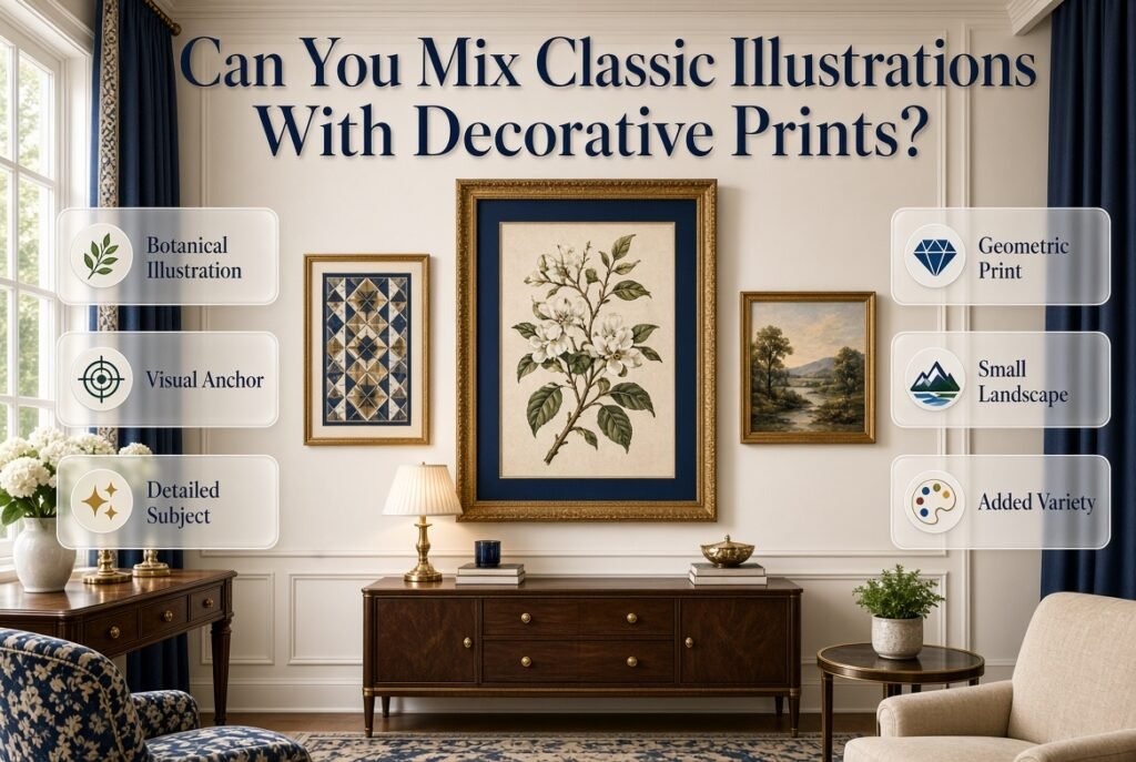
Yes.
The two categories can complement one another.
A classic illustration may provide detailed subject matter, while a decorative print can introduce color, pattern, or a simpler graphic shape.
For example:
Botanical illustration + geometric decorative print + small landscape
creates variety without requiring every artwork to look identical.
Explore Decorative Prints for another type of wall artwork that can be combined with traditional illustrations.
The Key Rule
Don’t let every piece compete equally.
One should act as the visual anchor.
The others should support it.
How Do You Mix Classic Illustrations With Framed Artwork?
“Framed artwork” is a broad category, so classic illustrations can easily become part of a larger framed-art collection.
For example:
- One botanical illustration
- One personal photograph
- One abstract print
- One architectural drawing
The frame can create the connection.
If all four pieces use different frames, different colors, and unrelated subjects, the wall may feel random.
If they share a consistent visual element, the arrangement becomes much easier to understand.
For more ideas, see Framed Artwork.
Can Personal Photographs Be Used With Classic Illustrations?
Yes, and this is one of the best ways to make a room feel personal.
A wall containing only decorative artwork can sometimes feel like a showroom.
Adding one or two personal photographs changes that.
Try:
Botanical illustration + personal photograph + architectural drawing
or:
Landscape + family photograph + floral illustration
The contrast between personal and decorative artwork creates a more collected feeling.
You can explore Personal Photographs for more ideas on integrating meaningful images into wall decor.
What About Patterned Wall Art?
Patterned wall art can add visual energy to a classic illustration arrangement.
However, pattern intensity matters.
If your room already contains:
- Striped bedding
- Gingham pillows
- Floral curtains
- Patterned rug
then adding heavily patterned wall art may make the room feel crowded.
Instead, choose a simpler illustration.
On the other hand, if the room is mostly solid colors, Patterned Wall Art can help create the missing visual interest.
A Useful Hierarchy
Try:
Strong textile pattern → medium illustration → simple supporting artwork
rather than:
Strong textile pattern → strong wall pattern → strong rug → strong curtains
The first arrangement gives the eye places to rest.
Should You Add Mirrors Near Classic Illustrations?
Mirrors and illustrations serve different purposes.
Illustrations provide subject matter.
Mirrors provide reflection and can help visually open the room.
Combining them can therefore create useful contrast.
For example:
Mirror + botanical illustration + small architectural print
can feel more varied than using three illustrations with similar shapes.
For practical ideas on combining reflective pieces with wall decoration, explore Mirrors.
Be careful with placement, however.
You don’t want the mirror reflecting a visually chaotic area.
Can Classic Illustrations Work With Inspirational Typography?
Yes, but typography should be used thoughtfully.
If the illustration is detailed, a simple typography piece can provide visual contrast.
For example:
Botanical illustration + simple typography + personal photograph
can create a balanced wall.
Avoid using several pieces of text together unless the room specifically calls for it.
A wall doesn’t need to communicate a message in every frame.
Sometimes artwork can simply be beautiful.
How Do You Coordinate Frames With Classic Illustrations?
The frame can completely change the appearance of an illustration.
Wood Frames
Wood frames feel:
- Warm
- Natural
- Traditional
- Relaxed
They work especially well with botanical and nature artwork.
Brass or Gold Frames
These can create:
- Elegance
- Warmth
- Traditional character
They work particularly well with navy, cream, white, and green palettes.
Black Frames
Black creates contrast and can make classic illustrations feel more contemporary.
Use it when the room already contains other dark accents.
White Frames
White frames feel light and clean.
They work especially well in bright rooms where you don’t want the artwork to feel heavy.
Should Every Frame Match?
Not necessarily.
Matching frames can create a polished appearance, but coordinated mismatched frames can create a more collected look.
A useful compromise is to repeat one characteristic.
For example:
- Different frame styles
- Same general wood tone
or:
- Different artwork
- Same cream mat
or:
- Different subjects
- Similar frame thickness
This gives you variety without visual disorder.
How Do You Use Classic Illustrations in a Bedroom?
The bedroom is one of the easiest places to use this type of artwork because the bed provides a natural visual anchor.
Consider these placements:
Above the Headboard
Use one large piece or a balanced arrangement.
Beside the Bed
Small vertical artwork can work well.
Above a Dresser
A larger illustration can anchor the furniture.
Near a Reading Chair
A botanical or architectural print can reinforce the quiet atmosphere.
Above a Desk
Choose something visually interesting but not distracting.
If you’re building the whole bedroom rather than only the wall, explore Preppy Room Bedroom and Preppy Room Bedroom Decor for broader styling ideas.
How Should Classic Illustrations Work With Preppy Furniture?
Furniture establishes the scale and personality of the room.
Classic illustrations should support that foundation.
If you have a traditional wooden dresser, an architectural or botanical illustration can reinforce its classic character.
If you have an upholstered contemporary bed, a cleaner botanical drawing can create an intentional mix of old and new.
For a broader furniture guide, see Preppy Room Furniture.
Remember
The artwork doesn’t have to match the furniture exactly.
It needs to belong to the same visual conversation.
How Do You Use Classic Illustrations in a Preppy Room Makeover?
A complete makeover doesn’t necessarily require replacing furniture.
Wall artwork can create a surprisingly significant change.
Start by photographing the room.
Then identify:
- Existing colors
- Main furniture
- Empty walls
- Existing artwork
- Patterns
- Areas that feel unfinished
Next, decide whether artwork should:
- Create a focal point
- Balance a large furniture piece
- Add color
- Introduce personality
- Fill a specific visual gap
If you’re planning a larger transformation, Preppy Room Makeover can complement the artwork-focused approach.
Pro Tip
Don’t buy artwork before understanding the wall.
Measure the space first.
Then choose artwork that fits the composition.
How Can DIY Projects Include Classic Illustrations?
Classic illustrations don’t always need to be expensive.
You can create your own decorative approach using:
- Reproduced public-domain-style artwork where legally appropriate
- Personal drawings
- Botanical studies
- Simple line art
- Carefully selected printable artwork
- Existing books or materials that you have permission to reproduce
For broader project ideas, explore DIY Preppy Room Decor.
The important part is quality and presentation.
Even inexpensive artwork can look polished when:
- The frame is appropriate
- The mat is clean
- The scale is correct
- The colors connect with the room
Classic Illustrations for Different Preppy Room Moods
Traditional and Elegant
Use:
- Botanical drawings
- Architectural illustrations
- Navy
- Cream
- Walnut
- Brass
- Structured frames
Keep the arrangement symmetrical.
Fresh and Modern
Use:
- Simple botanical artwork
- Clean frames
- Light wood
- Warm white
- Navy or sage accents
Keep the wall relatively uncluttered.
Soft and Feminine
Use:
- Floral illustrations
- Botanical studies
- Blush
- Cream
- Soft blue
- Light wood
Let the artwork provide subtle color.
Cozy and Relaxed
Use:
- Landscapes
- Botanical drawings
- Warm neutrals
- Natural wood
- Soft textiles
Prioritize warmth rather than formality.
Colorful
Use:
- Multicolor botanical illustrations
- Playful animal drawings
- Floral artwork
- Colorful decorative prints
Keep the number of dominant colors under control.
How Do You Avoid Making Classic Illustrations Look Old-Fashioned?
Classic doesn’t have to mean dated.
The easiest way to modernize traditional artwork is to change its surroundings.
Pair a traditional illustration with:
- Clean-lined furniture
- Simple bedding
- Contemporary lighting
- Minimal accessories
- Natural materials
- Plenty of negative space
For example:
Traditional botanical print + modern white nightstand + simple navy bedding
can feel much more current than:
Traditional botanical print + traditional furniture + heavily patterned bedding + ornate accessories
The artwork remains classic.
The overall composition becomes modern.
Common Mistakes When Decorating With Classic Illustrations
Mistake 1: Choosing Artwork Before Choosing the Room Palette
This often happens because people fall in love with a beautiful print.
The problem is that the print may introduce colors that don’t exist anywhere else in the room.
Better Approach
Establish the palette first.
Then choose artwork that connects with it.
Mistake 2: Using Too Many Different Subjects
A gallery wall containing:
- Animals
- Maps
- Flowers
- Typography
- Abstract shapes
- Photographs
- Architecture
can quickly become visually confusing.
Better Approach
Choose a common theme.
For example:
Nature + architecture
or:
Botanical + personal
or:
Traditional academic artwork
Mistake 3: Making Every Artwork the Same Size
Uniform sizes can sometimes look rigid.
A more interesting arrangement often uses different scales.
Try:
- One large piece
- Two medium pieces
- Several small supporting pieces
The important thing is maintaining balance.
Mistake 4: Ignoring Negative Space
People often think an empty wall is a problem.
It isn’t.
Negative space allows the artwork to breathe.
If every wall is decorated, individual pieces lose importance.
Mistake 5: Matching Everything Too Closely
If the artwork, bedding, pillows, curtains, and rug all contain the same pattern, the room can feel overly coordinated.
Instead, repeat colors rather than repeating every design.
Mistake 6: Hanging Artwork Too High
Artwork that floats far above furniture can disconnect the wall from the rest of the room.
Think about the entire furniture-and-wall composition.
Mistake 7: Ignoring the Frame
A beautiful illustration can still look wrong if the frame clashes with the room.
Always consider:
- Wood tone
- Metal finish
- Frame thickness
- Mat color
- Overall scale
Mistake 8: Filling Every Empty Space
Not every empty wall needs artwork.
Some walls should remain quiet.
This makes the decorated areas more meaningful.
A Professional Method for Choosing Classic Illustrations
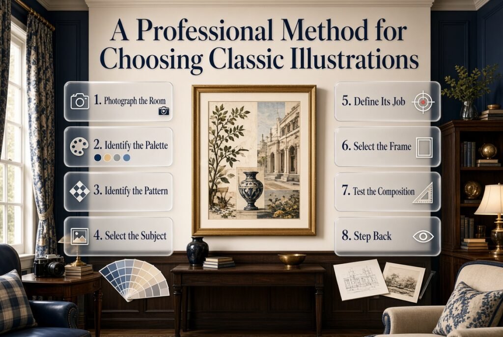
If you’re unsure where to begin, use this sequence.
Step 1: Photograph the Room
Take photographs from several angles.
This helps you see the room more objectively.
Step 2: Identify the Existing Palette
Write down the three or four colors that appear most often.
Step 3: Identify the Main Pattern
Is it:
- Stripe?
- Gingham?
- Floral?
- Plaid?
- Geometric?
Your artwork should support rather than fight that pattern.
Step 4: Select the Subject
Choose botanical, architectural, animal, landscape, or another appropriate subject.
Step 5: Decide the Artwork’s Job
Is it supposed to:
- Be the focal point?
- Fill a small space?
- Balance furniture?
- Add color?
- Create a gallery wall?
Step 6: Select the Frame
Choose a frame based on the room’s existing finishes.
Step 7: Test the Composition
Before hanging, place everything on the floor or use paper templates on the wall.
Step 8: Step Back
Look from across the room.
The artwork needs to work from a distance, not only up close.
How Do You Combine Classic Illustrations With a Gallery Wall?
A gallery wall should feel intentional but not mechanically perfect.
Start with your largest piece.
Then build around it.
A useful arrangement could be:
        [ Small ]
[ Medium ] [ LARGE ] [ Small ]
        [ Medium ]
The actual arrangement can vary.
What matters is that the visual weight is distributed.
Don’t place all dark frames on one side and all light frames on the other unless that imbalance is intentional.
Expert Tip
Lay everything on the floor first.
Take a photograph.
Look at the photograph instead of constantly rearranging the wall itself.
This often makes visual problems easier to identify.
How Do Classic Illustrations Work With Mirrors?
Mirrors can interrupt a wall-art sequence in a useful way.
For example:
[Botanical] [Mirror] [Architecture]
The mirror becomes a reflective focal point while the illustrations provide subject matter.
The arrangement works best when:
- Frames coordinate
- Spacing feels intentional
- The mirror is proportional
- The reflected view is attractive
This is particularly useful for bedrooms and dressing areas.
How Do Classic Illustrations Work With Personal Photographs?
A personal photograph adds something that decorative artwork cannot: direct personal meaning.
That makes the combination especially useful.
For example:
Botanical Illustration
        +
Personal Photograph
        +
Architectural Drawing
The wall now includes nature, memory, and place.
That feels more personal than a wall containing only commercially selected decorative pieces.
How Do Classic Illustrations Work With Decorative Prints?
Think of the difference this way:
Classic illustration = subject and detail
Decorative print = color and graphic personality
Combining them allows the wall to have both.
For example:
- Botanical illustration
- Navy geometric print
- Small cream decorative print
The illustration provides complexity while the decorative prints support the palette.
For an easy way to add both personality and practical storage to your room, explore these decorative shelves for ideas on arranging books, artwork, small accessories, and meaningful accents without making the space feel cluttered.
How Do Classic Illustrations Fit Into a Full Preppy Room?
A successful preppy room doesn’t treat wall art as an isolated category.
Instead, the artwork should connect with:
- Bedding
- Curtains
- Rugs
- Furniture
- Lighting
- Mirrors
- Decorative objects
- Personal items
For a broad overview, explore Preppy Room Ideas, Preppy Room Decor, Preppy Room Inspo, and Preppy Room Aesthetic.
These broader concepts are useful because classic illustrations become much easier to style once the room already has a clear visual direction.
Classic Illustrations With LED Lighting
LED lighting can be incorporated into a preppy room, but it should not overpower traditional artwork.
If the room includes classic illustrations, consider using lighting that supports rather than competes with them.
For example:
- Warm ambient lighting
- Soft desk lighting
- Under-shelf lighting
- Subtle accent illumination
If you want a more contemporary room with lighting elements, explore Preppy Room With LED Lights.
The key is maintaining visual balance.
A very bright or colorful lighting effect can make traditional artwork feel disconnected.
Classic Illustrations in Pink Preppy Rooms
Pink rooms can use classic illustrations beautifully.
Consider:
- Botanical flowers
- Botanical leaves
- Birds
- Butterflies
- Soft landscapes
- Traditional architectural sketches
For a more complete pink direction, explore Pink Preppy Room.
You can also compare it with Aesthetic Pink Preppy Room when deciding how soft, modern, or decorative you want the room to feel.
For additional color and styling ideas, Pink Preppy Room Ideas can help you develop the wider room around the artwork.
Classic Illustrations and Aesthetic Preppy Decor
An aesthetic room shouldn’t be created by collecting random attractive objects.
It needs a visual system.
Classic illustrations can support that system through:
- Consistent framing
- Coordinated colors
- Repeated subject matter
- Controlled scale
- Intentional placement
For broader inspiration, explore Aesthetic Preppy Room Decor.
The artwork should contribute to the aesthetic rather than becoming an isolated statement.
Classic Illustrations in a Complete Decor Plan
If you’re building an entire room, work in layers.
Layer 1: Foundation
Choose:
- Wall color
- Flooring
- Main furniture
Layer 2: Textiles
Add:
- Bedding
- Curtains
- Rugs
- Cushions
Layer 3: Wall Decor
Add:
- Classic illustrations
- Framed artwork
- Mirrors
- Decorative prints
Layer 4: Personal Details
Add:
- Photographs
- Books
- Collections
- Meaningful objects
Layer 5: Editing
Remove anything that doesn’t contribute.
This approach prevents the room from becoming overloaded.
For a wider collection of styling ideas, explore Preppy Room Decor Ideas.
Classic Illustrations for Different Room Sizes
Small Room
Use fewer pieces.
A single medium-to-large illustration can create enough interest without crowding the walls.
Medium Room
You have more flexibility.
Try:
- One focal artwork
- Small supporting artwork
- Mirror
- Personal photograph
Large Room
Larger walls can handle:
- Oversized artwork
- Gallery walls
- Pairs of illustrations
- Larger compositions
The key is scale.
Large walls require enough visual weight.
How Can You Make Classic Illustrations Feel Expensive?
You don’t necessarily need expensive artwork.
Presentation often makes a major difference.
Focus on:
Good Proportion
Artwork should suit the wall.
Appropriate Framing
A simple, well-chosen frame can look better than an elaborate frame that clashes with the room.
Clean Matting
A mat can create breathing room around the artwork.
Consistent Spacing
Gallery walls look more intentional when the spacing is controlled.
Quality Printing
If the artwork is blurry or poorly reproduced, the final result will suffer.
Good Lighting
Artwork should be visible without harsh glare.
What Are Classic Illustrations and How Are They Used in Interior Decor?
Classic illustrations are artwork based on timeless subjects, traditional drawing styles, natural forms, historical references, or detailed visual studies. Common examples include botanical drawings, floral studies, birds, animals, architectural sketches, landscapes, maps, and vintage-inspired artwork. They can be used to add character, color, visual interest, and a more collected feeling to a room.
In interior decor, their biggest advantage is flexibility. A classic illustration doesn’t have to make the entire room look old-fashioned. When paired with modern furniture, simple frames, coordinated colors, and clean surroundings, it can create a balanced combination of traditional and contemporary design.
Useful ways to use classic illustrations:
Place one larger illustration above a bed, dresser, or desk as a focal point.
Use botanical or floral illustrations to introduce natural colors.
Combine architectural artwork with traditional furniture for a refined appearance.
Use smaller illustrations as part of a carefully planned gallery wall.
Choose artwork that repeats one or two colors already present in the room.
The most important consideration is how the illustration relates to the rest of the room. A beautiful artwork can still feel out of place if its colors, scale, or subject don’t connect with the surrounding design.
What Types of Classic Illustrations Work Best in a Preppy Room?
The best classic illustrations for a preppy room are those that complement the room’s traditional, organized, and coordinated character. Botanical drawings, architectural illustrations, birds, animals, floral studies, landscapes, nautical artwork, and vintage-inspired decorative illustrations are particularly versatile.
Rather than choosing artwork simply because it looks attractive on its own, consider the existing furniture, patterns, and color palette. For example, a navy-and-white room can work beautifully with a botanical or architectural illustration using navy, cream, muted green, or soft blue.
Popular choices include:
Botanical illustrations: Ideal for adding natural detail and subtle color.
Architectural drawings: Useful for creating a sophisticated, collected appearance.
Bird and animal illustrations: Good for adding personality without relying on bold modern graphics.
Floral artwork: Works particularly well with softer preppy palettes.
Landscape illustrations: Suitable for bedrooms, reading areas, and cozy interiors.
Nautical illustrations: A natural choice for blue, navy, white, and coastal-inspired palettes.
The key is to maintain a visual connection. You don’t need every artwork to match perfectly; instead, let the illustrations share colors, framing, subject matter, or an overall traditional character.
How Do You Choose the Right Classic Illustration for Your Room?
Choosing the right illustration starts with the room rather than the artwork. Before buying anything, look at the colors, furniture, patterns, wall size, and existing decorations. The goal is to select artwork that fills a genuine visual need instead of simply adding another attractive object.
Start by identifying the room’s dominant colors. If the space already contains navy, cream, and sage, an illustration using those shades can connect the different elements naturally. If the room has bold patterned bedding, choose a quieter illustration so the wall doesn’t compete with the textiles.
Use this simple selection process:
Check the color palette: Look for artwork that complements existing colors.
Consider the furniture: Traditional furniture can support detailed illustrations, while modern furniture may benefit from simpler artwork.
Measure the wall: Artwork should be proportional to the furniture and available wall space.
Think about visual weight: Dark or highly detailed artwork attracts more attention.
Decide its purpose: Determine whether the piece will be a focal point, supporting decoration, or part of a gallery wall.
Consider the frame: The frame should work with the furniture finishes and overall room style.
A professional-looking room usually comes from relationships between elements, not from individually expensive pieces. If the artwork connects with the room’s colors, scale, and style, even a relatively simple illustration can look thoughtfully selected.
How Do You Style Classic Illustrations on a Gallery Wall?
Styling classic illustrations on a gallery wall works best when you create a sense of connection without making every piece identical. You can combine botanical illustrations, architectural drawings, personal photographs, decorative prints, and other artwork as long as there is a clear visual relationship between them.
Start with the largest or most important piece and build the arrangement around it. Then introduce smaller pieces to balance the composition. You can create unity through similar frame finishes, repeated colors, consistent matting, related subjects, or controlled spacing.
A balanced gallery wall might include:
One larger botanical illustration
One architectural drawing
One personal photograph
One smaller decorative print
One complementary landscape or nature illustration
Avoid adding pieces simply to fill empty spaces. A gallery wall usually looks more polished when there is enough negative space around the individual artworks.
Before hanging anything:
Arrange the pieces on the floor first.
Photograph the proposed layout.
Check whether the visual weight is balanced.
Keep spacing relatively consistent.
Make sure the largest piece has enough supporting artwork around it.
Step back and view the arrangement from across the room.
The goal isn’t perfect symmetry. The goal is visual balance. A slightly varied arrangement can actually feel more personal and collected than a perfectly identical grid.
How Can You Make Classic Illustrations Look Modern and Stylish?
Classic illustrations can look completely current when the surrounding design is edited and intentional. The artwork itself doesn’t necessarily determine whether a room feels old-fashioned or modern. Furniture, framing, color, lighting, spacing, and the number of decorative elements all influence the final appearance.
One of the easiest ways to modernize traditional artwork is to give it room to breathe. Instead of surrounding a classic illustration with many ornate accessories, pair it with clean furniture, simple bedding, restrained colors, and plenty of negative space.
Try these professional styling techniques:
Use a simple black, white, natural wood, or slim metallic frame.
Pair detailed illustrations with clean-lined furniture.
Keep the surrounding wall relatively uncluttered.
Repeat one color from the artwork elsewhere in the room.
Combine one traditional illustration with a simpler modern print.
Use larger artwork rather than filling every wall with small pieces.
Avoid combining too many competing patterns around the artwork.
For example, a traditional botanical illustration can look fresh above a simple white dresser with navy accessories and modern lighting. The artwork remains classic, but the surrounding elements give it a more contemporary context.
The strongest result comes from mixing timeless artwork with controlled modern elements rather than trying to make every part of the room look modern.
Conclusion
Classic illustrations can bring a timeless sense of character, detail, and personality to a preppy room without making the space feel outdated or overly formal. From botanical drawings and floral studies to architectural sketches, landscapes, birds, and traditional artwork, the right illustration can become an important part of the room’s overall design.
The key is not simply choosing a beautiful picture. It is choosing artwork that works with the colors, furniture, patterns, scale, and atmosphere already present in the room. A carefully selected illustration can repeat an existing color, balance a large piece of furniture, create a focal point, or add interest to an otherwise simple wall.
You also don’t need to cover every wall with artwork. One thoughtfully positioned illustration can sometimes have more impact than a crowded collection of unrelated pieces. When creating a gallery wall, focus on relationships between the pieces through color, framing, subject matter, spacing, or overall style.
Most importantly, let the artwork reflect the feeling you want your room to have. Classic illustrations work particularly well because they can adapt to traditional, modern, cozy, cute, minimal, and colorful preppy interiors. With the right presentation, even a traditional illustration can feel fresh and contemporary.
A well-decorated room isn’t about following every trend or matching every item perfectly. It’s about selecting pieces that feel connected and meaningful. When classic illustrations are chosen with attention to proportion, color, framing, and placement, they can give a preppy room the collected, personal, and timeless character that makes the space feel truly finished.