Introduction
Blue,Cream and Navy Color Palette | Choosing colors for a room sounds simple until you actually have to put them together. You may love soft blue, warm cream, and deep navy individually, but the real challenge is making them look intentional when they appear on walls, bedding, furniture, rugs, curtains, and accessories.
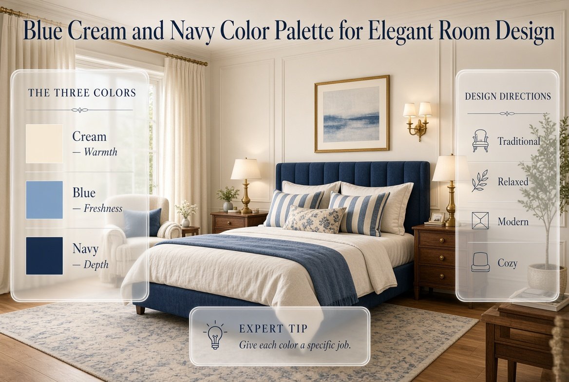
A blue, cream and navy color palette solves that problem beautifully because the three shades naturally create different visual roles. Cream provides warmth and breathing space, blue adds freshness and personality, and navy brings depth and contrast.
For anyone building a polished preppy interior, this combination is especially useful. It can feel traditional with stripes and brass, relaxed with linen and natural wood, modern with clean furniture, or cozy with layered fabrics and warm lighting.
If you’re starting your decorating journey and want broader inspiration before choosing a specific palette, the Preppy Room homepage is a useful place to explore different room styles, color ideas, layouts, and decorating directions.
The most important thing to remember is that you don’t need equal amounts of blue, cream, and navy. In fact, the room usually looks better when each color has a specific job.
This guide explains exactly how to choose the right shades, balance them, use patterns, select furniture and materials, decorate different rooms, avoid common mistakes, and create a blue, cream and navy interior that feels polished rather than overly matched.
What Is a Blue, Cream and Navy Color Palette?
A blue, cream and navy color palette combines a lighter or medium blue with a warm cream neutral and a deep navy accent. Blue provides the main color personality, cream creates visual space and warmth, while navy adds contrast and grounding.
The three colors belong to the same general visual family, which makes them easy to layer.
Instead of treating them as three unrelated colors, think of them as different levels of intensity.
Cream = light foundation
Blue = fresh supporting color
Navy = deep accent
This relationship allows you to create depth without constantly introducing new colors.
For example, a bedroom could use:
- Cream walls
- Light blue bedding
- Navy headboard
- Cream curtains
- Blue patterned cushions
- Navy artwork
- Natural wood furniture
- Brass lighting
Nothing has to match perfectly.
The colors simply need to repeat enough times for the room to feel connected.
Why Is This Palette So Versatile?
The combination can be adjusted according to the room and the mood you want.
More cream creates a brighter and softer room.
More blue creates a fresher and more colorful room.
More navy creates a dramatic and sophisticated appearance.
You can therefore use the same basic palette in several completely different ways.
A classic room may use navy stripes, cream upholstery, dark wood, and brass.
A modern room might use blue-gray, warm cream, light oak, and minimal navy.
A cozy room could use dusty blue, warm cream, textured fabrics, and muted navy.
The colors stay connected while the style changes.
Why Do Blue, Cream and Navy Work So Well Together?
The combination works because it balances cool and warm visual qualities.
Blue and navy are naturally cooler colors, while cream has a warmer and softer appearance. Cream prevents the room from feeling overly cold, while the blue shades stop the neutral foundation from becoming plain.
There is also a useful contrast between the lightest and darkest shades.
Cream gives the eye somewhere to rest.
Blue provides the main visual interest.
Navy creates an anchor.
This is why a room can contain several blue shades without feeling random when the colors are distributed carefully.
Cream Creates Breathing Space
Cream is particularly useful on large surfaces.
You can use it for:
- Walls
- Rugs
- Curtains
- Bedding
- Upholstery
- Lampshades
- Large furniture pieces
When cream occupies the larger areas, blue and navy become more noticeable without needing to be used excessively.
Blue Adds Personality
Blue can become the room’s main decorative color.
Depending on the shade, it can feel:
- Calm
- Fresh
- Traditional
- Cheerful
- Sophisticated
- Relaxed
Pale blue creates a softer atmosphere, while medium blue has more energy.
Navy Creates Depth
Navy is especially useful because it gives the palette a dark anchor without the visual harshness that black can sometimes create.
A navy headboard, sofa, chair, rug detail, or collection of cushions can give the entire room more definition.
Pro Tip: If your room feels too pale or flat, adding a few carefully repeated navy details can create more depth without requiring a complete redesign.
How Should You Balance Blue, Cream and Navy?
The easiest approach is to establish a dominant color, a supporting color, and an accent color.
Cream is often the easiest dominant color because it works well across large surfaces.
Blue can then become the supporting color.
Navy can act as the darker accent.
A starting formula might look like this:
| Color | Approximate Visual Role | Best Uses |
|---|---|---|
| Cream | Dominant | Walls, rugs, curtains, bedding |
| Blue | Supporting | Bedding, cushions, artwork, upholstery |
| Navy | Accent | Headboard, sofa, cushions, frames |
| Wood | Material accent | Furniture, shelves, tables |
| Brass | Finish | Lighting, hardware, frames |
These aren’t strict decorating percentages.
The purpose is simply to create visual hierarchy.
A navy sofa has much more visual weight than a small navy cushion, so you shouldn’t judge balance by counting individual objects.
Can You Use More Navy?
Yes.
If you want a dramatic room, navy can occupy a larger area.
For example:
- Navy accent wall
- Cream bed
- Light blue bedding
- Cream rug
- Natural wood furniture
- Brass lamps
The key is increasing the amount of light and warm elements around the navy.
If the room has limited natural light, too many dark surfaces may make it feel smaller or heavier.
How to Balance a Blue, Cream and Navy Color Palette
A blue, cream, and navy color palette works especially well when you want a space to feel timeless, layered, and sophisticated without relying on too many colors. A practical approach is to use cream as the dominant base, introduce blue as a secondary color, and reserve navy for stronger accents or statement pieces. For example, cream walls and textiles can create an open foundation, while blue bedding, cushions, artwork, or curtains add softness and visual interest. Navy can then be used on a headboard, accent chair, lamp, decorative trim, or selected accessories to create depth and definition. Adding natural wood, woven textures, or small brass details can further soften the contrast and make the palette feel more complete. For more detailed guidance on coordinating these shades across different room elements, explore our blue, cream and navy color palette guide.
Which Shade of Blue Works Best With Cream and Navy?

There isn’t one perfect blue.
The best shade depends on your lighting, furniture, flooring, and desired atmosphere.
Light Blue
Light blue is excellent when you want the room to feel airy and relaxed.
It works particularly well with:
- Cream
- Navy
- Light wood
- Brass
- White
- Soft green
It is an easy choice for bedrooms because it doesn’t visually dominate the room.
Powder Blue
Powder blue creates a softer and slightly more youthful appearance.
It works beautifully with cream and navy when you’re creating a cute or traditional preppy room.
For example:
Cream walls + powder blue bedding + navy cushions + brass lamp
creates a gentle layered palette.
Dusty Blue
Dusty blue has a muted quality that makes it easier to combine with warm neutrals.
It’s useful when you want the room to feel sophisticated rather than overly bright.
Medium Blue
Medium blue has more visual strength and can become the main accent.
It works well on:
- Accent chairs
- Curtains
- Bedding
- Artwork
- Rugs
- Decorative cushions
Blue-Gray
Blue-gray is particularly useful for modern interiors.
Its slightly muted appearance works well with warm cream, light wood, simple furniture, and restrained patterns.
Navy
Navy is the deepest blue in the palette and should usually have a deliberate role.
It works particularly well on:
- Upholstered headboards
- Sofas
- Accent chairs
- Curtains
- Bedding
- Rugs
- Accent walls
- Artwork
How Do You Choose the Right Cream?
Cream may look simple, but different cream shades can have very different undertones.
Some creams lean yellow.
Some lean beige.
Others are closer to ivory.
This matters because your cream needs to work with the existing flooring, furniture, fabrics, and lighting.
A cream that looks beautiful in a showroom may appear noticeably different in your room.
Always Test Cream in the Actual Room
Look at your sample:
- In morning light
- Around midday
- In the evening
- Under artificial lighting
- Next to your furniture
- Against your flooring
If possible, place several samples next to one another.
This makes undertones easier to notice.
Expert Tip: Don’t choose a cream based only on an online photograph. Lighting and surrounding colors can significantly change how warm or cool it appears.
How Can You Use the 60-30-10 Rule With This Palette?
The 60-30-10 rule is a useful starting framework for distributing colors.
Approximately:
60% = dominant color
30% = supporting color
10% = accent
For a blue, cream and navy room, that could become:
60% cream
30% blue
10% navy
For example:
- Cream walls
- Cream rug
- Cream curtains
- Blue bedding
- Blue artwork
- Navy cushions
- Navy lamp details
The exact percentages don’t need to be calculated.
The purpose is to prevent every color from becoming equally dominant.
Can You Reverse the Formula?
Absolutely.
For a dramatic room, you might use:
- 50% cream
- 20% light blue
- 30% navy
This could work with a navy accent wall or large navy sofa.
The important thing is to maintain enough lighter space to balance the darker color.
Blue, Cream and Navy Color Palette for a Bedroom
Bedrooms are one of the best places to use this palette because bedding provides an easy opportunity to layer colors.
Start with the largest visual element: the bed.
A strong combination might include:
- Cream duvet
- Navy headboard
- Light blue pillows
- Navy accent cushions
- Cream textured throw
- Blue-and-cream patterned cushion
- Natural wood nightstands
- Brass bedside lamps
The colors become more interesting when their textures are different.
For example, smooth cotton, knitted fabric, linen, velvet, and woven materials can all appear within the same palette.
This prevents the room from looking flat.
If you’re planning a complete blue-and-cream bedroom, you can also explore blue and cream bedroom design ideas for more room-specific ways to combine furniture, bedding, patterns, and accessories.
How Do You Choose Blue and Cream Bedding?
Bedding is often the easiest place to introduce the palette because it can be changed without repainting the room.
One approach is:
- Cream duvet
- Navy pillowcases
- Light blue cushions
- Blue-and-cream striped throw
- Navy blanket
Another is:
- Navy duvet
- Cream sheets
- Light blue decorative pillows
- Cream throw
- Blue patterned cushion
The second option has stronger contrast.
The first feels softer and more flexible.
For more ideas focused specifically on textiles, explore these blue and cream bedding ideas.
Should Everything on the Bed Match?
Not necessarily.
In fact, exact matching can make a bedroom look overly coordinated.
Instead, repeat the colors while changing:
- Texture
- Pattern
- Fabric
- Scale
- Shade
For example, use navy in a smooth pillowcase, a striped cushion, and a woven throw.
The navy repeats, but the materials remain different.
How to Apply a Blue and Cream Palette Throughout Your Home
A blue and cream color palette can be adapted beautifully to different rooms when you adjust the shade, proportion, and supporting materials to suit each space. Keep cream as the foundation on larger surfaces such as walls, rugs, curtains, or upholstery, then introduce blue through furniture, textiles, artwork, and decorative accents. In a bedroom, softer blue tones can create a calm atmosphere, while navy can give a living room or study greater depth and sophistication. To keep the palette connected from one room to another, repeat a few consistent elements such as natural wood, woven textures, warm metals, or similar blue accents. For more practical ideas on applying the palette according to different room types, explore our blue and cream color palette for rooms guide for room-by-room inspiration and styling guidance.
How Can You Use a Blue and Cream Bedroom Color Scheme?
The easiest way to establish a bedroom color scheme is to decide where each shade will appear before buying accessories.
For example:
| Bedroom Element | Suggested Color |
|---|---|
| Walls | Warm cream |
| Headboard | Navy |
| Duvet | Cream |
| Decorative pillows | Blue |
| Throw | Navy |
| Rug | Cream and blue |
| Curtains | Cream |
| Nightstands | Natural wood |
| Lamps | Brass |
| Artwork | Blue, cream and navy |
This creates a visual path through the room.
The eye notices cream first across the larger surfaces, then blue through textiles, and finally navy through stronger accents.
If you’re working on the full room scheme, this blue and cream bedroom color scheme guide can complement the broader palette planning.
How Do You Use Blue, Cream and Navy in a Living Room?
A living room usually contains larger furniture, so color balance becomes especially important.
One classic arrangement is:
- Navy sofa
- Cream walls
- Cream rug
- Natural wood coffee table
- Blue cushions
- Cream curtains
- Navy artwork
- Brass floor lamp
Here, the sofa provides the main anchor.
The cream surfaces keep the room bright.
The smaller blue and navy details connect everything.
What If You Don’t Want a Navy Sofa?
Use a cream sofa instead.
Then introduce navy through:
- Accent chair
- Cushions
- Rug
- Curtains
- Artwork
- Side table accessories
This gives you greater flexibility because the main furniture remains neutral.
How Can You Use Navy Without Making the Room Too Dark?

Navy is powerful because it has significant visual weight.
The most common mistake is using it on too many large surfaces.
For example, navy walls, navy sofa, navy curtains, and navy rug can quickly make a room feel heavy.
Instead, create repetition without concentration.
You might use:
- Navy sofa
- Small navy cushion
- Navy artwork
- Navy lamp detail
Now navy appears in several areas but doesn’t dominate everything.
What Warms Up Navy?
Several materials work particularly well:
- Natural wood
- Brass
- Cream
- Beige
- Woven materials
- Linen
- Warm lighting
These elements soften the stronger visual effect of navy.
Common Mistake: Adding more colors when the room feels too cold.
Often the better solution is to add warmer materials, not another bright color.
What Patterns Work Best With Blue, Cream and Navy?
This palette is especially suitable for classic preppy patterns.
Popular options include:
- Stripes
- Gingham
- Plaid
- Checks
- Florals
- Geometric patterns
The key is not to use every pattern at the same intensity.
Instead, establish a hierarchy.
For example:
Large pattern: rug
Medium pattern: bedding
Small pattern: cushion
Solid: throw
This gives the eye areas of rest.
Can You Mix Stripes and Florals?
Yes.
A navy-and-cream stripe can work beautifully beside a softer floral pattern.
The trick is making sure the colors overlap.
For example, if your floral contains:
- Navy
- Light blue
- Cream
- Sage
then a navy-and-cream stripe will naturally relate to it.
The patterns don’t need to be identical.
They need to share a visual connection.
How Do You Use Natural Wood With This Palette?
Natural wood is one of the best supporting materials for blue, cream, and navy.
It adds warmth without introducing another strong color.
You can use it through:
- Bed frames
- Nightstands
- Coffee tables
- Shelves
- Desks
- Picture frames
- Storage furniture
Light oak creates a fresh and modern feeling.
Medium wood creates a more traditional appearance.
Walnut can create a richer, more sophisticated room.
Choose the wood based on the overall style rather than trying to match every piece exactly.
Does Brass Work With Blue, Cream and Navy?
Brass works particularly well because it adds warmth and a polished finish.
Try brass on:
- Lamps
- Drawer pulls
- Mirror frames
- Picture frames
- Small decorative objects
You don’t need brass everywhere.
A few repeated brass details are usually enough.
For a classic preppy room, brass and navy are particularly effective.
For a modern room, use fewer brass details and keep the furniture simpler.
How Do You Create a Classic Blue, Cream and Navy Preppy Room?
The classic version can use more traditional patterns and furniture.
Start with:
- Warm cream
- Navy
- Medium blue
- Natural or dark wood
- Brass
Then introduce:
- Stripes
- Plaid
- Gingham
- Floral fabrics
- Framed artwork
- Tailored curtains
Symmetry can also strengthen the classic appearance.
For example:
- Matching bedside tables
- Matching lamps
- Two framed artworks
- Balanced cushions
The room doesn’t have to be perfectly symmetrical, but a sense of order helps create the traditional preppy feeling.
For a wider exploration of traditional styling, you can connect this palette with classic preppy room ideas.
How Do You Create a Modern Blue, Cream and Navy Room?
A modern version uses the same colors but reduces visual clutter.
Try:
- Warm cream walls
- Blue-gray sofa or bed
- Navy accent
- Light wood
- Simple artwork
- Minimal patterns
- Clean furniture
Instead of five cushions, use two or three.
Instead of several competing artworks, choose one larger piece.
Instead of many decorative accessories, select a few items with purpose.
The result feels modern while retaining the classic color relationship.
For more contemporary inspiration, see modern preppy room ideas.
How Do You Create a Cozy Blue, Cream and Navy Room?
A cozy room depends heavily on texture.
The palette can remain simple:
Cream + dusty blue + navy
Then layer:
- Quilts
- Throws
- Soft rugs
- Linen
- Cotton
- Woven baskets
- Cushions
Warm lighting is also important.
A room with beautiful colors can still feel uncomfortable if the lighting is harsh.
Use several light sources rather than depending entirely on one ceiling fixture.
For more ideas, explore cozy preppy room inspiration.
How Do You Create a Cute Version of This Palette?
A cute interpretation can use lighter blues and softer accents.
Try:
- Cream
- Powder blue
- Soft navy
- Blush
- Small amounts of green
Patterns such as gingham and small florals work especially well.
The important thing is to maintain a neutral foundation.
If every item is colorful, the room may lose the polished quality associated with preppy design.
For additional inspiration, see cute preppy room ideas.
How Do You Create a Minimal Blue, Cream and Navy Room?
Minimal does not mean completely colorless.
A simple palette could be:
- Cream walls
- Navy headboard
- Light blue bedding
- Natural wood
- One patterned cushion
- One framed artwork
- Brass lamp
That’s enough.
The key is removing objects that don’t serve a visual or practical purpose.
Use quality textures instead of lots of decorations.
This approach works particularly well when the room is small.
You can explore minimal preppy room ideas if you want to simplify the overall design further.
How Does Room Size Affect This Color Palette?
Room size doesn’t determine whether you can use navy.
It affects how you distribute it.
Small Room
Use:
- More cream
- Light blue
- Limited navy
- Light furniture
- Mirrors
- Simple patterns
Medium Room
You can increase the amount of navy and introduce larger patterned pieces.
Large Room
You have more freedom to use:
- Navy furniture
- Large rugs
- Darker accent walls
- Multiple patterns
- Larger artwork
But even a large room needs visual balance.
How Does Natural Light Change Blue and Navy?
Natural light can dramatically change the appearance of blue.
A room with strong daylight may make blue appear brighter and cleaner.
A darker room can make navy appear deeper.
This is why paint samples should be tested in the actual room.
Look at the color during different parts of the day.
Don’t rely entirely on a phone screen or online photograph.
North-Facing or Low-Light Rooms
In darker spaces, warm cream can help prevent the palette from feeling too cool.
Use natural wood and warm lighting to add further warmth.
Bright Rooms
Bright spaces can handle stronger navy and medium blue more comfortably.
What Accent Colors Work With Blue, Cream and Navy?

You don’t need a fourth color, but small accents can work beautifully.
Sage Green
Creates a natural and relaxed appearance.
Soft Pink
Adds warmth and a slightly playful feeling.
Burgundy
Creates a richer traditional atmosphere.
Red
Works particularly well in classic preppy rooms when used sparingly.
Beige
Adds another warm neutral layer.
Brass
Acts more like a finish than a competing color and works especially well with navy.
The rule is simple: introduce additional colors only when they improve the room.
Don’t add them because the palette seems like it “needs more.”
How Can You Use Blue and Cream in a Multicolor Palette?
Blue and cream can serve as the foundation for additional colors.
For example:
Cream + soft blue + navy + sage
creates a calm and sophisticated palette.
Or:
Cream + navy + blush + natural wood
creates a softer and more decorative room.
This approach is useful because cream provides a neutral base while blue and navy establish the identity.
You can then add one small accent without losing control.
For more detailed combinations, see blue and cream color combinations.
How Do You Use Different Blue Shades Together?
Using several blues can actually make the room feel more sophisticated.
Try:
- Powder blue
- Dusty blue
- Medium blue
- Navy
The trick is to vary intensity.
For example:
Cream walls
Powder blue bedding
Medium blue artwork
Navy headboard
This creates a visual gradient from light to dark.
You don’t need to use only one blue throughout the room.
Can Blue and Navy Be Used Together?
Absolutely.
Navy is simply a deeper blue, so the relationship is naturally compatible.
The easiest method is to use the lighter blue on larger textile areas and navy on smaller or stronger pieces.
For example:
- Light blue bedding
- Navy headboard
- Cream rug
- Blue artwork
- Navy cushions
This gives the room depth without requiring another color.
How Do You Make the Palette Look Expensive?
A polished room isn’t necessarily about expensive furniture.
It is more about consistency.
Focus on:
Better Proportions
Don’t let one color dominate accidentally.
Repeated Colors
Repeat important shades throughout the room.
Quality-Looking Textures
Linen, woven materials, wood, and velvet can add visual richness.
Controlled Patterns
Use fewer patterns but choose them intentionally.
Warm Lighting
Good lighting can make cream, blue, and navy feel significantly more refined.
Less Clutter
Too many small decorative items can weaken even a beautiful palette.
Expert Tip: If a room doesn’t feel sophisticated, don’t automatically buy more decor. First remove anything that isn’t contributing to the color story.
What Are the Most Common Mistakes?
Using Too Much Navy
Navy is visually strong.
Solution: balance it with cream and lighter blue.
Using Too Many Blue Shades
Five unrelated blues can make the room look accidental.
Solution: choose two or three related blues.
Making Everything Match
Exact matching often looks less natural.
Solution: repeat colors while varying texture and pattern.
Ignoring Undertones
Cream, wood, and blue can have different undertones.
Solution: test them together.
Using Too Many Patterns
Stripes, gingham, plaid, and florals can all be beautiful, but together they need hierarchy.
Solution: use one dominant pattern and quieter supporting patterns.
Adding Too Many Accent Colors
If you already have blue, cream, and navy, you may not need five additional colors.
Solution: add one supporting accent when necessary.
Forgetting Texture
A room can have perfect colors and still feel flat.
Solution: mix fabrics and materials.
Buying Accessories Too Early
Small accessories shouldn’t determine the entire room.
Solution: choose the major surfaces and furniture first.
How Can You Build This Palette Step by Step?
Step 1: Identify Your Starting Point
Choose an existing piece you love.
It could be:
- Bedding
- Rug
- Artwork
- Sofa
- Chair
- Wallpaper
Step 2: Identify the Main Colors
Write down the strongest colors in that item.
Step 3: Choose Your Foundation
Usually cream, ivory, warm white, or beige.
Step 4: Choose Your Main Blue
Decide whether you want:
- Powder blue
- Dusty blue
- Medium blue
- Blue-gray
Step 5: Add Navy
Use navy as the darker anchor.
Step 6: Choose Materials
Select:
- Wood
- Brass
- Linen
- Cotton
- Woven textures
Step 7: Add Patterns
Start with one main pattern.
Step 8: Repeat Colors
Make sure important colors appear in at least two or three locations.
Step 9: Add Small Accessories
Only now add:
- Books
- Plants
- Decorative objects
- Frames
- Trays
Step 10: Edit the Room
Remove anything that doesn’t support the palette.
How Do You Use Artwork to Connect the Colors?
Artwork is one of the easiest ways to bring several colors together.
Suppose the room contains:
- Cream
- Navy
- Light blue
- Sage
Choose artwork that contains at least two or three of those shades.
It doesn’t need to match the bedding exactly.
The artwork simply creates another visual connection.
This technique is particularly useful when furniture and textiles were purchased separately.
How Do Rugs Help Balance the Palette?
Rugs can either calm the palette or become a focal point.
If your room already has strong furniture colors, choose a quieter rug.
For example:
- Cream
- Beige
- Soft blue
- Subtle navy
If your furniture is neutral, a patterned blue-and-cream rug can introduce more personality.
A rug should connect with the room rather than introduce a completely unrelated color.
How Can You Use Plants?
Plants naturally introduce green, which works beautifully with blue, cream, and navy.
Use greenery if you want the room to feel fresher.
Plants also work especially well with:
- Natural wood
- Woven baskets
- Cream walls
- Blue textiles
You don’t need dozens of plants.
One or two well-placed plants may be enough.
How Can You Change the Palette for Different Seasons?
You don’t have to redesign the room every season.
Keep the permanent foundation:
Cream + navy + natural wood
Then change smaller accents.
Spring
Add:
- Pale blue
- Sage
- Soft floral patterns
Summer
Use:
- Sky blue
- Crisp cream
- Natural textures
Autumn
Introduce:
- Olive
- Burgundy
- Warm beige
- Brass
Winter
Use:
- Deep navy
- Forest green
- Warm cream
- Richer textiles
This keeps the room visually fresh while protecting the investment in major furniture.
How Can You Make the Palette Work in a Study Space?
For a study or home office, keep the colors focused.
Try:
- Cream walls
- Natural wood desk
- Navy chair
- Blue artwork
- Sage accessories
- Brass desk lamp
The neutral foundation keeps the workspace visually calm.
Navy provides structure without requiring a lot of decoration.
How Can You Use the Palette in a Guest Room?

Guest rooms benefit from flexible colors.
A combination such as:
Cream + light blue + navy
is welcoming without being overly specific.
Use cream for walls and larger surfaces.
Use blue for bedding.
Use navy in small decorative details.
This allows the room to feel polished without overwhelming visitors.
How Can You Use the Palette in a Dorm or Small Space?
Small spaces benefit from portable color.
Instead of repainting everything, focus on:
- Bedding
- Cushions
- Rug
- Curtains
- Artwork
- Storage
- Desk accessories
Cream and light blue can keep the space feeling open.
Navy can provide contrast through a throw, cushion, storage box, or artwork.
This is also a practical way to experiment with the palette before committing to larger changes.
How Do You Know If Your Palette Is Balanced?
Stand at the entrance and look at the entire room.
Ask yourself:
Does one color immediately dominate?
If yes, reduce or redistribute it.
Is there enough light space?
If not, introduce more cream or warm neutral.
Are patterns competing?
If yes, simplify one.
Does navy appear in more than one place?
If not, repeat it somewhere small.
Does the room feel too cold?
Add wood, brass, woven materials, or warmer lighting.
Does it feel too plain?
Add texture or one stronger pattern rather than several new colors.
This process is much more useful than simply asking whether each individual item looks attractive.
How Do You Balance Blue, Cream, and Navy in a Room?
The easiest way to balance blue, cream, and navy is to give each color a clear role instead of using all three equally. Cream usually works best as the foundation because it keeps the room light and warm. Blue can become the main decorative color through bedding, upholstery, curtains, or artwork, while navy works best as a deeper accent that adds contrast and visual structure.
A practical starting point is the 60-30-10 approach: use cream across roughly 60% of the visual space, blue for around 30%, and navy for approximately 10%. These percentages aren’t strict rules, but they help prevent navy from becoming overwhelming or blue shades from competing with one another.
Use cream on larger surfaces such as walls, rugs, or curtains.
Introduce blue through furniture, bedding, artwork, or textiles.
Repeat navy in two or three smaller areas for visual continuity.
Use natural wood or brass to add warmth.
Adjust the proportions depending on room size and natural light.
The goal isn’t mathematical perfection. A well-balanced room should feel connected when you look at it as a whole.
What Colors Go Best With Navy Blue and Cream?
Navy blue and cream already create a strong foundation, so the best additional colors are usually muted or naturally warm shades. Light blue is the easiest choice when you want to maintain a cohesive monochromatic look, while sage green, natural wood, brass, soft beige, and muted blush can introduce subtle variation without competing with navy.
For a classic preppy interior, navy, cream, natural wood, and brass create a particularly timeless combination. If you prefer a softer atmosphere, dusty blue and sage can make the palette feel more relaxed. For a more sophisticated room, warm beige and walnut wood can deepen the overall look.
Light blue: creates a softer layered blue palette.
Sage green: adds a natural, calming element.
Natural wood: introduces warmth and texture.
Brass: gives the room a polished decorative finish.
Soft beige: creates an additional warm neutral layer.
Muted blush: works well when you want a gentle decorative accent.
Keep additional colors controlled. Adding too many accent shades can weaken the clear identity of the blue, cream, and navy palette.
Can You Use Navy and Light Blue Together Without Making a Room Look Too Dark?
Navy and light blue can work exceptionally well together because they create contrast while remaining within the same color family. The key is to use light blue and cream across larger areas and reserve navy for stronger focal points. This creates a gradual transition from light to dark instead of placing several heavy colors next to one another.
For example, a bedroom could have cream walls, light blue bedding, a navy upholstered headboard, and small navy cushions. The cream keeps the room visually open, light blue creates softness, and navy provides a defined focal point.
Use cream as the visual breathing space.
Let light blue occupy larger textile areas.
Use navy on selected furniture or accessories.
Repeat navy in small details around the room.
Add natural wood if the palette feels too cool.
Use warm lighting to soften deeper blue tones.
In a smaller room, this approach is particularly useful because you can enjoy the richness of navy without covering every major surface with a dark color.
What Is the Best Way to Use Blue, Cream, and Navy in a Bedroom?
A bedroom benefits from this palette when cream provides the calm background, blue creates softness, and navy acts as the grounding accent. Start with the largest elements first rather than buying accessories immediately. Cream walls, a navy headboard, light blue bedding, and natural wood furniture create a strong foundation that can then be developed with smaller decorative details.
Bedding is especially useful because it allows you to layer multiple shades without making permanent changes. A cream duvet can be combined with blue pillows, a navy throw, and a subtle blue-and-cream pattern. Repeating the colors across different fabrics makes the room feel intentional rather than overly matched.
Choose cream for walls or other large background surfaces.
Use light or dusty blue across bedding and soft furnishings.
Introduce navy through a headboard, cushions, throw, or artwork.
Add natural wood for warmth.
Use brass lighting for a classic preppy appearance.
Mix linen, cotton, woven fabrics, or velvet for visual depth.
Keep patterns controlled so the bedroom remains restful.
The strongest bedroom designs usually don’t depend on one perfectly matching bedding set. They build the palette through several related shades, textures, and patterns.
How Can You Make a Blue, Cream, and Navy Room Look More Sophisticated?
Sophistication comes less from adding expensive decorations and more from controlling proportion, texture, pattern, and visual clutter. Start with a limited color palette and allow the three main colors to repeat naturally throughout the room. Instead of adding more colors when the design feels unfinished, introduce richer materials such as linen, velvet, natural wood, woven textures, or brass.
Pattern selection also matters. A navy-and-cream stripe can work with a small gingham or subtle floral when the patterns share similar colors but differ in scale. This creates the layered appearance associated with polished preppy interiors without making the room feel chaotic.
Choose one main focal point.
Repeat navy in several smaller locations.
Combine different textures instead of adding unnecessary colors.
Use brass or warm metal sparingly.
Keep large surfaces relatively calm.
Mix pattern scales rather than using several equally bold patterns.
Remove accessories that don’t contribute to the overall design.
Check the palette in both natural and artificial lighting.
A sophisticated blue, cream, and navy room should feel intentional rather than perfectly matched. The small variations in shade, texture, and pattern are what give the space character while the controlled palette keeps everything visually connected.
Conclusion
A blue, cream, and navy color palette offers one of the easiest ways to create a room that feels polished, comfortable, and timeless without looking overly formal. The key is not simply choosing three attractive colors, but deciding how each shade will function within the room. Cream can establish a warm and inviting foundation, blue can bring personality and freshness, while navy can provide depth, contrast, and a sophisticated preppy character.
For the most balanced result, start with a light foundation and introduce blue through larger furniture, bedding, curtains, rugs, or artwork. Use navy more intentionally on statement pieces, trim, accent walls, patterns, or smaller decorative details. Natural wood, brass, woven textures, greenery, and classic patterns such as stripes, plaid, gingham, and subtle florals can add another layer of visual interest without overwhelming the palette.
The beauty of this combination is its flexibility. It can work beautifully in bedrooms, living rooms, study spaces, dorm rooms, guest rooms, and other areas of the home. You can make it traditional and classic, relaxed and cozy, clean and modern, or playful and cute simply by changing the shades, patterns, materials, and proportions.
Most importantly, let the room develop gradually. Choose your main color first, establish a cream foundation, add one or two blue tones, and then use navy as a controlled accent. This approach creates a space that feels intentional rather than decorated all at once.
With thoughtful color balance and carefully selected textures, the blue, cream, and navy combination can become a lasting design foundation—one that feels distinctly preppy while remaining practical, welcoming, and easy to personalize.