Introduction
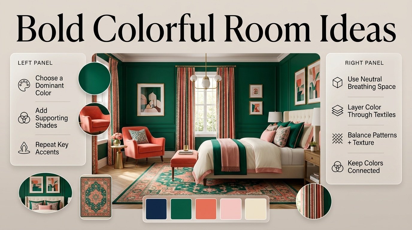
Bold Colorful Room Ideas | A room can have beautiful furniture, good lighting, and thoughtful accessories and still feel a little flat when the color palette is too predictable. On the other hand, adding every bright color you love can quickly create a space that feels busy rather than beautiful. Finding that middle ground is the real challenge.
That’s why bold colorful room ideas are becoming so useful for people who want more personality without giving up comfort or visual balance. A colorful room doesn’t have to mean neon walls, mismatched furniture, or dozens of unrelated shades. Bold color can be introduced through one statement wall, patterned bedding, colorful furniture, artwork, rugs, curtains, or carefully repeated accents.
If you’re looking for a place to explore different decorating directions, PreppyRoom brings together room inspiration, color ideas, decorating concepts, and preppy-inspired interiors that can help you develop a style that feels personal rather than copied.
The most successful colorful rooms usually have something in common: the colors have a relationship with each other. One shade may dominate, another may support it, and a third may appear only in small details. Neutrals, natural materials, lighting, and texture then give the stronger colors enough space to breathe.
In this guide, you’ll learn how to build a bold palette from scratch, choose colors that work together, decorate bedrooms and living spaces, combine patterns, use colorful furniture, avoid common mistakes, and create a vibrant room that still feels polished and comfortable.
What Are Bold Colorful Room Ideas?
Bold colorful room ideas are decorating approaches that use noticeable colors, strong contrasts, or several coordinated shades to give a room energy and personality. The colors may appear on walls, furniture, textiles, artwork, rugs, accessories, or architectural details.
The important word is coordinated.
A bold room isn’t simply a room containing lots of colors. A successful colorful interior usually has a visual hierarchy that tells the eye which colors should receive the most attention.
For example:
Navy wall → pink bedding → green accessories → cream furniture → small red accents
Here, five colors may appear, but they don’t all have the same visual importance.
Another room could use:
Emerald green → blush pink → warm white → natural wood
This palette is colorful but more controlled.
Bold color can also be surprisingly subtle. A neutral room with a cobalt blue chair, colorful artwork, and patterned cushions can feel much more expressive than a room where every wall is painted a different shade.
Modern decorating trends are also giving homeowners more freedom to experiment with color, pattern, and personalized interiors rather than treating neutral rooms as the only sophisticated option.
Why Are Bold Colorful Rooms Becoming So Popular?
Color gives a room something that furniture alone often can’t provide: an immediate sense of personality.
A cream sofa can look beautiful, but adding a deep green cushion, colorful artwork, patterned rug, or blue side table changes the emotional character of the space.
Current 2026 color guidance also shows strong interest in expressive palettes. For example, Dulux’s 2026 collections explore several blue-based color stories ranging from energetic indigo to softer and deeper blues, while also demonstrating color blocking and layered color schemes.
The appeal isn’t simply about following a trend.
People often want rooms that feel:
- More personal
- More cheerful
- More creative
- Less generic
- More connected to their interests
- More visually memorable
- Comfortable without looking plain
Color is one of the easiest ways to achieve that.
The challenge is knowing where to stop.
How Do You Make a Bold Colorful Room Look Balanced?
The easiest way to balance a colorful room is to give each color a specific job.
Instead of thinking:
“I need five colors.”
Think:
“I need a main color, supporting colors, accents, and breathing space.”
A practical framework looks like this:
| Color Role | Typical Purpose | Example |
|---|---|---|
| Dominant | Establishes the room’s identity | Navy |
| Secondary | Supports the dominant color | Pink |
| Accent | Adds energy | Red |
| Neutral | Creates breathing space | Cream |
| Natural | Adds warmth and texture | Wood |
You don’t have to follow an exact percentage rule.
A patterned rug might contain six colors but still look cohesive because those colors already belong to one visual composition.
Choose a Dominant Color
The dominant color usually appears on one of the largest visual surfaces.
It could be:
- Walls
- Sofa
- Bed
- Rug
- Curtains
- Large cabinetry
- Headboard
A deep navy wall, for example, can become the foundation for pink, green, cream, and brass details.
Add Supporting Colors
Supporting colors should make the dominant shade more interesting.
If navy is dominant, possible supporting colors include:
- Blush pink
- Emerald green
- Warm cream
- Muted red
- Powder blue
Use Accent Colors Sparingly
Accent colors are powerful precisely because they appear in smaller amounts.
A bright red vase may have more impact than ten red cushions.
This is one of the simplest ways to keep a colorful room from becoming visually exhausting.
What Are the Best Bold Colorful Room Ideas?
There isn’t one correct formula, so the best approach is to choose an idea based on how much change you’re comfortable making.
1. Paint One Bold Accent Wall
An accent wall remains one of the simplest ways to introduce strong color.
Consider:
- Navy
- Emerald
- Cobalt
- Deep teal
- Terracotta
- Plum
- Coral
- Rich pink
If the room already contains colorful furniture, artwork, or textiles, an accent wall can provide a strong visual anchor.
For example, an emerald wall can work beautifully with cream furniture, pink textiles, brass accents, and natural wood.
Why it works
The color is concentrated in one area rather than competing across the entire room.
Common mistake
Painting every wall a very intense color before understanding how the room’s lighting affects it.
Always test strong colors in the actual space.
2. Create a Navy, Pink and Cream Room
Navy, pink, and cream are especially useful for colorful preppy-inspired interiors.
Navy brings depth.
Pink adds softness and personality.
Cream prevents the combination from becoming too intense.
You can use:
- Navy on a wall
- Pink in bedding
- Cream on furniture
- Brass for small details
- Green through plants or accessories
For more ideas around this type of palette, explore Balanced Preppy Color Combinations.
The important part isn’t matching every item perfectly. Let the colors repeat naturally.
3. Use Colorful Bedding as the Focal Point
Bedding is one of the easiest ways to experiment with color because it can be changed without repainting the room.
Choose a duvet, quilt, or comforter containing two or more colors.
Then pull smaller colors from that pattern.
For example, if bedding contains:
Blue + green + pink + cream
you don’t need blue, green, pink, and cream everywhere.
Instead:
- Blue can appear in curtains
- Green can appear in a chair
- Pink can appear in cushions
- Cream can remain the background
This creates connection without excessive matching.
4. Build the Room Around a Colorful Rug
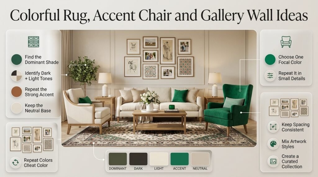
A rug can act as a ready-made color palette.
Look at the rug and identify:
- The dominant shade
- The darkest shade
- The lightest shade
- The strongest accent
- The neutral background
Then use those colors throughout the room.
This method is particularly useful for people who like colorful rooms but struggle to decide which shades belong together.
A patterned rug can also combine several colors more naturally than individually selecting dozens of accessories.
5. Add a Bold Accent Chair
A colorful chair can become the room’s focal point without requiring a complete makeover.
Try:
- Emerald green
- Cobalt blue
- Coral
- Pink
- Deep teal
- Mustard yellow
If the chair is visually strong, repeat only a small amount of its color elsewhere.
For example:
Green chair → green artwork detail → green cushion
That small repetition can make the chair feel intentional rather than random.
6. Create a Colorful Gallery Wall
A gallery wall is ideal for people who want multiple colors without painting the entire room.
Combine:
- Framed artwork
- Illustrations
- Personal photographs
- Decorative prints
- Patterned artwork
- Small objects
The key is to establish at least one connecting feature.
That feature could be:
- Similar frame colors
- Repeated colors
- Similar artwork style
- Consistent spacing
- A common theme
The goal isn’t to make every piece identical.
The goal is to make the collection feel curated.
7. Try Green, Blue and Pink
Green, blue, and pink offer many possibilities.
For a softer room:
Sage + powder blue + blush
For a stronger room:
Emerald + navy + vivid pink
For a preppy appearance:
Forest green + navy + pale pink + cream
The same three color families can produce very different results depending on saturation and proportion.
That is an important lesson in colorful decorating:
Color names alone don’t determine how a room will feel.
Shade intensity matters.
8. Use Colorful Furniture
Furniture is another opportunity to introduce strong color.
Consider:
- Blue nightstands
- Green chairs
- Pink benches
- Painted dressers
- Colorful bookcases
- Upholstered headboards
If the furniture is bold, consider quieter walls.
For example:
Cream walls + emerald chair + pink cushions + blue artwork
can feel more balanced than:
Emerald walls + emerald chair + pink sofa + blue cabinets
where every large surface demands attention.
9. Experiment With a Colorful Ceiling
The ceiling doesn’t have to remain white.
A soft blue, pale pink, muted green, or deeper shade can create an unexpected design feature.
A colored ceiling can be especially effective when the walls are relatively quiet.
For example:
Warm white walls + powder-blue ceiling + colorful artwork
creates interest without overwhelming the room.
Professional color guidance increasingly treats ceilings as part of the overall color composition rather than automatically leaving them outside the palette.
10. Use Colorful Curtains
Curtains occupy a large visual area, so they can dramatically change the character of a room.
Try:
- Navy curtains with cream walls
- Pink curtains with blue accents
- Green curtains with warm white
- Patterned curtains containing multiple room colors
If you choose a strong curtain color, repeat a small amount of that shade elsewhere.
For example:
Blue curtains + blue artwork + blue cushion
The repetition creates a visual thread.
How Do You Choose a Bold Color Palette?
Start with something that already exists in the room.
This is often easier than choosing five paint colors from scratch.
Your starting point could be:
- A favorite artwork
- A rug
- Bedding
- Wallpaper
- Curtains
- A piece of furniture
- A photograph
- A decorative object
Pick out the strongest colors from that item.
Then organize them into roles.
Example
Suppose your favorite artwork contains:
Navy + green + pink + cream + red
You could create:
- Dominant: navy
- Supporting: green
- Secondary: cream
- Accent: pink
- Small accent: red
The same five colors can look sophisticated because they don’t have equal visual weight.
If you want to introduce stronger shades while keeping the overall palette intentional and cohesive, explore these bold preppy color combinations for ideas on pairing vibrant colors with softer supporting tones.
How Many Colors Should a Colorful Room Have?
There is no strict number.
A better question is:
How many colors are competing for attention?
A room may contain many colors through artwork, books, flowers, textiles, and patterned accessories while still appearing cohesive.
However, beginners often find it easier to start with three or four main color families.
For example:
| Palette | Character |
|---|---|
| Navy + pink + cream | Preppy and polished |
| Green + blue + ivory | Fresh and relaxed |
| Pink + orange + cream | Warm and playful |
| Red + navy + white | Strong and classic |
| Emerald + blush + brass | Rich and decorative |
| Cobalt + yellow + white | Energetic and bright |
Once the basic relationship works, additional colors can be introduced through patterns and accessories.
Should a Colorful Room Have Neutral Colors?
Yes, especially when several bold colors are already present.
Neutral areas give the eyes somewhere to rest.
Useful neutrals include:
- Cream
- Ivory
- Warm white
- Beige
- Taupe
- Natural wood
- Soft gray
Don’t think of neutrals as removing personality.
They actually help colorful elements become more noticeable.
Imagine a bright pink chair against a colorful patterned wall.
It may disappear into the background.
Place the same chair against a warm cream wall, and suddenly it becomes a statement piece.
How Can You Combine Bright Colors Without Making Them Clash?
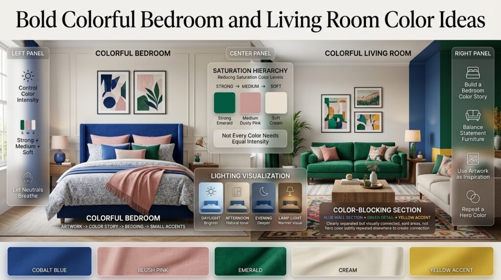
The easiest approach is to control intensity.
You don’t need every color to be equally bright.
For example:
Cobalt blue + blush pink + cream
is easier to balance than:
Electric blue + neon pink + fluorescent yellow + bright orange
The second palette can work in the right context, but it requires much stronger control over proportion.
Use a Saturation Hierarchy
Think of color intensity as levels:
Strong → Medium → Soft
For example:
- Strong: emerald
- Medium: dusty pink
- Soft: cream
This creates contrast without making every element visually loud.
💡 Pro Tip: If your palette feels too intense, don’t immediately remove a color. First try reducing its saturation or changing where it appears.
How Does Lighting Affect Bold Colors?
Lighting can completely change how a color appears.
A blue wall may look:
- Brighter during daylight
- Cooler under certain artificial lights
- Deeper in the evening
- Different again beside warm-colored furniture
This is why paint samples should be viewed at different times of day.
Consider:
- Natural daylight
- Morning light
- Afternoon light
- Evening lighting
- Ceiling fixtures
- Lamps
The room’s direction and window size can also affect how colors are perceived.
A color that looks perfect in an online photograph may behave differently in your actual room.
Bold Colorful Bedroom Ideas
Bedrooms are particularly good spaces for experimenting with color because textiles provide many opportunities to introduce and remove color.
Use a Colorful Headboard
A blue, green, pink, or patterned headboard can become the main focal point.
Keep the surrounding wall quieter if the headboard is highly decorative.
Layer Color Through Bedding
Use:
- Patterned duvet
- Solid-colored pillows
- Contrasting throw
- Small decorative cushions
Avoid making every item equally patterned.
Create a Color Story Around Artwork
Choose one artwork piece and pull colors from it.
For example:
Artwork: navy + pink + green
Then:
- Navy bedding
- Green cushion
- Pink lamp
- Cream wall
The artwork becomes the inspiration rather than just another decoration.
For additional bedroom-focused inspiration, explore Balanced Colorful Room Ideas.
Bold Colorful Living Room Ideas
Living rooms often have larger furniture, so color needs to be considered at a bigger scale.
Colorful Sofa + Neutral Walls
A green, blue, pink, or rust-colored sofa can become the main statement.
Then use:
- Neutral walls
- Patterned rug
- Coordinating cushions
- Colorful artwork
Colorful Rug + Neutral Sofa
This reverses the approach.
A neutral sofa allows the rug to carry more visual energy.
This can be especially useful when you’re renting or don’t want to repaint.
Color Blocking
Color blocking uses separate blocks or areas of color to create a deliberate composition.
Current Dulux 2026 guidance specifically demonstrates color blocking with blue, green, and yellow and recommends repeating a hero color to create visual connection.
You could use:
Blue wall section + green architectural detail + yellow accent
without covering the entire room in saturated color.
How Can You Use Multicolor Palettes Successfully?
A multicolor palette contains several shades that work together rather than appearing as isolated choices.
The trick is to establish relationships between the colors.
Useful relationships include:
Analogous Colors
These are colors that sit relatively close together.
Examples:
- Blue + blue-green + green
- Pink + coral + peach
They tend to create smoother transitions.
Complementary Contrast
This approach uses colors with stronger contrast.
For example:
- Blue + orange
- Green + red
Because the contrast is powerful, proportions matter.
Split Accent Approach
Instead of using two opposing colors equally, choose one as dominant and the other as a small accent.
This is often easier to manage.
If you want to explore this concept further, Multicolor Preppy Palettes provides a useful direction for developing several-color combinations within a preppy aesthetic.
What Is the Difference Between Bold, Balanced, Coordinated and Harmonious Color?
These terms overlap, but they describe different approaches.
| Style | Main Idea | Visual Effect |
|---|---|---|
| Bold | Strong colors and contrast | Energetic |
| Balanced | Controlled proportions | Comfortable |
| Coordinated | Colors intentionally repeat | Organized |
| Harmonious | Colors relate naturally | Connected |
| Multicolor | Several colors participate | Expressive |
A room can be bold and balanced at the same time.
It can also be multicolor and harmonious.
That’s why you shouldn’t treat these categories as completely separate styles.
For a more controlled approach, see Balanced Multicolor Room Palettes.
How Do You Create Coordinated Color Instead of Perfectly Matching Everything?
One of the biggest decorating mistakes is assuming that coordination means exact matching.
It doesn’t.
Imagine a room with:
- Navy curtains
- Light-blue artwork
- Dark-blue cushion
- Blue pattern in the rug
These aren’t identical shades, but they belong to the same visual family.
That variation creates depth.
If everything were exactly the same shade of blue, the room could actually feel less interesting.
This is why coordinated decorating often looks more natural than matching furniture sets.
For additional ideas, explore Coordinated Multicolor Room Ideas.
How Can Patterns Make a Colorful Room Better?
Patterns can introduce multiple colors at once.
Useful patterns include:
- Stripes
- Plaid
- Gingham
- Florals
- Geometric designs
- Abstract prints
- Checks
The safest way to mix patterns is to connect them through color.
For example:
Navy stripe + pink floral + green geometric
can work if all three share a consistent palette.
You can also vary pattern scale.
Large Pattern
Use it on one major surface.
Medium Pattern
Use it on furniture or curtains.
Small Pattern
Use it on cushions or accessories.
⚠ Common Mistake: Putting a large, high-contrast pattern on every major surface can make an otherwise beautiful palette feel chaotic.
How Can You Make a Bold Room Feel More Sophisticated?
Sophistication usually comes from restraint.
You don’t need expensive furniture to create a polished colorful room.
Focus on:
- Good proportions
- Intentional repetition
- Quality-looking materials
- Layered lighting
- Natural textures
- Thoughtful artwork
- Controlled pattern
For example:
Emerald sofa + cream walls + natural wood + brass + pink artwork
may feel more refined than:
Emerald sofa + pink walls + red rug + yellow curtains + blue cabinets + multicolor accessories
even though both are colorful.
The difference is visual hierarchy.
Why Texture Matters in Colorful Interiors
Color isn’t the only source of visual interest.
Texture can make a colorful room feel richer without adding another shade.
Consider:
- Velvet
- Cotton
- Linen
- Woven baskets
- Wood
- Ceramic
- Glass
- Metal
- Bouclé
- Natural fibers
For example, a navy room can gain depth through:
Navy velvet + cream linen + natural wood + brass
rather than requiring another four colors.
⭐ Expert Tip: When a room already has enough color, add texture instead of another accent shade.
This keeps the design interesting without making the palette more complicated.
How Can You Use Natural Wood With Bold Colors?
Natural wood is particularly useful because it adds warmth without competing strongly with most colorful palettes.
Try:
Cobalt blue + cream + oak
or:
Emerald green + blush + walnut
or:
Navy + red + white + natural wood
Wood can appear through:
- Bed frames
- Side tables
- Shelves
- Flooring
- Picture frames
- Storage
- Decorative objects
It also helps colorful rooms feel grounded.
How Do You Decorate a Small Room With Bold Colors?
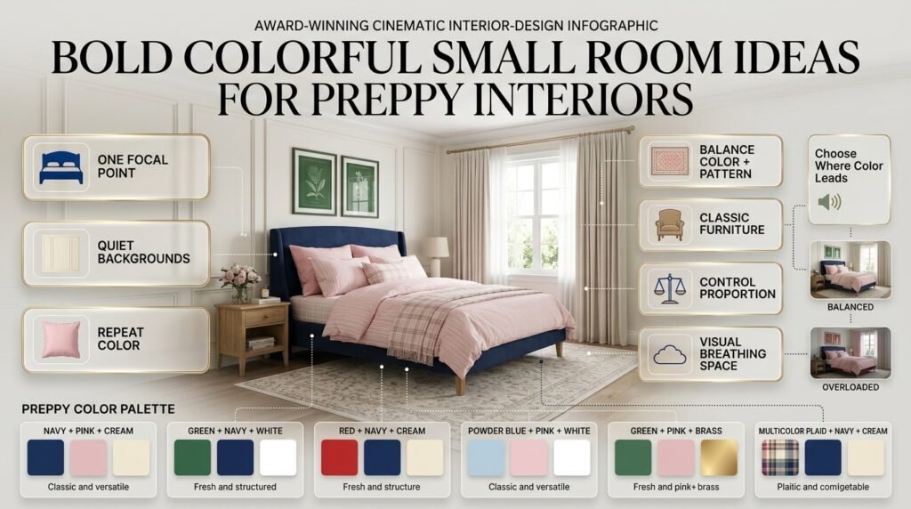
A small room doesn’t automatically need to be completely neutral.
Instead, decide where you want the strongest color to appear.
Good choices include:
- One wall
- Headboard
- Bedding
- Rug
- Curtains
- Artwork
- One statement chair
Keep some larger background surfaces quieter.
For example:
Cream walls + blue bed + pink bedding + green artwork
can create a colorful appearance while preserving visual breathing space.
If every large surface is highly saturated, the room may feel visually compressed.
Bold Colorful Room Ideas for a Preppy Interior
Preppy interiors are naturally suited to color because they often combine classic patterns, strong contrasts, traditional details, and playful accents.
Consider:
Navy + Pink + Cream
Classic and versatile.
Green + Navy + White
Fresh and structured.
Red + Navy + Cream
Strong and traditional.
Powder Blue + Pink + White
Light and playful.
Green + Pink + Brass
Decorative and expressive.
Multicolor Plaid + Navy + Cream
Layered and classic.
The important thing is to let classic elements balance the stronger colors.
A colorful preppy room doesn’t have to look childish or overly decorated.
It can feel sophisticated when color, pattern, furniture, and accessories are carefully proportioned.
How Do You Plan a Bold Colorful Room Step by Step?
Step 1: Choose One Inspiration Item
Start with something you already love.
Don’t begin with twenty Pinterest images.
Choose one:
- Rug
- Artwork
- Bedding
- Chair
- Fabric
- Wallpaper
This gives you a real starting point.
Step 2: Identify the Main Color
Ask:
Which color appears most strongly?
Make that your dominant shade.
Step 3: Select Supporting Colors
Choose one or two colors that already appear in your inspiration item.
Step 4: Choose a Neutral
Decide whether the room needs:
- Cream
- Ivory
- Beige
- White
- Natural wood
Step 5: Decide Where the Strongest Color Goes
Will it be:
- Wall?
- Sofa?
- Bed?
- Rug?
- Artwork?
Don’t put the strongest color everywhere.
Step 6: Repeat Important Colors
Repeat each major color naturally in two or three places.
Step 7: Add Texture
Introduce wood, fabric, metal, ceramics, or woven materials.
Step 8: Check the Lighting
Look at the room during different times of day.
Step 9: Remove One Thing if Necessary
This final step is surprisingly useful.
If the room feels too busy, remove an unnecessary accent before adding anything else.
What Are the Most Common Mistakes With Bold Colorful Rooms?
Using Too Many Strong Colors
The desire to create a colorful room can lead to excessive saturation.
Why it happens
People assume more color means more personality.
Why it can hurt the design
The eye has difficulty finding a clear focal point.
Better approach
Choose one or two dominant shades and let other colors play supporting roles.
Giving Every Color Equal Importance
A room can contain five colors without needing five focal points.
Better approach
Establish a hierarchy.
For example:
Navy = large
Pink = medium
Red = small
Cream = background
This immediately creates more control.
Ignoring the Existing Furniture
Before choosing paint, look at what you already own.
A room with a warm wooden floor, beige sofa, and brass lighting may need a different palette from a room with cool gray flooring and black furniture.
Color needs to work with the materials already present.
Matching Everything Too Closely
Exact matching can make a room feel staged.
Instead, use variations of a color.
A pale blue cushion can work with a navy chair and cobalt artwork.
They don’t need to be identical.
Forgetting Negative Space
Not every wall needs artwork.
Not every shelf needs accessories.
Not every surface needs color.
Empty space allows colorful elements to become more visible.
Choosing Color Only From Online Images
Screens can alter how colors appear.
Always evaluate important colors in your actual room.
Paint samples are especially important for bold shades.
How Can You Fix a Colorful Room That Feels Too Busy?
Don’t immediately start removing all the color.
First identify the problem.
If everything looks equally strong:
Add a neutral.
If there are too many unrelated shades:
Choose one or two colors to repeat and reduce the rest.
If patterns compete:
Keep one major pattern and simplify the others.
If the room feels dark:
Introduce lighter textiles, reflective surfaces, or brighter lighting.
If the room feels flat:
Add texture rather than another color.
If the focal point is unclear:
Choose one major element and reduce competing visual features.
A colorful room usually doesn’t need a complete redesign. Small adjustments can make a significant difference.
How Can You Make Bold Colors Feel Cohesive?
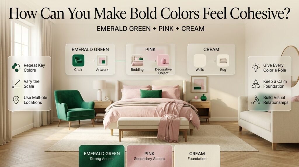
Cohesion comes from repetition and relationships.
Suppose you choose emerald green.
You could repeat it in:
- Chair
- Artwork
- Cushion
- Small vase
It doesn’t need to dominate all four areas.
Now add pink:
- Bedding
- Artwork
- Small decorative object
Then add cream:
- Walls
- Rug
- Furniture
Suddenly the room has a clear visual system.
This is why repetition is so powerful.
How Can You Use Color Blocking?
Color blocking divides a surface into intentional areas of different colors.
Examples include:
- Half-painted walls
- Geometric sections
- Painted arches
- Contrasting trim
- Colorful built-ins
- Two-tone furniture
It works particularly well when the colors are clearly connected.
For example:
Blue + green + yellow + warm white
can create a playful but deliberate composition.
Current 2026 color guidance from Dulux demonstrates color blocking as a practical way to combine several strong shades while maintaining visual connection through a repeated hero color.
What Are Some Bold Color Combinations to Try?
Here are several combinations worth experimenting with:
| Combination | Overall Character |
|---|---|
| Navy + blush + cream | Classic and soft |
| Emerald + pink + ivory | Rich and playful |
| Cobalt + yellow + white | Energetic |
| Green + blue + cream | Fresh |
| Red + navy + cream | Strong and traditional |
| Coral + blue + beige | Warm and lively |
| Plum + pink + cream | Dramatic and soft |
| Teal + orange + ivory | High contrast |
| Sage + pink + natural wood | Relaxed |
| Powder blue + red + white | Crisp and preppy |
Before committing to a palette, consider the existing room.
The same combination can look very different depending on furniture, flooring, lighting, and room size.
How Can You Use Color Without Repainting?
You don’t need paint to create a colorful room.
Try:
- Bedding
- Curtains
- Rugs
- Cushions
- Artwork
- Lamps
- Chairs
- Storage boxes
- Decorative objects
- Books
- Plants and planters
This is particularly useful if you’re renting or simply want flexibility.
A colorful textile can completely change the appearance of a neutral room.
How Do You Know When the Room Is Finished?
This is one of the most important questions.
A room is usually finished when adding another object doesn’t solve a problem.
Stand at the entrance and look at the entire room.
Ask:
What do I notice first?
If the answer is a beautiful focal point, you’re probably on the right track.
If your eye jumps between ten equally strong objects, simplify.
Then ask:
Does anything feel disconnected?
If yes, repeat one of its colors somewhere else.
Finally:
Does the room feel comfortable enough to live in?
A room should work in real life, not only in photographs.
Expert Advice for Designing Bold Colorful Rooms
The most useful principle is simple:
Don’t decorate by color alone. Decorate by visual weight.
A tiny red cushion and a red sofa are not equivalent simply because they’re both red.
The sofa has much more visual weight.
Likewise, a pale blue wall and a cobalt-blue artwork may belong to the same color family but have very different impact.
Before adding another color, consider whether what the room actually needs is:
- More contrast
- More texture
- Better lighting
- More empty space
- Better furniture placement
- Repetition of an existing shade
This approach prevents unnecessary decorating.
It also helps create rooms that feel intentional rather than simply colorful.
For readers who want to understand how several colors can work together without becoming disconnected, Harmonious Multicolor Color Schemes is a useful next step.
A Simple Formula for a Professional-Looking Colorful Room
If you’re completely unsure where to begin, use this framework:
One Strong Foundation
Choose one dominant color.
One Supporting Shade
Use another color to create contrast.
One Accent
Choose a stronger color and use it sparingly.
One Neutral
Give the room breathing space.
One Natural Material
Add wood, woven material, stone, or another natural texture.
One Pattern
Introduce visual interest without adding many separate objects.
For example:
Navy + pink + red + cream + wood + plaid
This can create a highly colorful room without requiring every object to be bright.
Quick Checklist Before You Finish Your Colorful Room
Use this checklist before buying more accessories:
- Is there a clear dominant color?
- Does the supporting color have a purpose?
- Is the strongest accent used sparingly?
- Is there enough neutral space?
- Do important colors repeat?
- Do patterns share colors?
- Have you considered natural light?
- Does the furniture work with the palette?
- Is there enough texture?
- Does the room have a clear focal point?
- Does the space still feel comfortable?
- Have you avoided unnecessary matching?
- Are there areas of visual breathing space?
If most of these answers are yes, your palette is probably heading in a coherent direction.
How Do You Make a Bold Colorful Room Look Balanced?
A bold colorful room looks balanced when strong colors have different levels of importance instead of competing equally. Start with one dominant color for a major element such as a wall, sofa, bed, or rug. Then introduce one or two supporting shades through furniture, textiles, artwork, or accessories. A neutral such as cream, ivory, beige, or warm white can provide visual breathing space between stronger colors.
The goal isn’t to reduce the amount of color. It’s to control where the eye goes first. For example, a navy wall can become the foundation, while pink bedding and small green or red accents add personality without making every surface equally noticeable.
Practical points:
Choose one dominant color before adding accents.
Repeat important colors in two or three areas.
Use neutrals to separate strong shades.
Avoid making every large surface brightly colored.
What Colors Work Best for a Bold Colorful Bedroom?
The best colors for a bold colorful bedroom depend on the atmosphere you want, but combinations such as navy and pink, emerald and blush, blue and green, or red and cream can create a strong yet coordinated look. The most important factor is proportion. A vivid color doesn’t have to cover an entire wall to make an impact; it can appear through bedding, a headboard, artwork, curtains, or an accent chair.
For a calmer bedroom, combine a deep or medium shade with softer supporting colors. For example, navy with blush pink and cream feels more controlled than combining several highly saturated shades across every surface. If you want more energy, introduce a brighter accent through cushions, artwork, or decorative objects rather than making every element intense.
Practical points:
Use bedding as an easy way to introduce bold color.
Combine strong shades with softer versions of other colors.
Keep some large surfaces relatively quiet.
Repeat colors instead of matching everything exactly.
Consider natural and artificial lighting before choosing wall colors.
How Many Colors Should You Use in a Colorful Room?
There is no strict number of colors that every colorful room should have. A practical starting point is three to five main color families, with additional shades appearing naturally in patterns, artwork, books, plants, or decorative objects. What matters more than the number of colors is whether they have a clear relationship and visual hierarchy.
For example, a patterned rug may contain six different shades, but the room can still feel cohesive if the furniture and accessories pull only two or three of those colors into the wider design. Problems usually occur when several unrelated colors are placed on large surfaces and all demand the same amount of attention.
Practical points:
Start with one dominant color.
Add one or two supporting shades.
Use a smaller accent color for contrast.
Include a neutral background when necessary.
Let patterns introduce extra colors naturally.
Don’t assume every color needs to appear in equal amounts.
How Do You Mix Bright Colors Without Making a Room Look Cluttered?
Mixing bright colors successfully requires control over saturation, proportion, and repetition. Instead of using several intense colors equally, allow one shade to dominate and let the others appear in smaller quantities. For example, a cobalt-blue wall can be paired with softer pink textiles, cream furniture, and small yellow or red accents. The bright colors remain noticeable, but the neutral elements give the eye somewhere to rest.
Patterns can also help connect several bright colors. If a rug contains blue, pink, green, and cream, you can repeat those colors selectively around the room rather than introducing completely unrelated shades.
Practical points:
Don’t make every color equally bright.
Use soft or muted versions to reduce visual intensity.
Repeat colors through small accessories and artwork.
Keep at least some areas visually quiet.
Use one major pattern instead of several competing patterns.
If the room feels too busy, remove an accent before adding another one.
How Can You Create a Bold Colorful Room Without Repainting the Walls?
You can create a dramatic colorful room without changing the wall color by using furniture, textiles, artwork, rugs, and accessories as the main sources of color. A neutral room can become highly expressive with a colorful sofa or chair, patterned rug, vibrant bedding, bold curtains, and coordinated artwork.
This approach is particularly useful if you’re renting or don’t want to commit to a permanent paint color. It also makes seasonal or future changes easier because textiles and smaller furniture pieces can be replaced without redesigning the entire room.
Practical points:
Use colorful bedding as a bedroom focal point.
Add a bold accent chair or bench.
Choose a patterned rug containing your preferred colors.
Use curtains to introduce a large block of color.
Create a colorful gallery wall.
Repeat two or three important shades throughout the room.
Keep the walls neutral if you want the furniture and accessories to stand out.
Conclusion
Bold colorful room ideas can transform an ordinary space into a room that feels expressive, energetic, welcoming, and completely personal. The key is not to use as many colors as possible, but to give every color a clear purpose within the overall design.
A successful colorful room usually starts with one dominant shade, supported by one or two complementary colors and enough neutral space to create visual breathing room. From colorful furniture and patterned textiles to artwork, accessories, rugs, and decorative accents, there are many ways to introduce strong color without making the room feel overwhelming.
If you are working with several shades, think about how they relate to one another throughout the space. Repeating a color in different areas, balancing bright tones with softer shades, and combining color with natural wood, warm metals, neutral fabrics, or simple architectural details can create a much more polished result.
For more inspiration, explore our PreppyRoom collection of room ideas, color palettes, decorating inspiration, and practical design approaches. You can also explore different approaches to Multicolor Preppy Palettes and learn how to create more intentional combinations through Balanced Multicolor Room Palettes.
Ultimately, the best bold colorful room is one that reflects your personality while still feeling comfortable and visually connected. Start with the colors you genuinely enjoy, build a simple foundation, introduce stronger shades gradually, and use repetition to bring the entire room together. With thoughtful planning, even the most vibrant palette can feel stylish, balanced, and beautifully coordinated.