Introduction
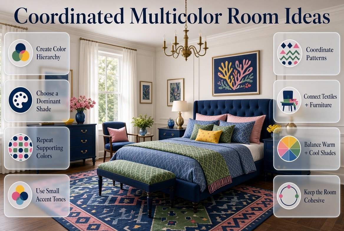
Coordinated Multicolor Room Ideas | A colorful room can feel energetic, personal, and full of character, but combining several colors isn’t always easy. You may love navy, pink, green, blue, yellow, and red individually, yet putting them all into one room can quickly create a space that feels disconnected.
The solution isn’t necessarily to remove color. It’s to learn how to coordinate it.
Coordinated multicolor room ideas are about creating a room where several shades can coexist while still feeling like they belong together. Instead of giving every color equal visual importance, you create a hierarchy. One color may dominate, another may support it, while smaller accents add personality and contrast.
This approach works especially well for colorful bedrooms, preppy interiors, playful spaces, study rooms, living areas, and rooms where artwork, textiles, furniture, and accessories already introduce several shades.
If you’re exploring different directions for a colorful interior, the Preppy Room collection provides a useful starting point for room inspiration and decorating ideas.
In this guide, we’ll look at how to build a coordinated multicolor palette from scratch, how many colors to use, how to combine warm and cool shades, how to work with patterns, furniture, walls, bedding, rugs, artwork, lighting, and accessories, and how to correct a room that already feels too busy.
What Are Coordinated Multicolor Room Ideas?
Coordinated multicolor room ideas involve using several colors in one space while maintaining a clear visual relationship between them. The colors don’t need to match exactly. Instead, they should connect through hue, saturation, repetition, proportion, pattern, material, or neutral space.
A successful multicolor room usually has three basic layers:
Foundation color → Supporting colors → Accent colors
For example:
Cream → Navy + Light Blue → Red
Cream can cover larger surfaces, navy can become the primary visual color, light blue can soften the palette, and red can appear in smaller details.
The room is still colorful, but the eye understands which colors are most important.
Why Does Color Coordination Matter?
When several colors appear without a plan, the eye has difficulty identifying a focal point.
Imagine a bedroom with:
- Bright blue walls
- Pink bedding
- Green curtains
- Yellow furniture
- Red cushions
- Orange artwork
- Purple accessories
Each item might look attractive individually, but together they may create visual competition.
Now imagine the same room with:
- Cream walls
- Navy bed
- Light blue bedding
- Sage curtains
- Small coral accents
- Natural wood furniture
There are still several colors, but they have different responsibilities.
That’s the difference between simply having many colors and having a coordinated multicolor room.
If you want to create a colorful interior without making the space feel visually overwhelming, explore these balanced colorful room ideas for practical guidance on choosing coordinated palettes, distributing colors effectively, combining patterns, and creating a cohesive room.
How Many Colors Should You Use in a Multicolor Room?
There is no universal maximum number of colors that every room must follow. A small room may work beautifully with four colors, while a large eclectic room may contain considerably more.
The important factor is visual hierarchy.
A practical starting point is to work with three to five main colors:
| Role | Purpose | Example |
|---|---|---|
| Foundation | Creates visual breathing room | Cream |
| Dominant | Establishes the room’s identity | Navy |
| Supporting | Adds variety | Light blue |
| Secondary accent | Creates contrast | Sage |
| Small accent | Adds energy | Coral |
This doesn’t mean you need exactly five colors.
You might create a beautiful room using:
Ivory + navy + red
Or:
Cream + sage + blue + terracotta
The more colors you introduce, the more important proportion becomes.
Should Every Color Appear Equally?
No.
This is one of the most important principles of multicolor decorating.
If every color occupies the same amount of visual space, they may compete with one another.
Instead, think of your palette as a conversation.
One color should speak first.
Another should respond.
A third can add a small interesting detail.
This creates rhythm rather than noise.
What Is the Best Color Ratio for a Multicolor Room?
The commonly used 60-30-10 approach can be a useful starting point.
It roughly suggests:
- 60% dominant or foundation color
- 30% secondary color
- 10% accent color
However, don’t treat these numbers as a strict decorating formula.
A bedroom might naturally end up closer to:
50% cream + 30% blue + 15% green + 5% coral
That’s perfectly reasonable.
The purpose of a ratio is simply to stop every color from becoming equally dominant.
Example: Navy, Cream, Blue, and Red
Imagine a preppy bedroom.
Cream could appear on:
- Walls
- Bedding
- Curtains
Navy could appear on:
- Headboard
- Bench
- Artwork frames
Light blue could appear on:
- Cushions
- Throw
- Decorative objects
Red could appear only in:
- A small patterned pillow
- Artwork
- A book cover
- Decorative trim
The result is colorful without making red compete with navy.
Pro Tip: Count patterns as multiple colors. A patterned pillow containing navy, cream, red, and green is already contributing several shades to the room.
How Do You Choose a Coordinated Multicolor Palette?
The easiest way to begin is not by choosing random colors from a paint chart.
Start with something already in the room.
It might be:
- A favorite rug
- A piece of artwork
- Bedding
- Curtains
- A patterned chair
- A vintage accessory
- A favorite fabric
- Natural wood
- Existing furniture
Choose one element you definitely want to keep.
Then identify two or three colors inside it.
For example, suppose your favorite rug contains:
Cream + navy + sage + muted red
That rug has already given you a complete starting palette.
Now you can use:
Cream as the foundation
Navy as the dominant color
Sage as the supporting color
Red as the accent
This is usually easier than choosing four unrelated colors and trying to make them work afterward.
What Color Combinations Work Well for Coordinated Multicolor Rooms?
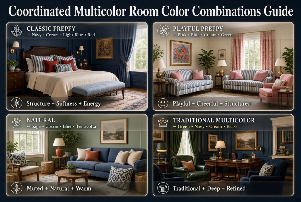
Different combinations create different moods.
Navy, Cream, Light Blue, and Red
This is a classic preppy direction.
Navy creates structure.
Cream keeps the room light.
Light blue adds softness.
Red creates energy in small doses.
This works especially well with:
- Stripes
- Plaid
- Traditional artwork
- Brass details
- White or cream bedding
- Dark wood
Pink, Blue, Cream, and Green
This combination can feel playful while still maintaining structure.
Use cream as the foundation.
Then let blue and pink become the primary colors.
Use green through plants, artwork, textiles, or small accessories.
This palette works well in youthful bedrooms and cheerful preppy interiors.
Sage, Cream, Blue, and Terracotta
For a more natural direction, combine muted colors.
Sage provides a soft green foundation.
Cream adds warmth.
Blue introduces cool contrast.
Terracotta adds a small amount of earthy warmth.
Natural wood works particularly well with this combination.
Green, Navy, Cream, and Brass
This palette has a more traditional feeling.
Forest green can be used on:
- An accent chair
- Curtains
- Cabinetry
- Artwork
Navy can support it through smaller furniture or textiles.
Cream keeps the overall room from becoming too dark.
Brass can provide a metallic highlight rather than functioning as a major color.
How Do You Use Neutral Colors in a Multicolor Room?
Neutral colors are not boring background colors.
They are one of the most useful tools for making several stronger colors work together.
Common foundations include:
- Ivory
- Cream
- White
- Beige
- Taupe
- Warm gray
- Natural wood
Suppose you want to use:
Navy + pink + green + yellow
Instead of putting all four colors across large surfaces, you could create:
Cream walls + navy furniture + pink bedding + green accessories + small yellow details
Now the neutral background gives the stronger colors room to breathe.
Why Is Negative Space Important?
Negative space isn’t necessarily empty.
A cream wall between colorful furniture and artwork creates visual separation.
A plain duvet can make patterned pillows more noticeable.
A neutral rug can prevent colorful furniture from competing with a patterned wall.
In multicolor decorating, empty-looking areas can actually make colorful areas more effective.
How Do You Choose the Dominant Color?
Your dominant color should usually reflect the mood you want the room to communicate.
Choose Navy When You Want:
- Classic character
- Structure
- Preppy style
- Contrast
- A more traditional feel
Choose Blue When You Want:
- Freshness
- Calmness
- Lightness
- A relaxed atmosphere
Choose Green When You Want:
- Natural character
- Freshness
- A botanical feeling
- Connection with nature
Choose Pink When You Want:
- Playfulness
- Warmth
- Softness
- A cheerful atmosphere
Choose Terracotta When You Want:
- Earthy warmth
- Richness
- A grounded feeling
Once the dominant color is chosen, supporting colors should help it rather than compete with it.
How Do You Coordinate Multicolor Furniture?
Furniture doesn’t have to be identical to look coordinated.
In fact, rooms often feel more natural when furniture pieces vary slightly.
For example:
- Cream upholstered bed
- Navy accent chair
- Natural wood desk
- Sage side table
- Brass lamp
These pieces don’t match exactly.
But they can still belong to one palette.
What Connects Different Furniture Pieces?
Look for relationships through:
- Color
- Wood tone
- Metal finish
- Shape
- Fabric
- Pattern
- Scale
For example, a navy chair and navy artwork don’t have to be beside each other.
The repeated color connects them across the room.
Should All Wood Furniture Match?
Not necessarily.
A room can contain more than one wood tone if the overall palette provides enough consistency.
If your colors are already complicated, however, limiting the number of wood finishes can make the space easier to coordinate.
How Do You Coordinate Multicolor Bedding?
Bedding is one of the easiest places to introduce several colors because it naturally contains layers.
Start with a neutral base.
For example:
Cream sheets
Then add:
Navy duvet
Then:
Light blue pillows
Then:
Sage or red accent cushion
Finally:
A small patterned throw
The key is to avoid making every layer equally complicated.
If the duvet has a strong pattern, use simpler pillows.
If the duvet is solid, you can introduce more pattern through cushions.
Example Bedroom Bedding Palette
Cream + navy + light blue + muted red
- Cream sheets
- Navy duvet
- Light blue pillowcases
- Striped navy-and-cream cushion
- Small muted red accent
- Natural wood bed frame
The colors are repeated without being mechanically matched.
How Do You Use Patterns in Coordinated Multicolor Rooms?
Patterns are powerful because they can introduce multiple colors at once.
But patterns also create one of the most common multicolor decorating problems.
Too many unrelated patterns can make the room feel chaotic.
A useful approach is to vary pattern scale.
For example:
Large Pattern
Botanical bedding
Medium Pattern
Striped cushion
Small Pattern
Tiny geometric accent
This creates hierarchy.
You can also connect different patterns by repeating one or two colors.
For example:
Navy floral + cream stripe + small red geometric pattern
These patterns are different, but navy, cream, and red provide a common language.
How Do You Coordinate Artwork With Multiple Colors?
Artwork can act as a bridge between different parts of a room.
Suppose your room contains:
Blue + green + pink + cream
Instead of finding four completely separate decorative pieces, look for artwork that contains at least two or three of these colors.
A large artwork piece can visually connect:
- Bedding
- Furniture
- Curtains
- Accent cushions
This is particularly helpful when the room contains furniture from different styles.
Should All Artwork Match?
No.
A gallery wall can contain different frames and artwork styles.
However, you can create cohesion by repeating:
- One frame finish
- Two or three colors
- Similar visual scale
- A consistent spacing system
The goal is coordination rather than uniformity.
How Do You Use Rugs in a Multicolor Room?
Rugs occupy a large visual area, so they should be considered part of the main palette.
If your room already has strong colors, a softer rug can provide balance.
For example:
Navy furniture + pink bedding + green curtains
could work with:
Cream and subtle blue rug
If the furniture is mostly neutral, the rug can become the room’s main colorful feature.
For example:
Cream sofa + natural wood table + neutral walls + multicolor rug
The rug can then introduce blue, green, pink, yellow, or red.
How Do You Coordinate Curtains?
Curtains don’t always need to match the walls.
Instead, they can connect with another part of the room.
For example:
Cream walls + navy curtains + blue bedding
Or:
White walls + sage curtains + green artwork
Or:
Soft blue walls + cream curtains + navy furniture
If curtains are patterned, keep nearby large surfaces simpler.
This prevents too many large patterns from competing.
How Do You Use Accent Walls in Multicolor Rooms?
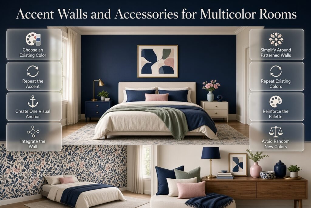
An accent wall can be effective when the room needs one strong visual anchor.
Choose a color already present somewhere else.
For example:
Navy accent wall
Then repeat navy through:
- Bedding
- Artwork
- Cushion
- Lamp
- Small decorative object
This makes the wall feel integrated.
A common mistake is creating an accent wall in a completely new color that appears nowhere else.
That can make the wall feel disconnected.
Can You Use a Patterned Accent Wall?
Yes, but consider the rest of the room first.
If the wallpaper is already colorful and detailed, simplify:
- Bedding
- Curtains
- Rugs
- Artwork
The wall can become the main visual statement.
How Do You Coordinate Accessories?
Accessories should usually repeat colors that already exist.
Useful options include:
- Vases
- Cushions
- Throws
- Lamps
- Books
- Frames
- Trays
- Decorative boxes
- Plants
- Ceramic objects
- Small sculptures
Instead of asking:
“What other color can I add?”
ask:
“Which existing color needs reinforcement?”
That small change in thinking can dramatically improve a multicolor room.
How Do You Use Plants in a Multicolor Room?
Plants naturally introduce green, which can become part of your color palette.
However, you don’t have to make every room green simply because it contains plants.
Use plant pots strategically.
For example:
Blue room + cream foundation + terracotta pot
The plant adds green while the terracotta connects to the warmer part of the palette.
If the room already has strong green furniture, use neutral pots so the plant doesn’t create unnecessary competition.
How Do You Use Metallic Finishes?
Metallic finishes can work as visual accents.
Common options include:
- Brass
- Gold
- Silver
- Chrome
- Bronze
You don’t necessarily need to treat them as full palette colors.
A few brass details can add warmth to a navy-and-cream room.
For example:
Navy + cream + light blue + brass
The brass can appear in:
- Lamp
- Drawer pulls
- Picture frames
- Mirror
- Small decorative object
Repeated small metallic details can create cohesion.
How Do You Balance Warm and Cool Colors?
This is an important consideration when using several colors.
Warm colors include:
- Red
- Orange
- Yellow
- Terracotta
- Warm pink
Cool colors include:
- Blue
- Green
- Blue-green
- Lavender
A room doesn’t need to contain only warm or only cool colors.
In fact, a controlled mixture can make the room more interesting.
For example:
Navy + sage + cream + terracotta
The navy and sage provide coolness.
Terracotta adds warmth.
Cream connects the two.
What If the Room Feels Too Cold?
Introduce:
- Warm wood
- Cream
- Beige
- Terracotta
- Warm lighting
- Brass
What If the Room Feels Too Warm?
Introduce:
- Blue
- Green
- Cool white
- Pale blue
- Silver or cooler metal details
How Do You Use Color in a Small Room?
Small rooms don’t have to be neutral.
The main concern is visual competition.
A useful formula is:
Light foundation + medium dominant color + small bright accents
For example:
Ivory + powder blue + sage + coral
The ivory creates openness.
Blue adds personality.
Sage provides another layer.
Coral creates small points of energy.
Use brighter colors on smaller objects rather than covering every large surface.
Can a Multicolor Room Still Look Sophisticated?
Absolutely.
Sophistication doesn’t come from using fewer colors.
It often comes from controlling:
- Proportion
- Materials
- Pattern
- Repetition
- Lighting
- Visual hierarchy
Consider this palette:
Ivory + navy + sage + dusty rose + brass
That’s five colors.
Yet it can feel refined if:
- Ivory dominates
- Navy provides structure
- Sage supports
- Dusty rose appears selectively
- Brass remains a small highlight
The same five colors could feel chaotic if each one is used equally across large surfaces.
How Do You Create a Coordinated Multicolor Preppy Room?
Preppy interiors naturally lend themselves to coordinated color because traditional preppy palettes often use combinations such as:
- Navy and cream
- Blue and white
- Green and navy
- Pink and blue
- Red and navy
- Green and cream
The secret is to combine classic color relationships with modern proportions.
For example:
Cream walls + navy bed + light blue bedding + green accents + small red details
This can feel distinctly preppy without making every object look like part of a matching set.
If you want to explore more combinations specifically designed around this aesthetic, the Multicolor Preppy Palettes collection can help you explore different color directions before choosing your final room palette.
How Do You Create a Balanced Multicolor Palette?
Sometimes the problem isn’t choosing colors.
It’s choosing colors that have similar visual strength.
Imagine using:
Bright red + bright yellow + bright blue + bright green
All at full intensity.
The colors may compete because none has enough visual support.
Instead, consider:
Navy + cream + sage + muted coral
The palette still has contrast, but the colors are easier to organize.
A balanced palette often combines:
- One stronger shade
- One neutral
- One medium shade
- One softer shade
- Optional small accent
For more focused guidance on controlling proportions and relationships between multiple colors, explore Balanced Multicolor Room Palettes.
How Do You Fix a Room That Already Has Too Many Colors?
You don’t always need to start again.
First, identify the colors that appear most often.
Then decide which colors you actually want to keep.
For example, suppose your room contains:
Blue + pink + green + yellow + orange + red
You may decide that:
Blue + pink + green + cream
should become the main palette.
Now reduce the yellow, orange, and red.
You don’t necessarily need to remove them completely.
A small yellow object may still work as a highlight.
The Three-Step Editing Method
Step 1: Remove visual competition
Temporarily remove smaller accessories.
Step 2: Identify your strongest three or four colors
Decide which colors belong in the core palette.
Step 3: Reintroduce selected accents
Bring back only the pieces that strengthen the palette.
This is often easier than buying everything new.
How Do You Make a Multicolor Room Feel Less Busy?
If a room feels too busy, don’t immediately paint the walls.
Try these changes first:
Reduce Pattern
Remove one or two competing patterns.
Increase Neutral Space
Add cream, white, beige, or another quiet surface.
Group Similar Colors
Repeat the same color in different areas.
Remove Random Accents
Take away objects that introduce colors appearing nowhere else.
Simplify Large Surfaces
A patterned rug, colorful bedding, and busy curtains together may be too much.
Keep one or two strong surfaces and simplify the others.
How Do You Make a Multicolor Room Feel More Interesting?
If your room feels flat rather than chaotic, you may have the opposite problem.
Instead of adding many new colors, increase variation through:
- Texture
- Pattern
- Material
- Shape
- Lighting
- Artwork
For example, a navy-and-cream room can become much more interesting through:
- Linen
- Velvet
- Wood
- Brass
- Woven baskets
- Stripes
- Botanical prints
You don’t need six more colors to create visual interest.
How Does Lighting Affect Multicolor Rooms?
Lighting can significantly change how colors appear.
Natural daylight may make blue appear clearer.
Warm artificial light may make cream and beige appear richer.
Green can shift depending on surrounding colors and lighting conditions.
Before making a final decision about a strong paint or textile color, observe it at different times of day.
Check Your Palette During:
- Morning
- Afternoon
- Evening
- Artificial lighting
This is especially important for colors covering large surfaces.
Expert Tip: A color that looks perfect in a store or on a screen may look noticeably different inside your room because surrounding colors and lighting influence perception.
How Do You Coordinate Color Across an Open Room?
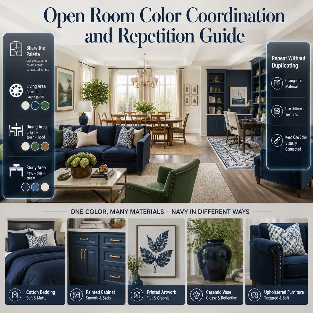
Open-plan spaces can be challenging because multiple zones are visible at once.
Instead of giving each area completely different colors, create one shared palette.
For example:
Living area: cream + navy + green
Dining area: cream + green + wood
Study area: navy + blue + cream
The colors overlap, creating continuity.
The spaces can still have different personalities without looking like unrelated rooms.
How Do You Use the Same Color Without Making the Room Repetitive?
Repetition doesn’t mean duplication.
You can use one color through different materials.
For example, navy could appear as:
- Cotton bedding
- Painted cabinet
- Printed artwork
- Ceramic vase
- Upholstery
The color stays consistent while the texture changes.
This creates a richer visual experience than simply buying five matching navy objects.
Common Mistakes When Creating a Multicolor Room
Mistake 1: Choosing Colors Independently
You may fall in love with individual colors without considering their relationship.
Why It Happens
Shopping often happens item by item.
Why It Causes Problems
Every purchase becomes another visual decision.
Better Approach
Create your palette before buying multiple decorative pieces.
Mistake 2: Making Every Color Bright
Bright colors can be beautiful, but several highly saturated shades can compete.
Better Approach
Pair stronger shades with muted colors and neutrals.
Mistake 3: Adding a New Accent Color Every Time
A room can slowly accumulate random colors.
Better Approach
Before adding an item, ask whether its color already exists somewhere.
Mistake 4: Matching Everything Too Closely
Exact matching can make the room feel artificial.
Better Approach
Repeat colors while varying textures, shapes, and materials.
Mistake 5: Ignoring Existing Flooring
Flooring is a major visual surface.
Warm wood, cool gray flooring, patterned tile, and carpet can all affect how your palette looks.
Better Approach
Include the floor in your color planning from the beginning.
Mistake 6: Forgetting the Ceiling
The ceiling doesn’t always need to be bright white.
However, in a colorful room, a quiet ceiling can provide useful visual breathing space.
Mistake 7: Adding Too Much Pattern
Colorful patterns can quickly become overwhelming when combined.
Better Approach
Vary pattern scale and allow some surfaces to remain solid.
A Professional Step-by-Step Method for Designing a Coordinated Multicolor Room
Step 1: Photograph the Existing Room
Take a photo in daylight.
Look at the room as a whole rather than focusing on individual objects.
Step 2: List the Existing Colors
Write down:
- Wall color
- Floor color
- Furniture colors
- Curtain color
- Bedding colors
- Rug colors
- Artwork colors
Step 3: Select Your Foundation
Choose the quietest major color.
This could be cream, ivory, white, beige, or natural wood.
Step 4: Select the Dominant Color
Choose the shade that should define the room.
For example:
Navy
Step 5: Add Supporting Colors
Choose one or two colors that complement the dominant color.
For navy:
Light blue + sage
Step 6: Choose an Accent
Add a small amount of a contrasting color.
For example:
Coral
Step 7: Assign Each Color a Job
Example:
Cream — walls
Navy — furniture
Light blue — textiles
Sage — accessories
Coral — tiny accents
Step 8: Repeat Colors Across the Room
Don’t put all of one color in a single corner.
Distribute it.
Step 9: Review Patterns
Make sure patterns share colors and don’t all compete for attention.
Step 10: Edit
Remove anything that feels unnecessary.
This final step can make a major difference.
A Practical Color Coordination Example
Let’s design a hypothetical preppy bedroom.
Existing Elements
- Cream walls
- Natural wood floor
- White bed
- Navy chair
- Neutral curtains
Now add:
Main Palette
Cream + navy + light blue + sage + coral
Bedding
Cream sheets + light blue duvet + navy pillows
Rug
Cream with subtle navy pattern
Artwork
Navy, blue, and sage botanical prints
Accessories
Sage vase + cream lamp + small coral object
Furniture
Natural wood + navy chair
Notice that coral doesn’t need to appear everywhere.
It can remain a small accent.
The room still contains five colors, but the colors have different levels of importance.
How Do You Choose Colors Based on Room Mood?
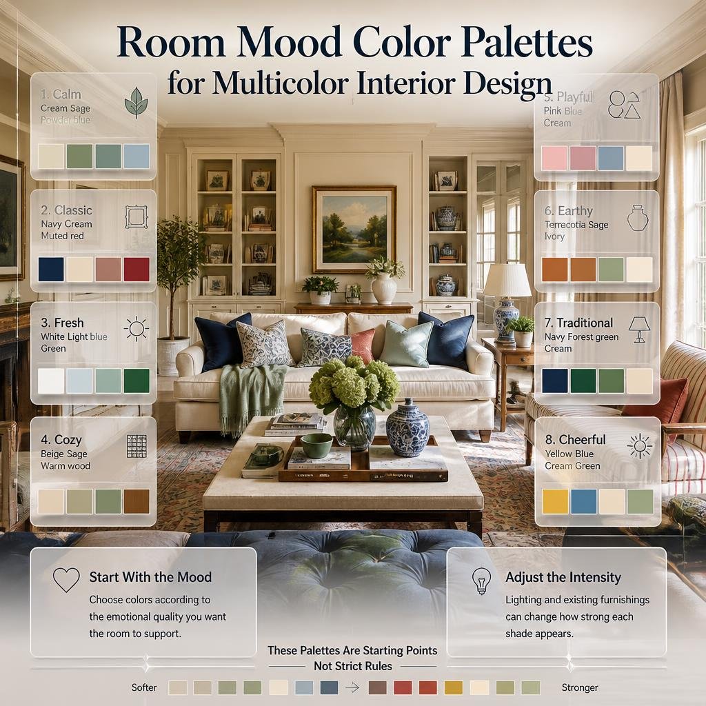
Your palette should support the emotional quality you want.
| Mood | Suggested Palette |
|---|---|
| Calm | Cream + sage + powder blue |
| Classic | Navy + cream + muted red |
| Fresh | White + light blue + green |
| Cozy | Beige + sage + warm wood |
| Playful | Pink + blue + cream |
| Earthy | Terracotta + sage + ivory |
| Traditional | Navy + forest green + cream |
| Cheerful | Yellow + blue + cream + green |
These are starting points rather than strict rules.
You can adjust the intensity of each shade according to the room’s lighting and existing furnishings.
How Do You Coordinate a Multicolor Room on a Budget?
You don’t need to replace everything.
Start with what you already own.
Keep
Items that fit the core palette.
Reposition
Move colorful objects to areas where they create better balance.
Re-cover
Use new pillow covers or throws instead of replacing furniture.
Repaint
A small piece of furniture can sometimes be updated with paint.
Edit
Remove colors that don’t contribute to the palette.
Often, the most affordable transformation is simply better coordination.
How Do You Shop for a Multicolor Room Without Losing Control?
Create a small palette reference before shopping.
For example:
Cream
Navy
Light Blue
Sage
Coral
Save it on your phone.
When you see a new item, compare it against the palette.
Ask:
- Does the color already exist?
- Is the item replacing something?
- Is the color too bright compared with the rest?
- Does the pattern introduce unnecessary colors?
- Will it work with the room’s largest surfaces?
This prevents impulse purchases from gradually changing your entire palette.
Expert Tips for Better Color Coordination
Repeat Colors at Different Heights
Place a color at different visual levels.
For example:
Navy
- Rug
- Chair
- Artwork
This creates a visual path around the room.
Repeat Colors in Different Textures
Use one color through multiple materials.
For example:
Sage
- Linen cushion
- Ceramic vase
- Botanical artwork
- Painted furniture
The repeated color feels natural because its textures vary.
Let Some Colors Be Quiet
Not every color needs to be obvious.
A very subtle shade appearing in artwork or fabric can still contribute to the palette.
Consider What You See From the Doorway
Stand at the room entrance.
That’s often where the overall balance becomes easiest to judge.
Ask:
What color do I notice first?
Then:
Where does my eye move next?
If the answer feels natural, your color hierarchy is probably working.
How Do You Choose Colors for a Coordinated Multicolor Room?
The easiest approach is to start with one color that already exists in the room, such as a rug, artwork, bedding, or furniture piece. Build the rest of the palette around it rather than choosing several unrelated colors at the same time. A practical palette usually includes a foundation shade, a dominant color, one or two supporting colors, and a small accent. This creates a clear visual hierarchy while still allowing the room to feel colorful and personal.
Start with a foundation: Cream, ivory, white, beige, or natural wood can provide visual breathing room.
Choose one dominant color: Navy, blue, green, pink, or another preferred shade can establish the room’s identity.
Add supporting colors: Select shades that naturally complement the dominant color.
Keep one accent controlled: A stronger color such as coral, red, or yellow can be used in smaller decorative details.
Check the existing room: Flooring, curtains, furniture, and artwork should all be considered before finalizing the palette.
How Many Colors Should You Use in a Multicolor Room?
There isn’t a fixed number that works for every room, but three to five main colors are a practical starting point for most coordinated spaces. The important consideration isn’t simply how many colors you use; it’s how much visual space each color occupies. Five carefully balanced shades can look more organized than three unrelated colors used in equal amounts.
A useful approach is to give every color a specific role. One shade can dominate large surfaces, another can appear through furniture or textiles, while smaller accents provide contrast. If you introduce additional colors through patterns or artwork, keep the surrounding elements simpler so the room doesn’t become visually crowded.
Foundation: Use on larger, quieter surfaces.
Dominant color: Give it the strongest visual presence.
Supporting colors: Repeat them through furniture, textiles, or artwork.
Accent colors: Keep brighter or highly saturated shades relatively limited.
Patterns: Remember that patterned items may introduce several additional colors.
How Do You Make a Multicolor Room Look Coordinated Instead of Cluttered?
The key is repetition and proportion. Colors should appear in more than one area of the room, but they don’t have to be repeated through identical objects. For example, navy might appear on a chair, in artwork, and through a cushion, while sage could appear in curtains and a decorative vase. These repeated connections help the eye move naturally around the room.
It’s also important to give strong colors enough neutral space. If the walls, bedding, furniture, curtains, rug, and artwork are all highly colorful and patterned, there may be too much competition. Simplifying one or two large surfaces can make the existing colors look more intentional without requiring you to remove the personality from the room.
Repeat colors: Use the same shades in different parts of the room.
Vary materials: Repeat a color through fabric, wood, ceramic, or artwork rather than identical objects.
Create breathing room: Use neutral walls, bedding, rugs, or furniture where needed.
Control strong colors: Highly saturated shades usually work better as accents.
Edit unnecessary pieces: Removing one competing item can sometimes improve the entire palette.
Can You Use Multiple Colors in a Small Bedroom Without Making It Feel Smaller?
Yes, but the proportion of each color becomes especially important in a smaller room. Using a lighter foundation such as ivory, cream, or soft white can keep larger surfaces visually open, while stronger colors can be introduced through bedding, artwork, cushions, furniture, and smaller accessories. This gives the room personality without covering every surface in a contrasting shade.
A small bedroom can actually benefit from a coordinated multicolor palette because carefully repeated colors can make the space feel more connected. Instead of assigning a completely different color to every area, carry two or three shades throughout the room and use one stronger accent sparingly.
Use a lighter foundation: Keep walls and larger surfaces relatively calm when appropriate.
Introduce color through textiles: Bedding, cushions, curtains, and throws are easy to adjust.
Repeat rather than scatter: Use related shades in several areas instead of introducing random colors.
Limit large competing patterns: Choose one main patterned feature and keep nearby elements simpler.
Use mirrors and light strategically: They can help maintain an open visual feeling while your color palette provides personality.
How Do You Mix Different Colors and Patterns Without Making a Room Look Too Busy?
The best approach is to coordinate the colors first and then control the scale of the patterns. Different patterns can coexist successfully when they share one or more colors. For example, a navy-and-cream floral design can work alongside a smaller blue stripe and a subtle geometric pattern because the palette connects them even though the designs are different.
Pattern scale also matters. If every pattern is large, bold, and equally noticeable, the room can quickly feel overwhelming. Instead, let one pattern become the main statement, use another at a medium scale, and keep additional patterns smaller or more subtle. Solid-colored furniture and neutral surfaces can then provide visual pauses between them.
Choose a shared color: Let at least one or two colors connect different patterns.
Vary pattern scale: Combine large, medium, and small designs.
Use one main statement pattern: Don’t make every textile a focal point.
Balance patterns with solids: Plain bedding, furniture, or curtains can calm a busy combination.
Consider the whole room: Artwork, rugs, wallpaper, and accessories all contribute to the total pattern load.
Conclusion
Creating a coordinated multicolor room is less about following strict color rules and more about understanding how different shades work together. A room can include several colors without feeling overwhelming when each shade has a clear purpose and the overall palette remains connected.
Start with a foundation color, choose one dominant shade, and then introduce supporting colors through furniture, textiles, artwork, rugs, and accessories. Repeating selected colors throughout the room creates continuity, while neutral surfaces provide the visual breathing space needed to keep stronger shades from competing.
Patterns, textures, and lighting also play an important role. You don’t need to make everything match perfectly. In fact, allowing different materials, patterns, and furniture styles to work within the same color family can make the room feel more personal and naturally designed.
The most effective coordinated multicolor room ideas balance personality with structure. Choose colors you genuinely enjoy, give each one a role, repeat them thoughtfully, and edit anything that creates unnecessary visual competition. The result is a colorful room that feels intentional, comfortable, and cohesive rather than simply filled with color.