Introduction
Balanced Multicolor Room Palettes | Choosing several colors for one room can sound exciting until you actually have to make them work together.
You might love navy, soft pink, sage green, light blue, cream, and a little red. Each shade looks beautiful on its own, but when they’re all introduced without a plan, the room can quickly feel crowded, disconnected, or visually tiring.
That’s where balanced multicolor room palettes make a difference.
Instead of asking which colors look good individually, you need to think about how colors behave together, where they should appear, how much visual weight each one carries, and which shades should remain quiet.
If you’re exploring the wider world of interior color, furniture, patterns, and layered decorating, the Preppy Room homepage provides a useful starting point for understanding how these elements can work together.
This guide focuses specifically on creating multicolor palettes that feel intentional. You’ll learn how to choose a dominant color, introduce supporting shades, use accents without overdoing them, combine warm and cool colors, coordinate patterns, work with neutral furniture, and build practical palettes for bedrooms and other spaces.
The goal isn’t to use fewer colors.
The goal is to make every color feel like it belongs.
What Are Balanced Multicolor Room Palettes?
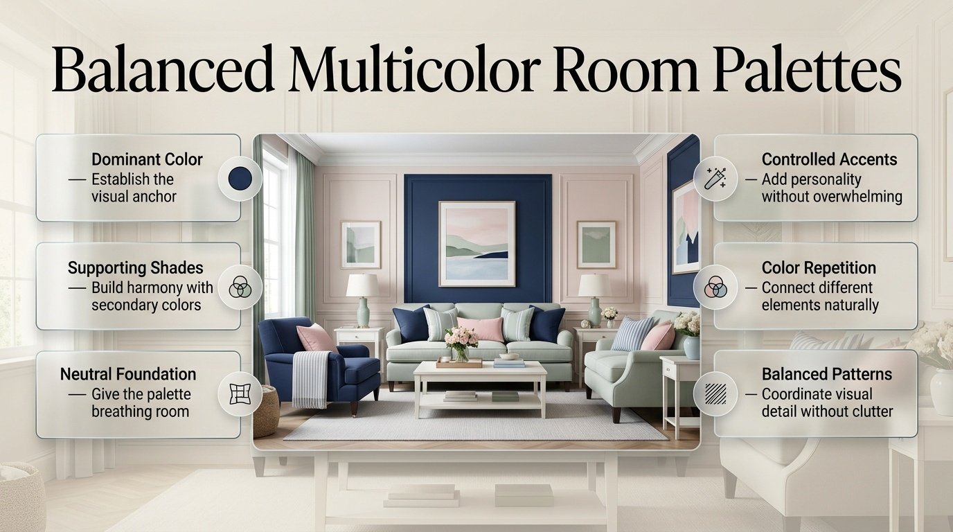
Balanced multicolor room palettes are color schemes that use several shades while giving each color a specific visual role.
Instead of making every color equally noticeable, you establish a hierarchy.
For example:
- Cream can provide the background.
- Navy can create contrast.
- Sage can add natural softness.
- Light blue can introduce freshness.
- Pink can act as a small accent.
- Brass can provide a warm finishing detail.
All of these colors can coexist without competing equally.
That’s the central idea behind a successful multicolor room.
A room doesn’t become balanced simply because its colors match. It becomes balanced when the colors have different levels of importance.
If you want to create a colorful interior without making the space feel visually overwhelming, explore these balanced colorful room ideas for practical guidance on choosing coordinated palettes, distributing colors effectively, combining patterns, and creating a cohesive room.
Why Does Color Balance Matter?
Color influences how a room feels before you consciously analyze the furniture or accessories.
A dark navy can create depth.
Cream can make the environment feel softer.
Light blue can create an airy impression.
Green can introduce a natural quality.
Pink can bring warmth or playfulness.
Red can create stronger visual energy.
When several of these colors appear together, their proportions become important.
If every color is bright and occupies a large area, the eye has too many competing points of attention.
If one or two colors dominate and the remaining shades support them, the same number of colors can feel much more organized.
This is why a multicolor room doesn’t necessarily need to be simplified into two colors.
It needs visual hierarchy.
How Many Colors Should a Balanced Multicolor Room Have?
There isn’t a universal maximum number of colors.
However, if you’re building a palette from scratch, starting with three to five major color families is usually easier to control.
For example:
| Color Role | Example | Typical Use |
|---|---|---|
| Dominant | Cream | Walls, bedding, large surfaces |
| Primary supporting | Navy | Headboard, rug, curtains |
| Secondary supporting | Sage | Cushions, artwork |
| Accent | Pink | Small accessories |
| Detail | Brass | Lighting and hardware |
Notice that these colors don’t receive equal treatment.
That’s intentional.
You can also use several shades within the same family.
For example:
- Powder blue
- Dusty blue
- Medium blue
- Navy
can all contribute to a blue-based palette without feeling like four completely unrelated colors.
If you want to combine several colors without making your space feel overwhelming, explore these balanced colorful room ideas for practical guidance on creating a cohesive palette with the right mix of tones, patterns, and decorative accents.
Should Every Color Appear Equally?
No.
In fact, equal distribution is one of the easiest ways to make a colorful room feel chaotic.
Imagine a bedroom where:
- 25% is navy
- 25% is pink
- 25% is green
- 25% is red
Even if the colors are attractive individually, they may compete strongly.
Instead, consider:
Cream → dominant
Navy → major supporting color
Sage → secondary supporting color
Pink → small accent
Red → tiny detail
The room can still contain five colors, but the eye understands their roles.
What Is the 60-30-10 Rule for Multicolor Rooms?
The 60-30-10 concept is a useful starting point for understanding visual proportion.
It suggests approximately:
- 60% dominant color
- 30% supporting color
- 10% accent color
You don’t need to measure the room literally.
Think of it as a visual planning tool.
For example:
60% cream
could appear through walls, larger furniture, bedding, and rugs.
30% navy
could appear through curtains, a headboard, cushions, and artwork.
10% sage and pink
could appear through smaller accessories and decorative details.
The actual distribution can vary significantly depending on the room.
A colorful rug may contain several colors while occupying only a small floor area.
A colorful wall may occupy a much larger visual area.
So the important question is not:
“Did I use exactly 60%?”
It’s:
“Does one color clearly lead the palette?”
How Do You Choose the Dominant Color?
Start with the largest visual surfaces in the room.
Look at:
- Walls
- Flooring
- Large furniture
- Bed
- Sofa
- Curtains
- Large rugs
- Existing cabinetry
If these elements already have color, don’t start by choosing another dominant shade.
Work with what you already have.
For example, if the room has warm cream walls and natural wood furniture, you already have a soft foundation.
You could then build around:
Cream + natural wood + navy + sage + pink
If the room already has dark navy furniture, the rest of the palette may need more lightness.
This is one reason color planning should happen before buying accessories.
How Do You Choose Supporting Colors?
Supporting colors should strengthen the dominant color rather than compete with it.
Suppose your dominant color is cream.
Possible supporting combinations include:
Cream + Navy
Classic and structured.
Cream + Sage
Soft and natural.
Cream + Light Blue
Fresh and relaxed.
Cream + Pink
Warm and playful.
Cream + Green + Navy
More layered and traditional.
If you want to explore a stronger two-color foundation first, Navy and White is useful because navy provides contrast while the lighter color gives it visual breathing room.
Once that foundation works, you can introduce another shade rather than trying to build the entire palette at once.
How Do You Build a Multicolor Palette Step by Step?
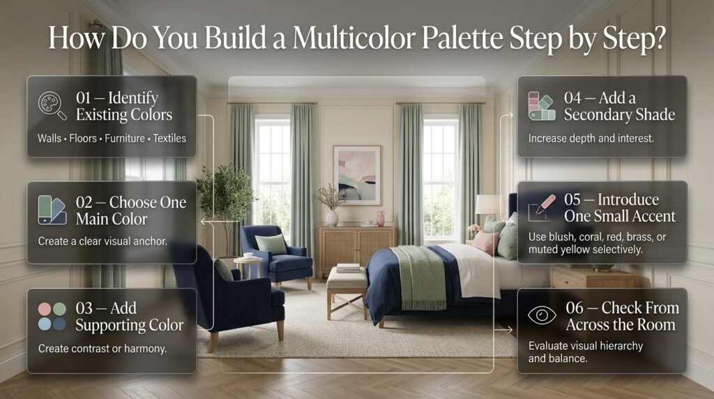
Creating a palette becomes easier when you add colors in stages.
Step 1: Identify Existing Colors
Before purchasing anything, list the colors already present.
Check:
- Wall paint
- Floor
- Furniture
- Bedding
- Curtains
- Rug
- Artwork
- Large decorative pieces
Don’t ignore wood tones.
Natural wood is effectively part of the visual palette.
Step 2: Choose One Main Color
Ask:
What color should people notice first?
It could be:
- Navy
- Cream
- Sage
- Light blue
- Pink
- Green
- Warm white
Step 3: Add One Supporting Color
Choose a shade that creates contrast or harmony.
For example:
Cream + navy
or:
Sage + cream
Step 4: Add a Secondary Supporting Shade
This is where the palette becomes more interesting.
For example:
Cream + navy + sage
Step 5: Introduce One Small Accent
Now you might add:
- Blush
- Coral
- Red
- Brass
- Muted yellow
Use it selectively.
Step 6: Check the Palette From Across the Room
Don’t only inspect individual objects.
Stand in the doorway.
Look at the entire room.
Ask:
- What do I notice first?
- What do I notice second?
- Is anything competing too strongly?
- Does the background feel calm enough?
- Is the accent repeated?
This final check is often more useful than judging objects one at a time.
When you want to bring several colors into the same room without making the space feel visually disconnected, explore these harmonious multicolor color schemes for practical guidance on coordinating shades that work naturally together.
How Can Blue and Cream Support a Multicolor Palette?
Blue and cream are particularly useful because they can create a foundation without consuming the entire visual composition.
Cream provides warmth and softness.
Blue provides structure and contrast.
From there, you can introduce:
- Sage
- Navy
- Pink
- Green
- Red
- Brass
- Natural wood
For example:
Cream + light blue + navy + sage
creates several levels of blue and green while keeping the overall palette connected.
For a dedicated foundation around these colors, explore Blue and Cream.
The important point is that blue doesn’t need to appear in only one shade.
You can layer:
- Powder blue
- Dusty blue
- Pale blue
- Medium blue
- Navy
This creates depth without requiring unrelated colors.
How Can Light Blue and White Make a Multicolor Palette Feel Lighter?
Light blue and white are useful when you want to introduce color without making the room feel visually heavy.
White provides brightness.
Light blue adds personality.
Then stronger colors can be introduced in smaller quantities.
For example:
White + light blue + navy + sage + blush
Here, the light blue and white establish the visual background while navy, sage, and blush provide variation.
If you’re building around this lighter direction, Light Blue and White offers another useful reference point.
Light blue can be particularly helpful when a room already contains darker furniture.
How Do You Use Green in a Multicolor Room?
Green can range from extremely soft to very dramatic.
Consider the difference between:
- Sage
- Eucalyptus
- Olive
- Moss
- Forest green
A pale sage can behave almost like a neutral.
Forest green has much more visual weight.
This means you shouldn’t automatically treat all greens the same.
For a lighter room:
Cream + sage + light blue + navy
For a richer room:
Ivory + forest green + navy + walnut
For a softer room:
Cream + sage + blush + natural wood
If you want to explore the softer combination in more detail, Green and Cream is a natural starting point.
How Do You Combine Pink With Other Colors Without Making the Room Overly Sweet?
Pink can work beautifully in a multicolor palette when it isn’t allowed to dominate automatically.
Instead of:
Pink + pink + pink + white
try:
Cream + navy + sage + dusty pink
or:
White + light blue + blush + navy
Navy can ground pink.
Sage can make pink feel more natural.
Cream can soften the contrast.
Wood can introduce warmth.
This makes pink part of a larger color story rather than the entire story.
For a simpler foundation, Pink and White can help you understand how the two colors behave before adding additional shades.
How Can Red Work in a Multicolor Preppy Palette?
Red has strong visual presence, so proportion matters.
You don’t necessarily need a large red object.
A small amount can be enough.
For example:
- Red stripe in artwork
- Red cushion
- Red book
- Small red decorative object
- Red detail in a patterned rug
A palette such as:
Navy + cream + sage + muted red
can feel more controlled than:
Navy + bright red + bright green + bright blue
If you’re interested in the stronger traditional relationship between the two colors, Red and Navy provides a focused foundation.
How Do You Use Green and Navy Together?
Green and navy are both capable of carrying significant visual weight.
That’s why they usually benefit from a lighter third element.
Try:
Navy + forest green + ivory
instead of:
Navy + forest green + black
The ivory creates breathing space.
You can then add:
- Brass
- Walnut
- Soft blue
- Muted red
as smaller details.
The relationship between green and navy can also work particularly well with traditional wood furniture.
How Do Neutral and Classic Tones Balance Multicolor Rooms?
Neutral colors are not simply “background colors.”
They are balancing tools.
Useful neutrals include:
- Ivory
- Cream
- Beige
- Taupe
- Warm white
- Soft gray
- Natural wood
Imagine your palette contains:
Navy + sage + pink + light blue
Without a neutral, the room may begin to feel highly colorful.
Add:
Cream walls + natural wood furniture
and suddenly the stronger colors have somewhere to sit.
For readers who prefer a quieter interpretation, Neutral and Classic Tones can help establish the foundation before stronger accents are introduced.
How Do You Combine Several Shades of Blue?
Using different values of the same color is one of the easiest ways to create depth.
For example:
Navy + medium blue + dusty blue + light blue + cream
The colors are related, but their visual weight changes.
Navy can act as the anchor.
Medium blue can support it.
Light blue can keep the room airy.
Cream can prevent the palette from becoming too monochromatic.
This approach is especially useful when you want a colorful room but don’t want to introduce too many unrelated color families.
If you are combining several colors and want the room to feel polished rather than overwhelming, explore these balanced preppy color combinations for practical ideas on creating a cohesive mix of dominant, secondary, and accent shades.
How Do You Mix Warm and Cool Colors?
Warm and cool colors can work together when something connects them.
For example:
Navy + light blue
are relatively cool.
Add:
Warm cream + natural wood
and the overall palette becomes more balanced.
Another example:
Sage + light blue + cream + terracotta
Here, cream and natural materials can bridge the cooler colors and warmer accent.
The problem isn’t necessarily mixing warm and cool shades.
The problem is mixing them without any visual relationship.
What Is a Bridge Color?
A bridge color is a shade that helps visually connect different parts of the palette.
Common bridge colors include:
- Cream
- Ivory
- Beige
- Warm white
- Natural wood
- Soft gray
For example:
Navy + pink + sage
can be connected by cream.
The cream might appear through:
- Walls
- Bedding
- Rug
- Curtains
- Artwork background
It doesn’t have to be the most noticeable color.
Its job is to create visual continuity.
How Do You Use Patterns in Balanced Multicolor Room Palettes?
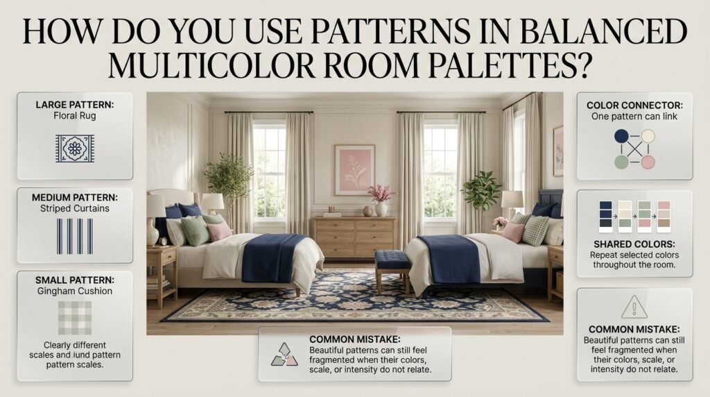
Patterns are powerful because they can contain several colors at once.
Imagine a rug featuring:
Navy + cream + sage + pink
You don’t need four separate furniture pieces in those exact colors.
The rug can act as a color connector.
You could then repeat:
- Navy in bedding
- Sage in cushions
- Pink in artwork
- Cream in curtains
Now the pattern provides the relationship between the colors.
This is one of the most natural ways to create a multicolor room.
How Many Patterns Should You Use?
There isn’t a fixed number.
The more important factor is pattern scale.
You could use:
Large pattern → floral rug
Medium pattern → striped curtains
Small pattern → gingham cushion
Because the scales are different, the eye can distinguish them more easily.
The patterns should ideally share one or more colors.
⚠ Common Mistake: Choosing three beautiful patterns independently and assuming they’ll work together. If their colors, scale, or visual intensity are unrelated, the room can feel fragmented.
How Do You Coordinate Furniture With a Multicolor Palette?
Furniture doesn’t need to match your accent colors.
In many cases, neutral furniture makes multicolor rooms easier to control.
Useful finishes include:
- Natural oak
- Walnut
- White
- Cream upholstery
- Beige
- Light wood
- Medium wood
For example:
Cream sofa + navy rug + sage pillows + pink artwork
can feel coordinated.
Compare that with:
Navy sofa + green chair + pink table + red rug
where every major piece becomes an important visual statement.
Neutral furniture gives your accent colors room to breathe.
When you want to bring several colors into one room while keeping the overall design visually connected, explore these coordinated multicolor room ideas for practical tips on combining shades, patterns, furniture, and accents into a cohesive look.
How Do You Use Natural Wood With Multicolor Palettes?
Natural wood can act as a visual bridge between colors.
It works particularly well with:
- Navy
- Green
- Cream
- Blue
- Pink
- Beige
- Red
Light wood tends to keep the palette airy.
Walnut and darker wood introduce greater depth.
If your palette contains several cool colors, warm wood can prevent the room from feeling overly cold.
How Do You Create a Balanced Multicolor Bedroom?
Bedrooms need color, but they also need visual calm.
That’s why the strongest colors often work best through removable or smaller elements.
For example:
Background
Cream walls
Main furniture
Natural wood
Bedding
Navy and cream
Secondary color
Sage
Accent
Dusty pink
Details
Brass
This gives you a colorful room without making every permanent surface highly saturated.
You can change the accent pillows or artwork later without rebuilding the entire room.
How Do You Create a Multicolor Palette in a Small Room?
Small rooms require more attention to visual density.
That doesn’t mean they should be completely white.
Instead, use:
Light background + medium supporting color + dark anchor + small bright accents
For example:
- Warm white walls
- Light blue bedding
- Navy chair
- Sage cushions
- Small pink artwork
The lighter background helps preserve visual openness.
The navy provides depth.
The smaller colors provide personality.
How Does Lighting Affect a Multicolor Palette?
A color that looks perfect in a store can behave differently inside your room.
Natural daylight can make colors appear clearer.
Warm artificial lighting can make some colors look warmer.
Cool artificial lighting can make others appear sharper.
Before committing to a strong paint color or large textile, observe it during:
- Morning
- Afternoon
- Evening
This is particularly important with:
- Cream
- Beige
- Gray
- Sage
- Navy
- Pink
These shades can change significantly depending on surrounding colors and lighting.
How Do You Use Artwork to Connect Several Colors?
Artwork is one of the easiest ways to introduce a complex palette without buying many colorful furniture pieces.
Suppose artwork contains:
Navy + green + pink + cream
You can repeat those colors elsewhere:
- Navy cushion
- Green vase
- Pink decorative object
- Cream bedding
The artwork becomes a visual bridge.
You can develop this strategy further through Framed Artwork.
Decorative prints can work similarly, particularly when you’re trying to introduce several shades without committing to a large patterned wall.
How Can Decorative Prints Support a Multicolor Palette?
Decorative prints can introduce small color relationships that would otherwise be difficult to establish.
For example, a print might contain:
Blue + green + cream
That gives you permission to introduce blue and green elsewhere.
You don’t need to match every color exactly.
Instead, look for related shades.
This creates a more natural room than trying to make every object identical.
How Do You Make a Multicolor Palette Look Sophisticated?
Sophistication usually comes from editing.
If you already have:
- Patterned bedding
- Colorful artwork
- A patterned rug
- Striped curtains
- Decorative cushions
you may not need five more colorful accessories.
Let some areas remain quiet.
A polished room needs contrast between:
Pattern and plain
Color and neutral
Dark and light
Detailed and simple
Decorated and open
This is what allows individual pieces to be appreciated.
What Are the Best Balanced Multicolor Preppy Palettes?
Here are several practical starting points.
| Palette | Dominant | Supporting | Accent |
|---|---|---|---|
| Classic | Cream | Navy + Green | Red |
| Soft Preppy | Cream | Sage + Light Blue | Pink |
| Fresh | White | Light Blue + Green | Navy |
| Traditional | Cream | Navy + Red | Brass |
| Natural | Beige | Sage + Green | Navy |
| Playful | White | Pink + Blue | Green |
| Rich | Ivory | Forest Green + Navy | Brass |
| Modern | Warm White | Navy + Sage | Wood |
These are starting points rather than strict recipes.
Your room’s existing furniture, lighting, flooring, and size should influence the final proportions.
How Do You Create a Classic Multicolor Preppy Palette?
A classic direction often benefits from:
Navy + cream + forest green + muted red + natural wood
Navy creates structure.
Cream provides lightness.
Green introduces depth.
Red adds a controlled accent.
Wood provides warmth.
Traditional patterns such as:
- Stripes
- Plaid
- Checks
- Florals
can reinforce the look.
The important thing is to avoid giving every pattern equal attention.
One statement pattern can often do more than several competing ones.
How Do You Create a Modern Multicolor Preppy Palette?
Modern preppy rooms generally benefit from more visual restraint.
Try:
Warm white + navy + sage + light wood + brass
or:
Cream + dusty blue + beige + forest green
The colors remain recognizable, but the composition becomes cleaner.
Modern styling usually works particularly well when:
- Walls remain relatively quiet.
- Furniture has simple silhouettes.
- Strong patterns are limited.
- Accent colors are repeated.
- Decorative objects are edited.
This approach is consistent with the broader modern preppy principle of giving neutral colors more visual space.
How Do You Create a Cute Multicolor Palette?
A cute room can use more playful combinations without becoming visually chaotic.
Try:
Blush + light blue + cream + sage
or:
Pink + white + powder blue + small navy accents
Useful patterns include:
- Gingham
- Small florals
- Stripes
- Tiny geometric patterns
Keep the brightest colors in smaller areas.
A cute room still needs quiet surfaces.
How Do You Create a Cozy Multicolor Palette?
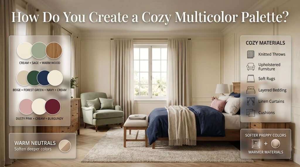
Cozy rooms often benefit from slightly warmer versions of traditional preppy colors.
Try:
Cream + sage + warm wood
or:
Beige + forest green + navy + cream
or:
Dusty pink + cream + burgundy
Warm neutrals help soften deeper colors.
Textiles also become important:
- Knitted throws
- Upholstered furniture
- Soft rugs
- Layered bedding
- Linen curtains
- Cushions
A cozy room doesn’t need to abandon preppy colors. It can simply use softer tones and warmer materials.
How Do You Use Brass and Metallic Details?
Metallic finishes should generally behave like supporting details rather than major colors.
Brass can appear through:
- Lamps
- Picture frames
- Drawer hardware
- Mirrors
- Decorative objects
Because metallic surfaces reflect light, even small quantities can become noticeable.
If the room already contains several strong colors, keep metallic details consistent.
For example:
Navy + cream + sage + brass
can feel more controlled than mixing brass, chrome, copper, and several other metallic finishes.
What Are the Most Common Multicolor Room Mistakes?
Mistake 1: Giving Every Color Equal Importance
This creates competition.
Why It Happens
The decorator likes every color and doesn’t want to leave anything out.
How to Fix It
Choose one dominant color.
Then decide which colors are secondary and which are accents.
Mistake 2: Adding Colors Randomly
A colorful object may look beautiful by itself but disconnected from the room.
How to Fix It
Repeat that color elsewhere.
It can appear in artwork, textiles, books, or small accessories.
Mistake 3: Using Too Many Bright Colors
Strong colors attract attention.
Several strong colors can create visual noise.
How to Fix It
Pair saturated colors with softer shades.
For example:
Bright navy + soft sage + cream + muted pink
instead of several equally intense colors.
Mistake 4: Ignoring Existing Wood and Flooring
Wood isn’t visually invisible.
How to Fix It
Treat the wood finish as part of your palette.
Warm wood can support warm colors.
Cooler pale wood can work well with airy blue and white palettes.
Mistake 5: Matching Everything Exactly
A room doesn’t need identical shades everywhere.
How to Fix It
Use related shades.
For example:
- Navy
- Dusty blue
- Powder blue
can create a coordinated blue family.
Mistake 6: Using Too Many Patterns
Even a perfect color palette can become overwhelming if every surface has a different pattern.
How to Fix It
Use a hierarchy:
One major pattern
One supporting pattern
One small pattern
Then leave some surfaces plain.
How Do You Test a Multicolor Palette Before Buying?
Create a simple physical or digital palette board.
Include:
- Paint sample
- Fabric sample
- Furniture finish
- Rug image
- Artwork
- Curtain material
- Accent color
Then place them together.
Look for:
Dominance
Which color appears first?
Balance
Is another color competing too strongly?
Repetition
Does each important color appear at least twice?
Contrast
Are there enough light and dark values?
Breathing Space
Are there enough neutral surfaces?
This small exercise can save you from purchasing pieces that later feel disconnected.
How Do You Know If You Have Added Too Many Colors?
Ask yourself one question:
If I remove this color, does the room lose something important?
If removing it makes the room feel cleaner without losing personality, you may not need it.
Another useful test is to photograph the room.
Photos often reveal visual competition more clearly than standing inside the room.
Look at the image from a distance.
If your eye jumps randomly between many objects, simplify the visual hierarchy.
How Do You Coordinate Colors Across Different Parts of the Room?
Color repetition creates rhythm.
Suppose your palette is:
Navy + cream + sage + pink
You might use:
- Navy bedding
- Cream curtains
- Sage cushion
- Pink artwork
- Navy frame
- Cream rug
- Sage vase
The colors don’t need equal representation.
They simply need to reappear naturally.
This principle is also useful when developing a larger preppy room design, where coordinated colors, patterns, textiles, and personal details work together as one visual system.
Should You Use a Neutral Background With a Multicolor Palette?
Usually, a neutral background makes multicolor decorating easier.
Good choices include:
- Warm white
- Cream
- Ivory
- Beige
- Soft gray
But this isn’t a requirement.
A colorful wall can work beautifully if the remaining elements are more controlled.
For example:
Sage wall + cream furniture + navy bedding + small pink accents
can be very successful.
The principle is simply to avoid making every major surface compete.
How Do You Use Multicolor Palettes in a Preppy Room Without Losing the Style?
The preppy character doesn’t come only from color.
It can also come from:
- Stripes
- Plaid
- Gingham
- Floral patterns
- Traditional furniture
- Layered textiles
- Framed artwork
- Personal objects
This means your color palette doesn’t have to carry the entire design.
A room with simple colors can still feel strongly preppy through patterns and furniture.
Conversely, a room with many colors can lose its identity if the patterns and furniture have no relationship.
The strongest result comes from combining color with the other visual elements.
How Do You Use Personal Photographs in a Multicolor Room?
Personal photographs can introduce colors naturally.
A photograph may contain:
- Blue sky
- Green landscape
- Warm wood
- Neutral clothing
- Pink or red details
Instead of forcing the room to match the photograph, identify one or two colors from it.
Then repeat those shades elsewhere.
This allows personal decoration to become part of the palette rather than looking randomly placed.
How Do You Use Mirrors With Multicolor Palettes?
Mirrors don’t add a new color in the same way that artwork or textiles do.
Instead, they reflect existing colors and light.
This makes them useful when a multicolor room already has enough visual information.
A mirror with a simple frame can help create breathing space around colorful artwork or furniture.
The frame itself can also repeat:
- Brass
- Wood
- White
- Navy
- Black
Choose the frame based on the existing palette rather than treating the mirror as an isolated accessory.
How Do You Use Accent Wall Details in a Multicolor Room?
Accent wall details can be powerful because the wall occupies a large visual area.
If you already have several colors elsewhere, keep the accent wall relatively controlled.
For example:
Cream wall + navy paneling + sage artwork + pink accessories
can feel more balanced than a wall containing several unrelated colors.
Accent details can include:
- Paneling
- Molding
- Wallpaper
- Framed artwork
- Decorative prints
- Color blocking
The wall should support the palette rather than introduce an entirely new one.
How Do You Choose the Right Palette for Your Room’s Mood?
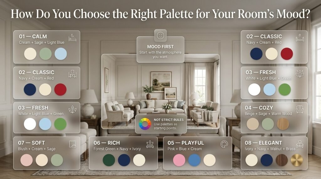
Start with the atmosphere you want.
| Desired Mood | Possible Palette |
|---|---|
| Calm | Cream + sage + light blue |
| Classic | Navy + cream + red |
| Fresh | White + light blue + green |
| Cozy | Beige + sage + warm wood |
| Playful | Pink + blue + cream |
| Rich | Forest green + navy + ivory |
| Soft | Blush + cream + sage |
| Elegant | Ivory + navy + walnut + brass |
These combinations aren’t rules.
They simply show how color relationships can change the feeling of a room.
What Colors Should You Avoid Combining?
There aren’t many absolute color combinations that are automatically wrong.
The bigger issue is usually proportion and saturation.
For example, bright red and bright green can work in a carefully designed room, but if both occupy large areas, they may compete heavily.
Likewise, navy and black can work together, but the room may need enough lighter tones to prevent the overall palette from becoming too dark.
Instead of asking:
“Can these colors go together?”
ask:
“How much of each color should I use?”
That is usually the more useful question.
How Can You Make a Multicolor Room Look More Expensive?
You don’t need more colors or more decorations.
In fact, the opposite is often true.
Focus on:
- Consistent color repetition
- Good visual spacing
- Layered textures
- Controlled patterns
- Natural materials
- Simple furniture silhouettes
- Quality-looking frames
- Coordinated lighting
- Fewer but more meaningful accessories
A room can contain inexpensive objects and still feel thoughtfully designed when the overall composition is intentional.
What Should You Do If the Room Already Feels Too Colorful?
Don’t immediately repaint everything.
Start with the smallest changes.
First
Remove a few decorative objects.
Second
Reduce competing patterns.
Third
Introduce a neutral textile.
Fourth
Group similar colors together.
Fifth
Repeat one dominant color in another area.
Often, the room doesn’t actually have too many colors.
It has too many equal-strength visual statements.
What Should You Do If the Room Feels Too Plain?
Add color gradually.
Start with:
One accent color
Then repeat it in two or three locations.
For example:
- Navy cushion
- Navy artwork
- Navy lamp detail
If that works, introduce a second supporting color.
This is safer than buying five colorful objects at once.
What Are the Best Balanced Multicolor Palettes for Beginners?
If you’re starting from zero, these are relatively easy structures to work with.
Palette 1: Cream + Navy + Sage + Pink
Cream provides the background.
Navy creates structure.
Sage softens the palette.
Pink adds a small playful note.
Palette 2: White + Light Blue + Navy + Green
White keeps the room bright.
Light blue provides softness.
Navy adds depth.
Green introduces a natural accent.
Palette 3: Beige + Forest Green + Navy + Brass
Beige provides warmth.
Green and navy add richness.
Brass supplies a small reflective detail.
Palette 4: Cream + Pink + Sage + Natural Wood
Cream creates calm.
Pink provides personality.
Sage balances the warmth.
Wood adds natural texture.
How Do You Create a Balanced Multicolor Room Palette Without Making the Room Look Too Busy?
A balanced multicolor room starts with visual hierarchy, not simply a list of colors that look attractive together. Choose one dominant color for the largest surfaces, one or two supporting colors for furniture and textiles, and keep stronger accent shades in smaller areas. This allows the room to feel colorful while still giving the eye a clear place to rest.
For example, cream + navy + sage + soft pink can work beautifully when cream remains the background, navy provides structure, sage adds a softer secondary layer, and pink appears through smaller details such as artwork, cushions, or accessories.
Professional points:
Choose one clear dominant color before adding accents.
Repeat important colors in at least two different areas.
Keep very bright or dark colors in controlled quantities.
Leave some walls, furniture, or surfaces visually quiet.
Use neutral shades such as cream, ivory, or white to separate stronger colors.
Don’t make every color equally prominent.
The 60-30-10 approach can be useful here: roughly 60% dominant, 30% supporting, and 10% accent. It should be treated as a planning guide rather than a rigid decorating formula.
What Colors Work Best Together for a Multicolor Preppy Room?
The strongest multicolor preppy palettes usually combine classic anchor colors with softer supporting shades. Navy, cream, white, light blue, green, pink, and muted red can work together particularly well when their visual intensity is controlled.
A practical example is cream + navy + sage + light blue + dusty pink. Cream gives the palette breathing room, navy creates depth, sage introduces a natural element, light blue keeps the room fresh, and pink provides a small amount of warmth and personality.
Another approach is to begin with an established two-color combination and gradually expand it. For instance, a navy-and-white foundation can be developed with sage or pink rather than introducing several unrelated colors at once. PreppyRoom’s current multicolor palette guidance similarly emphasizes using cream on larger surfaces, navy as an anchor, green as a supporting shade, and pink as a smaller accent.
Professional points:
Navy works well as a grounding color.
Cream and white provide visual breathing room.
Sage can soften stronger colors.
Light blue works well when you want a fresher appearance.
Pink is easier to control as a secondary or accent color.
Red is usually more effective when used selectively.
Natural wood can connect warm and cool colors.
The key is not finding a magical list of colors that “match.” It’s deciding which color leads and which colors support it.
How Many Colors Should You Use in a Balanced Multicolor Room?
For most rooms, three to five major color families are a practical starting point. That doesn’t mean every shade needs to appear equally or that you should stop at exactly five. Several variations of one color can function as a single color family, which makes the palette feel more layered without becoming visually fragmented.
For example, navy, medium blue, and powder blue can work as different levels of the same blue family. You could then add cream and sage as supporting colors and use a small amount of pink as an accent.
The bigger mistake is usually not having “too many” colors; it’s giving too many colors the same visual importance.
Professional points:
Start with three colors if you’re new to multicolor decorating.
Add a fourth color only when you know what role it will play.
Use different shades of the same color to create depth.
Keep highly saturated colors smaller.
Use neutrals to separate competing shades.
Repeat colors instead of constantly introducing new ones.
A useful test is to remove one accent color temporarily. If the room still feels complete, that accent should probably remain secondary rather than becoming another major color.
How Do You Mix Multiple Colors and Patterns Without Making a Preppy Room Feel Cluttered?
The easiest way to mix multiple colors and patterns is to make them share part of the same color story while giving the patterns different scales.
For example, imagine a room with a large floral rug containing navy, cream, sage, and pink. You could pair it with medium-scale navy-and-cream stripes and a small gingham cushion. The patterns are different, but the repeated colors create a connection.
The mistake is choosing every pattern independently. A beautiful floral, a colorful plaid, and a bright geometric print can all look good individually but become difficult to coordinate when they have unrelated colors and similar visual intensity.
Current 2026 design coverage also highlights a move toward more expressive pattern mixing and playful maximalism, but the same reporting describes the importance of combining lively colors with grounding neutrals.
Professional points:
Let one pattern become the main statement.
Use a medium pattern as supporting decoration.
Keep smaller patterns more restrained.
Repeat at least one or two colors between patterns.
Balance patterned surfaces with solid-colored textiles.
Don’t place several large, high-contrast patterns beside each other.
If the room feels overwhelming, reduce pattern density before removing every color.
A good multicolor preppy room should feel layered, not randomly decorated.
What Are the Best Multicolor Room Palette Trends to Consider in 2026?
For 2026, multicolor interiors are moving toward more expressive combinations rather than relying exclusively on pale neutrals. Current design coverage highlights earthy umber tones, softer sky blues, ochre, burgundy and red, pistachio-chartreuse, and warm lemon-vanilla tones as notable directions. These shades can be adapted to a preppy room without abandoning its classic character.
For a PreppyRoom-style interpretation, you don’t need to use every trend color together. Instead, take one contemporary shade and connect it with familiar preppy colors.
For example:
Navy + cream + desaturated sky blue + sage
creates a softer contemporary palette.
Or:
Cream + navy + burgundy + natural wood
creates a deeper traditional direction.
Another possibility is:
Warm white + sage + soft blue + muted ochre
for a more relaxed, updated multicolor room.
Professional points:
Use trend colors as accents rather than rebuilding the entire room.
Pair newer shades with established preppy colors.
Softer blues can work as a bridge between neutrals and stronger colors.
Earthy shades can add warmth to traditionally cool palettes.
Burgundy or muted red can provide depth without requiring bright red everywhere.
Choose colors based on your existing furniture and lighting, not simply because they’re trending.
The most useful approach is to treat trends as inspiration, not instructions. A well-balanced palette should still work after the trend has passed.
Conclusion
Creating a balanced multicolor room is not about using as many colors as possible. It is about giving each color a clear role so the room feels connected, comfortable, and visually interesting.
Start with a dependable foundation such as cream, white, soft beige, or another quiet neutral. Then introduce stronger colors through furniture, artwork, bedding, rugs, curtains, decorative accessories, and smaller accent details. A color such as navy can provide visual structure, while softer shades like sage, powder blue, pink, or muted green can add personality without overwhelming the space.
Pattern also matters. Instead of using several patterns with the same visual strength, combine different scales and repeat selected colors throughout the room. This creates continuity while allowing individual pieces to stand out.
The most successful multicolor preppy rooms usually feel intentional rather than perfectly matched. You do not need every color to appear equally. What matters is creating a clear visual hierarchy, repeating important colors naturally, and leaving enough quiet space for the eye to rest.
Whether you prefer classic combinations, cheerful accents, soft pastels, or more expressive multicolor schemes, the goal is the same: create a room where color adds personality without creating visual clutter.
With thoughtful proportions, coordinated patterns, and a consistent foundation, a multicolor palette can make a preppy room feel polished, welcoming, and uniquely personal.