Introduction
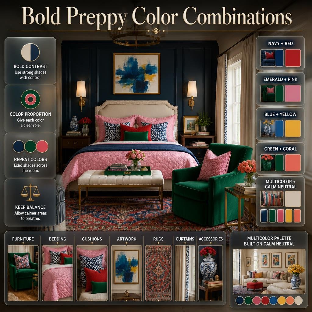
Bold Preppy Color Combinations | A preppy room can look incredibly stylish when color is used with confidence—but bold doesn’t have to mean chaotic. The challenge is knowing how to combine strong shades without making the room feel crowded, overly bright, or visually disconnected. A navy wall, emerald chair, pink bedding, red accents, or colorful patterned rug can each look beautiful individually, but they need a thoughtful relationship with the rest of the room.
That is where bold preppy color combinations become useful. Instead of choosing colors randomly, you can build a palette around contrast, proportion, repetition, and balance. If you’re exploring the broader world of preppy interiors, the Preppy Room homepage is a helpful starting point for understanding how color, furniture, patterns, and decorative details work together.
In this guide, you’ll learn how to choose bold preppy colors, combine classic and contemporary shades, control strong contrasts, coordinate furniture and accessories, use patterns without overwhelming the room, and create colorful bedrooms that still feel polished.
You’ll also find practical combinations you can use immediately, including navy with red, emerald with pink, blue with yellow, green with coral, and multicolor palettes built around a calm neutral foundation.
What Are Bold Preppy Color Combinations?
Bold preppy color combinations are palettes that use noticeable contrast, rich colors, or energetic accents while maintaining the classic, organized character associated with preppy interiors. Common examples include navy and red, emerald and pink, blue and yellow, green and coral, or deep blue with bright white and brass.
The important part is balance.
A bold preppy room isn’t simply a room containing many bright colors. It usually has a clear visual hierarchy.
For example:
Dominant color: Navy
Supporting color: Ivory
Accent color: Red
Secondary accent: Brass
This creates a stronger look than using navy, red, yellow, green, pink, and blue in equal amounts.
The colors can be bold, but their roles remain controlled.
That distinction is what separates a confident preppy interior from a room that simply feels busy.
Why Do Bold Colors Work So Well in Preppy Interiors?
Preppy design already has a strong relationship with contrast.
Traditional preppy interiors often use combinations such as navy and white, green and cream, red and blue, or patterned textiles against lighter backgrounds. Bold color simply pushes that characteristic a little further.
The result can feel:
- Energetic
- Traditional
- Playful
- Sophisticated
- Youthful
- Collected
- Expressive
- Visually memorable
The secret is not the number of colors.
It’s how those colors interact.
A strong navy can make a soft pink appear brighter. Cream can calm an emerald green. White can give red more visual impact. Natural wood can soften a combination of blue and yellow.
Recent interior design coverage also emphasizes the value of combining classic preppy colors with warmer neutrals and natural materials rather than relying exclusively on bright primary shades.
How Do You Choose Bold Colors for a Preppy Room?
Start with the room rather than the color.
Before choosing paint, bedding, curtains, or accessories, look at the existing elements.
Consider:
- Natural light
- Room size
- Flooring
- Existing furniture
- Ceiling height
- Window treatments
- Wood tones
- Metal finishes
- Patterned items
- Your preferred mood
A dark navy can feel dramatic in a small room with limited natural light but sophisticated in a bright room with large windows.
Likewise, bright yellow can feel cheerful when used as an accent but overwhelming if applied across too many large surfaces.
A simple professional formula
Try this structure:
1 dominant color + 1 neutral + 1 supporting color + 1 small accent
For example:
Navy + ivory + emerald + brass
or:
Cream + pink + green + navy
or:
White + cobalt blue + red + natural wood
This approach gives you freedom while preventing the palette from becoming random.
For more inspiration on using vibrant shades with confidence while keeping the overall space visually coordinated, explore these bold colorful room ideas for practical ways to layer expressive colors throughout a preppy interior.
The Difference Between Bold and Overwhelming Color
This is one of the most important concepts when designing a colorful preppy room.
A bold palette has hierarchy.
An overwhelming palette doesn’t.
Imagine a bedroom containing:
- Bright blue walls
- Red bedding
- Green curtains
- Yellow pillows
- Pink artwork
- Orange rug
- Purple accessories
Each color might be attractive individually, but none has a clear role.
Now imagine:
- Warm ivory walls
- Navy bed
- Emerald accent chair
- Red patterned pillows
- Brass lighting
- Natural wood furniture
The second room is still colorful, but the eye knows where to look.
The difference is visual hierarchy.
Use the 60–30–10 principle as a starting point
You don’t have to follow the formula mathematically, but it can help:
60% — dominant/background color
Walls, large rugs, major furniture, or bedding.
30% — supporting color
Curtains, upholstery, secondary textiles, or larger decorative pieces.
10% — accent color
Pillows, artwork, accessories, lamps, books, or small decorative objects.
This doesn’t mean you need to measure the room.
It simply reminds you that bold colors don’t need equal representation.
15 Bold Preppy Color Combinations to Try
1. Navy, White, and Bright Red
Navy, white, and red is one of the most recognizable bold preppy combinations.
Navy provides depth.
White provides breathing room.
Red supplies energy.
The combination works particularly well when red is treated as an accent rather than the dominant color.
Try this arrangement:
- White or ivory walls
- Navy upholstered bed
- White bedding
- Red patterned cushions
- Navy-and-white striped rug
- Brass lamp
- Small red artwork
This palette works especially well in traditional bedrooms because stripes, checks, and classic furniture naturally reinforce the color relationship.
The key is controlling the red.
If red appears everywhere, the room can quickly become visually intense.
Use it in repeated but limited places.
2. Emerald Green, Pink, and Cream
Emerald and pink create a much more playful interpretation of preppy style.
The combination has strong contrast because the colors differ significantly in temperature and visual character.
Cream is important because it gives the eye somewhere to rest.
A balanced version could include:
- Cream walls
- Emerald green chair
- Soft pink bedding
- Green-and-pink floral artwork
- Cream rug
- Light wood nightstand
- Small brass details
The pink doesn’t need to be neon.
Muted blush, dusty rose, or medium pink can create a sophisticated result.
For a stronger room, use emerald as the dominant color and pink as the accent.
For a softer room, reverse the proportions.
3. Navy, Emerald, and Ivory
Navy and emerald create a rich, sophisticated combination.
Both colors are deep, so ivory becomes especially important.
Without a lighter shade, the room can feel visually heavy.
A useful palette:
Navy + Emerald + Ivory + Walnut
Use navy on the major furniture.
Introduce emerald through:
- Cushions
- Accent chair
- Curtains
- Artwork
- Decorative objects
Then use ivory across larger surfaces.
Walnut furniture adds warmth and prevents the combination from feeling too cool.
This is a particularly useful option when you want a mature, elegant version of bold preppy style.
4. Cobalt Blue, White, and Yellow
If you want a brighter room, cobalt blue and yellow can create strong visual energy.
White keeps the palette fresh.
Cobalt gives the room structure.
Yellow becomes the cheerful accent.
Example:
- White walls
- Cobalt blue bedding
- Yellow cushion
- Blue-and-white curtains
- Natural wood furniture
- Small yellow artwork
Don’t distribute yellow equally with blue.
A little yellow can have a much greater visual impact than you might expect.
💡 Pro Tip: When working with an extremely bright accent, repeat it two or three times around the room rather than putting it in one isolated location. Repetition makes the color feel intentional.
5. Forest Green, Navy, and Burgundy
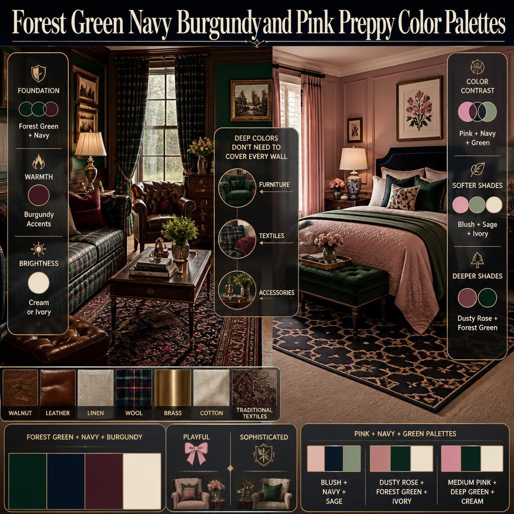
This combination takes preppy style in a deeper, more traditional direction.
Forest green and navy establish the foundation.
Burgundy adds warmth.
Cream or ivory can be introduced as a fourth color if the room needs more brightness.
Best materials for this palette:
- Walnut
- Leather
- Linen
- Wool
- Brass
- Cotton
- Traditional patterned textiles
This palette works particularly well with plaid, stripes, framed artwork, and classic furniture silhouettes.
The deeper colors should not necessarily cover every wall.
Using them through furniture and textiles can create depth without making the entire room feel dark.
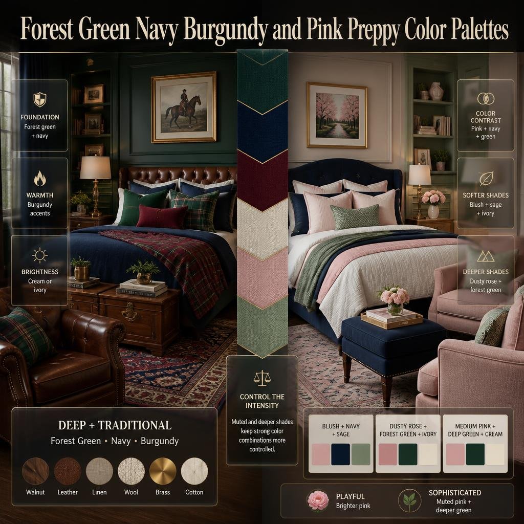
6. Pink, Navy, and Green
Pink, navy, and green are classic preppy colors that can create a colorful but controlled room.
The secret is selecting the right versions of each shade.
Instead of:
Bright pink + neon green + electric blue
consider:
Blush + navy + sage
or:
Dusty rose + forest green + ivory
or:
Medium pink + deep green + cream
This gives you the same basic color contrast while making the room easier to live with.
For a more playful room, use brighter pink.
For a more sophisticated bedroom, choose muted pink and deeper green.
7. Navy, Coral, and Cream
Coral can make navy feel warmer and more energetic.
Because navy is cool and deep while coral is warm and lively, the contrast is naturally noticeable.
Cream acts as the bridge.
Try:
- Cream walls
- Navy bed
- Coral pillows
- Navy-and-cream patterned rug
- Natural wood side table
- Coral artwork
Coral works especially well when repeated through small decorative elements.
You don’t need a coral sofa or an entire coral wall to make the color visible.
8. Teal, Pink, and White
Teal offers a more contemporary alternative to traditional navy.
Combined with pink and white, it creates a youthful and energetic palette.
This can work particularly well in a bedroom where textiles are the primary source of color.
Example:
White walls + teal bedding + pink cushions + white curtains
Then add natural wood to soften the contrast.
If the room contains patterned bedding, keep the curtains relatively simple.
Otherwise, the combination can become too visually active.
9. Royal Blue, Green, and Gold
Royal blue and green create a dramatic combination, while gold or brass adds warmth.
The metallic should be treated as a finish rather than a major color.
Use it on:
- Lamp bases
- Picture frames
- Drawer handles
- Mirrors
- Small decorative objects
This combination can look especially elegant when paired with cream or warm white.
Avoid adding too many additional colors.
Royal blue and green already provide plenty of visual information.
10. Red, Pink, and Navy
Red and pink can work together surprisingly well when navy provides structure.
The trick is choosing different intensities.
For example:
Navy + soft pink + muted red + ivory
rather than:
Bright red + hot pink + bright blue
The first palette has contrast without making every element compete.
A floral or geometric pattern can also combine the colors naturally.
This is one reason patterned textiles are useful in preppy design: they can visually connect colors that might otherwise look unrelated.
11. Orange, Navy, and Cream
Orange is a strong accent, so navy provides an excellent anchor.
Cream softens the entire palette.
A practical version might include:
- Cream walls
- Navy sofa or bed
- Orange cushions
- Navy patterned artwork
- Natural wood
- Brass accents
Use orange selectively.
If the orange becomes the largest visual element in the room, the design may shift away from classic preppy toward a much more contemporary look.
12. Purple, Navy, and Ivory
Purple can be used in preppy interiors, but it usually works better when the shade is controlled.
Consider:
- Dusty lavender
- Plum
- Soft violet
- Muted purple
Pair it with navy and ivory for a more sophisticated result.
For example:
Ivory walls + navy furniture + lavender bedding + brass details
This keeps purple from becoming overly dominant.
13. Lime Green, Navy, and White
Lime green is one of the boldest options on this list.
It should usually be treated as a small accent.
Try:
- White walls
- Navy furniture
- Lime green cushions
- Navy-and-white patterned rug
- Simple artwork
The lime color can appear in just a few places and still have a strong effect.
⚠ Common Mistake: Don’t use an extremely bright accent color on every decorative object. When everything demands attention, nothing becomes a true focal point.
14. Burgundy, Blush, and Navy
Burgundy adds richness.
Blush introduces softness.
Navy provides structure.
Together, they create a layered palette that feels colorful without relying on neon shades.
This works especially well with:
- Velvet
- Linen
- Brass
- Dark wood
- Cream
- Traditional patterns
For a bedroom, consider blush bedding, a navy upholstered headboard, burgundy cushions, and warm ivory walls.
15. Multicolor Preppy Palette
If you genuinely want several colors, you don’t have to eliminate them.
You simply need to organize them.
A multicolor palette might include:
Navy + Pink + Sage + Light Blue + Red + Cream
The cream becomes the visual foundation.
Navy acts as the anchor.
Pink, sage, light blue, and red become supporting accents.
This is much easier to control than making every color equally dominant.
For more ideas on building colorful combinations, explore Multicolor Preppy Palettes, which focuses specifically on creating relationships between multiple shades without making a room feel random.
How Do You Make Bold Colors Look Balanced?
Balance is not the same as using equal amounts of every color.
In fact, equal distribution can make a room feel less sophisticated.
Instead, create different levels of importance.
For example:
Palette A
Dominant: Ivory
Secondary: Navy
Accent: Red
Finish: Brass
Palette B
Dominant: Cream
Secondary: Emerald
Accent: Pink
Finish: Walnut
Palette C
Dominant: White
Secondary: Cobalt
Accent: Yellow
Finish: Natural wood
Each palette contains contrast.
But each also has hierarchy.
How Do Neutral Colors Help Bold Preppy Palettes?
Neutral colors are not boring.
They are useful design tools.
White, ivory, cream, beige, warm gray, and natural wood can separate stronger colors and prevent visual competition.
Imagine a room with navy, red, and green.
If all three colors appear across every surface, the room may feel crowded.
Now introduce ivory walls and a cream rug.
Suddenly, the stronger colors have space to stand out.
This is why neutral backgrounds are so useful for colorful preppy interiors.
Your neutral doesn’t have to be pure white.
Warm ivory, beige, cream, and soft khaki can produce a warmer and more contemporary result.
For a more structured approach to combining multiple shades without making the room feel visually crowded, explore these balanced preppy color combinations for practical ideas on using dominant, supporting, and accent colors together.
Should You Use Bold Paint Colors or Bold Furniture?
There is no single answer.
It depends on how permanent you want the color to be.
Bold walls
Best when:
- You love the color long-term
- The room receives good natural light
- The furniture is relatively restrained
- You want a dramatic atmosphere
Bold furniture
Best when:
- You want flexibility
- You rent
- You enjoy changing the room
- You want one strong focal point
Bold accessories
Best when:
- You’re experimenting
- You prefer subtle changes
- You want seasonal flexibility
- You already have colorful furniture
A useful strategy
If you’re uncertain, start with accessories.
You can always increase the amount of color later.
How Do Patterns Work With Bold Preppy Colors?
Patterns are one of the defining opportunities in preppy design.
Stripes, gingham, plaid, florals, checks, geometric motifs, and traditional prints can all work beautifully with strong color.
But patterns introduce another layer of visual information.
That’s why color coordination becomes even more important.
Suppose your bedding contains:
Navy + pink + green + cream
You don’t need every other item to introduce a new color.
Instead, pull colors from the bedding.
Use:
- Navy curtains
- Cream walls
- Green cushion
- Pink artwork
Now the pattern becomes the visual connector.
For additional guidance, Harmonious Multicolor Color Schemes can help when several colors need to work together without competing for attention.
How Many Patterns Should a Bold Preppy Room Have?
There is no universal rule, but scale matters.
If you use:
- Large floral wallpaper
- Large plaid bedding
- Large geometric rug
- Large striped curtains
all at once, the room may become visually overwhelming.
Instead, vary the scale.
For example:
Large: Floral bedding
Medium: Stripe cushion
Small: Gingham accent
This gives the eye different levels of detail.
The colors should also connect.
A navy stripe can relate to a navy floral.
A small pink check can connect with pink flowers.
This creates cohesion without requiring identical patterns.
How Can You Create a Bold Preppy Bedroom?
The bedroom is one of the easiest places to experiment because bedding, curtains, rugs, and artwork can introduce color without requiring major structural changes.
Start with the largest elements.
Step 1: Choose the foundation
Decide on:
- Wall color
- Floor tone
- Main furniture
- Large rug
Step 2: Select your anchor color
Navy, forest green, burgundy, cobalt, or emerald are useful choices.
Step 3: Add one energetic color
Consider:
- Pink
- Red
- Yellow
- Coral
- Orange
Step 4: Introduce a neutral
Use:
- Ivory
- Cream
- White
- Beige
Step 5: Repeat the accent
Place the accent color in two or three locations.
Step 6: Add pattern
Choose one major pattern and one smaller pattern.
Step 7: Finish with texture
Use:
- Linen
- Cotton
- Velvet
- Woven materials
- Natural wood
- Brass
This creates depth without requiring additional colors.
Bold Color Ideas for a Small Bedroom
Small rooms can absolutely use bold colors.
The mistake is assuming that a small room must contain only pale colors.
Instead, control where the bold shades appear.
A useful approach is:
Light walls + bold furniture + colorful textiles
For example:
- Warm white walls
- Navy bed
- Pink bedding
- Green cushion
- Cream rug
- Light wood furniture
Another option is a single dark accent wall combined with lighter furniture.
The goal is not to eliminate contrast.
It’s to prevent every surface from competing.
Bold Color Ideas for a Large Bedroom
Large rooms provide more room for stronger color relationships.
You can use:
- Darker walls
- Larger patterned rugs
- Strong upholstery
- More substantial artwork
- Multiple colorful textiles
However, size doesn’t remove the need for hierarchy.
A large room with too many unrelated colors can still feel chaotic.
Consider dividing the room visually.
For example:
Sleeping area: Navy + cream + pink
Reading corner: Emerald + ivory + brass
Desk area: Navy + light blue + natural wood
Then repeat one common color throughout.
This makes separate zones feel connected.
How Can You Use Bold Colors Without Making a Room Look Childish?
This is a common concern, particularly when using pink, yellow, coral, or multiple pastel colors.
The solution is not removing playful colors.
It’s balancing them with mature elements.
For example:
Pink + navy + ivory + walnut
will generally feel more grounded than:
Pink + bright purple + neon yellow + turquoise
Materials also matter.
Add:
- Wood
- Linen
- Brass
- Woven textures
- Framed artwork
- Classic furniture
- Structured lamps
Traditional silhouettes can make even a colorful palette feel polished.
How Can You Make a Bold Palette Feel More Elegant?
Elegance usually comes from control.
Choose fewer major colors and pay more attention to materials.
For example:
Emerald + ivory + navy + brass
can look more refined when paired with:
- Velvet upholstery
- Linen curtains
- Brass lamps
- Walnut furniture
- Framed artwork
- Simple patterned cushions
You don’t need to add more decoration.
Instead, make each element contribute something useful.
Current interior design advice similarly emphasizes intentional combinations of color, texture, materials, and contrast rather than simply adding more decorative objects.
How Can You Make a Bold Palette Feel Cozy?
Deep colors can create warmth, especially when combined with tactile materials.
Consider:
Forest green + navy + cream + walnut
Then add:
- Layered bedding
- Soft rug
- Woven basket
- Linen curtains
- Warm lighting
- Wooden furniture
The result doesn’t need to be dark.
Cream and warm wood can keep the room comfortable and inviting.
How Can You Make Bold Colors Feel Modern?
Modernize a traditional preppy palette by changing the undertones and materials.
Traditional:
Navy + white + red
Modern:
Navy + warm ivory + muted red + natural oak
Traditional:
Green + cream
Modern:
Sage + warm ivory + light wood
Traditional:
Pink + green
Modern:
Dusty rose + olive + cream
This approach keeps the recognizable preppy foundation while reducing the feeling of a themed or overly literal room.
The use of warmer neutrals, natural wood, and softened colors is also reflected in current interior design discussions.
Bold Preppy Color Combinations for Different Moods
| Desired Mood | Suggested Palette | Useful Materials |
|---|---|---|
| Classic | Navy + White + Red | Cotton, brass, wood |
| Sophisticated | Emerald + Navy + Ivory | Velvet, walnut, brass |
| Playful | Pink + Blue + Green + Cream | Cotton, painted wood |
| Cozy | Forest Green + Cream + Walnut | Wool, linen, wood |
| Energetic | Cobalt + Yellow + White | Cotton, metal, wood |
| Feminine | Blush + Navy + Ivory | Linen, velvet, brass |
| Modern | Sage + Warm Ivory + Navy | Oak, linen, matte finishes |
| Dramatic | Burgundy + Navy + Cream | Velvet, dark wood |
| Fresh | Light Blue + Green + White | Cotton, rattan, light wood |
| Tropical-inspired | Teal + Coral + Cream | Woven textures, wood |
Use the table as a starting point rather than a strict formula.
How Do You Coordinate Furniture With Bold Colors?
Furniture should support the palette rather than compete with it.
If your room already contains several strong colors, natural wood can be an excellent grounding element.
For example:
Navy + pink + green + cream + walnut
The walnut isn’t technically a colorful accent, but it helps connect the palette.
Similarly, brass can provide warmth between cool colors.
Furniture colors that work well with bold preppy palettes
Natural wood: Warm and versatile
Walnut: Rich and traditional
White: Crisp and clean
Cream: Softer than white
Navy: Strong and classic
Emerald: Dramatic and elegant
Choose the furniture based on the room’s dominant palette.
Don’t select every piece as a statement item.
How Can You Use Metallic Accents?
Brass, antique brass, and polished nickel can complement bold color palettes.
But metallic finishes should generally act as supporting details.
For example:
- Brass lamp
- Brass mirror frame
- Brass drawer pulls
- Small brass picture frames
You don’t need a gold-colored object on every surface.
Repetition is useful, but excess can become distracting.
If your room already contains several strong colors, let the metallic finish remain subtle.
Common Mistakes With Bold Preppy Color Combinations
Using Too Many Dominant Colors
One of the biggest mistakes is treating every color as equally important.
Why it happens
People often collect individual pieces they love without creating a palette first.
Why it causes problems
The eye doesn’t know where to focus.
Better approach
Choose one dominant color and make the other colors supporting characters.
Making Every Color Equally Bright
Bright blue, bright red, bright yellow, bright pink, and bright green can quickly become exhausting when used in equal amounts.
Better approach
Mix intensity levels.
For example:
Navy + blush + ivory + muted red
The palette remains colorful, but the visual intensity is controlled.
Ignoring Natural Light
Colors change depending on lighting.
A deep green may look dramatically different in a room with limited daylight compared with a bright south-facing room.
Always observe large color samples at different times of day before committing to paint.
Choosing Colors Only From Small Accessories
A tiny cushion may look perfect in a store but provide a poor foundation for the entire room.
Choose major colors based on:
- Walls
- Flooring
- Furniture
- Large textiles
Then use accessories to refine the palette.
Using Too Many Patterns
Preppy style welcomes patterns, but patterns need hierarchy.
Choose:
One major pattern + one supporting pattern + solid colors
before adding anything else.
Forgetting the Neutral
A neutral isn’t wasted space.
It gives stronger colors somewhere to breathe.
If you love bold color, you may actually benefit from more neutral space, not less.
Matching Everything Exactly
A room doesn’t need identical shades everywhere.
In fact, slight variations often make a room feel more collected.
For example:
- Navy
- Dusty blue
- Powder blue
- Blue-gray
can work together even though none is identical.
How Can You Build a Balanced Multicolor Palette?
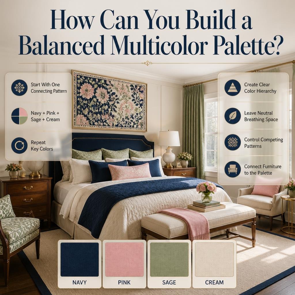
If you want four or more colors, begin with a single connecting element.
That might be:
- A patterned rug
- Floral bedding
- Wallpaper
- Artwork
- A colorful fabric
Suppose your artwork contains:
Navy + pink + sage + cream
Use those colors as your palette.
You don’t need to invent another five colors.
This approach is particularly useful for coordinated rooms because one patterned object can become the visual bridge between otherwise separate shades.
For more detailed ideas, Balanced Multicolor Room Palettes focuses on creating colorful combinations where every shade has a clear role.
How Do You Know if Your Color Palette Is Working?
Step back from the room.
Don’t inspect one pillow at a time.
Look at the room as a whole.
Ask:
1. Is there a clear dominant color?
If not, the room may lack hierarchy.
2. Is there enough neutral space?
If not, introduce cream, white, beige, or natural wood.
3. Are the strongest colors repeated?
If a color appears only once, it may feel accidental.
4. Are patterns competing?
If everything is patterned, simplify one or two surfaces.
5. Does the furniture belong to the palette?
Wood and neutral furniture can help connect strong colors.
6. Does the room still feel like you?
The best palette isn’t simply fashionable.
It should suit the people using the room.
A Practical Formula for Designing Your Own Bold Preppy Palette
Use this seven-step process.
Step 1: Pick Your Anchor
Choose one strong color.
Examples:
- Navy
- Emerald
- Forest green
- Burgundy
- Cobalt
This becomes the visual foundation.
Step 2: Choose Your Neutral
Select:
- White
- Cream
- Ivory
- Beige
- Warm gray
This gives the palette breathing room.
Step 3: Add a Contrasting Accent
Try:
- Red with navy
- Pink with green
- Yellow with blue
- Coral with teal
Step 4: Add a Material Tone
Natural wood is especially useful.
Walnut creates depth.
Oak creates lightness.
Rattan adds texture.
Step 5: Choose One Main Pattern
Use a stripe, floral, gingham, plaid, or geometric print.
Step 6: Repeat Colors
Repeat the main colors in at least two or three places.
Step 7: Remove One Unnecessary Color
This final step is surprisingly valuable.
If the room feels too busy, don’t automatically add more neutral objects.
First ask:
Which color isn’t actually doing useful work?
Removing one unnecessary shade can immediately improve the palette.
How Can You Create Bold Color Without Repainting?
You don’t need paint to create a colorful preppy room.
Try changing:
- Bedding
- Curtains
- Rug
- Accent chair
- Cushions
- Artwork
- Lampshades
- Throws
- Decorative accessories
For example, a plain cream bedroom can become:
Navy + pink + green
through bedding, artwork, cushions, and a chair.
This is particularly useful if you like changing your room regularly.
When Should You Use a Bold Accent Wall?
An accent wall can work well when the color is strong and the remaining walls provide enough visual relief.
Consider an accent wall when:
- The room has good natural light
- The wall is architecturally important
- The remaining furniture is relatively simple
- You want a clear focal point
A navy accent wall can work beautifully with white bedding and warm wood.
An emerald wall can work with cream textiles and brass details.
A burgundy wall can create a dramatic traditional atmosphere when balanced with lighter furniture.
The key is to let the accent wall remain an accent.
How Do You Adapt Bold Preppy Colors to Different Design Styles?
Classic Preppy
Use:
Navy + white + red + walnut
Add stripes, traditional furniture, and brass.
Modern Preppy
Use:
Warm ivory + navy + sage + oak
Keep furniture lines cleaner.
Use fewer patterns.
Feminine Preppy
Use:
Blush + navy + cream + sage
Add floral patterns and soft textiles.
Coastal Preppy
Use:
Navy + pale blue + white + sand
Add natural materials and relaxed textures.
Dramatic Preppy
Use:
Emerald + burgundy + navy + ivory
Add velvet, dark wood, and brass.
Playful Preppy
Use:
Pink + blue + green + yellow + cream
Keep the background light and use the strongest colors through accessories and textiles.
How Do Coordinated Colors Improve Bold Rooms?
A bold room becomes much easier to control when the colors have relationships.
A coordinated palette can help:
- Connect furniture
- Make patterns feel intentional
- Establish focal points
- Reduce visual clutter
- Create continuity
- Make accessories easier to select
- Simplify future decorating decisions
For a deeper look at this concept, Coordinated Multicolor Room Ideas can help you think about how several colors can work together across furniture, textiles, artwork, and accessories.
What If You Already Have Too Many Colors?
Don’t panic.
You don’t necessarily need to replace everything.
Start by identifying the colors already present.
Then divide them into:
Keep: Colors that appear several times or work naturally together.
Reduce: Colors that are visually strong but appear too often.
Remove: Colors that appear randomly and don’t connect with anything else.
For example, suppose your room contains:
- Navy
- Pink
- Green
- Yellow
- Orange
- Purple
You might decide to keep:
Navy + pink + green + cream
Then reduce or remove orange, purple, and yellow.
You can make this change gradually through pillows, artwork, bedding, or small accessories.
How Can You Use Bold Color in a Rental?
Renters often have limited control over walls.
That’s not a problem.
Focus on removable elements:
- Bedding
- Rugs
- Curtains
- Artwork
- Cushions
- Lamps
- Small furniture
- Decorative objects
A white rental room can become a bold preppy space through:
Navy + pink + green + brass
without changing the walls.
This approach also makes it easier to update the palette later.
How Can You Keep Bold Preppy Colors Timeless?
Trends change.
Strong color combinations can remain useful when their foundation is classic.
Instead of building the room around a short-lived color trend, start with a dependable foundation such as:
- Navy
- Cream
- White
- Forest green
- Natural wood
Then introduce trend-sensitive colors through smaller pieces.
For example:
Navy + cream + walnut
can remain the foundation.
Add coral cushions today.
Replace them with burgundy later.
The entire room doesn’t need to change.
This makes bold decorating more practical and sustainable.
Expert Advice: Think in Color Roles, Not Color Names
A professional-looking palette is easier to build when you stop thinking only about color names.
Think about roles.
Anchor
Provides visual weight.
Example: Navy.
Background
Creates breathing space.
Example: Ivory.
Supporting color
Adds personality.
Example: Emerald.
Accent
Creates moments of contrast.
Example: Red.
Material tone
Adds warmth.
Example: Walnut.
Finish
Adds subtle detail.
Example: Brass.
This approach gives you more control than simply saying:
“I want five colors.”
Expert Advice: Use Repetition Instead of More Color
If a room feels incomplete, many people respond by adding another color.
Try repetition first.
If you already have navy and pink, repeat navy and pink in:
- Artwork
- Cushions
- Books
- Curtains
- Small accessories
The room may feel much more complete without introducing green or yellow.
Repetition creates cohesion.
More colors create complexity.
Those aren’t the same thing.
Expert Advice: Let Materials Become Part of the Palette
Color doesn’t exist only in paint.
Wood, stone, woven fibers, metals, upholstery, and textiles all contribute visual color.
A navy and cream room can feel completely different with:
Light oak + linen
versus:
Dark walnut + velvet
The colors are similar, but the material palette changes the character of the room.
This is one reason natural materials work so well with preppy interiors. They can soften strong colors without taking away their personality.
Bold Preppy Color Combinations: Quick Decision Guide
If you want…
Classic contrast:
Navy + white + red
Soft sophistication:
Blush + sage + ivory
Rich elegance:
Emerald + navy + ivory
Fresh energy:
Cobalt + white + yellow
Warm traditional style:
Forest green + burgundy + cream
Playful color:
Pink + blue + green + cream
Modern preppy:
Sage + warm ivory + navy + oak
Dramatic atmosphere:
Burgundy + navy + ivory
Coastal feeling:
Navy + pale blue + white + sand
Maximum color:
Navy + pink + sage + light blue + red + cream
What Are the Best Bold Preppy Color Combinations for a Stylish Room?
The strongest bold preppy color combinations usually pair one deep or dominant shade with a lighter neutral and a contrasting accent. Popular combinations include navy, white, and red; emerald, cream, and pink; navy, emerald, and ivory; cobalt blue, white, and yellow; and forest green, burgundy, and cream. These palettes work because each color has a different visual role instead of competing equally for attention.
For a polished result, start with one anchor color and build the room around it. Navy or emerald can provide depth, while cream or ivory creates breathing space. A smaller amount of red, pink, yellow, or coral can then introduce the bold personality that makes the room feel distinctly preppy.
Useful ways to apply the palette:
Use the darkest color on major furniture or selected textiles.
Keep large background surfaces relatively calm.
Introduce the brightest color through cushions, artwork, bedding, or accessories.
Repeat important colors in at least two areas of the room.
Use natural wood or brass to add warmth and connect the palette.
The goal isn’t to use as many colors as possible. It’s to give every color a clear purpose.
How Do You Mix Bold Colors Without Making a Preppy Room Look Too Busy?
The easiest way to mix bold colors without creating visual chaos is to establish a clear hierarchy. Choose one dominant color, one supporting color, one accent, and a neutral background. This allows the room to remain colorful while giving the eye a place to rest.
For example, navy can be the dominant shade, cream can cover the larger background surfaces, emerald can become the supporting color, and red can appear in small decorative details. The colors don’t need to occupy equal amounts of space. In fact, equal distribution can make a bold palette feel less organized.
Professional approach:
Choose one primary anchor color.
Use a neutral such as cream, ivory, or white to create breathing room.
Limit the strongest accent to smaller areas.
Repeat colors rather than continuously introducing new ones.
Keep at least some furniture or surfaces visually quiet.
Avoid combining several large-scale patterns with equally bright colors.
A useful test is to step back and look at the entire room rather than individual accessories. If your eye immediately jumps between too many unrelated elements, simplify one color, pattern, or decorative area before adding anything else.
What Colors Go Best With Navy for a Bold Preppy Look?
Navy is one of the most flexible colors for a bold preppy interior because it can be paired with both traditional and contemporary accents. White and red create a classic combination, while pink and navy feel playful, emerald and navy feel sophisticated, and yellow and navy create a brighter, more energetic atmosphere. Cream, natural wood, and brass can also soften navy and make it feel warmer.
The best pairing depends on the mood you’re trying to create. For a traditional room, navy with white and red is an easy starting point. For a softer bedroom, navy with blush pink and ivory works well. If you want more depth, combine navy with emerald and warm cream.
Navy pairing ideas:
Navy + white + red: Classic and energetic
Navy + blush + ivory: Soft and refined
Navy + emerald + cream: Rich and sophisticated
Navy + yellow + white: Bright and cheerful
Navy + coral + cream: Warm and lively
Navy + sage + natural wood: Modern and relaxed
One important detail is proportion. Navy can handle strong accents, but the brighter color usually has more impact when used selectively rather than across every major surface.
Can You Use Multiple Bright Colors in a Bold Preppy Bedroom?
Multiple bright colors can work in a preppy bedroom when they share a visual connection and are supported by calmer colors. Instead of giving every bright shade equal importance, choose one strong anchor and allow the remaining colors to appear through bedding, artwork, cushions, rugs, curtains, or smaller furniture.
A patterned textile can be especially useful because it can contain several colors within one intentional design. You can then pull individual shades from that pattern and repeat them elsewhere. For example, bedding containing navy, pink, sage, and cream can become the foundation for the entire room’s palette.
For better balance:
Keep walls relatively calm when using several strong colors.
Choose one dominant color for the largest visual element.
Repeat bright shades in small, intentional locations.
Mix bold colors with cream, ivory, white, or natural wood.
Avoid using multiple large patterns at the same visual intensity.
Let one or two colors provide most of the visual energy.
The result should feel layered rather than random. A colorful bedroom can be expressive and youthful while still looking organized and thoughtfully designed.
How Can You Make Bold Preppy Colors Look Sophisticated Instead of Overly Bright?
The key to making bold preppy colors feel sophisticated is controlling intensity, proportion, materials, and contrast. Instead of combining several neon or highly saturated colors, pair one strong shade with deeper tones, warm neutrals, and quality-looking textures. Navy, emerald, burgundy, cream, walnut, linen, velvet, and brass can create a more refined interpretation of bold preppy style.
For example, emerald green becomes more sophisticated when paired with warm ivory, walnut furniture, and subtle brass details. Similarly, bright pink can feel more mature when combined with navy, cream, and natural wood instead of several other bright colors.
Ways to create a more polished look:
Replace pure white with warm ivory or cream when the palette feels too sharp.
Use natural wood to introduce warmth.
Choose one metallic finish rather than mixing several.
Combine saturated colors with softer versions of related shades.
Use classic patterns such as stripes, checks, or restrained florals.
Leave some surfaces undecorated so bold elements have room to stand out.
Sophistication doesn’t require removing personality from the room. It comes from editing the palette so the strongest colors have enough space to make an impact.
Conclusion
Bold preppy color combinations are all about finding the right balance between personality and control. Strong shades such as navy, emerald, red, pink, cobalt, yellow, and burgundy can create a memorable room, but they work best when each color has a clear purpose.
Start with one anchor color, add a dependable neutral such as cream, ivory, or white, and then introduce one or two contrasting shades through bedding, furniture, artwork, rugs, or accessories. Repeating colors throughout the room helps create connection, while natural wood, brass, and textured fabrics can soften stronger combinations and add depth.
You don’t need to make every element bold. In fact, allowing some areas to remain calm often makes the strongest colors look even more intentional.
Whether you prefer classic navy and red, sophisticated emerald and ivory, playful pink and green, or a carefully coordinated multicolor palette, the goal is the same: create a room that feels energetic, cohesive, and unmistakably personal.
Choose colors you genuinely enjoy, control their proportions, and give your palette enough breathing room. When bold color is thoughtfully balanced, a preppy room can feel both expressive and polished without ever becoming overwhelming.