Introduction
Balanced Preppy Color Combinations | Choosing colors for a preppy room can look simple at first. Navy, white, cream, pink, green, and light blue all work beautifully with the style, but combining them successfully is a different challenge. A room can contain attractive colors individually and still feel disconnected when those colors don’t have a clear relationship.
The secret is balance.
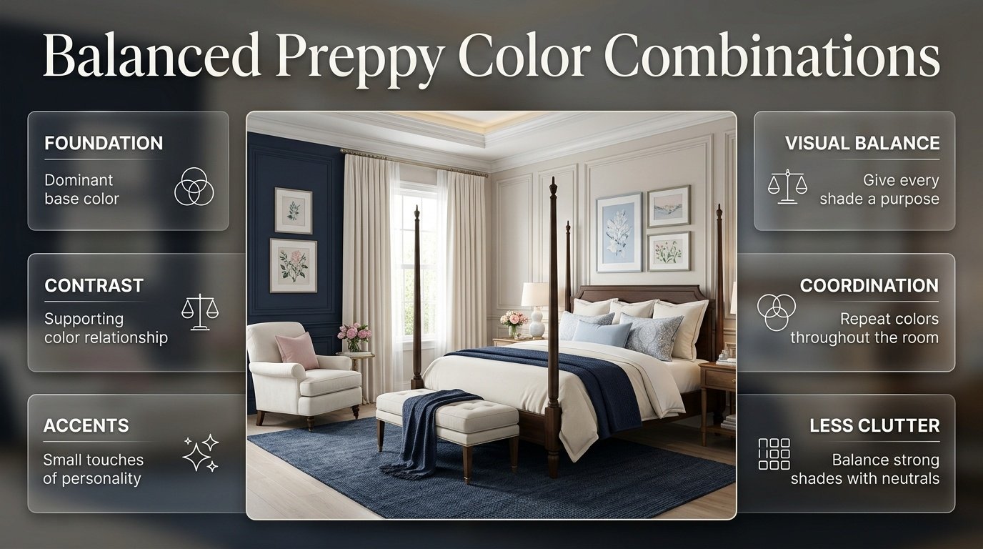
Balanced preppy color combinations allow you to use several shades while keeping the room polished, comfortable, and visually organized. Instead of making every color equally noticeable, a balanced palette gives each shade a specific purpose. One color may create the foundation, another may provide contrast, while smaller accents add personality.
If you’re building your overall decorating style, the Preppy Room guide is a useful starting point because preppy interiors naturally combine coordinated colors, classic patterns, layered textiles, personal artwork, and carefully selected decorative details.
In this guide, we’ll explore how to build balanced color palettes from the beginning, which combinations work especially well, how to use multiple colors without creating visual clutter, how patterns affect color balance, how to choose colors for bedrooms and small spaces, and how to correct common decorating mistakes.
The goal isn’t simply to find colors that “match.” The goal is to create a room where the colors feel connected from the walls to the furniture, bedding, artwork, rugs, curtains, and smallest accessories.
What Are Balanced Preppy Color Combinations?
Balanced preppy color combinations are palettes in which several colors work together through controlled contrast, repetition, proportion, and visual hierarchy. Instead of giving every shade equal attention, the palette establishes a dominant color, supporting colors, and smaller accents.
A simple example would be:
Cream + Navy + Powder Blue + Muted Red
Cream might cover the walls and larger surfaces. Navy could appear in the headboard, curtains, or rug. Powder blue might be repeated through bedding and cushions, while muted red could appear only in artwork or small accessories.
The result is colorful without becoming visually chaotic.
Balance doesn’t mean using fewer colors. It means using colors intentionally.
Why Is Color Balance Important in Preppy Interiors?
Preppy decorating often includes patterns and decorative details that already create visual activity. Stripes, checks, gingham, florals, framed artwork, layered pillows, rugs, and decorative accessories can all introduce additional colors.
If every element introduces a completely different shade, the room can quickly lose its sense of cohesion.
A coordinated palette solves that problem.
The same principle appears throughout well-designed preppy rooms: colors are repeated rather than randomly scattered. A shade introduced in the bedding may return in artwork. A color from the rug may appear again in a cushion. A darker tone used in furniture may be repeated in the lamp or picture frames.
This repetition creates a visual connection between otherwise different objects.
How Do You Choose a Balanced Preppy Color Palette?
The easiest approach is to build the palette in layers rather than choosing every color at once.
Start with a foundation.
Step 1: Choose Your Dominant Color
The dominant color should occupy the largest visual area.
Common choices include:
- Cream
- White
- Soft beige
- Pale blue
- Soft sage
- Very light pink
For many preppy rooms, cream and white are especially useful because they allow stronger colors such as navy or green to stand out without overwhelming the room.
Step 2: Add a Strong Supporting Color
Choose a deeper or more noticeable shade.
Navy is particularly useful because it provides structure and contrast while remaining strongly associated with traditional preppy interiors.
Other possibilities include:
- Forest green
- Burgundy
- Deep blue
- Muted red
- Rich teal
Step 3: Add a Secondary Shade
Now introduce a lighter or related color.
For example:
Navy → Powder Blue
or:
Forest Green → Sage
or:
Pink → Dusty Rose
This creates depth without forcing an entirely unrelated color into the palette.
Step 4: Choose a Small Accent
Finally, select one color for smaller decorative details.
This might be:
- Muted red
- Brass
- Dusty pink
- Soft green
- Burgundy
- Light blue
The accent should support the main palette rather than compete with it.
💡 Pro Tip: If you’re uncertain about a fourth color, leave it out initially. A palette that works with three colors can always be expanded later.
The Best Balanced Preppy Color Combinations to Try
There isn’t one universal preppy palette. Different combinations create different moods, and the best choice depends on the room’s natural light, furniture, patterns, and personality.
Here are several combinations that provide a useful starting point.
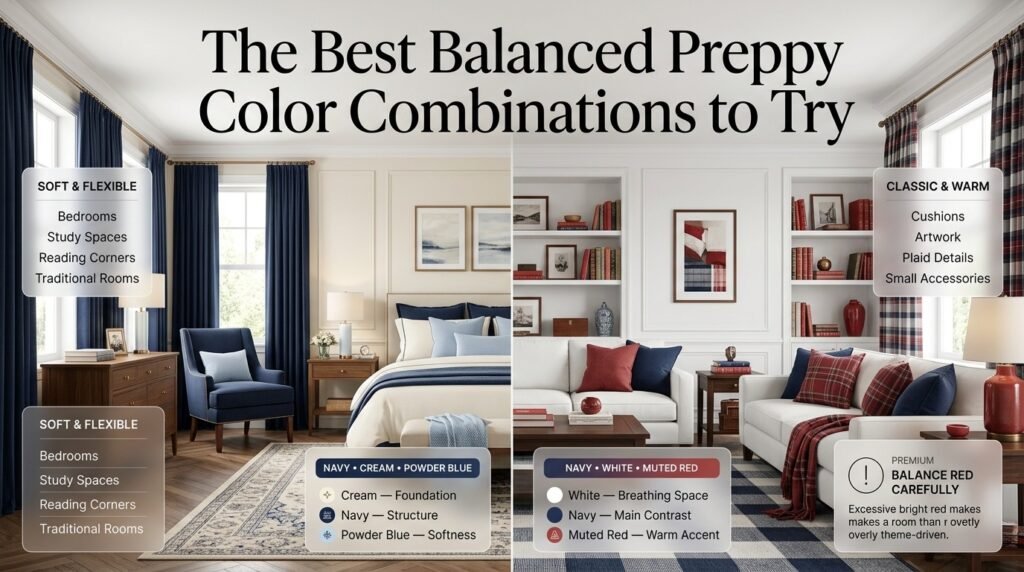
1. Navy, Cream, and Powder Blue
Navy, cream, and powder blue form a flexible combination that can work in traditional, coastal, modern, or softly styled preppy rooms.
Color roles:
- Cream — foundation
- Navy — structure
- Powder blue — softness
Cream can cover the walls or larger surfaces. Navy can be introduced through furniture, bedding, curtains, or rugs. Powder blue works well for pillows, throws, artwork, or smaller textiles.
The palette feels coordinated because the colors have different levels of visual intensity.
Where Does This Combination Work Best?
Try it in:
- Bedrooms
- Study spaces
- Reading corners
- Small sitting areas
- Traditional preppy rooms
If you want a stronger classic appearance, add a small amount of brass or warm wood.
2. Navy, White, and Muted Red
Navy, white, and red are closely associated with traditional preppy decorating, but the balance depends heavily on how much red you use.
White creates breathing space.
Navy provides the main contrast.
Muted red adds warmth and personality.
Instead of making red a major wall or furniture color, use it through:
- Cushions
- Books
- Artwork
- Plaid details
- Small accessories
- Decorative objects
This keeps the red from becoming visually dominant.
⚠ Common Mistake: Using bright red across too many large surfaces can make the room feel more theme-driven than thoughtfully decorated.
3. Sage Green, Cream, and Navy
For a softer and more contemporary interpretation of preppy style, sage green works beautifully with cream and navy.
Sage introduces an organic quality.
Cream keeps the room light.
Navy adds definition.
Natural wood can be added without disrupting the palette.
For example:
Cream walls + navy bedding + sage accent chair + natural wood nightstand
This creates enough contrast to make the room interesting while keeping the atmosphere comfortable.
4. Powder Blue, White, and Soft Pink
This is a useful choice when you want a lighter and more playful room.
White acts as the neutral foundation.
Powder blue provides the primary color.
Soft pink adds warmth.
You can use:
- Powder-blue bedding
- White walls
- Soft pink pillows
- Brass lighting
- Blue-and-pink artwork
The important point is that pink doesn’t need to dominate the room.
Small amounts can have a significant visual effect.
5. Green, Navy, and Cream
Green and navy can create a deeper, traditional atmosphere.
A practical distribution could be:
| Room Element | Color |
|---|---|
| Walls | Cream |
| Bed | Navy |
| Accent chair | Green |
| Rug | Cream + pattern |
| Artwork | Navy + green |
| Accessories | Small green accents |
Cream prevents the darker colors from making the room feel heavy.
This combination is particularly useful for rooms with traditional furniture or natural wood.
6. Pink, Navy, and Cream
Pink becomes more structured when paired with navy.
The navy provides visual weight while cream gives the palette space to breathe.
A simple bedroom could use:
Cream walls + navy headboard + soft pink bedding accents
You can then repeat navy through frames or a small rug.
The key is repetition rather than exact matching.
7. Light Blue, Sage, and Cream
This combination works especially well for relaxed rooms.
Light blue contributes freshness.
Sage introduces an earthy quality.
Cream connects both colors.
Natural materials such as linen, cotton, woven baskets, and light wood can make the palette feel even more cohesive.
This is a particularly useful combination if you want color without relying on highly saturated shades.
8. Burgundy, Navy, and Cream
Burgundy offers a richer alternative to bright red.
The combination can feel traditional and sophisticated when used carefully.
Try:
- Cream walls
- Navy bedding
- Burgundy throw
- Small burgundy artwork details
- Warm wood furniture
Because both navy and burgundy are strong colors, cream should remain visually significant.
⭐ Expert Tip: When combining two deep colors, give them a lighter background so they remain visually distinct.
9. Sage, Dusty Pink, and Cream
This palette provides a softer alternative to traditional navy-heavy preppy rooms.
Sage acts as the grounding color.
Dusty pink adds warmth.
Cream keeps the combination calm.
It works particularly well with:
- Floral patterns
- Soft textiles
- Light wood
- Brass
- Traditional furniture
The combination can feel colorful without becoming overly bright.
10. Navy, Light Blue, and Warm Beige
If white feels too stark, warm beige can create a softer foundation.
Try:
Warm beige + navy + light blue
Beige can appear in:
- Rugs
- Curtains
- Upholstery
- Bedding
- Wall color
Light blue keeps the palette fresh while navy creates contrast.
11. Cream, Navy, Muted Red, and Natural Wood
Natural wood is especially useful when working with several classic colors.
Wood introduces warmth without behaving like another strong accent color.
For example:
Cream walls + navy furniture + muted red accessories + oak flooring
The wood creates a bridge between the cooler navy and warmer red.
This is particularly effective in traditional rooms.
12. Cream, Navy, Sage, Powder Blue, and Dusty Pink
A multicolor palette can work when each shade has a specific role.
For example:
- Cream — foundation
- Navy — grounding color
- Sage — secondary color
- Powder blue — soft supporting shade
- Dusty pink — small accent
This approach is much more controlled than giving every color equal visual weight.
For more ideas, explore Multicolor Preppy Palettes, particularly if you want to move beyond simple three-color combinations.
How Does the 60-30-10 Rule Help With Preppy Colors?
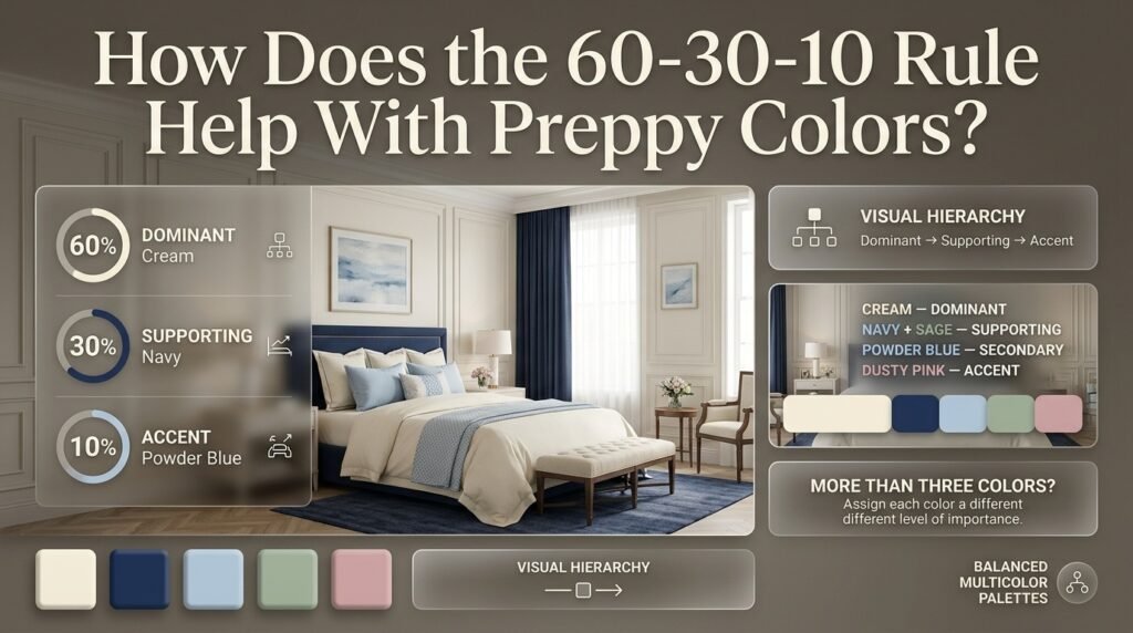
The 60-30-10 rule is a useful decorating framework for distributing colors.
Approximately:
60% = dominant color
30% = supporting color
10% = accent color
It shouldn’t be treated as an exact mathematical requirement.
Instead, think of it as a visual hierarchy.
For example:
60% Cream
30% Navy
10% Powder Blue
Cream might appear on walls and bedding.
Navy might appear on the headboard, curtains, and rug.
Powder blue might appear through pillows and artwork.
This makes the palette easier to understand visually.
Can You Use More Than Three Colors?
Absolutely.
For four or five colors, simply create different levels of importance.
For example:
Cream — dominant
Navy + Sage — supporting
Powder Blue — secondary
Dusty Pink — accent
This is why Balanced Multicolor Room Palettes can be useful when you’re working with more complicated combinations.
How Do You Balance Strong and Soft Colors?
A common problem occurs when all colors have similar intensity.
Imagine a room containing:
- Bright pink
- Bright blue
- Bright green
- Bright yellow
- Bright red
Even if the colors technically complement one another, they can compete for attention.
Instead, vary intensity.
For example:
Navy + Sage + Cream + Dusty Pink
Here, navy provides depth while sage and dusty pink are softer.
This creates visual hierarchy.
You can also use one strong color with several quieter colors:
Navy + Cream + Pale Blue + Soft Green
The navy becomes the anchor.
How Do You Use Neutral Colors in a Colorful Preppy Room?
Neutral colors aren’t just empty space. They help stronger colors communicate more clearly.
Useful neutrals include:
- Cream
- White
- Warm beige
- Soft taupe
- Natural wood
- Light gray
Cream is particularly flexible because it can connect warm and cool shades.
For example:
Navy + sage + dusty pink
may feel disconnected when placed side by side.
Add cream through walls, bedding, rugs, or furniture and the transition becomes softer.
📌 Quick Tip: If a colorful palette feels too busy, don’t immediately remove one of the colors. First try increasing the amount of neutral space around it.
How Do Patterns Affect Balanced Preppy Color Combinations?
Patterns are central to the character of many preppy rooms.
Common choices include:
- Stripes
- Gingham
- Plaid
- Florals
- Checks
- Geometric prints
But patterns introduce both color and visual movement.
That means a patterned object can affect the balance of the entire room.
For example, a navy-and-cream striped duvet already establishes two colors.
You can pull powder blue from another decorative piece rather than adding an entirely new shade.
This creates a connected color story.
The same principle works with floral bedding.
If the floral pattern contains:
Blue + green + cream + pink
you don’t necessarily need to introduce four new decorative colors.
Instead, choose two or three of those colors and repeat them elsewhere.
How Do You Mix Different Patterns Without Losing Color Balance?
The safest approach is to vary pattern scale.
For example:
Large pattern: Floral duvet
Medium pattern: Striped pillow
Small pattern: Gingham cushion
Then keep some pieces solid.
This prevents the room from becoming a collection of competing prints.
The colors should also overlap.
A navy stripe and navy floral detail can connect two completely different patterns.
This is more important than making the patterns identical.
How Do You Choose Balanced Colors for a Preppy Bedroom?
The bedroom is one of the easiest places to create a cohesive preppy palette because the bed naturally becomes a focal point.
Start with the bedding.
Then select:
- Headboard
- Wall color
- Rug
- Curtains
- Lighting
- Artwork
- Accent furniture
- Accessories
The colors should gradually repeat outward from the bed.
For example:
Navy + cream + powder blue
could begin with navy-and-cream bedding.
Then:
- Powder-blue cushion
- Cream rug
- Navy lamp base
- Powder-blue artwork
- Cream curtains
The colors appear throughout the room without being copied exactly.
For more bedroom-focused inspiration, explore Preppy Room Bedroom and Preppyroom Bedroom Decor.
How Do You Use Color With Preppy Furniture?
Furniture can act as either a neutral foundation or a major color statement.
Traditional furniture in:
- White
- Cream
- Natural wood
- Walnut
- Navy
can work with many palettes.
If your furniture is already colorful, keep the surrounding colors more restrained.
For example, a navy upholstered headboard doesn’t necessarily need navy everywhere else.
Instead, repeat navy in two or three smaller details.
This creates continuity without making the room feel repetitive.
If you’re planning furniture from scratch, consider how the pieces will interact with the palette before choosing upholstery or finishes.
How Can Wall Decor Support Your Color Palette?
Wall decor is one of the easiest ways to repeat colors without adding large blocks of new color.
You can use:
- Framed artwork
- Decorative prints
- Personal photographs
- Mirrors
- Gallery walls
- Patterned wall art
A gallery wall can combine several pieces while still following the same color story.
For example, if your room uses:
Navy + cream + sage
your wall collection might include:
- Navy frames
- Botanical green artwork
- Cream backgrounds
- Small neutral photographs
This creates visual continuity.
If you’re developing the wall section of your room, you can also explore Decorative Prints for ways to introduce color through smaller framed pieces.
How Can Personal Photos Fit Into a Preppy Color Palette?
Personal photographs can add character without requiring another decorative color.
Use frames that connect with your existing palette.
For a navy-and-cream room, choose:
- Navy frames
- Brass frames
- White frames
- Natural wood
The photographs themselves don’t need to match the room perfectly.
The frame provides the visual connection.
This is one reason Personal Photographs can work as part of a carefully coordinated wall arrangement.
How Do Mirrors Affect a Colorful Preppy Room?
A mirror doesn’t necessarily introduce another color, which makes it useful in rooms with complex palettes.
A classic framed mirror can:
- Reflect light
- Add visual depth
- Break up a wall
- Support symmetry
- Provide another decorative focal point
If the room already has several colors, choose a frame that repeats an existing material or finish.
For example:
Brass mirror + brass lamp + brass hardware
creates repetition without introducing another major color.
How Do You Use Framed Artwork Without Overloading the Palette?

Artwork should reinforce the room rather than compete with it.
If the room already has strong bedding and curtains, choose artwork with quieter colors.
For example:
Navy bedding + cream walls + sage artwork
works more easily than adding artwork containing five completely unrelated bright colors.
If you’re using several frames, you can learn more about arranging Framed Artwork while keeping the overall display coordinated.
How Can Patterned Wall Art Work With Preppy Colors?
Patterned wall art can be particularly effective when the artwork repeats existing colors.
For example:
Navy + cream room
can support:
- Blue geometric artwork
- Cream background
- Small muted red details
This makes the artwork feel connected to the room rather than randomly added.
Explore Patterned Wall Art when you want to introduce additional visual interest without changing the entire palette.
How Do You Create Balanced Colors in a Small Preppy Room?
Small rooms benefit from controlled contrast.
You don’t need to eliminate color.
Instead, use:
One light dominant color + one medium supporting color + one dark accent
For example:
Cream + powder blue + navy
Cream visually keeps the room open.
Powder blue provides color without excessive contrast.
Navy creates small areas of definition.
Use darker colors strategically on:
- Bed frame
- Lamp
- Picture frames
- Small furniture
- Cushions
Avoid covering every large surface with the darkest color unless you’re intentionally creating a dramatic room.
For a practical step-by-step approach to building a colorful room that feels cohesive rather than overwhelming, explore this guide to harmonious multicolor color schemes and learn how to balance dominant, supporting, accent, and neutral colors throughout your space.
What Are Good Balanced Preppy Color Combinations for Different Moods?
Different colors can support different visual moods.
| Desired Atmosphere | Possible Palette |
|---|---|
| Calm | Cream + sage + powder blue |
| Classic | Navy + cream + muted red |
| Fresh | White + light blue + green |
| Cozy | Beige + sage + warm wood |
| Playful | Pink + blue + cream |
| Rich | Navy + forest green + burgundy |
| Soft | Blush + cream + powder blue |
| Traditional | Navy + white + red |
These aren’t rigid rules.
Furniture, lighting, materials, and pattern scale can change how the same colors feel.
How Do You Create a Coordinated Multicolor Preppy Room?
A multicolor room needs stronger planning because every additional color increases the possibility of visual competition.
A practical formula is:
Neutral + two main colors + one accent + optional bridge color
For example:
Cream + Navy + Sage + Dusty Pink + Light Blue
Cream provides the foundation.
Navy gives structure.
Sage becomes the secondary natural color.
Dusty pink introduces warmth.
Light blue connects the cool side of the palette.
If you’re specifically working with several colors, Coordinated Multicolor Room Ideas can help you think about how repeated colors create continuity throughout a room.
How Do You Use Bold Preppy Colors Without Making the Room Chaotic?
Bold colors aren’t automatically a problem.
The issue is usually distribution.
If you want a bold preppy palette, select one dominant strong color.
For example:
Navy as the bold foundation
Then soften it with:
Cream + powder blue
and use:
Muted red
as a small accent.
Another approach is to use bold color on one focal element.
For example:
Navy headboard
can become the visual anchor while the rest of the room remains lighter.
This gives the eye a place to settle.
Common Mistakes With Balanced Preppy Color Combinations
1. Choosing Too Many Colors at the Beginning
It’s tempting to select every color you like.
The problem is that a room doesn’t need to display every favorite shade.
Better approach
Start with three.
Add a fourth only when the first three already work together.
2. Giving Every Color Equal Importance
A room becomes harder to read when every shade appears in equally large areas.
Better approach
Create hierarchy.
One color should clearly dominate.
3. Ignoring Lighting
A color that looks soft in a showroom can appear very different in a bedroom with warm artificial lighting.
Natural daylight also changes throughout the day.
Better approach
Test important colors in the actual room.
4. Matching Everything Too Precisely
A room where every blue is exactly the same shade can feel flat.
Better approach
Use related shades.
For example:
Pale blue + powder blue + navy
creates depth within one color family.
5. Using Too Many Patterns
Even a perfect color palette can become visually busy if every item has a different pattern.
Better approach
Mix patterned and solid pieces.
6. Forgetting Neutral Space
Color needs breathing room.
If every wall, cushion, shelf, and accessory is colorful, nothing feels special.
Better approach
Allow cream, white, beige, wood, or other quiet surfaces to remain visible.
7. Introducing Unrelated Accent Colors
A small decorative item may seem harmless, but a completely unrelated bright color can interrupt the visual flow.
Before adding it, ask:
“Where else does this color appear?”
If the answer is nowhere, consider whether you actually need it.
How Can You Test a Palette Before Buying Everything?
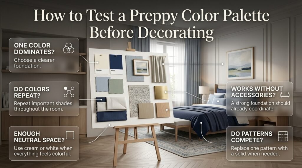
Create a simple physical or digital mood board.
Include:
- Wall color
- Main furniture
- Bedding
- Rug
- Curtains
- Artwork
- Accent colors
- Metal finish
- Wood tone
Then look at the entire collection together.
Ask:
Does one color dominate naturally?
If not, choose a clearer foundation.
Do the colors repeat?
If navy appears in the bedding, perhaps repeat it in artwork or furniture.
Is there enough neutral space?
If everything feels colorful, introduce cream or white.
Do the patterns compete?
If yes, replace one pattern with a solid.
Does the palette still work without accessories?
If the basic furniture and textiles already coordinate, the room has a strong foundation.
Expert Tips for Better Preppy Color Balance
Start With the Piece You Already Love
Don’t always start with paint.
A favorite quilt, rug, artwork, chair, or patterned fabric can provide a more natural color foundation.
Pull two or three colors from that piece.
This is often easier than trying to invent a palette from nothing.
Repeat Colors at Different Scales
Color repetition doesn’t mean repeating identical objects.
For example:
Large: Navy headboard
Medium: Navy rug detail
Small: Navy picture frame
The color connects the room while the different scales prevent repetition from becoming boring.
Use Texture Instead of More Color
When a room feels flat, many people immediately add another color.
Sometimes texture is the better solution.
Try:
- Linen
- Cotton
- Velvet
- Woven materials
- Wood
- Quilted fabric
- Soft knits
Texture creates visual interest without complicating the palette.
The same principle supports a polished preppy interior, where layered textiles and balanced visual details can provide richness without excessive color.
Use Natural Materials as a Bridge
Natural wood is particularly useful.
Imagine:
Navy + powder blue + cream
Adding warm oak can make the palette feel more grounded.
The wood doesn’t need to become another major color category.
It simply adds warmth and material contrast.
Keep the Focal Point Clear
A room can contain many beautiful objects and still feel balanced if one element leads the design.
The focal point might be:
- Bed
- Headboard
- Artwork
- Rug
- Feature wall
- Accent chair
Once you identify it, keep surrounding colors slightly quieter.
This prevents visual competition.
Balanced Preppy Color Combinations for Different Decorating Styles
Classic Preppy
Try:
Navy + Cream + Muted Red
Use traditional furniture, stripes, framed artwork, and tailored textiles.
Modern Preppy
Try:
White + Navy + Sage
Use cleaner furniture silhouettes and fewer decorative patterns.
Cozy Preppy
Try:
Cream + Sage + Warm Beige + Wood
Focus on soft textiles, warm lighting, and comfortable furniture.
Cute Preppy
Try:
Pink + Powder Blue + Cream
Use playful accessories and cheerful artwork while keeping the main surfaces calm.
Minimal Preppy
Try:
White + Navy + One Accent Color
Limit patterns and focus on strong furniture shapes and carefully selected accessories.
Colorful Preppy
Try:
Cream + Navy + Sage + Powder Blue + Dusty Pink
The important part is controlling the proportion of each color.
How Do You Know When a Color Palette Is Finished?
A palette is probably complete when adding another color doesn’t improve the room.
That’s an important distinction.
You don’t need to fill every empty color opportunity.
Look around the room.
If:
- The walls connect with the furniture
- The bedding connects with artwork
- The rug connects with the accent pieces
- The patterns share colors
- Neutral surfaces provide breathing room
- The focal point is clear
then the palette is doing its job.
At that stage, more color may actually reduce the sense of balance.
What Are the Best Balanced Preppy Color Combinations for a Room?
The best balanced preppy color combinations usually combine a classic foundation with one or two supporting shades and a smaller accent color. Navy and cream, navy and powder blue, sage green and cream, pink and navy, and muted red with navy and white are versatile choices because they create contrast without making the room feel visually crowded.
For a particularly balanced look, start with a lighter dominant color such as cream or white, introduce navy or another deeper shade for structure, and then add a softer accent such as powder blue, sage, or dusty pink. This creates a clear visual hierarchy instead of giving every color the same amount of attention.
Practical points:
Use cream or white for larger background surfaces.
Use navy or another deeper shade for furniture and major textiles.
Keep brighter accent colors to smaller decorative areas.
Repeat important colors in at least two or three places.
Consider the room’s natural lighting before choosing the final shades.
How Many Colors Should You Use in a Preppy Room?
A preppy room doesn’t need to be limited to three colors, but three main colors are an excellent starting point. A dominant neutral, a stronger supporting color, and a smaller accent usually provide enough contrast while keeping the room visually organized. More colors can be added when they have a clear relationship with the existing palette.
For example, cream can act as the foundation, navy can provide depth, and powder blue can soften the combination. If you want more variety, sage green or dusty pink can be introduced in smaller quantities. The important factor is not the exact number of colors but the proportion and repetition of each one.
Practical points:
Choose one dominant color first.
Add one strong supporting color.
Introduce one accent before adding additional shades.
Avoid giving every color equal visual importance.
Use neutral surfaces to separate stronger colors.
How Do You Make Multiple Preppy Colors Look Coordinated Instead of Messy?
The easiest way to make multiple colors look coordinated is to repeat the same shades throughout the room at different scales. A color shouldn’t appear only once because it can look disconnected, but it also doesn’t need to dominate every object. Repetition creates a visual connection between furniture, textiles, artwork, and accessories.
For example, if your palette is navy, cream, sage, and dusty pink, navy could appear in the headboard, a picture frame, and part of the rug. Sage might appear in curtains and artwork, while dusty pink could remain limited to cushions or a small decorative piece. This gives every color a purpose without making the room feel overloaded.
Practical points:
Repeat colors instead of matching every item exactly.
Vary the size of each color element.
Keep some furniture and surfaces neutral.
Limit competing patterns.
Make sure one color clearly acts as the visual foundation.
What Colors Go Best With Navy for a Balanced Preppy Bedroom?
Navy works particularly well with cream, white, powder blue, sage green, soft pink, beige, and muted red. Its deep tone gives a room structure, while lighter colors prevent the overall palette from becoming too heavy. This makes navy especially useful for headboards, bedding, curtains, rugs, and accent furniture.
For a softer bedroom, navy can be paired with cream and powder blue. For a more traditional appearance, navy, white, and muted red can work well. If you prefer a more natural atmosphere, navy with sage and cream provides contrast while remaining relatively calm.
Practical points:
Pair navy with a light neutral on larger surfaces.
Use powder blue for a softer blue-on-blue palette.
Add sage for a natural, contemporary feel.
Use muted red as a small traditional accent.
Avoid covering too many large surfaces with dark colors in a small bedroom.
How Do You Create a Colorful Preppy Room Without Making It Look Too Busy?
A colorful preppy room stays balanced when color, pattern, and visual intensity are controlled together. The problem isn’t usually the number of colors alone; it’s what happens when several strong colors and patterns compete for attention at the same time. Start with a calm foundation and let stronger colors appear selectively.
For example, cream walls can provide a quiet background while navy furniture establishes structure. Powder blue bedding can add softness, and a small amount of pink or muted red can introduce personality. If the bedding already contains a strong pattern, keep nearby curtains, rugs, or furniture simpler so the room has enough visual breathing space.
Practical points:
Use one dominant color instead of several equal-strength colors.
Balance patterned fabrics with solid pieces.
Keep walls or larger surfaces relatively calm when accessories are colorful.
Use neutral space to separate strong colors.
Introduce new colors gradually rather than decorating everything at once.
Let one major element—such as the bed, rug, or artwork—serve as the focal point.
Conclusion
Balanced preppy color combinations are not about filling a room with as many attractive colors as possible. The real goal is to create a clear visual relationship between colors so the room feels coordinated, comfortable, and intentionally designed. Classic shades such as navy, cream, white, powder blue, sage, soft pink, and muted red can work beautifully together when each color has a defined role.
A successful palette usually starts with a dominant color, supported by one or two secondary shades and smaller accents. The 60-30-10 approach can make this process easier, but it should be treated as a flexible decorating guide rather than a strict rule. Patterns, furniture, artwork, bedding, rugs, curtains, and accessories can then repeat selected colors throughout the room to create continuity.
The most important part is visual balance. If several strong colors are competing for attention, introduce a calm neutral. If the room feels too plain, bring in a carefully chosen accent color through artwork, textiles, decorative objects, or smaller furniture pieces. This creates the layered character that makes preppy interiors feel polished rather than overly matched.
For more inspiration, explore our Multicolor Preppy Palettes, Balanced Multicolor Room Palettes, Balanced Colorful Room Ideas, and Coordinated Multicolor Room Ideas guides to see how different color relationships can be applied to real decorating concepts.
Ultimately, the best balanced preppy color combination is one that reflects the atmosphere you want while maintaining enough repetition, contrast, and neutral space to keep the room visually organized. Start with a few colors you genuinely like, test how they interact in different lighting, and build the rest of the room around that foundation. With thoughtful color placement, even a colorful preppy space can feel timeless, cohesive, and effortlessly stylish.