Introduction
Harmonious Multicolor Color Schemes | Choosing several colors for a room sounds simple until you actually have to put them together. A shade of navy may look beautiful on its own, while pink, green, yellow, blue, or coral may also look attractive individually. The challenge begins when you try to use several of them in the same space without making the room feel random, crowded, or visually confusing.
This is exactly where harmonious multicolor color schemes become valuable.
A successful multicolor room isn’t created by choosing as many attractive colors as possible. It comes from understanding how colors relate to one another and deciding which shades should lead, which should support, and which should remain small accents. When those relationships are handled carefully, a colorful room can feel polished, welcoming, coordinated, and full of personality.
If you’re looking for a broader source of room inspiration before building your palette, Preppy Room provides a useful starting point for exploring different decorating styles, color directions, and room ideas.
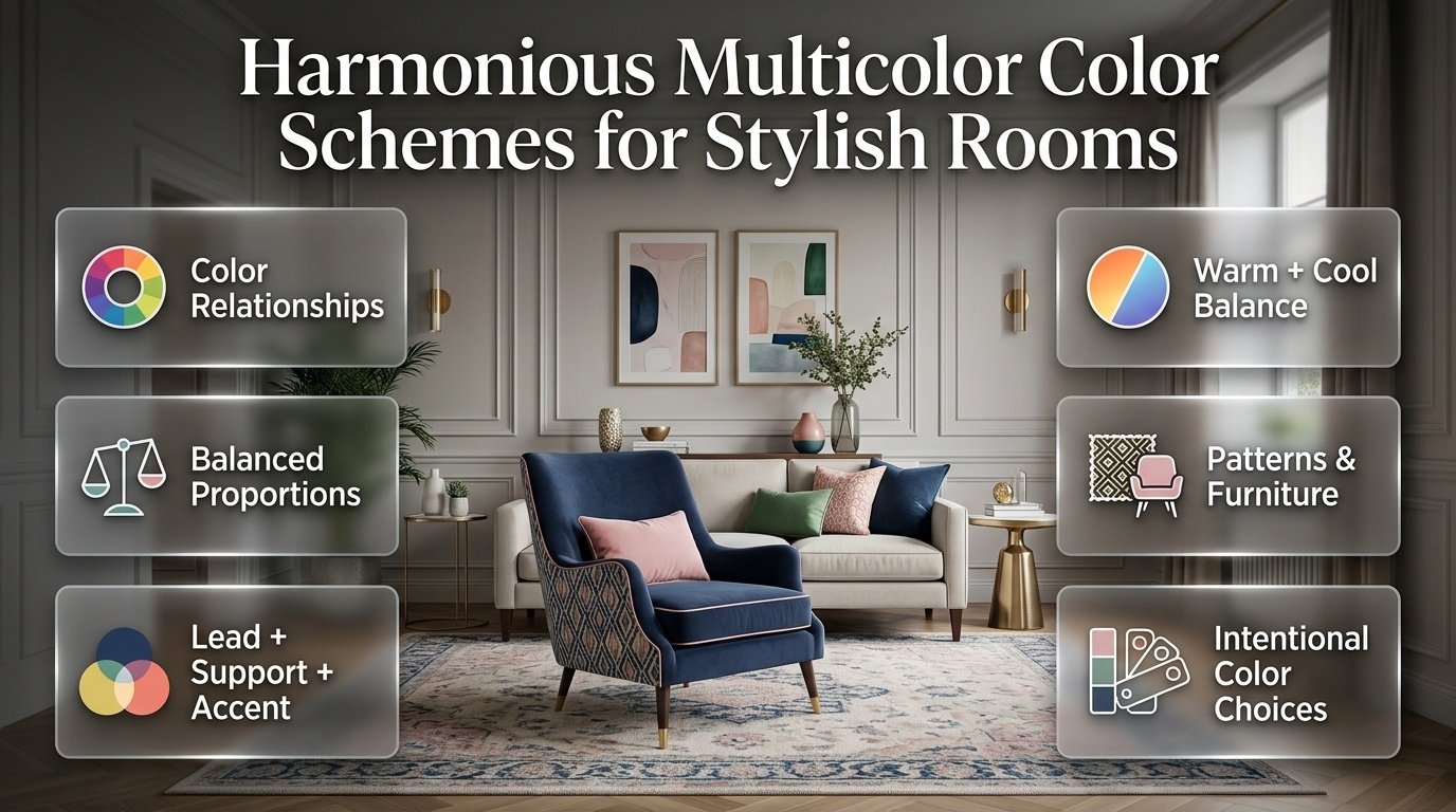
In this guide, we’ll look at how harmonious multicolor schemes actually work, how to select colors, how to control their proportions, how to combine warm and cool shades, how to use patterns and furniture, and how to create colorful rooms that still feel calm and intentional.
What Are Harmonious Multicolor Color Schemes?
Harmonious multicolor color schemes are color combinations containing several different shades that work together because they share a deliberate visual relationship. That relationship can come from similar undertones, color-wheel relationships, saturation, brightness, temperature, or repeated colors throughout the room.
The important point is that harmony doesn’t mean every color has to look similar.
A palette can contain navy, pink, green, yellow, cream, and blue and still feel unified. The key is deciding how much of each color appears and where each color belongs.
For example:
Navy + cream + powder blue + sage + muted coral
can create a very different effect from:
Bright blue + neon green + hot pink + orange + yellow
Both technically contain multiple colors, but the first palette has more controlled relationships in intensity and visual weight.
A harmonious palette usually has:
- A dominant color
- One or more supporting colors
- One or two accent shades
- A neutral or quiet background
- Repeated color connections
- Controlled contrast
Think of the palette as a team rather than a collection of individual colors. Every color has a job.
Why Is Color Harmony Important in a Multicolor Room?
Color harmony matters because a room is experienced as one visual composition.
When colors are selected independently, the eye may struggle to understand how they relate. A pink chair may look attractive, and a green cushion may also look attractive, but if neither color connects with anything else in the room, they can feel like isolated objects.
Harmony creates visual relationships.
For example, if your room contains:
- Navy bedding
- Pink artwork
- Sage cushions
- Cream curtains
- Powder-blue accessories
you can repeat navy in a picture frame, pink in a small decorative object, sage in a throw, and blue in another textile.
Suddenly, the colors feel connected.
This repetition doesn’t mean everything needs to match. It simply gives the eye familiar colors to recognize as it moves around the room.
The main benefits of color harmony include:
- A more cohesive appearance
- Better visual balance
- Easier furniture selection
- More intentional-looking accessories
- Greater flexibility with patterns
- Stronger room personality
- Less visual clutter
The goal isn’t to make the room perfectly symmetrical.
The goal is to make the colors feel like they belong to the same visual story.
How Many Colors Should You Use in a Multicolor Palette?
There is no universal maximum number of colors.
For many bedrooms and living spaces, however, three to six main colors provide enough variety without becoming difficult to control.
A practical palette might look like this:
| Color Role | Example | Possible Use |
|---|---|---|
| Dominant | Cream | Walls, curtains, upholstery |
| Main Color | Navy | Bed, rug, furniture |
| Supporting | Powder blue | Bedding, artwork |
| Supporting | Sage | Chair, cushions |
| Accent | Coral | Small decorative details |
| Accent | Yellow | Artwork or accessories |
Notice that these colors don’t appear in equal quantities.
That is important.
A room with six colors doesn’t need six equally large areas of color.
In fact, giving every color the same visual weight is one of the easiest ways to make a multicolor room feel chaotic.
A Better Question
Instead of asking:
“How many colors can I use?”
ask:
“How much attention should each color receive?”
That question leads to better decorating decisions.
What Is the 60–30–10 Rule for Multicolor Rooms?
The 60–30–10 rule is a useful starting framework for distributing color.
Traditionally:
- 60% is the dominant color
- 30% is the secondary color
- 10% is the accent color
You don’t have to follow those numbers literally.
For a more colorful preppy room, you might adapt the principle:
50% neutral or dominant color
30% secondary colors
20% accents
For example:
Cream 50% + navy and blue 30% + sage, pink, and coral 20%
This creates a multicolor effect while maintaining hierarchy.
The purpose of the rule isn’t mathematical accuracy. It’s to prevent every color from competing equally for attention.
How Do You Choose Colors That Naturally Work Together?
The easiest way to create a harmonious palette is to avoid starting with five completely unrelated colors.
Instead, choose one anchor color.
Your anchor might come from:
- A favorite bedspread
- A patterned rug
- A piece of artwork
- A chair
- Curtains
- Wallpaper
- A decorative object
Suppose your starting point is a navy-and-pink patterned textile.
You could extract:
Navy
Dusty pink
Cream
Powder blue
Sage
Now you have a complete palette with an obvious relationship.
This is much easier than randomly choosing five colors from a paint chart.
What Is an Anchor Color?
An anchor color is the shade that establishes the visual direction of your palette.
It doesn’t necessarily have to be the darkest color.
It simply gives the rest of the palette something to relate to.
For example:
Navy Anchor
Navy can be supported by:
- Cream
- Powder blue
- Sage
- Muted pink
Sage Anchor
Sage can be supported by:
- Cream
- Light blue
- Terracotta
- Dusty pink
- Warm beige
Pink Anchor
Pink can be supported by:
- Navy
- Cream
- Powder blue
- Soft green
Once you establish the anchor, choosing additional colors becomes much easier.
How Does the Color Wheel Help Create Multicolor Harmony?
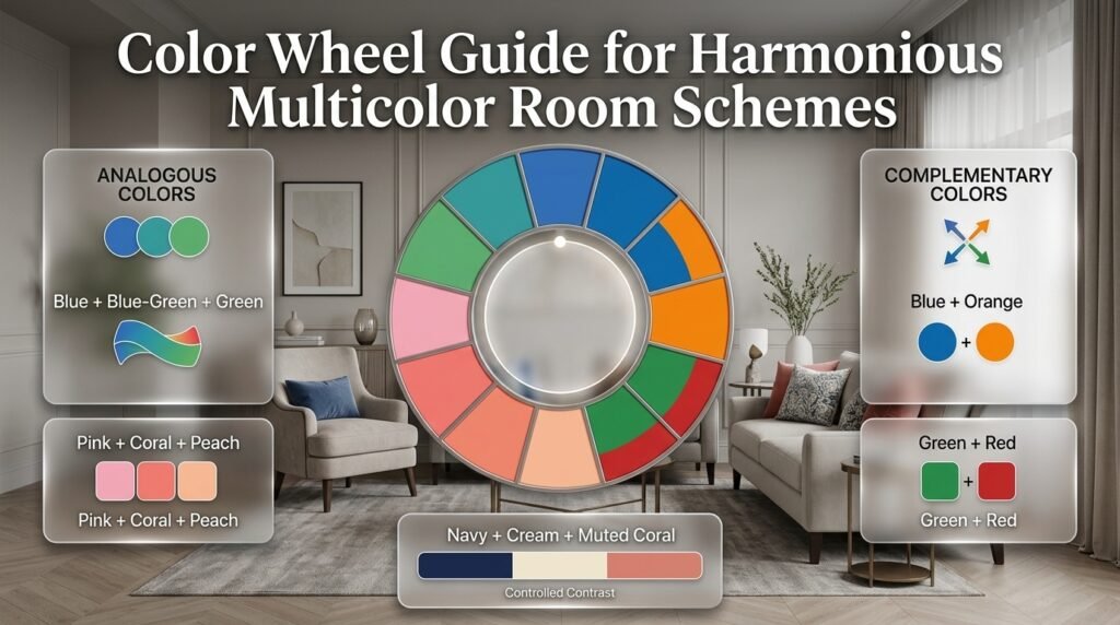
The color wheel isn’t only useful for painters or graphic designers. It can also help with interior decorating.
Several color relationships are especially useful.
Analogous Color Schemes
Analogous colors sit close together on the color wheel.
Examples include:
Blue + blue-green + green
or:
Pink + coral + peach
Because the colors are neighbors, they often feel naturally connected.
These palettes are useful when you want a room that feels:
- Calm
- Soft
- Fresh
- Relaxed
- Cohesive
Complementary Color Schemes
Complementary colors sit opposite each other.
Examples include:
Blue + orange
and:
Green + red
These combinations create stronger contrast.
That can be exciting, but you usually don’t want both colors competing at full intensity across large areas.
A better approach might be:
Navy + cream + muted coral
instead of:
Bright blue + bright orange
The first combination preserves contrast while reducing visual pressure.
Split-Complementary Color Schemes
A split-complementary palette uses one main color and two colors positioned near its complementary color.
For example:
Blue + muted yellow + soft coral
This creates variety while keeping a recognizable color relationship.
It’s especially useful when you want more personality than an analogous palette provides.
Triadic Color Schemes
Triadic combinations use three major color relationships around the color wheel.
A classic example is:
Blue + yellow + red
For interiors, these shades are often softened.
Instead of primary colors, consider:
Navy + muted mustard + dusty red
This keeps the energy of the relationship while making the palette more comfortable for everyday spaces.
How Do You Make a Multicolor Palette Look Sophisticated?
Sophistication usually comes from control, not from using fewer colors.
A room can contain five or six colors and still look polished if the colors have different visual roles.
For example:
Cream provides the background.
Navy provides structure.
Powder blue creates continuity.
Sage adds freshness.
Muted pink adds personality.
Soft yellow provides a small highlight.
None of these colors has to dominate.
One of the most effective professional tricks is reducing saturation.
Instead of choosing five highly intense colors, combine:
- One stronger shade
- Two medium shades
- Two muted shades
- One neutral
This creates depth without visual overload.
⭐ Expert Tip: When a palette feels too loud, don’t immediately remove a color. First try reducing the saturation or the amount of that color. You may be able to keep the personality while restoring balance.
What Are Some Harmonious Multicolor Color Scheme Examples?
There are countless combinations, but the following examples demonstrate different ways to structure a palette.
Classic Preppy Multicolor Scheme
Navy + cream + powder blue + muted red + sage
This works particularly well when you want a room that feels traditional but not overly formal.
Use navy for larger visual elements, cream as a background, and red or sage in smaller details.
Soft Preppy Palette
Dusty pink + cream + powder blue + sage + navy
This combination can create a soft bedroom without becoming overly monochromatic.
Use pink in textiles, navy for structure, and cream as the visual buffer.
Fresh Garden Palette
Sage + cream + light blue + soft yellow + dusty pink
This palette has a natural, cheerful quality.
The colors can be introduced through botanical artwork, bedding, curtains, cushions, and small accessories.
Coastal Preppy Palette
Navy + white + pale blue + sea green + sandy beige
The neutral beige and white prevent the blue family from becoming too heavy.
Navy can act as the grounding shade while pale blue and sea green provide lighter transitions.
Warm Traditional Palette
Forest green + cream + burgundy + warm beige + muted gold
This palette works well with traditional furniture and wood finishes.
The gold should usually remain an accent rather than becoming a dominant surface color.
Playful Multicolor Palette
Pink + navy + powder blue + cream + soft yellow
This combination is particularly useful when you want a youthful, cheerful, and colorful environment.
The cream keeps the palette from becoming too visually intense.
How Can You Build a Balanced Multicolor Room?
Balance doesn’t mean placing the same amount of each color on opposite sides of the room.
Instead, think about visual distribution.
For example:
Navy bed
Navy picture frames
Navy detail in the rug
This creates repeated visual weight.
Meanwhile:
Pink pillow
Pink artwork detail
Small pink accessory
creates a lighter repetition.
This is more natural than using one giant pink object simply because pink appears in your palette.
How Do You Use Multicolor Palettes in a Bedroom?
Bedrooms benefit from carefully controlled color because they are spaces where people often want both personality and visual calm.
Start with the largest surfaces:
- Walls
- Flooring
- Bed
- Curtains
- Rug
Then add color through:
- Pillows
- Throws
- Artwork
- Lamps
- Small furniture
- Decorative accessories
For example:
Cream walls
↓
Navy bed
↓
Powder-blue bedding
↓
Sage cushions
↓
Muted pink artwork
This creates several colors without making every surface equally active.
If you want to explore more approaches to balanced palettes, Balanced Multicolor Room Palettes can help you think about color proportion before choosing individual accessories.
How Do You Coordinate Furniture With Multiple Colors?
Furniture doesn’t have to match every color in the room.
In fact, neutral furniture often makes colorful rooms easier to decorate.
Useful furniture finishes include:
- Natural wood
- Light oak
- Cream upholstery
- White
- Navy
- Warm beige
- Medium wood tones
Suppose your palette is:
Navy + pink + sage + cream
You don’t need a navy sofa, pink chair, sage table, and cream cabinet.
Instead, you might use:
Cream upholstery + natural wood + navy textiles + pink and sage accessories
This creates flexibility.
If you later change pink to coral, you don’t have to replace the furniture.
How Do Patterns Help Harmonious Multicolor Color Schemes?
Patterns are one of the easiest ways to connect multiple colors.
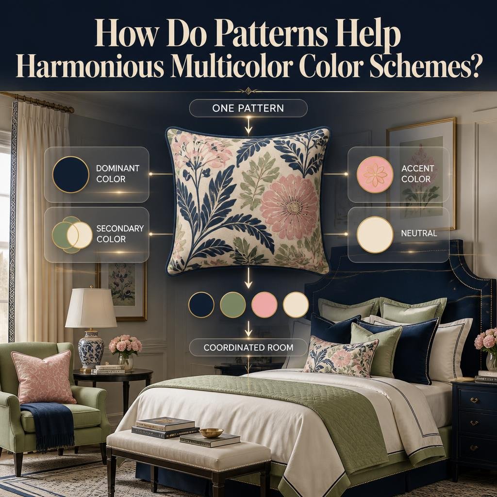
A single patterned fabric can contain:
Navy + cream + sage + pink
That pattern can become the foundation for the entire room.
Then choose solid versions of those colors for:
- Curtains
- Bedding
- Cushions
- Lamps
- Artwork
- Small furniture
This creates an intentional relationship between the pieces.
The One-Pattern Method
Start with one major pattern.
Then pull:
- One dominant color
- One secondary color
- One accent color
- One neutral
This gives you a controlled palette without needing to design every color from scratch.
How Many Patterns Should You Use?
You can use multiple patterns, but they should not all compete equally.
A useful structure is:
One large-scale pattern
One medium-scale pattern
One small-scale pattern
They should share at least one or two colors.
For example:
Large floral: navy + pink + green + cream
Small stripe: navy + cream
Tiny geometric: sage + cream
Now the patterns feel related even though they are different.
How Do You Repeat Colors Around the Room?
Color repetition creates rhythm.
Imagine your palette contains:
Navy + cream + sage + pink
You could distribute them like this:
Navy
- Bed
- Rug detail
- Picture frames
Cream
- Walls
- Curtains
- Upholstery
Sage
- Chair
- Cushion
- Artwork
Pink
- Pillow
- Artwork detail
- Small accessory
The room doesn’t look like a collection of four separate color zones.
Instead, the colors move around the space.
This is one of the most important principles in creating harmonious multicolor interiors.
What Role Do Neutrals Play in a Multicolor Palette?
Neutrals are not simply filler colors.
They act as visual breathing room.
Without enough quiet space, multiple strong colors can become tiring.
Useful neutrals include:
- Cream
- Ivory
- Warm white
- Beige
- Taupe
- Soft gray
- Light natural wood
Cream is particularly useful in preppy interiors because it can soften strong navy, pink, green, or red.
A neutral can also help two colors that don’t naturally relate to each other.
For example:
Navy + coral
may feel quite strong.
Adding:
Cream
between them can make the relationship feel more comfortable.
Can You Mix Warm and Cool Colors?
Yes, and doing so can create a much richer palette.
The important thing is to create a bridge between them.
For example:
Cool navy + cool blue + warm coral + warm cream
The cream helps connect the temperature difference.
Another example:
Sage + powder blue + warm beige + muted terracotta
The beige and muted quality of the terracotta help connect the cooler greens and blues.
⚠ Common Mistake: Mixing warm and cool colors isn’t the problem. Mixing highly saturated warm and cool colors without any visual bridge is more likely to create tension.
How Do You Use Multicolor Schemes in Small Rooms?
Small rooms don’t need to be completely neutral.
They simply need more careful visual organization.
A useful structure is:
Light background + medium-color furniture + smaller colorful accents
For example:
Cream + pale blue + sage + navy + pink
Cream and pale blue can occupy most of the room, while navy and pink remain accents.
This gives you the richness of a multicolor palette without making the room feel visually compressed.
Small Room Strategy
Instead of adding more colors, add:
- Texture
- Pattern variation
- Natural materials
- Different finishes
- Layered lighting
This creates interest without increasing the number of competing hues.
How Do You Use a Multicolor Palette for an Accent Wall?
An accent wall can become the dominant visual feature of the room, so choose its color carefully.
If the rest of your palette already contains several strong colors, consider a more muted wall shade.
For example:
Sage wall + cream furniture + navy bedding + dusty pink accents
creates a clear hierarchy.
If the wall itself is highly saturated, reduce the intensity of surrounding colors.
You can also use paneling, artwork, shelving, or other architectural details to make the accent wall more interesting without adding multiple new colors.
For ideas on building a more detailed focal wall, explore Accent Wall Details.
How Do You Make a Multicolor Room Feel Coordinated Rather Than Random?
Coordination comes from repetition and relationships.
A useful formula is:
Color relationship + repeated placement + controlled proportion
For example, if your rug contains navy, pink, sage, and cream, don’t introduce completely unrelated orange furniture.
Instead, select furniture and accessories that echo the colors already present.
This doesn’t mean matching everything.
It means making new choices based on what is already in the room.
What Is the Difference Between Harmonious, Balanced, and Coordinated Color Schemes?
These concepts are closely related but focus on different things.
Harmonious
Focuses on how the colors relate to each other.
Balanced
Focuses on how much visual weight each color receives.
Coordinated
Focuses on how colors are repeated across furniture, textiles, artwork, and accessories.
A room can therefore have:
Harmonious colors
but poor balance.
Or:
Balanced colors
but weak coordination.
The strongest result comes when all three work together.
For more practical examples, see Coordinated Multicolor Room Ideas.
How Do You Create a Multicolor Palette From Existing Decor?
You don’t have to redesign the room from the beginning.
Look at what you already own.
Suppose you have:
Cream walls
Navy bed
Blue-and-green rug
Pink artwork
You already have the beginnings of a palette:
Cream + navy + blue + green + pink
Now identify which colors should become dominant and which should remain accents.
You could make:
Cream = background
Navy = grounding color
Blue + green = supporting colors
Pink = accent
This is usually more successful than adding random colors to fill empty spaces.
How Does Lighting Change a Multicolor Palette?
Lighting can significantly alter how colors appear.
Natural daylight may make blue and green feel clearer.
Warm artificial lighting can make cream, beige, yellow, and red appear richer.
The same paint or fabric can therefore look different:
- In morning daylight
- At midday
- During sunset
- Under warm evening bulbs
- Under cooler LED lighting
Always evaluate important colors inside the actual room.
📌 Quick Tip: Place fabric and paint samples beside the furniture and flooring rather than looking at them separately. A color may look completely different when surrounded by your room’s existing materials.
How Do You Choose a Neutral That Works With Multiple Colors?
Start by identifying undertones.
If your palette contains:
Warm pink + sage + beige + muted yellow
a warm cream may work naturally.
If your palette contains:
Powder blue + navy + cool gray
a cooler white may feel more connected.
This doesn’t mean warm colors can never work with cool neutrals.
It simply means undertones should be considered intentionally.
How Can Texture Replace Additional Colors?
Sometimes a room feels boring because it lacks texture, not because it lacks color.
Before adding another shade, try introducing:
- Linen
- Velvet
- Woven fabric
- Natural wood
- Rattan
- Ceramic
- Brass
- Quilted textiles
For example, a cream room can contain several different cream textures without looking flat.
This is especially useful when you’re already working with a complex multicolor palette.
Adding another color may make the room busier when what it really needs is tactile variation.
How Do You Make a Colorful Room Look More Refined?
Refinement often comes from restraint.
Instead of asking:
“What else can I add?”
ask:
“Does this room need another color?”
If the answer is no, add interest through:
- Texture
- Scale
- Shape
- Pattern
- Material
- Lighting
For example, a navy cushion doesn’t need five more navy objects beside it.
A single repeated navy detail elsewhere may be enough.
What Are the Most Common Mistakes With Multicolor Color Schemes?
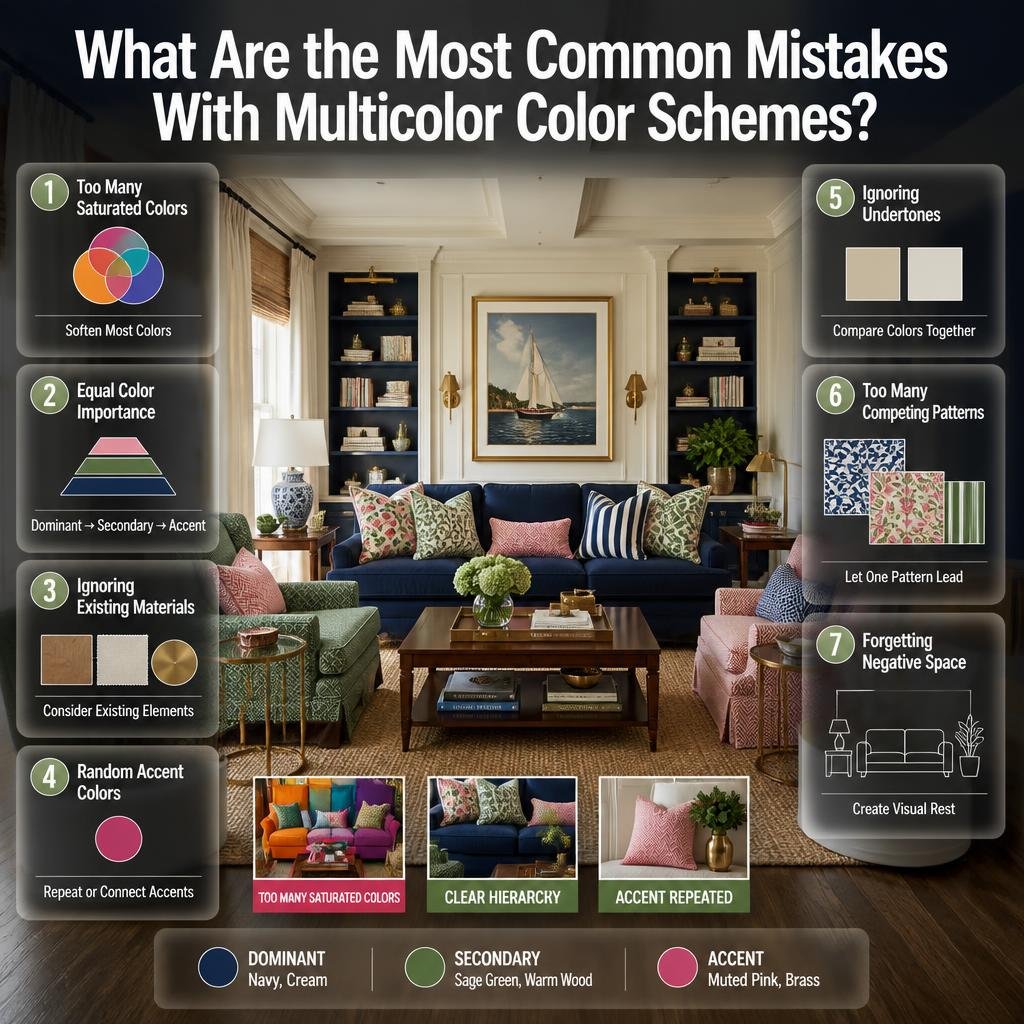
Using Too Many Saturated Colors
Bright colors can work together, but too many high-intensity shades can compete.
Better approach
Choose one or two strong colors and soften the rest.
Giving Every Color Equal Importance
When every shade has the same visual weight, the room can lack hierarchy.
Better approach
Assign each color a role.
Dominant → Secondary → Accent
Choosing Colors Without Considering Existing Materials
Flooring, wood, metal, furniture, and natural light already contribute to the room’s visual palette.
Better approach
Treat these existing elements as part of your color scheme.
Introducing Random Accent Colors
A single unrelated color can look accidental.
Better approach
If you introduce a new accent, repeat it at least once or connect it through a pattern.
Ignoring Undertones
Two whites or two beiges can look completely different beside one another.
Better approach
Compare colors together in the actual room.
Using Too Many Competing Patterns
Several colorful patterns can overwhelm even a well-designed palette.
Better approach
Let one pattern lead and make the others quieter.
Forgetting Negative Space
A room needs areas where the eye can rest.
Better approach
Use neutral walls, open surfaces, simple furniture, or quiet textiles between stronger colors.
How Can You Test Your Palette Before Buying Everything?
Create a simple physical or digital palette board.
Collect:
- Paint sample
- Fabric sample
- Rug image
- Furniture finish
- Artwork
- Accent colors
- Metal finish
- Wood tone
Put everything together.
Then evaluate:
Question 1
Does one color clearly dominate?
Question 2
Are the strongest colors repeated?
Question 3
Do the colors look connected?
Question 4
Is there enough neutral space?
Question 5
Does the palette work under different lighting?
Question 6
Does the room still feel like the style you intended?
This process can prevent expensive mistakes.
How Do You Build Harmonious Multicolor Color Schemes Step by Step?
Step 1: Choose Your Starting Point
Select one existing item or color you genuinely like.
It could be:
- Rug
- Bedding
- Artwork
- Curtains
- Chair
- Wallpaper
Why it matters: It gives your palette a natural foundation.
Step 2: Extract Three to Five Related Colors
Identify the dominant, supporting, and accent colors.
Don’t feel obligated to use every tiny color visible in the pattern.
Professional advice: Tiny colors are often best treated as accents.
Step 3: Select a Neutral
Choose a background shade that helps the palette breathe.
Cream, ivory, beige, white, or soft gray can all work depending on the undertones.
Step 4: Assign Color Roles
Write down:
Dominant:
Cream
Main:
Navy
Supporting:
Powder blue
Supporting:
Sage
Accent:
Dusty pink
Now you know where each color belongs.
Step 5: Decide Where Each Color Appears
For example:
Cream: walls and curtains
Navy: bed and rug
Blue: bedding
Sage: chair and cushions
Pink: artwork and small accessories
This is much easier than choosing objects individually.
Step 6: Add Patterns
Introduce one major pattern containing several of your existing colors.
This helps connect the palette.
Step 7: Add Texture
Before introducing another color, experiment with texture.
Use linen, wood, velvet, woven materials, ceramic, or metal finishes.
Step 8: Step Back and Edit
Once everything is in place, remove anything that feels unnecessary.
A professional-looking room often comes from editing as much as decorating.
What Are Some Advanced Ways to Improve Color Harmony?
Once you’ve mastered basic palette selection, you can start thinking beyond individual hues.
Match Saturation
Several colors with similar softness can feel naturally connected.
For example:
Dusty blue + dusty pink + muted green + cream
The colors differ in hue but share a gentle quality.
Match Value
Value refers to how light or dark a color appears.
A palette can feel cohesive when several colors have related lightness levels.
For example:
Pale blue + pale green + pale pink + cream
creates a light overall composition.
You can then introduce navy as the grounding contrast.
Create a Dark Anchor
Many multicolor rooms benefit from one darker color.
Examples:
- Navy
- Forest green
- Deep burgundy
- Charcoal
- Dark brown
This gives lighter colors something to visually balance against.
Use Repetition at Different Scales
A color can appear:
Large: navy bed
Medium: navy rug pattern
Small: navy picture frame
This creates a natural visual rhythm.
How Can Multicolor Palettes Support Different Room Moods?
The same number of colors can create completely different moods depending on their intensity and proportion.
| Mood | Example Palette |
|---|---|
| Calm | Cream + sage + powder blue + soft pink |
| Classic | Navy + cream + muted red + green |
| Fresh | White + light blue + sage + yellow |
| Cozy | Beige + forest green + terracotta + cream |
| Playful | Pink + blue + yellow + cream |
| Elegant | Navy + burgundy + cream + muted gold |
| Natural | Sage + beige + warm brown + soft blue |
The colors alone don’t determine the mood.
Their brightness, saturation, proportion, texture, and lighting also matter.
How Can You Create a Harmonious Multicolor Palette Without Making It Look Trendy?
Trends can be useful sources of inspiration, but a room becomes more timeless when its basic color relationships are strong.
Use:
- Classic neutrals
- Natural materials
- Repeatable accent colors
- Quality-looking textiles
- Simple furniture shapes
- Patterns that connect several colors
Then use trend-driven shades in smaller quantities.
This allows you to update the room later without rebuilding everything.
What Should You Do When Two Favorite Colors Don’t Work Together?
You don’t necessarily have to abandon either one.
Try adding a bridge color.
For example:
Strong navy + bright pink
may feel intense.
Add:
Cream + dusty blue
Now the palette has more transitions.
You can also reduce the amount of one color.
Sometimes the solution isn’t changing the colors.
It’s changing their proportion.
How Do You Know When a Multicolor Palette Is Finished?
A palette is usually finished when adding another color doesn’t improve the room.
Ask:
- Does every major color have a purpose?
- Are important colors repeated?
- Is there enough visual rest?
- Do the colors work with the furniture?
- Do the patterns share colors?
- Does the palette work in the room’s lighting?
- Does the space feel like one room rather than separate color zones?
If the answer is yes, stop adding.
More colors don’t automatically create more personality.
How Do You Choose Colors for a Harmonious Multicolor Room?
Start with one color that you already love or that is already present in the room, such as a rug, artwork, bedding, or furniture piece. Use that shade as your anchor, then select two or three supporting colors that relate through tone, temperature, saturation, or the color wheel. Finally, add a neutral such as cream, ivory, beige, or soft white to give the palette visual breathing room.
A professional approach is to decide the role of every color before adding it to the room. One shade should dominate, two or three can support it, and stronger colors should usually remain accents. This prevents a multicolor scheme from becoming a collection of unrelated shades.
Practical points:
Begin with an existing room element rather than choosing colors randomly.
Select supporting colors that share a visual quality with the anchor.
Use a neutral to separate stronger shades.
Decide where each color will appear before buying accessories.
Test the complete palette under the room’s actual lighting.
How Many Colors Should Be Used in a Harmonious Multicolor Color Scheme?
A practical starting point is three to six colors, although there is no fixed maximum. The more important factor is how much visual weight each color receives. A room can contain six colors successfully when one or two are dominant and the remaining shades appear in smaller or softer forms.
For example, cream might cover the walls and curtains, navy could provide the main furniture color, powder blue and sage could appear in textiles, while pink and yellow remain small accents. This creates variety without making every part of the room compete for attention.
Practical points:
Use larger surfaces for dominant or softer colors.
Reserve highly saturated colors for smaller areas.
Don’t make every color equally prominent.
Repeat important colors in different locations.
Use texture to create interest instead of continuously adding new colors.
How Do You Make Multiple Colors Look Cohesive Instead of Cluttered?
The key is repetition, proportion, and visual hierarchy. When the same colors appear in different parts of the room, the eye begins to recognize them as part of one palette. For example, navy can appear on the bed, in a rug pattern, and in artwork, while a smaller amount of pink can repeat through cushions and decorative details.
Another effective technique is to use one patterned item as the color reference. A rug, bedding set, or curtain containing several colors can establish the palette naturally. Solid versions of those colors can then be introduced elsewhere instead of adding completely unrelated shades.
Practical points:
Repeat major colors instead of isolating them in one location.
Give each shade a clear decorating role.
Keep some surfaces visually quiet.
Limit competing patterns.
Use cream, white, beige, or another neutral to separate strong colors.
Before adding a new color, check whether an existing shade could solve the decorating problem.
What Color Combinations Work Best for a Harmonious Multicolor Bedroom?
Some of the most versatile combinations combine a darker grounding shade, a soft neutral, and several muted supporting colors. For example, navy + cream + powder blue + sage + dusty pink creates a colorful but controlled palette. Another option is sage + cream + light blue + soft yellow + muted pink for a fresher and lighter atmosphere.
The best combination depends on the mood and existing features of the bedroom. A darker shade such as navy or forest green can provide structure, while cream and softer colors prevent the room from becoming visually heavy. The important part is not simply choosing attractive colors but assigning them different proportions.
Practical points:
Use cream or another neutral for larger background areas.
Choose one darker color to provide visual grounding.
Keep brighter accents relatively small.
Coordinate bedding, artwork, rugs, and curtains around the same palette.
Consider natural and artificial lighting before committing to strong colors.
How Can You Make a Multicolor Room Look More Sophisticated?
Sophistication usually comes from control rather than reducing the number of colors. A multicolor room can look refined when the palette has a clear hierarchy, the colors are repeated intentionally, and patterns and accessories are not competing for attention.
One effective approach is to combine one strong color with several muted shades and a refined neutral. For example, navy can provide structure while cream, sage, dusty pink, and powder blue create softer layers. Natural wood, linen, woven textures, ceramics, and understated metal finishes can add depth without introducing unnecessary colors.
Practical points:
Use muted versions of bright colors when you want a calmer appearance.
Keep the largest surfaces relatively controlled.
Repeat colors instead of matching every item.
Introduce texture before adding another hue.
Avoid filling every empty surface with colorful accessories.
Use patterns that contain colors already present in the room.
The most polished multicolor rooms usually have a clear visual rhythm: one color leads, several colors support it, and small accents provide personality without taking over the entire space.
Conclusion
Creating harmonious multicolor color schemes is not about putting as many attractive colors as possible into one room. It is about creating a clear relationship between colors so the space feels coordinated, comfortable, and visually interesting.
The most effective approach is to begin with an anchor color, build a small supporting palette, and decide how much visual weight each shade should receive. Neutrals such as cream, ivory, beige, or soft white can provide breathing room, while repeated accent colors help connect furniture, textiles, artwork, and decorative details.
Remember that balance matters more than the exact number of colors. A well-planned palette can include several shades while still feeling calm and sophisticated when colors are repeated intentionally and stronger tones are used selectively.
Whether you are designing a bedroom, refreshing a living space, or developing a colorful preppy room, focus on proportion, repetition, lighting, undertones, and texture. These details are what turn separate colors into a unified interior.
Ultimately, harmonious multicolor design gives you plenty of freedom to express personality without sacrificing visual order. Choose colors you genuinely enjoy, give each one a purpose, and allow the overall palette to develop through thoughtful layering rather than adding everything at once.