
Introduction
Decorative Prints | A room can have beautiful furniture, carefully selected bedding, attractive lighting, and a well-planned color palette, yet still feel like something is missing. You may look at the walls and realize that the room has plenty of empty space but not enough personality. This is where decorative prints can make a meaningful difference.
The right print can add color without repainting the room, introduce pattern without replacing your bedding, and create a focal point without requiring a major renovation. It can also help connect separate elements that already exist in the space, such as navy bedding, cream curtains, green accessories, brass lighting, or natural wood furniture.
For anyone creating a stylish bedroom, the bigger goal is not simply to put something attractive on an empty wall. The goal is to create a room where artwork, furniture, colors, patterns, and accessories feel connected.
That approach is especially useful when creating a preppy interior. Preppy design often combines classic patterns, fresh colors, layered textiles, elegant details, and personal artwork. As the Preppy Room design approach demonstrates, the strongest rooms usually balance personality with visual organization rather than filling every available surface with decoration.
This complete guide explains how to choose decorative prints, how to match them with different preppy color palettes, how to select the right size and frame, how to create gallery walls, where to hang prints, what mistakes to avoid, and how to make artwork look polished without making the room feel crowded.
What Are Decorative Prints?
Decorative prints are printed artworks, illustrations, photographs, patterns, graphics, or artistic reproductions that are primarily displayed to improve the appearance and atmosphere of an interior space.
They can be simple or detailed.
They can be colorful or neutral.
They can look traditional, modern, playful, sophisticated, cozy, or minimalist.
Unlike artwork selected strictly for artistic or historical importance, decorative prints are often chosen because they work well within a particular interior.
Common examples include:
- Botanical illustrations
- Floral prints
- Landscape artwork
- Architectural illustrations
- Vintage-inspired prints
- Abstract designs
- Geometric artwork
- Coastal illustrations
- Animal or nature artwork
- Decorative typography
- Patterned artwork
- Travel-inspired prints
- Traditional sketches
- Photography
- Personalized artwork
If you want to introduce more visual interest without overwhelming the room, explore these patterned wall art ideas for practical guidance on choosing prints, motifs, colors, and arrangements that complement your existing decor.
A decorative print doesn’t have to dominate the room.
Sometimes its job is simply to repeat a color already used somewhere else.
For example, a small navy botanical print may connect navy bedding with a navy cushion. A cream-and-green landscape can connect a green accent chair with neutral walls. A soft pink floral illustration can bring together pink bedding and white furniture.
This is why good artwork often feels like it belongs in the room rather than looking like something that was added afterward.
Why Do Decorative Prints Matter in Interior Design?
Walls occupy a large amount of visual space.
When they are completely empty, the room can sometimes feel unfinished. When they are overloaded with unrelated decoration, the room can feel cluttered.
Decorative prints provide a middle ground.
They allow you to introduce visual interest while maintaining control over the overall design.
A well-selected print can:
- Add personality
- Create a focal point
- Introduce color
- Reinforce an existing palette
- Add pattern
- Balance large furniture
- Fill an awkward empty wall
- Support a decorating theme
- Make a room feel more complete
- Create visual continuity
- Add a personal touch
The important part is that artwork should solve a design need.
If a wall already has a large headboard, patterned bedding, decorative lighting, and several accessories, adding six more prints may not improve the room.
But if a large wall feels empty and disconnected from the rest of the space, a carefully planned arrangement can make a substantial difference.
Decorative Prints Should Support the Room
A common beginner mistake is choosing artwork in isolation.
Someone sees a beautiful print online or in a store and immediately wants to use it.
The artwork may be attractive, but that doesn’t automatically mean it is right for the room.
Before choosing a print, consider:
- What colors already dominate the room?
- Is the room classic, modern, cute, cozy, or minimalist?
- How large is the wall?
- What furniture sits beneath it?
- Are there already strong patterns?
- Does the room need more color or more calm?
- Is the artwork supposed to be the focal point?
These questions make the selection process much easier.
How Do You Choose Decorative Prints for a Preppy Room?
The easiest way to choose decorative prints is to begin with the room rather than the artwork.
Look at the existing environment.
Your bedding may already establish the main color palette. Your furniture may establish whether the room feels traditional or modern. Your curtains may introduce pattern. Your rug may add texture.
Artwork should respond to those elements.
A preppy room doesn’t need artwork that literally says “preppy.”
Instead, it can express the style through classic subjects, traditional framing, coordinated colors, botanical details, elegant patterns, and balanced compositions.
Start With the Main Color Palette
Identify two or three important colors already appearing in the room.
For example:
Navy + White + Brass
or
Pink + White + Soft Green
or
Green + Cream + Natural Wood
or
Blue + Cream + Beige
Then look for artwork that includes some of those colors.
You don’t need an exact match.
In fact, exact matching can sometimes make a room look overly coordinated.
A slightly different shade can create more depth.
For example, a navy room doesn’t require artwork with exactly the same navy. A deep blue, muted blue, or blue-gray can work beautifully.
The goal is visual relationship rather than identical color.
For more detailed guidance on creating a consistent palette, the Coordinated Colors approach can help you think about how different shades work together across a room.
What Types of Decorative Prints Work Best in Preppy Rooms?
There are many suitable choices, and the best one depends on the room’s personality.
Botanical Decorative Prints
Botanical prints are among the most versatile options.
They can feel traditional, fresh, sophisticated, or relaxed depending on the illustration style and frame.
A traditional botanical illustration in a dark wood frame can support a classic room.
A simple green leaf print in a white frame can suit a modern preppy room.
A colorful floral illustration can work well in a cute or feminine space.
Botanical artwork also works well with green, navy, cream, pink, and natural palettes.
Because plants naturally contain multiple shades of green, they can introduce visual richness without requiring bright colors.
Floral Prints
Floral artwork can add softness and personality.
For a more classic room, look for detailed botanical-style flowers.
For a modern room, choose simplified floral shapes.
For a cute room, playful flowers and softer colors can work well.
Be careful when using floral prints with heavily patterned bedding.
If the bedding already contains large florals, another large floral print may create too much repetition.
Instead, choose a quieter artwork style or use the same floral colors in a different type of composition.
Landscape Prints
Landscape prints can make a bedroom or reading area feel calm and established.
Possible subjects include:
- Gardens
- Countryside scenes
- Coastal landscapes
- Traditional architecture
- Mountains
- Lakes
- Classic outdoor scenes
Landscape artwork is particularly useful when the room needs a sense of depth.
A room with mostly flat surfaces can benefit from an artwork that visually creates distance.
Vintage-Inspired Decorative Prints
Vintage-inspired prints can add character without requiring genuine antique pieces.
Examples include:
- Old maps
- Botanical plates
- Architectural drawings
- Traditional sporting illustrations
- Vintage travel-inspired artwork
- Historic-style landscapes
The important thing is restraint.
If every object in the room looks vintage, the result may start feeling themed.
One or two vintage-inspired elements can be enough to introduce character.
Geometric Prints
Geometric artwork can provide structure.
This works especially well in modern preppy interiors where traditional colors are combined with cleaner furniture.
Look for:
- Stripes
- Checks
- Grids
- Repeated shapes
- Simple line compositions
- Balanced geometric patterns
The artwork doesn’t have to be complicated.
Often, a restrained pattern looks more polished than a highly detailed graphic.
Abstract Decorative Prints
Abstract prints can work in preppy rooms when their colors and composition are controlled.
For example, a navy, cream, and muted green abstract print can complement a classic room without looking overly traditional.
The key is choosing abstract artwork that still relates to the room’s palette.
How Should Decorative Prints Match the Preppy Aesthetic?

The preppy aesthetic often relies on visual balance.
According to the design direction of Preppy Room Ideas, classic patterns, coordinated colors, layered textiles, wall artwork, and carefully selected accessories work best when they support one another.
This means your decorative prints don’t need to be identical to the rest of the room.
Instead, they should share visual characteristics.
You might repeat:
- A color
- A pattern
- A frame finish
- A traditional subject
- A geometric shape
- A texture
- A level of formality
This creates continuity.
Personal photographs can add warmth, personality, and a meaningful sense of character to a preppy space—explore our guide to Personal Photographs for thoughtful ideas on displaying them with a polished, timeless look.
Think in Terms of a Color Story
A color story is simply the way selected colors appear repeatedly throughout the room.
Imagine a bedroom with:
- Cream walls
- Navy bedding
- Light blue cushions
- Brass lamps
- Natural wood furniture
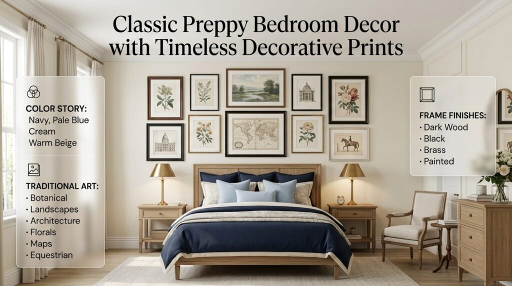
A decorative print could contain navy, pale blue, cream, and a small amount of warm beige.
The print doesn’t need brass in it.
The brass can remain a separate accent.
This is enough to make the artwork feel connected to the environment.
Decorative Prints for Classic Preppy Rooms
Classic preppy rooms usually benefit from traditional-looking artwork.
Consider:
- Botanical illustrations
- Landscapes
- Equestrian-inspired artwork
- Architectural prints
- Traditional florals
- Vintage-style maps
- Classic framed illustrations
Frames can be slightly more substantial in a classic room.
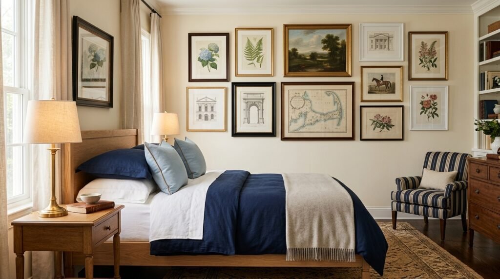
Dark wood, traditional black, brass-toned, or elegant painted frames can work well.
If you want the overall room to feel timeless rather than trendy, choose artwork with a subject that you can imagine enjoying for several years.
The Classic Preppy Room style is a useful direction when you want artwork to feel integrated with traditional furniture and classic patterns.
Decorative Prints for Modern Preppy Rooms
Modern preppy design allows more flexibility.
You can combine traditional preppy colors with:
- Minimal artwork
- Abstract prints
- Simple graphics
- Clean line drawings
- Geometric artwork
- Contemporary photography
Frames should usually be simpler.
Black, white, light wood, or minimal metallic frames can work well.
The key is to avoid creating a room where the furniture is modern but the artwork is extremely traditional unless that contrast is intentional.
The Modern Preppy Room approach can help when you’re looking for that balance between classic character and contemporary simplicity.
Decorative Prints for Cute Preppy Rooms
Cute preppy rooms can use artwork to introduce personality and cheerful details.
Consider:
- Small floral prints
- Playful illustrations
- Soft-colored artwork
- Cute animals
- Whimsical patterns
- Cheerful typography
- Colorful botanical designs
Pink, light blue, lavender, cream, and soft green can work particularly well.
However, cute doesn’t mean everything needs to be bright.
A soft blush print with a cream background may look more polished than several highly saturated pieces.
For more inspiration, explore Cute Preppy Room and Cute Preppy Room Ideas.
Decorative Prints for Cozy Preppy Rooms
A cozy preppy room needs artwork that contributes to warmth.
Good choices include:
- Soft landscapes
- Botanical artwork
- Warm-toned illustrations
- Traditional scenes
- Nature photography
- Neutral decorative prints
Natural wood frames can be especially effective.
Cream, beige, muted green, dusty blue, and warm brown can soften the overall composition.
The artwork should complement soft bedding, throws, rugs, and warm lighting rather than competing with them.
The Cozy Preppy Room direction is particularly useful if your goal is to create a room that feels welcoming rather than overly formal.
Decorative Prints for Minimal Preppy Rooms
Minimal preppy design requires more editing.
Instead of decorating every wall, choose a few meaningful pieces.
A large framed print can often work better than a collection of small pieces.
Keep the color palette controlled.
Use negative space deliberately.
A minimalist room should allow the artwork to breathe.
The Minimal Preppy Room approach is useful when you want classic character without visual overload.
How Do You Match Decorative Prints With Different Color Palettes?
Color coordination is one of the most important parts of successful artwork placement.
Navy and White Decorative Prints
Navy and white create a classic foundation.
Suitable artwork includes:
- Blue botanical prints
- Navy-and-white illustrations
- Coastal artwork
- Traditional landscapes
- Blue geometric designs
- White-background artwork with navy details
Navy artwork can reinforce bedding or furniture without requiring another large navy element.
For more inspiration, explore Navy and White Preppy Room Ideas.
Blue and Cream Decorative Prints
Blue and cream create a softer look.
Artwork can include:
- Powder blue
- Pale blue
- Cream
- Beige
- Soft green
- Muted brown
Traditional landscapes and botanical illustrations work particularly well with this palette.
See Blue and Cream Preppy Room for more ideas around this color combination.
Pink and White Decorative Prints
Pink and white provide plenty of flexibility.
You can choose:
- Soft floral prints
- Botanical artwork
- Blush abstract pieces
- Pink-and-cream illustrations
- Vintage-style floral prints
- Small colorful artworks
Don’t feel limited to bright pink.
Dusty rose, blush, muted berry, and pale pink can create more sophisticated variations.
Explore Pink and White Preppy Room Ideas and Pink Preppy Room for additional inspiration.
Green and Cream Decorative Prints
Green and cream are natural partners.
Consider:
- Botanical prints
- Garden scenes
- Landscape artwork
- Leaf illustrations
- Green geometric designs
Sage can create a softer appearance, while forest green produces more contrast.
See Green and Cream Preppy Room Ideas for more direction.
Red and Navy Decorative Prints
Red and navy can create a stronger statement.
Artwork should help balance those colors rather than intensify them unnecessarily.
White and cream are useful supporting colors.
A navy print with small red details may work better than artwork containing large amounts of both colors.
You can explore Red and Navy Preppy Room Ideas for additional palette inspiration.
Green and Navy Decorative Prints
Green and navy create a richer, more sophisticated combination.
Because both colors can be strong, consider using artwork with a lighter background.
Cream, white, beige, and natural tones can prevent the arrangement from becoming too dark.
See Green and Navy Preppy Room Ideas for more ideas.
Light Blue and White Decorative Prints
Light blue and white are particularly useful for a fresh, airy room.
Suitable artwork includes:
- Coastal illustrations
- Soft botanical designs
- Clouds or skies
- Traditional blue artwork
- Simple geometric prints
The Light Blue and White palette can be especially effective in smaller bedrooms because it can maintain a visually light appearance.
Neutral and Classic Tones
Neutral rooms don’t need to be boring.
Use artwork to introduce subtle variation through:
- Beige
- Cream
- Taupe
- Soft brown
- Warm gray
- Muted green
- Deep navy accents
The Neutral and Classic Tones direction works well when you want the room to feel calm and timeless.
Multicolor Preppy Palettes
Multicolor rooms require more discipline.
If the room already contains several colors, choose artwork that repeats existing shades rather than introducing several new ones.
A multicolor print can act as a bridge between different parts of the room.
The Multicolor Preppy Palettes approach can help you think about how multiple shades can coexist without becoming chaotic.
How Large Should Decorative Prints Be?
Size is one of the easiest details to get wrong.
A beautiful print can look disappointing if it is too small for the wall.
A huge artwork can overwhelm a small space.
The best starting point is to consider the furniture beneath the artwork.
If you are hanging artwork above a bed, dresser, desk, or console, think about the visual relationship between the furniture and the artwork.
The artwork should feel connected to the furniture rather than floating independently.
Use the Floor Test
Before hanging anything, place the artwork on the floor.
Stand several steps away.
Look at it from different angles.
Ask:
- Does it feel large enough?
- Does it feel too dominant?
- Does it look connected to the furniture?
- Is the arrangement balanced?
If you’re using several prints, arrange all of them together rather than evaluating them one at a time.
This is much closer to how they will look on the wall.
Should You Use One Decorative Print or Several?
Both approaches can work.
The decision depends on the room.
One Large Print
One large print can work well when:
- The artwork has a strong composition
- The wall is relatively simple
- The room already has multiple patterns
- You want a clean appearance
- You prefer minimal decoration
Two Prints
Two coordinated prints can create balance.
They work particularly well above:
- Nightstands
- A desk
- A dresser
- A narrow console
They can be identical or complementary.
Three or More Prints
Multiple prints can create a gallery effect.
This works especially well when each print is individually simple.
You can connect them through:
- Similar frames
- Shared colors
- Related subjects
- Similar sizes
- One consistent theme
How Do You Create a Decorative Print Gallery Wall?
Gallery walls can look complicated, but the planning process is actually quite simple.
Start by collecting the pieces.
Don’t immediately hang them.
Place them on the floor.
Move them around.
Try several layouts.
Take photographs.
Then choose the strongest arrangement.
A useful gallery wall can include:
- One large central print
- Two medium prints
- Several smaller pieces
- Different frame sizes
- Repeated colors
The arrangement doesn’t need to be perfectly symmetrical.
What matters is visual balance.
A Simple Gallery Wall Structure
[ Small ]   [ Medium ]   [ Small ]

        [ Large Print ]

[ Medium ]  [ Small ]    [ Medium ]
This is only an example.
You can change the structure according to your wall and artwork.
The important thing is to avoid creating a composition where all the visual weight sits on one side.
For more practical guidance on arranging artwork, choosing the right layout, and creating a balanced display, explore our complete guide to Gallery Walls.
Patterned wall art can bring visual interest, color, and personality to a preppy interior while keeping the overall design cohesive. Explore our guide to Patterned Wall Art for stylish ideas on choosing and arranging patterns that complement your room.
How Much Space Should You Leave Between Decorative Prints?
Spacing should feel intentional.
If prints are too close together, the arrangement may look crowded.
If they are too far apart, they may stop reading as one composition.
The exact gap depends on:
- Print size
- Frame size
- Wall size
- Number of pieces
- Overall room scale
Consistency is usually more important than following one exact measurement.
If one gap is noticeably larger than the others, the difference should look intentional.
Otherwise, the arrangement can appear unfinished.
What Frames Work Best With Decorative Prints?
The frame is part of the artwork’s presentation.
Even a simple print can look polished when the frame is appropriate.
Popular options include:
- Black
- White
- Natural wood
- Dark wood
- Brass
- Gold-toned
- Navy
- Cream
Classic Room Frames
Traditional rooms can handle more detailed frames.
Dark wood, brass, and elegant traditional profiles can reinforce the classic atmosphere.
Modern Room Frames
Modern rooms generally benefit from cleaner profiles.
Thin black, white, or natural wood frames can provide structure without competing with the artwork.
Cute Room Frames
White and light wood frames can keep the room feeling fresh.
Cozy Room Frames
Warm wood and cream frames can add softness.
Minimal Room Frames
Simple black, white, or natural frames are usually easiest to integrate.
Can You Mix Different Frames?
Yes.
Mixed frames can make a gallery wall feel collected over time.
However, mixing everything at once can create visual noise.
If your frames are different, keep something else consistent.
For example:
Different frames + same color palette
or
Different frames + related artwork subjects
or
Different frames + similar artwork sizes
This gives the eye a reason to see the collection as one group.
Where Should You Hang Decorative Prints?
Placement matters almost as much as selection.
Above the Bed
This is one of the strongest locations for decorative prints.
The artwork should relate to the bed’s width and visual weight.
A large horizontal arrangement often works well.
Above a Dresser
A wide arrangement can balance the horizontal shape of the dresser.
A mirror can also work, but if artwork is the priority, choose a composition that feels proportional.
Above a Desk
Smaller prints can personalize a study area.
Avoid making the arrangement so large that it becomes distracting during work or study.
Beside a Bed
Small vertical artwork can work well on narrow wall areas.
Reading Corner
Artwork can help visually define a reading area.
A landscape print, botanical illustration, or small gallery arrangement can make the corner feel more intentional.
Open Wall
An empty wall can become a focal point.
But don’t assume every empty wall needs artwork.
Sometimes leaving a wall quiet provides useful visual breathing space.
How Can Decorative Prints Improve a Small Room?
Small rooms require careful editing.
Large collections of tiny artwork can sometimes make the walls feel busier.
Instead, consider:
- One strong focal print
- A pair of coordinated pieces
- Light-colored artwork
- Simple frames
- Plenty of negative space
The goal is not to make the room appear full.
The goal is to make it feel complete without adding unnecessary visual weight.
How Do You Use Decorative Prints With Patterned Bedding?
This is particularly important in preppy rooms.
Preppy interiors often use stripes, gingham, florals, checks, and other patterns.
If your bedding already contains a bold pattern, your artwork doesn’t necessarily need another bold pattern.
For example:
Patterned bedding + simple botanical print
can be more balanced than:
Patterned bedding + patterned curtains + patterned rug + heavily patterned artwork.
The room can still feel decorative.
The difference is that the patterns are being edited.
The Framed Artwork direction is useful when you want to think more carefully about how artwork and framing contribute to the overall room composition.
How Do Decorative Prints Work With Preppy Room Decor?
Artwork should connect with other decorative elements.
For example, a botanical print can connect with greenery.
A navy print can connect with navy cushions.
A brass-framed artwork can connect with brass lamps.
A traditional landscape can connect with classic furniture.
This is what makes a room feel designed rather than decorated randomly.
The artwork doesn’t have to match every object.
It simply needs to participate in the room’s visual language.
For broader inspiration, explore Preppy Room Decor and Aesthetic Preppy Room Decor.
How Do You Use Decorative Prints in an Aesthetic Preppy Room?
An aesthetic room often relies heavily on visual consistency.
Artwork should therefore support:
- The color palette
- The lighting
- The furniture
- The textiles
- The overall mood
A soft pastel room may benefit from delicate prints.
A darker navy room may suit richer traditional artwork.
A bright cute room may handle more playful illustrations.
The important thing is to avoid choosing artwork simply because it is currently popular.
Choose pieces that make sense within the room.
The Preppy Room Aesthetic guide can help establish the larger visual direction before selecting individual artwork.
Decorative Prints for Pink Preppy Rooms
Pink doesn’t automatically mean the artwork needs to be pink.
In fact, using too much of the same shade can flatten the room.
Instead, combine pink with:
- Cream
- White
- Burgundy
- Soft green
- Beige
- Light blue
- Muted brown
A floral print with cream and blush can look elegant.
A botanical print with green and pink can introduce contrast.
A simple black-and-white illustration can also work if the room needs visual grounding.
For additional inspiration, explore Aesthetic Pink Preppy Room.
Decorative Prints With LED Lighting
LED lighting can change how artwork is perceived.
If your room includes LED lighting, be careful about choosing artwork with colors that become visually harsh under colored light.
For example, strongly saturated red artwork can look very different under blue or purple lighting.
Neutral backgrounds and controlled colors tend to remain easier to integrate.
If you’re combining artwork with this type of lighting, the Preppy Room With LED Lights direction can provide useful inspiration.
How Can Decorative Prints Work With DIY Decor?
DIY artwork can be useful when you want something personal or affordable.
You can create:
- Simple botanical prints
- Abstract color compositions
- Personalized illustrations
- Collage-style artwork
- Pressed botanical displays
- Simple geometric designs
The important part is presentation.
A handmade print can look polished when it has:
- A clean frame
- Good proportions
- A controlled color palette
- Consistent spacing
- Appropriate placement
DIY doesn’t have to look temporary.
The DIY Preppy Room Decor approach can help you think about how handmade pieces can fit naturally into a larger preppy interior.
Decorative Prints for Girls’ Preppy Rooms
A girl’s preppy room can use decorative prints to introduce personality without relying entirely on decorative objects.
Possible themes include:
- Flowers
- Soft botanical artwork
- Fashion-inspired illustrations
- Travel artwork
- Cute animals
- Initials or personal artwork
- Soft landscapes
- Classic patterns
The important point is personalization.
Artwork should reflect the person using the room rather than simply following a generic trend.
You can also combine decorative prints with the ideas in Preppy Room Decor for Girls where appropriate.
How Do You Create a More Expensive-Looking Artwork Display?
A sophisticated artwork arrangement isn’t necessarily expensive.
Presentation often matters more than price.
Focus on:
Scale
Choose artwork that fits the wall.
Spacing
Keep gaps intentional.
Frames
Choose frames that complement the room.
Alignment
Create clear visual relationships.
Color
Avoid introducing unnecessary shades.
Editing
Don’t use more artwork than the room needs.
A simple print with excellent framing and placement can look far more polished than an expensive piece that is too small or poorly positioned.
The Professional Rule: Fix the Arrangement Before Buying More
If your wall doesn’t look right, your first response shouldn’t be to buy another print.
Check:
- Is the artwork too small?
- Is it too high?
- Is the spacing uneven?
- Are the frames conflicting?
- Are there too many colors?
- Is the arrangement centered?
- Is there already too much visual activity nearby?
These problems can often be fixed without spending additional money.
What Are the Most Common Decorative Print Mistakes?
Mistake 1: Choosing Artwork Before the Room
This happens because people naturally choose pieces they love.
The problem is that the artwork may not work with the existing room.
Better approach: Choose artwork after understanding the room’s palette and style.
Mistake 2: Buying Prints That Are Too Small
A tiny print can disappear above a large bed or dresser.
Better approach: Test the approximate dimensions before purchasing.
Mistake 3: Using Too Many Colors
Every new color creates another visual relationship.
Better approach: Repeat existing colors whenever possible.
Mistake 4: Matching Everything Too Closely
Exact matching can make the room feel artificial.
Better approach: Coordinate rather than duplicate.
Mistake 5: Ignoring the Frame
A print and its frame should be considered together.
Better approach: Think about the frame’s color, material, thickness, and relationship with other furniture.
Mistake 6: Hanging Prints Too High
Artwork can look disconnected from furniture when there is excessive empty space underneath.
Better approach: Consider the artwork and furniture as one visual group.
Mistake 7: Making Every Wall a Gallery
Not every wall needs decoration.
Better approach: Let some areas remain visually quiet.
Mistake 8: Mixing Too Many Themes
Botanical artwork, sports illustrations, abstract graphics, travel posters, and cartoon prints may all be attractive individually.
Together, they may lack coherence.
Better approach: Establish one main visual direction.
Mistake 9: Creating Uneven Gallery Wall Spacing
Small differences can become noticeable when several pieces are displayed together.
Better approach: Measure and test the arrangement before hanging.
Mistake 10: Following Trends Instead of Personal Style
A trendy print may look great online but feel wrong in your room.
Better approach: Choose artwork that supports the room’s long-term identity.
How Do You Arrange Decorative Prints Step by Step?
Step 1: Identify the Wall
Choose the wall that actually needs artwork.
Don’t start by buying prints.
Start with the space.
Step 2: Measure the Area
Measure the available width and height.
Consider doors, windows, furniture, switches, shelves, and lighting.
Step 3: Identify the Furniture Relationship
Ask what sits below the artwork.
A bed, desk, dresser, or chair affects the appropriate scale.
Step 4: Select a Color Direction
Choose artwork that connects with the existing palette.
Step 5: Select the Artwork
Now choose the subjects and designs.
Step 6: Select Frames
Treat the frame as part of the composition.
Step 7: Test the Arrangement
Use the floor or paper templates.
Step 8: Photograph It
A photograph can reveal imbalance that isn’t obvious in person.
Step 9: Adjust
Move pieces until the composition feels balanced.
Step 10: Hang Carefully
Only after you’re satisfied should you commit to the wall.
What Is the Best Way to Mix Decorative Prints?
Mixing works when there is a controlled relationship between the pieces.
For example:
Botanical + Landscape + Geometric
can work if all three share navy, cream, and green.
Similarly:
Floral + Abstract + Illustration
can work if the palette and frame style connect them.
The mistake is assuming that “different” automatically means “interesting.”
Variation needs structure.
A successful collection usually contains both:
Consistency
and
Variation.
Consistency gives the eye order.
Variation gives the arrangement personality.
How Do You Use Decorative Prints on Open Shelves?
Prints don’t have to be hung.
Small framed prints can lean against a wall on shelves.
This creates a relaxed appearance.
Combine them with:
- Books
- Small plants
- Decorative objects
- Vases
- Small boxes
- Personal items
Avoid filling every shelf.
Leave some empty space.
This allows the artwork to remain visible and prevents the shelf from looking crowded.
Can Decorative Prints Be Layered?
Yes.
Layering can make a room feel collected.
For example, a large framed print can sit behind a smaller frame on a dresser.
Or a small print can lean against a larger one on a shelf.
The key is stability and visual clarity.
Don’t layer so many pieces that the artwork becomes difficult to see.
How Do Decorative Prints Work With Mirrors?
Mirrors and artwork can complement each other.
A mirror reflects light and adds dimensionality.
Artwork adds color, subject, and personality.
However, avoid creating a wall where every element competes for attention.
If the mirror is ornate and visually strong, the artwork may need to be simpler.
If the artwork is dramatic, use a simpler mirror.
This keeps the composition balanced.
How Do You Use Decorative Prints in a Preppy Room Makeover?
Artwork can be one of the easiest elements to change during a room makeover.
You don’t necessarily need to replace furniture.
For example:
Before
- Neutral walls
- Simple bedding
- Plain dresser
- Empty wall
After
- Coordinated bedding
- Large framed artwork
- Small botanical print
- Decorative lamp
- One accent color
- Organized accessories
The room can feel significantly different without a complete renovation.
If you’re planning a larger transformation, see Preppy Room Makeover for broader ideas.
How Do Decorative Prints Work With Preppy Room Inspiration?
When gathering inspiration, don’t simply copy an entire room.
Instead, identify individual techniques.
For example:
One room may inspire your color palette.
Another may inspire the artwork arrangement.
Another may inspire the frame style.
Another may inspire the combination of patterns.
This allows you to build something personal rather than reproducing a photograph.
You can use Preppy Room Inspo as a starting point for identifying the design details you genuinely like.
How Can Decorative Prints Support Preppy Room Ideas?
Think of artwork as one layer of the room.
A strong preppy room might have:
- A coordinated palette
- Layered bedding
- Classic patterns
- Appropriate furniture
- Decorative lighting
- Wall artwork
- Personal accessories
The artwork should reinforce those layers.
For example, navy artwork can reinforce navy bedding.
Botanical artwork can reinforce greenery.
A geometric print can echo a patterned rug.
A brass frame can connect with brass lighting.
This is how small relationships create a cohesive room.
Decorative Prints and Framed Artwork: What’s the Difference?
Decorative prints refer to the printed artwork itself.
Framed artwork refers to artwork that has been presented inside a frame.
A decorative print can be:
- Framed
- Unframed
- Mounted
- Displayed on a shelf
- Used as part of a gallery wall
Framing adds structure and protection while also influencing the visual style.
For a polished room, framing is often worth considering because the frame becomes part of the overall design.
How Do You Choose Decorative Prints for a Rental Room?
Renting doesn’t mean you have to live with completely blank walls.
Depending on the wall surface and rental rules, lightweight artwork and appropriate removable hanging solutions can make a major difference.
Small framed prints are particularly flexible.
You can also use:
- Leaning artwork
- Shelf displays
- Lightweight gallery pieces
- Removable hanging systems
- Decorative boards
Always consider the wall surface and the weight of the artwork before choosing a hanging method.
How Can You Keep Decorative Prints Looking Fresh?
Dust and sunlight can affect displayed artwork over time.
To maintain the appearance:
- Dust frames regularly
- Avoid excessive direct sunlight when possible
- Keep artwork away from areas with moisture
- Use appropriate glass or acrylic
- Handle prints carefully
- Check frames occasionally
- Replace damaged prints rather than keeping visibly worn pieces
Good maintenance helps a room continue looking intentional.
Can Decorative Prints Be Personalized?
Absolutely.
Personal artwork can make a room feel more meaningful.
Ideas include:
- Favorite places
- Personal photographs
- Family artwork
- Travel memories
- Meaningful illustrations
- Initials
- Custom botanical designs
- Personal collections
Personalization doesn’t have to be obvious.
A framed photograph with colors that match the room can feel both personal and sophisticated.
How Many Decorative Prints Should a Preppy Room Have?
There is no universal number.
The correct amount depends on:
- Room size
- Wall space
- Furniture
- Artwork scale
- Existing patterns
- Personal taste
A minimalist room may need only one or two.
A large bedroom may comfortably support a gallery wall.
The best approach is to stop when the room feels complete.
Don’t continue adding artwork simply because an empty wall remains.
An empty wall can be intentional.
What Is the Best Decorative Print Strategy for Beginners?
If you’re completely new to decorating, don’t try to create a complicated gallery wall immediately.
Start with one wall.
Choose one large or medium print.
Make sure the colors work.
Choose a suitable frame.
Hang it correctly.
Then live with it for a few days.
After that, you can decide whether the room needs more.
This approach prevents overbuying and gives you a better understanding of your own decorating preferences.
Expert Tips for Styling Decorative Prints
Expert Tip 1: Start With the Largest Visual Element
If the bed is the largest object in the room, use it as a reference for artwork scale.
Expert Tip 2: Repeat Colors, Not Exact Designs
If your bedding has navy stripes, your artwork doesn’t need navy stripes too.
A navy botanical print may create a more interesting relationship.
Expert Tip 3: Use Negative Space
Empty wall space is not wasted space.
It helps important artwork stand out.
Expert Tip 4: Step Back Frequently
Artwork can look different from two feet away compared with the doorway.
Always evaluate the whole room.
Expert Tip 5: Don’t Let Artwork Compete With the Bed
In a bedroom, the bed is often the primary focal point.
Artwork should support it unless you’re intentionally making the wall the main feature.
Expert Tip 6: Use Frames Strategically
Frames can repeat wood, metal, black, white, or other finishes already present in the room.
Expert Tip 7: Choose Longevity Over Trends
If you love a print today, consider whether you’ll still enjoy it when you change the bedding or color palette.
This is especially important for larger and more expensive pieces.
Decorative Print Ideas by Room Function
Bedroom
Use calm artwork, botanical designs, landscapes, or coordinated gallery arrangements.
Study Area
Use architectural prints, maps, geometric designs, or artwork connected to personal interests.
Reading Corner
Use landscapes, botanical artwork, or peaceful illustrations.
Dressing Area
Use elegant fashion-inspired artwork, mirrors, or coordinated decorative prints.
Guest Room
Choose neutral artwork that feels welcoming without being overly personal.
A Practical Decorative Print Decision Table
| Room Situation | Recommended Direction |
|---|---|
| Large empty wall | One large print or gallery wall |
| Small bedroom | One strong focal piece |
| Patterned bedding | Simpler artwork |
| Plain bedding | Artwork can carry more pattern |
| Classic furniture | Traditional or botanical prints |
| Modern furniture | Minimal or geometric prints |
| Colorful room | Controlled artwork palette |
| Neutral room | Artwork can introduce color |
| Minimal room | One or two carefully selected pieces |
| Large gallery wall | Repeat frames, colors, or subjects |
Decorative Prints and Visual Balance
Balance doesn’t necessarily mean symmetry.
A room can be balanced through:
- Color distribution
- Size
- Shape
- Texture
- Placement
- Visual weight
For example, a large dark print on one side of a room may be balanced by a darker chair or rug elsewhere.
Similarly, a large colorful artwork may need quieter surroundings.
Think of the room as one composition.
This is why a decorative print should never be evaluated only by itself.
How Can You Tell When a Decorative Print Is Wrong for the Room?
There are several warning signs.
The artwork may be wrong if:
- It introduces a color that appears nowhere else
- It is too small
- It overwhelms the furniture
- Its style conflicts with the room
- The frame feels unrelated
- The wall feels crowded
- The artwork competes with another focal point
- It looks attractive alone but awkward in context
When this happens, don’t assume the artwork itself is bad.
It may simply be the wrong artwork for that specific location.
Should Decorative Prints Be Symmetrical?
Symmetry can create a polished appearance, especially around a bed.
For example:
[ Print ]      [ Print ]
     [    Bed    ]
However, symmetry isn’t required.
Asymmetrical gallery walls can feel more relaxed and collected.
The choice depends on the room’s overall personality.
Classic rooms often benefit from stronger symmetry.
Modern or creative rooms can handle more variation.
How Do You Make a Gallery Wall Feel Professional?
Professional-looking gallery walls usually have some form of structure.
That structure may come from:
- Repeated frames
- Consistent spacing
- A limited palette
- One central piece
- Related subjects
- Similar proportions
You don’t need to make every piece identical.
You simply need to give the collection a visual reason to work together.
Decorative Prints and Preppy Room Decor: Final Styling Formula
If you’re unsure where to begin, use this simple formula:
Room palette → Furniture → Main focal point → Artwork → Frames → Accessories
Don’t reverse the process.
If you start with accessories and artwork before establishing the main room structure, you may end up buying pieces that don’t work together.
Start with the largest elements.
Then add artwork.
Then use smaller accessories to finish the composition.
A Complete Decorative Prints Checklist
Before you finish your wall, ask:
- Does the artwork suit the room?
- Does it support the color palette?
- Is the size appropriate?
- Does the frame complement the furniture?
- Is the artwork positioned correctly?
- Is the spacing consistent?
- Does the arrangement feel balanced?
- Is there enough negative space?
- Does the artwork compete with another focal point?
- Are there too many colors?
- Are there too many patterns?
- Does the wall actually need another piece?
- Does the artwork feel personal?
- Will you still like the artwork later?
If most answers are yes, you’re probably on the right track.
How Do You Choose the Right Decorative Prints for a Room?
Choosing the right decorative prints starts with looking at the room as a whole rather than selecting artwork on its own. Consider the existing wall color, furniture, bedding, curtains, rugs, lighting, and accessories. The print should add something useful to the space, whether that’s color, pattern, personality, or a focal point.
For a preppy room, start by identifying two or three colors that already appear in the space. You can then choose artwork that repeats one or two of those shades without trying to match everything exactly. The subject matters too. Botanical illustrations, landscapes, classic patterns, architectural artwork, and elegant geometric designs can all work well depending on whether the room is classic, modern, cute, cozy, or minimal.
Practical points:
Start with the room’s existing color palette.
Choose artwork that supports the room’s decorating style.
Consider the wall size before selecting the print.
Repeat existing colors rather than introducing too many new ones.
Think about the frame at the same time as the artwork.
Choose something you’ll enjoy seeing for a long time rather than following a short-term trend.
What Size Should Decorative Prints Be for a Bedroom Wall?
The right size depends on the wall, the furniture underneath it, and whether you’re using one print or several pieces together. Artwork that is too small can disappear on a large wall, while artwork that is too large can overwhelm a smaller bedroom.
When placing decorative prints above a bed, dresser, or desk, consider the furniture as your main reference point. A single large print can create a strong focal point, while several smaller prints can create a gallery arrangement. The combined visual width of a group should still feel connected to the furniture below it.
Before buying or hanging the artwork, use paper or removable tape to mark its approximate dimensions on the wall. Step back and look at it from across the room. This simple test often makes scale problems obvious before you commit to the final arrangement.
Practical points:
Consider the width of the furniture below the artwork.
Avoid very small artwork on very large walls.
Use multiple smaller prints when a gallery arrangement suits the space.
Test the dimensions before drilling holes.
Step back and judge the artwork from the normal viewing distance.
Leave enough surrounding space so the print doesn’t feel crowded.
Should Decorative Prints Match the Colors of the Room?
Decorative prints don’t need to match the room perfectly. In most cases, coordinating with the existing palette creates a more natural and sophisticated result than trying to make every color identical.
For example, a navy-and-white room could use artwork containing navy, cream, pale blue, or muted green. A pink-and-white room might use blush, cream, soft green, or muted berry tones. The artwork doesn’t need to reproduce the exact colors of the bedding or curtains; it simply needs to create a visual relationship with them.
This approach also gives the room more depth. Slight variations in color prevent the design from looking like everything was purchased as one matching set.
Practical points:
Repeat one or two important room colors.
Don’t force an exact color match.
Use artwork to connect separate areas of the room.
Introduce new colors carefully.
Consider the artwork background as well as its main colors.
Keep the overall palette controlled when the room already contains several strong colors.
How Do You Arrange Decorative Prints on a Wall?
A successful arrangement starts with planning rather than immediately hanging each piece. First, place all the prints on the floor and experiment with different layouts. This allows you to change the composition without creating unnecessary holes in the wall.
For a gallery wall, you can combine different sizes while maintaining a connection through color, frame style, subject, or spacing. Perfect symmetry isn’t required, but the overall visual weight should feel balanced. If one side contains a large dark frame, for example, the other side may need enough visual weight to prevent the arrangement from feeling uneven.
Take a photograph of the arrangement before hanging it. A photo often makes uneven spacing or an awkward composition easier to notice.
Practical points:
Plan the complete arrangement before hanging anything.
Keep spacing reasonably consistent.
Use repeated colors or frames to connect different pieces.
Balance large and small artwork carefully.
Test the layout from several viewing distances.
Leave some negative space around the complete arrangement.
What Decorative Prints Look Best in a Preppy Room?
The best decorative prints for a preppy room are those that support its colors, patterns, and overall character. Traditional botanical illustrations, landscapes, floral artwork, architectural drawings, vintage-inspired prints, geometric designs, and carefully selected abstract pieces can all work beautifully.
The specific choice should depend on the type of preppy room you’re creating. A classic preppy bedroom may suit traditional botanical or landscape artwork with elegant frames. A modern preppy room can handle cleaner geometric or abstract designs. A cute preppy room may benefit from softer illustrations and playful artwork, while a minimal preppy space often looks better with fewer, larger pieces.
The most important thing is to avoid choosing artwork simply because it is attractive by itself. It should also make sense alongside the room’s furniture, bedding, colors, and accessories.
Practical points:
Choose artwork that reflects the room’s specific preppy style.
Botanical prints work well with green, navy, cream, and natural palettes.
Landscapes can add depth and a calm traditional feeling.
Geometric prints can support a modern preppy room.
Floral artwork can work especially well in softer or cute rooms.
Keep artwork and frames consistent with the room’s overall visual direction.
Conclusion
Decorative prints can completely change how a room feels without requiring a major makeover. The right artwork can bring color to an empty wall, add personality to a simple space, create a focal point, and connect different elements throughout the room.
For a preppy room, the best results come from choosing prints that work with the existing design rather than competing with it. Consider your color palette, furniture, patterns, wall size, and overall decorating style before making a final choice. A classic botanical print, elegant landscape, floral design, geometric artwork, or carefully selected abstract piece can all work beautifully when the scale and presentation are right.
Don’t feel pressured to fill every empty wall. Sometimes one well-chosen print can have more impact than a collection of unrelated pieces. Pay attention to framing, spacing, alignment, and negative space, and always test your arrangement before permanently hanging the artwork.
Most importantly, let your decorative prints reflect your personality. A well-designed room should feel coordinated, but it should also feel personal and comfortable.
When you choose artwork thoughtfully and give it the right space to breathe, even a simple decorative print can become an important detail that makes the entire room feel more complete, polished, and inviting.