Introduction
Gallery Walls | A blank wall can make an otherwise beautiful room feel unfinished. The furniture may be comfortable, the bedding may have the right colors, and the room may already include thoughtful accessories, yet something can still feel missing.
A well-planned gallery wall can solve that problem without requiring a complete room makeover.
Instead of treating wall art as a collection of unrelated decorations, a gallery wall brings several pieces together into one visual composition. In a preppy room, that composition can combine classic artwork, botanical prints, personal photographs, traditional illustrations, patterns, mirrors, initials, and other meaningful details while still maintaining a polished appearance.
If you’re exploring the wider style, you can begin with Preppy Room to understand how colors, patterns, furniture, textiles, and wall decoration work together.
The key, however, is not simply putting several frames on a wall.
A successful gallery wall needs a sense of relationship, proportion, spacing, color, balance, and personality.
This complete guide explains how to plan a gallery wall from the beginning, choose artwork and frames, select the right layout, work with different preppy color palettes, decorate around a bed or desk, avoid common mistakes, and create a display that feels collected rather than cluttered.
What Is a Gallery Wall?
A gallery wall is a deliberate arrangement of multiple decorative or artistic pieces displayed together on one wall. The pieces may include framed artwork, photographs, illustrations, mirrors, typography, botanical prints, personal objects, or other decorative elements.
The important part is the relationship between the pieces.
A gallery wall doesn’t require every frame to match. In fact, a mixture of sizes, artwork types, and frame styles can create more personality when the overall arrangement has a clear visual connection.
That connection can come from:
- A shared color palette
- Similar frame finishes
- Repeated shapes
- Related artwork subjects
- Consistent spacing
- Similar visual weight
- A common design style
- Repeated colors found elsewhere in the room
In a preppy bedroom, for example, navy, cream, green, brass, pink, or soft blue can appear across several pieces without making every artwork identical.
The goal is cohesion without excessive uniformity.
Why Do Gallery Walls Work So Well in Preppy Rooms?
Preppy interiors naturally lend themselves to framed artwork and carefully arranged wall decoration.
Classic preppy rooms often include recognizable colors and patterns such as navy, white, cream, green, stripes, checks, florals, and traditional illustrations. These elements create plenty of opportunities to build relationships between wall art and the rest of the room.
A gallery wall can also make a room feel more personal.
Instead of purchasing one oversized decorative piece simply to fill an empty wall, you can create a collection that reflects your interests and personality.
For example, a bedroom gallery wall could combine:
- A botanical illustration
- A small landscape
- A navy abstract print
- A personal photograph
- A simple monogram
- A small floral artwork
- A vintage-inspired illustration
The individual pieces may be different, but a shared palette can make them feel connected.
This is particularly useful when creating a room that should feel polished without becoming overly formal.
How Do You Plan a Gallery Wall Before Hanging Anything?
The best gallery walls usually begin with planning rather than drilling holes.
One of the easiest mistakes is choosing artwork individually and immediately hanging each piece wherever there appears to be empty space.
That approach often creates uneven gaps, awkward proportions, or an arrangement that feels visually disconnected.
Instead, treat the entire wall as one composition.
Step 1: Identify the wall
First decide exactly where the gallery wall will go.
Possible locations include:
- Above a bed
- Above a dresser
- Behind a desk
- Beside a reading chair
- Along a hallway
- Above a console
- On a small bedroom wall
- Around an architectural feature
- On an otherwise empty accent wall
The location affects the size and shape of the arrangement.
A narrow wall may need a vertical composition, while a wide wall above a dresser may work better with a horizontal arrangement.
Step 2: Measure the available space
Measure:
- Wall width
- Wall height
- Furniture width
- Distance between furniture and ceiling
- Available space around doors or windows
You don’t need to cover every available inch.
The gallery wall should relate to the furniture below it.
Step 3: Decide on the visual direction
Ask yourself whether you want the arrangement to feel:
- Traditional
- Symmetrical
- Relaxed
- Eclectic
- Modern
- Cute
- Minimal
- Colorful
- Vintage-inspired
- Personal
This decision makes later choices easier.
For example, a classic preppy bedroom may benefit from an organized arrangement with traditional frames, while a more playful room may work better with mixed sizes and slightly irregular placement.
How Many Pieces Should a Gallery Wall Have?
There is no single correct number.
A gallery wall can contain three pieces or many more.
The right number depends on:
- Wall size
- Frame sizes
- Artwork scale
- Furniture below
- Desired visual density
- Room style
A small wall might need only three to five pieces.
A larger wall could accommodate seven, nine, or more.
The important point is not to choose a number simply because it sounds appropriate.
Instead, think about visual coverage.
Three large frames may have more visual impact than eight tiny frames.
Likewise, ten small pieces can look intentional when carefully arranged, while five unrelated pieces can look random.
What Should You Put in a Preppy Gallery Wall?
The artwork should reflect the personality of the room.
There is no requirement that every piece be traditional or obviously preppy.
Good options include:
Botanical Prints
Botanical artwork is one of the easiest ways to introduce classic character.
Leaves, flowers, herbs, and botanical illustrations can work particularly well with:
- Green and cream
- Navy and white
- Pink and white
- Neutral palettes
- Natural wood
Landscapes
Traditional landscape artwork can create a calm and established feeling.
A small landscape can also balance more colorful or graphic artwork elsewhere in the arrangement.
Architectural Prints
Buildings, houses, doors, windows, and architectural illustrations can introduce structure without overwhelming the room.
Personal Photography
Personal photographs can make the gallery wall feel meaningful rather than purely decorative.
You could include:
- Family memories
- Travel photographs
- Favorite places
- Nature photographs
- Black-and-white images
Personal photographs can add warmth, personality, and a meaningful sense of character to a preppy space—explore our guide to Personal Photographs for thoughtful ideas on displaying them with a polished, timeless look.
Initials and Monograms
Monogram-inspired artwork can add a traditional preppy touch.
However, use personalization thoughtfully.
One or two meaningful details are usually more effective than repeating initials throughout the entire room.
Patterned Artwork
Stripes, checks, gingham, small florals, and geometric patterns can be framed as artwork.
This is particularly useful when you want to repeat a textile pattern from bedding or curtains without purchasing another large decorative item.
Patterned wall art can bring visual interest, color, and personality to a preppy interior while keeping the overall design cohesive. Explore our guide to Patterned Wall Art for stylish ideas on choosing and arranging patterns that complement your room.
Mirrors
A small mirror can break up a collection of framed artwork.
It also introduces a different shape and reflective surface.
For example, a round or oval mirror can soften a gallery wall dominated by rectangular frames.
Typography
Simple lettering or classic phrases can work when they genuinely suit the room.
Typography should support the design rather than becoming the entire theme.
How Do You Choose Frames for a Gallery Wall?
Frames are one of the most important parts of the composition.
The artwork might be beautiful, but if every frame competes for attention, the display can feel chaotic.
At the same time, making every frame identical isn’t always necessary.
The easiest approach is to establish one or two repeated frame characteristics.
For example:
- Mostly white frames with one wood frame
- Mostly natural wood with one brass frame
- Black frames mixed with one dark walnut frame
- Brass frames with cream mats
- Navy frames with lighter artwork
Think about the frame as part of the room’s existing material palette.
If your bedroom already has brass lamps and hardware, a subtle brass frame can create a useful connection.
If your room uses natural wood furniture, wood frames may help the wall feel integrated.
Should All Gallery Wall Frames Match?
No.
Matching frames can create a clean and organized result, but mixed frames can add character.
The key is to avoid uncontrolled variety.
If every frame has a completely different:
- Color
- Shape
- Material
- Thickness
- Finish
- Decorative style
the gallery can become visually noisy.
Instead, create a hierarchy.
For example:
70% similar frames + 30% contrasting frames
This isn’t a strict design rule. It’s simply a useful way to think about balance.
You could use mostly natural wood frames and add one brass frame.
Or use mostly white frames and introduce a single navy frame.
The contrast becomes intentional rather than accidental.
How Do You Choose the Right Gallery Wall Layout?
The layout determines how the wall feels.
Several common arrangements work well.
1. Symmetrical Grid
A grid uses evenly sized pieces arranged in rows and columns.
It works particularly well when:
- Artwork sizes are similar
- Frames match
- The room has a traditional feel
- You want a calm appearance
A grid can look especially polished above a desk or dresser.
It also works well for a collection of botanical prints or coordinated illustrations.
2. Centered Cluster
This arrangement starts with one larger central piece and places smaller artwork around it.
For example:
- One large landscape
- Two medium botanical prints
- Two small photographs
- One small decorative piece
The larger piece acts as an anchor.
This is one of the easiest layouts for beginners.
3. Organic Gallery Wall
An organic arrangement uses different sizes and shapes without following a strict grid.
The pieces can be slightly asymmetrical while still maintaining balance.
This approach is useful when the artwork has different visual weights.
A dark artwork may visually carry more weight than a pale botanical print, even if both frames are the same size.
4. Vertical Gallery
A vertical gallery works well on:
- Narrow walls
- Beside wardrobes
- Along stair areas
- Next to tall furniture
- Small bedroom sections
Use vertically oriented artwork and stack pieces carefully.
5. Horizontal Gallery
A horizontal arrangement works especially well above:
- Beds
- Dressers
- Desks
- Consoles
- Low cabinets
The overall width should relate to the furniture below it.
A tiny gallery floating above a wide dresser can feel disconnected.
Likewise, a huge arrangement extending far beyond a small desk can feel disproportionate.
How Much Space Should You Leave Between Frames?

Spacing has a major effect on the final appearance.
If frames are placed too close together, the gallery can feel crowded.
If the gaps are too large, the pieces may look unrelated.
The exact spacing can vary depending on frame size, but consistency is usually more important than following one universal measurement.
Before hanging, place the pieces on the floor.
Look at the gaps from several angles.
If one gap is noticeably larger than the others without a deliberate reason, adjust it.
The goal is for the arrangement to feel like one composition rather than separate objects that happen to be on the same wall.
How Do You Arrange Gallery Wall Pieces on the Floor?
This is one of the most useful preparation steps.
Start by placing all your frames on the floor.
Arrange them approximately as you imagine they will appear on the wall.
Then experiment.
Move:
- Large pieces
- Small pieces
- Dark frames
- Light artwork
- Decorative objects
- Personal photographs
around until the arrangement feels balanced.
Take a photograph of the final floor arrangement.
You can use that image as a reference while hanging.
This method also makes it easier to identify problems before making holes in the wall.
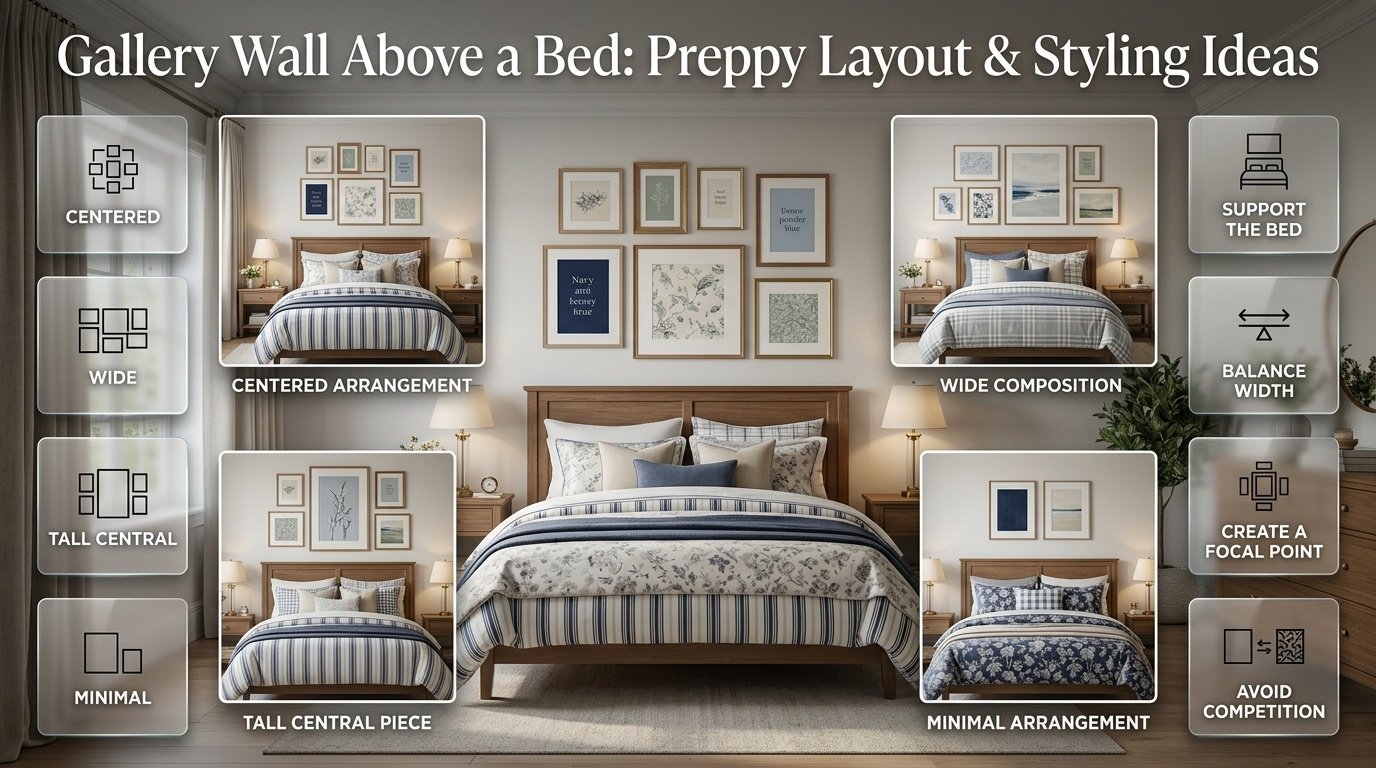
How Do You Create a Gallery Wall Above a Bed?
A gallery wall above a bed needs extra attention because the bed already creates a strong horizontal focal point.
The wall art should support that structure.
A few useful approaches include:
One centered arrangement
Create a gallery wall centered over the headboard.
This gives the room a clear focal point.
Wide composition
Use several pieces across the width of the bed.
This can make the wall feel more substantial.
Tall central piece
Place one taller artwork in the center and smaller pieces around it.
Minimal arrangement
If the bedding is heavily patterned, use fewer and simpler artworks.
This is important in a preppy room because bedding may already include stripes, florals, checks, or other patterns.
When the bed is visually strong, the wall doesn’t need to compete.
How Do You Create a Gallery Wall Above a Desk?
A desk gallery wall can be both decorative and practical.
Start by considering the height of the desk.
The artwork should visually connect the workspace to the wall rather than appearing too high.
You can include:
- Botanical prints
- Small landscapes
- Inspirational typography
- Personal photographs
- Maps
- Illustrations
- Small mirrors
Avoid filling every inch above the desk.
Leave enough visual breathing room so the workspace doesn’t feel crowded.
This is especially important in a small room.
How Do You Make a Gallery Wall Look Preppy?
A preppy gallery wall doesn’t need to contain stereotypical symbols.
Instead, build the look through color, pattern, framing, and subject matter.
A classic combination might use:
- Navy
- White
- Cream
- Brass
- Botanical artwork
- Traditional illustrations
- Natural wood
A softer interpretation could use:
- Powder blue
- Cream
- Sage
- Light wood
- Floral prints
- Soft landscapes
A more colorful arrangement could introduce:
- Pink
- Green
- Navy
- Red
- White
The goal is to connect the gallery wall with the rest of the room.
Your existing Coordinated Colors can provide the starting point if you’re unsure how different shades should work together.
Gallery Walls for a Classic Preppy Room
A classic preppy room benefits from artwork that feels timeless.
Consider:
- Botanical prints
- Traditional landscapes
- Equestrian-inspired artwork
- Architectural drawings
- Vintage-style illustrations
- Maps
- Classic photography
- Simple monograms
Frame these pieces in:
- Walnut
- Natural wood
- White
- Brass
- Dark traditional finishes
A classic arrangement doesn’t have to be perfectly symmetrical.
However, it should feel organized.
For more ideas about the wider style, explore the Classic Preppy Room approach.
Gallery Walls for a Modern Preppy Room
Modern preppy rooms usually benefit from cleaner artwork and simpler framing.
Instead of using many ornate frames, consider:
- Simple black frames
- Thin brass frames
- White frames
- Natural wood
- Minimal mats
You can still include classic subjects, but present them in a cleaner composition.
One large artwork surrounded by smaller pieces can create a contemporary focal point.
You can also explore Modern Preppy Room ideas when you want the gallery wall to feel more streamlined.
Gallery Walls for a Cute Preppy Room
A cute preppy gallery wall can be playful without looking childish.
Consider:
- Small floral prints
- Bows
- Soft illustrations
- Pretty typography
- Personal photographs
- Small mirrors
- Pastel artwork
- Decorative sketches
Pink, cream, light blue, green, and white can work particularly well.
For more ideas, see Cute Preppy Room.
The most important principle is restraint.
Choose a few charming details rather than trying to include every cute object available.
Gallery Walls for a Cozy Preppy Room
A cozy gallery wall should feel warm and personal.
Use:
- Warm wood frames
- Cream mats
- Soft landscapes
- Botanical prints
- Personal photographs
- Vintage-inspired artwork
- Natural textures
If the room already contains layered bedding, rugs, throws, and curtains, keep the artwork slightly quieter.
You can explore Cozy Preppy Room for ways to connect the wall with the rest of a comfortable preppy interior.
Gallery Walls for a Minimal Preppy Room
Minimal preppy design is not about leaving the wall completely empty.
It is about choosing fewer pieces with greater purpose.
A minimal gallery wall might contain:
- One large central artwork
- Two smaller pieces
- One small photograph
- A simple mirror
Keep the palette restrained.
You could use:
- White
- Cream
- Navy
- Soft blue
- Natural wood
For additional direction, see Minimal Preppy Room.
Navy and White Gallery Wall Ideas
Navy and white is one of the easiest palettes for a preppy gallery wall because it provides strong contrast while remaining classic.
Possible combinations include:
- Navy botanical prints
- White mats
- Navy frames
- Black-and-white photography
- Blue landscapes
- White decorative artwork
- Brass accents
The Navy and White Preppy Room Ideas collection can help you extend this color relationship beyond the wall.
A useful approach is to let navy appear in several small places rather than putting all the navy into one oversized artwork.
Blue and Cream Gallery Wall Ideas
Blue and cream creates a softer alternative to high-contrast navy and white.
Use:
- Cream backgrounds
- Pale blue artwork
- Medium blue accents
- Natural wood frames
- Soft botanical illustrations
- Traditional landscapes
This palette can feel especially comfortable when paired with warm lighting and natural textures.
See Blue and Cream Preppy Room for additional ways to develop the same palette throughout a room.
Pink and White Gallery Wall Ideas
Pink and white can create a light and cheerful gallery wall.
Instead of making every artwork pink, use white as the base and introduce pink selectively.
For example:
- One pink floral print
- One white botanical print
- One black-and-white photograph
- One pale pink illustration
- One small gold frame
This creates variety without allowing pink to dominate.
You can continue the palette through Pink and White Preppy Room Ideas.
Green and Cream Gallery Wall Ideas
Green and cream is particularly useful for botanical-inspired gallery walls.
Try:
- Green botanical prints
- Cream mats
- Natural wood
- Soft sage artwork
- Vintage-style plant illustrations
- Small landscape prints
Green does not need to be bright.
Sage, olive, forest, and muted botanical greens can create very different moods.
For a broader room approach, see Green and Cream Preppy Room Ideas.
Red and Navy Gallery Wall Ideas
Red and navy can create a stronger, more energetic preppy palette.
Because both colors have visual presence, white or cream can provide breathing room.
A gallery wall might use:
- Navy artwork
- Small red botanical details
- White mats
- Red-and-white illustrations
- Navy frames
- One brass accent
The Red and Navy Preppy Room Ideas collection can help coordinate this palette with bedding and accessories.
The main rule is balance.
You don’t need equal amounts of red and navy.
A small amount of red can be enough to create the intended contrast.
Neutral and Classic Gallery Wall Ideas
Not every gallery wall needs strong color.
Neutral artwork can create a sophisticated result using:
- Cream
- Beige
- Taupe
- White
- Brown
- Soft black
- Natural wood
This is particularly useful when the furniture or bedding already contains stronger colors.
The Neutral and Classic Tones approach can help keep the rest of the room visually calm.
Green and Navy Gallery Wall Ideas
Green and navy create a deeper, traditional combination.
Try pairing:
- Navy frames
- Botanical green artwork
- Cream mats
- Dark wood
- Small brass details
This combination can work beautifully in a room with traditional furniture.
You can extend the palette with Green and Navy Preppy Room Ideas.
Light Blue and White Gallery Wall Ideas
Light blue and white creates a fresh and airy appearance.
It works particularly well with:
- White walls
- Light wood
- Soft blue bedding
- Cream textiles
- Simple brass accents
Artwork can include clouds, landscapes, botanical drawings, abstract shapes, or traditional illustrations.
For more room-wide inspiration, explore Light Blue and White.
Multicolor Gallery Walls
A multicolor gallery wall can be beautiful, but it needs stronger organization.
The easiest way to control multiple colors is to choose a limited palette.
For example:
Navy + Pink + Green + Cream
or:
Red + Navy + White + Brass
or:
Powder Blue + Sage + Pink + Cream
Don’t make every piece contain every color.
Instead, repeat selected colors across different pieces.
The Multicolor Preppy Palettes guide can help when you want more than two or three colors without making the room feel random.
How Do You Mix Different Artwork Styles?
Different artwork styles can work together when something connects them.
Imagine you have:
- A botanical illustration
- A landscape
- A photograph
- A geometric print
At first, they may seem unrelated.
But if all four use cream, navy, and muted green, they can become part of one composition.
Alternatively, use matching frames to create unity.
This is why you shouldn’t judge each artwork separately.
Always step back and consider the entire arrangement.
How Do You Mix Different Frame Sizes?
Different frame sizes create movement and hierarchy.
A useful arrangement might contain:
- One large frame
- Two medium frames
- Three smaller frames
The large frame acts as an anchor.
The smaller frames create supporting details.
Avoid creating a staircase effect where every frame gets progressively smaller.
Instead, distribute sizes throughout the composition.
For example, a small frame can sit beside a large frame, while a medium frame balances the opposite side.
How Do You Create Balance Without Perfect Symmetry?
Balance does not mean both sides have to look identical.
Imagine a large dark frame on the left.
You could balance it with:
- Two smaller dark frames
- One medium artwork with darker colors
- A larger light-colored piece
The visual weight can be similar even though the objects are different.
This is called visual balance.
It is one reason gallery walls can feel natural without looking mechanically arranged.
How Do You Make a Gallery Wall Feel Personal?
A gallery wall becomes more interesting when some pieces mean something to you.
You don’t need to make everything personal.
One or two meaningful pieces can be enough.
Consider including:
- A favorite photograph
- A travel memory
- A family image
- A meaningful illustration
- A favorite landscape
- A handwritten-style artwork
- A personal collection
- A small monogram
Personal items work especially well when mixed with decorative artwork.
The result feels curated rather than like a collection of random store-bought prints.
Should Gallery Wall Artwork Match the Bedding?
It doesn’t need to match exactly.
In fact, exact matching can make a room feel overly coordinated.
Instead, look for relationships.
If the bedding has navy and white stripes, the gallery wall might include:
- Navy botanical artwork
- Cream illustrations
- Small blue photographs
- Natural wood frames
If the bedding has pink florals, the wall could include:
- One pink botanical print
- Green artwork
- Cream photography
- A simple brass frame
The goal is coordination, not duplication.
How Do You Use Gallery Walls With Patterned Bedding?

Patterned bedding already creates visual activity.
Therefore, the gallery wall should usually contain some quieter elements.
For example:
Patterned bedding + simple artwork + restrained frames
works better than:
Patterned bedding + patterned curtains + patterned rug + highly colorful gallery wall
When every surface demands attention, the room can lose its hierarchy.
A gallery wall should complement the strongest existing feature.
How Do You Use Gallery Walls With Plain Bedding?
Plain bedding gives you more freedom.
If your bed is mostly white, cream, navy, or another solid color, the gallery wall can introduce additional personality.
You can use:
- More varied artwork
- Stronger colors
- Mixed frames
- Larger compositions
- Decorative mirrors
- Patterned prints
This is an opportunity to let the wall become the room’s main visual story.
Gallery Wall Ideas for Small Bedrooms
A small bedroom doesn’t need a giant gallery wall.
In fact, a smaller arrangement can feel more intentional.
Try:
- Three vertically stacked frames
- Five small frames above a desk
- One central artwork with two smaller pieces
- A narrow vertical collection
- A small gallery beside the bed
Use lighter frames if the room already feels visually crowded.
Mirrors can also help reflect light, but think carefully about what the mirror reflects.
A mirror facing clutter won’t make the room feel calmer.
Gallery Wall Ideas for Large Bedrooms
Large bedrooms can support larger compositions.
You can use:
- Oversized central artwork
- Multiple rows
- Floor-to-ceiling arrangements
- Wide gallery walls
- Mixed frame sizes
- Artwork combined with decorative objects
However, a large wall doesn’t automatically require dozens of pieces.
Sometimes five large pieces create a stronger composition than fifteen tiny ones.
Start with the furniture scale and build outward.
Gallery Wall Ideas Around a Window
Windows create a natural interruption in the wall.
Instead of treating the window as a problem, use it as part of the composition.
You could place artwork:
- On one side
- On both sides
- Above the window
- Around the window without blocking it
Keep the window functional.
Don’t place frames where curtains need to open or where artwork could interfere with natural light.
Gallery Walls on Accent Walls
A gallery wall can work on an accent wall, but the wall color matters.
If the accent wall is dark navy, for example, white mats and lighter artwork may provide enough contrast.
If the wall is pale blue, darker frames may create definition.
If the wallpaper is patterned, consider reducing the number of artwork pieces.
A highly detailed wall plus a highly detailed gallery wall can become too busy.
How Do You Combine Mirrors and Artwork?
A mirror can act as a visual break.
For example:
- One oval mirror
- Two botanical prints
- Two photographs
- One landscape
- One small illustration
The mirror changes the texture of the composition.
Use mirrors carefully in bedrooms.
Think about what they reflect during both daytime and nighttime.
A mirror that reflects a beautiful window, lamp, or artwork can enhance the room.
A mirror that reflects clutter can have the opposite effect.
Can You Include Shelves in a Gallery Wall?
Yes.
Floating shelves can become part of a larger wall composition.
Instead of hanging every object, place a few framed pieces on a shelf and combine them with wall-mounted artwork.
For example:
- One shelf
- Two framed prints
- One small vase
- One decorative book
- Two wall-mounted artworks above
Keep decorative objects limited.
The shelf should support the gallery wall, not become a second cluttered display.
How Do You Use Gallery Walls in a Preppy Room With LED Lights?
LED lighting can affect how artwork appears.
If the room already has decorative lighting, choose artwork and frame finishes that remain attractive under that light.
Warm lighting can make cream, brass, wood, and warm neutrals feel richer.
Cooler lighting can make blues and whites appear more prominent.
If you are developing a room around decorative lighting, you can explore Preppy Room With LED Lights.
The important point is to consider the gallery wall during the lighting plan rather than treating it as a completely separate element.
Gallery Wall Ideas for a Preppy Room Aesthetic
A gallery wall can become one of the strongest elements of a broader Preppy Room Aesthetic.
The wall should repeat the room’s visual language.
If the room uses:
- Navy
- Cream
- Brass
- Natural wood
- Botanical patterns
the gallery wall should include at least some of those relationships.
This doesn’t mean every artwork needs all five elements.
Instead, distribute them.
One artwork may introduce navy.
Another may introduce green.
The frame may introduce brass.
The mat may introduce cream.
The room itself completes the connection.
How Do You Build a Gallery Wall From Scratch?
If you’re starting with a completely empty wall, use this sequence.
Step 1: Choose the room’s main palette
Pick the colors already present.
Don’t start with ten colors.
Two or three major colors plus neutrals are usually easier to coordinate.
Step 2: Select one anchor piece
Choose one artwork you genuinely like.
It could be:
- A landscape
- Botanical print
- Photograph
- Abstract artwork
- Illustration
This becomes the visual starting point.
Step 3: Add supporting pieces
Choose pieces that relate to the anchor.
Look for repeated:
- Colors
- Shapes
- Subjects
- Textures
- Frame finishes
Step 4: Mix sizes
Avoid making everything exactly the same size unless you’re deliberately creating a grid.
Step 5: Arrange on the floor
Build the composition before touching the wall.
Step 6: Photograph it
A photograph often makes imbalance easier to see.
Step 7: Adjust
Move pieces around until the composition feels balanced.
Step 8: Hang carefully
Start with the main anchor and build outward.
Common Gallery Wall Mistakes
A gallery wall can go wrong even when the individual artwork is attractive.
Here are the mistakes worth avoiding.
Mistake 1: Buying Artwork Without a Plan
You see a beautiful print and buy it.
Then another.
Then another.
Eventually you have several attractive pieces that don’t work together.
Better approach
Choose a palette and visual direction first.
Mistake 2: Making Everything Match
Matching every frame and artwork can make the wall feel flat.
Better approach
Create repeated elements while allowing controlled variation.
Mistake 3: Using Too Many Tiny Pieces
Small pieces can disappear on a large wall.
Better approach
Use at least one or two pieces with enough visual weight to anchor the arrangement.
Mistake 4: Ignoring Furniture Scale
A gallery wall that is too narrow above a large dresser can feel disconnected.
Better approach
Consider the furniture below the wall before choosing the artwork.
Mistake 5: Inconsistent Spacing
Random gaps can make the wall look unfinished.
Better approach
Plan the arrangement on the floor and maintain a visual rhythm.
Mistake 6: Adding Too Many Colors
Every colorful artwork may look exciting individually.
Together, they can create visual confusion.
Better approach
Repeat a limited color palette.
Mistake 7: Filling Every Empty Space
Not every blank area needs artwork.
Better approach
Leave breathing room.
Negative space is part of the composition.
Mistake 8: Ignoring the Rest of the Room
A gallery wall shouldn’t look like it belongs to a completely different interior.
Better approach
Repeat colors, materials, patterns, or shapes already present in the room.
How Do You Make a Gallery Wall Look Expensive?
You don’t need expensive artwork to create a polished result.
Professional-looking gallery walls usually depend more on:
- Proportion
- Spacing
- Frame coordination
- Artwork selection
- Color relationships
- Matting
- Placement
A simple botanical print can look sophisticated in the right frame.
Likewise, expensive artwork can look awkward if the arrangement is poorly planned.
Pro Tip
Spend more time planning the composition than shopping for additional pieces.
Good placement can make ordinary artwork feel much more intentional.
How Do You Use Mats in Gallery Wall Frames?
Matting can create breathing room between the artwork and the frame.
It is particularly useful when:
- The artwork is small
- The frame is large
- The wall is busy
- You want a more traditional appearance
White, cream, and off-white mats are versatile choices.
For a classic preppy room, cream matting can soften dark frames.
For a modern room, white matting can create cleaner contrast.
How Do You Choose Artwork by Color?
Start with the room rather than the artwork.
Look around and identify the colors that appear repeatedly.
For example:
Navy bedding + cream curtains + brass lamp
could lead to:
Navy artwork + cream mats + brass frame
Another room with:
Sage bedding + natural wood + white walls
could use:
Green botanical artwork + cream mats + wood frames
This creates continuity.
How Do You Choose Artwork by Theme?
Theme can be useful, but don’t make it too literal.
A nautical-inspired preppy room doesn’t need every piece to show boats.
Instead, you could use:
- Blue landscapes
- Coastal photography
- Abstract water imagery
- Maps
- Botanical artwork
- One nautical illustration
The overall feeling becomes coastal without turning the wall into a themed display.
How Do You Create a Gallery Wall That Can Grow Over Time?
A gallery wall doesn’t have to be finished in one day.
In fact, collecting pieces gradually can create a more personal result.
Start with:
- One large artwork
- Two medium pieces
- One personal photograph
Then add pieces when you find something meaningful.
This approach prevents unnecessary purchases.
It also allows the gallery wall to develop naturally.
A mature collection often feels more authentic because every piece has a reason for being there.
How Do You Update an Existing Gallery Wall?
You don’t always need to remove everything.
Try changing one element at a time.
You can:
- Replace one outdated print
- Add a new photograph
- Change one frame
- Introduce a small mirror
- Rebalance the spacing
- Add a new accent color
- Remove one unnecessary piece
This can refresh the wall without requiring a complete redesign.
Gallery Wall Ideas Using Personal Photos
Personal photos can make a preppy bedroom feel warmer.
Instead of using only photographs, mix them with artwork.
For example:
- Two family photos
- One botanical print
- One landscape
- One patterned artwork
- One monogram
- One small mirror
Use consistent framing to help the different content feel connected.
Black-and-white photographs are particularly useful when the room already contains several colors.
They add personality without introducing another strong color.
Gallery Wall Ideas With Vintage Artwork
Vintage-inspired artwork can work beautifully in a traditional preppy room.
Consider:
- Botanical plates
- Old-style maps
- Architectural drawings
- Botanical sketches
- Landscape paintings
- Classic illustrations
You don’t need genuine antiques.
The goal is to create an appropriate visual character.
Pair vintage-inspired artwork with modern furniture if you want an updated look.
This combination can create a room that feels collected rather than dated.
Gallery Walls and Coordinated Room Design
A gallery wall should never be designed in complete isolation.
Think about the room as a connected system:
Walls → Furniture → Bedding → Rug → Curtains → Lighting → Artwork → Accessories
Each element influences the others.
For example, if the bedding contains a bold floral pattern, the gallery wall could repeat one flower color.
If the room contains navy furniture, artwork can introduce lighter blues.
If the room uses brass lighting, one or two brass frames may provide continuity.
This is why a coordinated palette is often more important than choosing identical artwork.
How Do You Know When a Gallery Wall Is Finished?
Stop when the composition feels balanced.
You don’t need to fill every available space.
Ask:
- Does one piece dominate too much?
- Are the colors connected?
- Are the gaps intentional?
- Does the gallery relate to the furniture?
- Does the wall feel too crowded?
- Is there enough visual breathing room?
- Does the arrangement feel like one collection?
- Does it still look good from across the room?
If the answer is yes, the gallery wall may already be complete.
Adding another piece simply because there is an empty section can actually make the result worse.
Gallery Wall Checklist
Before hanging your artwork, check the following:
Planning
- Measure the wall
- Measure the furniture below
- Decide on the overall shape
- Choose a color direction
- Select an anchor piece
Artwork
- Mix artwork sizes thoughtfully
- Include personal pieces where appropriate
- Repeat selected colors
- Avoid too many competing themes
- Consider artwork visual weight
Frames
- Choose a dominant frame finish
- Add contrast intentionally
- Consider matting
- Check frame proportions
Arrangement
- Lay everything on the floor
- Photograph the arrangement
- Check spacing
- Check balance
- Adjust before hanging
Final Styling
- Step back from the wall
- View it from the doorway
- Check the relationship with the bed or desk
- Remove anything that feels unnecessary
- Leave some breathing room
How Gallery Walls Fit Into Different Preppy Room Styles
Gallery walls are flexible enough to work across several interpretations of preppy design.
Classic
Use traditional artwork, botanical prints, maps, landscapes, and wood or brass frames.
Modern
Use clean frames, simplified artwork, larger negative spaces, and a controlled palette.
Cute
Use floral artwork, soft colors, bows, personal details, and playful illustrations.
Cozy
Use warm wood, cream mats, landscapes, photography, and soft colors.
Minimal
Use fewer pieces, simple frames, and carefully selected artwork.
The gallery wall itself doesn’t define the entire room.
The surrounding furniture, colors, patterns, lighting, and textiles complete the style.
Decorative prints are an easy way to introduce character, color, and visual balance while keeping a preppy room polished and thoughtfully layered. Explore our guide to Decorative Prints for practical ideas on selecting and styling prints that complement your overall interior.
How Do You Keep a Gallery Wall From Looking Cluttered?
The simplest answer is to create hierarchy.
Every piece shouldn’t compete equally.
Choose:
One main focal point
Then:
Supporting artwork
Then:
Small details
For example:
- Large navy landscape = focal point
- Medium botanical print = supporting piece
- Small photograph = personal detail
- Small patterned print = secondary accent
This creates a visual order.
Without hierarchy, the eye doesn’t know where to look.
Expert Advice for Better Gallery Walls
A few practical principles can make the process easier.
1. Start with what you already own
Before buying new artwork, look around your room.
You may already have:
- Photographs
- Prints
- Old frames
- Cards
- Illustrations
- Decorative objects
Some of these may become part of the collection.
2. Choose the palette before the quantity
Don’t ask, “How many frames do I need?”
Ask, “What visual story am I creating?”
3. Use one strong anchor
A gallery wall becomes easier to organize when one piece establishes the visual center.
4. Repeat rather than duplicate
Repeat colors and materials rather than buying identical artwork.
5. Step back often
A piece that looks perfect from two feet away may feel too small or too dark from across the room.
6. Don’t rush the final pieces
The last empty space isn’t automatically a problem.
Wait until you find something that genuinely improves the arrangement.
Gallery Walls and Preppy Room Decor

A gallery wall becomes much more effective when it works with the broader principles of Preppy Room Decor.
Think about the room as a combination of:
- Color
- Pattern
- Texture
- Furniture
- Lighting
- Artwork
- Personal details
The wall should support that combination.
If the room is already rich in pattern, simplify the artwork.
If the room is mostly neutral, use the gallery wall to introduce color.
If the room feels too formal, add personal photographs or playful artwork.
If it feels too casual, use more structured framing and traditional artwork.
Gallery Walls as Part of Preppy Room Ideas
When developing broader Preppy Room Ideas, wall decoration should be considered early rather than added at the very end.
The wall can influence the rest of the room.
For example, a botanical gallery wall may inspire:
- Green bedding accents
- Natural wood
- Floral pillows
- Cream curtains
A navy-and-white collection may lead toward:
- Navy bedding
- White walls
- Brass lamps
- Blue accessories
The artwork can therefore become part of the room’s design foundation.
Gallery Walls and Preppy Room Decor Ideas
A gallery wall can also become a practical starting point for Preppy Room Decor Ideas.
Instead of decorating the room randomly, choose one wall collection first.
Then pull colors and materials from that collection into:
- Pillows
- Bedding
- Curtains
- Rugs
- Lamps
- Accessories
This approach helps prevent the room from becoming a collection of unrelated purchases.
Gallery Walls and Preppy Room Inspo
When looking for Preppy Room Inspo, pay attention to relationships rather than copying an entire room.
Look at:
- Frame combinations
- Artwork scale
- Color repetition
- Wall placement
- Furniture relationship
- Negative space
Then adapt those ideas to your own room.
A successful gallery wall doesn’t need to look exactly like another person’s gallery wall.
It should make sense in your space.
Gallery Walls and Preppy Room Decor
A gallery wall can also work as a central feature within Preppy Room Decor.
Use it to connect decorative details that might otherwise feel separate.
For example, if your room contains navy bedding, green plants, brass lighting, and natural wood furniture, the gallery wall can include artwork that subtly repeats each of those elements.
The result feels intentional without requiring everything to match.
Gallery Walls and Aesthetic Preppy Room Decor
For Aesthetic Preppy Room Decor, presentation matters.
Choose artwork that photographs well but still makes sense in person.
Consider:
- Balanced compositions
- Attractive negative space
- Coordinated frames
- Soft lighting
- Layered textures
- Strong focal points
But don’t design only for photographs.
The room should remain comfortable and functional.
Gallery Walls and Preppy Room Makeovers
If you’re planning a Preppy Room Makeover, a gallery wall can create a major visual change without replacing every piece of furniture.
A practical sequence is:
- Keep useful furniture.
- Establish the new color palette.
- Update bedding and textiles.
- Improve lighting.
- Plan the gallery wall.
- Add smaller decorative details.
This gives the makeover structure.
You don’t need to change everything simultaneously.
Gallery Walls and DIY Preppy Room Decor
Gallery walls are also suitable for DIY Preppy Room Decor.
You can create your own:
- Simple artwork
- Botanical prints
- Collages
- Patterned paper art
- Personalized initials
- Photo arrangements
- Painted frames
DIY does not mean the final result has to look unfinished.
The same principles still matter:
Good proportions + consistent spacing + controlled colors + thoughtful framing
A simple handmade print can look polished when presented well.
Gallery Walls for Girls’ Preppy Rooms
For Preppy Room Decor For Girls, the gallery wall can include more playful details while maintaining a polished foundation.
Possible elements include:
- Floral artwork
- Soft pink prints
- Bows
- Personal photographs
- Fashion-inspired illustrations
- Initials
- Small mirrors
- Botanical artwork
The key is to coordinate the details.
A room doesn’t need every possible decorative trend to feel expressive.
Gallery Walls and Pink Preppy Rooms
A Pink Preppy Room can use gallery artwork to prevent the pink palette from becoming too one-dimensional.
Pair pink with:
- Cream
- White
- Green
- Navy
- Natural wood
- Brass
A pink floral print can be balanced by a navy landscape.
A pale pink illustration can sit beside a cream botanical print.
This gives the wall more depth.
Gallery Walls and Aesthetic Pink Preppy Rooms
For an Aesthetic Pink Preppy Room, consider using pale pink as an accent rather than making every artwork pink.
A sophisticated arrangement might contain:
- Cream botanical artwork
- Soft pink floral print
- Navy illustration
- White photograph
- Brass frame
This creates a layered palette without overwhelming the room.
Gallery Walls and Cute Preppy Room Ideas
If you’re developing Cute Preppy Room Ideas, think in terms of small moments.
One small bow print can be enough.
One floral illustration can be enough.
One playful photograph can be enough.
The gallery wall becomes charming because of the relationships between details, not because every piece is playful.
Gallery Walls and the Broader Preppy Room
Ultimately, the gallery wall is only one part of a complete room.
You can explore the broader Preppy Room collection when you want to coordinate the wall with:
- Bedding
- Furniture
- Colors
- Lighting
- Rugs
- Curtains
- Accessories
- Room layout
A strong room design comes from relationships between these elements.
How Do You Create a Gallery Wall That Looks Professional and Well Balanced?
A professional-looking gallery wall starts with composition rather than the number of pictures. The artwork should feel like one connected display, even when the frames, sizes, or subjects are different. Start with one strong anchor piece, then build outward with smaller and medium pieces. Keep a consistent visual connection through color, frame finish, matting, artwork style, or subject matter. Consistent spacing is equally important; current gallery-wall guides commonly recommend roughly 2–3 inches between frames as a practical starting point.
A good gallery wall should also relate to the furniture beneath it. A small collection floating above a large dresser can look undersized, while an oversized arrangement can overwhelm a narrow piece of furniture. Before hanging anything, arrange the frames on the floor or create paper templates so you can evaluate the complete composition first.
Important points:
Begin with one clear focal or anchor piece.
Mix frame sizes without making the arrangement feel random.
Keep spacing visually consistent.
Repeat at least one element such as color, frame material, or mat style.
Consider the width and scale of the furniture below.
Step back and judge the entire arrangement, not individual frames.
What Is the Best Layout for a Gallery Wall?
The best layout depends on the wall, furniture, artwork sizes, and overall style of the room. A grid layout works particularly well when you have similarly sized artwork and want a clean, structured appearance. A salon-style arrangement is better for mixed artwork, different frame sizes, and a more collected look. Another useful approach is a central anchor with smaller pieces arranged around it, creating a clear visual hierarchy.
For a preppy room, the layout should also reflect the character you’re trying to create. A classic room can benefit from an organized grid or balanced symmetrical arrangement, while a more relaxed or personalized room can handle mixed sizes and an organic composition. The important thing is that the arrangement has an invisible structure even if it doesn’t look perfectly symmetrical.
Important points:
Use a grid for a clean and traditional appearance.
Use mixed sizes for a more collected gallery.
Start with the largest or most important artwork when building an organic arrangement.
Keep the overall display visually centered.
Make the layout fit the wall instead of forcing a favorite arrangement into an unsuitable space.
Test the complete layout before putting holes in the wall.
How Much Space Should Be Between Frames on a Gallery Wall?
Spacing is one of the details that can make or break a gallery wall. If the frames are too close, the arrangement can feel cramped; if they’re too far apart, the artwork may stop reading as one collection. A practical starting point for many gallery walls is about 2–3 inches between frames, with slightly tighter spacing sometimes working for small pieces and more breathing room for very large artwork. The most important principle is consistency.
Don’t treat the measurement as an absolute design law. The size of the wall, frame proportions, and layout style all matter. A formal grid benefits from extremely consistent gaps, while an organic salon arrangement can tolerate small variations as long as they look intentional.
Important points:
Start around 2–3 inches between most frames.
Keep gaps consistent in a grid arrangement.
Smaller frames can usually handle tighter spacing.
Large pieces may need slightly more visual breathing room.
Don’t judge spacing from one frame; evaluate the whole group.
Lay the frames out before hanging to check the rhythm of the gaps.
How Do You Choose Frames and Artwork That Work Together?
The artwork doesn’t have to match perfectly, and neither do the frames. What matters is creating repetition and connection. For example, you can combine botanical prints, personal photographs, landscapes, and illustrations if they share a similar color palette. Likewise, different frame styles can work together when they repeat a finish such as wood, brass, white, or black.
This approach is especially effective for preppy interiors because the style already works well with repeated colors, traditional artwork, botanical subjects, classic patterns, and polished materials. Current design coverage is also showing stronger interest in personalized gallery walls and displays that tell a story rather than looking like a generic set of matching prints.
Important points:
Repeat colors across several pieces.
Use one dominant frame finish and introduce contrast carefully.
Mix personal photographs with decorative artwork.
Use mats to create additional consistency.
Avoid giving every frame a completely different visual identity.
Choose artwork that supports the room’s existing colors and style.
Are Gallery Walls Still in Style in 2026?
Gallery walls remain relevant in 2026, but the way they are being styled is becoming more personal, intentional, and curated. Rather than simply covering a blank wall with numerous matching frames, designers and homeowners are increasingly using meaningful photographs, artwork, heirloom-style pieces, textiles, mirrors, and other personal elements to create a display with character.
For a preppy room, this shift works particularly well because you can combine classic artwork with personal details while maintaining a controlled color palette. A gallery wall doesn’t need to follow a strict trend to look current. A well-proportioned arrangement using timeless frames, thoughtful artwork, and a few personal pieces can remain attractive much longer than a display built entirely around a short-lived decorative trend.
Important points:
Prioritize meaningful pieces over filling empty wall space.
Combine classic artwork with personal details.
Use cohesive colors and framing to keep the display polished.
Don’t force every current trend into one arrangement.
Let the gallery wall reflect the personality of the room.
Focus on proportion, spacing, and visual storytelling rather than simply adding more frames.
Conclusion
A beautiful gallery wall is not simply a collection of pictures placed together on an empty wall. It is a thoughtful combination of artwork, color, framing, spacing, scale, and personal details that helps bring the entire room together.
For a preppy room, the possibilities are especially flexible. You can create a classic arrangement with botanical prints and traditional artwork, a modern display with clean frames and simple compositions, or a softer and more personal gallery wall using photographs, florals, mirrors, and meaningful decorative pieces.
The most important thing is to design the gallery wall around the room rather than treating it as a separate decoration. Consider the colors of your bedding, furniture, curtains, rugs, lighting, and accessories, then choose artwork and frames that naturally connect with those elements.
Start with one strong focal piece, build around it, maintain consistent spacing, and allow some negative space. Mix different artwork and frame sizes when appropriate, but keep a few repeated elements to create cohesion. You don’t need expensive artwork or a large number of frames to achieve a polished result.
Most importantly, give yourself permission to create something personal. A gallery wall should reflect the character of the room and the people who use it. Whether you prefer classic navy and white, soft blue and cream, green and cream, pink and white, or a more colorful preppy palette, thoughtful planning can turn an ordinary blank wall into a meaningful part of the room.
When color, proportion, artwork, and placement work together, a gallery wall can add personality, visual interest, and a polished finishing touch while still keeping the timeless charm of a preppy interior.