Introduction
Green and Cream Painted Wall Designs | Choosing the right wall colors can be more difficult than it first appears. You might want a room that feels fresh and welcoming, but a green shade that looks beautiful in a paint catalogue can appear too dark at home. Cream paint can also look different depending on natural light, flooring, furniture, and the other colors in the room. The secret is finding a combination that feels balanced rather than simply choosing two attractive colors.
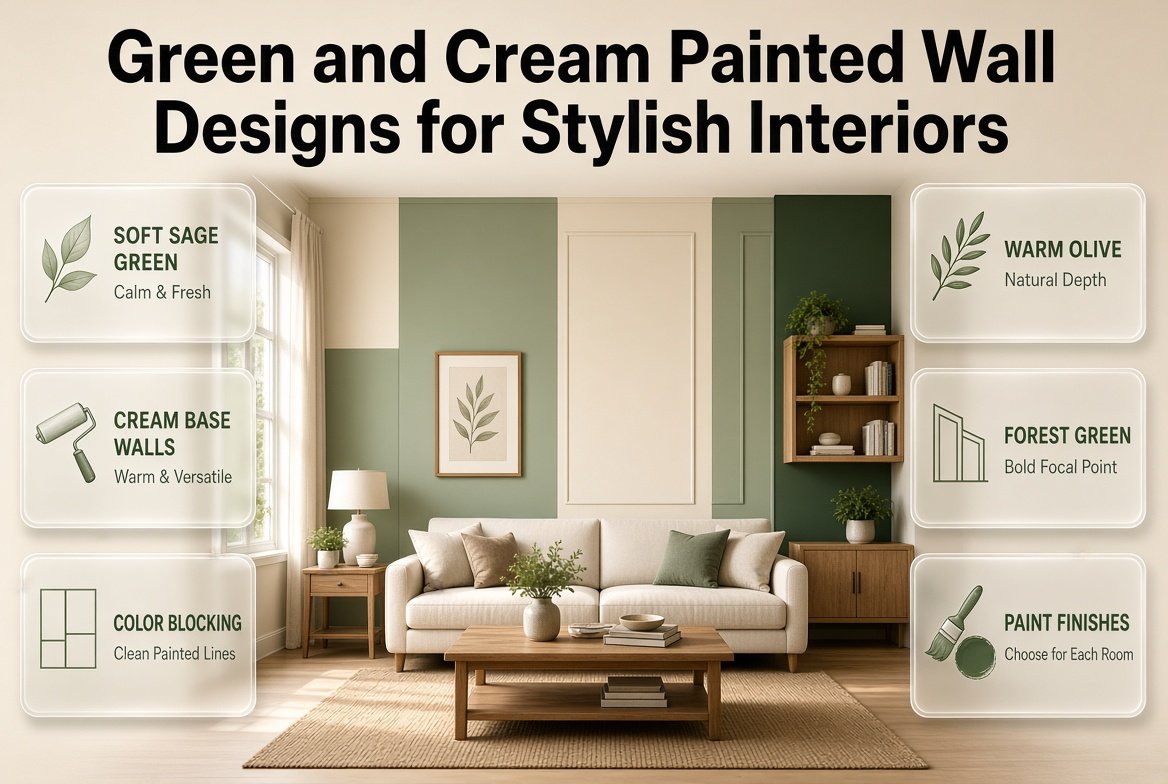
Green and cream painted wall designs offer a practical way to introduce color while keeping an interior comfortable, versatile, and visually connected. Soft sage green can create a gentle background, olive can bring warmth, and forest green can establish a dramatic focal point. Cream balances these shades and provides room for furniture, fabrics, artwork, and decorative details.
Whether you’re updating a bedroom, refreshing a living room, decorating a guest space, or planning a modern feature wall, the right painting technique can make an ordinary wall feel carefully designed.
For more interior inspiration, Preppy Room offers ideas for creating attractive, coordinated spaces that combine classic style with fresh decorating choices.
In this guide, you’ll discover 12 green and cream wall painting ideas, learn how to choose suitable shades, compare paint finishes, and follow a practical process from preparation to the final coat. You’ll also find room-specific recommendations, solutions to common painting problems, professional design tips, and answers to the questions homeowners often ask before starting a project.
Why Are Green and Cream Painted Wall Designs a Popular Choice?
Green and cream work together because they offer different but complementary qualities. Green introduces a natural color element, while cream provides a softer neutral background. The combination can look traditional, contemporary, relaxed, or decorative depending on the shades and painting pattern you choose.
Unlike a highly contrasting palette that relies on dramatic differences, green and cream can create visual interest without requiring numerous colors. This makes the combination useful when you want a coordinated interior that remains easy to update.
What makes this color combination work?
Green shades range from pale, grayish sage to warm olive and deep forest green. Cream also varies from nearly white ivory to richer beige-toned neutrals. These variations allow you to adjust the contrast according to your room’s lighting and existing decor.
The main benefits include:
- Flexible styling: Green and cream suit modern, traditional, cottage, minimalist, and preppy interiors.
- Easy coordination: The colors generally work well with natural wood, woven materials, neutral upholstery, and selected metallic finishes.
- Different levels of contrast: Pale green produces a subtle effect, while darker greens establish stronger focal points.
- Decorative freedom: You can use the colors on complete walls, borders, painted arches, stripes, geometric patterns, or two-tone sections.
- Long-term versatility: A carefully chosen combination can remain useful even when you change curtains, bedding, cushions, or other accessories.
For example, a living room with sage green walls, cream curtains, and oak furniture can feel understated and coordinated. A bedroom with cream walls and a forest green headboard wall offers more contrast without requiring dark paint throughout the room.
The most important decision is not whether green and cream look good together. It is deciding which shade should dominate, where the contrasting color should appear, and how the design will relate to the room’s proportions.
12 Green and Cream Painted Wall Design Ideas
Each painting technique creates a different effect. Some are easy enough for beginners, while others require careful measuring and more time. Choose a design based on your experience, the condition of your walls, and the visual result you want.
1. Sage Green Walls With Cream Trim
Sage green is a muted shade that often contains gray undertones. It offers a noticeable change from plain neutral walls without introducing the intensity of a deep green.
One effective approach is to paint the main walls sage green and use cream on skirting boards, door frames, window trim, and other suitable architectural details. The cream outlines the wall and creates a softer contrast than bright white may provide in a warm interior.
This design is particularly useful when you want the room to feel coordinated rather than decorative. It allows furniture, curtains, and artwork to remain important parts of the overall design.
Best rooms: Bedrooms, living rooms, hallways, and home offices.
How to style it: Combine sage green walls with cream upholstery, light wood furniture, and simple fabrics. If you prefer a traditional appearance, consider framed artwork and subtle decorative molding.
Common mistake: Choosing a sage shade that looks too gray or too blue beside the selected cream. Test both colors together rather than evaluating them separately.
2. Cream Walls With a Green Accent Wall
An accent wall introduces a stronger color on one carefully selected surface while the remaining walls stay cream.
The wall behind a sofa, bed, fireplace, or dining table is often a suitable location because it already has a clear function within the room. A green accent can highlight that area without making every wall visually compete for attention.
Sage creates a gentle focal point, olive provides warmth, and forest green makes a more dramatic statement.
Best rooms: Small bedrooms, living rooms, apartments, and reading corners.
Practical example: In a compact bedroom, keep three walls cream and paint the wall behind the headboard muted green. Add cream bedding and a small number of green accessories to connect the colors.
Professional advice: Check the wall from the room’s main entrance and from the usual seating position. The accent should support the layout rather than interrupt the visual flow.
For more focused inspiration, see Green and Cream Accent Wall Ideas, which explores feature-wall approaches within this color palette.
3. Two-Tone Green and Cream Painted Walls

A two-tone wall divides the surface into two distinct color sections. The division is often horizontal, although vertical arrangements can also work.
A popular version places cream on the upper portion and sage green on the lower portion. This creates a defined visual base while keeping the upper wall light. You can also reverse the colors if you want the lower section to remain cream and the upper section to carry more color.
The division does not have to sit at exactly half the wall height. Its position can be adjusted to suit the furniture, wall dimensions, and existing architectural features.
Best rooms: Dining rooms, bedrooms, hallways, and casual family spaces.
How to achieve a clean result:
- Measure the wall height and decide where the division should sit.
- Mark the line with a measuring tape and level.
- Apply suitable painter’s tape along the boundary.
- Paint each section according to the planned order.
- Follow the manufacturer’s drying instructions before applying another coat or removing tape.
Common mistake: Placing the dividing line without considering furniture height. A line that runs awkwardly behind a headboard or cuts across a prominent feature may make the room feel less organized.
4. Forest Green and Cream Feature Walls
Forest green offers a richer, deeper appearance than sage. Against cream, it creates a strong contrast that can suit classic interiors, contemporary rooms, and preppy decorating styles.
Use forest green on one feature wall and keep the remaining surfaces cream. Natural wood, understated artwork, and warm lighting can soften the contrast and make the design feel connected.
This approach works particularly well when the wall has a clear purpose, such as framing a bed, defining a seating area, or highlighting a dining space.
Best rooms: Larger bedrooms, living rooms, dining rooms, and home libraries.
What to consider: Deep green may absorb more light than a pale shade. In a room with small windows or limited daylight, a large dark wall can feel heavier than expected.
Before painting, apply a sample and inspect it in daylight and under the lamps you normally use. A forest green that looks balanced at midday may appear much darker in the evening.
Styling tip: Use cream curtains, a light-colored rug, or pale upholstery to maintain contrast. You do not need to add another bright color to make the room interesting.
5. Green and Cream Geometric Wall Patterns
Geometric painting uses shapes such as rectangles, triangles, arches, or large color blocks to create a decorative surface.
For example, you could paint a broad sage green section on a cream wall and add a smaller cream shape inside it. Another option is to divide a wall into a few large rectangles of alternating colors.
This technique allows you to create a custom feature without using wallpaper or installing additional wall materials.
Best rooms: Modern bedrooms, home offices, creative spaces, and selected living-room walls.
How to plan the pattern: Begin with a sketch showing the wall dimensions, furniture, doors, and windows. Decide where each shape will start and finish before marking the wall.
Limit the design to a few well-proportioned shapes. Too many angles, overlapping sections, or unrelated color blocks can make the wall feel cluttered.
Professional tip: Use low-tack painter’s tape appropriate for the surface and paint finish. Test it in an inconspicuous area first, especially if the existing coating is delicate or recently applied.
6. Green and Cream Vertical Painted Stripes
Vertical stripes create a repeating pattern that draws the eye along the height of the wall. They can suit traditional interiors, guest bedrooms, dressing areas, and selected feature walls.
Alternating sage green and cream stripes produce a softer appearance. Olive and cream provide a warmer contrast, while deeper green creates a more noticeable pattern.
The width of the stripes determines much of the final effect. Wider stripes often feel simpler and more contemporary, while narrower stripes can look more traditional and decorative.
Best rooms: Guest bedrooms, dressing areas, hallways, and classic interiors.
How to avoid uneven stripes: Measure the wall’s usable width, calculate the number of stripes, and mark their boundaries before painting. Account for corners, doors, and windows instead of assuming that every section will be the same width.
A laser level can help establish straight vertical lines, while a measuring tape helps maintain consistent spacing.
Common mistake: Starting to paint before confirming the complete pattern. If the final stripe becomes unusually narrow near a corner, the whole design can look unbalanced.
7. Olive Green and Cream Painted Borders
Olive green has earthy undertones that work naturally with warm cream, wood, and neutral textiles. Instead of painting a complete wall olive, you can use it as a border around a cream background.
Possible designs include a broad horizontal band, a simple frame around a wall section, or a narrow painted line that follows the room’s architectural details.
This technique provides definition without making the wall too visually dominant.
Best rooms: Dining rooms, traditional bedrooms, studies, and warm minimalist spaces.
Practical advice: Match the border width to the wall’s proportions. A broad band may suit a large dining-room wall, while a narrow border can work better in a hallway.
Repeat the olive shade in a small accessory or fabric detail if you want to connect the wall with the rest of the room.
Avoid adding several different border widths unless the design has a clear structure. Consistency usually creates a more polished appearance.
8. Green Painted Arches on Cream Walls

Painted arches create a decorative focal point without requiring structural construction. A curved green shape on a cream wall can frame furniture and introduce a softer line into a room dominated by rectangular furniture.
A sage green arch behind a bed is a popular option, but the same technique can frame a desk, console table, reading chair, or decorative display.
Best rooms: Bedrooms, studio apartments, reading corners, and contemporary interiors.
How to paint an arch:
- Measure the available wall area and mark the arch’s height and width.
- Find the center point and establish the intended shape.
- Mark the curved outline with a suitable guide.
- Use careful brushwork and appropriate tape on straight sections.
- Apply the paint evenly and allow it to dry according to the product instructions.
Expert tip: Keep the arch in proportion to the furniture below it. A very small arch may disappear behind a large headboard, while an oversized shape can dominate a narrow wall.
For the cleanest result, practise the outline on paper or a spare board before marking the finished surface.
9. Green and Cream Color-Blocked Walls
Color blocking uses a few large, clearly defined color areas instead of a repeating pattern.
For instance, you could paint the lower third of a wall olive green and leave the upper portion cream. Another option is an offset green rectangle that extends behind a sofa or desk.
Unlike stripes, color blocking does not depend on repeated measurements. Its impact comes from the size, position, and relationship between the shapes.
Best rooms: Contemporary living rooms, creative workspaces, modern bedrooms, and minimalist interiors.
How to make it work: Align at least one edge of the painted shape with an architectural feature or furniture arrangement. This gives the design a visual reason for being there.
Use cream as the background and choose one green shade for the main block. Introduce additional colors only when the wider room scheme genuinely benefits from them.
Common mistake: Making the shapes too complicated. Two well-positioned blocks can look more intentional than several overlapping forms with no clear relationship.
10. Cream Walls With Painted Green Panel Effects
Painted panel effects imitate the outlines of decorative wall molding without requiring raised woodwork.
You can paint a cream wall and add green rectangular outlines, or use green as the background with cream outlines. The result can create a traditional, structured appearance while keeping the actual wall surface relatively simple.
This approach suits rooms where you want more visual detail than a plain accent wall provides.
Best rooms: Formal living rooms, guest bedrooms, dining rooms, and classic interiors.
Planning advice: Measure the full wall and decide how many panels will fit comfortably. Keep spacing consistent, and consider how the outlines will sit behind furniture, artwork, switches, and doors.
The panel shapes should relate to the room’s scale. Too many narrow rectangles may create a busy result, while a few larger shapes can provide a calmer effect.
If you want actual raised molding rather than a painted illusion, explore Green and Cream Wall Paneling Ideas.
11. Soft Green-to-Cream Ombre Walls
An ombre wall gradually transitions from one color to another. In this palette, green may become progressively lighter until it blends into cream.
The technique can create an artistic effect, but it requires more skill than a standard two-tone wall. The transition must look gradual rather than showing an obvious band of uneven or patchy paint.
Best rooms: Artistic bedrooms, creative spaces, and carefully selected decorative walls.
What makes it challenging: Paint begins to dry while you’re blending, and the final appearance depends on the paint formulation, application method, and working conditions. Inconsistent blending can leave visible marks.
Practical approach: Test the technique on a large board before attempting the full wall. Follow the paint manufacturer’s recommendations and work in manageable sections.
If you want a predictable finish or are painting for the first time, a two-tone design or painted arch is usually easier to control.
12. Cream Walls With a Green Ceiling Border
A painted border just below the ceiling can connect the wall color with the room’s architectural details.
Keep the main walls cream and add a narrow sage or olive band near the ceiling. You can repeat the same color around door frames or selected trim to create a coordinated scheme.
This technique introduces green without covering a large area of the wall.
Best rooms: Hallways, dining rooms, traditional interiors, and rooms with clear architectural lines.
Design consideration: The border should suit the ceiling height. A thick band can dominate a low ceiling, while a very narrow line may not be noticeable from the usual viewing distance.
Measure carefully and check the border from different positions in the room. Its appearance should remain consistent around corners and openings.
Which Green and Cream Paint Colors Should You Choose?
Choosing a painting technique is only half the decision. The exact shades determine whether the finished room feels warm, cool, subtle, or dramatic.
Green paint can have gray, yellow, blue, or brown undertones. Cream can range from a soft ivory to a deeper beige. Two shades that appear similar on separate paint cards may look noticeably different when placed side by side.
Best green and cream combinations
| Green shade | Suitable cream | Visual effect | Suggested use |
|---|---|---|---|
| Sage green | Soft ivory | Muted and balanced | Bedrooms and living rooms |
| Olive green | Warm cream | Earthy and welcoming | Dining rooms and studies |
| Forest green | Pale cream | Strong and sophisticated | Feature walls |
| Mint green | Light cream | Fresh and gentle | Bright bedrooms |
| Moss green | Beige cream | Natural and grounded | Traditional interiors |
| Eucalyptus green | Warm ivory | Soft and contemporary | Home offices and living spaces |
These are starting points rather than exact paint formulas. Different manufacturers use different names, pigments, and undertones.
How do you select the right cream?
Start with the fixed elements in your room. Flooring, countertops, large furniture pieces, and existing trim are often more difficult to replace than curtains or cushions.
If you have warm wooden floors and beige upholstery, a warm cream may help connect those materials. If the room contains cool gray furnishings, a cream with less noticeable yellow undertones may produce a better balance.
Natural light also matters. A room receiving strong daylight may make some creams appear brighter, while a dim room can make the same paint look darker or warmer.
Pro tip: Paint samples beside each other on large boards or suitable wall areas. Observe them in the morning, afternoon, and evening. Compare the colors with the furniture and flooring rather than choosing them under showroom lighting alone.
For more help choosing shades for different rooms, see Green and Cream Wall Color Ideas.
How Do You Plan a Green and Cream Painted Wall Properly?
A well-planned wall is easier to paint and less likely to require expensive corrections. Before buying paint, determine the design, measure the surface, and check whether the existing wall needs repair.
Step 1: Decide what the wall needs to achieve
Consider the room’s purpose and the result you want. A bedroom may benefit from a calm backdrop, while a dining room may suit a more structured two-tone design.
Ask yourself three questions:
- Should the wall feel subtle or become the main focal point?
- Does the room need more lightness or stronger contrast?
- Will the design still work with the furniture that is already there?
Your answers will help narrow down the options before you begin.
Step 2: Assess the room’s light
Observe how sunlight reaches the wall throughout the day. Also consider the color and intensity of the room’s lamps.
If the room has limited daylight, test lighter greens and creams before choosing a deep shade. In a bright room, richer olive or forest green may be easier to balance.
Do not assume that every dark wall makes a room look smaller or that every light wall makes it feel larger. The result also depends on contrast, furniture placement, ceiling height, and the size of the painted area.
Step 3: Select the right wall
Choose a surface that supports the room’s layout. The wall behind a bed, sofa, or dining table is often a logical option for a feature design.
Check for windows, doors, built-in storage, electrical fittings, and other interruptions. A simple wall may be easier for stripes or geometric patterns than a surface broken up by multiple openings.
Step 4: Establish the color balance
Decide which color will dominate. Cream can provide the main background while green supplies the accent, or green can cover the main walls while cream highlights the trim.
There is no universal percentage that works for every room. A deep forest green may require more surrounding cream to achieve your desired contrast, whereas a pale sage can cover a larger area without appearing as strong.
Use the room’s actual dimensions and lighting to guide the decision.
Step 5: Prepare the wall surface
Remove dust and suitable surface contaminants, repair minor holes and cracks, and allow any repairs to dry fully.
Loose or peeling paint should be addressed before applying a new coating. If the wall has stains, substantial repairs, or a dramatic change in color, an appropriate primer may be necessary.
Follow product instructions for surface preparation, ventilation, application, and drying.
Step 6: Measure and mark the pattern
For a two-tone wall, mark the dividing line using a measuring tape and level. For stripes, calculate the width of every section before painting. For arches and geometric patterns, sketch the intended shape and confirm its proportions against the furniture.
Take time to check the markings from a normal viewing position. A design that appears symmetrical close to the wall may look different when viewed from across the room.
Step 7: Apply paint carefully
Use suitable brushes for corners and detailed edges and an appropriate roller for larger surfaces. Apply the paint according to the manufacturer’s instructions.
Allow the required drying time between coats. Do not assume that a surface is ready for another coat simply because it feels dry to the touch.
When using painter’s tape, test it on the existing finish and remove it according to the tape and paint instructions.
Step 8: Inspect before completing the room
Check the wall in daylight and artificial light. Look for uneven coverage, rough edges, missed areas, or inconsistent stripe widths.
Make corrections before reinstalling delicate wall decorations or moving furniture back against the surface. Follow the paint manufacturer’s guidance on drying and curing before washing the wall or exposing it to regular contact.
Which Paint Finish Is Best for Green and Cream Walls?
The finish affects the wall’s sheen, appearance, and maintenance requirements. The right choice depends on the wall condition and how frequently the surface will be touched or cleaned.
| Finish | Appearance | Main advantage | Possible drawback |
|---|---|---|---|
| Matte | Low sheen | Helps reduce the visibility of minor surface imperfections | Some products are less washable |
| Eggshell | Soft, subtle sheen | Practical option for many living spaces | May reveal some surface irregularities |
| Satin | Noticeable sheen | Often easier to clean | Can highlight uneven preparation |
| Semi-gloss | Reflective | Useful for suitable trim and detailed surfaces | Strong reflections can emphasize defects |
Matte or eggshell finishes can work well in bedrooms and living rooms. In busy hallways or frequently touched areas, a washable eggshell or satin product may be more practical.
However, product formulations vary. Check the label for cleaning, durability, and surface suitability rather than relying on the finish name alone.
A painted arch or geometric pattern also benefits from consistent sheen across the design. Using different finishes without a clear reason can make the wall appear uneven under certain lighting.
How Can You Match Green and Cream Walls With Furniture?

A painted wall looks most successful when it works with the room’s other materials. You do not need every item to match the paint exactly, but the undertones and visual weight should feel coordinated.
Wooden furniture
Oak, walnut, and other natural wood finishes can complement green and cream. Pale wood tends to support a lighter, more casual interior, while darker wood can create a traditional or formal effect.
If the room already has strong wood tones, use them as part of your color decision. A warm olive and cream scheme may connect naturally with some golden wood finishes, while a muted sage may suit a more restrained palette.
Cream and white furniture
Cream upholstery can blend into cream walls, creating a calm background for a green feature wall. To prevent the room from feeling flat, vary the textures through woven fabrics, linen, wood, or a textured rug.
Bright white furniture can also work, but compare it with the selected cream paint. A strong difference between the two neutrals may be noticeable even when both appear white in isolation.
Black and metallic details
Black picture frames, lamp bases, and furniture details can define the edges of a green and cream palette. Brass-colored or bronze accents may complement warm cream and earthy olive.
Use these details selectively. The purpose is to connect the wall design with the rest of the room, not to introduce several competing focal points.
Curtains, rugs, and bedding
Choose textiles that repeat one or both wall colors. Sage green walls, cream curtains, and a beige rug can form a quiet combination. A forest green feature wall can be balanced by pale bedding and neutral curtains.
You can also introduce a small amount of another compatible color through artwork or accessories, provided it does not undermine the main palette.
For broader room styling inspiration, explore Green and Cream Preppy Room Ideas.
How Do You Adapt Green and Cream Painted Walls to Different Rooms?
The same colors can produce different results depending on the room’s function. A wall design that works behind a bed may not suit a narrow hallway or a busy dining area.
Bedrooms
Bedrooms often benefit from designs that do not compete with bedding and other soft furnishings. Sage green walls with cream trim or a cream room with a green headboard wall are practical starting points.
If the room is small, test the accent color carefully and keep the pattern simple. If the room is spacious, a deeper green may provide a stronger focal point.
Living rooms
Living rooms often contain several competing elements, including sofas, televisions, windows, shelving, and artwork. Choose the feature wall according to the furniture arrangement rather than selecting the wall simply because it is empty.
A cream background with a green accent can organize the seating area. A two-tone wall can also work when the division aligns with the room’s proportions.
Guest bedrooms
A guest bedroom should feel welcoming without depending on highly personalized decoration. Muted sage, soft cream, and a restrained accent wall can create a flexible backdrop for different bedding and accessories.
Avoid introducing too many decorative patterns if the room is already furnished with patterned curtains, rugs, or bedding.
For more targeted inspiration, see Green and Cream Guest Bedroom Ideas.
Dining rooms
Dining rooms can accommodate richer colors and more structured painted designs, particularly when the wall behind the table provides a clear focal point.
Olive green and cream borders, painted panel effects, or a two-tone arrangement can define the dining area. Consider the table’s height, artwork placement, and lighting before deciding where a line or panel should sit.
Hallways and narrow spaces
Hallways benefit from simple designs that remain easy to read from the entrance. Cream walls with green trim or a restrained horizontal band can add interest without creating a busy appearance.
In narrow spaces, check how stripes and borders look from both ends. The design should connect the walls rather than make the passage feel visually fragmented.
Home offices
A home office needs a wall design that works with desks, shelving, lighting, and screens. A sage green accent wall or a simple color-blocked design can provide visual interest without overwhelming the workspace.
Before painting, consider where the desk and camera will sit. The wall behind the working area may be more important than a wall that remains mostly hidden by furniture.
What Are the Most Common Green and Cream Wall Painting Mistakes?
Even attractive colors can produce disappointing results when the planning or application is rushed.
Choosing paint without testing it
Why it happens: A color looks attractive on a small sample card or in an online photograph.
Why it causes problems: The paint may look darker, cooler, or more yellow in the actual room.
How to avoid it: Test samples in the intended space and compare them with the flooring, furniture, and lighting.
Using too many green shades
Combining sage, olive, mint, moss, and forest green on a single wall can make the design feel disconnected.
Choose one main green. If you want a second green, make sure it serves a clear purpose and works with the first shade’s undertones.
Ignoring wall proportions
An oversized painted arch, thick border, or complicated geometric pattern can overwhelm a small wall.
Measure the surface and consider how the design relates to the furniture and architectural details. A simple, well-proportioned design is often more effective than an elaborate one.
Skipping surface preparation
Paint does not reliably conceal loose coatings, grease, dust, or significant surface damage.
Prepare the wall before painting and follow the manufacturer’s guidance for repairs and primer. Rushing this stage can lead to poor adhesion or a finish that looks uneven.
Choosing the wrong paint finish
A reflective finish may highlight surface imperfections, while a product that is difficult to clean may be inconvenient in a busy hallway.
Consider both the condition of the wall and how the room is used. Select a suitable product rather than choosing a finish based only on appearance.
Creating a feature wall without a clear purpose
An accent wall should support the room’s layout. If it competes with several other focal points, the space may feel less organized.
Choose a wall that naturally relates to the bed, sofa, dining table, or another important feature.
Rushing the painting process
Applying another coat too soon, removing tape incorrectly, or failing to check the markings can affect the final result.
Allow the recommended drying time and inspect the surface between stages. Careful application usually saves time that would otherwise be spent correcting mistakes.
Expert Tips for a More Professional Result
A polished finish usually comes from consistent decisions and careful preparation rather than complicated decoration.
Keep the undertones compatible. Warm cream and earthy olive often work naturally together. A grayish sage may suit a less yellow cream, depending on the flooring and furnishings.
Use the right design for the wall. Large surfaces can support broader shapes, while narrow walls may suit simple borders or a single color.
Plan around the furniture. Before marking an arch or dividing line, identify the positions of the bed, sofa, table, and other large items.
Pay attention to edges. Clean boundaries are particularly important for geometric patterns, stripes, panel outlines, and two-tone walls.
Choose products for the room. Follow the paint manufacturer’s instructions for the surface, moisture exposure, cleaning requirements, and drying time.
Repeat green in small details. A cushion, plant pot, artwork detail, or fabric can connect the wall with the rest of the room without requiring every accessory to match.
Do not copy a photograph blindly. Online examples may show different lighting, ceiling heights, furniture dimensions, and wall finishes. Adapt the proportions and shades to your own space.
Keep a record of the paint. Note the brand, shade name, finish, and any relevant product information. This makes future touch-ups easier and reduces the risk of choosing a noticeably different color
What are the best green and cream painted wall designs for a modern home?
The best green and cream painted wall designs for a modern home combine clean lines, balanced color contrast, and a pattern that complements the room’s size. Sage green accent walls, two-tone paint combinations, geometric patterns, and cream walls with olive green details are particularly versatile choices. The right design depends on the room’s lighting, furniture, and overall decorating style.
For a contemporary appearance, keep the main wall surfaces relatively simple and use green strategically to create a focal point. Cream helps maintain visual balance, while natural wood, neutral fabrics, and understated accessories complete the look.
Popular design options include:
Sage green accent walls: Suitable for bedrooms, living rooms, and home offices.
Two-tone painted walls: Combine cream above with muted green below for a structured appearance.
Geometric wall patterns: Introduce modern shapes without requiring wallpaper.
Olive green borders: Add definition to cream walls without overwhelming the space.
Forest green feature walls: Create stronger contrast when balanced with lighter furnishings.
Professional tip: Choose one main design feature rather than combining multiple patterns on the same wall. A simple, well-executed design often creates a more polished result than excessive decoration.
Which shades of green look best with cream walls?
Sage, olive, eucalyptus, moss, and forest green can all complement cream walls, but each creates a different visual effect. Sage green offers a muted appearance, olive introduces earthy warmth, and forest green provides dramatic contrast. The best choice depends on the cream’s undertone, the room’s natural light, and the colors of your existing furniture and flooring.
Before selecting a shade, consider whether you want the room to feel subtle, warm, contemporary, or more dramatic. Testing paint samples beside your cream color helps you avoid combinations that appear too yellow, gray, or dark once applied to the wall.
Recommended combinations:
Sage green and soft cream: For calm, understated bedrooms and living spaces.
Olive green and warm cream: For traditional interiors and rooms with natural wood furniture.
Forest green and pale cream: For striking accent walls and sophisticated living areas.
Eucalyptus green and ivory: For a soft, contemporary color scheme.
Moss green and beige cream: For earthy interiors with natural textures.
Professional tip: Evaluate paint samples in morning daylight, afternoon light, and evening lighting. The same green can look noticeably different throughout the day, so never rely on a small paint card alone.
How can I make a small room look spacious with green and cream painted walls?
To make a small room feel more open, use cream as the main wall color and introduce green through a carefully selected accent wall, painted arch, or simple decorative border. Cream can help reflect available light, while a restrained green feature adds depth and character without covering every surface in a darker shade.
The placement of the design matters as much as the colors. An accent wall behind a bed or sofa can establish a focal point, while excessive stripes, large contrasting blocks, and numerous decorative details may make a compact space feel visually busy.
Practical ways to achieve a balanced result:
Use light cream on the majority of the walls.
Choose a muted green, such as sage or eucalyptus, for the accent.
Coordinate curtains and larger furniture pieces with the wall colors.
Keep painted patterns simple and proportional to the available wall space.
Use suitable lighting to brighten darker corners.
Avoid unnecessary furniture and decorative clutter.
Professional tip: Before painting, consider where the largest furniture pieces will sit. A carefully positioned accent wall can help organize the room visually, but the effect depends on the room’s proportions, lighting, and layout.
Are green and cream two-tone painted walls better than a single accent wall?
Neither design is universally better. Two-tone walls divide a surface into distinct sections, creating a structured appearance, while a single accent wall concentrates color in one location. The better option depends on the room’s layout, the amount of contrast you prefer, and whether you want a decorative wall or a more subtle focal point.
A two-tone design can work particularly well in dining rooms, hallways, and bedrooms where a horizontal division complements the furniture or architectural details. An accent wall is often easier to execute and may be more suitable for beginners who want to introduce green without measuring multiple sections.
Design
Main advantage
Best suited for
Two-tone wall
Creates structure and visual division
Dining rooms, hallways, bedrooms
Single accent wall
Establishes a clear focal point
Living rooms, guest bedrooms
Geometric painting
Adds a contemporary decorative feature
Modern interiors and home offices
Green painted borders
Introduces subtle definition
Traditional rooms and neutral interiors
Professional tip: If you choose a two-tone wall, measure the dividing line carefully and consider its relationship to the furniture. If you choose an accent wall, select a surface that naturally draws attention rather than one that competes with windows, doors, or other focal points.
What is the best paint finish for green and cream walls, and how can I maintain it?
The best paint finish depends on the wall’s condition and how frequently the surface needs cleaning. Matte finishes provide a soft appearance and can help disguise minor surface imperfections, while eggshell offers a subtle sheen that suits many living spaces. Washable satin finishes may be practical in busy areas, provided the wall is properly prepared.
The choice also affects how the colors appear. A more reflective finish can make green look different under direct lighting, particularly on walls with uneven plaster or visible repairs. For this reason, it’s important to evaluate both the color and the finish before painting the entire room.
How to choose and maintain the finish:
Matte: Consider for bedrooms and living rooms where a low-sheen appearance is preferred.
Eggshell: Consider for general living spaces when a balance of appearance and cleanability is needed.
Satin: Consider for frequently touched surfaces when the product is suitable for the wall.
Semi-gloss: Often useful for suitable trim and detailed surfaces rather than large walls.
For maintenance, follow the manufacturer’s cleaning instructions, remove dust gently, and avoid harsh chemicals or excessive scrubbing unless the product permits them. Keep the paint shade and finish information for future touch-ups.
Professional tip: Test the selected paint finish on a sample area and inspect it under the room’s usual lighting. A suitable finish, careful preparation, and correct application help green and cream walls remain attractive and easier to maintain.
Conclusion
Green and cream painted wall designs offer a versatile way to create interiors that feel fresh, balanced, and timeless. Whether you prefer soft sage green with warm cream, muted olive with ivory, or a deeper green accent wall against light neutral surroundings, the right combination can add character without making a room feel overwhelming. The key is to choose shades that complement your natural lighting, furniture, flooring, and overall decorating style.
Before painting, consider how each wall will look throughout the day, test sample colors in different lighting conditions, and select a finish that suits the room’s practical needs. Simple techniques such as two-tone walls, painted arches, geometric patterns, and carefully planned accent walls can introduce visual interest without requiring an expensive renovation.
For a cohesive interior, coordinate your wall colors with natural wood, neutral fabrics, subtle metallic accents, and carefully selected accessories. Explore more inspiration through Green and Cream Preppy Room Ideas and discover additional decorating approaches at Preppy Room.
Ultimately, the best green and cream painted wall design is one that reflects your personal taste while supporting the way you use your space. With thoughtful color selection, proper preparation, and a balanced approach to decoration, you can create walls that remain attractive, comfortable, and easy to style for years to come.