Introduction
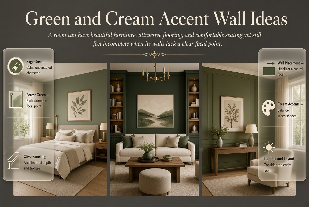
Green and Cream Accent Wall Ideas | A room can have beautiful furniture, attractive flooring, and comfortable seating yet still feel incomplete when its walls lack a clear focal point. Repainting an entire room is not always necessary to solve this problem. A thoughtfully designed accent wall can introduce color, add architectural interest, and make the existing furniture feel more connected.
Green and cream accent wall ideas offer a particularly versatile solution because green adds character while cream creates visual balance. Depending on the shades, materials, and design you choose, this combination can feel relaxed, traditional, contemporary, elegant, or playful. It can also work in different spaces, including bedrooms, living rooms, dining rooms, guest rooms, and home offices.
The most effective accent wall is not simply the wall with the brightest color. It is a feature that supports the room’s layout, complements the furniture, and creates a natural point of attention. A sage green wall behind a bed, a forest green wall behind a sofa, or an olive green panelled wall can each produce a different result.
Before choosing a design, consider the size of the room, the direction of natural light, the existing furniture finishes, and the atmosphere you want to create. These decisions will help you avoid expensive changes and make the final result feel intentional.
For more coordinated decorating inspiration, explore Preppy Room, where different interior styles and color combinations can help you plan a cohesive home.
This guide covers practical accent wall designs, placement strategies, materials, color coordination, budget considerations, decorating mistakes, and professional planning tips. The goal is to help you select a feature wall that looks attractive while remaining suitable for everyday living.
What Are the Best Green and Cream Accent Wall Ideas?
The best green and cream accent wall designs use green to establish a focal point and cream to connect the feature with the rest of the room. Sage green creates a soft effect, olive green introduces earthy warmth, and forest green adds depth. Painted shapes, decorative molding, wallpaper, and textured panels provide different ways to introduce the combination.
The right design depends on how much attention you want the wall to attract.
For a quiet bedroom, a muted green wall with cream bedding may be sufficient. In a formal living room, deep green paint with decorative molding can create a more architectural appearance. In a contemporary space, a simple geometric design may provide the desired contrast without introducing additional furniture.
Consider these popular options:
- Sage green accent walls for calm and understated rooms.
- Forest green feature walls for dramatic focal points.
- Olive green walls paired with natural wood finishes.
- Green and cream board-and-batten treatments.
- Geometric painted designs with clean edges.
- Green wallpaper used on one carefully selected wall.
- Decorative molding with contrasting paint colors.
- Green built-in shelving against cream walls.
- Striped accent walls for traditional or tailored interiors.
- Green panels combined with natural timber details.
The important distinction is that each option serves a different design purpose. Choose the treatment that solves your room’s actual problem rather than selecting a design simply because it looks attractive in a photograph.
1. Sage Green Accent Walls for a Soft, Balanced Interior
Sage green is a useful choice when you want a visible change without making the room feel overly dramatic. Its muted appearance works with cream, beige, natural wood, and many neutral fabrics.
Unlike a highly saturated green, sage often blends comfortably with existing furniture. This makes it suitable for rooms where the wall should improve the overall design without becoming the only feature people notice.
How to style a sage green accent wall
Begin by identifying a wall that already has a natural purpose. In a bedroom, this may be the wall behind the headboard. In a living room, it may be the surface behind the main sofa or a reading area.
Keep the surrounding walls cream and introduce additional texture through linen curtains, upholstered furniture, woven accessories, or wooden side tables.
A practical bedroom arrangement could include a sage green wall, a cream upholstered bed, oatmeal bedding, pale oak bedside tables, and warm lighting. Each element contributes something different without competing for attention.
For a living room, consider a sage feature wall behind a cream sofa. A natural wood coffee table and a neutral rug can connect the wall to the seating area.
Which sage shade should you choose?
Sage green can appear gray, yellow, or slightly blue depending on its undertones. A grayish sage may suit a contemporary interior, while a warmer sage can complement cream walls and natural timber.
Do not select a paint shade solely by its name. Test a sample beside the actual furniture and flooring.
Professional tip: Observe the sample in the morning, afternoon, and evening. A green that looks balanced in daylight may appear considerably darker under artificial lighting.
Sage is especially useful when you want the room to feel coordinated but do not want to replace existing furnishings.
2. Forest Green Accent Walls for a Dramatic Focal Point
Forest green creates a stronger visual statement than sage. Its deep appearance can make a wall feel rich and distinctive, especially when paired with cream upholstery and carefully selected natural finishes.
This approach works particularly well in living rooms, formal bedrooms, dining spaces, and rooms with decorative architectural details.
How can you balance deep green?
The main consideration is contrast. A forest green wall can look heavy when surrounded by other dark surfaces, particularly in a room with limited daylight.
Cream furniture and light-colored textiles provide a useful counterbalance. A cream sofa, ivory curtains, or pale bedding can keep the room from feeling visually crowded.
Wood also contributes warmth. Walnut creates a sophisticated contrast, while lighter oak can make the combination feel more relaxed.
A useful color arrangement is:
- Feature wall: deep forest green.
- Adjacent walls: warm cream.
- Main upholstery: cream, ivory, or oatmeal.
- Furniture: medium oak or walnut.
- Decorative accents: restrained brass or matte black.
- Lighting: comfortable warm-white illumination.
When is forest green a good choice?
Choose forest green when you want the accent wall to become a defining feature rather than a subtle background.
It can also emphasize an existing fireplace, built-in bookcase, or architectural recess. However, avoid placing too many competing decorative elements on the same wall. The color already provides substantial visual interest.
If the room is small or poorly lit, test a less saturated green before committing to a very dark shade.
3. Olive Green and Cream Accent Walls for Natural Warmth
Olive green has earthy undertones that make it particularly suitable for interiors with natural wood, beige textiles, woven accessories, and warm flooring.
It can create a relaxed, grounded appearance without looking as bright as a yellow-green shade or as dramatic as forest green.
How to decorate with olive green
Consider an olive accent wall behind a wooden dining table, a cream sofa, or a bed with a natural timber frame.
The surrounding cream surfaces help maintain balance, while materials such as linen, oak, rattan, and jute introduce texture.
For example, a living room might combine an olive feature wall with a cream sofa, oak side tables, a beige rug, and simple ceramic accessories. The result feels connected because the materials reinforce the natural character of the colors.
Olive green can also suit traditional interiors with darker furniture. In this situation, lighter cream curtains and upholstery help separate the furniture visually from the wall.
What should you avoid?
Some olive shades contain strong yellow undertones. Under warm artificial lighting, these can become more noticeable than expected.
Test the color next to your existing wood finishes and cream paint before selecting the final shade. If the combination appears too yellow, try a more muted olive.
Olive is a good option when you want an accent wall that connects naturally with the room instead of creating a sharp, high-contrast statement.
4. Green and Cream Board-and-Batten Accent Walls

Board-and-batten is a decorative wall treatment made using vertical boards or narrow strips that create a repeated pattern. It adds dimension to a flat wall and can make a room feel more carefully finished.
When combined with green paint and cream surroundings, this treatment creates interest without requiring a complicated printed design.
How should you plan the paneling?
First, measure the wall and determine the number and spacing of the vertical sections. Consider the location of windows, door frames, outlets, and large furniture.
In a bedroom, the wall behind the headboard is often a practical location. In a living room, the treatment can work behind a sofa or along a wall that needs more structure.
Once the layout is planned, prepare the surface, install the materials, fill gaps where appropriate, sand, prime, and paint according to the material manufacturer’s instructions.
Which color combination works best?
Sage green with cream walls creates a softer result. Olive green introduces more warmth, while forest green gives the paneling a stronger traditional character.
You can also reverse the arrangement by using cream paneling with green walls, depending on the desired effect.
Common mistake: Uneven spacing becomes noticeable after the wall is painted. Measure carefully and check the layout from the entrance before installation.
Board-and-batten is particularly effective when the room needs architectural detail rather than additional decorative objects.
5. Geometric Green and Cream Accent Walls
Geometric accent walls use shapes, lines, and color blocks to create a feature without installing permanent architectural materials.
This option can be useful for contemporary interiors, creative spaces, bedrooms, and home offices. It also provides flexibility because the design can be repainted later.
Which geometric design should you use?
A painted arch behind a bed creates a softer focal point. Large rectangular blocks produce a structured appearance, while simple diagonal shapes add movement.
For a restrained design, choose one green shade and combine it with cream. Avoid introducing too many shapes or additional colors unless the room already has a clear design scheme.
A bedroom might use a broad sage arch behind the headboard, with cream walls and simple bedding. A home office could use a green rectangular panel behind the desk to define the working area.
How do you achieve clean edges?
Plan the design before opening the paint. Measure the wall, mark the boundaries lightly, and use suitable painter’s tape where straight lines are required.
For curved designs, create a consistent outline before painting. Apply paint carefully and follow the manufacturer’s guidance for drying times and surface preparation.
Check the design from the doorway as well as from directly in front of the wall. A pattern that looks balanced close up may feel too large or too low when viewed from across the room.
Geometric painting works best when the shape supports the furniture rather than competing with it.
6. Green Wallpaper Accent Walls With Cream Furnishings
Wallpaper provides an alternative when solid paint feels too simple. Green botanical patterns, delicate florals, geometric prints, and traditional motifs can introduce detail while preserving the green and cream palette.
The key is to choose a pattern that suits the scale of the room and the amount of decoration already present.
How should you select a wallpaper pattern?
Large prints make a stronger statement. Smaller repeating designs often feel quieter and can work well in traditional or compact spaces.
If your room already contains patterned curtains, cushions, or rugs, consider a wallpaper with a restrained design. If the remaining furnishings are simple, a more decorative print may become the main feature.
Cream upholstery is especially useful because it gives the eye a visual break from the pattern.
For more specific pattern options, see Green and Cream Wallpaper Ideas.
That resource focuses on wallpaper designs, while this article concentrates on the wider decisions involved in choosing and coordinating an accent wall.
Is wallpaper easier than painting?
The answer depends on the product and the condition of the wall. Paint is often easier to change, while wallpaper can provide complex patterns without requiring you to create them by hand.
Wallpaper installation also requires careful alignment, especially when the pattern repeats. Before purchasing it, check the manufacturer’s installation instructions, cleaning guidance, and removal recommendations.
Use wallpaper when the pattern itself contributes something meaningful to the room. If the wall already contains strong architectural details, a simpler painted finish may be more suitable.
7. Green and Cream Striped Accent Walls
Striped accent walls can create a tailored appearance and introduce visual rhythm. Vertical stripes tend to emphasize height, while horizontal stripes can make a wall feel wider.
The result depends on stripe width, color contrast, and the scale of the room.
How should you plan the stripes?
For a traditional bedroom, muted green and cream vertical stripes can work behind a simple upholstered bed. In a reading room or study, a more restrained stripe pattern may create a classic, organized appearance.
Use two colors rather than introducing several shades. Consistent spacing usually looks more polished than a pattern with many different stripe widths.
Before painting, calculate the number of stripes and mark their boundaries carefully. If the existing wall is already cream, you may be able to retain that color and paint only the green sections.
What can make striped walls look wrong?
Stripes can appear uneven when measurements are inaccurate. They can also become distracting when combined with several other strong patterns.
If the room contains a patterned rug or elaborate curtains, keep the wall design relatively simple. Allow the stripes to become the main repeated pattern and use solid-colored textiles elsewhere.
Striped accent walls are best when the room benefits from structure and a clearly defined visual rhythm.
8. Green Accent Walls With Decorative Molding
Decorative molding creates raised or recessed-looking shapes on a wall, depending on the installation method. Picture-frame molding and rectangular panels can add traditional character without requiring wallpaper.
Green and cream provide several ways to use this treatment.
Which molding arrangement should you choose?
You can paint the wall green and leave the molding cream for a contrasting finish. Alternatively, paint both the molding and wall green to create a more unified appearance.
Another option is to keep the upper wall cream and use green on the lower panels.
For a traditional living room, deep green molding can work with cream upholstery and wooden furniture. In a bedroom, muted sage panels can provide a more understated feature behind the bed.
How can you make the design look professional?
Start by considering the proportions of the wall. Large panels can look appropriate on a broad wall but may feel crowded when squeezed into a narrow area.
Plan the arrangement around doors, windows, and furniture. Avoid creating panels that disappear almost entirely behind a large sofa or bed.
Accurate measurements and clean finishing matter more than the number of decorative sections.
Molding is particularly useful when the room needs architectural definition, but it should support the overall design rather than become decoration for its own sake.
9. Green Accent Walls With Natural Wood Slats

Wooden slats introduce texture and vertical lines, making them a useful addition to contemporary and transitional interiors.
Combining green paint with a wood feature can create a more layered appearance than using either material alone.
Where should you use wooden slats?
Consider the wall behind a bed, the area behind a sofa, or a section of a home office. A slatted panel can also define a seating area in an open-plan room.
You do not necessarily need to cover the entire wall. A narrower wood section beside a green painted area can provide sufficient contrast.
Light oak generally produces a relaxed combination with sage and cream. Walnut creates a deeper effect with olive or forest green.
What practical details matter?
Wood slats introduce spaces that can collect dust. Consider the maintenance required before choosing a closely spaced design.
Also check the suitability of the wall, the weight of the materials, and the installation requirements. If the treatment is near electrical outlets or equipment, plan those areas before installation.
Use slats when you want texture and architectural interest. If the room already contains prominent wood finishes, a simpler painted feature may create better balance.
10. Green and Cream Accent Walls for Small Rooms
A small room can benefit from an accent wall when the design creates a clear focal point without adding unnecessary visual complexity.
The goal is not to make every surface pale. Instead, choose a green shade and placement that work with the available light, furniture, and room proportions.
Which green shades work in compact spaces?
Sage, muted eucalyptus, and softer olive shades are useful starting points. They introduce color without necessarily creating the visual weight of a very dark green.
However, a small room with good daylight may still accommodate forest green. The right choice depends on the entire setting, not room size alone.
How should you arrange the room?
Keep the surrounding walls cream and choose furniture that suits the room’s proportions. Avoid oversized decorative objects that cover most of the feature wall.
Useful strategies include:
- Place the accent behind the main furniture piece.
- Use cream bedding or upholstery to maintain contrast.
- Choose curtains that coordinate with the surrounding walls.
- Limit the number of competing patterns.
- Use suitable lighting to keep the space functional.
- Consider a painted arch or smaller feature if a full wall feels too dominant.
For example, a compact bedroom might combine a sage wall behind the bed, cream bedding, pale wood furniture, and one restrained decorative accessory.
The result has a clear focal point without requiring a large amount of decoration.
11. Green and Cream Accent Walls in Bedrooms
The wall behind the bed is often the most practical location for a bedroom accent because it creates a natural focal point.
A green wall can add depth, while cream bedding and furnishings soften the contrast. The combination also provides flexibility because you can change cushions, throws, and smaller accessories without repainting.
How do you coordinate the bedroom?
Start with the headboard and bedding. If the headboard is cream, sage, olive, and forest green can all work, depending on the desired contrast.
If the bed frame is dark wood, consider a green shade that complements its undertones. Cream bedding can separate the dark furniture from the wall and make the overall arrangement easier to read.
Curtains should also relate to the surrounding walls. Warm cream, ivory, beige, and natural linen are flexible choices.
Avoid matching every fabric to exactly the same shade of green. Small variations in color and texture usually create a more natural result.
What about guest bedrooms?
Guest rooms benefit from designs that feel welcoming without relying on highly personal decoration. A muted green accent wall, cream bedding, and natural wood furniture create a flexible foundation.
For additional guest-room planning, explore Green and Cream Guest Bedroom Ideas.
Use that topic for the broader guest-room design, while selecting the accent wall according to the room’s existing furniture, light, and proportions.
12. Green and Cream Accent Walls in Living Rooms
In a living room, an accent wall should connect with the main seating arrangement and the room’s focal point.
The wall behind the sofa is often a practical option, but a fireplace wall or built-in shelving area may be more appropriate when those features already define the space.
How should you coordinate the living room?
Use green as the primary feature, cream as the supporting color, and natural materials to introduce texture.
For example, an olive wall behind a cream sofa can be paired with an oak coffee table, a neutral rug, and understated accessories.
In a more formal room, forest green may work with decorative molding and walnut furniture. In a casual space, sage can coordinate with linen upholstery and light timber.
How much decoration should you add?
Start with the furniture arrangement. If the wall already creates a strong focal point, you may need only one piece of artwork or a small number of accessories.
Avoid filling every section with shelves, frames, and decorative objects. The wall should have enough open space for its color and texture to remain visible.
If you want a broader look at how the colors work throughout a room, explore Green and Cream Preppy Room Ideas.
This provides a wider room-styling perspective, while the present guide remains focused on the feature wall itself.
13. Green and Cream Accent Walls in Dining Rooms
Dining rooms can benefit from an accent wall because it helps define the dining area and creates a more intentional setting for meals.
Olive and forest green are useful options when the room contains wooden furniture. Sage can be a better starting point for a bright dining area where you prefer a softer contrast.
Where should the accent wall go?
Consider the wall behind the dining table or the wall that is most visible when entering the room.
If the table is positioned in front of a large window, the opposite wall may provide a clearer focal point. Avoid choosing a wall that is almost entirely covered by large cabinets unless the color is intended to highlight those cabinets.
Which materials work well?
Decorative molding can create a traditional look, while a simple painted surface suits contemporary interiors.
Cream walls, natural wood, and restrained lighting can balance the green feature. If the dining chairs are already upholstered in a strong color, test the palette before adding another prominent shade.
The accent wall should support the dining arrangement rather than compete with the table, chairs, and lighting.
14. Green and Cream Accent Walls for Home Offices
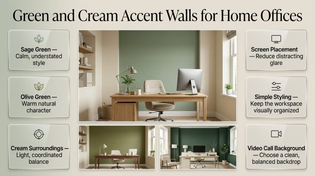
A home office needs a comfortable background without introducing unnecessary distractions.
A muted green wall behind the desk can define the workspace, while cream surroundings maintain a light and coordinated appearance.
How should you plan the office wall?
First, consider the desk position, screen placement, and lighting. The accent should not create distracting reflections on screens or make the working area feel unnecessarily dark.
Sage green is a flexible choice for a quiet office. Olive works well with natural wood desks, while deeper green can provide a more formal backdrop in a well-lit room.
Use shelving and decorative accessories sparingly. If the wall is already patterned or panelled, simple storage and neutral desk accessories can help maintain visual order.
For video calls, look at the background from the camera’s position. A simple green wall with a few coordinated details may work better than a complicated pattern.
The best office accent wall supports both the appearance and practical use of the workspace.
How to Choose the Right Green and Cream Combination
Selecting colors requires more than deciding whether you like green or cream individually. Their undertones, surrounding materials, and lighting affect how the combination appears.
Understand warm and cool undertones
Green can contain yellow, blue, gray, or brown undertones. Cream can also range from warm ivory to a more muted neutral.
A warm olive may work naturally with yellow-based cream, while a grayish sage may suit a cream that appears less yellow.
These are starting points, not strict rules. Some contrasting undertones can look attractive when deliberately balanced with furniture and accessories.
Use the room’s existing finishes
Look at the flooring, cabinetry, upholstery, and trim before selecting the paint.
If your room contains warm oak, test green shades that complement the wood rather than competing with it. If the furniture is mostly black, gray, or another cooler neutral, test a more muted green and compare it with the existing finishes.
Do not make the decision using a paint card alone. Small samples may look different when surrounded by large surfaces.
Compare different combinations
| Green shade | Cream pairing | Overall effect | Suitable setting |
|---|---|---|---|
| Sage | Warm cream | Soft and relaxed | Bedrooms and living rooms |
| Olive | Beige cream | Earthy and grounded | Dining rooms and traditional spaces |
| Forest | Ivory cream | Rich and dramatic | Feature walls and formal rooms |
| Eucalyptus | Light cream | Muted and contemporary | Offices and guest rooms |
| Muted mint | Soft cream | Fresh and playful | Casual and creative spaces |
Choose the combination that works with the room rather than selecting a shade because it is currently popular.
How to Choose the Best Accent Wall Location
A good accent wall establishes a focal point. It should support the room’s layout, not simply introduce color wherever there is an empty surface.
Look at the room from the entrance
Stand at the doorway and identify which wall naturally attracts attention. Then consider whether the wall supports an important piece of furniture or architectural feature.
A bedroom often benefits from a feature behind the bed. A living room may benefit from a wall behind the sofa or fireplace. A dining room may use the wall behind the table.
Consider windows and doors
A wall with several openings may break up the accent color and make the result feel less unified.
This does not mean that walls with doors or windows cannot be painted green. It simply means you should evaluate how the color will appear around those interruptions.
Check the furniture arrangement
If a large wardrobe, sofa, or cabinet covers most of the wall, the accent may have limited visual impact.
Sometimes a smaller painted feature or a different wall location creates a more effective result.
Avoid choosing a wall in isolation
The accent wall should relate to the rest of the room. Check the adjoining walls, ceiling, flooring, and furniture before deciding.
A successful focal point makes the entire room feel more organized, not just more colorful.
Paint, Wallpaper, or Paneling: Which Accent Wall Treatment Is Best?
The best treatment depends on the design you want, your budget, and how easily you may want to change the room later.
| Feature | Paint | Wallpaper | Decorative paneling |
|---|---|---|---|
| Visual effect | Clean and flexible | Patterned and detailed | Architectural and textured |
| Design flexibility | High | Depends on the pattern | Depends on the layout |
| Installation | Often straightforward | Requires pattern alignment | Requires measuring and fitting |
| Maintenance | Depends on the paint finish | Depends on the product | Depends on materials and spacing |
| Future updates | Usually repaintable | Removal varies by product | May require additional finishing |
| Best suited to | Simple or geometric designs | Botanical and decorative designs | Traditional or structured interiors |
When should you choose paint?
Paint is a useful option when you want a solid green wall, a geometric design, or a flexible feature that can be updated later.
It also allows you to control the exact color relationship between the green and cream areas.
When is wallpaper more suitable?
Wallpaper is worth considering when the printed pattern contributes significantly to the design. It can provide botanical details, stripes, and geometric effects without requiring you to paint each element individually.
When does paneling make sense?
Paneling is appropriate when the wall needs additional structure or architectural interest. It may involve more preparation and installation work than a plain painted surface.
Choose the treatment that serves the room’s purpose. More complicated materials are not automatically better.
Common Green and Cream Accent Wall Mistakes to Avoid
Even attractive colors can produce disappointing results when the placement, proportions, or surrounding finishes are poorly planned.
Mistake 1: Choosing paint without testing it
A green shade may look perfect on a screen but appear much darker or more yellow in the room.
How to avoid it: Test samples in different lighting conditions and compare them beside the existing furniture.
Mistake 2: Ignoring cream undertones
A cream that appears too yellow or too gray may not complement the green as expected.
How to avoid it: Evaluate both colors together instead of selecting them separately.
Mistake 3: Using too many patterns
Patterned wallpaper, striped curtains, printed cushions, and a decorative rug can compete for attention.
How to avoid it: Select one main pattern and use simpler textures elsewhere.
Mistake 4: Choosing a wall that lacks a clear purpose
An accent wall may feel disconnected if it does not support the furniture arrangement or the room’s natural focal point.
How to avoid it: Consider the view from the entrance and the position of the main furniture before painting.
Mistake 5: Making a small room too visually busy
Too many shapes, panels, colors, and decorative objects can make a compact room feel crowded.
How to avoid it: Use a restrained design with a clear focal point and enough open space.
Mistake 6: Ignoring surface preparation
Uneven surfaces, unfilled holes, and poorly finished joints can become more noticeable after painting.
How to avoid it: Clean and prepare the wall, repair defects, and use the appropriate primer and paint.
Mistake 7: Adding green everywhere
Repeating the same color on every surface can reduce the accent wall’s impact.
How to avoid it: Use green as the main feature and repeat it selectively in accessories or textiles.
Mistake 8: Forgetting maintenance
Textured slats, decorative panels, and certain wallpaper finishes may require more cleaning than a simple painted wall.
How to avoid it: Choose materials that suit your household and the room’s everyday use.
Professional Tips for a More Polished Accent Wall

A professional-looking result usually comes from careful planning rather than expensive decoration.
1. Establish the focal point first
Choose the wall based on the room’s layout. Decide whether the feature should highlight a bed, sofa, fireplace, desk, or another existing element.
This prevents the accent from feeling like an unrelated design addition.
2. Keep the color hierarchy simple
Use green for the focal point, cream for balance, and natural materials for additional warmth.
You can introduce a third accent color, but it should have a clear purpose. Brass, black, or a complementary neutral can provide small details without overwhelming the palette.
3. Repeat the green carefully
A green cushion, vase, or artwork can connect the accent wall to the rest of the room.
The repeated color does not need to match exactly. Similar undertones are often enough to create a relationship between the elements.
4. Check the design at different distances
A pattern may look attractive close up but appear too crowded from the entrance.
Review the wall from several positions before finalizing the layout. This is particularly important for geometric designs, stripes, and paneling.
5. Prioritize clean finishing
Careful edges, consistent spacing, and properly prepared surfaces help the accent wall look complete.
Do not rush the preparation stage. Correcting uneven joints or paint lines after the room has been furnished can be more difficult.
6. Plan the lighting
The green should look appropriate under both natural and artificial light.
Use suitable ambient lighting for general comfort and task lighting where needed. If you have a dark green feature wall, make sure the room remains practical after sunset.
7. Think about future decorating changes
If you expect to change furniture or accessories, a simple painted accent wall may be more flexible than a highly specific pattern.
If the room has traditional architectural details, decorative molding may provide a longer-lasting design feature.
The right choice is the one that works with your current room while leaving reasonable flexibility for future updates.
How to Create a Green and Cream Accent Wall on a Budget
You do not need a full renovation to create an attractive feature wall. A simple painted surface can produce a noticeable change when the color and placement are carefully selected.
Start with the existing room
Before buying materials, inspect the furniture, flooring, curtains, and decorative objects you already own.
Choose a green that complements those elements. This reduces the chance of needing to replace other furnishings to make the new wall work.
Choose a straightforward design
A solid sage wall or a simple painted shape generally requires less planning than a complicated pattern or a full panel installation.
If the existing wall is already cream and in good condition, you may only need to paint the selected green section.
Calculate the materials
Measure the wall and check the paint manufacturer’s coverage information. Include the recommended number of coats and any primer required for the surface.
Buy enough material to complete the job consistently, but avoid estimating quantities without measuring.
Prepare the surface properly
Cleaning, repairing small defects, and applying the correct primer can improve the final result.
Skipping preparation may save time initially but can lead to a finish that looks uneven or requires additional work.
Reuse existing accessories
Once the wall is complete, rearrange existing cushions, lamps, artwork, or furniture before buying anything new.
A green accent wall often changes the way existing items appear. You may discover that the room already has enough decoration.
What is the best green shade for a cream accent wall?
The best green shade depends on your room’s natural lighting, furniture, and the atmosphere you want to create. Sage green is ideal for a soft, relaxed appearance, olive green adds earthy warmth, and forest green creates a deeper, more dramatic focal point. For a balanced interior, choose a green that complements your cream walls, flooring, and existing furniture rather than selecting a shade based on appearance alone.
Sage green: Works well in bedrooms, guest rooms, and relaxed living spaces.
Olive green: Complements natural wood, beige fabrics, and traditional furniture.
Forest green: Creates a striking contrast with cream upholstery and lighter surroundings.
Muted eucalyptus green: Suits contemporary interiors that need subtle color.
Professional tip: Test paint samples beside your cream surfaces and observe them in daylight and artificial lighting before making your final decision.
How do you design a green and cream accent wall in a small room?
A green and cream accent wall can add character to a small room without making the design feel crowded. The key is to select an appropriate shade, place the feature where it supports the furniture arrangement, and keep the surrounding surfaces visually balanced. A sage green wall behind a bed or sofa is often a practical starting point, while cream walls and light-colored furnishings help maintain a cohesive appearance.
Choose a muted green if the room receives limited natural light.
Place the accent wall behind a main furniture piece to establish a clear focal point.
Use cream curtains, bedding, or upholstery to balance the green.
Avoid combining several competing patterns on the same wall.
Consider a painted arch or simple geometric design if a full accent wall feels too dominant.
Professional tip: Evaluate the wall from the doorway and the room’s main seating position. The design should complement the room’s proportions rather than draw attention away from its functionality.
What furniture and decor work best with green and cream accent walls?
Natural wood furniture, cream upholstery, neutral textiles, and carefully selected decorative accessories work particularly well with green and cream accent walls. These materials create contrast while helping the colors feel connected throughout the room. The ideal combination depends on the green shade: pale oak creates a lighter effect with sage, while walnut can add richness to olive or forest green.
Furniture: Cream sofas, upholstered beds, oak side tables, and walnut cabinets.
Textiles: Linen curtains, oatmeal cushions, neutral bedding, and textured rugs.
Decorative accents: Ceramic vases, framed artwork, woven baskets, and restrained brass details.
Lighting: Warm, comfortable lighting that complements the paint’s undertones.
Natural materials: Wood, jute, rattan, and linen for additional texture.
Professional tip: Repeat green in two or three smaller details, such as cushions or artwork, instead of matching every accessory to the accent wall. This creates continuity without making the room look overly coordinated.
Is paint or wallpaper better for green and cream accent walls?
Paint is generally the more flexible option for solid-color feature walls, geometric designs, and simple painted arches. Wallpaper is better suited to designs that depend on botanical prints, traditional patterns, stripes, or decorative textures. Your decision should depend on the room’s existing finishes, installation requirements, maintenance preferences, and how easily you want to update the design later.
Choose paint for a clean, understated appearance and easier future color changes.
Choose wallpaper when a distinctive pattern is the main feature of the design.
Choose decorative paneling when you want architectural depth rather than a printed pattern.
Consider maintenance before selecting textured materials or wallpaper for a frequently used room.
Check the wall condition because proper preparation improves the result with any treatment.
Professional tip: If the room already contains patterned curtains, cushions, or rugs, a simple painted accent wall may provide better balance. If the rest of the room is relatively plain, green and cream wallpaper can introduce visual interest without requiring additional decorative elements.
How do you make a green and cream accent wall look professional and expensive?
A professional-looking green and cream accent wall depends on thoughtful color selection, accurate finishing, suitable proportions, and coordination with the rest of the room. Expensive materials are not essential. Even a simple painted wall can look refined when its undertones complement the furniture and the surrounding decor follows a consistent design direction.
Select complementary undertones: Check how the green works with the cream walls, flooring, and furniture.
Prepare the surface: Clean the wall, repair imperfections, and apply primer when required.
Choose the right focal point: Highlight a bed, sofa, fireplace, or architectural feature.
Introduce texture selectively: Use molding, natural wood, or paneling when it supports the room’s style.
Maintain visual balance: Allow the accent wall to stand out without filling every surrounding surface with decoration.
Finish edges carefully: Clean paint lines and consistent panel spacing make the design look more polished.
Professional tip: Before purchasing new decor, rearrange your existing furniture and accessories around the finished wall. A coordinated layout and well-chosen lighting can improve the overall appearance without increasing the decorating budget.
Conclusion
Green and cream accent wall ideas offer a versatile way to bring warmth, freshness, and visual balance into a home. Whether you prefer a soft sage feature wall, a deeper olive focal point, elegant botanical wallpaper, or a simple painted finish, the best choice depends on your room’s natural light, existing furniture, and overall decorating style. Cream helps soften green tones, while carefully selected textures, natural wood, balanced lighting, and complementary accessories create a cohesive finish.
Before choosing a design, consider the room’s size, the mood you want to create, and how the accent wall will work with the surrounding colors. A thoughtful approach can make the feature wall feel like a natural part of the interior rather than a disconnected decoration.
For more inspiration, explore Green and Cream Preppy Room Ideas and discover how different shades, patterns, and decorating details can help you create a welcoming, polished space that suits your home.