Introduction
Green and Navy Room Inspiration | Choosing colors for a room sounds simple until you start putting everything together. You may love deep navy, admire the natural feeling of green, and still wonder whether the two colors will actually work in the same space. The wrong shades or proportions can make a room feel too dark, while the right combination can create a space that feels sophisticated, comfortable, and full of personality.
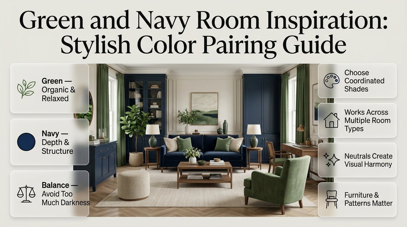
That is why green and navy room inspiration is such a useful starting point. Green brings an organic, relaxed quality, while navy adds depth, structure, and classic contrast. Together, they can work in bedrooms, living rooms, studies, dorms, reading corners, and preppy interiors.
If you’re building a complete room style rather than choosing colors in isolation, Preppy Room offers a broader collection of decorating ideas that can help you think about the room as a complete space.
This guide focuses on how to actually make green and navy work. You’ll learn which shades pair best, how much of each color to use, what neutrals and materials balance them, how to choose furniture and patterns, how to brighten a dark room, and which mistakes can make this combination look crowded or disconnected.
Why Is Green and Navy Such a Good Room Combination?
Green and navy work together because they share a sophisticated depth while offering different visual qualities. Green connects a room with nature, plants, and organic materials, whereas navy provides structure and contrast.
The combination is particularly effective because neither color has to do all the work.
Green can create the atmosphere through walls, bedding, upholstery, or artwork. Navy can then define specific areas through cushions, curtains, furniture, rugs, or decorative details.
The result can feel:
- Classic without looking outdated
- Colorful without becoming chaotic
- Cozy without feeling heavy
- Sophisticated without becoming formal
- Preppy without looking overly themed
- Natural without becoming rustic
The important part is balance.
If you cover every major surface in dark green and navy, the room may lose brightness. If you only use tiny accessories, the colors may not have enough visual impact.
A successful design sits somewhere between those extremes.
Expert Tip: Think about green and navy as a relationship rather than two separate colors. Decide which one should be noticed first, which one should support it, and which neutral colors will connect the two.
What Does Green and Navy Room Inspiration Actually Mean?
Green and navy room inspiration refers to decorating ideas that use green and navy as the primary or supporting color relationship within a room.
It doesn’t mean that every item needs to be green or navy.
Instead, the palette can include:
- Green walls
- Navy furniture
- Cream upholstery
- Natural wood
- Green plants
- Navy artwork
- Patterned textiles
- Brass accessories
- Beige rugs
- Warm white curtains
This distinction matters because a well-designed room rarely depends on two colors alone.
The strongest interiors usually combine color with texture, material, pattern, proportion, and lighting.
For example, a navy sofa can look completely different depending on whether it sits against a white wall, a sage wall, or a dark green wall. The furniture hasn’t changed, but the surrounding colors have changed its visual weight.
Which Shades of Green Work Best With Navy?
Not every green produces the same result with navy. The shade you choose should reflect the amount of natural light, the room size, the furniture style, and the mood you want.
Sage Green and Navy
Sage green is one of the easiest combinations for beginners.
Because sage is muted, it doesn’t compete aggressively with navy. It creates a softer appearance that works especially well in bedrooms, small spaces, and relaxed living rooms.
Try pairing sage with:
- Cream
- Warm white
- Light oak
- Linen
- Natural woven materials
- Aged brass
- Soft beige
A sage wall with a navy headboard can create a sophisticated bedroom without making the room feel overly dark.
Best for:
- Bedrooms
- Small rooms
- Calm interiors
- Modern-preppy spaces
- Relaxed family rooms
Olive Green and Navy
Olive green creates a warmer and more grounded appearance.
It works especially well with natural wood, leather, brass, and traditional furniture.
Olive and navy can make a room feel:
- Mature
- Cozy
- Traditional
- Rich
- Earthy
However, both colors can become visually heavy when used in large quantities.
Balance olive and navy with cream, beige, warm white, or natural wood.
Common Mistake: Using olive walls, navy furniture, dark curtains, and dark flooring without enough light surfaces. The individual colors may look beautiful, but together they can make the room feel smaller than it actually is.
Emerald Green and Navy
Emerald green gives the palette a much more dramatic personality.
It is excellent for people who want a luxurious or statement-making room.
However, emerald doesn’t always need to cover an entire wall.
You can introduce it through:
- A velvet chair
- Accent pillows
- Artwork
- A bench
- Decorative objects
- Curtains
- A statement headboard
Emerald and navy become especially attractive when balanced with ivory, cream, brass, or warm wood.
Forest Green and Navy
Forest green is deeper and more dramatic than sage or olive.
It works beautifully in traditional rooms, libraries, studies, and sophisticated bedrooms.
Because both forest green and navy are dark, use them strategically.
A forest-green accent wall can work with a cream bed, navy pillows, natural wood nightstands, and brass lighting.
This creates contrast without turning every surface dark.
How Much Green and Navy Should You Use?

One of the most important principles is that you don’t need equal amounts of both colors.
In fact, equal amounts can sometimes make a room feel visually competitive.
A simple starting formula is:
60% neutral foundation + 30% dominant color + 10% accent color
For example:
- 60% cream, beige, or warm white
- 30% green
- 10% navy
Or you could reverse the relationship:
- 60% cream
- 30% navy
- 10% green
Another option is:
- 60% soft green
- 30% cream
- 10% navy
These aren’t strict interior-design rules. They’re simply useful starting points.
Why Does Color Proportion Matter?
Dark colors have stronger visual weight than pale colors.
A navy pillow might be small physically, but because the color is intense, your eye notices it immediately.
That’s why a few well-positioned navy pieces can have more impact than dozens of small accessories.
Should Green or Navy Be the Main Color?
The answer depends on the mood you want.
Choose Green as the Main Color If You Want:
- A natural feeling
- A softer atmosphere
- A relaxed bedroom
- An earthy interior
- A botanical look
- A lighter visual mood
Choose Navy as the Main Color If You Want:
- A classic appearance
- More contrast
- A sophisticated atmosphere
- A dramatic accent wall
- A traditional or tailored look
Use Both as Supporting Colors If:
You’re already working with a strong neutral foundation and want the green-and-navy combination to appear through furniture, textiles, and accessories.
This approach is especially useful if you’re renting or don’t want to repaint.
What Neutral Colors Go With Green and Navy?
Neutral colors are what make the combination comfortable.
Without them, green and navy can easily become too intense.
Cream
Cream is probably the most versatile choice.
It softens navy and creates a warm background for green.
Use cream for:
- Walls
- Bedding
- Curtains
- Sofas
- Rugs
- Upholstery
Warm White
Warm white is useful when you want a brighter appearance without making the room feel cold.
It works especially well with sage and medium greens.
Beige
Beige introduces warmth and makes the palette more relaxed.
It is particularly useful in living rooms where comfort matters more than high contrast.
Natural Wood
Wood acts as a visual bridge between cool colors and warm materials.
Light oak gives a casual look, while walnut creates a deeper, more traditional feeling.
Bring Green and Navy Into the Bedroom
Green and navy work especially well in a preppy bedroom because they combine a fresh natural feeling with the classic depth of navy. Instead of giving both colors equal space, choose one as the main color and use the other for accents and supporting details. For example, navy bedding can create a strong foundation, while green cushions, curtains, artwork, or a patterned throw can add contrast and personality. Cream or white walls, light wood furniture, and neutral textiles can help balance the darker shades and keep the bedroom feeling bright and comfortable. You can also introduce classic preppy patterns such as stripes, plaid, gingham, or botanical prints to create visual interest without overwhelming the room. If you are looking for more practical ways to combine these colors across bedding, furniture, walls, patterns, and accessories, explore these green and navy preppy bedroom ideas for additional inspiration and decorating guidance.
How Can You Use Green and Navy in a Bedroom?
Bedrooms are one of the easiest places to experiment with this palette because textiles give you plenty of flexibility.
A balanced bedroom might include:
- Cream walls
- Green upholstered headboard
- Navy throw pillows
- Neutral bedding
- Light wood nightstands
- Brass lamps
- Botanical artwork
- Soft cream curtains
This arrangement gives you enough color without making the room feel visually crowded.
Option 1: Green Wall + Navy Accents
Paint one or more walls in sage or muted green.
Then introduce navy through:
- Bedding
- Cushions
- Artwork
- Lamps
- Curtains
This is ideal when you want green to create the main atmosphere.
Option 2: Navy Headboard + Green Textiles
Keep the walls neutral and make the navy headboard the focal point.
Add green through:
- Bedding
- Accent pillows
- Bench upholstery
- Artwork
- Plants
This approach is easier to change later.
Option 3: Navy Wall + Green Furniture
A navy accent wall can provide dramatic depth.
Balance it with a green chair, cream bedding, light wood, and plenty of warm lighting.
For readers specifically interested in building a stronger preppy bedroom around this palette, Green and Navy Preppy Room Ideas provides another useful direction for combining classic patterns, furniture, and color.
How Can You Use Green and Navy in a Living Room?
Living rooms require slightly more planning because they contain multiple large surfaces.
Instead of making the sofa, curtains, walls, and rug all dark, choose one major focal point.
For example:
| Room Element | Recommended Color |
|---|---|
| Walls | Warm white |
| Sofa | Cream |
| Accent chair | Green |
| Cushions | Navy + green |
| Rug | Beige or neutral |
| Curtains | Cream |
| Coffee table | Natural wood |
| Accessories | Brass + navy |
This creates a layered palette where every color has a job.
A navy sofa can also work beautifully with sage cushions and cream walls.
The key is to repeat the colors in at least two or three locations.
For example, if you use navy on the sofa, repeat a small amount of navy in artwork and one accessory.
This creates visual continuity.
Designing a Sophisticated Green and Navy Preppy Interior
A green and navy color scheme can instantly give a room a classic, collected, and distinctly preppy character, but the key is knowing how to balance the two strong colors. Softer greens can create a relaxed atmosphere, while deeper navy tones add contrast and traditional elegance. To keep the room from feeling too dark, introduce cream or ivory walls, light upholstery, natural wood, woven materials, or subtle metallic accents. You can also bring in preppy patterns such as stripes, plaid, gingham, and tasteful botanical prints to add visual interest without overwhelming the space. For a more complete look at how these colors, patterns, furniture choices, and decorative details work together, explore our Green and Navy Preppy Interior guide. It can help you create a cohesive interior that feels polished, welcoming, timeless, and easy to personalize.
How Can You Decorate a Small Green and Navy Room?
Small rooms don’t automatically mean you have to avoid dark colors.
Instead, you need to control their visual weight.
Use the following approach:
- Keep the ceiling light.
- Use cream or warm white on larger surfaces.
- Choose one darker focal area.
- Keep flooring visually simple.
- Use mirrors where appropriate.
- Avoid covering every wall with dark artwork.
- Let natural light reach the room.
- Use lighter fabrics around the darker colors.
For example, a small bedroom could have:
Cream walls + sage bedding + navy pillow + light oak furniture + brass lamp
The room still has a clear green-and-navy identity without feeling enclosed.
Quick Tip: In a small room, use dark colors where you want the eye to stop. Don’t automatically spread them evenly around the room.
What Patterns Work With Green and Navy?

Patterns are one of the best ways to give this palette personality.
The combination naturally works with traditional and preppy patterns such as:
- Stripes
- Plaid
- Gingham
- Botanical prints
- Florals
- Checks
- Small geometric designs
But pattern scale matters.
A useful hierarchy is:
One dominant pattern → one supporting pattern → subtle texture
For example:
- Large navy and green plaid
- Medium striped cushion
- Small botanical print
- Solid cream bedding
This feels layered rather than chaotic.
Green and Navy Stripes
Stripes are ideal when you want a classic appearance.
Use them on:
- Curtains
- Pillows
- Bedding
- Upholstery
- Small rugs
Green and Navy Plaid
Plaid gives the room a traditional and cozy quality.
It works particularly well with:
- Wood furniture
- Brass
- Cream
- Leather
- Traditional artwork
Gingham
Gingham is excellent for a playful preppy room.
Use it in smaller quantities so the room doesn’t feel overly themed.
How Do You Add Warmth to Green and Navy?
Green and navy can sometimes look cool, especially when the chosen shades contain strong blue undertones.
The solution isn’t necessarily another bright color.
Instead, introduce warm materials.
Good options include:
- Oak
- Walnut
- Rattan
- Woven baskets
- Linen
- Cotton
- Leather
- Brass
- Terracotta
- Cognac
For example, imagine a navy upholstered bed against a sage wall.
Add a walnut nightstand, cream bedding, brass lighting, and a woven basket.
The room immediately feels warmer because the materials balance the colors.
Can You Add Other Accent Colors?
Yes, but additional colors should have a clear purpose.
Brass
Brass is one of the easiest accents for green and navy.
Use it for:
- Lamps
- Cabinet handles
- Frames
- Mirrors
- Small decorative objects
Cognac
Cognac leather or brown wood can make the room feel sophisticated and traditional.
Terracotta
Terracotta adds warmth and works especially well with olive and earthy greens.
Blush Pink
Muted blush can soften the palette without overpowering it.
Use it in small quantities through cushions, flowers, artwork, or accessories.
Rust
Rust can add warmth to an otherwise cool room, but it should remain an accent rather than becoming another dominant color.
Expert Tip: If you already have three strong colors, don’t keep adding more. A restrained palette usually looks more expensive and intentional.
How Can You Create a Green and Navy Preppy Room?
Green and navy are naturally suited to preppy interiors because the colors work beautifully with classic patterns and traditional details.
A preppy green-and-navy room might include:
- Navy stripes
- Green botanical patterns
- Cream walls
- Plaid cushions
- Traditional furniture
- Brass hardware
- Framed artwork
- Natural wood
- Gingham details
However, preppy doesn’t mean putting every traditional pattern into one room.
Choose a few signature details and let the rest of the room remain calm.
For a more detailed variation of this style, Green and Navy Preppy Room Ideas can be used as a separate source of inspiration for pattern combinations and preppy decorating details.
The important distinction is that this article focuses on overall green-and-navy room inspiration, while a dedicated preppy room guide can focus more specifically on preppy styling.
What Furniture Looks Best With Green and Navy?
Furniture should support the palette rather than compete with it.
Light Wood
Light wood works well when the room needs brightness.
It is particularly effective with:
- Sage
- Soft navy
- Cream
- Beige
Medium Wood
Medium oak tones are versatile and work with both modern and traditional rooms.
Dark Wood
Dark wood creates a richer, more formal appearance.
Use it carefully if your walls and furniture are already dark.
Upholstered Furniture
A cream, beige, green, or navy upholstered piece can become the room’s focal point.
If you choose bold upholstery, keep surrounding furniture relatively simple.
How Important Is Lighting in a Green and Navy Room?
Lighting can completely change how these colors look.
A green wall may look soft and muted during daylight but considerably darker under cool artificial bulbs.
Similarly, navy can appear almost black in poor lighting.
Use multiple light sources instead of depending on one ceiling fixture.
Consider:
- Ceiling lighting
- Table lamps
- Floor lamps
- Wall sconces
- Accent lighting
- Natural daylight
Warm lighting generally helps the palette feel more comfortable in the evening.
Check Your Colors at Different Times
Before committing to a paint color, observe a sample:
- In morning light
- Around midday
- In the evening
- Under artificial lighting
This simple test can prevent an expensive repainting mistake.
How Do You Choose Green and Navy Paint Colors?

Don’t choose paint based solely on how it looks on a phone or computer screen.
Paint samples can appear different depending on:
- Room orientation
- Natural light
- Flooring
- Furniture
- Artificial lighting
- Nearby colors
Paint a reasonably large sample area or use large sample boards.
Then observe it for at least a day.
Look at the Undertones
A green may contain:
- Yellow undertones
- Blue undertones
- Gray undertones
A navy may also lean:
- Blue
- Gray
- Almost black
The colors don’t need identical undertones, but they should feel compatible with the room’s other materials.
How Do You Make a Dark Green and Navy Room Feel Brighter?
If the room already feels too dark, start with the largest visual surfaces.
Use:
- Cream bedding
- Light rugs
- Warm white curtains
- Pale wood
- Light upholstery
- Reflective accessories
- Layered lighting
Don’t solve a dark-room problem by simply adding more small decorations.
Large light surfaces have a much stronger effect.
For example, replacing a dark rug with a large cream rug may brighten the room more effectively than adding ten small decorative objects.
Common Green and Navy Decorating Mistakes
Using Too Much Dark Color
This is probably the most common mistake.
Dark green walls, navy furniture, dark curtains, dark flooring, and dark accessories can overwhelm a room.
Better Approach
Choose one or two major dark elements and surround them with lighter surfaces.
Making Every Color Equally Strong
A room becomes visually confusing when green, navy, red, orange, and multiple patterns all compete.
Better Approach
Choose:
Dominant color + supporting color + neutral foundation + small accent
Ignoring Pattern Scale
Three patterns may technically use the same colors but still look chaotic.
Better Approach
Mix different scales.
Use one large pattern, one medium pattern, and one subtle texture.
Buying Accessories First
Small accessories are exciting, but they shouldn’t determine the entire palette.
Better Approach
Choose major surfaces and furniture first.
Then build the smaller details around them.
Forgetting the Floor
Flooring occupies a large visual area.
A dark floor combined with dark green and navy walls can make a room feel much heavier.
If you already have dark flooring, increase the amount of cream, beige, or warm white elsewhere.
Using Too Many Matching Items
A room where every item is exactly the same shade can look artificial.
Real rooms have variation.
Mix:
- Solid colors
- Patterns
- Textures
- Materials
- Different shades of green
- Different values of navy
The result feels more collected and personal.
A Practical Step-by-Step Green and Navy Room Plan
Step 1: Decide the Mood
Before buying anything, write down three words describing the room.
For example:
Calm + Classic + Cozy
This gives you a direction.
Step 2: Choose the Dominant Color
Decide whether green or navy will occupy more visual space.
Don’t start shopping until this decision is clear.
Step 3: Select Your Neutral
Choose cream, beige, or warm white.
This color will help connect the darker elements.
Step 4: Pick One Hero Element
Your hero element could be:
- A headboard
- Sofa
- Accent wall
- Rug
- Curtains
- Large artwork
Let this piece establish the strongest version of the palette.
Step 5: Choose Supporting Textiles
Add pillows, throws, bedding, or curtains.
Repeat your main colors without making every textile identical.
Step 6: Introduce Natural Materials
Add wood, woven materials, linen, cotton, leather, or rattan.
This creates texture and prevents the room from feeling flat.
Step 7: Add One Small Accent Finish
Brass is an easy choice, but you could also use:
- Cognac
- Terracotta
- Rust
- Muted blush
Keep this accent limited.
Step 8: Review the Room From the Doorway
This is an underrated professional trick.
Stand at the entrance and look at the room as a whole.
Ask:
- Where does my eye go first?
- Is one color dominating too much?
- Is there enough light?
- Are the patterns competing?
- Does the room feel balanced?
Fix the biggest visual problem first rather than changing everything.
Green and Navy Room Combinations at a Glance

| Green Shade | Navy Style | Neutral | Overall Mood |
|---|---|---|---|
| Sage | Soft navy | Cream | Calm |
| Sage | Classic navy | White | Fresh |
| Olive | Deep navy | Beige | Warm |
| Forest | Navy | Ivory | Dramatic |
| Emerald | Deep navy | Cream | Luxurious |
| Muted green | Navy | Light wood | Relaxed |
| Medium green | Classic navy | Cream | Preppy |
This table is useful when you’re unsure which direction to take. Start with the mood you want, then choose the green and navy combination that supports it.
How Can You Make the Room Feel More Personal?
Color alone shouldn’t define the room.
A beautifully coordinated room can still feel generic if everything looks like it came from one showroom.
Add objects that have meaning:
- Books
- Artwork
- Photographs
- Travel-inspired pieces
- Favorite collections
- Handmade objects
- Family keepsakes
- Plants
These details give the room personality.
For example, a navy-and-green bedroom with a favorite framed print, books on the nightstand, a meaningful photograph, and a small collection of objects will feel much more personal than a perfectly coordinated room with nothing connected to the person living there.
The goal isn’t perfection.
The goal is a space where the colors, furniture, textures, and personal objects naturally belong together.
How Can You Avoid Making the Room Look Over-Designed?
One of the easiest ways to make a room feel professional is to leave some breathing space.
You don’t need something on every shelf.
You don’t need artwork on every wall.
You don’t need every cushion to contain green or navy.
Allow some surfaces to remain quiet.
This creates contrast and gives the important pieces more impact.
A simple cream wall beside a green chair may be more effective than a wall completely covered in green-and-navy accessories.
When Should You Use Green and Navy Together?
This palette is especially useful when you want a room that feels:
- Timeless
- Sophisticated
- Comfortable
- Natural
- Traditional
- Preppy
- Layered
- Colorful but controlled
It’s less suitable if your goal is an extremely minimal monochromatic room with almost no color contrast.
Even then, muted sage and soft navy can be introduced in very small amounts.
The palette is flexible enough to adapt to different decorating styles, which is one reason it continues to work across bedrooms, living spaces, offices, and dorm rooms.
Quick Checklist Before You Finish the Room
Before considering the room finished, check each of these:
- One color clearly dominates
- The second color appears in several locations
- A light neutral balances the darker colors
- There is enough natural or layered lighting
- Furniture doesn’t compete with the color palette
- Patterns have different scales
- Natural materials add warmth
- Additional accent colors are limited
- The room has some empty visual space
- Personal objects make the room feel lived-in
If most of these boxes are checked, the palette will usually feel much more intentional.
What colors go best with a green and navy room?
Cream, warm white, beige, natural wood, and soft neutral tones are among the best colors for a green and navy room. They create the visual breathing space needed to balance two relatively strong colors. If you want more warmth, introduce brass, cognac, terracotta, or muted blush through smaller decorative elements rather than making them major colors.
The best supporting color also depends on the shade of green and navy you’re using. Sage green generally looks beautiful with cream and light wood, while olive works well with beige, walnut, and warm metallic finishes. Deeper emerald or forest green can be softened with ivory and warm white.
Practical ways to balance the palette:
Use cream or warm white for larger surfaces.
Add natural wood to introduce warmth.
Use brass for small highlights.
Keep additional accent colors limited.
Repeat the same neutral in several areas for visual consistency.
Is green and navy a good combination for a bedroom?
Green and navy can be an excellent bedroom combination because the colors offer both depth and a calming natural quality. The key is choosing shades and proportions that suit the room’s lighting. Softer greens such as sage create a relaxed atmosphere, while navy can be introduced through bedding, a headboard, curtains, or smaller decorative pieces.
For a peaceful bedroom, avoid making every major surface dark. A cream or warm-white foundation gives the darker colors enough contrast to feel intentional rather than overwhelming.
A balanced bedroom combination could include:
Sage green wall or headboard
Cream or ivory bedding
Navy cushions or throw
Light or medium wood furniture
Warm brass lighting
Simple botanical or traditional artwork
The result feels sophisticated while remaining comfortable enough for everyday use.
How do you decorate a room with dark green and navy without making it look too dark?
The most effective approach is to control the amount of dark color rather than avoiding it completely. Dark green and navy can look beautiful when surrounded by lighter surfaces. Use cream, warm white, beige, pale wood, and lighter textiles to create contrast and visual breathing space.
Lighting is equally important. A room that looks balanced during the day may appear much darker at night if it relies on a single ceiling fixture. Layered lighting helps maintain the room’s atmosphere after sunset.
Professional ways to brighten the palette:
Keep ceilings and major light surfaces bright.
Use a lighter rug when flooring is dark.
Add cream curtains or upholstery.
Introduce light-colored wood.
Use table lamps and floor lamps instead of one light source.
Test paint colors in both daylight and artificial light.
A dark palette becomes much easier to manage when the surrounding materials are intentionally lighter.
What shade of green looks best with navy blue?
Sage, olive, forest, and emerald green can all work with navy, but they create very different moods. Sage is generally the easiest choice because its muted quality creates a softer transition into navy. Olive produces a warmer and more traditional appearance, while emerald and forest green create a richer, more dramatic room.
Your room’s natural light should influence the decision. Deep green can look substantially darker in a poorly lit room, while sage may retain a softer appearance.
Choose your green based on the mood you want:
Sage + navy: Calm, relaxed, and versatile
Olive + navy: Warm, earthy, and traditional
Forest green + navy: Rich, classic, and dramatic
Emerald + navy: Luxurious, bold, and sophisticated
For most beginners, sage and navy are the safest starting point because they provide contrast without becoming excessively heavy.
How can you make a green and navy room look expensive and professionally designed?
A sophisticated room isn’t necessarily created by expensive furniture. It usually comes from good proportions, coordinated materials, thoughtful lighting, and restraint. Instead of filling the room with matching green and navy accessories, choose a few strong elements and allow neutral surfaces to support them.
Texture is particularly important. Linen, cotton, velvet, wood, woven materials, leather, and brass can make the same color palette feel much richer and more layered.
Professional design details that make a difference:
Choose one dominant color instead of treating every color equally.
Mix solid colors with one or two carefully selected patterns.
Repeat green and navy in different parts of the room.
Add natural wood for warmth.
Use quality-looking lighting and warm bulbs.
Leave some surfaces intentionally uncluttered.
Include artwork and personal objects instead of only decorative accessories.
The goal is to make the room feel collected rather than perfectly matched. That balance is what gives a green and navy interior its polished, timeless character.
Conclusion
Green and navy can turn an ordinary room into a space that feels sophisticated, comfortable, and full of personality. The combination works best when you don’t try to make both colors equally dominant. Instead, choose one as the main color, use the other to create contrast, and bring in cream, warm white, beige, natural wood, or other soft neutrals to keep the room balanced.
The shade you choose also matters. Sage and navy create a calm and versatile look, while olive and navy feel warmer and more traditional. If you prefer something richer, emerald or forest green with deep navy can create a dramatic and luxurious atmosphere.
Most importantly, don’t stop at color. Patterns, lighting, furniture, natural materials, artwork, and personal accessories all contribute to how the finished room feels. A few carefully chosen details will usually have a stronger effect than filling every surface with matching green and navy decor.
Whether you’re designing a bedroom, living room, study, dorm, or preppy-inspired space, start with the mood you want to create and build the palette around it. Keep the proportions controlled, add enough light surfaces, and allow the room to have some breathing space.
The best green and navy room isn’t the one that uses the most color. It’s the one where every color, texture, and decorative detail has a clear purpose and works naturally with the rest of the space.