Introduction
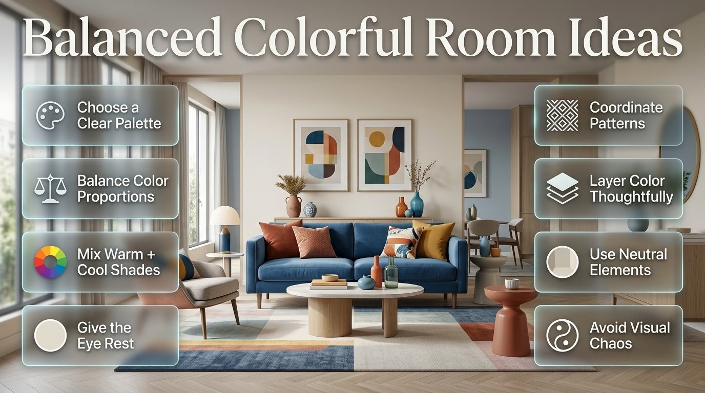
Balanced Colorful Room Ideas | A colorful room can completely change the personality of a home. It can feel cheerful, creative, welcoming, and personal. But there is an important difference between a room that uses lots of color successfully and one that simply contains lots of different colors. When every shade competes for attention, even beautiful furniture and accessories can start to feel disconnected.
That is why balanced colorful room ideas focus on more than simply choosing attractive colors. The real goal is to understand how colors interact, where they should appear, how much visual space each shade should occupy, and how neutral elements can give the eye somewhere to rest.
If you’re exploring different decorating directions, Preppy Room offers a useful starting point for understanding how color, pattern, furniture, and decorative details can work together in a cohesive interior.
In this guide, you’ll learn how to build a colorful room from the ground up, choose a practical palette, combine warm and cool shades, use patterns, coordinate furniture, decorate walls, balance colorful accessories, and avoid the mistakes that commonly make multicolor interiors feel chaotic.
What Are Balanced Colorful Room Ideas?
Balanced colorful room ideas are decorating approaches that use several colors while giving each shade a specific role within the room. Instead of allowing every color to dominate equally, the design establishes a visual hierarchy between the main background color, supporting colors, accent shades, patterns, and neutral elements.
A balanced colorful room can be bright or muted, traditional or modern, playful or sophisticated.
The important factor is organization.
For example, consider a bedroom with:
- Warm white walls
- Navy bedding
- Sage green curtains
- Light blue artwork
- Small pink accents
- Natural wood furniture
There are several noticeable colors, but they aren’t competing equally.
Warm white creates the background.
Navy provides visual weight.
Sage and light blue support the main palette.
Pink provides a small moment of contrast.
Wood introduces a natural material that visually softens the overall combination.
That is the basic idea behind balance.
Why Does Color Balance Matter?
Color is one of the first things people notice when they enter a room. Before they examine individual accessories or furniture details, they usually perceive the overall distribution of light, dark, warm, cool, muted, and bright areas.
When color is balanced, the room feels intentional.
When it isn’t, the eye can move rapidly between unrelated areas.
For example, imagine:
Bright yellow wall + red sofa + turquoise curtains + purple rug + orange accessories
Every element might look attractive separately, but the combined effect can become overwhelming.
Now change the structure:
Cream walls + navy sofa + patterned rug containing blue and green + sage curtains + small coral accents
The room is still colorful, but the colors have different levels of importance.
That difference is what makes a multicolor interior feel controlled.
How Do You Balance Multiple Colors in One Room?
The easiest way to balance several colors is to assign them different levels of visual importance.
A useful starting point is the familiar 60-30-10 approach.
It isn’t a strict decorating rule, but it can help when you’re unsure where to begin.
| Color Role | Approximate Visual Share | Typical Use |
|---|---|---|
| Dominant color | 50–60% | Walls, large surfaces, major background |
| Supporting color | 25–35% | Furniture, curtains, bedding, rugs |
| Accent color | 5–10% | Accessories, artwork, cushions |
| Neutral/natural elements | Flexible | Wood, cream, white, woven textures |
The percentages don’t need to be mathematically exact.
The principle is more important than the numbers.
If you have five colors and all five appear in equally large areas, the room can feel busy.
If one or two colors occupy most of the visual space while the others appear as supporting details, the room usually becomes easier to read.
Example of a Balanced Palette
Imagine you’re decorating a bedroom.
Your palette could be:
- 55% warm ivory
- 25% powder blue
- 10% sage green
- 5% navy
- 5% blush pink
You could distribute those shades like this:
Ivory: walls, rug, larger furniture
Powder blue: bedding and curtains
Sage: chair and small textile details
Navy: artwork frames and decorative accents
Blush pink: cushions and flowers
Nothing says you must follow those exact numbers.
The point is to create hierarchy.
💡 Pro Tip: When you’re unsure whether a color is becoming too dominant, remove a few small accessories before changing a large piece of furniture. Sometimes the problem isn’t the palette itself; it’s simply the amount of repetition.
How Do You Choose a Color Palette for a Colorful Room?
Start with the atmosphere you want rather than choosing individual colors randomly.
Ask yourself:
- Should the room feel calm?
- Should it feel cheerful?
- Do you want a classic appearance?
- Should it feel playful?
- Do you prefer soft colors or stronger shades?
- Do you want a traditional preppy feeling?
- Should the room feel modern?
- Do you want the colors to look natural and relaxed?
Your answers can guide the palette.
Calm Colorful Palette
Try:
Sage + ivory + pale blue + soft navy
This combination gives you several colors without relying on intense contrast.
Classic Colorful Palette
Try:
Navy + white + red + natural wood
This creates stronger contrast while keeping the overall direction structured.
Soft and Playful Palette
Try:
Blush pink + light blue + cream + sage
This works particularly well for bedrooms and cozy spaces.
Fresh Palette
Try:
White + green + light blue + small yellow accents
The white keeps the composition open while green and blue create a natural relationship.
Rich Palette
Try:
Emerald + navy + cream + burgundy
The darker shades create depth while cream prevents the room from becoming visually heavy.
For broader inspiration, Multicolor Preppy Palettes can help you explore how multiple shades can be organized into a cohesive color direction.
How Many Colors Should a Colorful Room Have?
There isn’t a universal maximum number of colors.
A room can contain many shades and still feel balanced.
What matters is whether those colors have a relationship.
For example, a blue-focused room could include:
- Navy
- Denim
- Powder blue
- Sky blue
- Blue-gray
Technically, those are different shades, but visually they belong to one color family.
Then you might introduce:
- Cream
- Sage
- Small coral accents
The room now contains many colors, but the palette still has structure.
Color Families Are Easier to Coordinate
Instead of choosing five completely unrelated colors, consider choosing:
One dominant family + one supporting family + one accent
For example:
Blue family: navy, denim, pale blue
Green family: sage, olive
Accent: coral
This creates much more flexibility.
⭐ Expert Tip: Don’t count every shade as a completely separate color. Think in terms of visual families. Several related shades can create depth without creating visual confusion.
What Is the Best Foundation for a Colorful Room?
A neutral foundation is one of the easiest ways to make a multicolor room feel organized.
Useful foundation colors include:
- Warm white
- Ivory
- Cream
- Soft beige
- Light gray
- Pale blue
- Muted sage
A neutral foundation doesn’t mean the room has to look boring.
It simply creates a quieter background for stronger colors.
For example:
Cream walls + navy furniture + green curtains + colorful artwork
can feel much more controlled than:
Navy walls + green furniture + pink curtains + colorful artwork
The second design isn’t automatically wrong, but it requires more careful control because several large areas are already competing for attention.
Can a Colorful Room Have Neutral Walls?
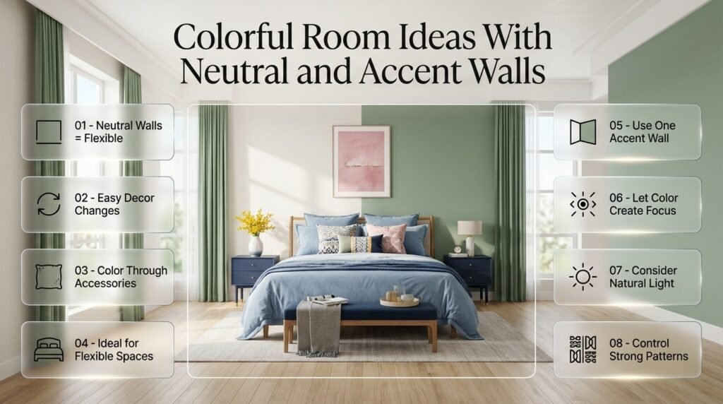
Absolutely.
In fact, neutral walls are one of the most practical options if you enjoy changing your decor.
Imagine a room with warm white walls.
You can introduce:
- Blue bedding
- Green curtains
- Pink artwork
- Yellow flowers
- Navy furniture
- Patterned cushions
If your taste changes later, you can replace smaller elements without repainting the entire room.
This makes neutral walls especially useful for renters, bedrooms, guest rooms, and flexible living spaces.
When Should You Choose a Colorful Wall?
A colorful wall can work when:
- The room has plenty of natural light
- Furniture is relatively controlled
- The color supports the existing palette
- You want a clear focal point
- The room isn’t already overloaded with strong patterns
One colorful wall can often have more impact than making every wall bright.
How Do You Use the 60-30-10 Rule in a Real Room?
Let’s build a practical example.
Imagine a preppy-inspired bedroom.
60% — Cream
Use cream for:
- Walls
- Large rug
- Major background surfaces
30% — Navy and Light Blue
Use these shades for:
- Bedding
- Curtains
- Accent chair
- Artwork
10% — Pink
Use pink for:
- Cushions
- Flowers
- Small decorative objects
- Artwork details
Now add natural wood.
Wood isn’t necessarily another “color” that needs to compete with the palette. It can function as a grounding material.
The result feels colorful but structured.
How Do You Mix Warm and Cool Colors?
You can absolutely combine warm and cool colors.
In fact, doing so can make a room more dynamic.
Cool colors include:
- Blue
- Green
- Blue-gray
- Some purples
Warm colors include:
- Red
- Orange
- Yellow
- Terracotta
- Warm pinks
The trick is to give them a relationship.
Example
Navy + sage + cream + terracotta
Navy and sage create a cooler foundation.
Terracotta adds warmth.
Cream connects the palette and softens the contrast.
Another option is:
Light blue + white + green + coral
The first three colors create a fresh atmosphere while coral introduces warmth.
📌 Quick Tip: If a cool-colored room feels too cold, you don’t necessarily need to replace the main colors. Try adding warm wood, brass, terracotta, warm lighting, or a small warm-toned accent instead.
How Do You Use Colorful Furniture Without Overloading the Room?
Colorful furniture can become the visual anchor of a room.
Suppose you have a navy sofa.
You don’t need:
- Navy curtains
- Navy rug
- Navy coffee table
- Navy lamps
- Navy cushions
- Navy artwork
Instead, repeat the navy in smaller amounts.
For example:
Navy sofa
plus
Small navy detail in artwork
plus
Navy cushion
That creates repetition without turning the entire room into one color.
Should Furniture Match Exactly?
No.
A room often looks more interesting when related colors are used instead of exact matches.
A navy chair can work with a pale blue sofa.
A sage green ottoman can work with olive artwork.
A blush cushion can work with dusty rose details.
Coordination is more important than exact matching.
⚠ Common Mistake: Buying every major piece in the same strong color can make the room feel like a showroom. Repeat colors, but allow some variation.
How Do You Use a Colorful Sofa?
A colorful sofa can define the entire room’s palette.
If you choose a blue sofa, consider building the room around it.
For example:
Blue sofa
→ cream rug
→ sage curtains
→ patterned cushions containing blue and green
→ wood coffee table
→ artwork containing blue, cream, and small coral details
This creates a visual chain.
The sofa doesn’t have to match everything.
It simply needs to connect with the surrounding palette.
How Do You Use Colorful Rugs?
Rugs are particularly useful because they can combine several colors in one place.
Suppose your room contains:
- Navy
- Sage
- Cream
- Pink
Instead of buying a rug in a completely unrelated color, look for a design that includes at least two or three of these shades.
The rug can then act as a bridge.
A Patterned Rug as a Color Map
Think of a patterned rug as a color map.
If the rug contains:
Blue + cream + green + pink
you can pull:
- Blue into furniture
- Cream into walls
- Green into curtains
- Pink into accessories
This makes decorating much easier.
How Do Curtains Affect Color Balance?
Curtains occupy a surprisingly large amount of visual space.
That’s why they should be considered part of the main palette rather than an afterthought.
Option 1: Repeat the Supporting Color
If sage is your supporting color, sage curtains can strengthen the palette.
Option 2: Choose a Neutral
If the room already has colorful furniture and artwork, cream or ivory curtains can create breathing room.
Option 3: Use a Pattern
Patterned curtains can work when the pattern repeats existing room colors.
Avoid introducing several new colors through a large curtain pattern unless you’re deliberately making the curtains the focal point.
How Do Patterns Help Create Balanced Colorful Rooms?
Patterns can actually make multiple colors easier to coordinate.
Imagine a cushion with:
- Navy
- Green
- Cream
- Pink
Instead of treating those colors as separate choices, use the cushion as a reference for the entire room.
This creates a shared visual language.
Use One Strong Pattern as an Anchor
If you already have a strong patterned rug, you may not need heavily patterned curtains and bedding.
Let one pattern lead.
Then use smaller patterns elsewhere.
For example:
Large patterned rug
- small striped cushion
- plain navy sofa
- solid cream curtains
This gives the room variety without visual overload.
How Do You Balance Different Patterns?
The safest approach is to vary the scale of patterns.
For example:
- Large floral rug
- Medium stripe cushion
- Small geometric detail
This is usually easier to manage than three patterns of exactly the same size.
You can also connect patterns through color.
A floral cushion and striped curtain don’t have to look identical.
They simply need to share one or two important colors.
How Do You Use Colorful Wall Decor?
Wall decor gives you another opportunity to introduce color without changing major furniture.
Good options include:
- Gallery walls
- Framed artwork
- Decorative prints
- Personal photographs
- Patterned wall art
- Mirrors
- Decorative shelves
A gallery wall can be especially useful when you want several colors to appear together.
For example, you could create a gallery wall using artwork containing:
Navy + green + pink + cream
Then repeat those colors subtly elsewhere.
This approach can make the room feel collected rather than overly coordinated.
How Can a Gallery Wall Balance Multiple Colors?
Start by choosing the palette first.
Then look for artwork that contains those colors.
You don’t need every artwork piece to contain every shade.
For example:
Artwork 1: navy + cream
Artwork 2: green + cream
Artwork 3: pink + navy
Artwork 4: green + blue
Together, they create a connected visual story.
The frames can provide another layer of consistency.
Using similar frame finishes can help different artwork styles feel like part of one arrangement.
Can Mirrors Help Balance a Colorful Room?
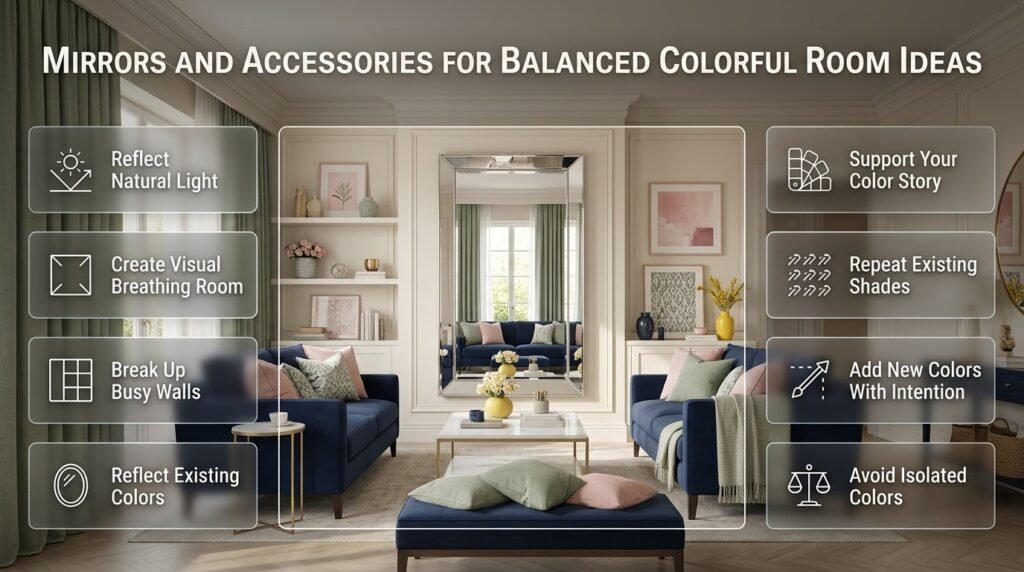
Yes.
Mirrors don’t necessarily add another strong color, which makes them useful in visually active interiors.
A mirror can:
- Reflect natural light
- Create visual breathing room
- Break up a heavily decorated wall
- Reflect existing colors
- Add shape without adding another competing hue
This makes mirrors particularly useful when the room already contains colorful artwork or patterns.
How Do You Use Accessories in a Colorful Room?
Accessories should reinforce the palette rather than randomly expand it.
Instead of buying objects simply because you like their individual colors, ask:
Does this object support my existing color story?
For example, if your palette is:
Navy + cream + sage + pink
then a yellow vase might be attractive, but ask whether it contributes something useful.
If yellow appears nowhere else, it may become a distracting isolated color.
That doesn’t mean you can never use yellow.
You could introduce it deliberately through artwork or flowers and repeat it elsewhere.
The key is intention.
How Do You Use Plants in a Colorful Room?
Plants can act as natural green accents.
This is useful if green already exists in your palette.
However, plants don’t have to match your room exactly.
Natural greenery can function almost like a neutral decorative element because it introduces organic color and texture.
Pairing plants with:
- Cream
- Blue
- Natural wood
- Terracotta
- Sage
can create a relaxed and fresh atmosphere.
How Do You Use Wood in a Colorful Room?
Wood is one of the most useful materials for balancing strong colors.
It introduces warmth and natural texture without demanding the same visual attention as a bright painted surface.
For example:
Navy + green + pink + cream
can become warmer with:
- Oak furniture
- Wooden shelves
- Woven baskets
- Natural wood frames
This helps prevent the room from feeling overly dependent on painted color.
How Do You Use Metallics in a Colorful Room?
Metallic finishes can provide small highlights.
Useful options include:
- Brass
- Gold
- Chrome
- Black metal
- Aged bronze
For a classic colorful room, brass can work particularly well with:
- Navy
- Green
- Cream
- Burgundy
- Blush
The important thing is to keep metallic finishes controlled.
You don’t need every object to be metallic.
A few coordinated details are usually enough.
How Do You Balance a Colorful Bedroom?
Bedrooms require a slightly different approach because the room should remain comfortable and visually restful.
Start with a calm foundation.
For example:
Ivory + powder blue + sage + small coral accents
Use ivory for larger surfaces.
Use powder blue for bedding.
Use sage for curtains or an accent chair.
Use coral in small accessories.
This creates personality without making the entire sleeping environment intensely colorful.
Colorful Bedroom Formula
Try:
Quiet background
one main color
one secondary color
small accent
natural texture
This is a reliable starting point.
How Do You Balance a Colorful Living Room?
Living rooms can support stronger color combinations because they’re often designed for social interaction and visual interest.
A useful formula is:
Neutral walls
colorful sofa or chairs
patterned rug
coordinated artwork
natural wood
small accent accessories
For example:
Cream walls + navy sofa + sage chair + patterned rug + coral artwork details
The sofa and chair don’t need to match.
The rug and artwork can connect the colors.
How Do You Balance a Colorful Dining Room?
Dining rooms can handle stronger color because they often have fewer decorative objects than living rooms.
Consider:
Cream walls + green dining chairs + natural wood table + navy artwork + brass lighting
The table provides a neutral/natural anchor.
The chairs provide the strongest color.
Artwork introduces another shade without overwhelming the room.
How Do You Create a Colorful Room With a Small Budget?
You don’t need to replace everything.
Start with the elements that have the greatest visual impact.
Changeable Elements
- Cushion covers
- Throws
- Artwork
- Curtains
- Lampshades
- Small rugs
- Decorative objects
- Flowers
- Bedding
These can transform a room without requiring major renovation.
Keep Expensive Pieces Neutral
If you’re purchasing long-term furniture, neutral shades can provide flexibility.
Then use smaller items to experiment with color.
This means your palette can change over time without replacing your major furniture.
What Are the Biggest Mistakes in Colorful Room Design?
Using Every Favorite Color at Full Strength
You may love blue, pink, yellow, green, orange, and purple.
That doesn’t mean every color needs to dominate.
Better Approach
Choose one or two favorites as primary colors.
Use the others as smaller accents.
Giving Every Wall a Different Color
This can sometimes work in creative interiors, but it can also divide the room visually.
Better Approach
Use one accent wall or keep the walls neutral and introduce color through furnishings.
Adding Too Many Small Accessories
Small objects can accumulate quickly.
One vase isn’t a problem.
Twenty colorful objects can completely change the visual balance.
Better Approach
Group accessories intentionally and remove anything that doesn’t support the palette.
Ignoring Lighting
A color can look completely different under:
- Morning sunlight
- Afternoon daylight
- Warm lamps
- Cool LEDs
Better Approach
Test important colors under the actual lighting conditions of the room.
Using Colors With Conflicting Undertones
A warm beige and a cool gray may look strange together if the transition isn’t intentional.
Better Approach
Compare samples side by side.
Matching Everything Too Exactly
Perfectly matched colors can make a room feel artificial.
Better Approach
Use related shades.
How Do You Know If Your Room Has Too Much Color?
There are several signs.
You may have too much visual color when:
- There is no clear focal point
- Every wall attracts attention
- Several unrelated colors appear only once
- Artwork competes with furniture
- Patterns are difficult to distinguish
- Accessories feel randomly distributed
- You notice individual objects before seeing the room as a whole
The solution isn’t always removing color.
Sometimes you simply need to redistribute it.
Try This Test
Stand at the doorway.
Look at the room for ten seconds.
Ask:
Where does my eye go first?
Then:
Where does it go second?
If your eye jumps randomly around the room, you may need stronger hierarchy.
If your eye moves naturally from one area to another, the palette is probably working more effectively.
⭐ Expert Tip: Take a photo of the room and look at the image instead of the physical space. A photograph often makes color imbalance easier to identify because the entire room is compressed into one composition.
How Can You Make a Multicolor Room Look More Sophisticated?
Sophistication doesn’t require removing color.
It requires controlling it.
Try these techniques:
Use Fewer High-Intensity Colors
Muted colors are often easier to combine.
Keep Large Surfaces Controlled
Walls, sofas, and rugs have major visual impact.
Use Repetition
Repeat your key colors.
Add Natural Materials
Wood, linen, cotton, rattan, and woven textures add depth.
Limit Decorative Clutter
A colorful room doesn’t need dozens of accessories.
Coordinate Finishes
Keep frame and hardware finishes reasonably consistent.
Use Layered Lighting
Lighting can influence how colors are perceived and can add depth to the overall room.
How Can You Make a Colorful Room Feel More Preppy?
Preppy interiors often benefit from strong but organized combinations.
Common directions include:
- Navy and white
- Navy and red
- Green and cream
- Blue and cream
- Pink and navy
- Light blue and white
- Green and navy
- Red and navy
The style becomes more distinctive through patterns and details such as:
- Stripes
- Plaid
- Traditional artwork
- Botanical prints
- Classic furniture
- Brass accents
- Structured textiles
- Framed illustrations
The goal isn’t to use every traditional preppy element.
Choose the ones that support your room’s palette.
How Do You Use Multicolor Palettes Without Losing a Preppy Look?
Start with a classic foundation.
For example:
Cream + navy
Then introduce:
Green + pink + light blue
Instead of using all three secondary colors equally, assign them different roles.
For example:
Cream: walls
Navy: furniture
Green: curtains
Light blue: bedding
Pink: small accessories
Now the room is multicolor but still has a recognizable visual structure.
This is where Balanced Multicolor Room Palettes can be useful when you want to explore more controlled combinations rather than adding colors randomly.
What Are Good Balanced Colorful Room Ideas for Different Moods?
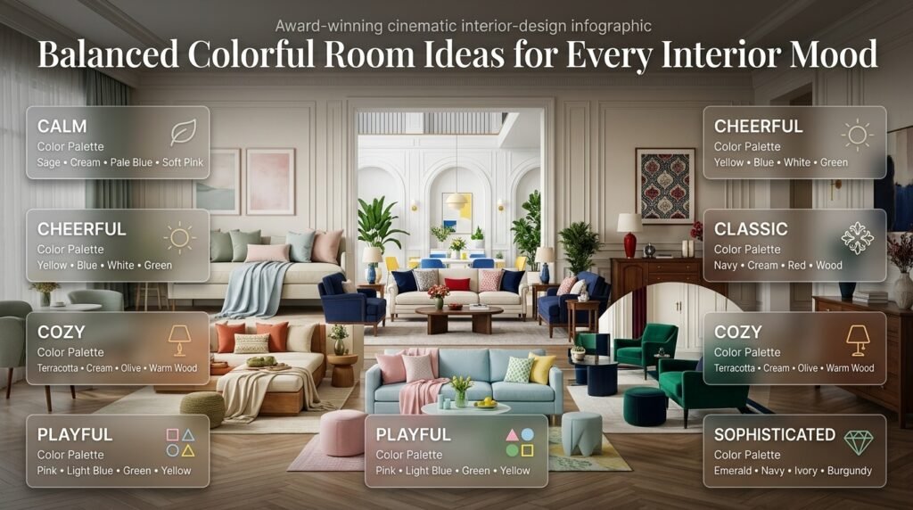
Calm and Colorful
Try:
Sage + cream + pale blue + soft pink
Use muted versions of the colors.
Cheerful and Colorful
Try:
Yellow + blue + white + green
Keep yellow in smaller areas if it feels too intense.
Classic and Colorful
Try:
Navy + cream + red + wood
This works well with traditional patterns.
Cozy and Colorful
Try:
Terracotta + cream + olive + warm wood
Textures become especially important here.
Playful and Colorful
Try:
Pink + light blue + green + yellow
Keep one or two shades softer so the room doesn’t become visually overwhelming.
Sophisticated and Colorful
Try:
Emerald + navy + ivory + burgundy
Use the strongest colors strategically rather than equally.
How Do You Build a Balanced Color Palette Step by Step?
Step 1: Identify the Room’s Existing Colors
Look at:
- Flooring
- Doors
- Furniture
- Countertops
- Curtains
- Lighting
- Artwork
Don’t choose new colors before understanding what is already present.
Step 2: Choose Your Dominant Color
This could be:
- Cream
- White
- Pale blue
- Beige
- Sage
Step 3: Choose the Supporting Color
Pick something that creates enough contrast to make the room interesting.
Step 4: Add an Accent
Use a stronger color in a limited quantity.
Step 5: Choose One Pattern
Use a rug, cushion, curtain, or artwork that connects several colors.
Step 6: Repeat Your Main Colors
Repeat important shades in at least two or three areas where appropriate.
Step 7: Add Natural Texture
Introduce:
- Wood
- Woven baskets
- Linen
- Cotton
- Ceramic
- Natural fibers
Step 8: Edit
Remove anything that doesn’t contribute to the overall design.
How Can You Test a Color Palette Before Decorating?
Create a simple mood board.
You don’t need professional software.
Collect images or samples representing:
- Wall color
- Furniture
- Rug
- Curtains
- Bedding
- Artwork
- Accessories
- Wood tone
- Metal finish
Put them together.
Then ask:
Does one color dominate too strongly?
Are there enough quiet areas?
Do the patterns share colors?
Do warm and cool elements feel connected?
Is there a clear focal point?
A mood board can prevent expensive mistakes.
What If Your Existing Furniture Doesn’t Match Your New Palette?
Don’t replace everything immediately.
Instead, identify which pieces can be connected through smaller details.
For example, suppose you have:
Brown wood furniture + blue chair + green curtains
You could add:
- Blue artwork
- Green cushions
- Cream rug
- Natural wood accessories
Suddenly the existing pieces feel more connected.
The goal is often to build relationships between objects rather than replacing them.
How Do You Balance Bright Colors With Muted Colors?
This is one of the most useful techniques for colorful rooms.
Suppose you love bright pink.
Instead of combining it with equally bright:
- Blue
- Green
- Yellow
- Orange
try:
Bright pink + muted sage + cream + soft blue
The bright pink becomes the focal accent.
The muted colors support it.
This gives you energy without visual competition.
Can Dark Colors Work in a Colorful Room?
Yes.
Dark colors can actually provide structure.
For example:
Navy + cream + pink + sage
Navy adds depth.
Cream provides openness.
Pink adds warmth.
Sage softens the contrast.
Similarly:
Forest green + ivory + light blue + brass
can create a rich but balanced room.
The key is to consider how much natural light the room receives.
How Does Room Size Affect Color Balance?
Small rooms don’t automatically need to be completely white.
However, large areas of very strong color can feel visually heavier.
For smaller spaces:
- Use lighter foundation colors
- Keep patterns controlled
- Introduce stronger colors through accessories
- Use mirrors strategically
- Avoid excessive visual clutter
For larger rooms:
- You can usually experiment with stronger furniture colors
- Larger patterns can work
- Darker accent walls may have more visual impact
- Multiple color zones can be introduced
Room size doesn’t determine the palette.
It influences how much visual weight the palette can comfortably carry.
How Does Natural Light Affect Color Choices?
Natural light changes throughout the day.
A room facing strong daylight may make colors appear brighter.
A darker room may make certain shades appear heavier.
Before committing to paint or expensive furniture, observe the room at different times.
Check:
Morning
How does the color look in natural daylight?
Afternoon
Does it become warmer or cooler?
Evening
Does artificial lighting change the appearance?
This simple observation can prevent disappointment.
How Do You Use Lighting in a Colorful Room?
Lighting should support the palette.
Instead of relying on one ceiling fixture, consider layers:
- Ceiling lighting
- Table lamps
- Floor lamps
- Accent lighting
- Natural daylight
Warm lighting can make cream, beige, pink, terracotta, and warm wood feel richer.
Cooler lighting can make blues and greens appear different.
The lighting doesn’t have to match the color palette perfectly.
It simply needs to create a comfortable atmosphere.
How Do You Use Artwork to Connect a Colorful Room?
Artwork can act as the bridge between furniture and accessories.
Suppose you have:
Navy sofa + sage chair + cream rug
Choose artwork that contains:
Navy + sage + cream
You could then introduce a tiny amount of pink through the artwork and repeat that pink in one cushion.
The artwork becomes the connecting element.
This is much easier than trying to make every individual object match.
How Do You Avoid a “Rainbow Effect”?
A rainbow effect happens when many unrelated bright colors appear with similar visual strength.
It can happen accidentally when decorating item by item.
You buy:
- A yellow cushion
- A blue vase
- A red frame
- A green lamp
- An orange throw
Each purchase may look good independently.
Together, however, they may create a scattered palette.
Better Approach
Choose the palette first.
Then shop within it.
This simple change can make decorating much more intentional.
What Is the Best Way to Shop for a Colorful Room?
Before buying anything, create a short palette.
For example:
Main: Cream
Secondary: Navy + sage
Accent: Pink
Then take that palette with you.
When considering an item, ask:
Does this belong to one of these groups?
If not, ask whether it adds something genuinely valuable.
This prevents random purchases.
How Do You Refresh a Colorful Room Seasonally?

You don’t need a completely different room every season.
Keep the permanent foundation stable.
For example:
Cream + navy + wood
Then change accents.
Spring
Add:
- Soft green
- Light blue
- Fresh floral details
Summer
Add:
- Coral
- Brighter blue
- Fresh greenery
Autumn
Add:
- Terracotta
- Olive
- Burgundy
Winter
Add:
- Deep green
- Navy
- Warm cream
- Burgundy
This gives the room flexibility without requiring major changes.
Quick Color Balance Checklist
Before considering your room finished, check:
- Is there a clear dominant color?
- Is there enough neutral space?
- Do the major furniture pieces work together?
- Are strong colors repeated?
- Does the artwork connect with the room?
- Do patterns share colors?
- Are there too many isolated colors?
- Does the room have a clear focal point?
- Does the lighting support the palette?
- Do natural materials add warmth?
- Does the room still feel comfortable?
- Can you remove a few accessories without losing personality?
If you can answer yes to most of these, your palette is probably moving in the right direction.
Balanced Colorful Room Ideas: A Practical Decision Table
| If the Room Feels… | Try This |
|---|---|
| Too plain | Add one stronger accent color |
| Too colorful | Increase cream, white, or natural materials |
| Too cold | Add warm wood or warm accent shades |
| Too dark | Increase lighter background colors |
| Too random | Repeat two or three existing colors |
| Too childish | Add navy, cream, wood, or structured patterns |
| Too formal | Add softer colors and relaxed textures |
| Too matched | Introduce related shades rather than exact matches |
| Too busy | Remove small accessories |
| Flat | Add pattern and texture |
| Disconnected | Use a patterned rug or artwork as a color bridge |
| Heavy | Increase lighter colors and reflective surfaces |
Expert Advice for Creating a Better Colorful Room
One of the biggest differences between an average colorful room and a professionally considered room is editing.
Beginners often think good decorating means adding more.
Professionals frequently improve a room by removing something.
A colorful room already has visual energy.
It doesn’t need every available surface decorated.
Instead, give important elements enough space to be noticed.
For example, if you have a beautiful patterned chair, allow it to stand out.
Don’t surround it with five equally dramatic accessories.
If you have a colorful gallery wall, let the surrounding furniture remain relatively controlled.
If you have a bold rug, don’t automatically add bold curtains, bold bedding, and bold wallpaper.
The strongest rooms usually have a clear visual hierarchy.
How do you balance multiple colors in a room without making it look too busy?
The easiest way to balance multiple colors is to give each shade a different role instead of using every color with the same visual strength. Start with a dominant background color, such as cream, warm white, beige, or a soft pastel. Then introduce one or two supporting colors through furniture, curtains, rugs, or bedding. Stronger shades should generally be reserved for smaller accents such as cushions, artwork, lamps, or decorative objects.
A useful starting point is the 60-30-10 approach: approximately 60% dominant color, 30% supporting color, and 10% accent color. It doesn’t have to be followed exactly, but it helps prevent several strong colors from competing for attention.
Practical points:
Choose one main color for the largest visual areas.
Use one or two supporting shades to create depth.
Keep very bright colors in smaller areas.
Repeat important colors in at least two or three places.
Leave some neutral or natural surfaces for visual breathing room.
Use patterns that already contain colors from your chosen palette.
For example, cream walls, navy furniture, sage curtains, and small pink accessories can create a colorful room without making every surface compete for attention.
What colors go well together for a colorful room?
Successful colorful rooms usually combine colors that have a clear relationship rather than simply collecting several favorite shades. Blue, green, pink, cream, yellow, navy, coral, and red can all work beautifully together when their intensity and proportions are controlled.
For a softer room, combinations such as sage green, cream, powder blue, and blush pink create a relaxed atmosphere. For a more classic look, navy, white, red, and natural wood provide stronger contrast. If you want something cheerful, blue, yellow, white, and green can introduce energy while keeping the background relatively light.
Useful combinations to consider:
Navy + cream + pink — classic with a softer accent.
Sage + ivory + light blue — calm and fresh.
Blue + white + yellow — bright and cheerful.
Green + navy + cream — traditional and grounded.
Coral + pale blue + cream — warm, fresh, and approachable.
Emerald + ivory + burgundy — richer and more dramatic.
The important point is not simply whether two colors “match.” Consider their undertones, brightness, saturation, and how much of each color you plan to use.
How many colors should you use in a balanced colorful room?
There isn’t a fixed number of colors that every room should follow. A better approach is to think in terms of a dominant color, supporting colors, accent colors, and neutral elements. A room may contain five or more visible shades and still look cohesive when several of those shades belong to the same color family.
For example, a blue-based room could include navy, denim, powder blue, and pale blue. Although these are different shades, they work together because they share a visual relationship. Cream and a small amount of coral could then provide contrast without disrupting the overall palette.
A practical structure is:
1 dominant color — walls or large background surfaces.
1–2 supporting colors — furniture, textiles, curtains, or rugs.
1 accent color — artwork, cushions, accessories, or small details.
Neutral/natural elements — cream, white, wood, woven textures, or similar materials.
Instead of asking, “How many colors are too many?” ask whether each color has a purpose. If a shade appears only once and doesn’t connect with anything else, it may feel random. Repetition creates cohesion.
How can you make a colorful room look sophisticated instead of overwhelming?
A sophisticated colorful room usually depends more on control and editing than on using fewer colors. Keep the largest surfaces relatively calm, then allow stronger colors to appear through selected furniture, artwork, textiles, and accessories. Natural materials such as wood, linen, cotton, woven textures, and ceramic can also soften strong color combinations.
For example, a room with cream walls, a navy sofa, sage accents, patterned artwork, and small touches of coral can feel polished because the colors have different levels of importance. If every element were equally bright and patterned, the same palette could become visually tiring.
Ways to create a more polished appearance:
Keep large surfaces quieter than small accents.
Choose one clear focal point.
Repeat colors rather than matching everything exactly.
Limit the number of competing patterns.
Mix solid colors with patterned pieces.
Add natural wood or woven textures.
Keep decorative accessories intentional.
Use consistent frame or hardware finishes where appropriate.
Remove objects that introduce unnecessary colors.
A useful professional test is to photograph the room and look at the image rather than the physical space. The photograph compresses the entire design into one view, making it easier to notice whether one color is dominating or whether the room lacks a clear focal point.
How do you add more color to a room without completely redecorating it?
You don’t need to replace your furniture or repaint every wall to create a more colorful room. Start with smaller, changeable elements that can introduce noticeable color without requiring a major investment. Cushions, throws, bedding, curtains, artwork, rugs, lampshades, flowers, and decorative accessories can completely change the color direction of an existing room.
For example, if you already have a neutral bedroom, you could keep the walls and furniture unchanged and introduce navy bedding, sage curtains, colorful artwork, and a few pink accents. The room would immediately feel more colorful while the existing foundation remains intact.
Start with these elements:
Cushion covers
Throws and blankets
Bedding
Curtains
Area rugs
Framed artwork
Decorative prints
Flowers and plants
Lampshades
Small decorative objects
Before buying anything, establish a simple palette such as cream + navy + sage + pink. Then choose new pieces from that palette. This prevents the room from gradually turning into a collection of unrelated colors and makes future decorating decisions much easier.
Conclusion
Creating a colorful room does not mean using as many colors as possible. The real goal is to create a space where different shades work together naturally, while the room still feels comfortable, organized, and visually balanced. With the right combination of dominant, supporting, and accent colors, even a vibrant room can feel calm and intentional.
Start by choosing a clear color direction, then build the room around a few connected shades. Use neutral surfaces, repeated colors, balanced patterns, and natural textures to prevent the space from feeling overwhelming. You can also introduce color gradually through artwork, bedding, curtains, rugs, cushions, accessories, and smaller decorative details rather than changing everything at once.
The best balanced colorful room ideas are personal. Your room should reflect the colors, patterns, and atmosphere you genuinely enjoy while maintaining enough visual breathing space. When each color has a purpose and the elements are connected through repetition, proportion, and contrast, the result feels collected rather than chaotic.
Whether you prefer soft pastel combinations, bold preppy colors, playful contrasts, or a sophisticated mix of rich and muted shades, thoughtful planning can help you create a room that feels colorful without losing its sense of harmony.