Introduction
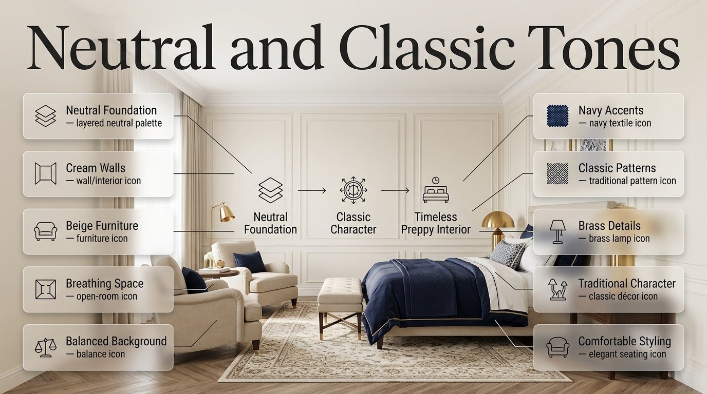
Neutral and Classic Tones | A room can have beautiful furniture, attractive bedding, and carefully selected decorations, yet still feel disconnected when the colors don’t work together. This is one of the most common challenges when creating a stylish bedroom or living space. You may love cream walls, navy bedding, beige furniture, a patterned rug, and brass accessories individually, but the real challenge is making them feel like part of one intentional design.
That is where Neutral and Classic Tones become especially useful.
A neutral foundation gives a room breathing space, while classic colors add character, tradition, and visual identity. When these elements are combined thoughtfully, they can create an interior that feels polished without looking overly designed. This approach is particularly effective for preppy interiors, where timeless patterns, traditional details, elegant colors, and comfortable styling often work together.
If you’re exploring the wider world of preppy interiors, Preppy Room is a useful starting point for discovering ideas related to room colors, furniture, patterns, lighting, decorating details, and different interpretations of the preppy style.
The important thing to understand is that neutral decorating doesn’t mean creating a room filled with beige objects. Classic decorating doesn’t mean making everything formal or old-fashioned. Instead, the best results come from creating a balanced relationship between quiet background colors and stronger design elements.
In this guide, you’ll learn how to choose neutral colors, combine classic tones, balance dark and light shades, use patterns, coordinate furniture and accessories, decorate small and large rooms, avoid common color mistakes, and build a timeless preppy palette that can evolve with your taste.
What Are Neutral and Classic Tones?
Neutral and classic tones are versatile colors that can provide a long-lasting foundation for an interior design scheme. Neutral shades usually include white, ivory, cream, beige, taupe, greige, soft gray, and natural brown. Classic tones can include deeper traditional colors such as navy, forest green, burgundy, muted red, traditional blue, and other sophisticated shades.
In a preppy room, these colors can be used at different levels.
For example:
- Cream can cover the walls.
- White can appear in bedding.
- Navy can become the primary accent.
- Green can appear in a pillow or artwork.
- Natural wood can add warmth.
- Brass can provide a refined finishing detail.
- Plaid or stripes can connect several colors.
This layered approach is more effective than assigning one color to every surface.
Neutral Does Not Mean Boring
One of the biggest misconceptions about neutral rooms is that they must look plain.
A cream bedroom with textured bedding, a navy upholstered headboard, striped cushions, natural wood, brass lighting, and traditional artwork can have considerable personality.
The interest comes from several sources:
Color + texture + pattern + material + proportion + shape
This is why two rooms with almost identical color palettes can feel completely different.
One may feel cold and empty, while the other feels warm, sophisticated, and welcoming.
Why Are Neutral and Classic Tones So Effective in Preppy Interiors?
Preppy design often contains recognizable visual elements such as stripes, plaid, checks, traditional florals, tailored furniture, classic color combinations, and decorative details.
If every one of these elements is strong, the room can quickly become visually crowded.
Neutral tones solve this problem by creating visual breathing space.
A cream wall doesn’t compete with a navy-and-white striped headboard. A beige rug can calm a colorful patterned cushion. An ivory duvet can allow a traditional plaid throw to become the focal point.
This creates a simple design hierarchy:
Quiet foundation → classic color → pattern → texture → decorative detail
The viewer sees the larger elements first and then gradually notices the smaller details.
This is one reason neutral and classic combinations remain useful even when interior trends change.
How Do Neutral Colors Create a Strong Foundation?
The largest surfaces in a room have a major influence on its overall appearance.
These include:
- Walls
- Flooring
- Large rugs
- Curtains
- Bedding
- Large furniture
- Upholstered pieces
If these surfaces are relatively calm, you have more freedom with smaller decorative elements.
For example, consider two rooms.
Room A
- Bright patterned walls
- Patterned bedding
- Strong colorful curtains
- Patterned rug
- Colorful artwork
- Decorative pillows in several colors
Even if every item is attractive, the room may feel busy because there is nowhere for the eye to rest.
Room B
- Cream walls
- Ivory bedding
- Natural wood furniture
- Navy headboard
- Blue-and-white patterned cushions
- One traditional rug
- Brass lighting
The second room may contain just as much personality, but the neutral foundation makes the design easier to read.
Which Neutral Colors Work Best?
Different neutral colors create different moods. Choosing the right one depends on lighting, furniture, flooring, room size, and the atmosphere you want.
Soft White
Soft white is one of the most flexible choices.
Unlike extremely bright white, a softer white can feel comfortable and refined.
It works well for:
- Walls
- Trim
- Bedding
- Curtains
- Furniture
- Shelving
- Ceiling details
Soft white works particularly well with navy, blue, green, natural wood, and brass.
Best Use
Use soft white when you want the room to feel:
- Fresh
- Clean
- Bright
- Traditional
- Flexible
Ivory
Ivory has a slightly warmer appearance than white.
It can soften a room while still maintaining a polished look.
Ivory works beautifully with:
- Navy
- Burgundy
- Forest green
- Natural wood
- Brass
- Muted blue
An ivory foundation can be especially effective when a pure-white room feels too stark.
Cream
Cream is one of the most useful neutral tones for a cozy classic room.
It creates warmth without requiring a large number of colors.
Try:
Cream walls + navy bedding + natural wood + brass lighting
or:
Cream bedding + beige rug + forest green cushions + traditional artwork
Cream can also help stronger accent colors feel less aggressive.
Beige
Beige provides warmth and versatility.
However, beige works best when it has enough contrast around it.
Instead of using beige on every surface, combine it with:
- Crisp white
- Cream
- Navy
- Green
- Dark wood
- Brass
This gives the room structure.
Taupe
Taupe is useful when you want something more sophisticated than ordinary beige.
It sits between brown and gray and can provide a mature foundation.
Taupe pairs particularly well with:
- Navy
- Cream
- Forest green
- Warm white
- Brass
- Dark wood
It can be especially effective in rooms intended to feel elegant rather than youthful.
Greige
Greige combines characteristics of gray and beige.
It can work particularly well in contemporary interpretations of preppy design because it provides a neutral backdrop without feeling completely traditional.
Pair it with:
- Navy
- White
- Soft blue
- Muted green
- Natural wood
For more contemporary styling, Modern Preppy Room offers a useful direction for combining classic character with cleaner design choices.
Warm Neutrals vs. Cool Neutrals
One of the most important decisions is whether your neutral palette should lean warm or cool.
Warm Neutrals
Examples include:
- Cream
- Ivory
- Beige
- Warm taupe
- Warm white
These tend to create a:
- Cozy atmosphere
- Traditional feeling
- Relaxed appearance
- Welcoming environment
They work particularly well with:
- Natural wood
- Brass
- Warm lighting
- Forest green
- Burgundy
Cool Neutrals
Examples include:
- Cool white
- Pale gray
- Blue-gray
- Cooler greige
These can create a:
- Crisp appearance
- Fresh atmosphere
- Contemporary feeling
They often work well with:
- Navy
- Blue
- Silver
- Black accents
- Clean white
Balanced Neutrals
Taupe and greige can sit between warm and cool directions, although their exact appearance depends on undertones and lighting.
Why Undertones Matter
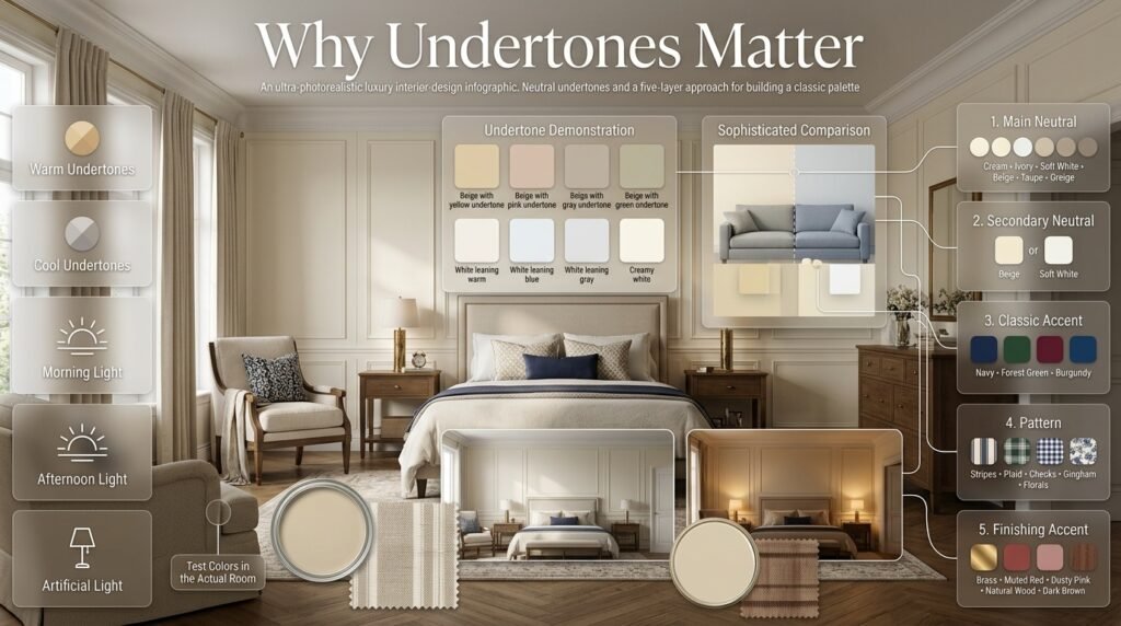
A neutral is rarely completely neutral.
A beige may contain yellow, pink, gray, or green undertones. A white may lean warm, blue, gray, or creamy.
This matters because two colors that look similar in a store may look very different when placed next to each other.
For example, a warm cream wall can make a cool gray sofa appear noticeably blue or cold.
Likewise, a yellow-toned beige may clash with certain cool whites.
Practical Testing Method
Before committing to a paint or large textile:
- Place a large sample in the actual room.
- Look at it in morning light.
- Check it in afternoon light.
- Check it under artificial lighting.
- Place nearby furniture or fabric samples beside it.
- Observe how the colors change.
⚠ Common Mistake: Choosing a neutral because it looks attractive in a showroom or online photograph without checking how its undertone behaves in your own lighting.
How Do You Build a Neutral and Classic Color Palette?
A successful palette usually starts with the largest surfaces and gradually becomes more detailed.
Use this five-layer approach.
Layer 1: Main Neutral
Choose one primary neutral.
Examples:
- Cream
- Ivory
- Soft white
- Beige
- Taupe
- Greige
Layer 2: Secondary Neutral
Add another closely related neutral.
For example:
Cream + ivory
or:
Beige + soft white
This creates subtle variation.
Layer 3: Classic Accent
Choose one stronger color.
Examples:
- Navy
- Forest green
- Burgundy
- Deep blue
Layer 4: Pattern
Introduce stripes, plaid, checks, gingham, or florals.
Layer 5: Finishing Accent
Use a smaller amount of another color or material.
This could be:
- Brass
- Muted red
- Dusty pink
- Natural wood
- Dark brown
Classic Neutral Color Combinations
Cream and Navy
Cream and navy are among the most dependable combinations for traditional preppy interiors.
Cream provides warmth and brightness, while navy introduces depth and contrast.
You can use:
- Cream walls
- White or ivory bedding
- Navy headboard
- Navy cushions
- Blue-and-white artwork
- Brass lighting
The combination feels classic without requiring excessive decoration.
If you want a brighter variation, Navy and White Preppy Room Ideas provides another useful color direction.
Blue and Cream
Blue and cream can create a softer alternative to high-contrast navy and white.
This combination works well for:
- Bedding
- Curtains
- Rugs
- Artwork
- Decorative pillows
The cream prevents blue from feeling too cool, while blue provides enough visual definition.
For additional ideas, explore Blue and Cream Preppy Room.
Beige and Forest Green
Beige and forest green create a natural, sophisticated palette.
Beige can appear on:
- Walls
- Rugs
- Upholstery
Forest green can appear on:
- Pillows
- Curtains
- Artwork
- Accent furniture
- Plants or botanical motifs
Natural wood works particularly well with this combination.
Cream and Burgundy
Burgundy brings depth to a neutral room without requiring a bright red.
It works especially well through traditional patterns.
For example:
Cream bedding + burgundy plaid throw + navy cushion + natural wood
The key is to use burgundy selectively.
Ivory and Muted Blue
Muted blue can provide a calm, traditional character.
It is especially useful when you want a preppy room that feels soft rather than dramatic.
Combine it with:
- Ivory
- Cream
- Beige
- Natural wood
- Brass
Can Red Work With Neutral and Classic Tones?
Yes, but red should generally have a clear role.
Instead of spreading red across the entire room, use it as an accent.
Good locations include:
- Plaid bedding
- Small cushions
- Artwork
- Decorative objects
- A patterned rug
- A throw
Muted red and burgundy often integrate more easily into sophisticated palettes than extremely bright red.
For a stronger traditional combination, Red and Navy Preppy Room Ideas can help you explore how these colors can work together.
Can Pink Work in a Classic Preppy Room?
Pink can absolutely work when its intensity is controlled.
Soft pink, blush, dusty rose, and muted pink can provide warmth and personality.
Try:
Ivory + soft pink + navy
or:
Cream + blush + muted blue
Pink works particularly well when the surrounding colors are restrained.
For another interpretation, see Pink and White Preppy Room Ideas.
Can Green Work With Neutral Tones?
Green is one of the most versatile classic accent colors.
Depending on the shade, it can make a room feel:
- Natural
- Traditional
- Fresh
- Sophisticated
- Relaxed
Forest Green
Creates stronger contrast and a more traditional atmosphere.
Sage Green
Feels softer and more relaxed.
Muted Green
Works well when you want color without overwhelming the neutral foundation.
A green-and-cream palette is particularly useful for rooms inspired by traditional interiors.
Explore Green and Cream Preppy Room Ideas for more ideas.
How Do Patterns Fit Into Neutral Interiors?
Patterns are an important part of preppy design.
Common choices include:
- Stripes
- Plaid
- Gingham
- Checks
- Florals
- Geometric patterns
- Traditional motifs
The key is not simply choosing attractive patterns. It’s making sure they communicate with each other.
Use a Pattern Hierarchy
A practical structure is:
One dominant pattern + one supporting pattern + solids
For example:
- Large navy plaid
- Small blue stripe
- Solid cream bedding
This gives the room visual variety without creating competition.
How Many Patterns Should You Use?
There is no strict number, but beginners often make the mistake of treating every decorative item as an opportunity to introduce another pattern.
Instead, consider pattern scale.
Large Pattern
Can be used on:
- Rug
- Headboard
- Curtains
- Accent chair
Medium Pattern
Can be used on:
- Bedding
- Pillows
- Throws
Small Pattern
Can be used on:
- Small cushions
- Decorative objects
- Smaller accessories
When patterns differ in scale, they are easier to combine.
Why Texture Is So Important in Neutral Rooms
Color isn’t the only way to create visual interest.
Texture can make a neutral room feel considerably richer.
Consider combining:
- Cotton
- Linen
- Quilted fabric
- Woven baskets
- Upholstery
- Wood
- Ceramic
- Metal
- Wool-style textiles
Imagine an ivory room where every surface is smooth and flat.
Now imagine the same room with:
- Quilted bedding
- Linen curtains
- Woven basket
- Wood nightstand
- Brass lamp
- Textured rug
The color palette remains almost identical, but the room feels much more developed.
⭐ Expert Tip: If a neutral room feels boring, add texture before adding several new colors. Texture often solves the problem without disturbing the palette.
How Should Furniture Work With Neutral and Classic Tones?
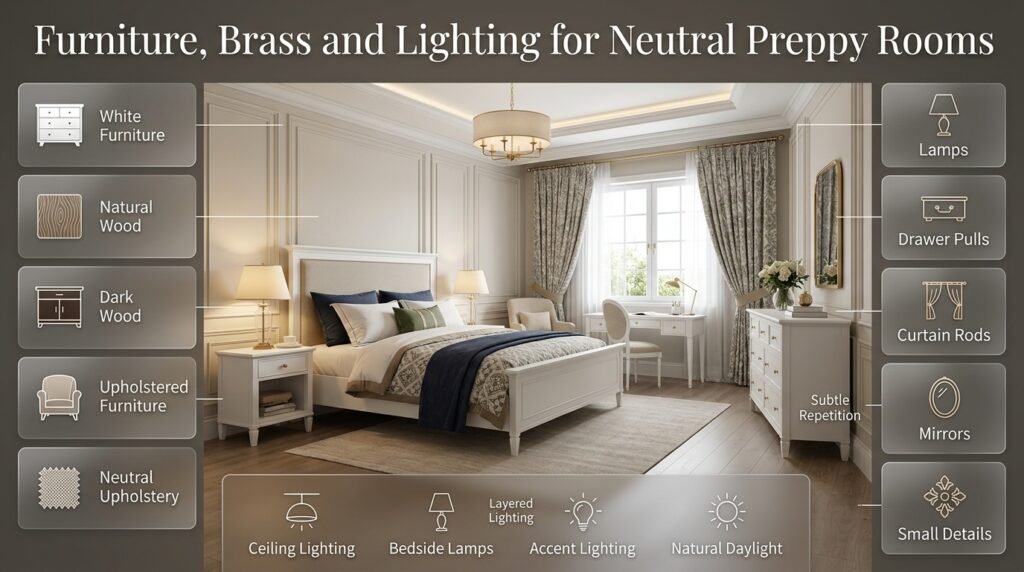
Furniture should support the palette rather than compete with it.
White Furniture
White furniture can create a bright, fresh appearance.
It works especially well in:
- Smaller bedrooms
- Youthful spaces
- Bright rooms
- Clean traditional interiors
Natural Wood
Natural wood introduces warmth.
It pairs beautifully with:
- Cream
- Beige
- Green
- Navy
- White
Dark Wood
Dark wood can create a more traditional and sophisticated atmosphere.
It works especially well in larger rooms where there is enough light and visual space.
Upholstered Furniture
An upholstered headboard or accent chair can introduce softness and texture.
Choose a neutral upholstery if your bedding or curtains already contain strong patterns.
What Role Does Brass Play?
Brass can work as a finishing material rather than a dominant color.
Use it for:
- Lamps
- Drawer pulls
- Curtain rods
- Mirrors
- Small decorative details
- Hardware
Because brass has visual warmth, it works particularly well with cream, ivory, beige, navy, and green.
Avoid using too much of it.
The goal is subtle repetition rather than making every object metallic.
How Can Lighting Improve Neutral Colors?
Lighting can change the appearance of almost every color.
Warm lighting can make cream and beige feel richer.
Cooler lighting can make whites and blue-gray shades appear crisper.
For a classic preppy room, layered lighting is often more effective than relying on a single ceiling fixture.
Consider:
- Ceiling lighting
- Bedside lamps
- Accent lighting
- Natural daylight
The shade of the lamp and the material surrounding the bulb can also influence how the room feels.
Neutral Tones for Small Rooms
Small rooms need careful visual planning.
The objective isn’t to make every object white. Instead, create a relatively light visual foundation.
A useful palette is:
Soft white + cream + navy + natural wood
Use the lighter colors on large surfaces and navy in smaller areas.
Small-Room Strategy
- Keep walls relatively light.
- Avoid too many large dark surfaces.
- Use one dominant accent color.
- Choose appropriately scaled furniture.
- Limit competing patterns.
- Use texture instead of excessive color.
- Keep pathways visually clear.
A small room can still be strongly preppy; it simply benefits from greater restraint.
Neutral Tones for Large Rooms
Large rooms offer more freedom.
You can use:
- Larger patterns
- Darker furniture
- More layered textiles
- Larger artwork
- Multiple accent colors
- Statement chairs
- Larger rugs
For example:
Cream walls + navy upholstered bed + forest green chair + patterned rug + burgundy accents
The additional visual space helps prevent these colors from feeling crowded.
How Can You Make a Neutral Room Look More Luxurious?
Luxury doesn’t require expensive decoration.
It often comes from consistency, proportion, material quality, and restraint.
Focus on:
1. Better proportions
Choose furniture that suits the room rather than filling every available area.
2. Layered textiles
Combine bedding, throws, cushions, and rugs thoughtfully.
3. Repeated materials
Repeat wood, brass, or woven textures in several locations.
4. Controlled color
Avoid introducing a new color every time you add an accessory.
5. Thoughtful lighting
Lighting should support the atmosphere rather than simply illuminate the room.
How Do You Use Neutral Tones Without Making Everything Match?
A sophisticated room rarely depends on exact matching.
Instead, use related shades.
For example:
- Cream wall
- Ivory bedding
- Beige rug
- Taupe chair
- Navy cushion
These colors belong to the same family without being identical.
This creates a more natural appearance.
Perfect matching can sometimes make a room look like a furniture showroom rather than a lived-in home.
How Can Coordinated Colors Improve the Design?
Color coordination means creating relationships between colors rather than simply choosing several colors that you happen to like.
Suppose your room contains a navy plaid cushion.
Instead of repeating navy on every surface, you could pick up its quieter colors elsewhere:
- Cream in the curtains
- Soft blue in artwork
- Beige in the rug
- Natural wood in the furniture
The colors are connected without becoming repetitive.
For more guidance on building relationships between shades, Coordinated Colors is a useful resource.
How Should You Decorate a Classic Preppy Bedroom?
A classic preppy bedroom can start with a simple neutral foundation.
Example Palette
Walls: Cream
Bed: White or natural wood
Bedding: Ivory
Accent: Navy
Pattern: Traditional stripe or plaid
Metal: Brass
Secondary accent: Forest green
Then distribute the colors.
For example:
- Navy headboard
- Cream wall
- White bedding
- Navy stripe cushion
- Green decorative pillow
- Brass lamp
- Natural wood nightstand
This creates consistency without excessive matching.
For a broader traditional design approach, explore Classic Preppy Room.
How Do Neutral Tones Work in a Cozy Preppy Room?
Cozy interiors usually benefit from warm neutrals.
Use:
- Cream
- Ivory
- Beige
- Warm taupe
- Soft brown
Then introduce:
- Forest green
- Muted blue
- Navy
Layer textiles generously.
A cozy preppy room might include:
- Quilted duvet
- Knitted throw
- Upholstered headboard
- Soft rug
- Woven basket
- Warm bedside lighting
The objective is comfort without losing structure.
For more ideas, explore Cozy Preppy Room.
How Do Neutral Colors Work in Minimal Preppy Rooms?
Minimal preppy design requires discipline.
Instead of using many decorative objects, let a small number of carefully selected pieces define the room.
A strong palette could be:
Ivory + navy + natural wood
Use:
- One patterned textile
- One statement artwork
- One distinctive lamp
- A few functional accessories
The neutral background allows each item to have greater visual importance.
For further inspiration, see Minimal Preppy Room.
How Can Neutral Colors Support a Cute Preppy Room?
Cute preppy interiors can easily become visually busy because playful decorations often involve several colors.
Neutral tones can control this.
Use:
Cream + white + blush + soft blue
Then introduce playful elements through:
- Small artwork
- Cushions
- Decorative objects
- Bedding
- Wall accessories
This keeps the room cheerful while maintaining visual organization.
See Cute Preppy Room for more ideas.
Should Walls Be Neutral?
Neutral walls are not mandatory, but they are one of the easiest ways to create flexibility.
A neutral wall allows you to change:
- Bedding
- Curtains
- Artwork
- Rugs
- Accent furniture
without redesigning the entire room.
Good choices include:
- Cream
- Ivory
- Soft white
- Beige
- Taupe
- Light greige
- Very soft blue-gray
The best choice depends on the room’s natural light and existing finishes.
Should Bedding Be Neutral?
Neutral bedding is extremely versatile.
A cream or ivory duvet can act as a blank canvas for:
- Navy pillows
- Green cushions
- Patterned throws
- Blue stripes
- Burgundy accents
However, patterned bedding can also work.
If the bedding is highly patterned, consider keeping the surrounding curtains and major furniture relatively quiet.
Should Curtains Match the Bedding?
They don’t need to match exactly.
Coordination usually looks more natural than identical matching.
For example:
Navy bedding + cream curtains with subtle blue detail
can look more sophisticated than:
Navy bedding + identical navy curtains + navy rug + navy cushions
The first approach creates repetition without overuse.
How Can Rugs Support Neutral and Classic Tones?

A rug can connect multiple colors within a room.
Suppose your room contains:
- Cream
- Navy
- Soft blue
- Beige
A rug containing two or three of these colors can visually connect the space.
However, don’t choose a rug simply because it contains every color in the room.
It should also suit:
- Furniture scale
- Pattern intensity
- Room size
- Overall style
A rug with a subtle traditional motif can reinforce the preppy character without overwhelming the palette.
How Can Artwork Work With Neutral Tones?
Artwork is an opportunity to introduce personality.
In a neutral room, artwork can provide:
- Color
- Pattern
- Historical character
- Botanical elements
- Geometric structure
- Personal meaning
Instead of matching artwork perfectly to your bedding, look for one or two colors that relate to the existing palette.
For example, a navy-and-green artwork can connect:
Navy bedding + green cushion + cream wall
without requiring additional navy and green objects everywhere.
What Are the Biggest Beginner Mistakes?
Mistake 1: Using Too Much Beige
Beige can be beautiful, but too much of one shade can make the room look flat.
Solution
Add:
- Cream
- White
- Navy
- Green
- Wood
- Pattern
- Texture
Mistake 2: Using Too Much Navy
Navy provides beautiful contrast, but large amounts can make a room feel heavy.
Solution
Balance it with:
- Cream
- White
- Ivory
- Light wood
Mistake 3: Choosing Colors Without Considering Light
Natural light changes throughout the day.
Solution
Test colors at multiple times.
Mistake 4: Using Too Many Strong Patterns
Preppy design doesn’t require every item to be patterned.
Solution
Use a pattern hierarchy.
Mistake 5: Ignoring Texture
A room can have a beautiful palette and still feel lifeless.
Solution
Layer different materials.
Mistake 6: Making Every Item Match
Perfect matching can make the room feel artificial.
Solution
Use related colors rather than identical colors.
Mistake 7: Adding Too Many Accent Colors
Every new color introduces another visual relationship.
Solution
Start with one main accent and one secondary accent.
Mistake 8: Decorating Before Establishing a Foundation
Buying pillows and accessories before deciding on the main palette often creates unnecessary mismatches.
Solution
Work from large surfaces toward small details.
A Professional Method for Choosing Colors
When designing a room from scratch, use this sequence.
Step 1: Study the Existing Room
Look at:
- Floor
- Wall
- Window frames
- Doors
- Built-ins
- Existing furniture
Step 2: Identify Permanent Colors
Some colors cannot easily be changed.
Build your palette around them.
Step 3: Choose the Main Neutral
Pick cream, white, beige, taupe, or another foundation.
Step 4: Select One Classic Accent
Navy is an excellent starting point.
Step 5: Choose a Pattern
Pick something that contains your primary colors.
Step 6: Add Texture
Use fabric, wood, woven materials, and upholstery.
Step 7: Add Secondary Accents
Introduce small amounts of green, red, blue, or pink if appropriate.
Step 8: Edit
Remove anything that doesn’t contribute to the room.
A Simple Neutral Preppy Color Formula
For beginners, try:
60% Neutral Foundation
Walls, large furniture, bedding, rugs.
30% Classic Accent
Navy, green, blue, or another dominant traditional color.
10% Detail
Pattern, brass, muted red, pink, or another smaller accent.
These percentages aren’t rules. They’re simply a useful starting framework.
The important principle is that stronger colors should usually occupy less visual space than your foundation.
Neutral Tones and Different Room Sizes
Small Room
Use:
- Light neutral foundation
- One dark accent
- Minimal large patterns
- Light furniture
- Controlled accessories
Example:
Ivory + soft blue + navy
Medium Room
You can introduce:
- Two accent colors
- One larger pattern
- More textile layering
- Moderate contrast
Example:
Cream + navy + sage + natural wood
Large Room
You can experiment with:
- Darker furniture
- Larger patterns
- Multiple textiles
- Deeper accent colors
Example:
Cream + navy + forest green + burgundy + dark wood
Neutral and Classic Tones for Different Moods
Calm
Use:
Ivory + soft blue + beige
Traditional
Use:
Cream + navy + natural wood + brass
Elegant
Use:
Taupe + ivory + navy + dark wood
Fresh
Use:
Soft white + blue + light wood
Cozy
Use:
Cream + beige + forest green
Playful
Use:
Ivory + blush + soft blue + navy
The same neutral foundation can support completely different moods.
How Can You Refresh a Neutral Room Without Redecorating Everything?
One of the biggest advantages of neutral design is flexibility.
You can change the room’s personality through relatively small updates.
Change the Bedding
A navy duvet can create a stronger traditional look.
A cream duvet can make the room softer.
Change the Pillows
Use:
- Plaid
- Stripe
- Floral
- Solid colors
Change the Throw
A burgundy or forest green throw can immediately introduce a seasonal accent.
Change Artwork
Artwork can shift the mood without changing the furniture.
Change Lighting
A different lamp shade or fixture can alter the atmosphere considerably.
This flexibility is one reason neutral foundations are practical for long-term decorating.
Seasonal Updates With Neutral Tones
Neutral interiors can adapt easily throughout the year.
Spring
Introduce:
- Soft blue
- Sage
- Pale pink
Summer
Try:
- Crisp white
- Blue
- Natural textures
Autumn
Introduce:
- Burgundy
- Forest green
- Warm beige
Winter
Use:
- Cream
- Navy
- Deep green
- Warm brown
Because the foundation stays consistent, seasonal updates don’t require a complete redesign.
How Can You Create a More Personal Neutral Room?
Neutral design should never mean removing personality.
Your personal character can appear through:
- Books
- Artwork
- Photographs
- Collections
- Travel objects
- Favorite patterns
- Meaningful accessories
The goal is not to create a showroom.
A well-designed room should still look lived in.
One carefully selected personal object can be more meaningful than ten generic decorations.
How Do You Balance Traditional and Contemporary Elements?
A neutral palette makes this combination easier.
For example:
Traditional navy plaid + contemporary cream furniture
or:
Classic brass lamp + modern clean-lined nightstand
or:
Traditional botanical artwork + simple neutral bedding
This creates a room that feels timeless rather than locked into one particular period.
Why Timeless Design Is Better Than Following Every Trend
Trends can be useful for inspiration, but designing an entire room around a short-lived trend can become expensive and frustrating.
Neutral and classic tones offer a more stable foundation.
You can update the room with smaller trend-driven elements while keeping major investments relatively timeless.
For example:
Timeless: cream walls, natural wood furniture, classic navy bedding.
Changeable: decorative cushions, artwork, small accessories.
This makes future updates easier.
How Do You Know if Your Color Palette Is Balanced?
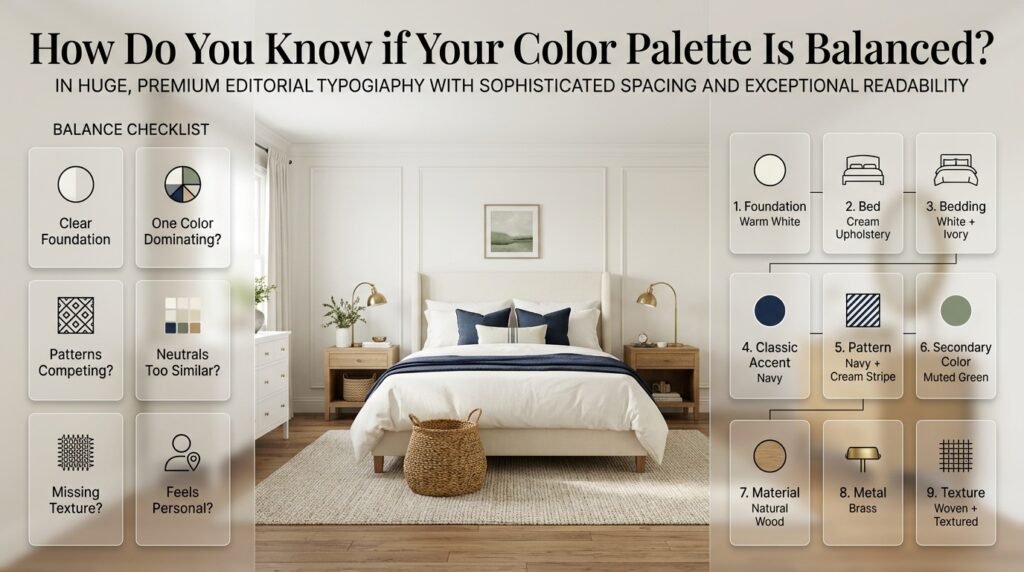
Stand at the entrance of the room and look at the entire space.
Ask:
Is there a clear foundation?
If not, the room may need more neutral space.
Is one color dominating?
If navy or another dark color immediately takes over, introduce lighter elements.
Are the patterns competing?
If your eyes don’t know where to look first, simplify.
Are the neutrals too similar?
Add slight tonal variation.
Is the room missing texture?
Add textiles and natural materials.
Does the room feel personal?
Add meaningful objects rather than generic decoration.
A Practical Example: Building a Neutral Preppy Bedroom
Imagine an empty bedroom.
The walls are warm white and the floor is medium natural wood.
Step 1: Foundation
Keep the walls warm white.
Step 2: Bed
Choose a cream upholstered bed.
Step 3: Bedding
Use white and ivory bedding.
Step 4: Classic Accent
Introduce navy through cushions and a throw.
Step 5: Pattern
Add a navy-and-cream stripe.
Step 6: Secondary Color
Introduce muted green through a small cushion or artwork.
Step 7: Material
Use natural wood nightstands.
Step 8: Metal
Add brass lamps.
Step 9: Texture
Add a woven basket and textured rug.
The result is not dependent on one dramatic feature. Instead, several small decisions reinforce the same visual direction.
How Can You Use Neutral Tones in a More Colorful Preppy Room?
You don’t have to choose between neutral and colorful design.
Neutral tones can actually make stronger palettes easier to manage.
Suppose you love:
- Navy
- Red
- Green
Instead of using all three across every surface, use cream as the foundation.
Then:
Cream → Navy → Red → Green
Each color receives a specific role.
For example:
- Cream walls
- Navy bedding
- Red plaid pillow
- Green artwork
This is much easier to control than using all three strong colors at equal intensity.
The Role of Negative Space
Negative space means areas that are intentionally left visually quiet.
This is particularly important in preppy interiors because patterns and decorative details can accumulate quickly.
Examples include:
- An uncluttered wall
- A mostly solid duvet
- A plain curtain
- Open floor space
- A simple bedside table
Negative space doesn’t mean unfinished.
It gives the decorative elements somewhere to stand out.
Should You Use Black With Neutral and Classic Tones?
Black can work, but use it thoughtfully.
Because navy and dark wood are already strong, adding large amounts of black may make the room visually heavy.
Small black accents can be effective:
- Picture frames
- Hardware
- Lighting
- Small decorative objects
If you’re using navy, consider whether black actually adds something necessary.
Sometimes the room already has enough contrast.
How Can Natural Wood Improve a Neutral Palette?
Natural wood introduces warmth and organic variation.
No two pieces of wood look exactly identical, which can help a room feel more natural.
Wood works particularly well with:
- Cream
- Beige
- Navy
- Forest green
- Ivory
It also provides a useful transition between traditional and modern design.
How Can You Avoid a Sterile White Room?
If you prefer an almost-white palette, introduce contrast through materials.
For example:
Soft white + ivory + natural wood + navy + brass
You don’t need a large number of colors.
Instead, vary:
- Texture
- Shape
- Finish
- Pattern
- Material
This produces depth while maintaining a clean appearance.
Are Neutral and Classic Tones Suitable for Teen Rooms?
Yes. They can create a flexible foundation that evolves over time.
A younger room might use:
Cream + blush + soft blue
while a more mature version could transition toward:
Ivory + navy + natural wood
Because the major surfaces remain neutral, accessories can change without requiring a complete redesign.
Are Neutral Tones Suitable for Adult Bedrooms?
They are particularly useful for adult bedrooms because they can create a sophisticated atmosphere without relying on overly dramatic colors.
Try:
Warm white + taupe + navy + brass
or:
Cream + forest green + natural wood
The final appearance depends heavily on furniture, lighting, textiles, and proportions.
What are the best neutral colors for a classic preppy room?
The strongest neutral choices for a classic preppy room are cream, ivory, soft white, beige, taupe, and warm greige. These shades create a calm background that allows traditional preppy colors such as navy, forest green, muted blue, burgundy, and soft red to stand out without making the room feel crowded. Cream and ivory are especially useful when you want warmth and a more traditional atmosphere, while soft white creates a fresher and cleaner appearance.
A good professional approach is to choose the neutral according to the room rather than choosing it simply because it’s popular. Consider the natural light, flooring, furniture, and existing materials before deciding.
Practical points:
Cream: warm, traditional, and comfortable.
Ivory: refined and softer than bright white.
Soft white: fresh, bright, and flexible.
Beige: warm and relaxed.
Taupe: sophisticated and slightly more mature.
Greige: useful for a more contemporary preppy look.
Pair the neutral foundation with one main classic accent, such as navy or green.
Use stronger colors through bedding, artwork, cushions, rugs, or smaller furniture rather than covering every surface.
The goal isn’t to make the room completely neutral. The neutral foundation should give the classic colors and patterns enough space to become the personality of the room.
How do you combine neutral colors with navy in a preppy room without making it look too dark?
The key is to let navy provide contrast rather than allowing it to dominate the entire room. Navy works particularly well with cream, ivory, white, beige, and natural wood because these lighter elements visually balance its depth. This is one reason navy remains such a recognizable color in classic preppy interiors.
Instead of using navy on several major surfaces at once, give it a clear role. For example, cream walls with ivory bedding can provide the foundation, while navy appears on the headboard, cushions, artwork, or a patterned throw. Natural wood and warm lighting can then prevent the room from feeling too cold.
A balanced formula could be:
Main foundation: cream or soft white
Primary accent: navy
Supporting material: natural wood
Pattern: navy-and-cream stripe or plaid
Finishing detail: brass
Optional secondary accent: muted green or burgundy
If the room is small or receives limited natural light, keep the largest surfaces lighter and use navy in smaller areas. In a larger, brighter room, you have more freedom to use navy on furniture or even a larger architectural feature.
The professional rule is simple: use navy as an anchor, not as the entire visual background.
How many colors should you use in a neutral and classic preppy room?
A practical starting point is one dominant neutral, one primary classic color, and one smaller accent color. You can then allow additional shades to appear naturally through wood, artwork, patterns, metals, and textiles. This gives the room enough variety while preventing every object from introducing a completely different color.
For example, you could build the room around:
Cream + Navy + Sage
Here, cream controls the larger surfaces, navy establishes the preppy identity, and sage provides a softer secondary accent.
Another option could be:
Ivory + Soft Blue + Burgundy
In this case, ivory creates the foundation, blue provides the main color, and burgundy appears in smaller decorative details.
Useful guidelines:
Keep the largest surfaces relatively calm.
Let one color clearly lead the palette.
Repeat your main accent in at least two or three places.
Use the secondary accent more sparingly.
Don’t introduce a new color simply because an accessory looks attractive by itself.
Remember that wood, brass, artwork, and patterned fabrics also contribute visual color.
A simple 60–30–10 approach can be useful as a starting point, but it isn’t a strict decorating law. The important thing is visual hierarchy. The eye should understand which color is the foundation, which one gives the room its identity, and which details are there to add interest.
This is also why coordinated colors matter more than exact matching. A successful room doesn’t require every item to be the same shade; the colors simply need to feel connected.
How can you make a neutral preppy room look interesting without adding too many colors?
The best way is to increase texture, pattern, material variation, and contrast before adding more colors. A neutral room can have considerable visual depth when cream, ivory, beige, navy, wood, brass, textiles, and carefully selected patterns are layered together.
For example, imagine a room using mostly cream and ivory. Instead of adding five new colors, introduce a quilted duvet, linen curtains, a woven basket, a natural-wood nightstand, a textured rug, a navy stripe, and a brass lamp. The palette remains controlled, but the room no longer feels flat.
Use these elements to create interest:
Texture: quilted bedding, linen, woven materials, upholstery.
Pattern: stripes, plaid, checks, gingham, or subtle florals.
Material: wood, ceramic, metal, glass, and fabric.
Contrast: combine light neutrals with one deeper classic tone.
Shape: use different furniture silhouettes and decorative forms.
Artwork: introduce personality without changing the entire color scheme.
Lighting: warm layered lighting can make neutral colors feel richer.
This approach is especially useful because current interior-design direction is moving toward warmer, more layered, personalized spaces rather than interiors that feel overly sterile or perfectly matched.
Professional tip: If your neutral room feels boring, don’t immediately buy another colorful accessory. First ask whether it needs more texture, stronger contrast, better pattern scale, or better lighting. Often, one of those solves the problem more effectively than another color.
What is the best way to mix patterns with neutral and classic tones in a preppy room?
The most reliable method is to give each pattern a different visual role instead of allowing several strong patterns to compete equally. Start with one dominant pattern, one supporting pattern, and solid neutral areas that allow the eye to rest.
For example, you could use a navy-and-cream plaid as the dominant pattern, a narrow blue stripe as the supporting pattern, and solid ivory bedding as the quiet background. The patterns share colors, but they don’t have the same scale or visual intensity.
A professional pattern-mixing formula:
Dominant pattern: larger plaid, floral, or geometric design.
Supporting pattern: smaller stripe, check, or gingham.
Solid foundation: cream, ivory, white, or beige.
Classic accent: navy, green, or burgundy.
Texture: quilted, woven, linen, or upholstered element.
Pattern scale is important. If every pattern is large and visually strong, the room can feel chaotic even when the colors technically coordinate. If the patterns vary in scale, they can create a more layered and intentional appearance.
Also, don’t feel that every preppy element needs a pattern. Some of the most polished rooms deliberately leave certain surfaces quiet so the important patterns have room to stand out. This restrained approach is consistent with the way classic and minimal preppy interiors use patterns today.
The key principle: don’t ask whether two patterns are identical. Ask whether they share a color relationship, have different visual weights, and have enough solid space around them. That is what makes pattern mixing look intentional rather than accidental.
Conclusion
Neutral and classic tones provide one of the most reliable foundations for creating a preppy room that feels timeless, polished, and comfortable rather than overly decorated. Colors such as ivory, cream, beige, taupe, soft gray, warm white, and muted natural shades can establish a calm visual base while giving classic preppy accents enough space to stand out. From there, deeper colors such as navy, forest green, burgundy, dusty rose, or soft blue can be introduced thoughtfully to give the room personality and definition.
The key is not to make every element match perfectly. A successful neutral preppy room comes from creating a balanced relationship between color, pattern, furniture, lighting, and texture. Neutral walls can support patterned bedding, a navy accent can anchor lighter furnishings, and natural wood or subtle brass details can add warmth without making the room feel busy.
Your choice of palette should also reflect the character of the room. A classic approach may emphasize navy, cream, traditional patterns, and timeless furniture, while a modern interpretation can combine warm neutrals with clean lines and natural materials. A cozy room may rely more heavily on layered textures, whereas a minimal preppy space can achieve its character through restraint and carefully selected details.
When planning your own space, start with a neutral foundation and build gradually. Choose one dominant color, introduce a complementary preppy shade, and then add a smaller accent where it contributes to the overall design. Pay attention to undertones, natural light, room size, and the visual weight of furniture before committing to major changes.
Most importantly, neutral and classic design should make the room feel like your own. The goal is not to follow every decorating trend or fill the space with matching accessories. Instead, create a room where classic colors, thoughtful patterns, comfortable materials, and personal details work together naturally.
With the right balance, neutral and classic tones can give a preppy room a sophisticated foundation that remains easy to refresh over time. Whether you prefer traditional navy and cream, soft beige and green, understated pastels, or a warmer combination of ivory and natural wood, a well-planned neutral palette allows your room to stay stylish while still feeling personal, inviting, and effortlessly preppy.
Leave a Reply