Introduction
Summer Preppy Color Palettes | Summer has a way of changing how a room feels. Natural light becomes stronger, windows stay open longer, and colors that seemed perfect during colder months can suddenly feel too heavy. A dark accent wall, deep bedding, or overly rich combination may no longer create the fresh atmosphere you want.
That is why choosing the right summer preppy color palettes can make such a noticeable difference.
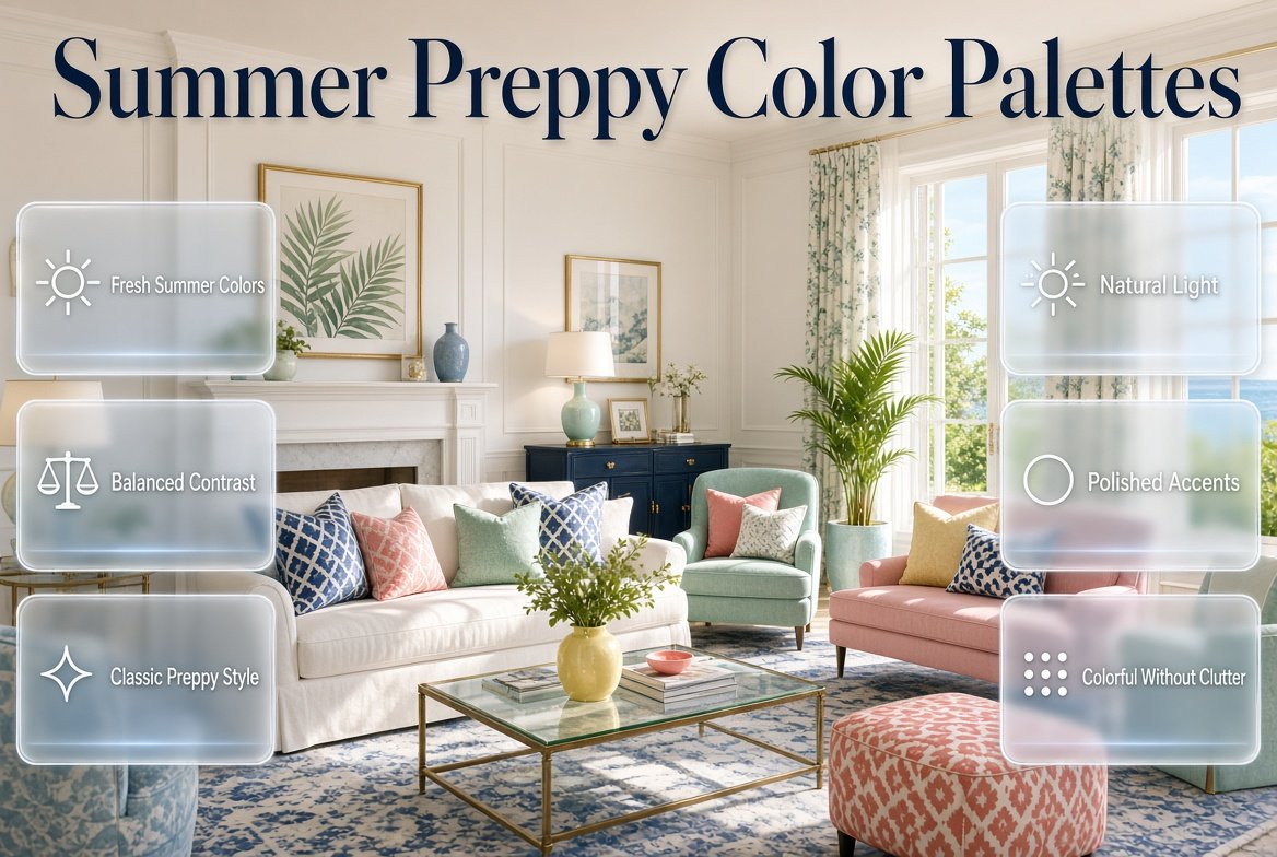
Preppy style already has a strong foundation of classic colors, tailored patterns, polished details, and balanced contrast. Summer simply gives those elements a lighter and fresher direction. Instead of abandoning the traditional character of preppy design, you can introduce powder blue, crisp white, soft green, pale yellow, blush, coral, mint, aqua, and other seasonal shades.
The key is balance.
A successful summer palette should feel fresh without becoming childish, colorful without becoming chaotic, and relaxed without losing the polished quality that makes preppy rooms so appealing.
If you’re building or refreshing a complete preppy interior, the Preppy Room homepage is a useful place to explore the broader style before deciding how your summer color scheme should fit into the room.
In this guide, we’ll look at how summer preppy palettes work, which color combinations are easiest to use, how to match them with furniture and patterns, how natural light changes colors, and how to avoid the common mistakes that make colorful rooms feel disconnected.
What Are Summer Preppy Color Palettes?
Summer preppy color palettes are seasonal color combinations that bring lighter, brighter, softer, or more refreshing shades into a classic preppy interior. They often combine traditional colors such as navy, white, and green with summer-inspired shades such as powder blue, mint, blush pink, pale yellow, coral, aqua, lavender, or soft turquoise.
The important point is that summer preppy design isn’t simply about using bright colors.
It is about using seasonal colors within a structured preppy framework.
For example, a room could use:
- White as the main background
- Powder blue as the supporting color
- Navy as the classic anchor
- Coral as a small accent
Another room could use:
- Cream as the dominant neutral
- Sage green as the main color
- Soft pink as an accent
- Navy through small patterns
Both rooms can feel completely different while still following the same basic design principle.
Summer 2026 interior discussions are also showing interest in both soft seasonal colors and richer nature-inspired shades, including pale yellows, pistachio-like greens, blue-greens, and warm neutrals.
That makes summer a particularly useful season for experimenting with a preppy palette that is colorful but still sophisticated.
Why Do Summer Preppy Colors Work So Well?
Summer preppy colors work because they combine freshness with structure.
Very soft palettes can sometimes make a room feel flat. Extremely bright palettes can become visually tiring. Traditional preppy colors solve part of this problem by introducing contrast.
Navy can ground pale blue.
Cream can soften green.
White can give coral more breathing room.
Natural wood can warm cool colors.
A carefully chosen darker shade can therefore make lighter summer colors feel more intentional.
The basic formula
A useful starting formula is:
Dominant color + supporting color + classic anchor + small accent
For example:
White + powder blue + navy + coral
Or:
Cream + sage + navy + blush
You don’t have to follow a strict percentage formula. The purpose is simply to prevent every color from becoming equally important.
Why proportion matters
Imagine a room containing:
- Bright yellow curtains
- Coral bedding
- Navy furniture
- Green cushions
- Pink artwork
- Blue rug
- Patterned walls
Every individual item might look attractive.
Together, however, they may compete for attention.
Now imagine the same room with:
- White walls
- Light blue bedding
- Navy chair
- Small yellow cushions
- One coral artwork
The colors are still there, but they have hierarchy.
That hierarchy is what makes a colorful preppy room feel designed rather than randomly decorated.
How Do You Choose a Summer Preppy Color Palette?
Choosing colors becomes easier when you stop thinking about individual colors and start thinking about relationships between colors.
Before buying paint, bedding, curtains, or accessories, examine the room itself.
Look at:
- Natural light
- Flooring
- Existing furniture
- Wall color
- Wood tone
- Metal finishes
- Room size
- Existing patterns
- Overall mood
Then decide what needs to change.
Step 1: Choose the Foundation
Your foundation should usually be the least aggressive color.
Good choices include:
- White
- Warm white
- Ivory
- Cream
- Pale beige
- Very light blue
A light foundation gives you flexibility.
For example, white walls can support navy, mint, yellow, pink, green, and coral without forcing you to redesign the room every time you change an accent.
Step 2: Choose the Preppy Anchor
The anchor gives the palette its classic character.
Popular choices include:
- Navy
- Deep green
- Forest green
- Dark blue
- Burgundy
- Deep teal
Navy is particularly versatile because it can make an otherwise soft palette feel more structured.
Step 3: Select a Summer Accent
Now introduce the seasonal personality.
Possible accents include:
- Coral
- Pale yellow
- Blush
- Mint
- Aqua
- Lavender
- Soft turquoise
- Pistachio
- Light green
Don’t automatically choose three or four accents.
Start with one.
If the room feels too plain afterward, add another small accent.
Step 4: Repeat the Colors
Color repetition creates connection.
If you use powder blue on the bedding, repeat it somewhere else.
It could appear in:
- Artwork
- Curtains
- Cushions
- A rug
- Books
- Decorative objects
The repeated color doesn’t need to be identical. Similar shades can still create a visual relationship.
What Are the Best Summer Preppy Color Combinations?
There is no single perfect summer palette because different rooms need different levels of contrast.
Here are some practical combinations to consider.
1. Navy, White, and Powder Blue
This is one of the safest starting points for a classic summer preppy room.
White keeps the space crisp.
Powder blue creates softness.
Navy provides contrast.
You could use:
- White walls
- Powder blue bedding
- Navy pillows
- Navy-and-white striped curtains
- Light wood furniture
- Brass accessories
This combination works especially well in bedrooms, study rooms, and coastal-inspired interiors.
Why it works
The three colors already have a natural visual hierarchy.
White is light.
Powder blue is soft.
Navy is strong.
That makes it easy to control the room.
2. White, Pale Yellow, and Navy
Pale yellow can introduce a sunny summer feeling without requiring an extremely bright yellow.
Try:
- White walls
- Navy furniture
- Pale yellow cushions
- Cream curtains
- Blue-and-white artwork
This works particularly well in rooms that don’t receive a lot of warm natural light.
Pale yellow can also work beautifully with traditional furniture because it adds freshness without making the room look overly modern.
Common mistake
Using a highly saturated yellow across too many large surfaces can make the room visually intense.
For most preppy spaces, a softer yellow is easier to live with.
3. Mint, Cream, and Soft Pink
This is a gentle and cheerful summer combination.
Mint creates freshness.
Cream adds warmth.
Soft pink introduces personality.
It can work particularly well for:
- Bedrooms
- Dressing areas
- Reading corners
- Small study spaces
Try keeping cream or ivory dominant.
Then use mint across medium-sized pieces and pink through smaller accents.
For example:
Cream walls → mint bedding → pink cushions → light wood furniture
The result feels colorful without requiring every surface to carry a strong shade.
4. Sage, Ivory, and Powder Blue
For a calmer interpretation of summer preppy style, sage is an excellent choice.
Sage is softer than many saturated greens, so it can introduce color without overwhelming the room.
Use:
- Ivory walls
- Sage curtains
- Powder blue cushions
- Natural wood
- Navy artwork
The addition of navy is optional.
Without navy, the palette feels softer.
With navy, it becomes more traditionally preppy.
5. Coral, Cream, and Powder Blue
Coral can be beautiful in summer interiors, but it usually works better as an accent.
Combine it with:
- Cream
- Powder blue
- White
- Navy
For example:
- Cream walls
- Powder blue bedding
- Coral cushions
- Navy patterned artwork
The cool blue tones control the warmth of coral.
Cream keeps the overall palette soft.
6. Lavender, White, and Navy

Lavender can give traditional preppy design a softer and more contemporary direction.
White creates space around the color.
Navy brings back the classic contrast.
Try:
- White walls
- Lavender bedding
- Navy cushions
- Light wood furniture
- Small brass details
Keep lavender relatively consistent throughout the room instead of introducing several unrelated purple shades.
7. Aqua, White, and Coral
This combination is more energetic.
Aqua provides a fresh blue-green quality while coral introduces warmth.
Because both can be noticeable colors, white should occupy plenty of visual space.
This is especially suitable for:
- Playful bedrooms
- Summer guest rooms
- Creative spaces
- Youthful interiors
If the combination feels too bright, replace coral with blush or dusty pink.
8. Blush, Blue, and Cream
Blush pink and blue are classic partners, but cream can make the combination feel more refined.
Use:
- Cream walls
- Light blue bedding
- Blush cushions
- Navy pattern details
The result is softer than a navy-and-white palette but still has enough contrast to avoid looking washed out.
9. Pistachio, Cream, and Navy
Pistachio provides a fresher alternative to traditional green.
Current summer design coverage has highlighted pistachio and other nature-inspired greens as seasonal choices that can provide both energy and calm depending on their tone and use.
For a preppy interpretation:
- Cream walls
- Pistachio chair
- Navy cushion
- Light wood furniture
- Small floral patterns
The navy is important because it gives the lighter green a stronger traditional anchor.
10. Light Blue, White, and Lemon Yellow
This is a clean and cheerful combination.
Use light blue as the supporting color and lemon yellow as a smaller accent.
For example:
- White walls
- Light blue bedding
- Lemon yellow cushions
- Navy picture frames
- Natural wood furniture
The palette works especially well when the room already has plenty of daylight.
How Many Colors Should a Summer Preppy Room Have?
There is no universal number, but three to four clearly related colors are usually easier to control than a room containing many unrelated shades.
A practical structure is:
Dominant
The color that occupies the most visual space.
Examples:
- White
- Cream
- Light blue
- Sage
Supporting
The color that gives the room personality.
Examples:
- Powder blue
- Mint
- Pink
- Pale yellow
Anchor
The stronger shade that adds contrast.
Examples:
- Navy
- Forest green
- Deep teal
Accent
The smallest color.
Examples:
- Coral
- Yellow
- Blush
- Brass
You don’t need all four roles in every room.
Sometimes three colors are enough.
How Should You Distribute Colors Across the Room?
Color selection is only one part of the process.
Distribution can completely change how the same palette feels.
A useful approach is to think in terms of visual size.
Large Surfaces
Large surfaces include:
- Walls
- Flooring
- Curtains
- Bedding
- Large rugs
These should generally use the calmer or dominant colors.
Medium Elements
Medium elements include:
- Chairs
- Pillows
- Throws
- Artwork
- Accent furniture
These are ideal for supporting colors.
Small Elements
Small elements include:
- Vases
- Books
- Lamps
- Decorative objects
- Small picture frames
These are excellent places for stronger accent colors.
Example
Imagine:
White + navy + powder blue + coral
You could distribute it as:
- White walls
- Powder blue bedding
- Navy chair
- Coral cushion
- Navy picture frames
- White curtains
This creates repetition without making coral dominate the room.
For a warm and sophisticated seasonal update, explore these fall preppy color combinations for practical ideas on pairing rich autumn shades with classic neutrals and refined preppy accents.
How Do You Use Summer Preppy Colors in a Bedroom?
Bedrooms are one of the easiest places to experiment with seasonal color because many elements can be changed without replacing permanent furniture.
Start with the bed because it is often the visual focus.
For a classic summer look:
- White bedding
- Powder blue quilt
- Navy cushions
- Small coral accent pillow
- Light wood nightstand
- White or cream curtains
For a softer palette:
- Cream bedding
- Sage throw
- Blush cushions
- Ivory curtains
- Light blue artwork
For a more traditional palette:
- White bedding
- Navy headboard
- Blue-and-white stripes
- Pale yellow accent
- Brass lighting
Professional approach
Don’t try to make every item colorful.
If your bedding already contains three colors, keep the surrounding accessories quieter.
That allows the pattern to remain the focal point.
How Can You Use Summer Preppy Colors in a Study Room?
Study rooms need enough visual personality to feel welcoming, but too many competing colors can make the space feel busy.
A good approach is:
Neutral background + calm color + stronger small accent
For example:
- Cream walls
- Pale blue desk chair
- Navy desk accessories
- Sage artwork
- Light wood desk
Another option:
- White walls
- Navy chair
- Pale yellow lamp
- Powder blue storage
- Natural wood desk
The furniture should generally provide structure while accessories carry the seasonal colors.
What Colors Work Best in Small Rooms?
Small rooms can absolutely use color.
The key is not to avoid color altogether but to manage contrast.
Lighter shades such as:
- White
- Ivory
- Cream
- Powder blue
- Pale green
- Soft yellow
can create a more open visual background.
Then add stronger colors through smaller elements.
For example:
Small room palette
- White walls
- Cream curtains
- Powder blue bedding
- Navy cushions
- Coral artwork
This gives the room color without allowing the darkest shade to dominate.
Quick Tip
If your room already feels visually crowded, don’t add another color to fix it.
Remove one.
Editing is often more effective than adding.
How Does Natural Light Affect Summer Preppy Colors?
Natural light can significantly change how colors appear.
A color that looks soft in the morning may look stronger in afternoon sunlight.
A room with cooler natural light can also make blue and green shades appear more pronounced.
This is why looking at color samples only under artificial lighting can be misleading.
For Bright Rooms
You can generally experiment with stronger accents.
Try:
- Navy
- Forest green
- Coral
- Deeper blue
- Richer pink
For Darker Rooms
Lighter and warmer colors may be easier to work with.
Try:
- Cream
- Ivory
- Pale yellow
- Soft pink
- Light blue
- Warm white
Expert Tip
Test your palette at different times of the day.
Look at it:
- In morning light
- Around midday
- In late afternoon
- Under evening lighting
The room should still feel balanced rather than perfect for only one moment.
How Can You Make Summer Colors Look More Preppy?
Color alone doesn’t create the preppy aesthetic.
Patterns, furniture shapes, textiles, and decorative details also contribute to the overall appearance.
Classic preppy patterns include:
- Stripes
- Checks
- Gingham
- Plaid
- Florals
- Geometric patterns
For example, a powder blue room can feel very different depending on whether you add:
- Modern abstract artwork
or:
- Navy-and-white striped cushions
- Traditional framed prints
- Gingham bedding
The second combination immediately creates a stronger preppy identity.
How Should You Layer Patterns With Summer Colors?
Pattern layering is one of the easiest ways to add personality, but it requires some discipline.
A useful approach is to vary the scale.
Large Pattern
Use one larger pattern on:
- Rug
- Wallpaper
- Curtains
- Large bedding
Medium Pattern
Use a medium-scale print on:
- Chair
- Throw
- Cushion
Small Pattern
Use smaller details on:
- Decorative pillows
- Small accessories
- Artwork
The colors should still relate.
For example:
Navy + powder blue + white
could appear in:
- Large blue floral bedding
- Medium navy stripe
- Small blue geometric cushion
The patterns don’t have to be identical.
They simply need a shared color relationship.
How Can You Use Neutrals in Summer Preppy Palettes?
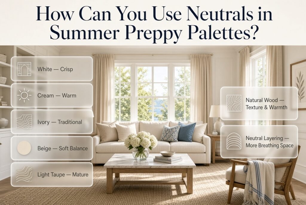
Neutrals are extremely important because they create visual breathing space.
Popular choices include:
- White
- Cream
- Ivory
- Beige
- Light taupe
- Natural wood
White produces a crisp appearance.
Cream feels warmer.
Ivory can create a softer traditional look.
Natural wood adds texture and warmth.
A room containing several colorful shades can often become more sophisticated simply by increasing the amount of neutral space.
Current 2026 design coverage also points toward warmer, nature-inspired neutrals such as cream, mushroom, taupe, and earthy tones alongside stronger seasonal colors.
That makes neutral layering particularly useful when you want a summer palette that feels mature rather than overly bright.
How Do You Match Summer Colors With Wood Furniture?
Furniture finish can influence the entire palette.
Light Wood
Light wood works well with:
- Mint
- Powder blue
- Blush
- Cream
- Pale yellow
- Sage
It creates a relaxed and airy feeling.
Medium Wood
Medium wood provides more warmth.
It works well with:
- Navy
- Cream
- Sage
- Pale yellow
- Coral
Dark Wood
Dark wood creates stronger contrast.
Try:
- White
- Ivory
- Powder blue
- Pale yellow
- Soft green
If dark furniture and dark colors are both used heavily, make sure enough light color remains visible elsewhere.
How Do You Modernize a Traditional Summer Preppy Palette?
You don’t have to abandon classic preppy colors to make the room feel current.
Instead, soften the composition.
For example:
Traditional
Navy + bright white + red
More relaxed
Navy + warm ivory + muted coral + natural wood
Or:
Traditional
Green + cream + navy
More contemporary
Sage + warm ivory + light wood + muted navy
The concept remains preppy, but the overall combination feels less rigid.
This approach is especially useful if you want a room that won’t feel tied to one particular decorating trend.
How Do You Create a Multicolor Summer Preppy Room Without Making It Busy?
Multicolor rooms require more planning because every additional shade introduces another visual relationship.
A useful strategy is to select colors that already appear together naturally.
For example:
Cream + navy + powder blue + sage + blush
These colors can work because they contain different levels of visual intensity.
Cream provides the background.
Powder blue and sage provide softness.
Navy adds structure.
Blush introduces warmth.
This is much easier to manage than combining five highly saturated colors.
If you want to explore the broader principles behind combining several colors, Multicolor Preppy Palettes is a natural next step because it focuses specifically on creating coordinated multicolor rooms.
How Can You Refresh an Existing Room for Summer?
You don’t need to completely redesign your room.
Start with the elements that are easiest to replace.
Summer Refresh Checklist
1. Change Heavy Textiles
Replace thick blankets with lighter throws.
2. Introduce a Seasonal Accent
Try:
- Mint
- Powder blue
- Pale yellow
- Blush
- Coral
3. Brighten the Background
If possible, use lighter curtains or bedding.
4. Reduce Dark Accessories
You don’t have to remove navy completely.
Simply reduce the amount if the room feels heavy.
5. Add Pattern Carefully
A single stripe or floral print can change the atmosphere significantly.
6. Edit Decorative Objects
Remove pieces that no longer support the palette.
This last step is often overlooked.
A room can have beautiful furniture and still feel visually messy because too many small objects compete with the main color story.
How Do Seasonal Preppy Palettes Change From Spring to Summer?
Spring and summer can overlap, but the visual emphasis can change.
Spring palettes often lean toward:
- Soft pink
- Lavender
- Fresh green
- Pale blue
- Cream
Summer can introduce:
- Brighter blue
- Crisp white
- Aqua
- Coral
- Pale yellow
- Fresh green
- Stronger navy contrast
The transition doesn’t require changing everything.
You can keep:
Cream + navy + light wood
and simply replace:
Spring pink + lavender
with:
Summer blue + pale yellow
For a broader understanding of how seasonal colors can be planned throughout the year, see Seasonal Preppy Color Palettes.
What Are the Biggest Mistakes With Summer Preppy Color Palettes?
Using Too Many Bright Colors
Why it happens
Summer is associated with energy and bright colors.
It can be tempting to use every shade you like.
Why it causes problems
When multiple strong colors compete equally, the room loses hierarchy.
Better approach
Choose one main accent.
Then introduce stronger colors in smaller quantities.
Making Every Color Equal
Why it happens
You may want every favorite color to be visible.
Why it causes problems
The eye doesn’t know where to rest.
Better approach
Choose:
- One dominant color
- One supporting color
- One anchor
- Optional small accent
Ignoring Undertones
Two whites may look completely different.
One can be cool and crisp.
Another can be warm and creamy.
The same issue occurs with:
- Greens
- Blues
- Pinks
- Yellows
If your cream has warm undertones and your blue has an extremely cool appearance, the combination may feel less connected than expected.
Choosing Colors Without Considering Furniture
A palette can look beautiful online but fail in the actual room.
Always consider:
- Wood
- Upholstery
- Flooring
- Existing rugs
- Metal finishes
before selecting new colors.
Using Too Much Navy
Navy is one of the strongest preppy colors, but more isn’t always better.
If your room already has:
- Navy bed
- Navy curtains
- Navy rug
- Navy chair
- Navy cushions
then adding more navy may reduce the lightness you wanted from a summer palette.
Use navy strategically.
Choosing Trends Instead of the Room
A trending color isn’t automatically right for your space.
Summer 2026 design coverage includes both soft seasonal shades and deeper earthy colors, showing that there isn’t one universal summer direction.
Your room’s light, size, furniture, and existing finishes should still guide the final decision.
How Can You Make a Summer Preppy Palette Look Expensive?
A polished room isn’t necessarily the room with the most expensive furniture.
Coordination has a huge impact.
Repeat colors intentionally
If navy appears once, it can feel accidental.
If navy appears in the chair, artwork, and cushion, it feels intentional.
Control patterns
Don’t use five competing large-scale patterns.
Mix:
- One large
- One medium
- One small
Leave breathing space
Empty visual space can make colorful rooms feel more sophisticated.
Use texture
Even a simple color palette becomes more interesting when you combine:
- Cotton
- Linen
- Woven materials
- Wood
- Brass
- Ceramic
- Soft upholstery
Color and texture should work together.
How Can You Choose Colors for Different Preppy Room Styles?
Classic Preppy
Try:
Navy + white + cream + red accent
Keep patterns traditional and structured.
Modern Preppy
Try:
Warm ivory + navy + sage + natural wood
Use cleaner furniture and fewer decorative patterns.
Cute Preppy
Try:
Blush + powder blue + cream + soft pink
Use playful patterns and smaller colorful accents.
Cozy Preppy
Try:
Cream + sage + navy + warm beige
Add layered textiles and warm wood.
Minimal Preppy
Try:
White + navy + one accent color
Keep the number of accessories low.
These directions demonstrate why the same preppy style can adapt to very different personalities.
How Can You Use Summer Colors Without Repainting?
Paint is not the only way to change a room’s palette.
Try changing:
- Bedding
- Pillow covers
- Curtains
- Throws
- Rugs
- Artwork
- Lampshades
- Desk accessories
- Decorative objects
This is particularly useful if you enjoy seasonal decorating.
A neutral room can become:
Summer: White + powder blue + coral
Autumn: Cream + olive + burgundy
Winter: Ivory + navy + deep green
The permanent foundation stays the same.
Only the seasonal layer changes.
How Can You Create a Balanced Color Story?

Think about the room from the doorway.
Instead of looking at individual objects, look at the entire visual composition.
Ask yourself:
Is there a clear dominant color?
If not, increase your neutral foundation.
Is one color unexpectedly overpowering everything?
Reduce it.
Do the colors repeat?
If not, repeat important shades in at least two areas.
Do the patterns support the colors?
If not, simplify one pattern.
Does the room feel too cold?
Add warm cream, wood, blush, pale yellow, or another warm accent.
Does it feel too warm?
Introduce blue, green, white, or another cooler shade.
This process is more useful than simply asking whether two colors “match.”
What Are the Best Summer Preppy Colors for Different Moods?
| Desired Mood | Suggested Palette |
|---|---|
| Fresh | White + powder blue + mint |
| Classic | Navy + white + cream |
| Cheerful | Pale yellow + blue + white |
| Soft | Blush + cream + powder blue |
| Natural | Sage + ivory + light wood |
| Energetic | Aqua + coral + white |
| Elegant | Navy + ivory + muted green |
| Playful | Pink + blue + green + white |
| Calm | Sage + cream + pale blue |
| Coastal | Navy + light blue + white + sand |
Use these as starting points rather than strict rules.
Your lighting and furniture should still influence the final result.
What Are the Best Summer Preppy Colors for Darker Rooms?
Darker rooms usually benefit from lighter colors that prevent the palette from becoming visually heavy.
Consider:
- Warm white
- Cream
- Ivory
- Pale yellow
- Light blue
- Soft mint
You can still use navy or forest green, but use them selectively.
For example:
Cream walls + pale yellow curtains + light blue bedding + navy cushions
This gives the room enough contrast without allowing dark colors to dominate.
What Are the Best Summer Preppy Colors for Bright Rooms?
Bright rooms can usually handle more contrast.
Consider:
- Navy
- Deep green
- Coral
- Stronger blue
- Medium pink
- Richer aqua
However, you still don’t need every color to be intense.
A bright room can actually make saturated colors appear even stronger.
If you’re uncertain, start with a smaller accent area.
How Can You Use Summer Preppy Colors in a Dorm or Small Rental?
If painting isn’t possible, focus on temporary elements.
Use:
- Bedding
- Removable wall art
- Cushions
- Rugs
- Desk accessories
- Curtains
- Storage baskets
A simple dorm palette could be:
White + powder blue + navy + pale yellow
Keep the large foundation neutral because dorm rooms often already contain strong permanent elements such as flooring, furniture, or wall finishes.
How Can You Use Color Without Making the Room Look Childish?
This is especially important when working with pink, yellow, aqua, or pastel colors.
The easiest solution is to combine youthful colors with sophisticated anchors.
For example:
Blush + cream + navy + brass
rather than:
Bright pink + bright yellow + bright blue + bright green
The first palette still feels cheerful but has stronger visual structure.
Furniture style also matters.
Traditional shapes, framed artwork, tailored textiles, and controlled patterns can make lighter colors feel more mature.
How Do You Combine Summer Preppy Colors With Patterns?
Patterns can actually make color coordination easier because one patterned piece can contain several colors at once.
Suppose you find a floral cushion containing:
- Navy
- Powder blue
- Sage
- Coral
- Cream
Instead of adding five unrelated colors, use that cushion as your palette reference.
Pull:
- Cream for the background
- Powder blue for bedding
- Navy for furniture
- Sage for a secondary textile
- Coral for one tiny accent
This creates a connected color story.
The pattern becomes the bridge between the colors.
How Can You Use One Pattern to Build the Whole Palette?
This is one of the easiest professional-looking techniques.
Start with one pattern you genuinely love.
Then identify three colors inside it.
For example:
Floral pattern
- Cream
- Sage
- Powder blue
- Small coral detail
Build the room around those colors.
You don’t have to use all four equally.
Instead:
- Cream → walls
- Powder blue → bedding
- Sage → chair
- Coral → small cushion
This method reduces guesswork because the colors already have a relationship.
How Can You Keep Summer Preppy Decor From Looking Too Seasonal?
If you want the room to work beyond summer, avoid making every element obviously seasonal.
Instead of decorating with only bright tropical colors, use versatile combinations such as:
- Navy
- Cream
- Sage
- Powder blue
- Natural wood
Then add one temporary accent such as coral or yellow.
When summer ends, replace that accent.
This makes seasonal decorating easier and more economical.
What Should You Do If Your Existing Colors Don’t Match?
Don’t immediately replace everything.
First identify the color that creates the biggest problem.
Then ask whether you can connect it to the rest of the room.
For example, suppose you already have:
- Navy furniture
- Cream walls
- Pink bedding
but want to introduce green.
Rather than adding random green objects, introduce a floral print containing:
Navy + pink + sage + cream
Now the new green has a relationship with the existing palette.
This is much more effective than simply adding a green chair because you like the color.
Can Summer Preppy Palettes Be Bold?
Absolutely.
Preppy design doesn’t have to be pale or restrained.
You can create a bolder summer room with:
- Navy
- Coral
- Turquoise
- Pink
- White
The difference between bold and chaotic is structure.
Keep one or two colors dominant.
Use white or cream to create breathing space.
Repeat colors intentionally.
Control the pattern scale.
Bold design becomes much easier when the palette has a clear hierarchy.
What Are Some Sophisticated Summer Preppy Palette Ideas?
If you want something less obviously pastel, try deeper combinations.
Navy + Pistachio + Ivory
Fresh but structured.
Charcoal Navy + Shell Pink + Cream
Soft with stronger contrast.
Olive + Pale Yellow + Ivory
Warm and natural.
Dusty Blue + Terracotta + Cream
A more mature summer direction.
Deep Green + Powder Blue + White
Traditional with a fresh seasonal quality.
Current interior design coverage increasingly highlights combinations where softer seasonal shades are balanced by deeper or earthy anchors, which can help prevent a colorful room from feeling overly decorative.
How Can You Build a Summer Palette From Scratch?
Use this simple process.
Step 1: Photograph the Room
Take a photo from the doorway.
This helps you see the room as one composition.
Step 2: Identify Permanent Colors
Write down:
- Flooring
- Furniture
- Walls
- Curtains
- Existing rugs
Step 3: Choose a Foundation
Pick white, cream, ivory, beige, or pale blue.
Step 4: Select a Preppy Anchor
Choose navy, green, or another deeper shade.
Step 5: Add One Summer Color
Choose:
- Mint
- Coral
- Yellow
- Blush
- Aqua
Step 6: Repeat the Colors
Place each important color in at least two locations.
Step 7: Remove Anything That Doesn’t Belong
Don’t keep an object simply because it is attractive.
Ask whether it supports the palette.
Step 8: Check the Room at Different Times
Look at the colors in different lighting conditions.
This final step can prevent expensive decorating mistakes.
What Are the Most Important Professional Tips?
Pro Tip: Start With What You Already Own
Before buying anything, identify three colors already present in the room.
You may discover that you already have the foundation of a beautiful summer palette.
Expert Tip: Use Dark Colors as Anchors
A small amount of navy or deep green can give several light colors a stronger visual structure.
Quick Tip: Repeat Accent Colors
If coral appears only once, it may look accidental.
Repeat it subtly in artwork, a cushion, or another small object.
Common Mistake: Adding More Colors to Fix a Problem
If a room feels disconnected, adding another shade rarely solves the issue.
First simplify.
Then rebuild the relationships between the existing colors.
How Do Summer Preppy Palettes Compare With Spring Palettes?
Spring and summer can share many colors, but their emphasis is different.
Spring often feels:
- Soft
- Fresh
- Floral
- Pastel
- Light
Summer can feel:
- Crisp
- Airy
- Bright
- Relaxed
- More contrast-driven
For example:
Spring
Lavender + blush + sage + cream
Summer
Powder blue + white + navy + coral
You can also create a transition palette:
Cream + sage + powder blue + soft pink
This can work comfortably from late spring into summer.
For more detailed spring combinations, see Spring Preppy Color Combinations.
What Are the Best Colors for a Summer Preppy Room?
The best summer preppy colors combine the crisp, classic character of traditional preppy design with lighter and fresher seasonal shades. White, navy, powder blue, cream, sage, mint, blush pink, pale yellow, coral, and aqua are particularly versatile. The important part isn’t simply choosing attractive colors; it’s creating a clear hierarchy between dominant, supporting, and accent shades.
For a classic look, navy, white, and powder blue create a timeless foundation. If you prefer something softer, cream, sage, and blush can make the room feel relaxed while still maintaining a polished appearance. Pale yellow and coral are useful when the room needs more warmth and energy.
Useful points:
Use white, cream, or ivory for larger surfaces.
Choose navy or deep green when you need stronger contrast.
Use coral, yellow, or pink mainly as accents.
Powder blue and sage work well when you want a softer summer atmosphere.
Repeat important colors in at least two areas of the room for better coordination.
How Do You Combine Colors for a Balanced Summer Preppy Palette?
A balanced summer preppy palette usually starts with one dominant color, followed by a supporting shade, a darker anchor, and, when needed, a small accent color. This approach prevents the room from becoming visually overwhelming while still allowing several colors to contribute personality.
For example, white can dominate the room, powder blue can become the supporting color, navy can provide contrast, and coral can appear in small decorative details. The colors don’t need to occupy equal amounts of space. In fact, giving every color the same visual weight is one of the easiest ways to make a colorful room feel chaotic.
Useful points:
Start with one dominant color.
Add one supporting color rather than several competing shades.
Use navy, forest green, or another deeper shade as an anchor.
Keep the strongest accent colors on smaller objects.
Repeat colors through textiles, artwork, and accessories.
Leave enough neutral space so the palette can breathe.
What Colors Go Best With Navy in a Summer Preppy Room?
Navy works particularly well with summer colors because it provides a strong classic foundation while allowing lighter shades to stand out. White and powder blue create the most traditional combination, while blush, pale yellow, coral, mint, and sage can make the palette feel more seasonal.
The key is to control how much navy you use. If navy appears on the walls, furniture, bedding, curtains, and accessories simultaneously, it can make a room feel heavier than intended. When used strategically, however, navy can actually make a summer palette look more polished.
Useful points:
Pair navy with white for a crisp classic look.
Add powder blue for a softer blue-on-blue palette.
Use pale yellow to introduce warmth.
Add coral when you want a stronger summer accent.
Combine navy with sage for a more natural appearance.
Use blush with navy when you want a softer and more elegant contrast.
How Can You Make a Summer Preppy Room Look Colorful Without Making It Too Busy?
strength of each color. A room doesn’t become sophisticated simply because it contains many coordinated shades. It becomes sophisticated when those shades have clear roles.
Start with a quiet background such as white, cream, or ivory. Add one main seasonal color, such as powder blue or sage, then introduce navy or another deeper shade for structure. If you want additional color, use a small amount of coral, pink, or yellow through accessories and patterns.
Patterns should also be controlled. Instead of using several large competing prints, combine one larger pattern with smaller supporting patterns that share at least one or two colors.
Useful points:
Keep large surfaces relatively calm.
Use stronger colors on smaller or medium-sized pieces.
Avoid giving every color equal visual importance.
Repeat colors rather than constantly introducing new ones.
Mix pattern sizes instead of using several large patterns.
Use white, cream, or natural wood to create visual breathing space.
What Are the Best Summer Preppy Color Combinations for Small Rooms?
Small rooms usually benefit from a lighter dominant color combined with carefully controlled darker accents. White, cream, ivory, powder blue, soft mint, and pale yellow can create a visually open foundation, while navy, sage, or another deeper color can provide contrast without taking over the room.
A particularly practical combination is white, powder blue, and navy. White keeps the background light, powder blue adds personality, and navy creates the traditional preppy contrast. Another softer option is cream, mint, and blush, especially when you want the room to feel warm and relaxed.
Instead of using a dark color across large surfaces, introduce it through cushions, artwork, a chair, bedding details, or decorative accessories. This preserves contrast while keeping the room visually lighter.
Useful points:
Keep walls and large surfaces light when possible.
Use darker colors as accents rather than the main background.
Choose patterns with some light or neutral space.
Avoid filling every wall or surface with decoration.
Use mirrors and reflective finishes to increase the sense of openness.
Repeat one or two colors so the small room feels coordinated rather than crowded.
Conclusion
Summer preppy color palettes are all about creating a room that feels fresh, cheerful, polished, and easy to live in. The best palettes do not depend on using as many colors as possible. Instead, they combine a clear foundation with a few well-chosen accent shades that create personality without making the space feel overwhelming.
Classic combinations such as navy and white remain timeless, while powder blue, mint, soft pink, pale yellow, coral, lavender, and sage can bring a lighter seasonal character to the room. The key is to consider how colors work together with natural light, furniture, patterns, textiles, and the overall size of the space.
For a more coordinated approach, explore our Preppy Room ideas and discover additional inspiration for classic, modern, colorful, and comfortable interiors. You can also explore Seasonal Preppy Color Palettes when you want to adapt your color scheme throughout the year.
Whether you prefer a traditional navy-and-white look or a softer combination of pastels and cheerful accents, a thoughtful summer palette can make your room feel brighter and more welcoming while keeping the unmistakable character of preppy design. Start with two or three main colors, balance them with neutrals, and add patterns or decorative accents gradually. That simple approach can help you create a summer-inspired preppy room that feels stylish, balanced, and genuinely personal.