Introduction
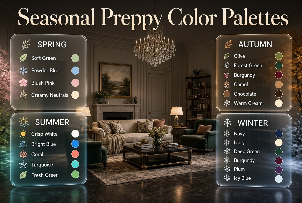
Seasonal Preppy Color Palettes | A preppy room can look polished and inviting throughout the year, but using exactly the same colors in every season can eventually make the space feel predictable. The good news is that you don’t need to repaint the walls, replace your furniture, or completely redesign the room every few months. A carefully planned seasonal preppy color palette can change the mood of your space while keeping its classic personality intact.
Spring may call for soft greens, powder blues, blush pinks, and creamy neutrals. Summer can introduce brighter blues, crisp whites, coral, turquoise, or fresh green. As autumn arrives, richer shades such as olive, forest green, burgundy, camel, chocolate, and warm cream can add depth. Winter naturally creates opportunities for navy, ivory, deep green, burgundy, plum, and icy blue.
The important part is knowing how to change colors without losing balance.
If you’re building a complete preppy decorating style, Preppy Room homepage is a useful starting point for exploring different preppy room styles and decorating approaches.
In this guide, you’ll learn how to create seasonal preppy color palettes for all four seasons, how to combine colors professionally, which shades work best in bedrooms and living rooms, how to transition between seasons, how to use patterns and textures, and which mistakes can make seasonal decorating look cluttered or overly themed.
What Are Seasonal Preppy Color Palettes?
Seasonal preppy color palettes are coordinated groups of colors used to give a room a different seasonal mood while preserving the room’s overall preppy design identity.
The idea isn’t to completely change your room every season. Instead, you maintain a reliable foundation and make smaller changes to accent colors, textiles, patterns, artwork, and accessories.
For example, a room might keep:
- Cream walls
- Light wood furniture
- Navy accents
- Classic striped patterns
- Traditional artwork
Throughout the year, the supporting colors can change.
In spring, navy might be paired with sage and blush.
In summer, the same navy could be combined with crisp white and coral.
In fall, navy can work with camel and burgundy.
In winter, navy can become richer when combined with ivory and forest green.
This approach makes seasonal decorating much easier because you’re not starting from zero every few months.
Why Does Seasonal Color Work So Well With Preppy Style?
Preppy interiors already have a strong relationship with color. Traditional combinations such as navy and white, pink and green, blue and cream, or red and navy create a foundation that can be adjusted without losing the style.
Preppy rooms also commonly use patterns such as:
- Stripes
- Plaid
- Gingham
- Checks
- Florals
- Geometric prints
- Traditional motifs
These patterns make it easier to introduce several shades without making the room feel random.
The secret is repetition.
If sage green appears in a pillow, repeating it in artwork or a small decorative object makes the color feel intentional. If burgundy appears in a fall throw, repeating a small amount of burgundy in a patterned cushion or framed artwork creates visual connection.
Seasonal Decorating Is About Adjustment, Not Replacement
One of the biggest advantages of a seasonal palette is flexibility.
You can keep expensive or permanent elements unchanged while updating inexpensive details.
For example:
Permanent foundation
- Walls
- Flooring
- Sofa
- Bed
- Main furniture
- Large rug
Seasonal layer
- Pillow covers
- Throws
- Bedding
- Small artwork
- Flowers
- Decorative objects
- Table accessories
This makes seasonal decorating practical rather than expensive.
How Do You Build a Seasonal Preppy Color Palette?
A successful palette normally needs three levels of color:
Dominant color + supporting color + accent color
A neutral can then act as the visual bridge between them.
For example:
Cream + sage + powder blue + blush
Cream provides the foundation.
Sage provides the main seasonal character.
Powder blue supports the palette.
Blush adds a small amount of warmth.
You don’t need to use all four colors equally.
Choose a Dominant Color
Start with the shade that should be easiest to notice.
Examples include:
- Sage green in spring
- Navy or turquoise in summer
- Forest green in fall
- Burgundy or navy in winter
Choose a Supporting Color
The supporting color should complement the dominant shade without competing with it.
For example:
Forest green + camel
works because the warm neutral helps soften the depth of the green.
Add a Small Accent
Your accent should usually occupy the least amount of visual space.
Examples:
- Blush pillow
- Coral vase
- Burgundy artwork
- Pale yellow flowers
Small accents can have a surprisingly strong effect.
The Role of Neutrals in Seasonal Preppy Rooms
Neutrals are often what make colorful rooms feel sophisticated.
Without enough neutral space, several strong colors can compete for attention.
Useful preppy neutrals include:
- Warm white
- Cream
- Ivory
- Beige
- Soft gray
- Light taupe
- Natural wood
- Dark brown
Cream is particularly versatile because it works with both soft pastel colors and deeper autumn or winter shades.
Crisp white can create a cleaner, brighter summer appearance, while ivory and warm beige often work beautifully with fall and winter palettes.
Pro Tip: If your seasonal colors are becoming difficult to control, don’t immediately remove the colors. First increase the amount of your neutral foundation.
For a bright and refreshing seasonal look, explore these summer preppy color palettes for practical ideas on combining crisp neutrals, lively accents, and airy shades in a polished preppy room.
Spring Preppy Color Palettes
Spring is naturally associated with freshness, renewal, and lighter visual weight. That makes it one of the easiest seasons to interpret through preppy color.
Soft pastels are an obvious choice, but spring doesn’t have to mean an entirely pastel room.
Current spring color discussions continue to include fresh greens, soft blues, lighter pastels, and more saturated accents, so you can choose between a delicate or more energetic interpretation.
For a fresh and cheerful seasonal update, explore these spring preppy color combinations for practical ideas on pairing soft pastels, crisp neutrals, and lively accent shades in a cohesive preppy room.
What Are the Best Spring Preppy Colors?
Strong options include:
- Sage green
- Mint green
- Powder blue
- Blush pink
- Lavender
- Pale yellow
- Soft peach
- Cream
- Light coral
A particularly balanced combination is:
Sage + powder blue + blush + cream
This palette feels colorful but remains calm.
Spring Palette 1: Sage, Blush, and Cream
This combination is excellent for bedrooms and reading spaces.
Use:
- Cream as the foundation
- Sage on cushions or a chair
- Blush in small decorative details
- Natural wood to add warmth
The result is soft without becoming overly feminine or childish.
Spring Palette 2: Powder Blue, Lavender, and White
This palette creates a cooler spring appearance.
Try:
- White walls
- Powder-blue bedding
- Lavender artwork
- Pale blue curtains
- Small green accents
The white foundation gives the colors room to breathe.
Spring Palette 3: Mint, Pale Yellow, and Cream
This combination feels more cheerful.
Use mint as the dominant color and introduce pale yellow through small accessories.
Don’t cover every surface in yellow.
Instead, let it appear in:
- Flowers
- Artwork
- Books
- Small cushions
- Decorative objects
How Can You Make Pastel Preppy Colors Look Sophisticated?
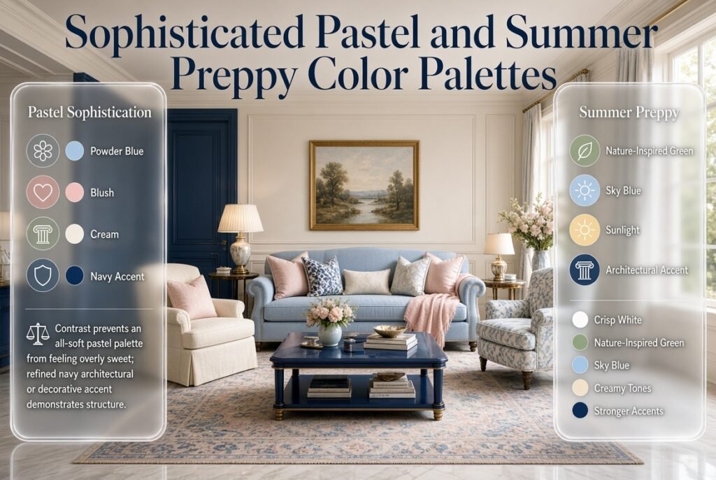
Pastels can sometimes feel too sweet when every element is soft and pale.
The solution is contrast.
Introduce one deeper preppy color such as navy or dark green.
For example:
Powder blue + blush + cream + navy
The navy creates structure and keeps the palette connected to traditional preppy design.
Summer Preppy Color Palettes
Summer gives you more freedom to use bright and energetic colors.
Crisp white is especially useful because it can visually separate strong colors.
Summer 2026 interior color reporting has also highlighted livable combinations built around nature-inspired greens, sky blues, creamy tones, and occasional stronger accents rather than relying only on stereotypical bright summer shades.
What Are the Best Summer Preppy Colors?
Consider:
- Crisp white
- Navy
- Sky blue
- Turquoise
- Coral
- Kelly green
- Seafoam
- Sunny yellow
- Soft aqua
Summer Palette 1: Navy, White, and Coral
This is one of the easiest preppy summer combinations.
Use:
- White as the main foundation
- Navy in furniture or stripes
- Coral in pillows and small accessories
Because navy is a classic preppy color, the room stays recognizable even when the coral becomes more playful.
Summer Palette 2: Turquoise, White, and Pale Yellow
This combination feels lighter and more relaxed.
Try turquoise through:
- Artwork
- Bedding
- Decorative objects
Then use pale yellow sparingly.
Summer Palette 3: Blue, White, and Green
For a more traditional room, use:
Navy + crisp white + fresh green
This palette works particularly well in:
- Study rooms
- Living rooms
- Teen rooms
- Guest rooms
How Do You Prevent Bright Summer Colors From Becoming Too Much?
The easiest method is to control the surface area.
Use bright colors on smaller or medium elements rather than covering every large surface.
For example:
Large surfaces: white and cream
Medium surfaces: navy
Small accents: coral and turquoise
This gives you a colorful room without visual competition.
Common Mistake: Using coral, turquoise, yellow, pink, green, and blue in equal amounts simply because they all feel summery.
Choose a hierarchy instead.
Fall Preppy Color Palettes
Fall is an opportunity to make a preppy room feel deeper, warmer, and more layered.
Instead of relying on bright orange decorations, consider sophisticated earthy colors such as olive, forest green, chocolate, camel, burgundy, rust, and warm cream.
Recent 2026 interior coverage has also emphasized earthy greens, chocolate, caramel, burgundy, and richer natural tones as alternatives to overly literal seasonal decoration.
For a warm and sophisticated seasonal update, explore these fall preppy color combinations for practical ideas on pairing rich autumn shades with classic neutrals and refined preppy accents.
What Are the Best Fall Preppy Colors?
Useful shades include:
- Forest green
- Olive
- Burgundy
- Rust
- Terracotta
- Camel
- Chocolate brown
- Warm beige
- Cream
- Deep navy
Fall Palette 1: Forest Green, Camel, and Cream
This is an excellent sophisticated preppy combination.
Use:
- Cream walls
- Forest-green chair
- Camel throw
- Dark wood accents
The palette becomes warm without feeling overly autumn-themed.
Fall Palette 2: Burgundy, Navy, and Warm Cream
This combination feels traditional and elegant.
Burgundy can appear in:
- Pillows
- Throws
- Artwork
- Small rugs
Navy provides the preppy foundation while cream prevents the combination from becoming too dark.
Fall Palette 3: Olive, Rust, and Beige
This is more earthy.
Use olive as the main accent, rust as a smaller supporting shade, and beige or cream as the foundation.
Natural wood works especially well with this combination.
How Can Texture Strengthen a Fall Color Palette?
Color isn’t the only way to create seasonal atmosphere.
Texture matters enormously.
Consider:
- Wool
- Velvet
- Bouclé
- Linen blends
- Woven baskets
- Textured rugs
- Wood
- Leather details
The same forest green can feel completely different in velvet compared with cotton.
That’s why fall decorating can feel richer even when you haven’t added many new colors.
Winter Preppy Color Palettes
Winter is particularly well suited to traditional preppy colors.
Navy, burgundy, forest green, ivory, deep red, icy blue, and plum can create a sophisticated seasonal palette.
For a cozy and sophisticated seasonal atmosphere, explore these winter preppy color palettes for practical ideas on combining deep winter shades, soft neutrals, and classic preppy accents.
What Are the Best Winter Preppy Colors?
Consider:
- Navy
- Ivory
- Burgundy
- Forest green
- Plum
- Icy blue
- Charcoal
- Deep red
- Soft gray
Winter Palette 1: Navy, Ivory, and Burgundy
This combination is classic and versatile.
Use ivory on large surfaces.
Add navy through:
- Curtains
- Bedding
- Upholstery
Then introduce burgundy through small accents.
Winter Palette 2: Forest Green, Cream, and Brown
This combination feels natural and cozy.
Dark wood can become part of the palette rather than something that needs to be hidden.
Winter Palette 3: Icy Blue, Ivory, and Navy
For a lighter winter room, combine cool blue with ivory and navy.
This works particularly well in bedrooms because the colors remain visually calm.
How Do You Keep Winter Colors From Making a Room Feel Dark?
Use a light foundation.
For example:
Ivory walls + cream bedding + navy accent + burgundy details
rather than:
Navy walls + burgundy bedding + dark brown furniture + forest-green curtains
The second combination may work in a large, naturally bright room, but it can feel heavy in a smaller space.
Seasonal Preppy Color Palette Comparison
| Season | Dominant Colors | Accent Colors | Best Supporting Neutrals |
|---|---|---|---|
| Spring | Sage, powder blue | Blush, lavender | Cream, white |
| Summer | Navy, white | Coral, turquoise | Crisp white |
| Fall | Forest green, olive | Burgundy, rust | Camel, cream |
| Winter | Navy, ivory | Burgundy, forest green | Ivory, gray |
Use this as a starting framework rather than a strict rule.
The best palette depends on your room’s natural light, furniture, flooring, and existing colors.
How Do You Transition From One Season to Another?
A common mistake is treating seasonal changes as four separate decorating projects.
A better method is to create a visual bridge between seasons.
For example:
Spring to Summer
Keep:
- White
- Navy
- Light blue
Replace:
- Blush with coral
- Sage with brighter green
Summer to Fall
Keep:
- Navy
- Cream
Replace:
- Coral with rust
- Turquoise with olive
Fall to Winter
Keep:
- Forest green
- Cream
Replace:
- Rust with burgundy
- Camel with ivory
Winter to Spring
Keep:
- Navy
- Cream
Replace:
- Burgundy with blush
- Forest green with sage
This makes the transition much smoother.
How Do You Create a Year-Round Preppy Base?
If you don’t want to redecorate often, choose a foundation that works with every season.
A strong year-round foundation could include:
- Cream walls
- Light or medium wood
- Navy accents
- Neutral rug
- Classic striped textiles
- White or cream bedding
- Traditional artwork
Then create seasonal changes through accessories.
This strategy also helps when you invest in quality furniture because you don’t need to replace expensive pieces whenever the season changes.
How Should You Use Patterns in Seasonal Preppy Decorating?
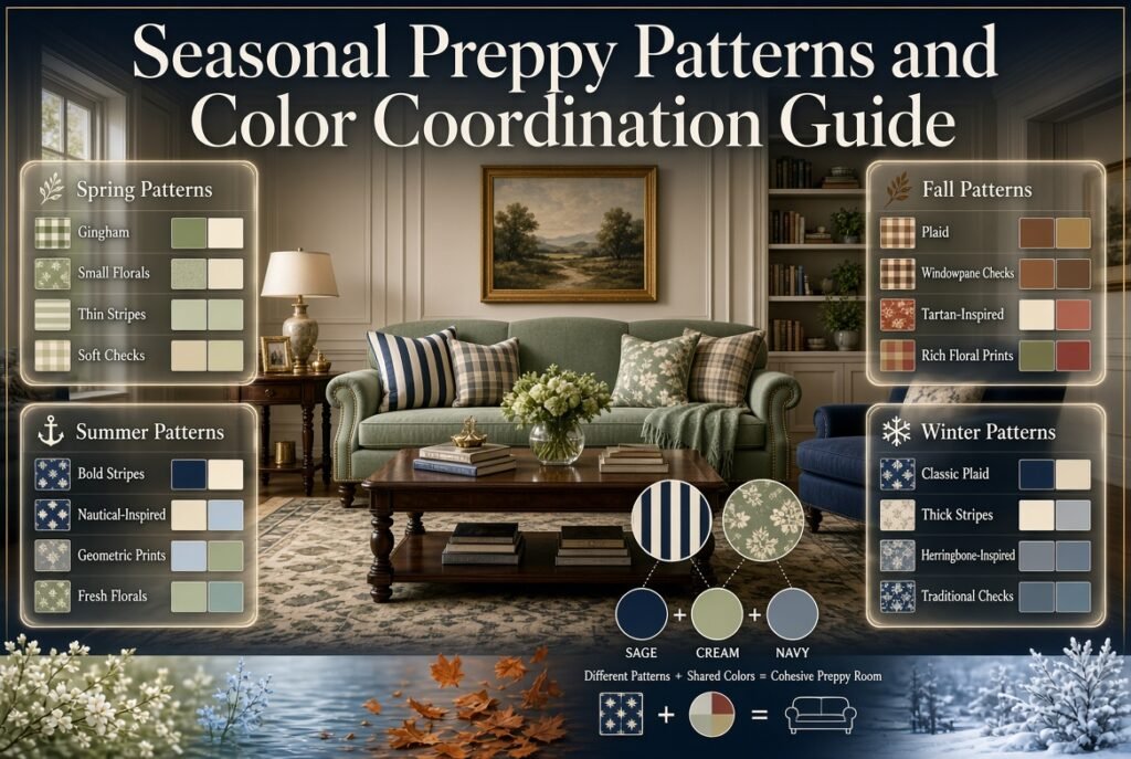
Patterns are one of the easiest ways to strengthen preppy style.
However, patterns should share colors with the rest of the room.
For example, if your palette is:
Sage + cream + navy
you might choose a striped cushion containing navy and cream, then add a floral pillow containing sage and cream.
The patterns are different, but the colors connect them.
Best Preppy Patterns for Spring
Try:
- Gingham
- Small florals
- Thin stripes
- Soft checks
Best Preppy Patterns for Summer
Try:
- Bold stripes
- Nautical-inspired patterns
- Geometric prints
- Fresh florals
Best Preppy Patterns for Fall
Try:
- Plaid
- Windowpane checks
- Tartan-inspired patterns
- Rich floral prints
Best Preppy Patterns for Winter
Try:
- Classic plaid
- Thick stripes
- Herringbone-inspired patterns
- Traditional checks
The pattern doesn’t have to be seasonal itself. Its colors and material can create the seasonal effect.
How Do You Layer Seasonal Colors Across a Room?
Color layering is more effective when you think about the room in levels.
Large Elements
Use your quietest colors on:
- Walls
- Large rugs
- Sofa
- Bed
- Curtains
Medium Elements
Use supporting colors on:
- Chairs
- Bedding
- Pillows
- Throws
- Artwork
Small Elements
Use stronger accents on:
- Vases
- Books
- Decorative objects
- Small frames
- Lamps
- Flowers
This creates depth without making every object compete.
For a more detailed approach to distributing several colors across a room, Layered Color Schemes for Rooms can be useful when planning how colors should move from large surfaces to smaller decorative details.
How Do Seasonal Palettes Work in Different Rooms?
The same seasonal palette doesn’t need to be used identically throughout the house.
Instead, maintain a few connecting colors.
Seasonal Preppy Bedroom
Bedrooms usually benefit from softer colors.
Spring
Sage + blush + cream
Summer
Powder blue + white + navy
Fall
Olive + camel + cream
Winter
Navy + ivory + burgundy
Seasonal Preppy Living Room
Living rooms can handle more contrast.
Spring
Sage + blue + cream
Summer
Navy + coral + white
Fall
Forest green + rust + camel
Winter
Burgundy + navy + ivory
Seasonal Preppy Study Room
A study can support more traditional colors.
Spring
Sage + cream + navy
Summer
Blue + white + yellow
Fall
Olive + brown + burgundy
Winter
Navy + forest green + ivory
How Can You Decorate Seasonally on a Budget?
Seasonal decorating doesn’t require buying an entirely new collection every few months.
Start with the items that are easiest to replace.
Rotate Pillow Covers
Instead of buying four sets of pillows, keep the inserts and change only the covers.
Use Seasonal Throws
One well-chosen throw can introduce a completely different accent color.
Change Small Artwork
Replace one or two prints rather than redesigning the entire gallery wall.
Use Flowers and Greenery
Natural elements are an inexpensive way to reinforce seasonal color.
Rearrange Existing Accessories
Before buying something new, move items between rooms.
You may already have colors that work with your new palette.
Quick Tip: Photograph your room before each seasonal change. When you’re ready to transition again, the photo can help you remember what worked and where specific pieces were placed.
How Do You Make Seasonal Preppy Colors Look More Expensive?
Sophisticated decorating usually comes from consistency rather than simply using expensive objects.
Repeat Important Colors
If you use burgundy once, repeat it.
If sage appears in a pillow, echo it somewhere else.
This creates intentionality.
Control Contrast
Strong contrast can be attractive, but too much contrast everywhere creates visual noise.
Use the strongest contrast in the areas where you want attention.
Mix Textures
Combine:
- Smooth cotton
- Woven materials
- Velvet
- Linen
- Wood
- Metal
- Wool
Different textures allow a simple palette to feel much richer.
Don’t Make Every Object Decorative
A polished room still needs practical objects.
Books, baskets, lamps, trays, and storage can become part of the color story without looking staged.
What Are the Most Common Seasonal Preppy Decorating Mistakes?
Using Every Seasonal Color
Why It Happens
Each season has dozens of attractive colors, so it can be tempting to use all of them.
Why It Doesn’t Work
The eye has nowhere to rest.
Better Approach
Choose one dominant seasonal color, one supporting color, and one small accent.
Changing Too Much
Why It Happens
You want the seasonal update to feel obvious.
Why It Doesn’t Work
The room loses its established identity.
Better Approach
Keep permanent furniture and major surfaces stable.
Making the Room Too Themed
Why It Happens
Seasonal decorating can easily become literal.
Why It Doesn’t Work
The room may feel temporary rather than thoughtfully designed.
Better Approach
Use color, texture, and pattern instead of excessive seasonal symbols.
Ignoring Existing Undertones
Why It Happens
You choose colors from a palette without looking at your furniture or flooring.
Why It Causes Problems
A warm beige sofa may clash with a very cool gray-based palette, for example.
Better Approach
Look at your existing materials first.
Identify whether they feel:
- Warm
- Cool
- Neutral
Then choose seasonal shades that work with them.
Making Every Color Equal
Why It Happens
It seems fair to give every color the same amount of space.
Why It Doesn’t Work
A room needs hierarchy.
Better Approach
Give one color the largest role, another a supporting role, and the accent the smallest role.
How Can You Choose Seasonal Colors Based on Natural Light?
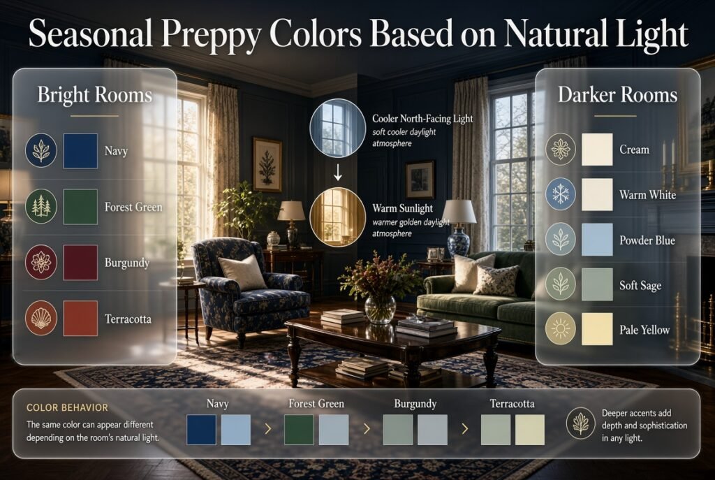
Natural light can change how colors appear.
A north-facing room may feel cooler, while a room receiving strong warm sunlight can make colors appear warmer.
This means a color that looks soft in one room may appear more intense in another.
For Bright Rooms
You can generally handle deeper or richer accent colors more easily.
Try:
- Navy
- Forest green
- Burgundy
- Terracotta
For Darker Rooms
Lighter colors can help maintain visual openness.
Try:
- Cream
- Warm white
- Powder blue
- Soft sage
- Pale yellow
You don’t have to avoid dark colors completely. Use them strategically.
How Can You Use 2026 Color Ideas Without Making Your Room Trend-Dependent?
A useful strategy is to separate timeless colors from trend-driven accents.
Blue remains extremely flexible in current interior color direction, while 2026 color stories also show interest in nature-inspired greens, warmer neutrals, and more expressive combinations.
Instead of painting your entire room in a trend color, use newer shades in:
- One cushion
- A small artwork
- A vase
- A throw
- A decorative chair
- A small rug
This allows you to enjoy current color directions without committing your entire room to a short-lived trend.
Seasonal Preppy Color Ideas for a Small Room
Small rooms benefit from controlled color distribution.
Small Spring Room
Warm white + sage + powder blue + blush
Use white or cream on the largest surfaces.
Small Summer Room
Crisp white + navy + pale blue + coral
Keep coral to small details.
Small Fall Room
Cream + olive + camel + burgundy
Use burgundy sparingly.
Small Winter Room
Ivory + navy + forest green + burgundy
Let ivory dominate the room.
The principle is simple:
The smaller the room, the more carefully you should control strong colors.
Seasonal Preppy Color Ideas for a Teen Bedroom
A preppy teen room can be colorful without becoming childish.
Spring
- Lavender
- Mint
- Cream
- Navy
Summer
- Turquoise
- Coral
- White
- Navy
Fall
- Dusty rose
- Olive
- Cream
- Brown
Winter
- Burgundy
- Blush
- Navy
- Ivory
Patterns can add personality without requiring additional colors.
For example, a navy-and-white stripe can provide structure while floral or gingham accents introduce seasonal personality.
How Do You Know When a Palette Needs Editing?
Sometimes the colors are technically compatible but the room still doesn’t feel right.
Look for these warning signs:
- Your eyes immediately move between too many objects.
- Every cushion has a different color.
- The room feels busier after adding accessories.
- One accent color appears in too many places.
- The seasonal colors don’t connect to the permanent furniture.
- There isn’t enough neutral space.
When this happens, don’t automatically add another color.
Remove something first.
Professional-looking rooms often come from editing.
A Practical Seasonal Color Planning Checklist
Before changing your room, ask:
Foundation
- What colors are already permanent?
- Are the walls warm, cool, or neutral?
- What color is the flooring?
- What color is the main furniture?
Seasonal Direction
- Should the room feel fresh?
- Bright?
- Warm?
- Cozy?
- Rich?
- Calm?
Palette
- What is my dominant color?
- What is my supporting color?
- What is my accent?
- What neutral connects them?
Application
- Which color goes on large surfaces?
- Which color goes on medium pieces?
- Which color stays limited to small accessories?
Final Check
- Are the colors repeated?
- Is there enough neutral space?
- Do the patterns share colors with the palette?
- Does the room still look preppy?
- Does anything feel unnecessary?
What Are the Best Seasonal Preppy Color Palettes for Spring, Summer, Fall, and Winter?
The best seasonal preppy palettes are the ones that reflect the mood of each season while keeping a consistent classic foundation. Instead of completely changing a room, use a few seasonal colors with timeless preppy shades such as navy, white, cream, light blue, or green. This keeps the room coordinated throughout the year while allowing its atmosphere to change naturally.
A practical seasonal approach looks like this:
Spring: Sage green, blush pink, powder blue, lavender, and cream create a fresh and soft appearance.
Summer: Navy, crisp white, coral, turquoise, and bright green give the room a cleaner and more energetic feel.
Fall: Forest green, olive, burgundy, rust, camel, and warm cream add depth and warmth.
Winter: Navy, ivory, burgundy, forest green, icy blue, and plum create a richer and more traditional atmosphere.
The key is not to use every seasonal color at once. Choose one dominant shade, one supporting color, and a smaller accent. This creates the visual hierarchy that makes a colorful preppy room feel intentional rather than cluttered.
How Do You Change a Preppy Room’s Colors for Each Season Without Redecorating the Entire Room?
The easiest way to change a preppy room seasonally is to keep permanent elements neutral and update removable decorative layers. Walls, flooring, major furniture, and large investment pieces can remain the same while pillows, throws, bedding, artwork, flowers, and accessories introduce the new seasonal palette.
For example, a cream-and-navy bedroom can transition through the year without changing its furniture:
Spring: Add sage and blush pillows.
Summer: Replace them with coral and light blue.
Fall: Introduce olive, rust, or burgundy.
Winter: Use forest green, burgundy, and ivory.
This approach is not only more affordable but also creates a more sophisticated result because the room maintains a recognizable design foundation.
Useful seasonal changes include:
Changing pillow covers instead of buying new pillows
Rotating lightweight and heavier throws
Updating bedding accents
Switching small framed artwork
Adding seasonal flowers or greenery
Replacing small decorative objects
The professional approach is to edit the room rather than rebuild it. If the foundation is already well designed, a handful of carefully selected changes can create a completely different seasonal mood.
How Many Colors Should You Use in a Seasonal Preppy Color Palette?
A practical seasonal preppy palette usually works best with two or three main colors plus a neutral foundation. There is no strict rule requiring a specific number, but limiting the main palette helps maintain visual hierarchy and prevents different colors from competing for attention.
A simple formula is:
60% dominant color + 30% supporting color + 10% accent
For example, a fall bedroom might use:
60% cream or warm neutral
30% forest green
10% burgundy
The percentages don’t need to be measured literally. They simply explain how visual weight should be distributed.
You can also use different shades from the same color family. For instance, a spring palette might combine pale blue, medium blue, and navy rather than introducing several unrelated colors.
When working with multiple colors, pay attention to:
Saturation
Brightness
Contrast
Room size
Natural lighting
Existing furniture colors
Pattern density
If the room already contains several colorful patterns, keep the surrounding accessories simpler. A controlled palette generally makes preppy patterns such as stripes, gingham, plaid, and florals look more polished.
How Do You Choose Seasonal Preppy Colors That Work With Existing Furniture and Room Decor?
Start with the colors that are already permanent in the room. Flooring, furniture, countertops, rugs, curtains, and wall colors should be considered before choosing seasonal accents. The goal is to select seasonal shades that complement those existing colors rather than forcing an entirely new palette into the space.
For example, warm wood furniture usually works comfortably with colors such as:
Cream
Camel
Olive
Rust
Forest green
Burgundy
Cooler gray furniture may work more naturally with:
Navy
Powder blue
Sage
Icy blue
Soft gray
Crisp white
Natural lighting also matters. A room with strong warm sunlight can make colors appear warmer, while a darker or cooler room may make some shades appear more subdued.
Before buying seasonal accessories, create a simple color inventory:
Identify your permanent colors.
Decide whether they feel warm, cool, or neutral.
Choose one seasonal dominant color.
Add a supporting shade that complements the existing furniture.
Introduce one small accent.
Remove colors that compete with the main palette.
This approach prevents one of the most common decorating mistakes: choosing a beautiful color combination in isolation that doesn’t actually work with the room you already have.
How Can You Make Seasonal Preppy Color Palettes Look Sophisticated Instead of Overly Themed?
The key to sophisticated seasonal decorating is subtlety. Instead of filling a room with obvious seasonal decorations, communicate the season through color, texture, pattern, and a few carefully selected accessories.
For example, a sophisticated fall preppy room doesn’t need to be filled with pumpkins, orange decorations, or autumn symbols. Forest green, burgundy, camel, warm cream, plaid, wood, and textured fabrics can create the same seasonal feeling in a much more timeless way.
Use these principles:
Keep large surfaces relatively calm.
Limit the number of dominant colors.
Repeat important colors in several locations.
Use classic preppy patterns instead of excessive themed decorations.
Introduce seasonal colors through removable textiles.
Mix textures to add depth.
Leave enough neutral space for the eye to rest.
For instance, a winter palette of navy + ivory + burgundy + forest green can feel elegant when used through bedding, one throw, patterned cushions, and small accessories. The same colors could feel overwhelming if every piece of furniture and decoration uses a different dark shade.
A polished preppy room should still look appropriate after the season has passed. That’s a useful test: if removing two or three seasonal accessories makes the room look completely normal again, your seasonal decorating is probably well controlled.
Conclusion
Creating beautiful seasonal preppy color palettes is less about completely changing your room and more about knowing how to make thoughtful color adjustments throughout the year. A strong preppy foundation gives you the flexibility to introduce fresh seasonal shades while keeping the room classic, coordinated, and personal.
Spring can bring soft sage, blush, powder blue, and cream into the space, while summer can introduce crisp white, navy, coral, turquoise, and brighter greens. Fall creates opportunities for richer colors such as forest green, olive, burgundy, camel, and rust, while winter can move toward navy, ivory, deep green, burgundy, and icy blue.
The most effective approach is to choose a dominant color, add a supporting shade, and use a smaller accent while allowing neutral colors to provide balance. You can then reinforce the palette through stripes, gingham, plaid, florals, artwork, bedding, pillows, throws, and other easily changeable elements.
You don’t need to buy new furniture every season. In many cases, changing a few textiles and accessories is enough to give the room a noticeably different atmosphere. Keep your permanent pieces timeless, repeat your chosen colors throughout the space, and use texture to add depth.
Most importantly, let the season inspire your room without allowing it to take over the design. When seasonal colors are introduced with restraint and intention, your preppy space can feel fresh, comfortable, and beautifully coordinated from spring through winter.