Introduction
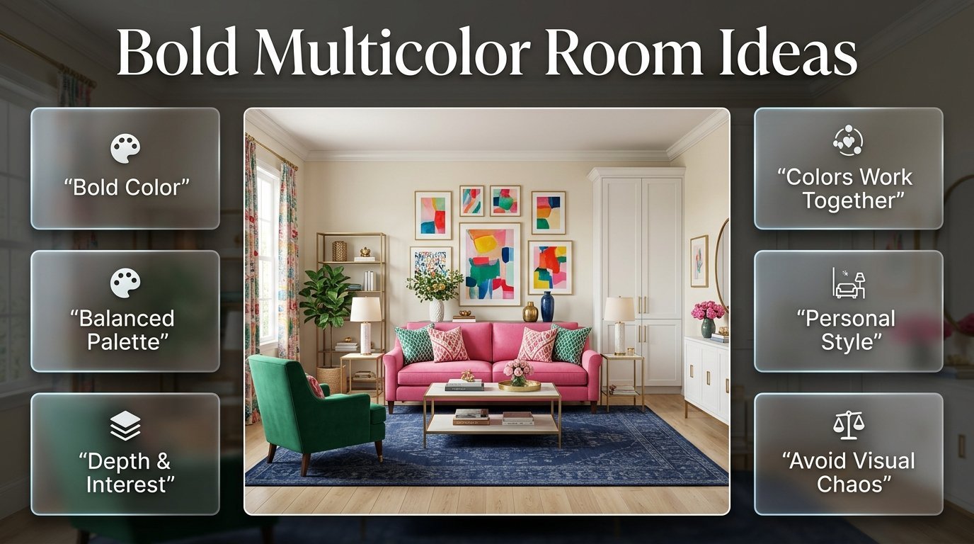
Bold Multicolor Room Ideas | A colorful room can completely change the way a space feels. It can make a bedroom more cheerful, a study more energetic, or a living room feel more personal and expressive. But there’s a fine line between a room that feels intentionally colorful and one that simply has too many unrelated colors competing for attention.
That’s where bold multicolor room ideas become especially useful. Instead of choosing one bright color and stopping there, you can combine several strong shades to create a room with personality, depth, and visual interest. The trick is knowing how to make those colors work together.
If you’re looking for broader inspiration before choosing a specific palette, PreppyRoom offers a useful starting point for exploring colorful, classic, modern, cute, cozy, and minimalist room styles.
In this guide, you’ll learn how to build a bold multicolor palette from scratch, decide which colors should dominate, combine bright and soft shades, coordinate furniture and patterns, decorate bedrooms and living spaces, work with neutral backgrounds, and avoid the common mistakes that make colorful rooms look chaotic.
Most importantly, you’ll learn how to use several colors without making every part of the room compete for attention.
What Are Bold Multicolor Room Ideas?
Bold multicolor room ideas are decorating approaches that use several noticeable colors together rather than relying on a single accent shade. The colors can be bright, deep, pastel, muted, or a mixture of different intensities, but they should have some visual relationship.
The goal isn’t simply to put more colors into a room.
The goal is to create a color hierarchy.
One color may dominate the space. Another may support it. A third might appear only through accessories or artwork. A fourth could be used as a tiny accent that adds contrast.
For example, a room might use:
- Cream as the foundation
- Navy as the dominant color
- Emerald green as the supporting shade
- Pink as a secondary accent
- Coral as a small highlight
- Brass and natural wood as material finishes
That’s a multicolor room, but it doesn’t mean every color has equal importance.
This distinction is what separates an intentionally bold room from a visually confusing one.
Why Does Color Hierarchy Matter?
Imagine walking into a room where the walls are bright blue, the bed is red, the curtains are green, the rug is yellow, the chair is purple, and every accessory introduces another shade.
There may be nothing technically wrong with any individual color.
The problem is that the room has no visual leader.
Your eyes move from one object to another without knowing where to settle.
A stronger approach is to decide which color should be noticed first.
For example:
Cream → Navy → Green → Pink → Small Coral Accents
Now the room has a visual order.
That order makes the room easier to understand.
How Many Colors Should You Use in a Bold Multicolor Room?
There is no universal number that every room must follow. However, starting with three to five main colors is usually easier to control than choosing a completely unrestricted palette.
The important part is not the number of colors.
It’s the amount of each color.
A useful structure is:
| Color role | Purpose | Example |
|---|---|---|
| Foundation | Creates the background | Cream |
| Dominant | Gives the room identity | Navy |
| Supporting | Adds variation | Emerald |
| Accent | Adds personality | Pink |
| Small highlight | Creates contrast | Coral |
You can also use several shades of the same color.
For example, a blue-based room might contain:
- Powder blue
- Sky blue
- Medium blue
- Navy
These don’t necessarily feel like four unrelated colors because they belong to the same color family.
This technique can be especially useful when you’re nervous about mixing too many contrasting shades.
How Do You Choose Colors for a Bold Multicolor Room?
The easiest approach is to begin with something you already love.
Instead of opening a color chart and choosing six shades at random, look around the room.
You may already have:
- A favorite rug
- A patterned duvet
- A colorful chair
- Artwork
- Curtains
- A decorative cushion
- Wallpaper
- A favorite object
Use that item as your starting point.
Choose an Inspiration Piece
Suppose your favorite patterned rug contains:
- Navy
- Cream
- Pink
- Sage green
- Light blue
You don’t need to use all five colors equally.
You could decide:
Cream = foundation
Navy = dominant
Sage = supporting
Pink = accent
Light blue = secondary accent
Now you have a plan.
The rug becomes more than decoration. It becomes the color map for the entire room.
⭐ Expert Tip: When a pattern already contains several colors you love, pull colors from the pattern rather than introducing completely unrelated shades. This is one of the simplest ways to create a cohesive multicolor room.
What Is the Best Color Formula for Bold Rooms?
A useful starting formula is:
Dominant color + supporting color + accent colors + neutral
For example:
Navy + emerald + pink + cream
The dominant color establishes the strongest identity.
The supporting color adds depth.
The accent color creates energy.
The neutral gives your eyes somewhere to rest.
You don’t need to follow a strict percentage rule, but the popular 60-30-10 concept can help you understand visual balance.
You might use approximately:
- 60% cream
- 25% navy
- 10% emerald
- 5% pink
The exact numbers don’t matter.
The principle does.
Your strongest colors don’t necessarily need to cover the largest surfaces.
A small amount of a highly saturated color can attract more attention than a much larger area of a pale shade.
How Can You Make Several Bright Colors Feel Cohesive?
Cohesion usually comes from repetition.
Suppose you’ve chosen:
- Navy
- Pink
- Emerald
- Cream
Don’t put navy only on one wall, pink only on the bed, green only on one chair, and cream everywhere else.
Instead, repeat the colors.
For example:
Navy
- Headboard
- Artwork
- Small cushion
Pink
- Bedding
- Artwork detail
- Small decorative object
Emerald
- Chair
- Cushion
- Plant pot
Cream
- Walls
- Rug
- Larger furniture
Now each color has multiple connections throughout the room.
This makes the palette feel intentional.
Use Color Repetition Instead of Exact Matching
Your navy doesn’t have to be exactly the same navy everywhere.
Likewise, your pink can have slightly different shades.
What matters is the overall relationship.
A room can actually look more sophisticated when colors vary slightly rather than appearing perfectly matched.
For additional ideas around strong color relationships, explore Bold Preppy Color Combinations.
Should You Use Neutral Colors in a Multicolor Room?
Absolutely.
Neutral colors are often what make bold color combinations work.
Useful neutrals include:
- White
- Ivory
- Cream
- Beige
- Warm gray
- Taupe
- Natural wood
Think of neutral space as visual breathing room.
If every wall, piece of furniture, cushion, artwork, and accessory is colorful, the room can become tiring.
But if strong colors are surrounded by calmer surfaces, they become more effective.
For example:
Cream walls + navy bed + green chair + pink cushions + colorful artwork
will usually feel more controlled than:
Blue walls + red bed + green curtains + pink furniture + yellow rug + purple accessories.
Both rooms contain multiple colors.
The difference is hierarchy.
How Can You Use Bold Colors Without Making the Room Feel Chaotic?
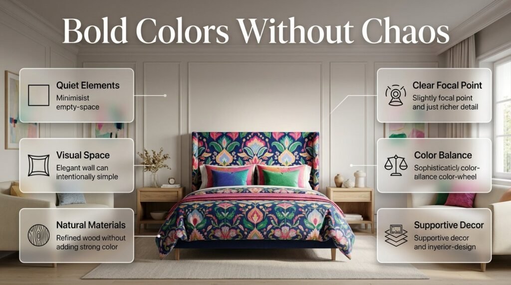
The first step is to stop thinking that every empty area needs another color.
Empty visual space is useful.
A blank wall isn’t necessarily unfinished.
A plain cream sofa isn’t boring just because the cushions are colorful.
A natural wood table doesn’t need to be painted another color to contribute to the design.
In fact, quiet elements can make your bold elements stronger.
Create a Focal Point
Choose one major feature that gets the most attention.
It could be:
- A colorful headboard
- A statement rug
- Large artwork
- A bold accent wall
- A bright chair
- Patterned bedding
Then let the rest of the room support it.
If your bed is already a major visual statement, you may not need another equally dramatic piece directly opposite it.
📌 Quick Tip: Stand at the doorway and look into the room. If several objects immediately compete for attention, choose the one that should be the focal point and reduce visual intensity around it.
What Are Some Bold Multicolor Room Color Combinations?
There are countless combinations, but some are especially flexible.
Navy, Pink, Green, and Cream
This is a versatile combination for preppy-inspired rooms.
Navy provides structure.
Pink adds softness.
Green brings freshness.
Cream keeps the overall palette comfortable.
You can use:
- Cream walls
- Navy furniture
- Green cushions
- Pink bedding
- Multicolor artwork
The combination can feel playful without becoming childish.
Cobalt Blue, Coral, Yellow, and White
This is more energetic.
Cobalt creates strong visual impact.
Coral adds warmth.
Yellow brings brightness.
White gives the palette breathing room.
Because these colors can all be powerful, use at least one large neutral surface.
Emerald, Blush, Terracotta, and Ivory
This combination has a warmer, more sophisticated character.
Emerald provides depth.
Blush softens the palette.
Terracotta introduces warmth.
Ivory prevents the room from becoming too saturated.
This can work particularly well with natural wood furniture.
Red, Navy, Green, and Cream
This combination has a traditional, classic quality.
Use cream as the foundation.
Navy can become the main anchor.
Green can support it.
Red can remain a smaller accent.
If you’re interested in more colorful room inspiration, Bright Preppy Room Colors can help you explore stronger color directions without losing the idea of coordination.
How Can You Use Bright Colors Without Making Them Look Too Harsh?
Brightness isn’t necessarily the problem.
The issue is usually how much brightness is used.
For example, a bright pink cushion can look fantastic against a cream sofa.
But if the sofa, walls, curtains, rug, bed, and furniture are all equally bright, the room may become visually exhausting.
Try balancing saturated shades with softer versions.
Instead of:
- Bright pink
- Bright green
- Bright blue
- Bright yellow
try:
- Deep navy
- Sage
- Dusty pink
- Soft yellow
You still have multiple colors, but their intensity is more varied.
This creates depth.
Can Bold Multicolor Rooms Use Pastel Colors?
Yes.
Bold doesn’t always mean neon or extremely saturated.
A room can feel bold because it uses many distinct colors together, even when the individual colors are relatively soft.
For example:
- Powder blue
- Blush pink
- Sage green
- Lavender
- Cream
This palette can create a colorful room without harsh contrast.
If you want a softer room, use pastel colors across larger areas and introduce one darker shade, such as navy or forest green, for structure.
Why Does a Dark Anchor Help?
Several pale colors can sometimes blend together.
A darker anchor gives the palette definition.
For example:
Cream + blush + sage + powder blue + navy
works because navy gives the lighter shades something to contrast against.
Without a grounding color, the room might feel visually flat.
How Do Patterns Work in Bold Multicolor Rooms?
Patterns can make a colorful room much more interesting.
But they can also be one of the fastest ways to create visual chaos.
The safest approach is to use a hierarchy of pattern sizes.
Try:
Large pattern → Medium pattern → Small pattern → Solid colors
For example:
- Large floral bedding
- Medium striped cushion
- Small gingham pillow
- Solid cream throw
This creates variety without allowing every pattern to compete equally.
Should Different Patterns Match?
They don’t need to match exactly.
They should share something.
That something could be:
- A color
- A similar scale
- A related visual style
- A common background color
For example, navy-and-cream stripes can sit comfortably beside a floral pattern containing navy, cream, and pink.
The patterns are different, but the colors connect them.
How Can You Mix Bold Colors and Patterns?
Start with one dominant pattern.
Then choose supporting patterns that are quieter.
For example:
Main Pattern
Large floral bedding containing navy, pink, green, and cream.
Secondary Pattern
Small navy-and-white stripe cushion.
Supporting Pattern
Tiny green gingham accent.
Solids
Cream blanket and navy chair.
This creates a layered look without turning every object into a statement.
⚠ Common Mistake: Using three or four large-scale patterns in different color combinations. Each pattern may look beautiful individually, but together they can overwhelm the room.
How Should Furniture Work With Bold Multicolor Decor?
Furniture provides structure.
If the room already has colorful accessories and patterns, furniture doesn’t always need to be colorful too.
Useful furniture colors include:
- Cream
- White
- Navy
- Natural wood
- Walnut
- Light oak
- Muted green
A neutral sofa can actually make colorful cushions more noticeable.
A natural wood table can soften a strong blue-and-green palette.
A navy bed can anchor several lighter colors around it.
The goal is to create relationships rather than make every furniture piece compete for attention.
How Can You Create a Bold Multicolor Bedroom?
A bedroom is one of the easiest places to experiment with multicolor design because bedding gives you a large, flexible surface for introducing color.
Start with one major feature.
For example:
Cream walls + navy headboard + colorful bedding + green chair + pink artwork
Then repeat smaller details from the bedding throughout the room.
Use Bedding as the Color Center
A patterned duvet can contain:
- Navy
- Pink
- Green
- Cream
Then use:
- Navy in the headboard
- Green in the chair
- Pink in cushions
- Cream in curtains
The result feels connected because the bedding acts as the bridge.
Don’t Make Every Bedroom Surface Bold
Bedrooms benefit from visual calm.
Keep some areas simple:
- Plain walls
- Neutral flooring
- Simple nightstands
- Solid curtains
- Uncluttered surfaces
This allows the colorful bedding and artwork to become the personality of the room.
How Can You Create Bold Multicolor Living Room Ideas?
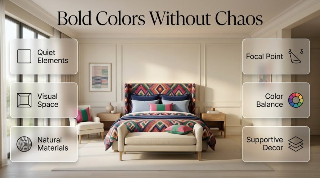
Living rooms usually contain more furniture, so balance becomes especially important.
A useful formula is:
Neutral sofa + colorful chairs + patterned rug + repeated accessories
For example:
- Cream sofa
- Navy accent chair
- Emerald cushions
- Pink artwork
- Coral decorative objects
- Multicolor rug
- Natural wood table
The rug can connect the entire palette.
If the rug contains navy, green, pink, and cream, repeat those colors in the furniture and accessories.
You don’t need another completely new color.
How Can You Create a Bold Multicolor Study Room?
A study or home office can use color to create energy without covering every surface.
Use strong colors around:
- Artwork
- Desk accessories
- Chair
- Bookshelves
- Pinboards
- Small storage pieces
Keep the desk itself relatively calm if you want a focused environment.
For example:
Warm white + navy + green + pink
could become:
- Warm white walls
- Navy chair
- Green storage
- Pink artwork
- Natural wood desk
This gives the space personality without turning the workspace into a collection of competing objects.
How Can You Create Bold Multicolor Room Ideas for a Small Space?
Small rooms can absolutely use multiple colors.
The key is to control the amount of visual weight.
Start with a light foundation such as:
- White
- Cream
- Ivory
- Pale blue
Then introduce stronger colors through:
- Bedding
- Artwork
- One chair
- Cushions
- A rug
- Small decorative objects
A darker color can still be used.
For example, a navy headboard can create a strong focal point without making the entire room dark.
Use Vertical Color
In a small room, consider:
- Tall curtains
- Vertical artwork
- A tall headboard
- Shelving
- Floor lamps
These can create visual height while also introducing color.
Should Walls Be Bold or Neutral?
Both options can work.
The decision depends on how much color already exists in the room.
Choose Bold Walls When:
- Furniture is relatively simple.
- You want the wall to be the main feature.
- The room has enough natural light.
- Other large surfaces are relatively quiet.
Choose Neutral Walls When:
- Furniture is already colorful.
- Bedding contains several colors.
- You have bold artwork.
- You want flexibility.
- The room is relatively small.
Neutral walls are often the safer choice when experimenting with multicolor design for the first time.
You can always add stronger wall color later.
How Can You Use an Accent Wall?
An accent wall allows you to introduce a dramatic shade without covering the entire room.
Good locations include:
- Behind the bed
- Behind a desk
- Behind a sofa
- Fireplace wall
- Reading nook
But don’t treat the accent wall as an isolated color.
Repeat that color somewhere else.
If your accent wall is emerald green, perhaps add:
- Green cushions
- Green artwork
- A small green vase
That repetition makes the wall feel integrated.
How Does Lighting Affect Bold Multicolor Rooms?
Lighting can completely change how colors look.
Natural daylight may make blue appear cleaner and green feel fresher.
Warm artificial lighting may make:
- Cream appear warmer
- Pink appear richer
- Green appear deeper
- Beige appear more golden
This is why you should never choose major colors based only on a digital image.
Test your samples in the actual room.
Look at them:
- In morning light
- In afternoon light
- At night
- Under your existing lamps
📌 Quick Tip: Put color samples next to your actual flooring, furniture, and curtains. A color can look completely different beside warm wood than it does beside bright white.
How Can You Use Colorful Artwork in a Multicolor Room?
Artwork is one of the easiest ways to connect several colors.
Suppose your room contains:
- Navy
- Pink
- Green
- Cream
Choose artwork containing at least two or three of those colors.
You don’t need artwork containing every color.
The artwork can act as a visual bridge.
For example:
Navy sofa → colorful artwork → pink cushion → green plant pot
The eye moves naturally through the room.
Gallery Walls
A gallery wall can become the main colorful feature.
Keep the frames relatively coordinated if the artwork itself is very colorful.
Alternatively, if the frames are varied, keep the artwork palette more controlled.
The important thing is to avoid having both the frames and the artwork competing equally.
How Can You Use Textiles to Introduce Multiple Colors?
Textiles are particularly useful because they’re easy to replace.
Use:
- Cushions
- Throws
- Bedding
- Curtains
- Rugs
- Upholstery
A good strategy is to use expensive permanent elements in relatively flexible colors and introduce stronger seasonal colors through textiles.
For example:
Permanent
- Cream sofa
- Natural wood table
- Neutral rug
Changeable
- Pink cushions
- Green throw
- Blue artwork
This gives you flexibility if your color preferences change later.
What Are the Most Common Mistakes With Bold Multicolor Rooms?
Using Every Favorite Color Equally
This is probably the biggest beginner mistake.
You may love blue, pink, green, yellow, orange, red, and purple.
But if all seven receive equal visual importance, the room can become difficult to read.
Better approach: choose one dominant color and let the others support it.
Adding Colors Too Quickly
People often buy accessories before the main palette is established.
Then they discover that the accessories don’t work together.
Better approach: decide on your large surfaces and furniture first.
Ignoring Existing Colors
Flooring, wood tones, curtains, and furniture already contribute color.
Ignoring them can result in an accidental palette.
Better approach: include existing elements when building your color plan.
Using Too Many Bright Patterns
Several colorful patterns can compete.
Better approach: choose one hero pattern and make supporting patterns quieter.
Forgetting Neutral Space
A colorful room needs areas where the eye can rest.
Better approach: keep some walls, furniture, or textiles relatively simple.
Choosing Colors Only From Screens
Digital colors aren’t always accurate.
Better approach: test physical samples in the actual lighting conditions.
Buying Decorative Objects Before Establishing the Palette
Small objects are easy to buy but difficult to coordinate later.
Better approach: finish the major color structure first.
Making Everything a Statement
A room doesn’t need ten focal points.
Better approach: choose one main focal point and several supporting details.
How Can You Make Bold Multicolor Rooms Look More Sophisticated?
Sophistication usually comes from editing.
You don’t necessarily need fewer colors.
You need better proportions.
For example:
Cream + navy + emerald + blush + brass
can look sophisticated when:
- Cream covers larger surfaces.
- Navy provides structure.
- Emerald appears in furniture or textiles.
- Blush remains an accent.
- Brass appears through lighting or hardware.
The same five colors could look chaotic if every one is used in large amounts.
Choose Quality-Looking Materials
Color becomes more sophisticated when combined with materials such as:
- Linen
- Cotton
- Velvet
- Wood
- Ceramic
- Glass
- Brass
- Woven textiles
Texture adds depth without forcing you to introduce another color.
How Can You Make a Colorful Room Feel More Mature?
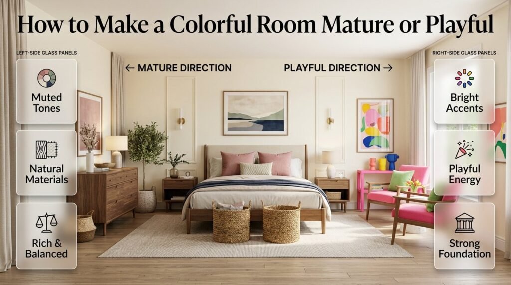
If a colorful room feels too youthful, you don’t need to remove all the color.
Change the intensity.
Instead of:
- Bright pink → dusty rose
- Neon green → sage
- Electric blue → navy
- Stark white → warm ivory
Then add natural materials such as:
- Walnut
- Oak
- Linen
- Woven baskets
- Brass
This creates a richer, more balanced appearance.
How Can You Make a Bold Room Feel More Playful?
If you want more energy, introduce stronger accents.
Try:
- Bright pink
- Coral
- Yellow
- Cobalt
- Fresh green
Use these colors through:
- Artwork
- Cushions
- Small furniture
- Lamps
- Decorative objects
- Bedding
The important thing is to keep a recognizable foundation underneath them.
For a stronger colorful direction, see Bold Colorful Room Ideas.
What Is the Difference Between Bold Multicolor and Maximalist Color?
Bold multicolor design and colorful maximalism can overlap, but they aren’t exactly the same.
| Feature | Bold Multicolor | Colorful Maximalist |
|---|---|---|
| Number of colors | Several | Often many |
| Color control | Structured | More layered |
| Patterns | Usually controlled | Often abundant |
| Neutral space | Common | May be limited |
| Visual intensity | High | Very high |
| Main focus | Color relationships | Overall abundance |
A bold multicolor room can remain relatively clean and organized.
A maximalist room may intentionally embrace more layers.
If you enjoy stronger layering, Colorful Maximalist Preppy Rooms is a natural next step.
How Can You Build a Bold Multicolor Room From Scratch?
If the room is completely empty, don’t start by buying accessories.
Work from large decisions to small ones.
Step 1: Decide the Mood
Choose words that describe how you want the room to feel.
For example:
- Energetic
- Playful
- Classic
- Elegant
- Cozy
- Fresh
- Creative
Your mood will influence your color intensity.
Step 2: Choose the Foundation
Decide:
- Wall color
- Flooring
- Main furniture
- Primary neutral
Cream, ivory, white, and natural wood are flexible foundations.
Step 3: Choose the Dominant Color
This should be the strongest recognizable color.
Navy, emerald, cobalt, terracotta, or deep pink can work well.
Step 4: Add a Supporting Color
Choose a color that works naturally with your dominant shade.
Step 5: Add One or Two Accents
Use stronger accents in smaller quantities.
Step 6: Introduce Your Main Pattern
Choose one pattern that contains at least some of your main colors.
Step 7: Repeat the Palette
Spread important colors around the room.
Step 8: Add Texture
Use different materials to create depth.
Step 9: Add Accessories Last
Only add decorative objects once the major composition works.
Step 10: Edit
Remove anything that feels unnecessary.
This last step is often what turns a room from “decorated” into “finished.”
How Can You Use Bold Multicolor Ideas Without Over-Decorating?
Color and clutter are two different things.
A room can have many colors while still feeling clean.
The solution is to give objects enough space around them.
Instead of putting ten objects on a shelf, try three carefully selected pieces.
Instead of filling every wall, choose one strong artwork arrangement.
Instead of using colorful cushions everywhere, choose a few that repeat the palette.
This creates breathing room.
How Can You Use a Neutral Base With Bold Color Accents?
This is one of the safest approaches for beginners.
Start with:
Cream + natural wood
Then add:
Navy + green + pink
For example:
- Cream walls
- Natural wood furniture
- Navy chair
- Green cushions
- Pink artwork
- Multicolor rug
The neutral base makes it easy to change the accent colors later.
It also prevents the room from becoming visually heavy.
How Can You Create a Bold Multicolor Room Around Navy?
Navy is particularly useful because it can anchor several lighter colors.
Try:
Navy + Cream + Pink
Soft and classic.
Navy + Cream + Green
Fresh and grounded.
Navy + Light Blue + White
Bright and airy.
Navy + Red + Cream
Traditional and energetic.
Navy + Emerald + Blush + Ivory
Rich and expressive.
Don’t automatically make navy the wall color.
A navy headboard, chair, rug, or cabinet can be enough.
How Can You Create a Bold Multicolor Room Around Green?
Green can move between fresh, traditional, earthy, and dramatic depending on its shade.
Sage Green
Works well with:
- Cream
- Blush
- Light blue
- Natural wood
Emerald Green
Works well with:
- Navy
- Pink
- Ivory
- Brass
Forest Green
Works well with:
- Cream
- Walnut
- Burgundy
- Navy
The darker the green, the more useful a lighter neutral becomes.
How Can You Create a Bold Multicolor Room Around Pink?
Pink doesn’t need to dominate the room.
It can become an accent that softens stronger colors.
Try:
Navy + cream + pink
or:
Sage + ivory + blush
or:
Pink + white + light blue + navy
If the room starts feeling too sweet, introduce:
- Navy
- Walnut
- Forest green
- Brass
- Warm beige
These can ground the palette.
How Can You Use Bright Preppy Colors Without Making Them Overwhelming?
Start with one bright color.
For example:
Bright pink
Then add:
Navy + cream
Now the bright pink has a foundation.
You can later introduce a small amount of green or yellow.
This staged approach is much easier than beginning with five saturated colors.
For more inspiration on brighter palettes, use the Bright Preppy Room Colors guide as a supporting resource.
How Can You Use Multicolor Palettes in Different Room Styles?

The same color family can produce completely different results depending on style.
Classic
Use:
- Navy
- Cream
- Forest green
- Muted red
- Walnut
Add:
- Stripes
- Plaid
- Traditional artwork
Modern
Use:
- Warm white
- Navy
- Sage
- Light wood
- Brass
Keep silhouettes simple.
Cute
Use:
- Pink
- Powder blue
- Cream
- Sage
Add:
- Gingham
- Small florals
- Playful artwork
Cozy
Use:
- Beige
- Cream
- Forest green
- Navy
Add:
- Quilts
- Throws
- Woven textures
Minimal
Use:
- Cream
- Navy
- One accent color
Keep accessories limited.
The same principle applies throughout:
Color needs structure.
How Can You Create a Multicolor Room That Still Feels Calm?
Use contrast selectively.
If every color is strong, the room will naturally feel energetic.
For a calmer result:
- Use muted colors.
- Keep the foundation neutral.
- Limit the number of strong patterns.
- Repeat colors instead of introducing new ones.
- Use warm lighting.
- Include natural textures.
For example:
Ivory + sage + dusty blue + blush + natural wood
can still be colorful without feeling loud.
How Can You Create a Multicolor Room That Feels Energetic?
Increase contrast.
Try:
Cobalt + coral + yellow + navy + white
But don’t give all five colors equal space.
Let:
- White provide breathing room.
- Navy anchor the room.
- Cobalt become the main bright color.
- Coral provide warmth.
- Yellow remain a smaller highlight.
This gives you energy without visual confusion.
How Can You Use Accessories to Finish a Bold Multicolor Room?
Accessories should reinforce the palette rather than introduce random colors.
Useful accessories include:
- Cushions
- Lamps
- Vases
- Books
- Frames
- Small trays
- Decorative boxes
- Plants
- Throws
Before buying an accessory, ask:
Does this color already exist somewhere in the room?
If the answer is no, ask whether the new color genuinely improves the palette.
If it doesn’t, skip it.
What Should You Do When Your Room Has Too Many Colors?
Don’t panic.
You don’t necessarily need to start over.
First identify the colors that matter most.
Then:
- Remove the least useful accent.
- Reduce one competing pattern.
- Add more neutral space.
- Repeat your strongest colors.
- Move visually distracting objects.
- Simplify crowded surfaces.
Often the room can be fixed through editing rather than replacement.
What Should You Do When the Room Looks Too Plain?
Don’t immediately add another color.
First ask whether the room needs:
- More texture
- Better lighting
- Pattern
- Contrast
- Repetition
- Artwork
- Different scales
For example, a cream-and-navy room may not need another color.
It might simply need:
- A patterned rug
- Textured bedding
- Greenery
- Brass lighting
- Layered cushions
Texture can solve a problem that color cannot.
What Is the Professional Approach to Bold Multicolor Decorating?
A professional-looking room usually starts with the large visual decisions.
Think in this order:
Architecture → Foundation → Furniture → Textiles → Pattern → Artwork → Accessories
This prevents small decorative pieces from controlling the entire design.
Professionals also think about:
- Scale
- Proportion
- Repetition
- Contrast
- Texture
- Lighting
- Visual balance
Color is only one part of the room.
A beautiful palette can still look wrong if the furniture is poorly scaled or the room has too many objects.
Practical Bold Multicolor Room Checklist
Before you finish your room, review the following.
Color
- Is there a dominant color?
- Is there a supporting color?
- Are accent colors repeated?
- Is there enough neutral space?
- Does one color overpower everything?
Patterns
- Is there one main pattern?
- Are secondary patterns quieter?
- Do patterns share at least one color?
- Are the pattern scales different?
Furniture
- Does the furniture provide structure?
- Are too many pieces competing?
- Is there a clear focal point?
- Are large furniture pieces relatively balanced?
Lighting
- Have you checked colors in daylight?
- Have you checked them at night?
- Do warm and cool light sources work together?
Accessories
- Do they repeat the existing palette?
- Are there unnecessary colors?
- Could removing something improve the room?
Final Check
Stand at the doorway.
Look at the room for a few seconds.
Ask:
What do I notice first?
If the answer is a clear focal point, the composition is probably working.
If your eyes immediately jump between six different objects, simplify the visual hierarchy.
How do you combine multiple bold colors in one room without making it look overwhelming?
The easiest way to combine bold colors successfully is to give each color a specific role instead of using every shade with equal importance. Start with a neutral foundation, choose one dominant color, add one or two supporting colors, and keep the brightest shades for smaller accents. Repeating the same colors in different areas of the room also creates a visual connection.
For example, cream walls can provide the foundation, navy can become the dominant color, emerald green can support it, and pink or coral can appear through cushions, artwork, or small accessories.
Helpful points:
Choose one dominant color first.
Use strong accent colors in smaller quantities.
Repeat important colors around the room.
Keep some large surfaces neutral.
Avoid giving every bright color the same visual weight.
What colors work best together for a bold multicolor room?
Bold multicolor rooms can use many different combinations, but the most successful palettes usually combine contrast with a grounding shade. Navy, emerald green, pink, coral, cobalt blue, cream, ivory, and warm neutrals are particularly flexible because they can be adjusted from playful to sophisticated depending on their proportions.
A combination such as navy, emerald, pink, and cream creates a balanced preppy look, while cobalt, coral, yellow, and white produces a much more energetic atmosphere. The key isn’t simply choosing attractive colors; it’s controlling their intensity and placement.
Helpful points:
Use a neutral to connect stronger shades.
Combine warm and cool colors carefully.
Consider the existing flooring and furniture.
Test colors under the room’s actual lighting.
Use one or two colors as smaller accents rather than making everything equally bold.
How many colors should you use in a bold multicolor room?
For most rooms, starting with three to five main colors makes the palette easier to control. This doesn’t mean you have to remove every additional shade. Small variations can naturally appear through artwork, patterns, books, plants, textiles, and decorative objects.
A practical structure is to choose one foundation color, one dominant shade, one supporting color, and one or two accents. For example, cream + navy + green + pink gives you plenty of visual variety without requiring every object to introduce a new color.
Helpful points:
Three colors are easier for beginners to manage.
Four or five can create more visual richness.
Use different shades of the same color when appropriate.
Don’t distribute every color equally.
Remember that pattern can introduce several colors at once.
How can you make a bold colorful bedroom look stylish and balanced?
A bold colorful bedroom looks more polished when the strongest colors are concentrated around a few important features rather than covering every surface. Start with a calm foundation such as cream, ivory, or soft white, then use colorful bedding, a statement headboard, artwork, cushions, or an accent chair to introduce stronger shades.
For example, a cream bedroom with a navy headboard, emerald accents, pink cushions, and multicolor artwork can feel expressive while still maintaining visual order. Repeating colors between the bedding, artwork, and accessories helps the entire room feel connected.
Helpful points:
Use bedding as a major color opportunity.
Keep some surfaces visually quiet.
Choose one main bedroom focal point.
Repeat colors instead of constantly introducing new ones.
Use texture to add depth without adding unnecessary colors.
What are the biggest mistakes to avoid when decorating with bold multicolor ideas?
The biggest mistake is treating every color as equally important. When several saturated shades appear in large amounts, the room can quickly lose its focal point. Other common problems include using too many unrelated patterns, ignoring existing colors, choosing accessories before establishing the main palette, and forgetting how lighting changes color.
A better approach is to establish the room’s foundation first, select the dominant color, add supporting shades gradually, and introduce accessories at the end. If the finished room feels too busy, editing a few objects is often more effective than replacing the entire color scheme.
Helpful points:
Don’t use every favorite color in equal amounts.
Avoid putting several large statement patterns together.
Don’t ignore flooring, wood tones, and existing furniture.
Test major colors before committing to them.
Leave enough neutral space for the eye to rest.
Edit unnecessary accessories before adding more decoration.
Conclusion
Bold multicolor room ideas can transform an ordinary space into a room that feels energetic, personal, and visually memorable. The key is not simply adding more colors, but creating a clear relationship between them. A strong dominant color, a few supporting shades, balanced neutrals, and thoughtful repetition can make even a colorful room feel intentional rather than overwhelming.
Start with the mood you want to create, build a practical color palette, and decide which shades deserve the most attention. From walls and furniture to bedding, artwork, rugs, and smaller accessories, every element should contribute to the same visual story. If several bright colors are competing for attention, introduce softer neutrals or reduce the number of highly saturated pieces.
The best bold multicolor rooms also leave room for personality. You do not need to follow a rigid formula or make every color perfectly equal. Instead, use color with purpose, repeat important shades naturally, and allow some areas of the room to breathe. With the right balance, bold colors can create a space that feels lively, cohesive, stylish, and uniquely yours.