Introduction
Soft Pastel Room Color Ideas | Choosing colors for a room sounds simple until you actually have to decide which shades belong together. A pastel blue that looks beautiful in a store can feel too cool at home. A soft pink can suddenly look much brighter against white furniture, while sage green can change dramatically depending on natural light.
That is why finding the right soft pastel room color ideas is less about choosing several pretty colors and more about understanding how those colors work together.
Preppy Room brings together room inspiration, decorating ideas, color combinations, and practical design concepts for creating spaces that feel personal and thoughtfully coordinated. When working with pastel colors, that same principle is especially important: the goal isn’t simply to make a room colorful. The goal is to create a palette that feels balanced, comfortable, and intentional.
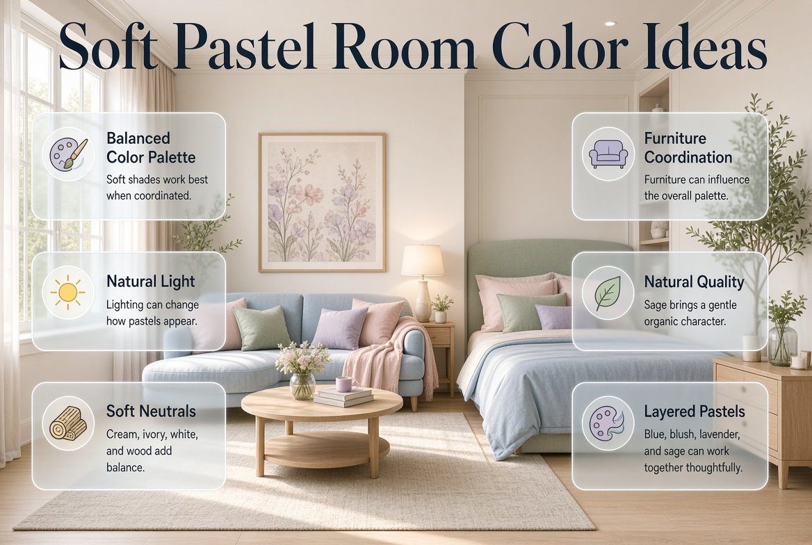
Soft pastel colors are particularly useful because they can introduce personality without making a room feel visually heavy. Powder blue can make a bedroom feel fresh, sage can bring a natural quality, blush can add warmth, and lavender can create a gentle decorative accent. When these colors are supported by cream, ivory, white, natural wood, or carefully chosen darker accents, the result can feel polished rather than overly sweet.
In this guide, you’ll learn how to choose pastel colors, combine multiple shades, work with furniture and lighting, create pastel bedrooms and living spaces, avoid common decorating mistakes, and build a complete color palette that works in a real room.
What Are Soft Pastel Room Colors?
Soft pastel room colors are light and muted versions of traditional colors. They usually have a high amount of white or a softened intensity, which gives them a lighter visual appearance than saturated colors.
Common pastel room colors include:
- Powder blue
- Blush pink
- Soft sage
- Pale lavender
- Mint green
- Butter yellow
- Soft peach
- Pale coral
- Powder pink
- Light aqua
- Dusty lilac
- Soft beige
- Pale pistachio
The defining characteristic isn’t simply that the color is light. A successful pastel shade usually has a gentle, softened quality rather than appearing extremely bright.
For example, a strong electric blue isn’t pastel simply because it is used in a small amount. A muted powder blue has a fundamentally softer appearance.
This distinction matters because the atmosphere of a pastel room depends heavily on the intensity of the colors.
A room using muted blue, sage, cream, and blush can feel calm and layered.
A room using extremely bright blue, bright green, hot pink, and yellow may feel energetic instead, even though the colors technically belong to similar color families.
Why Are Pastel Colors Popular for Interior Design?
Pastel colors are popular because they offer a middle ground between completely neutral interiors and highly colorful rooms.
They allow you to introduce color without making the entire space feel dominated by it.
For example, a bedroom with cream walls and powder-blue bedding can feel colorful without becoming visually complicated.
Similarly, a living room with a neutral foundation, sage cushions, blush artwork, and light wood can have personality without relying on strong saturated colors.
Pastels are also flexible.
Depending on furniture, materials, lighting, and accessories, the same color can contribute to completely different styles.
Soft blue can feel:
- Coastal
- Classic
- Preppy
- Minimal
- Contemporary
- Relaxed
Sage can feel:
- Natural
- Modern
- Traditional
- Organic
- Calm
- Sophisticated
This flexibility is one reason pastel palettes continue to work across different decorating styles.
How Do You Choose the Right Pastel Color for a Room?
The best pastel color isn’t necessarily your favorite color. It needs to work with the room’s existing conditions.
Before choosing a shade, consider four things:
- Natural lighting
- Existing furniture
- Room size
- Desired mood
These factors can make the same pastel appear completely different from one room to another.
Start With the Mood You Want
Ask yourself what you want to feel when you enter the room.
Do you want the space to feel:
- Calm?
- Fresh?
- Cozy?
- Cheerful?
- Elegant?
- Playful?
- Natural?
- Classic?
- Modern?
Your answer gives you a useful starting point.
For a calm room, consider:
- Sage
- Powder blue
- Lavender
- Soft gray-blue
For a warmer room:
- Blush
- Peach
- Cream
- Butter yellow
For a fresh room:
- Powder blue
- Mint
- Ivory
- Pale green
For a classic preppy direction:
- Powder blue
- Soft pink
- Navy
- Cream
- White
The goal is not to follow a rigid formula. It is to establish a visual direction before selecting individual shades.
How Does Natural Light Affect Pastel Colors?
Lighting is one of the most overlooked parts of choosing pastel colors.
A pastel color can look different in morning sunlight, afternoon light, and artificial evening lighting.
A cool blue may look fresh and airy during daylight but noticeably cooler at night.
A pale yellow may look creamy in warm lighting but more neutral during daylight.
Sage may appear greener in bright natural light and more muted in darker conditions.
This is why choosing a paint color from an online image or tiny sample can be risky.
Before making a final decision:
- Test the actual color.
- Place the sample near your furniture.
- Look at it in daylight.
- Check it in the evening.
- Observe it against the flooring.
- Compare it with your curtains.
- View it from different areas of the room.
Pro Tip: Don’t judge a pastel color from one corner of the room. Walk around the space and look at it beside your furniture, flooring, window treatments, and lighting.
What Are the Best Soft Pastel Room Color Combinations?
The best pastel combinations usually have a clear relationship between the colors.
Instead of choosing several unrelated shades, look for colors that share a similar softness or undertone.
Some versatile combinations include:
| Color Combination | Mood | Good For |
|---|---|---|
| Powder Blue + Cream | Fresh and peaceful | Bedrooms |
| Sage + Ivory | Natural and relaxed | Bedrooms and living rooms |
| Blush + White | Soft and elegant | Bedrooms |
| Lavender + Cream | Gentle and refined | Bedrooms and studies |
| Peach + Sage | Warm and organic | Bedrooms and sitting areas |
| Pale Yellow + Blue | Cheerful and fresh | Creative spaces |
| Mint + Blush | Playful and soft | Youthful interiors |
| Blue + Sage + Cream | Balanced and natural | Whole-room palettes |
| Blush + Sage + Ivory | Warm and sophisticated | Bedrooms |
| Lavender + Sage + Cream | Muted and elegant | Relaxing spaces |
The important part is not simply selecting a combination from a list.
You also need to determine which color should dominate.
How Many Pastel Colors Should You Use in One Room?
A room doesn’t need five or six pastel colors to look interesting.
In many cases, three or four colors are enough.
A simple palette could contain:
One dominant color + one supporting color + one neutral + one small accent
For example:
Powder blue + blush + ivory + navy
Here, powder blue could be the primary color, blush could appear in smaller decorative elements, ivory could form the neutral foundation, and navy could provide contrast.
This creates much more visual control than giving every color equal importance.
If you want to introduce multiple colors without creating an overly bright or busy atmosphere, explore these muted colorful room ideas for practical ways to combine softened shades into a sophisticated and cohesive preppy interior.
Use the 60–30–10 Concept
A useful starting point is:
- 60% dominant or neutral color
- 30% supporting color
- 10% accent
This isn’t a strict decorating rule.
It simply helps prevent a common problem where too many colors compete for attention.
For example:
60% cream
Walls, rug, major furniture
30% powder blue
Bedding, curtains, chair
10% navy
Artwork, cushions, lamp details
The result can feel distinctly pastel without making every surface colorful.
15 Soft Pastel Room Color Ideas

1. Powder Blue and Cream
Powder blue is one of the easiest pastel colors to work with.
It has enough color to give the room personality while remaining light and flexible.
Pair it with cream instead of relying exclusively on bright white when you want a warmer appearance.
A bedroom could use:
- Powder-blue walls
- Cream bedding
- White furniture
- Light wood accessories
- Navy decorative accents
- Brass lighting
The navy gives the room definition while cream prevents the blue from becoming too cool.
This combination works especially well for classic, preppy, coastal, and relaxed interiors.
2. Sage Green and Ivory
Sage green is ideal when you want a pastel room with a natural feeling.
Unlike pink or lavender, sage has an earthy visual quality that connects easily with natural materials.
Try combining:
- Sage walls
- Ivory bedding
- Light oak furniture
- Beige rug
- Cream curtains
- Small brass accents
The result can feel calm without becoming boring.
Sage also works particularly well with plants and natural textures because the colors already have an organic relationship.
3. Blush Pink and Warm White
Blush pink can create a soft and welcoming room without becoming overly bright.
The key is to combine it with warm white or ivory.
Instead of using pink everywhere, use it selectively.
For example:
- Ivory walls
- Blush bedding
- White furniture
- Pink artwork
- Beige rug
- Brass details
This allows the blush to become an accent rather than overwhelming the room.
4. Lavender and Soft Gray
Lavender can look sophisticated when it is kept muted and paired with a quiet neutral.
Soft gray provides enough contrast without introducing a harsh visual break.
Try:
Lavender + soft gray + white + natural wood
This combination can work especially well in bedrooms, reading corners, and study areas.
Avoid adding too many different purple tones.
One carefully chosen lavender is usually more effective than several competing shades.
5. Pale Yellow and Powder Blue
Pale yellow introduces warmth while powder blue provides freshness.
This is an excellent choice when you want a room that feels cheerful without using strong colors.
A practical combination could be:
- Cream walls
- Powder-blue furniture or textiles
- Pale-yellow cushions
- White shelving
- Light wood details
Use yellow in smaller amounts if you want the room to remain calm.
6. Peach and Sage
Peach and sage offer a more unexpected pastel pairing.
Peach contributes warmth, while sage brings a natural, slightly cooler balance.
A room could include:
Cream walls + sage bedding + peach cushions + natural wood
This palette works particularly well when you want something softer than traditional high-contrast combinations.
7. Mint and Blush
Mint green and blush pink can create a playful pastel room.
However, the shades should be muted rather than highly saturated.
Use:
- Pale mint
- Dusty blush
- Ivory
- Light wood
Avoid making every accessory pink or green.
A neutral foundation gives both colors enough breathing room.
8. Baby Blue and Pale Pink
Blue and pink can work beautifully when handled with restraint.
Rather than splitting the room equally between the two colors, select one as the dominant shade.
For example:
Cream + baby blue + pale pink
Blue might appear in bedding and curtains while pink appears in artwork and cushions.
This creates balance without making the room feel overly coordinated.
9. Lilac and Sage
Lilac and sage are both soft but visually different enough to create interest.
They work particularly well with cream and natural wood.
Try:
- Cream walls
- Sage furniture
- Lilac cushions
- Ivory curtains
- Light wood accessories
This combination is a strong option for anyone who wants a pastel room that feels distinctive without being dramatic.
10. Blue, Cream, and Butter Yellow
Butter yellow is softer than traditional yellow and can bring warmth to a blue-based room.
Use blue as the dominant color and yellow as the smaller accent.
For example:
- Pale blue walls
- Cream sofa or bed
- Butter-yellow cushions
- White furniture
- Natural wood
This creates a cheerful but controlled palette.
11. Dusty Pink, Sage, and Ivory
If traditional pink feels too sweet, dusty pink can provide a more mature alternative.
Combine it with sage and ivory.
The ivory becomes the visual bridge between the warm pink and cool green.
This palette is particularly effective in bedrooms.
Use the colors through:
- Bedding
- Curtains
- Artwork
- Cushions
- Small furniture pieces
12. Pale Peach and Cream
Pale peach creates a warm atmosphere without the intensity of orange.
It works especially well with:
- Cream
- Ivory
- Beige
- Light wood
- Soft white
This combination can make a room feel welcoming and comfortable.
13. Pastel Coral and Soft Blue
A very pale coral can add personality to a blue room.
The important point is moderation.
Use soft blue for the main surfaces and coral for small accents.
This might include:
- Coral artwork
- Decorative cushions
- Small accessories
- Patterned bedding
The result is energetic enough to feel interesting but still soft overall.
14. Butter Yellow and Sage
Butter yellow and sage create a natural, sunny combination.
The yellow brings warmth, while sage prevents it from feeling overly bright.
Cream or warm white can complete the palette.
This combination works well in:
- Bedrooms
- Breakfast spaces
- Creative rooms
- Small sitting areas
15. Soft Multicolor Pastel Palette
If you enjoy several colors, you can create a carefully controlled multicolor pastel room.
Consider:
Powder blue + blush + sage + lavender + ivory
But don’t make every shade equally strong.
Instead:
- Dominant: powder blue
- Supporting: sage
- Secondary accent: blush
- Small accent: lavender
- Foundation: ivory
This creates variety without visual chaos.
If you want to explore this approach in greater depth, Soft Multicolor Room Palettes can help you think about how several gentle colors can work together without overwhelming a space.
How Do You Build a Pastel Palette Around One Main Color?
Choosing one starting color makes the entire process easier.
Let’s say your favorite color is sage.
Instead of immediately adding five more colors, ask:
What neutral supports sage?
Cream or ivory.
Then ask:
What second color creates interest?
Blush, powder blue, or pale yellow.
Then:
What darker accent gives the palette structure?
Navy, dark green, charcoal, or natural wood.
Now you have a complete palette:
Sage + ivory + blush + navy
The same process works with almost any pastel.
Building Around Powder Blue
Try:
Powder blue + cream + navy
For more warmth:
Powder blue + ivory + blush
For a natural direction:
Powder blue + sage + cream
Building Around Pink
Try:
Blush + ivory + light wood
For contrast:
Blush + cream + navy
For a softer multicolor palette:
Blush + sage + ivory
Building Around Sage
Try:
Sage + cream + natural wood
For more color:
Sage + blush + ivory
For a preppy direction:
Sage + navy + cream
Building Around Lavender
Try:
Lavender + white + soft gray
For warmth:
Lavender + cream + natural wood
For a multicolor look:
Lavender + sage + ivory
How Do Pastel Colors Work With Furniture?
Furniture can either strengthen your color palette or disrupt it.
That’s why furniture should be considered before you finalize your wall color.
White Furniture
White furniture is highly flexible.
It can work with:
- Blue
- Pink
- Sage
- Lavender
- Mint
- Yellow
The result is usually clean and bright.
Light Wood
Light wood introduces warmth.
It works particularly well with:
- Sage
- Blush
- Peach
- Cream
- Powder blue
This combination can make a pastel room feel more natural.
Medium or Dark Wood
Dark wood creates contrast.
It can make pale colors feel more sophisticated, but too much dark furniture can visually dominate a small room.
Balance it with lighter textiles and walls.
Brass and Gold
Warm metals work beautifully with blush, cream, sage, and lavender.
They can make a pastel room feel more polished without requiring stronger colors.
Black Details
Small black details can provide useful contrast.
Think:
- Picture frames
- Lamp bases
- Cabinet handles
- Small furniture legs
- Decorative objects
The goal is not to add large amounts of black. A few details can be enough.
How Can You Make a Pastel Room Look Modern?
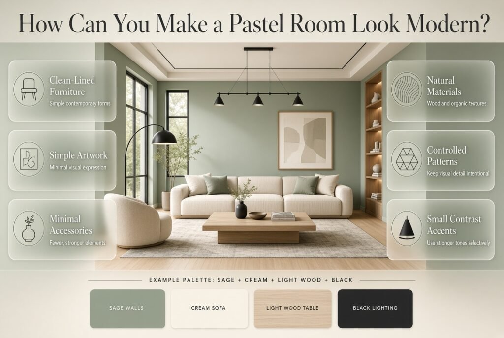
Pastel colors don’t automatically create a traditional or childish appearance.
The styling determines much of the final result.
For a modern pastel room, combine soft colors with:
- Clean-lined furniture
- Simple artwork
- Minimal accessories
- Natural materials
- Controlled patterns
- Stronger contrast in small amounts
For example:
Sage walls + cream sofa + light wood table + simple black lighting
The sage remains soft, but the furniture gives the room a contemporary structure.
Modern pastel design is usually less about adding more decoration and more about choosing fewer, stronger elements.
How Can You Create a Cozy Pastel Bedroom?
A cozy pastel bedroom should have depth.
If every element is pale and smooth, the room can look flat.
Instead, combine color with texture.
Consider:
- Quilted bedding
- Knitted blankets
- Linen curtains
- Soft rugs
- Woven baskets
- Textured cushions
- Natural wood
- Warm lamps
For example:
Sage + cream + light wood + beige
can feel much cozier when the bedding, rug, curtains, and cushions have different textures.
The colors don’t need to become darker.
The texture creates the depth.
How Do You Use Pastel Colors in a Small Room?
Small rooms benefit from visual consistency.
A soft pastel can work very well because it keeps the overall palette light.
However, avoid using too many contrasting colors.
A small room might work better with:
Cream + powder blue + navy
than:
Pink + blue + yellow + green + lavender + orange
Use similar tones across large surfaces.
Keep furniture proportional to the room.
Use mirrors strategically.
Allow natural light to move through the space.
And avoid filling every available surface with decorative objects.
A pastel palette works best when it has room to breathe.
How Do You Use Pastel Colors in a Large Room?
Large rooms can handle stronger layering.
You have more space to introduce:
- Multiple textiles
- Larger artwork
- Pattern
- Accent furniture
- Two or three related pastel colors
For example, a large bedroom could use:
Sage walls + cream bedding + blush chair + lavender artwork + natural wood
Because the room has enough visual space, the colors can be distributed across different areas.
Still, maintain a hierarchy.
A large room doesn’t need every color everywhere.
How Do You Use Pastels Without Making a Room Look Childish?
This is one of the most common concerns with pastel interiors.
The solution is balance.
Use sophisticated materials and restrained decoration.
Instead of:
Pink walls + pink bedding + pink cushions + pink artwork
try:
Ivory walls + dusty pink bedding + light wood + cream rug + brass lighting
The pink remains present, but the surrounding elements make it feel more mature.
You can also introduce:
- Navy
- Olive
- Charcoal
- Natural wood
- Brass
- Soft black
These darker or grounded elements create visual maturity.
How Do Patterns Work With Pastel Rooms?
Patterns can add personality to a pastel room, but they should connect with the existing palette.
If your room uses:
Sage + blush + ivory
look for patterns that include at least two of those colors.
Good options include:
- Stripes
- Checks
- Small florals
- Botanical prints
- Geometric designs
- Traditional preppy patterns
Avoid introducing a completely unrelated bright color through one large pattern.
That can make the room feel disconnected.
A Simple Pattern Formula
Try:
One dominant pattern + one small pattern + solid fabrics
For example:
- Large floral bedding
- Small striped cushion
- Solid cream curtains
This provides variety without creating visual competition.
How Do You Add Contrast to Pastel Rooms?
Pastel rooms need some contrast.
Without it, everything can blend together.
Contrast can come from:
- Navy
- Dark green
- Charcoal
- Dark wood
- Black
- Brass
- Deeper versions of the main pastel
For example:
Powder blue + cream + navy
is more defined than:
Powder blue + cream + extremely pale blue
The darker color doesn’t need to occupy much space.
A few carefully placed accents can be enough.
How Do You Choose the Right Neutral for Pastels?
The neutral you choose can completely change the character of the room.
Bright White
Creates a crisp and clean appearance.
Best with:
- Blue
- Mint
- Lavender
- Cool pinks
Cream
Creates warmth.
Best with:
- Sage
- Blush
- Peach
- Butter yellow
Ivory
Softer than bright white and particularly useful in elegant pastel rooms.
Beige
Adds warmth and works well with natural materials.
Soft Gray
Creates a more contemporary atmosphere.
It works particularly well with lavender, blue, and muted pink.
Common Soft Pastel Room Decorating Mistakes
Mistake 1: Using Too Many Pastel Colors
The room starts with blue, then pink, then yellow, then green, then lavender.
Each color looks good individually, but together they don’t create a clear palette.
Better Approach
Choose one dominant pastel and two supporting colors.
Mistake 2: Ignoring Undertones
A warm cream may look strange beside an icy blue.
A cool gray may make peach appear too warm.
Better Approach
Look at the colors together rather than individually.
Mistake 3: Making Everything Match
Matching every object perfectly can make the room look staged.
Better Approach
Use related colors rather than identical colors.
Mistake 4: Forgetting Contrast
A room can become too pale.
Better Approach
Add navy, wood, dark green, charcoal, or another deeper accent.
Mistake 5: Choosing Paint First
Large furniture and flooring often occupy significant visual space.
Better Approach
Consider the permanent elements before finalizing wall colors.
Mistake 6: Ignoring Lighting
A pastel that looks beautiful online may not look the same under your room’s lighting.
Better Approach
Test the actual color in the actual space.
Mistake 7: Using Bright Accessories Everywhere
A pastel foundation can be ruined by too many saturated decorative pieces.
Better Approach
Keep accessories within the same muted intensity.
How Can You Create a Preppy Pastel Room?
Pastels work particularly well with preppy interiors because traditional preppy design often relies on clean contrasts, classic patterns, and carefully coordinated colors.
A pastel preppy room might combine:
- Powder blue
- White
- Navy
- Blush
- Cream
- Brass
Patterns can include:
- Stripes
- Checks
- Plaid
- Geometric motifs
- Traditional decorative prints
The key is to balance the softness of pastels with the structure of classic colors.
For readers who want to explore coordinated pastel combinations specifically, Pastel Preppy Color Combinations provides a useful direction for building a more intentional preppy palette.
How Can You Make a Multicolor Pastel Room Look Organized?
A multicolor room becomes easier to control when the colors repeat.
Suppose your palette is:
Blue + blush + sage + ivory
Don’t use blue only once.
Repeat it in two or three places.
For example:
- Blue bedding
- Blue artwork
Then repeat blush:
- Blush cushion
- Blush decorative object
And sage:
- Sage chair
- Sage plant pot
This repetition creates visual connection.
The room feels coordinated because the colors communicate with each other.
If you want to explore broader multicolor combinations, Multicolor Preppy Palettes can help you think beyond two-color combinations while still maintaining a clear palette structure.
How Do You Choose Pastel Colors for Different Rooms?
Different rooms can benefit from different pastel approaches.
Bedroom
Bedrooms usually benefit from softer combinations.
Try:
- Sage + cream
- Powder blue + ivory
- Lavender + white
- Blush + beige
Living Room
Living rooms often need more structure.
Try:
- Sage + cream + wood
- Blue + ivory + navy
- Blush + beige + charcoal
Home Office
A small amount of color can make the room feel more inviting.
Try:
- Sage + white
- Powder blue + cream
- Lavender + soft gray
Guest Room
Keep the palette broadly appealing.
Try:
- Blue + cream
- Sage + ivory
- Soft peach + beige
Creative Room
You can experiment with more colors.
Try:
- Pale yellow
- Powder blue
- Blush
- Sage
- Ivory
Keep the overall intensity consistent.
How Do You Choose Pastel Colors for Walls?

Walls occupy a large visual area, so they should usually carry the softer part of the palette.
If your furniture is already colorful, a neutral wall may be more practical.
If your furniture is mostly white, cream, or wood, a pastel wall can become the main design feature.
For a stronger effect, use a pastel on one accent wall.
For a quieter effect, use the color throughout the room but keep the shade extremely muted.
Always test first.
Can Pastel Colors Work With Darker Accents?
Absolutely.
In fact, darker accents can make pastel colors look more sophisticated.
Try:
Powder blue + navy + cream
or:
Sage + dark green + ivory
or:
Blush + burgundy + warm white
The darker shade should usually occupy less visual space.
Think of it as punctuation rather than the entire sentence.
How Do You Use Artwork in a Pastel Room?
Artwork is an easy way to introduce or repeat pastel colors without repainting the room.
Look for artwork containing at least one or two colors from your existing palette.
For example:
Sage + cream room
could use botanical artwork containing muted green and ivory.
A:
Powder blue + blush room
could use artwork containing pale blue, dusty pink, and white.
This creates continuity.
Frames can also add contrast.
White frames keep the look soft.
Wood frames add warmth.
Black frames create stronger definition.
How Do Rugs and Curtains Affect Pastel Colors?
Large textiles are important because they occupy significant visual space.
A rug can either connect your colors or introduce unnecessary contrast.
If the walls are pastel, a neutral rug is often a safe choice.
For example:
Sage walls + ivory rug + blush cushions
or:
Powder-blue walls + cream rug + navy accents
Curtains can either blend into the wall color or create a gentle contrast.
For a calm room, keep curtains close to the wall’s color family.
For more definition, choose a neutral or supporting pastel.
What Textures Work Best With Pastel Rooms?
Texture is particularly valuable in pastel interiors.
Because pastel colors are visually soft, texture prevents the room from feeling flat.
Useful materials include:
- Linen
- Cotton
- Wool
- Bouclé
- Woven fibers
- Natural wood
- Ceramic
- Rattan
- Brushed metal
- Quilted fabrics
A sage-green room with five different smooth surfaces may feel less interesting than the same color palette with textured bedding, a woven rug, natural wood, and ceramic accessories.
How Can You Refresh an Existing Room With Pastel Colors?
You don’t always need to repaint.
Start with smaller elements.
Try changing:
- Bedding
- Cushions
- Curtains
- Artwork
- Rug
- Lampshade
- Decorative accessories
For example, a neutral bedroom can become a soft pastel room through:
Sage bedding + blush cushions + ivory curtains + botanical artwork
This is less expensive and gives you an opportunity to test the palette before making larger changes.
What Should You Do If Two Pastel Colors Clash?
Don’t immediately abandon the entire idea.
First determine why they clash.
Possible causes include:
- Different undertones
- Different intensity
- One color is too saturated
- The neutral is incompatible
- Lighting changes one color significantly
Try adding a bridging neutral.
For example:
Blue + peach
may become easier to coordinate when cream or ivory is introduced.
You can also reduce the amount of one color.
A color that looks overwhelming on a wall may work beautifully as a cushion or small accessory.
Expert Tips for Creating Better Pastel Rooms
Choose Colors From the Same Visual Family
Pastels don’t need to be identical, but they should feel related.
A very pale blue and very muted sage often work better together than a pastel blue and a highly saturated green.
Use Materials to Add Depth
Don’t rely entirely on additional colors.
Add texture instead.
Let Neutrals Do More Work
Cream, ivory, white, and beige aren’t boring.
They allow pastel colors to become the visual focus.
Repeat Your Accent Color
If you use blush in one cushion, repeat it elsewhere.
This creates cohesion.
Keep Permanent Elements Flexible
If you’re unsure about a bold pastel wall, introduce the color through removable or replaceable elements first.
Consider the Entire Room
Don’t choose a wall color while ignoring:
- Flooring
- Ceiling
- Furniture
- Doors
- Curtains
- Lighting
- Artwork
A room is one visual system.
A Practical Pastel Room Planning Checklist
Before finalizing your palette, ask:
Color
- What is my dominant pastel?
- What supporting color will I use?
- What neutral connects everything?
- Do I need a darker accent?
Lighting
- How does the room look during daylight?
- How does it look at night?
- Does the pastel become too cool or too warm?
Furniture
- Does the color work with my furniture?
- Are my wood tones warm or cool?
- Is there enough contrast?
Accessories
- Do my patterns repeat the main colors?
- Are there too many decorative colors?
- Can I remove anything unnecessary?
Balance
- Is one color clearly dominant?
- Are the neutrals doing enough work?
- Does the room feel calm rather than crowded?
Soft Pastel Palette Examples
Here are several ready-to-use combinations.
Palette One: Calm Classic
Powder blue + ivory + navy + light wood
Best for:
- Bedrooms
- Guest rooms
- Classic interiors
Palette Two: Natural Softness
Sage + cream + beige + natural wood
Best for:
- Bedrooms
- Living rooms
- Relaxing spaces
Palette Three: Gentle Feminine
Blush + ivory + beige + brass
Best for:
- Bedrooms
- Dressing areas
- Personal spaces
Palette Four: Fresh Pastel
Mint + white + pale yellow + light wood
Best for:
- Creative rooms
- Small bedrooms
- Bright interiors
Palette Five: Elegant Pastel
Lavender + cream + sage + brass
Best for:
- Bedrooms
- Reading areas
- Sophisticated interiors
Palette Six: Preppy Pastel
Powder blue + white + blush + navy
Best for:
- Bedrooms
- Study rooms
- Classic preppy spaces
Palette Seven: Warm Pastel
Peach + cream + sage + beige
Best for:
- Cozy bedrooms
- Sitting areas
- Warm interiors
What Are the Best Soft Pastel Color Combinations for a Room?
The best soft pastel color combinations are usually built around one dominant pastel, one supporting shade, and a neutral that gives the palette visual breathing room. Popular combinations include powder blue with cream, sage green with ivory, blush with warm white, lavender with soft gray, and peach with sage. These combinations work because the colors are gentle enough to complement one another without creating excessive contrast.
For a more layered room, you can introduce a third pastel, but it should be used selectively rather than giving every color equal importance. For example, powder blue, blush, and sage can work beautifully when ivory remains the main neutral foundation.
Useful combinations to consider:
Powder blue + cream + navy
Sage + ivory + natural wood
Blush + beige + warm white
Lavender + cream + soft gray
Peach + sage + ivory
Pastel blue + pale yellow + white
The most important consideration is the relationship between the shades. A muted pastel palette generally looks more coordinated when the colors have similar softness and intensity.
Which Pastel Colors Are Best for a Calm and Cozy Bedroom?
Soft sage green, powder blue, muted lavender, blush, and pale peach are excellent starting points for a calm bedroom. However, the final atmosphere depends on how these colors are combined with lighting, furniture, textiles, and neutral shades. A pastel color by itself doesn’t automatically make a bedroom feel relaxing.
For a cozy bedroom, consider using a muted pastel as the main color and surrounding it with warm neutrals and tactile materials. For example, sage walls with cream bedding, light wood furniture, a beige rug, and warm lighting can create a comfortable and grounded atmosphere.
For a calmer bedroom:
Choose muted rather than highly saturated pastels.
Use cream or ivory to soften the palette.
Add natural wood for warmth.
Layer different fabric textures.
Keep strong accent colors limited.
Test the color under both daylight and evening lighting.
A pastel bedroom generally feels more sophisticated when the color is supported by texture instead of being repeated on every decorative object.
How Many Pastel Colors Should You Use in One Room?
Three to four coordinated colors are usually enough to create a layered pastel room without making it feel visually crowded. A practical approach is to choose one dominant pastel, one supporting color, one neutral, and optionally a darker accent. This creates a clear visual hierarchy and makes the room easier to coordinate.
For example, you could use powder blue as the dominant color, ivory as the foundation, blush as a secondary accent, and navy in small details. The colors don’t need to appear in equal amounts.
A useful starting balance is:
60%: Main neutral or dominant color
30%: Supporting pastel
10%: Accent color
This isn’t a strict decorating rule. It’s simply a useful way to prevent every color from competing for attention.
If you want a multicolor pastel room, repetition also matters. If blush appears in a cushion, repeating a similar blush tone in artwork or a small decorative item can make the palette feel intentional rather than random.
How Can You Make a Pastel Room Look Sophisticated Instead of Childish?
A pastel room looks more sophisticated when soft colors are balanced with mature materials, neutral tones, clean furniture, and controlled contrast. Instead of matching every element to the same pastel shade, use the pastel as one part of a broader color story.
For example, blush can look considerably more refined when paired with ivory, beige, natural wood, and brass rather than being combined with several shades of pink. Similarly, powder blue can feel sophisticated when used with cream, navy, light wood, and simple artwork.
To create a more polished pastel interior:
Use muted versions of pastel colors.
Introduce natural wood or stone-like textures.
Add one deeper accent color.
Choose simple, well-proportioned furniture.
Avoid excessive matching accessories.
Use quality-looking textiles and layered textures.
Keep decorative patterns coordinated.
The key is contrast. Pastels provide softness, while darker accents, natural materials, and structured furniture provide definition. That balance allows the room to remain gentle without looking overly themed.
How Do You Choose the Right Pastel Color for Your Room’s Lighting?
The right pastel color depends heavily on the amount and type of light your room receives. Natural daylight, warm artificial bulbs, cool LEDs, and the direction of your windows can all change how a pastel appears. A color that looks neutral in a showroom may appear noticeably warmer, cooler, brighter, or duller in your own room.
For a room with strong natural sunlight, cooler pastels such as powder blue, pale green, or lavender may work well because the light can balance their cooler qualities. A darker or poorly lit room may benefit from warmer options such as cream, blush, peach, or butter yellow.
Before finalizing a pastel color:
Test the actual paint or material in the room.
Observe it during morning and afternoon light.
Check the color after sunset.
Place the sample beside your furniture.
Compare it with the flooring and curtains.
Look at the shade from different parts of the room.
Don’t rely solely on an online photograph or a small color card. Pastel colors are subtle, which means even small changes in lighting and surrounding colors can noticeably affect their appearance.
Conclusion
Soft pastel room colors offer a simple way to create a space that feels calm, welcoming, fresh, and thoughtfully designed. The key is not to fill the room with as many pastel shades as possible, but to build a balanced palette where each color has a clear purpose.
Whether you prefer powder blue and cream, sage and ivory, blush and warm white, lavender and soft gray, or a layered multicolor palette, the most successful result comes from considering the room as a whole. Lighting, furniture, flooring, textiles, artwork, and natural materials should all work together with your chosen pastel shades.
For a more polished look, start with one dominant color, add one or two supporting shades, and use neutrals to create breathing space. Natural wood, deeper accents, textured fabrics, and simple decorative details can also give pastel interiors greater depth and sophistication.
If you want to explore more coordinated combinations, discover these Pastel Preppy Color Combinations and Soft Multicolor Room Palettes for additional inspiration. You can also explore Multicolor Preppy Palettes when you want to bring several soft shades together in a more expressive way.
Ultimately, the best soft pastel room is one that reflects your preferred atmosphere while remaining comfortable and visually balanced. Choose colors you genuinely enjoy, test them in your actual lighting, and let texture, contrast, and proportion complete the design.