Introduction
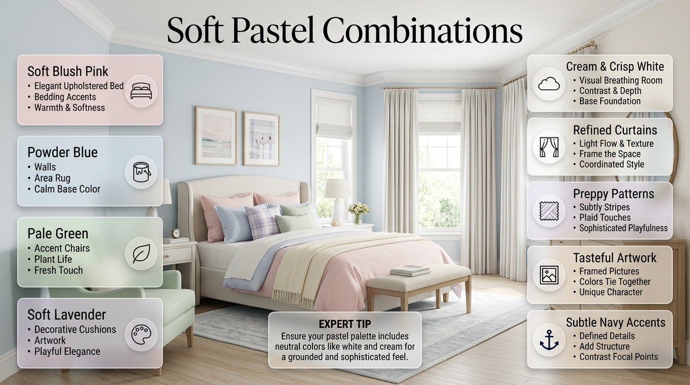
Soft Pastel Combinations | Have you ever chosen two pastel colors that looked beautiful individually, only to discover that they don’t look quite right together once they’re inside the room? This is one of the most common problems people face when decorating a bedroom. Soft colors can look effortless in inspiration photos, but creating that same balanced feeling at home requires more than simply picking a few light shades.
The right soft pastel combinations can completely change the personality of a preppy room. They can make a space feel fresh, welcoming, elegant, playful, cozy, or sophisticated without relying on extremely bright colors.
If you’re building a complete room from scratch, Preppy Room can serve as your starting point for exploring different preppy decorating directions before deciding on your final palette.
In this guide, we’ll go far beyond a basic list of pastel colors. You’ll learn how pastel combinations work, which shades naturally complement each other, how to mix warm and cool pastels, how to use white and cream, how to introduce navy and darker accents, how lighting changes pastel colors, and how to create a polished preppy room without making everything look overly matched.
We’ll also look at more than 60 practical color combinations, room-specific ideas, common decorating mistakes, professional-style color formulas, pattern combinations, furniture considerations, and answers to the questions people most often ask about pastel interiors.
What Are Soft Pastel Combinations?
Soft pastel combinations are color palettes that pair light, muted versions of colors such as pink, blue, green, yellow, lavender, peach, coral, and lilac. Pastels generally have a softer visual intensity than highly saturated colors, which makes them useful for creating rooms that feel bright and comfortable without appearing overly dramatic.
A pastel combination isn’t simply a collection of light colors. A successful palette considers hue, undertone, contrast, proportion, lighting, texture, and repetition.
For example, pale blue and pale pink can look beautiful together, but the result changes depending on whether the surrounding elements are bright white, warm cream, natural wood, gray, or navy.
That’s why choosing pastel colors individually isn’t enough.
The better question is:
How will these colors behave together inside the actual room?
Why Are Pastel Combinations Popular in Preppy Interiors?
Preppy interiors often combine classic design elements with fresh colors and recognizable patterns.
Pastels fit naturally into that style because they provide color without overpowering traditional details.
A preppy room might combine:
- Powder blue bedding
- Cream walls
- Navy stripes
- Light wood furniture
- Brass hardware
- Small floral patterns
- Soft pink accessories
None of these elements needs to dominate the room. Their relationship creates the overall style.
This is particularly useful if you want a room that feels youthful but still polished.
How Do You Choose a Good Pastel Color Combination?
The easiest method is to start with three roles:
Dominant color + supporting color + neutral
For example:
Sage green + blush pink + cream
The sage might appear on a feature wall or bedding, blush could appear through cushions and artwork, and cream could occupy the largest amount of visual space.
You can then add a fourth accent such as navy, brass, or natural wood.
A useful decorating guideline is:
- 60% dominant color
- 30% secondary color
- 10% accent
These numbers don’t have to be mathematically exact. They’re simply a useful way to prevent every color from competing equally.
💡 Pro Tip: When you’re uncertain about a palette, reduce the number of colors instead of adding more. A simple palette usually gives you more control over the finished room.
60+ Soft Pastel Combinations for Preppy Rooms
There isn’t one perfect pastel palette for every room. Different combinations create different moods.
Below are practical combinations you can adapt to bedrooms, study spaces, guest rooms, and other interiors.
1. Soft Pink and Cream
Soft pink and cream create one of the easiest warm pastel palettes.
Cream prevents pink from becoming visually dominant and gives the room a softer foundation.
Try:
- Cream walls
- Soft pink bedding
- White furniture
- Cream curtains
- Pink cushions
- Brass accents
For a mature appearance, choose dusty pink, blush, or muted rose rather than an extremely bright pastel pink.
This combination is especially useful when you want a feminine-inspired palette without turning the entire room intensely pink.
2. Powder Blue and White
Powder blue and white are excellent for a clean, classic preppy room.
The white creates contrast while allowing the pale blue to remain the main visual color.
A simple bedroom formula could be:
White walls + powder blue bedding + navy accents
The navy adds enough depth to stop the room from feeling washed out.
3. Sage Green and Cream
Sage green has a naturally calming quality.
When combined with cream, it becomes softer and warmer than when paired with bright white.
Add:
- Light wood
- Botanical artwork
- Cream bedding
- Woven textures
- Brass details
This combination works particularly well if you want your preppy room to feel connected to nature.
4. Lavender and Soft White
Lavender can introduce personality without requiring a strong color statement.
Pairing it with soft white creates a light and clean palette.
Use lavender through:
- Pillows
- Throws
- Artwork
- Bed linens
- Small decorative accessories
Keeping the larger furniture neutral makes the color easy to update later.
5. Peach and Cream

Peach adds warmth without the intensity of orange.
A peach-and-cream room can feel cheerful and welcoming.
Use peach sparingly if the shade is relatively saturated. Cream, beige, and white can keep the room balanced.
6. Baby Blue and Pale Pink
Baby blue and pale pink are classic pastel partners.
The challenge is preventing the room from looking too themed.
Instead of using equal amounts of both colors everywhere, make one dominant.
For example:
Baby blue = 60%
Cream/white = 30%
Pale pink = 10%
This creates a more sophisticated appearance.
7. Mint Green and White
Mint green can make a room feel fresh and energetic.
White keeps the palette crisp.
Use mint on:
- A chair
- Curtains
- Cushions
- Bedding
- Small furniture
- Artwork
Natural wood can soften the combination if the white begins to feel too stark.
8. Butter Yellow and Cream
Butter yellow is a softer alternative to traditional yellow.
It works beautifully with cream because both colors have warm qualities.
This palette can be particularly attractive in rooms that don’t receive strong natural daylight.
9. Blush Pink and Sage Green
Blush and sage provide an appealing warm-and-cool contrast.
Sage acts as the grounding color while blush introduces warmth.
Cream or warm white can connect the two.
This is one of the strongest choices for a sophisticated pastel preppy bedroom.
10. Pale Blue and Sage Green
Pale blue and sage green create a calm, nature-inspired palette.
Because both colors can feel cool, introduce warm elements such as:
- Cream
- Beige
- Natural wood
- Warm lighting
This prevents the room from becoming visually cold.
11. Peach and Pale Blue
Peach and pale blue create a balanced contrast.
Blue provides freshness while peach introduces warmth.
Cream works as the bridge between them.
This combination can feel especially attractive in rooms where you want pastel colors without using the most predictable pink-and-white formula.
12. Lilac and Sage
Lilac and sage create a more unusual pastel combination.
Both shades are soft, but they have different personalities.
Use cream or warm white as the neutral.
This palette works well when you want a room that feels creative while remaining refined.
13. Soft Coral and Cream
Soft coral is warmer and more energetic than blush pink.
Because of that, it works best as an accent.
Try:
- Cream walls
- White furniture
- Coral cushions
- Soft coral artwork
- Natural wood
The result can feel warm without becoming overly colorful.
14. Pale Yellow and Powder Blue
Pale yellow and powder blue create a cheerful classic palette.
The blue supplies coolness while yellow adds warmth.
A preppy version can include navy stripes or checked patterns.
15. Pastel Rainbow With Cream
You can use multiple pastel colors if the neutral foundation is strong.
For example:
- Cream walls
- White furniture
- Pale blue bedding
- Soft pink cushions
- Sage artwork
- Lavender accessories
- Pale yellow details
The important thing is that no single accent color should appear everywhere.
16. Dusty Pink and Soft Gray
Dusty pink can work well with a gentle gray when you want a less traditional pastel palette.
The gray gives the pink a more contemporary appearance.
Use white or cream to prevent the room from becoming too cool.
17. Pale Green and Warm White
Pale green and warm white provide a clean but natural atmosphere.
This palette is particularly effective with:
- Wood furniture
- Woven baskets
- Botanical prints
- Linen-style textiles
18. Soft Blue and Beige
Beige warms blue and makes it feel less clinical.
This is an excellent choice if you like blue but don’t want an entirely cool-looking room.
19. Lavender and Cream
Cream makes lavender feel warmer and more sophisticated.
Use darker purple only in very small amounts if you want additional contrast.
20. Pale Peach and Warm White
This palette feels gentle and inviting.
It works particularly well with light wood and neutral textiles.
More Pastel Combinations to Experiment With
Once you understand the basic color relationships, you can explore more combinations.
Here are additional pairings:
- Blush + White
- Blush + Beige
- Rose Pink + Cream
- Dusty Pink + Sage
- Pale Pink + Lavender
- Baby Blue + Cream
- Powder Blue + Beige
- Sky Blue + Soft Gray
- Pale Blue + Blush
- Sage + White
- Sage + Beige
- Mint + Cream
- Pale Green + Blush
- Olive Pastel + Cream
- Pale Yellow + White
- Butter Yellow + Soft Blue
- Pale Yellow + Sage
- Peach + White
- Peach + Beige
- Apricot Pastel + Cream
- Lilac + White
- Lilac + Beige
- Lavender + Pale Blue
- Lavender + Blush
- Soft Coral + Pale Blue
- Coral + Cream
- Muted Aqua + White
- Pale Aqua + Beige
- Seafoam + Cream
- Soft Turquoise + White
- Pale Mint + Blush
- Sage + Lavender
- Sage + Powder Blue
- Cream + Pastel Yellow
- Cream + Pastel Pink
- White + Pastel Green
- White + Pastel Blue
- Beige + Lavender
- Warm White + Peach
- Warm White + Dusty Rose
- Cream + Baby Blue
- Cream + Sage
- Soft Blue + Navy
- Blush + Navy
- Sage + Navy
- Pale Yellow + Navy
- Lavender + Navy
- Cream + Navy + Powder Blue
- Blush + Sage + Cream
- Pale Blue + Peach + Cream
These combinations aren’t strict rules. They’re starting points that can be adjusted according to the room, furniture, lighting, and personal preference.
Which Pastel Combinations Look Most Preppy?
Not every pastel combination automatically looks preppy.
The preppy character usually comes from the combination of color + pattern + structure + classic details.
Some particularly effective palettes include:
Powder Blue + White + Navy
This is one of the strongest classic preppy combinations.
Use:
- Powder blue as the main color
- White as the foundation
- Navy as the contrast
Add stripes, checks, or traditional furniture.
Blush + Cream + Navy
This palette creates a more feminine but sophisticated appearance.
The navy provides structure while cream softens the contrast.
Sage + Cream + Navy
This combination feels natural and traditional.
It works particularly well with botanical prints and medium wood.
Pale Yellow + Blue + White
This combination feels cheerful and classic.
Use yellow as an accent rather than covering the entire room.
How Can You Make Pastel Colors Look More Sophisticated?
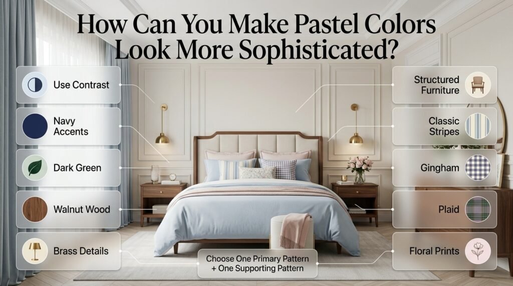
Pastel colors can sometimes appear too youthful when every element uses a soft shade.
The easiest solution is contrast.
Add one or more of the following:
- Navy
- Dark green
- Walnut wood
- Brass
- Structured furniture
- Classic stripes
- Plaid
- Gingham
- Traditional artwork
For example, a room containing pale blue bedding and cream walls may feel simple.
Add navy piping, a striped rug, brass lighting, and a structured headboard, and the same palette can suddenly feel much more sophisticated.
⭐ Expert Tip: Sophistication often comes from contrast rather than complexity. You don’t need more colors; you often need better relationships between the colors you already have.
How Do Pastel Colors Work With Classic Preppy Patterns?
Patterns can completely change the appearance of a pastel room.
Consider:
Stripes
Stripes are excellent with:
- Blue
- Pink
- Green
- Cream
- Yellow
Gingham
Gingham works particularly well with:
- Pastel blue
- Blush pink
- Sage
- Lavender
Plaid
Plaid can provide stronger visual structure.
Use it with softer colors so the pattern doesn’t dominate.
Floral Prints
Small floral prints work naturally with:
- Sage
- Pink
- Lavender
- Peach
- Cream
The goal isn’t to place every pattern in one room.
Instead, choose one primary pattern and one smaller supporting pattern.
Soft Pastel Combinations With Navy
Navy deserves special attention because it can transform a pastel palette.
Pastels are light.
Navy is deep.
That difference creates visual depth.
Try:
Powder blue + cream + navy
or:
Blush pink + cream + navy
or:
Sage + white + navy
Navy can appear through:
- Pillow borders
- Stripes
- Artwork
- Rugs
- Lamps
- Chairs
- Small decorative pieces
You don’t need much navy to create a noticeable effect.
If you’re specifically interested in a classic blue-and-dark-neutral direction, Navy and White Preppy Room Ideas can provide a useful complementary direction.
Soft Pastel Combinations With Cream
Cream is one of the most forgiving neutrals for pastel decorating.
It works particularly well with warm shades such as:
- Blush
- Peach
- Butter yellow
- Dusty rose
- Warm sage
Cream can also soften cooler colors such as pale blue and lavender.
The difference between white and cream may seem small, but it can significantly change the atmosphere.
White tends to feel crisp.
Cream tends to feel warmer.
If your furniture is natural wood, cream can often create a smoother transition.
Soft Pastel Combinations With White
White works particularly well when you want a fresh and clean room.
Good combinations include:
- Powder blue + white
- Mint + white
- Lavender + white
- Blush + white
- Pale yellow + white
- Sage + white
White is especially useful in smaller rooms because it provides visual breathing space.
However, too much bright white can sometimes make a warm pastel palette feel disconnected.
Always compare the undertones.
Blue and Cream Pastel Ideas
Blue and cream are among the most versatile choices for preppy interiors.
A simple palette could include:
Cream walls
Soft blue bedding
White furniture
Navy accent
Natural wood
This combination can work in both traditional and modern rooms.
For more focused inspiration around this color relationship, explore Blue and Cream Preppy Room.
Pink and White Pastel Ideas
Pink and white can create a bright and friendly room.
The key is choosing the right pink.
Very saturated pink may dominate.
Blush, dusty pink, rose pastel, and muted pink usually create a softer appearance.
You can use:
- Pink bedding
- White walls
- White furniture
- Pink artwork
- Small gold or brass details
For more ideas specifically around this palette, see Pink and White Preppy Room Ideas.
Green and Cream Pastel Ideas
Green and cream provide a naturally balanced combination.
Sage is usually easier to coordinate than a stronger green because it has a muted appearance.
Add:
- Light wood
- Botanical artwork
- Cream textiles
- Natural woven materials
- Brass accents
This can produce a room that feels relaxed while retaining a classic character.
For a deeper look at this specific palette, explore Green and Cream Preppy Room Ideas.
Red and navy preppy room ideas
Red and navy preppy room ideas bring together two classic colors that can create a room with personality, balance, and timeless charm. Navy provides a deeper, sophisticated foundation, while red adds warmth, energy, and visual interest without making the space feel overly bright. This combination works especially well with traditional preppy elements such as plaid patterns, striped bedding, upholstered furniture, framed artwork, decorative pillows, and polished wood details. The key is to use the colors thoughtfully rather than covering every surface in red and navy. A navy bed or accent wall can provide a strong foundation, while red can be introduced through cushions, throws, rugs, artwork, or smaller decorative accents. Adding white, cream, or soft neutral tones between the two stronger colors helps keep the room fresh and comfortable. Whether you prefer a classic, cozy, modern, or youthful look, red and navy can be adapted to create a stylish preppy room that feels coordinated, inviting, and personal.
For more inspiration and practical decorating ideas, explore our complete guide to Red and Navy Preppy Room Ideas, where you can discover thoughtful ways to combine classic patterns, balanced colors, furniture, bedding, and decorative accents for a stylish preppy space.
How Do You Create a Coordinated Pastel Room?
Coordination doesn’t mean everything has to match.
Instead, repeat colors strategically.
Suppose your palette is:
Sage + blush + cream
You might use:
- Sage bedding
- Cream walls
- Blush cushion
- Sage curtain
- Blush artwork
- Cream rug
Notice that the colors repeat without every object being identical.
This creates a visual connection between different parts of the room.
For broader guidance on creating a unified palette, Coordinated Colors can be used alongside this pastel approach.
How Many Pastel Colors Should Be Used in One Room?
Two main colors plus a neutral are usually the easiest starting point.
For example:
Blue + cream + navy
or:
Pink + sage + cream
or:
Lavender + white + beige
You can introduce a fourth color, but it should generally have a smaller role.
A common mistake is treating every pastel as equally important.
That makes the eye move around too much.
Instead, create hierarchy.
A Simple Color Hierarchy
Primary: largest visual area
Secondary: supporting areas
Accent: smallest details
This makes the room feel intentional.
How Do You Use Pastel Colors in a Small Bedroom?
Small rooms benefit from visual simplicity.
Start with:
- Light walls
- One dominant pastel
- Neutral furniture
- Minimal patterns
- Reflective or light surfaces
- Controlled accents
For example:
Cream walls + pale blue bedding + navy accents
can create a clean appearance without visually dividing the room into too many sections.
Avoid using a different pastel on every wall.
Instead, let accessories provide variation.
How Do You Use Pastel Colors in a Large Bedroom?
Large rooms allow greater flexibility.
You can introduce:
- Multiple pastel colors
- Patterned wallpaper
- Larger artwork
- Accent furniture
- Layered bedding
- Darker contrast colors
For example:
Sage wall + cream furniture + blush bedding + navy accents
can work beautifully in a larger space.
The room has enough visual area to support multiple relationships.
How Does Lighting Change Pastel Colors?
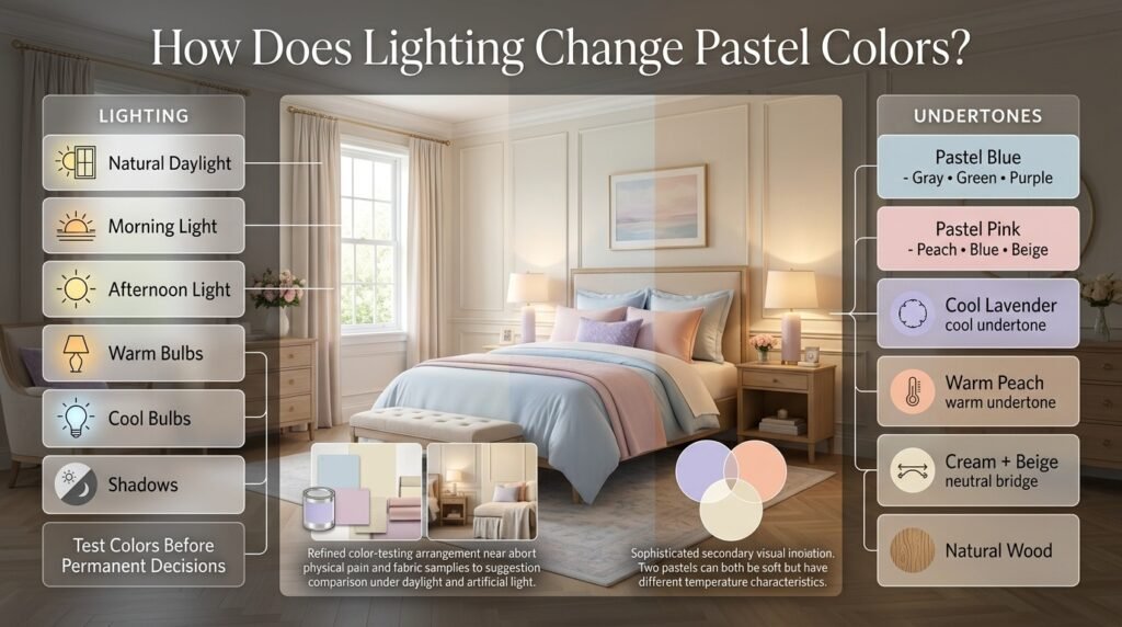
Lighting is one of the most overlooked parts of color selection.
The same pastel can appear different depending on:
- Natural daylight
- Morning light
- Afternoon light
- Warm bulbs
- Cool bulbs
- Shadows
- Nearby wall colors
A pale blue may appear cleaner in daylight but slightly gray under certain artificial lighting.
A warm peach may become more intense under warm bulbs.
That’s why you should test colors before making permanent decisions.
The Best Testing Method
- Get physical paint or fabric samples.
- Place them near the furniture.
- Observe them during the day.
- Check them at night.
- Move them to different walls.
- Compare them beside your flooring.
- Look at them from several distances.
⚠ Common Mistake: Choosing a color solely from an online image. Digital screens can display shades differently from physical materials.
How Do Undertones Affect Pastel Combinations?
Undertones are subtle colors hidden beneath the main color.
A pastel blue might lean:
- Gray
- Green
- Purple
A pastel pink might lean:
- Peach
- Blue
- Beige
Two colors can both look “pastel” but still clash because their undertones don’t cooperate.
For example, a cool lavender may look strange beside a very warm peach if there isn’t a neutral connecting them.
Cream, beige, and natural wood can often help bridge warm and cool shades.
Can Warm and Cool Pastels Be Mixed?
Yes.
In fact, combining warm and cool pastels can make a room more interesting.
Examples include:
Cool blue + warm peach + cream
Cool sage + warm blush + cream
Cool lavender + warm yellow + white
The key is balance.
If the room contains several cool colors, introduce warmth through:
- Wood
- Cream
- Beige
- Brass
- Warm lighting
If the room contains many warm colors, white, pale blue, or soft gray can introduce freshness.
Pastel Color Combinations for Different Moods
For a Calm Room
Choose:
- Sage + cream
- Pale blue + white
- Lavender + cream
Avoid too many contrasting accents.
For a Cheerful Room
Choose:
- Pale yellow + blue
- Peach + cream
- Mint + white
Use playful patterns carefully.
For an Elegant Room
Choose:
- Blush + cream + navy
- Sage + cream + brass
- Lavender + warm white
Keep accessories controlled.
For a Cozy Room
Choose:
- Peach + cream
- Dusty pink + beige
- Sage + warm white
Add layered textiles.
For a Fresh Room
Choose:
- Mint + white
- Powder blue + white
- Pale green + cream
Keep the visual environment uncluttered.
How Can Pastels Work in a Modern Preppy Room?
Modern preppy design usually has fewer decorative elements and cleaner furniture.
Instead of covering the room with many pastel objects, choose one main pastel and combine it with neutral architecture.
For example:
Soft sage + white + walnut
or:
Powder blue + cream + navy
or:
Blush + warm white + natural wood
The furniture should provide structure while the pastel color supplies personality.
If you want to move toward a cleaner interpretation of the style, Modern Preppy Room is a useful related direction.
How Can Pastels Work in a Classic Preppy Room?
Classic preppy interiors usually benefit from:
- Traditional furniture
- Stripes
- Plaid
- Gingham
- Framed artwork
- Structured bedding
- Navy
- White
- Brass
Pastels can soften these classic elements.
For example:
Pale blue + white + navy + brass
creates a timeless combination.
A classic room doesn’t need to look old-fashioned. The balance of traditional forms and fresh colors keeps it current.
For a stronger traditional direction, explore Classic Preppy Room.
How Can Pastels Work in a Cute Preppy Room?
Cute preppy rooms can use softer and more playful combinations.
Good options include:
- Blush + lavender
- Baby blue + pink
- Mint + pale yellow
- Peach + cream
Use playful patterns and decorative details, but keep the main palette controlled.
Too many decorative colors can quickly make the room look cluttered.
A more playful interpretation can be explored through Cute Preppy Room.
How Can Pastels Create a Cozy Preppy Room?
Pastels don’t automatically make a room cozy.
Texture is what adds much of that feeling.
Combine pastel colors with:
- Layered blankets
- Cushions
- Rugs
- Soft curtains
- Upholstered furniture
- Natural wood
- Warm lighting
For example:
Dusty pink + cream + walnut
can feel much warmer than the same pink paired with bright white furniture.
If coziness is your priority, Cozy Preppy Room offers another useful design direction.
How Can Pastels Work in a Minimal Preppy Room?
Minimal preppy design requires restraint.
Instead of using six pastel shades, select one.
For example:
Cream + pale blue + navy
Then let:
- Furniture
- Architecture
- Texture
- Lighting
- One or two patterns
provide the character.
A minimalist pastel room should feel intentional rather than empty.
For more inspiration in this direction, Minimal Preppy Room is a natural related resource.
How Do You Match Pastel Colors With Furniture?
Furniture should influence your color selection.
With White Furniture
Most pastels work well.
Especially:
- Pink
- Blue
- Sage
- Lavender
- Yellow
With Natural Wood
Warm pastels often work particularly well.
Try:
- Sage
- Peach
- Cream
- Blush
- Butter yellow
With Dark Wood
You can use lighter pastels to create contrast.
Try:
- Pale blue
- Soft pink
- Lavender
- Cream
With Gray Furniture
Cool pastels may feel more natural.
Try:
- Lavender
- Pale blue
- Sage
- Blush
But test the combination because gray can have either warm or cool undertones.
How Do You Choose Pastel Bedding?
Bedding is one of the easiest places to introduce pastel color because it can be changed without major renovation.
If your walls are neutral, bedding can carry more color.
For example:
Cream walls + white furniture + sage bedding
or:
White walls + pale blue bedding + blush cushions
Layering is especially useful.
Use:
- Solid base sheets
- One dominant duvet color
- Patterned cushions
- Neutral throw
- Small accent pillows
This creates depth without requiring multiple wall colors.
How Do You Use Pastel Wallpaper?
Wallpaper can create a strong visual statement.
If the wallpaper already contains multiple colors, let it determine the rest of the room’s palette.
For example, if a wallpaper contains:
sage + cream + blush
you can repeat those three colors through bedding, artwork, and accessories.
Don’t introduce several unrelated colors afterward.
Pastel Wallpaper Patterns That Suit Preppy Rooms
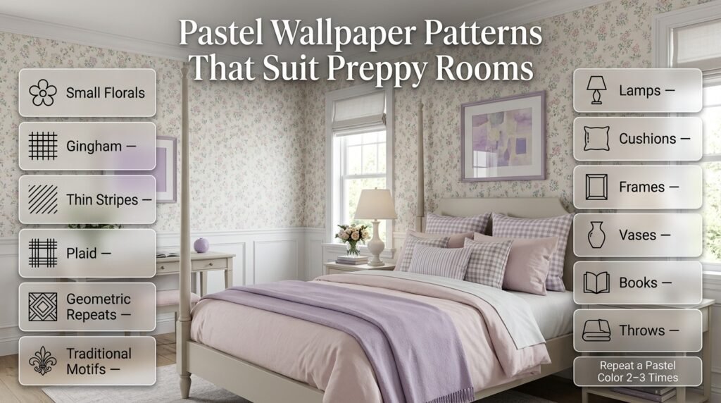
Consider:
- Small florals
- Gingham
- Thin stripes
- Plaid
- Geometric repeats
- Traditional motifs
Large, complicated patterns require more restraint elsewhere.
How Do You Use Pastel Accessories Without Overdoing Them?
Accessories should reinforce the palette rather than introduce a completely new one.
Good choices include:
- Lamps
- Cushions
- Frames
- Vases
- Books
- Small artwork
- Desk accessories
- Throws
A useful strategy is to repeat a pastel color at least two or three times.
For example, if you introduce lavender artwork, repeat lavender through one cushion and a small decorative object.
That creates visual continuity.
Common Mistakes When Decorating With Soft Pastel Combinations
Mistake 1: Using Too Many Pastels
A room containing pink, blue, green, yellow, lavender, peach, and coral can quickly become visually confusing.
Why It Happens
People often think that because all the colors are soft, they won’t compete.
Why It’s a Problem
The room can lose a clear visual hierarchy.
Better Approach
Choose one or two dominant pastels and use additional colors only as accents.
Mistake 2: Making Everything Match Exactly
A room where every object is the exact same shade can look artificial.
Better Approach
Use related colors and varying textures.
Coordination is more natural than exact matching.
Mistake 3: Ignoring Undertones
A warm pink beside a very cool purple can look disconnected.
Better Approach
Compare the shades physically before committing.
Mistake 4: Using Only Pale Colors
A completely pale room can lack depth.
Better Approach
Add:
- Navy
- Dark green
- Wood
- Brass
- Medium gray
Use stronger colors selectively.
Mistake 5: Ignoring Existing Furniture
A pastel palette may look beautiful online but fail with your actual flooring and furniture.
Better Approach
Choose colors after considering the permanent elements.
Mistake 6: Choosing Paint First
Paint is often easier to change than furniture, flooring, or expensive textiles.
Better Approach
If major furniture already exists, let those materials influence your wall color.
Mistake 7: Overusing White
White is useful, but excessive white can make warm pastels appear disconnected.
Better Approach
Try cream or warm white when your palette contains warm shades.
Mistake 8: Forgetting Texture
A room can have perfect colors and still feel flat.
Better Approach
Mix:
- Cotton
- Linen-style fabrics
- Wool-like textures
- Wood
- Metal
- Woven materials
Color and texture work together.
A Professional Method for Building a Pastel Palette
If you want a more structured process, follow these steps.
Step 1: Study the Room
Look at:
- Flooring
- Furniture
- Windows
- Natural light
- Existing textiles
- Room size
These elements are already part of your palette.
Step 2: Choose Your Main Color
Pick the shade you want to notice first.
For a bedroom, this might be:
- Blue
- Sage
- Pink
- Cream
Step 3: Select a Supporting Pastel
Choose something that complements rather than competes.
Step 4: Add a Neutral
Use:
- White
- Cream
- Beige
- Soft gray
Step 5: Add Contrast
Choose:
- Navy
- Dark green
- Wood
- Brass
Step 6: Add Pattern
Select one major pattern.
Step 7: Repeat the Colors
Distribute the colors across the room.
Step 8: Remove Anything That Feels Random
This final step is important.
If an accessory introduces a color that doesn’t belong anywhere else, consider removing it.
Pastel Color Decision Table
| If You Want… | Try This Combination |
|---|---|
| Calm | Sage + Cream |
| Fresh | Powder Blue + White |
| Warm | Peach + Cream |
| Elegant | Blush + Cream + Navy |
| Playful | Pink + Baby Blue |
| Natural | Sage + Beige |
| Cheerful | Pale Yellow + Blue |
| Creative | Lavender + Sage |
| Minimal | Pale Blue + Cream |
| Traditional | Blue + White + Navy |
| Cozy | Dusty Pink + Cream |
| Feminine | Blush + White |
| Sophisticated | Sage + Cream + Navy |
| Bright | Mint + White |
| Soft | Lavender + Warm White |
How Do You Create Contrast Without Losing the Pastel Feeling?
You don’t need extremely dark colors to create contrast.
Small amounts of deeper shades are enough.
For example:
90% light palette + 10% navy
can create significant visual structure.
You can also create contrast through texture.
A smooth cream wall beside a woven basket and a structured navy pillow can create depth even without introducing another bright color.
How Do Metals Work With Pastel Colors?
Metal finishes can subtly change the personality of the room.
Brass
Works especially well with:
- Blush
- Peach
- Cream
- Sage
Gold
Can create a more decorative appearance.
Silver
Often works well with:
- Pale blue
- Lavender
- Cool gray
- White
Black
Use sparingly.
Black hardware or frames can create strong modern contrast.
How Do Natural Materials Work With Pastels?
Natural materials help prevent pastel colors from feeling too delicate.
Consider:
- Light oak
- Walnut
- Rattan
- Woven baskets
- Natural fibers
- Stone-like textures
Sage and cream are particularly compatible with natural materials.
Peach and blush can also work well with warm wood.
How Do You Keep a Pastel Room From Looking Childish?
This is mostly a matter of proportion and supporting elements.
Use:
- Mature furniture shapes
- Neutral walls
- Classic patterns
- Darker accents
- Quality-looking textures
- Simple artwork
- Limited decorative clutter
For example, blush pink can look sophisticated when paired with cream, walnut, brass, and structured furniture.
The same pink can feel much more youthful when surrounded by multiple bright pastel accessories and playful patterns.
The color isn’t necessarily the problem.
The context is.
How Do You Create a Pastel Accent Wall?
An accent wall can be useful if you want stronger color without covering the entire room.
Good choices include:
- Sage
- Powder blue
- Dusty pink
- Lavender
- Soft peach
Keep the other walls neutral.
Then repeat the accent color through one or two smaller objects.
This makes the wall feel connected to the rest of the room.
Should the Ceiling Be Pastel?
Usually, keeping the ceiling white or very light is the safer option.
A very pale pastel ceiling can work in certain designs, but it should be intentional.
If the room is already visually busy, a neutral ceiling provides a useful break.
Should Pastel Colors Match the Curtains?
They don’t have to match exactly.
Curtains can either:
- Repeat the main color
- Use the neutral
- Introduce a pattern containing both colors
For example:
Sage walls + cream curtains + blush bedding
can feel more sophisticated than sage curtains, sage walls, and sage bedding.
How Do You Use Pastel Rugs?
A rug can connect several colors.
Suppose your room contains:
Blue + cream + pink
Choose a rug that contains subtle amounts of those colors.
This helps visually connect separate areas of the room.
If your bedding already has a strong pattern, a simpler rug is usually better.
How Do You Create a Pastel Gallery Wall?
A gallery wall doesn’t have to contain pastel-colored frames.
Instead, use:
- Cream backgrounds
- Botanical prints
- Blue artwork
- Small pink accents
- Traditional illustrations
- Simple wood frames
The goal is to repeat the room’s palette rather than introduce random colors.
Soft Pastel Combinations for Different Room Sizes
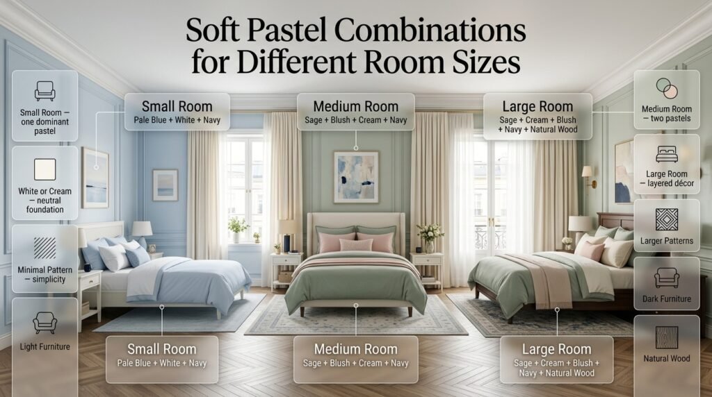
Small Room
Best approach:
- One dominant pastel
- White or cream
- Minimal pattern
- Light furniture
Example:
Pale blue + white + navy
Medium Room
You can introduce:
- Two pastels
- One neutral
- One dark accent
Example:
Sage + blush + cream + navy
Large Room
You can experiment with:
- Multiple textiles
- Larger patterns
- Multiple accent colors
- Dark furniture
- Layered décor
Example:
Sage + cream + blush + navy + natural wood
Curtains
Use cream.
Rug
Choose a neutral rug with a subtle blue pattern.
Furniture
Keep the existing white furniture.
Artwork
Use artwork containing blue, cream, and small amounts of blush.
Accessories
Add brass details and a small amount of navy.
Notice that every color has a role.
Nothing needs to match perfectly.
The room feels coordinated because the colors repeat.
Another Example: Sage and Cream Preppy Room
For a warmer, more natural design:
Dominant: Sage
Secondary: Cream
Accent: Blush
Contrast: Navy
Use sage through bedding or a feature wall.
Use cream across larger surfaces.
Introduce blush through small decorative elements.
Use navy in one patterned textile.
Add light wood furniture.
The result is softer than a blue-and-white palette but still distinctly preppy.
A Third Example: Lavender and Pale Blue
For a more creative pastel bedroom:
Dominant: Pale blue
Secondary: Lavender
Neutral: Warm white
Accent: Silver or navy
Keep the walls neutral.
Use pale blue through larger textiles.
Use lavender through artwork and accessories.
Add navy in a small amount if the room needs stronger contrast.
This palette works particularly well when you want something different from traditional pink or green.
How to Know When Your Pastel Palette Is Finished
A common problem during decorating is continuing to add things.
You don’t necessarily need more.
Stand at the doorway and look at the room.
Ask:
- Does one color clearly dominate?
- Do the supporting colors appear in several places?
- Is there enough neutral space?
- Is there enough contrast?
- Does the furniture belong to the palette?
- Do the patterns feel related?
- Does anything look random?
- Does the room still feel comfortable rather than overly decorated?
If the answers are mostly yes, stop adding.
Sometimes the most professional-looking improvement is removing one unnecessary color.
Expert Advice for Choosing Pastel Combinations
Experienced decorators generally don’t begin with a shopping list.
They begin with the room itself.
Look at the permanent features first.
Your:
- Flooring
- Furniture
- Windows
- Architectural details
- Existing fabrics
- Natural light
already create a visual foundation.
Your pastel palette should respond to those elements.
For example, if your room already contains warm oak furniture, sage, cream, peach, and blush may feel more natural than icy blue and cool gray.
If your furniture is white and your room receives cool daylight, powder blue and lavender may work beautifully.
The goal isn’t to force a trendy color combination into every room.
The goal is to make the colors belong to the space.
⭐ Expert Tip: Choose your palette in the same environment where you’ll use it. A color that looks perfect under store lighting may behave completely differently beside your flooring and furniture.
Final Pastel Decorating Checklist
Before completing your room, review this checklist.
Color
- One dominant color is clear.
- Supporting colors complement it.
- Neutral space is sufficient.
- Undertones work together.
- Dark accents aren’t overpowering.
Furniture
- Furniture works with the palette.
- Wood tones complement the colors.
- Large permanent items don’t clash.
Patterns
- One main pattern is established.
- Supporting patterns are restrained.
- Patterns repeat at least one existing color.
Lighting
- Colors have been tested in daylight.
- Colors have been checked at night.
- Artificial lighting doesn’t distort the palette.
Styling
- Colors repeat throughout the room.
- Accessories don’t introduce random shades.
- Texture adds depth.
- The room doesn’t feel overcrowded.
What are the best soft pastel combinations for a preppy room?
The best combinations depend on the mood you want, but some palettes consistently give a stronger preppy result than others. Powder blue and white create a crisp, classic foundation, while blush pink and cream feel warmer and softer. If you want something more sophisticated, sage green, cream, and navy gives you a natural pastel base with enough contrast to keep the room from looking flat.
For a more playful room, pale pink and baby blue work well, while lavender and soft white can give the space a more creative personality. The important part isn’t simply choosing colors that look good individually. You need to decide which shade will dominate and which colors will appear as supporting accents.
A practical approach is to use one pastel across the larger visual elements, one secondary shade through textiles or accessories, and a neutral or darker accent to create structure.
Good combinations to consider:
Powder blue + white + navy — classic and clean
Blush pink + cream + navy — warm and sophisticated
Sage green + cream + natural wood — calm and natural
Lavender + soft white + pale blue — fresh and creative
Peach + cream + light wood — warm and welcoming
Pale yellow + powder blue + white — cheerful and traditional
Professional tip: Don’t make all three colors equally noticeable. A controlled hierarchy will usually look much more polished than a room where every pastel competes for attention.
How do you mix pastel colors without making a room look childish or too sweet?
The easiest way to make pastels look sophisticated is to introduce contrast, structure, and mature materials. Pastel colors themselves aren’t what make a room look childish; the problem usually comes from using too many soft colors, overly coordinated accessories, and playful patterns without anything grounding the design.
For example, blush pink can look completely different depending on what surrounds it. Pairing pink with white, cartoon-style accessories, and several other bright pastels creates a very different result from pairing dusty pink with cream, walnut wood, brass, and a small amount of navy.
Current interior color direction is also moving toward quieter, more muted pastel shades rather than highly sugary versions of the colors.
Use these elements to add sophistication:
Navy or deep green for contrast
Natural wood for warmth
Brass or understated metallic details
Cream instead of excessive bright white
Stripes, gingham, or restrained plaid
Structured furniture
Layered fabrics and varied textures
Fewer but better-chosen accessories
Avoid:
Making every item pastel
Using five or six competing pastel shades
Matching every accessory exactly
Filling the room with overly themed decorations
Expert approach: Think of pastel as the color story, not the entire room. Let furniture, texture, pattern, and contrast provide the sophistication.
Which pastel colors go well together in a bedroom?
The strongest pastel bedroom combinations usually come from balancing warm and cool colors rather than simply selecting several shades that are equally light. For example, pale blue with peach creates a pleasant warm-and-cool relationship, while sage with blush combines a natural green with a warmer pink. Cream or warm white can then act as the bridge between the two.
If you want a quieter bedroom, sage + cream, powder blue + white, or lavender + warm white are excellent starting points. If you want more personality, blush + sage + cream or pale blue + peach + cream gives you more visual interest.
Pastel palettes are currently being used beyond small accessories, with soft shades appearing across furniture, textiles, and larger interior elements.
Try these bedroom formulas:
Calm: Sage + cream + natural wood
Classic: Powder blue + white + navy
Warm: Peach + cream + blush
Elegant: Blush + cream + navy
Fresh: Mint + white + light wood
Creative: Lavender + pale blue + warm white
Cheerful: Pale yellow + blue + cream
One important point is undertone. A warm blush and a cool mint may both be pastel, but they can feel disconnected if there isn’t a neutral or material connecting them.
Best practice: Put your actual fabric, paint, furniture, and flooring samples beside one another before making your final choice. That’s much more reliable than judging colors separately.
How can you make a pastel room look modern and sophisticated?
A modern pastel room needs restraint. Instead of covering every surface with a different pastel color, choose one main shade and allow the architecture, furniture, texture, and contrast to create the rest of the design.
For example, a soft sage wall + cream upholstery + natural wood + simple brass lighting can feel modern without becoming visually complicated. Similarly, pale blue can look contemporary when paired with clean white furniture and a carefully controlled navy accent.
Another effective technique is to use pastel colors on permanent elements more selectively and bring additional color through removable pieces such as bedding, cushions, artwork, and throws. This makes the room easier to update as your preferences change.
Recent 2026 design coverage also points toward softer, quieter colors working alongside natural materials and richer neutrals rather than relying exclusively on bright pastel-on-pastel decoration.
For a modern result, focus on:
One dominant pastel
Warm or neutral surroundings
Clean furniture shapes
Natural wood or stone-like textures
Limited patterns
One deeper accent
Layered but uncluttered textiles
A strong formula:
Pastel + warm neutral + natural material + dark accent
That formula gives the softness of pastel color while maintaining enough visual weight to make the room feel intentional and current.
What is the best way to choose pastel colors for a room’s lighting?
Lighting should be considered before you commit to a pastel wall color because soft shades can change significantly depending on the amount and temperature of light in the room. A color that looks fresh and airy during daylight may appear cooler, grayer, warmer, or more intense under artificial lighting.
For rooms with strong natural light, you generally have more freedom to experiment with soft blues, greens, pinks, and other delicate shades. In darker rooms, warmer pastels such as cream, peach, warm blush, or soft yellow may help create a more welcoming visual atmosphere.
This is especially important because current pastel palettes often rely on subtle undertones rather than obvious, saturated color.
Before choosing the final shade:
Test a physical sample rather than relying only on a screen.
Look at it in morning daylight.
Check it during afternoon light.
View it under your evening lighting.
Place it beside the flooring and furniture.
Compare it with your intended white or cream trim.
Check the color on more than one wall.
Professional tip: Never evaluate a pastel color completely by itself. Put the sample beside your actual bedding, furniture, flooring, and neutral colors. The surrounding colors can change how the pastel appears.
This small testing step can prevent one of the most expensive decorating mistakes: choosing a beautiful color that simply doesn’t behave the way you expected once it’s inside the room.
Conclusion
Choosing the right soft pastel combinations is less about finding colors that simply look good together and more about creating a balanced relationship between color, lighting, furniture, patterns, and texture. A beautiful pastel room should feel intentional rather than overly matched.
For a preppy room, combinations such as powder blue and white, blush pink and cream, sage green and cream, or pale blue with navy can provide a strong starting point. From there, natural wood, classic stripes, gingham, plaid, brass details, and carefully selected accessories can add depth and personality.
The most important thing is to give every color a purpose. Let one shade become the main color, use another as support, keep enough neutral space around them, and introduce a darker accent when the room needs more contrast. Always test your colors in the actual lighting of your room before making permanent decisions.
Whether you’re creating a classic, modern, cozy, cute, or minimalist preppy space, you don’t need dozens of colors to make the room interesting. A thoughtfully chosen palette, balanced proportions, and well-coordinated details will always create a stronger result than simply adding more decoration.
Start with the colors you genuinely love, test how they work together, and build the room gradually. When the palette feels balanced from the walls to the smallest accessories, your pastel preppy room will feel fresh, comfortable, and timeless rather than simply colorful.
Leave a Reply