
Introduction
Green and Cream Living Space Ideas | A living room can have beautiful furniture, attractive accessories, and carefully chosen paint colors yet still feel incomplete. Sometimes the problem is too many competing colors. In other rooms, the furniture feels disconnected, the lighting makes everything look dull, or the decor lacks warmth. Choosing the right color combination can solve many of these problems without requiring an expensive renovation.
Green and cream living space ideas offer a practical way to create a room that feels comfortable, naturally inviting, and visually balanced. Green introduces depth and a connection to nature, while cream softens the overall appearance and helps the space feel light and welcoming. Together, they work in contemporary apartments, traditional homes, cozy family rooms, and elegant living spaces. For more inspiration on creating beautiful, coordinated interiors, explore Preppy Room.
The secret is not simply placing green furniture against cream walls. The most successful designs consider color undertones, furniture proportions, natural light, textures, flooring, and everyday functionality.
Whether you are refreshing an existing living room or planning a complete interior update, this guide explains how to choose complementary shades, arrange furniture, select decorative accessories, avoid common mistakes, and create a cohesive interior that suits your lifestyle. You will also learn how to adapt the palette to small rooms, modern interiors, traditional spaces, and different budgets.
1. Why Are Green and Cream Such a Good Combination for Living Spaces?
Green and cream work well together because they balance natural richness with visual softness. Green can provide character, depth, and contrast, while cream creates a quieter background that prevents the room from feeling overwhelming. This combination is flexible enough for different decorating styles and can be adapted to both compact apartments and larger family homes.
Green is available in many variations, from pale sage to deep forest green. Cream also ranges from soft ivory to warmer, buttery neutrals. These variations allow you to create different atmospheres without abandoning the basic palette.
What makes this combination suitable for everyday living?
A living room needs to look attractive while remaining comfortable and practical. Green and cream support this balance in several ways.
- Visual harmony: Cream softens the intensity of stronger green shades.
- Decorating flexibility: The colors work with wood, stone, woven fabrics, and several metal finishes.
- Adaptability: You can update the appearance through cushions, curtains, artwork, and other accessories.
- Natural character: Green complements plants, botanical patterns, and organic materials.
- Different design moods: Muted greens create a relaxed atmosphere, while deeper shades introduce sophistication.
For example, a sage-green sofa against warm cream walls creates a calm, contemporary appearance. An olive armchair with ivory upholstery and walnut furniture feels warmer and more traditional. Forest-green curtains paired with cream walls can provide stronger contrast without requiring a major change to the room.
The combination is also useful when you want to introduce color gradually. Instead of repainting every wall or replacing all your furniture, you can begin with a few green accessories and assess how they look in your existing space.
The most important consideration is balance. A room filled with dark green furniture, heavy curtains, and limited lighting may feel visually dense. On the other hand, a room containing only cream furniture and pale walls may lack definition.
The aim is to give each color a clear purpose.
2. Which Shades of Green and Cream Should You Choose?
The best shades depend on your room’s lighting, existing finishes, furniture, and preferred decorating style. Sage and warm cream create a gentle appearance, olive and buttery cream feel earthy, and forest green with soft ivory produces a richer atmosphere. Test the actual colors together before making permanent decisions.
| Green shade | Suitable cream shade | Overall effect | Best application |
|---|---|---|---|
| Sage green | Warm ivory | Soft and peaceful | Walls, sofas, cushions |
| Olive green | Buttery cream | Earthy and welcoming | Upholstery, curtains, furniture |
| Forest green | Soft ivory | Deep and sophisticated | Accent walls, statement furniture |
| Moss green | Linen cream | Natural and relaxed | Textiles, accessories |
| Mint green | Pale warm cream | Fresh and light | Small accents, casual interiors |
| Emerald green | Balanced cream | Bold and elegant | Accent chairs, cushions, decorative details |
Sage green and warm cream for a calm living room
Sage green is a muted shade that usually contains gray undertones. It provides color without creating the intensity associated with brighter greens.
Pair it with warm cream if you want a relaxed room that feels welcoming rather than stark. This combination suits simple furniture, pale wood, textured upholstery, and understated accessories.
You can use sage on the walls and retain cream upholstery, or reverse the arrangement with cream walls and a sage sofa.
Sage is particularly useful when you want the room to feel cohesive without relying on strong patterns or multiple accent colors.
Practical example: Imagine a small living room with warm cream walls, a sage sofa, a light oak coffee table, and a textured ivory rug. A few botanical prints complete the look without making the space feel crowded.
Olive green and buttery cream for warmth
Olive green has yellow or earthy undertones that create a warmer appearance than many blue-based greens.
It works well with walnut furniture, tan leather, woven baskets, and natural fabrics. Buttery cream reinforces the warmth and helps the space feel comfortable, especially in traditional or rustic-modern interiors.
However, olive can look muddy if it is paired with an unsuitable gray or overly cool neutral. Compare samples beside your flooring and existing furniture before choosing a final shade.
Best application: Use olive on an accent chair, curtains, cushions, or a sofa. Keep larger surrounding surfaces lighter if the room has limited natural light.
Forest green and soft ivory for a sophisticated interior
Forest green introduces depth and visual weight. It can make a living room feel more structured, particularly when combined with tailored upholstery, simple artwork, and carefully selected lighting.
Soft ivory prevents the darker shade from dominating the room. Consider using forest green on one wall, a sofa, or a pair of curtains rather than covering every major surface.
This combination can also work in traditional interiors with wood furniture and brass details.
Expert Tip: When using deep green, consider the amount of daylight your room receives. If the space is naturally dark, balance the green with lighter upholstery, layered lamps, and reflective surfaces.
Mint green and cream for a fresh appearance
Mint green offers a lighter, more playful approach. It can work well in casual interiors, apartments, and rooms with simple furniture.
Because mint can have cool undertones, it needs careful pairing. A cream that is strongly yellow may clash with a cool mint, so test both colors together under the lighting you actually use.
Use mint as an accent rather than assuming it must cover the entire room. A mint chair, decorative cushions, or a small painted cabinet may provide enough color.
Moss green and linen cream for an organic style
Moss green has an earthy quality that works naturally with linen, wood, woven textures, and understated decorative pieces.
Linen cream is particularly suitable because its subtle texture and neutral appearance prevent the palette from looking overly polished or artificial.
This combination is a useful choice if you prefer a relaxed interior with natural materials rather than a formal or highly decorative room.
3. How Can You Use Green and Cream in a Living Room?
The easiest way to create a balanced room is to decide which color will dominate and which will provide contrast. Cream can establish the background, green can introduce character, and natural materials can connect the two. This approach creates a clear design without requiring every item to match.
Use cream walls with a green sofa
A green sofa against cream walls is one of the most adaptable arrangements.
The walls remain neutral, allowing the sofa to become the main focal point. You can also change the room’s appearance later by updating cushions, artwork, and curtains without repainting the walls.
Consider these elements:
- Warm cream walls.
- A sage, olive, or forest-green sofa.
- A cream or oatmeal-colored rug.
- A natural wood coffee table.
- Textured cushions in complementary shades.
- A table lamp with a warm finish.
If your living room already contains cream walls, this arrangement may require only one major purchase.
Choose upholstery according to everyday use. A sofa that looks attractive but is uncomfortable or difficult to maintain will not be a successful long-term choice.
Create a green feature wall
A green feature wall can give the room a clear focal point without making every wall colorful.
The wall behind the sofa is a common choice because it naturally frames the main seating area. A wall behind a fireplace or console may also work, depending on the room’s layout.
Sage and muted olive generally create a softer effect. Forest green provides more contrast and may work particularly well with cream upholstery and lighter artwork.
Before painting, examine the wall at different times of day. The same green can appear brighter in direct daylight and deeper under evening lighting.
Avoid choosing a feature wall simply because a photograph looks attractive. Consider how the color relates to the room’s actual dimensions, window placement, and existing furniture.
Introduce green through curtains
Curtains are useful when you want to introduce color without replacing the main furniture.
Sage curtains can soften a contemporary interior, while olive curtains provide warmth. Deeper green fabrics create a more formal appearance when paired with ivory upholstery.
Consider the fabric’s weight, privacy requirements, and how much daylight you want to retain. Heavy curtains may be appropriate for a room that needs greater privacy, but they can make a small space feel enclosed if they block too much light.
Where practical, hang the curtain rod higher than the window frame and allow the curtains to fall toward the floor. This can help emphasize the room’s vertical proportions.
Add a green accent chair
An accent chair offers an effective way to introduce green when your existing sofa is cream, beige, or another neutral shade.
Position the chair where it supports conversation rather than leaving it isolated in a corner. A side table and reading lamp can turn it into a useful seating area.
For example, a cream sofa, olive armchair, walnut side table, and pale rug create a coordinated arrangement without requiring every object to share the same color.
Repeat the green in a cushion or artwork if necessary, but avoid matching every accessory exactly.
For a broader collection of related decorating concepts, explore Green and Cream Room Ideas.
4. How Can You Make a Green and Cream Living Space Feel Cozy?
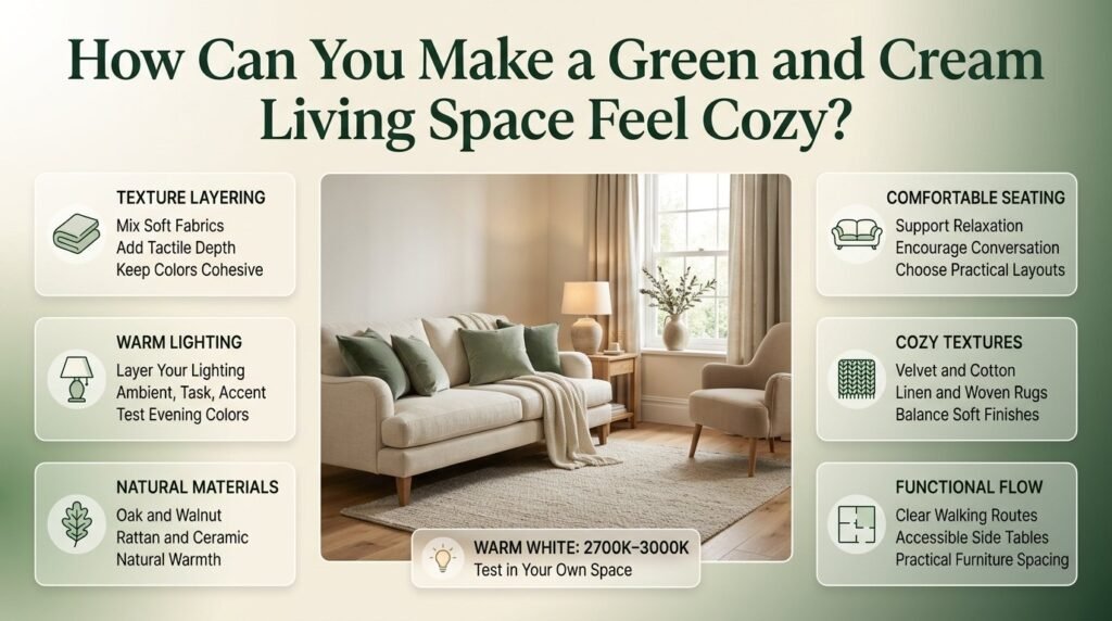
A cozy living room combines comfortable seating, layered textures, suitable lighting, and a furniture arrangement that supports everyday activities. Green and cream provide a useful foundation because they can accommodate soft fabrics and natural materials without requiring additional bold colors.
Layer textures instead of adding more colors
A room can feel flat when every surface has the same finish, even if the color palette is attractive.
Texture creates visual interest without introducing unnecessary colors.
Consider combining:
- A cream woven sofa.
- Sage velvet or cotton cushions.
- Linen-look curtains.
- A textured rug.
- A knitted throw.
- A wooden side table.
- A ceramic vase.
Each material contributes a different quality. Velvet creates a richer appearance, linen introduces a relaxed texture, and wood provides a natural visual connection between green and cream.
You do not need every material in one room. Choose a few that support the intended style and work with your existing furniture.
Use lighting to improve the atmosphere
Lighting affects the appearance of both green and cream. A green that looks balanced in daylight may appear much warmer under certain bulbs, while cream can look yellow or gray depending on the surrounding finishes.
Rather than depending on a single ceiling light, create several layers of illumination.
- Ambient lighting: Provides general light throughout the room.
- Task lighting: Supports reading or other focused activities.
- Accent lighting: Highlights artwork, shelves, or architectural details.
Warm-white lighting around 2700K–3000K often creates a comfortable residential atmosphere, although the best choice depends on your existing finishes and personal preference.
Professional Tip: Test your paint and fabric samples under both daylight and your planned evening lighting. This is more reliable than making a decision from a showroom display.
Introduce wood and natural materials
Natural materials help connect the colors and give the room a more complete appearance.
Light oak works well with sage and warm cream. Walnut introduces richer contrast with olive or forest green. Rattan and woven materials can soften an interior that otherwise contains smooth furniture and polished finishes.
Stone accessories, ceramic lamps, and linen textiles can also support the palette.
The key is consistency. Choose a few materials that complement one another rather than introducing every attractive finish you encounter.
Arrange seating around everyday activities
A cozy room should support the way people actually use it.
If you regularly host family conversations, arrange the seating so people can comfortably face one another. If the room is primarily for reading and relaxing, ensure the main chair has appropriate lighting and a convenient side table.
Avoid pushing every piece of furniture against the wall simply because the room feels small. Depending on the dimensions, a more intentional seating arrangement may make the space feel better organized.
Keep walking routes clear and leave enough room to use drawers, doors, and other furniture comfortably.
How to Create a Balanced Look with Green and Cream Room Styling
Creating a beautiful room starts with balancing colors, textures, and decorative elements without making the space feel overcrowded. Green and cream work well together because green adds a fresh, natural character, while cream creates a soft and inviting foundation. You can use cream for walls, bedding, sofas, or rugs and introduce green through cushions, curtains, accent furniture, indoor plants, and artwork. To make the design feel more coordinated, incorporate natural wood finishes, textured fabrics, and warm lighting. Choose a few complementary patterns rather than mixing too many competing designs. For more practical advice, explore our guide to Green and Cream Room Styling for helpful decorating techniques, color coordination tips, and creative ways to achieve a polished and comfortable interior.
5. What Furniture Works Best With Green and Cream?
Furniture should support the color scheme while meeting practical requirements. Start with the largest pieces, including the sofa, rug, coffee table, and storage furniture, because they occupy the most visual space. Once these elements work together, smaller accessories become easier to select.
Should you choose a green sofa or a cream sofa?
Both options can work well, but they create different results.
| Feature | Green sofa | Cream sofa |
|---|---|---|
| Main visual effect | Stronger focal point | Lighter, neutral foundation |
| Decorating approach | Coordinate surrounding colors with green | Introduce green through accessories |
| Best for | Rooms needing a clear focal point | Rooms needing a flexible background |
| Future changes | May require coordinated accent choices | Usually easy to restyle |
| Maintenance | Depends on fabric and shade | Some marks may be more visible |
A green sofa may be the better choice when your walls are neutral and you want the furniture to establish the room’s identity.
A cream sofa is useful if you enjoy changing your decorative accessories or already have a green feature wall.
Neither color guarantees easy maintenance. Fabric construction, stain resistance, removable covers, and cleaning requirements matter more than appearance alone.
Select a coffee table that supports the palette
A coffee table should complement the room without interrupting movement around the seating area.
Light oak creates a relaxed, airy appearance and suits sage green particularly well.
Walnut adds warmth and depth, making it a strong option for olive and forest-green interiors.
Glass can reduce the visual bulk of a coffee table in a compact room, although fingerprints and cleaning requirements should be considered.
Stone-look finishes work well in contemporary interiors and can introduce a different texture.
Black metal details add contrast and may suit modern furniture with clean lines.
Before buying, measure the available space and consider the height of the sofa seats. A table that is too large can dominate the room, while one that is too small may not serve its practical purpose.
Choose storage furniture carefully
Storage can make the difference between a room that looks curated and one that feels cluttered.
Cream sideboards, wooden cabinets, and closed storage units can hide everyday items while maintaining the palette.
Open shelves are useful for displaying books, pottery, and selected decorative pieces. However, leaving some shelf space empty often creates a more intentional result than filling every available area.
If the room is small, prioritize furniture that provides useful storage without obstructing doors, windows, or walking routes.
Match furniture proportions to the room
Large furniture can overwhelm a compact living room, while undersized pieces can look disconnected in a spacious interior.
Measure the room before shopping. Consider the sofa’s depth, the distance between seating and the coffee table, and the space required to walk comfortably.
Furniture with visible legs may feel lighter than pieces with solid bases, although the difference depends on the overall design.
The objective is not to buy the smallest furniture possible. It is to select pieces that suit the room’s dimensions and intended use.
6. Green and Cream Living Space Ideas for Small Rooms
Green and cream can work particularly well in small living rooms when cream provides the main background and green is introduced through carefully chosen elements. The most important factors are suitable furniture proportions, clear walking routes, appropriate lighting, and restrained decoration.
Keep the main surfaces light
Cream walls and a light rug can help a small room feel visually open.
Choose a cream that suits your natural lighting. A very yellow shade may feel overly warm in some rooms, while a grayish cream may appear dull under limited daylight.
You can still introduce darker green through a sofa, curtains, cushions, or artwork.
A small room does not have to be entirely pale. The key is to balance darker elements with lighter surrounding surfaces.
Choose furniture with a practical footprint
Before purchasing furniture, measure:
- The available floor area.
- The sofa’s width and depth.
- The clearance around the coffee table.
- Door and drawer opening space.
- Walking routes between seating areas.
- The space required for additional chairs.
Avoid buying furniture based solely on its appearance in a showroom. A sofa may look compact when displayed in a large store but feel oversized in a small apartment.
Consider storage benches or compact side tables if they provide genuine practical value.
Use mirrors thoughtfully
A mirror can reflect available daylight and create a greater sense of visual openness.
Position it where it reflects a window, an attractive feature, or a brighter part of the room. Avoid placing it where it mainly reflects clutter.
Mirrors do not create additional light, and their effect depends on placement, window size, and the surrounding finishes.
Keep patterns restrained
Stripes, botanical prints, and small checks can complement green and cream, but too many patterns can make a compact room feel busy.
Choose one main patterned element, such as a rug or pair of cushions. Keep the other major surfaces relatively simple.
This approach allows the color palette to remain interesting without competing with the room’s limited space.
Common Mistake: Choosing only pale furniture in the hope of making a small room feel larger. Without contrast, the interior can look flat. A green chair, darker cushion, or wooden table can add definition while maintaining an open appearance.
Create a useful focal point
A small room benefits from a clear visual center.
This could be the sofa, a piece of artwork, a feature wall, or a well-arranged seating area. When too many items compete for attention, the room may feel less organized.
Choose one main focal point and let the remaining decor support it.
7. How Do You Create a Modern Green and Cream Living Room?
A modern green and cream interior relies on clean-lined furniture, restrained decoration, and a thoughtful selection of materials. The combination can feel fresh and contemporary without relying on excessive ornamentation or fashionable accessories that quickly become outdated.
Choose simple furniture shapes
Look for sofas with clean silhouettes, coffee tables with restrained detailing, and storage furniture with minimal hardware.
Sage green works well with pale wood and cream upholstery. Forest green can create stronger contrast with ivory, walnut, or black metal.
Simple shapes help the colors remain the main visual feature.
However, modern does not have to mean uncomfortable or severe. Choose furniture that suits your daily routine rather than sacrificing comfort for appearance.
Limit the number of decorative objects
A modern living room often benefits from a few carefully selected accessories rather than numerous small items.
Consider a ceramic vase, a framed abstract print, a sculptural bowl, or a simple table lamp.
Vary the shapes and textures so the arrangement feels natural. Repeating the exact same object across every surface can make the room feel more like a display than a lived-in home.
Introduce contrast with supporting finishes
Black metal, walnut, and brushed brass can complement green and cream when used selectively.
For example, a sage sofa, cream walls, oak coffee table, and black floor lamp can create a clear contemporary composition.
Avoid adding too many unrelated metals and accent colors. A restrained palette makes it easier for the main colors to stand out.
Keep the layout functional
Modern interiors often appear spacious because the furniture arrangement is deliberate.
Allow enough room to move between the sofa, coffee table, and other seating. Avoid placing decorative objects where they interfere with everyday activities.
If the living room also functions as a workspace or dining area, use furniture placement and rugs to define the different zones.
For more specific styling approaches, explore Green and Cream Interior Design Ideas.
8. How Can You Style a Traditional or Preppy Green and Cream Living Room?
Traditional and preppy interiors can use green and cream through tailored furniture, classic patterns, decorative trim, and coordinated accessories. The best results come from combining patterned elements with plain surfaces so the room feels detailed without becoming visually overwhelming.
Introduce stripes, checks, and plaid
Green-and-cream stripes can work on cushions, curtains, or occasional upholstery. Plaid and gingham introduce a more traditional character.
These patterns are most effective when they share compatible colors.
A balanced arrangement might include:
- A plain cream sofa.
- Green striped cushions.
- A checked accent chair.
- A traditional rug with restrained colors.
- Framed botanical artwork.
If the room already contains patterned upholstery, keep the curtains or rug simpler.
The goal is to create a connection between the patterns rather than allowing each item to compete for attention.
Use classic decorative details
Traditional living rooms can benefit from framed artwork, table lamps, decorative molding, and wooden furniture.
Brass finishes may complement olive and forest green, while light wood can soften the overall appearance.
Choose decorative details that relate to the architecture of your home. Adding numerous traditional accessories to an otherwise contemporary room may create an inconsistent result unless the contrast is deliberate.
Balance formality with comfort
A polished room should still feel comfortable for everyday use.
Combine structured seating with soft cushions, practical side tables, and lighting suitable for reading or conversation.
If you regularly host guests, consider the number of seats and how easily people can move around the room. A beautiful arrangement that leaves insufficient space for normal activities is unlikely to remain satisfying.
Avoid excessive pattern repetition
You do not need to cover every surface with stripes, plaid, or botanical prints to establish a preppy style.
One or two prominent patterns, supported by plain cream fabrics and carefully selected green accents, are often sufficient.
For additional inspiration focused on this particular aesthetic, visit Green and Cream Preppy Room Ideas.
9. Which Accessories Complete a Green and Cream Living Space?

Accessories connect the main colors, add texture, and help the room feel personal. Choose items that support the existing furniture and layout instead of purchasing decorative objects simply because they match the palette.
Cushions and throws
Cushions are an easy way to repeat green across a cream sofa or introduce cream into a green seating arrangement.
A useful starting combination includes two solid cushions, one textured neutral cushion, and one patterned cushion that incorporates both colors.
Adjust the number according to the size of the sofa and your preferred level of comfort.
A throw can introduce additional texture without adding another strong color. Choose a material suitable for the season and the amount of everyday use the sofa receives.
Rugs
A cream rug can connect the furniture visually and create a lighter foundation. A patterned green rug can introduce color when the walls and sofa are neutral.
Consider the room’s dimensions, flooring, and cleaning requirements before choosing a rug.
In a busy household, stain resistance and maintenance may be more important than a delicate pattern. If the room already contains several patterned fabrics, a plain or subtly textured rug may be the better option.
Artwork
Botanical prints, landscapes, abstract compositions, and restrained geometric designs can complement green and cream interiors.
Consider the size of the artwork in relation to the furniture beneath it. A very small frame above a large sofa can look disconnected, while a well-proportioned piece or coordinated group can establish a clear focal point.
Repeat one or two colors from the artwork elsewhere in the room if the arrangement needs greater cohesion.
Indoor plants
Plants can strengthen the natural character of the palette and introduce variation in leaf shapes and textures.
Choose plants according to the room’s light, temperature, available space, and care requirements. Not every plant will thrive in a dim living room.
Planters in cream ceramic, terracotta, woven materials, or muted stone finishes can connect greenery with the furniture and textiles.
Avoid filling every corner with plants. A few well-positioned specimens can make a stronger contribution than numerous small pots scattered around the room.
Lamps and decorative objects
Lamps can provide both useful lighting and a finishing detail.
Cream ceramic bases, brass fittings, natural wood, and understated black finishes can work well with the palette.
Choose decorative objects in different heights and shapes, but leave some surfaces clear. A sideboard does not need a collection of objects across its entire length to look finished.
10. What Wall Colors, Flooring, and Materials Work Best With Green and Cream?
The surrounding finishes determine whether green and cream feel warm, cool, rustic, or contemporary. Consider your flooring, window frames, existing woodwork, and permanent architectural features before choosing paint or furniture.
| Material or finish | Complementary palette | Overall effect |
|---|---|---|
| Light oak | Sage and warm cream | Airy and natural |
| Walnut | Olive and ivory | Rich and traditional |
| Pale stone | Sage and soft cream | Calm and contemporary |
| Terracotta | Olive and buttery cream | Warm and earthy |
| Black metal | Forest green and ivory | Modern contrast |
| Brass | Olive or forest green with cream | Classic sophistication |
| Natural linen | Muted greens and cream | Relaxed and textured |
Choose flooring that supports the palette
Light wood flooring can help a sage-and-cream room feel open and relaxed.
Medium or dark wood creates a richer atmosphere, particularly with olive or forest green. If the flooring is already dark, a cream rug or lighter upholstery can help balance the visual weight.
You do not necessarily need to replace flooring that doesn’t perfectly match your chosen palette. Existing finishes can often be incorporated through the selection of rugs, furniture, and wall colors.
Understand warm and cool undertones
Undertones are the subtle qualities that make colors appear warmer, cooler, yellower, or grayer.
A yellow-based cream may complement warm olive, while a more neutral cream may work better with grayish sage.
Problems arise when the undertones conflict. For example, a strongly yellow cream can look out of place beside a cool green, even when both colors appear attractive independently.
Test paint and fabric samples together. Place them beside the flooring and view them in different lighting conditions before making a final decision.
Select complementary materials
Natural materials can help connect the different colors.
Light wood supports an airy atmosphere, walnut introduces depth, and stone can create a more contemporary appearance. Linen and woven textiles soften the room, while metal details introduce contrast.
Limit the number of prominent finishes. A clear combination of two or three materials usually looks more coordinated than a mixture of many unrelated surfaces.
11. What Are the Most Common Green and Cream Decorating Mistakes?
Most decorating problems come from poor color proportions, incompatible undertones, unsuitable furniture sizes, or selecting individual items without considering the room as a whole.
Understanding these issues before shopping can save time and money.
Mistake 1: Using too many shades of green
Why it happens: Accessories and furniture are purchased separately without a consistent plan.
Why it causes problems: Several unrelated greens can compete, making the room feel less cohesive.
How to avoid it: Choose one dominant green and, if necessary, one supporting shade. Repeat them through upholstery, textiles, or artwork.
Mistake 2: Choosing the wrong cream
Why it happens: Cream is treated as a single neutral color.
Why it causes problems: A strongly yellow cream may clash with a cool green, while a grayish cream may make warm olive appear dull.
How to avoid it: Compare paint samples and fabric swatches beside one another and against the existing flooring.
Mistake 3: Making every surface dark
Why it happens: Deep green looks dramatic in inspiration photographs.
Why it causes problems: Dark walls, dark furniture, heavy curtains, and limited lighting can make the room feel visually dense.
How to avoid it: Balance deep green with cream upholstery, lighter rugs, layered lighting, or reflective surfaces.
Mistake 4: Buying furniture before measuring
Why it happens: A sofa or coffee table looks suitable in a showroom.
Why it causes problems: Furniture that is too large can block circulation and disrupt the room’s proportions.
How to avoid it: Measure the room, mark furniture footprints, and check delivery access before purchasing.
Mistake 5: Using too many patterns
Why it happens: Stripes, plaid, florals, and checks look attractive individually.
Why it causes problems: Competing patterns can make the room feel restless, particularly when the furniture and rug also contain strong designs.
How to avoid it: Choose one dominant pattern, one supporting pattern if appropriate, and plain fabrics to create balance.
Mistake 6: Ignoring everyday maintenance
Why it happens: Appearance receives more attention than practical use.
Why it causes problems: Delicate upholstery and difficult-to-clean rugs may not suit busy households.
How to avoid it: Check fabric durability, removable covers, cleaning instructions, and the manufacturer’s care recommendations.
Mistake 7: Matching everything exactly
Why it happens: Matching accessories seem like an easy way to create coordination.
Why it causes problems: Identical shades and finishes can make the room look repetitive or overly staged.
How to avoid it: Use compatible variations in texture and tone. A cream woven cushion, sage velvet cushion, and natural wood table can coordinate without matching precisely.
Mistake 8: Ignoring the room’s existing features
Why it happens: A decorating plan is copied from an image without considering the actual home.
Why it causes problems: The chosen colors may conflict with existing flooring, window frames, or fixed cabinetry.
How to avoid it: Build the palette around the features that will remain in the room. Replacing every fixed finish is rarely necessary.
12. What Professional Decorating Tips Make the Biggest Difference?
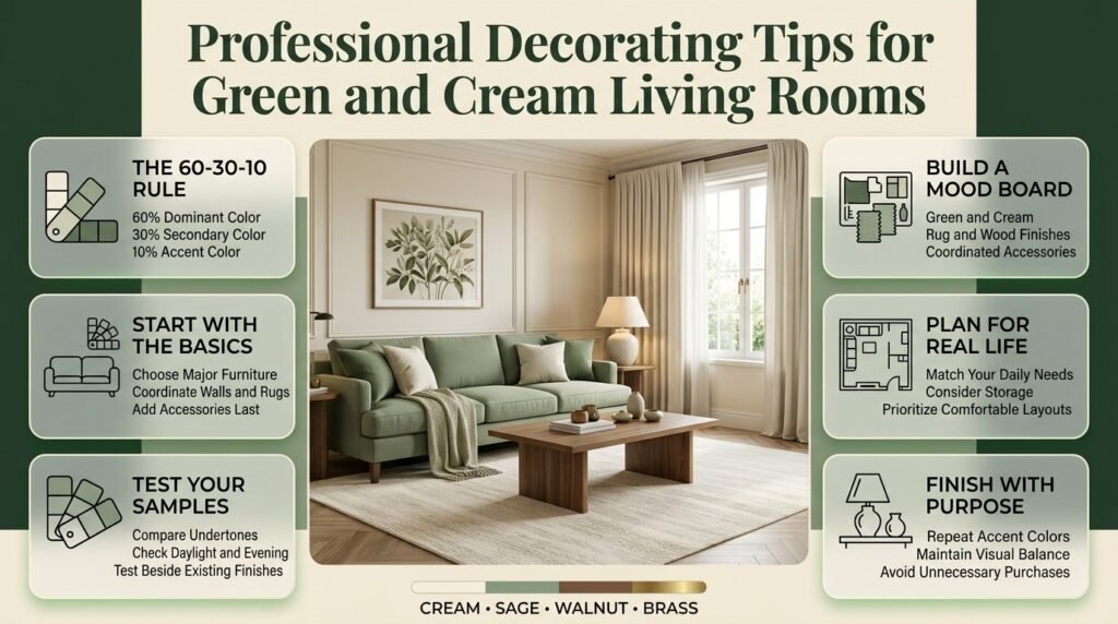
A successful green-and-cream living room depends on thoughtful planning rather than the number of decorative items you purchase. Professionals often consider visual proportions, lighting, material relationships, and the function of each area before selecting accessories.
Use the 60-30-10 rule as a starting point
The 60-30-10 rule is a common decorating guideline for distributing colors.
- 60% dominant color: Often cream walls, rugs, or other large surfaces.
- 30% secondary color: Green furniture, curtains, or selected textiles.
- 10% accent color: Wood details, brass, black, or another restrained accent.
These percentages are approximate. They are not strict measurements, and a room can look balanced without following them precisely.
The purpose is to establish a visual hierarchy. One color provides the foundation, another introduces character, and smaller accents complete the composition.
For example, cream walls and a cream rug might establish the background, a green sofa might provide the main color, and brass or walnut details might introduce contrast.
Start with the largest visual elements
Choose the main sofa, wall color, and rug before buying small decorative objects.
These larger elements determine how the palette will appear across the room. Accessories should support the design rather than force you to change your original choices.
If you already own furniture, begin with those pieces and identify which colors will work around them.
Test samples before making permanent changes
Paint and fabric can look different under changing light.
Follow this process:
- Obtain paint samples and fabric swatches.
- Place them beside existing flooring and furniture.
- Observe the colors in daylight and evening lighting.
- Compare warm and cool versions of cream.
- Make the final decision after seeing the materials together.
This process can help prevent costly mistakes, particularly when choosing a large sofa or repainting an entire room.
Create a simple mood board
A mood board can be a physical collection of samples or a digital arrangement of reference images.
Include the main green, cream paint, sofa fabric, rug, wood finish, and one or two accessory materials.
Look at the complete group rather than judging each item independently. If one material looks noticeably stronger than the others, consider adjusting its shade or proportion.
For more curated decorating inspiration and related ideas, explore Green and Cream Room Inspiration.
Plan the room around its actual use
A family living room, formal sitting room, and compact apartment lounge may all use the same palette but require different furniture and materials.
Ask yourself:
- How many people regularly use the room?
- Does the space need to accommodate children or pets?
- Is the room used for reading, entertaining, or watching television?
- How much storage is necessary?
- Which existing pieces will remain?
Answering these questions helps you select furniture that works in practice, not just in photographs.
Quick Tip: Photograph your living room before buying accessories. The photograph can help you identify empty areas, excessive decoration, and colors that need to be repeated elsewhere.
13. How Can You Create a Green and Cream Living Room on a Budget?
A green-and-cream update can be completed gradually. You don’t need to replace every piece of furniture or renovate the entire room at once. Begin with the changes that offer the greatest visual improvement for the amount you spend.
Step 1: Rearrange the existing furniture
Start by improving the seating arrangement and removing unnecessary obstacles.
Create a clear walking route and position the furniture to support conversation or your usual activities.
Why it matters: A better layout can improve the room without requiring any new purchases.
Common mistake: Buying additional furniture before checking whether the existing arrangement can be improved.
Step 2: Introduce green textiles
Add a few cushions, a throw, or curtains in a coordinated shade of green.
If the sofa is cream, these items can establish the secondary color without requiring a major investment.
Why it matters: Textiles are easier to replace than permanent finishes and allow you to test the palette gradually.
Professional advice: Choose shades that complement the existing walls and flooring instead of selecting each item independently.
Step 3: Update selected accessories
Use a ceramic vase, framed print, planter, or table lamp to connect the colors.
Focus on objects that fill a genuine gap in the design or serve a practical purpose.
Why it matters: A small number of carefully selected accessories can make the room feel more coordinated.
Step 4: Consider repainting
If the existing wall color conflicts with the new palette, test a suitable cream or muted green paint.
Painting one wall may be sufficient if you want a clear focal point.
Why it matters: Wall color influences the appearance of furniture, textiles, and other large surfaces.
Common mistake: Choosing paint before checking it against the sofa, flooring, and curtains.
Step 5: Upgrade one major item if necessary
Only replace the sofa, rug, coffee table, or lighting when the existing item no longer meets your needs or works with the planned design.
Why it matters: Prioritizing one major improvement prevents unnecessary spending and keeps the room’s style consistent.
Where should you spend more?
| Item | Suggested priority | Reason |
|---|---|---|
| Sofa | High | Frequent use and major visual impact |
| Lighting | High | Affects comfort and color appearance |
| Rug | Medium to high | Defines the seating area and receives wear |
| Curtains | Medium | Influence privacy, light, and visual height |
| Cushions | Low to medium | Easy to update |
| Decorative objects | Low | Usually provide finishing details |
The appropriate budget depends on your household and the condition of your existing furniture. A durable sofa may deserve more investment than decorative accessories that can be changed later.
For additional ideas on planning a coordinated interior, you can visit Preppy Room, where the broader decorating theme can help you explore related styles and color approaches.
14. How Do You Maintain a Green and Cream Living Space?
A well-designed living room should remain attractive after everyday use. Maintenance depends on the materials you choose, how often the room is used, and the cleaning requirements of the furniture and accessories.
Choose fabrics according to your household
Cream upholstery can show certain marks more readily than darker fabrics, but the actual result depends on the material and finish.
Before purchasing a sofa or chair, investigate:
- Cleaning instructions.
- Stain resistance.
- Fabric durability.
- Removable and washable covers.
- The manufacturer’s recommended maintenance routine.
For households with children or pets, practical upholstery may be more important than selecting the lightest possible shade.
Keep rugs and curtains practical
Rugs collect dust and everyday debris, particularly in high-traffic areas. Select a material and construction that can be maintained according to your routine.
Curtains may need occasional cleaning depending on the fabric, room conditions, and manufacturer’s instructions.
If you prefer a pale cream rug, consider how frequently it will be used and whether the material is suitable for the household.
Maintain plants and decorative surfaces
Indoor plants need suitable light, water, and care. Remove damaged leaves when appropriate and avoid placing planters where water could damage wooden furniture or flooring.
Keep decorative surfaces functional. Regularly remove unnecessary objects from coffee tables and sideboards so the room remains comfortable and easy to clean.
Refresh the palette without redesigning the room
One benefit of green and cream is that small changes can update the atmosphere without requiring a complete redesign.
You might replace lightweight cushions with richer textures during colder months, introduce lighter fabrics during warmer periods, or change a few accessories to reflect your preferences.
Keep the main colors and major furniture relatively consistent if you want to avoid unnecessary spending.
How do you decorate a living room with green and cream colors?
Decorating a living room with green and cream starts with choosing a dominant color and using the second shade to create balance. Cream walls, rugs, and upholstery provide a light foundation, while green sofas, curtains, accent chairs, or decorative cushions introduce depth and personality. The most effective approach is to coordinate these colors with suitable furniture, lighting, and natural materials rather than matching every item exactly.
For a calm, contemporary interior, combine sage green with warm cream and light oak furniture. If you prefer a richer appearance, choose olive or forest green with ivory upholstery, walnut furniture, and carefully selected brass accents. Textured fabrics, botanical artwork, and a few indoor plants can complete the arrangement without making the room feel cluttered.
Professional decorating tips:
Choose one dominant green shade and one complementary cream.
Introduce different textures through cushions, rugs, curtains, and upholstery.
Test paint and fabric samples under natural and artificial lighting.
Keep the furniture arrangement practical and leave sufficient walking space.
Which shades of green look best with cream in a living space?
Sage, olive, forest, and moss green are excellent options for cream living spaces, but the best choice depends on the room’s lighting, existing finishes, and desired atmosphere. Sage green creates a soft, understated appearance, while olive introduces warmth and forest green provides a stronger, more dramatic contrast. Moss green is particularly suitable for interiors that emphasize natural materials and relaxed textures.
Cream also has different undertones. Warm cream generally complements earthy olive shades, while a balanced ivory can work well with deeper forest green. Sage often pairs beautifully with warm neutrals, although the exact combination depends on the undertones of both colors. Testing samples together is essential because a shade that looks attractive individually may appear different beside another color.
How to choose the right combination:
Sage and warm cream: Ideal for calm, light, contemporary living rooms.
Olive and buttery cream: Suitable for warm, traditional, and nature-inspired interiors.
Forest green and ivory: Effective for sophisticated spaces with strong contrast.
Moss green and linen cream: A good choice for relaxed interiors with wood and woven fabrics.
How can you make a small living room look bigger with green and cream?
A small living room can feel more open when cream is used across the main surfaces and green is introduced through selected furniture or accessories. Cream walls, suitable lighting, and a thoughtfully sized rug help maintain visual openness, while a green sofa or accent chair adds definition. However, the room’s proportions, furniture arrangement, and available daylight matter more than color alone.
Choose furniture that fits the space rather than purchasing oversized pieces that restrict movement. A coffee table with a visually light design, practical storage, and curtains that emphasize the room’s height can help create a more organized appearance. Mirrors may also help distribute existing daylight when positioned to reflect a window or another bright area.
Practical ways to improve a compact room:
Use cream on larger surfaces and introduce green through a few focal elements.
Measure furniture before purchasing and maintain clear walking routes.
Avoid excessive patterns and too many unrelated decorative objects.
Use layered lighting to reduce dark corners.
Select mirrors and storage solutions according to the room’s actual layout.
What furniture and accessories work best with a green and cream living room?
The most suitable furniture and accessories depend on the shade of green and the overall decorating style. Light oak furniture complements sage and cream by creating a fresh, natural appearance, while walnut adds richness to olive and forest-green interiors. Cream upholstery provides a neutral foundation, whereas a green sofa can become the room’s main focal point. Both choices work well when the surrounding materials and colors are coordinated.
Accessories should add texture, contrast, and practical value. Cream rugs, green cushions, linen curtains, ceramic lamps, and restrained botanical artwork can connect the palette without making the room feel repetitive. Brass details may complement warmer greens, while black metal can provide a sharper contrast in contemporary interiors.
Furniture and styling recommendations:
Choose a green sofa when you want a clear focal point against cream walls.
Consider a cream sofa if you prefer flexibility when updating accessories.
Use natural wood to introduce warmth and connect the main colors.
Combine plain cushions with one or two complementary patterns.
Select rugs and upholstery according to durability and cleaning requirements.
How do you make a green and cream living room look elegant without spending too much?
An elegant green and cream living room depends on thoughtful color coordination, suitable proportions, good lighting, and consistent materials rather than expensive decorations. Start by improving the arrangement of your existing furniture, then introduce green through cushions, throws, curtains, or a carefully selected accent chair. These smaller changes allow you to establish the palette before investing in major furniture or paint updates.
Pay particular attention to the details that have the greatest visual impact. Well-positioned lighting, properly fitted curtains, coordinated wood finishes, and a clutter-free coffee table can make a room feel more considered. Instead of buying a complete matching furniture set, combine a few complementary pieces and repeat selected colors throughout the space.
Budget-friendly improvements:
Rearrange existing furniture before buying replacements.
Introduce green with affordable textiles and selected accessories.
Reuse suitable furniture and coordinate it with the new palette.
Prioritize lighting and practical storage over unnecessary ornaments.
Test paint colors before committing to a complete room makeover.
The most effective strategy is to make changes gradually. A consistent green-and-cream palette, comfortable furniture, and a few well-chosen details can create a polished living room without requiring a complete renovation.
Conclusion
Green and cream living space ideas offer a timeless way to create a home that feels fresh, comfortable, and visually balanced. Cream provides warmth and brightness, while green introduces a natural character that can make a room feel peaceful, welcoming, and stylish. Whether you prefer soft sage, rich forest green, muted olive, or deep emerald, choosing the right shades helps you create a living space that reflects your personal taste.
For the best results, start with a balanced color palette, select comfortable furniture, and introduce green through upholstery, curtains, cushions, rugs, plants, or accent walls. Use cream on larger surfaces when you want an airy atmosphere, and add deeper green accents when you want more contrast and character. Natural materials such as wood, linen, and woven textures can further enhance the overall design without making the room feel overcrowded.
Remember that successful interior design is not about buying expensive furniture or following every trend. It is about combining colors, textures, lighting, and practical furniture choices in a way that suits your space and everyday needs. With thoughtful planning and a few carefully selected details, you can create a green and cream living room that feels elegant, inviting, and easy to maintain for years to come.