Introduction
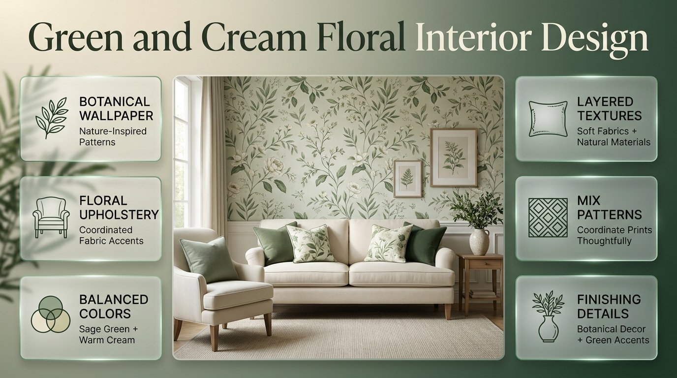
Green and Cream Floral Interior Design | A room can have beautiful furniture, attractive paint colors, and carefully selected accessories yet still feel incomplete. Often, the missing element is a pattern that brings the different parts of the interior together. Green and cream floral interior design offers a practical solution by combining nature-inspired patterns with the softness of a neutral color palette.
Green introduces freshness and visual depth, while cream keeps the overall appearance warm and balanced. Floral designs add personality through leaves, flowering branches, delicate petals, and traditional botanical illustrations. Depending on the pattern and furnishings, this combination can create anything from a relaxed cottage-inspired bedroom to an elegant, contemporary living room.
At Preppy Room, readers can explore interior inspiration, but the key to a successful floral room is understanding how to use patterns thoughtfully rather than decorating every surface with them.
This guide explains how to select green and cream floral patterns, coordinate wallpaper and upholstery, decorate different rooms, combine floral designs with other prints, and avoid common decorating mistakes. You’ll also learn how to create a cohesive interior that suits your space, budget, and personal style.
1. What Makes Green and Cream Floral Interior Design Special?
Green and cream floral interior design combines botanical patterns with complementary green and cream colors to create an interior that feels natural, welcoming, and visually coordinated. The floral element can appear on wallpaper, curtains, upholstery, bedding, artwork, or accessories, allowing homeowners to choose between subtle decoration and a more noticeable statement.
The appeal of this combination comes from the relationship between its colors and patterns.
Green can range from pale sage to rich forest green. Cream can appear warm and buttery or soft and understated. When these shades are combined with floral motifs, they provide a decorative theme that works across several interior styles.
Why does this combination work so well?
It balances pattern with softness. Cream provides visual breathing room around detailed flowers and leaves, preventing the design from feeling excessively busy.
It introduces natural character. Botanical motifs bring the appearance of gardens, leaves, and flowering plants into the home without requiring an abundance of decorative objects.
It suits different decorating styles. Traditional roses can create a classic atmosphere, while simplified leaves and abstract flowers can complement contemporary furniture.
It offers flexibility. You can introduce the theme through a single cushion or build a more complete design around floral wallpaper.
The most important principle is balance. Green and cream should connect the decorative elements, while the floral pattern should have a clear purpose within the room.
2. Which Green and Cream Floral Patterns Should You Choose?
The right floral pattern depends on the room’s proportions, the furniture already in place, and the atmosphere you want to create. Large botanical designs attract attention, delicate flowers create a softer effect, and traditional floral motifs provide decorative detail.
Before choosing a print, consider where it will appear and how much visual attention it should receive.
Large botanical patterns
Large botanical patterns feature oversized leaves, prominent flowers, and spreading branches. They are useful when a room needs a clear focal point.
For example, a living room with plain cream upholstery can benefit from a large green floral design behind the sofa. The wallpaper provides personality while the furniture remains visually calm.
Large patterns are particularly effective on:
- A wall behind a bed.
- A living room feature wall.
- A decorative wall beside a dining area.
- A statement upholstered chair.
- A carefully selected set of curtains.
However, oversized motifs may dominate a narrow wall or compete with heavily patterned furniture.
Pro tip: Before buying wallpaper, obtain a sample and examine the complete motif at the distance from which people will normally see it. A small sample may not reveal how large flowers will appear across an entire wall.
Small and delicate floral prints
Small floral patterns usually feature fine stems, tiny blossoms, and repeated botanical details. They work well when you want the room to feel decorative without introducing a dramatic focal point.
These patterns are suitable for guest bedrooms, reading corners, cottage-inspired interiors, and traditional sitting rooms.
They can also be used on curtains or cushions where a large pattern might look too dominant.
The main consideration is repetition. A delicate print can become visually tiring when repeated across wallpaper, curtains, bedding, and upholstery without enough plain surfaces to balance it.
Vintage floral designs
Vintage-inspired floral patterns often include roses, flowering vines, symmetrical arrangements, or illustrations that resemble traditional botanical prints.
They pair naturally with classic wooden furniture, cream-painted bedside tables, decorative lamps, and soft curtains.
For a more updated appearance, combine vintage floral wallpaper with simple furniture and fewer accessories. This preserves the character of the pattern without making the entire room feel formal or old-fashioned.
Contemporary floral designs
Contemporary floral prints often simplify flowers and leaves into cleaner shapes. Some use widely spaced branches, abstract petals, or restrained outlines against a cream background.
These patterns are useful when you want botanical character without an elaborate traditional appearance.
Pair them with streamlined furniture, understated lighting, plain curtains, and a limited selection of decorative accessories.
Expert tip: Choose the pattern according to the overall room, not just whether you like the individual print. A beautiful fabric may not work well if its scale, color intensity, or visual weight conflicts with the furniture.
3. How Should You Combine Green and Cream Shades?
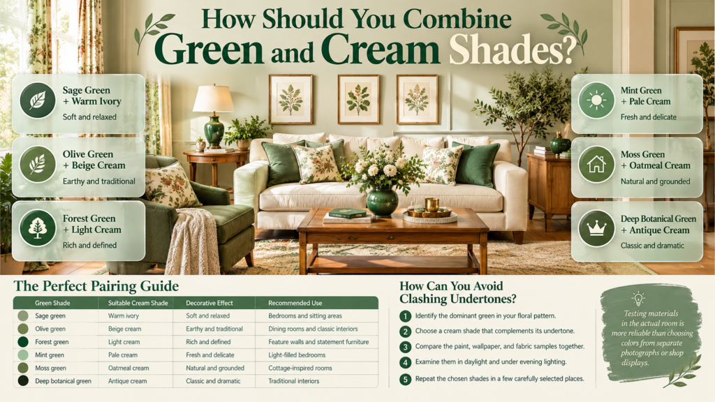
Green and cream floral interiors look most cohesive when the colors share compatible undertones. Sage and warm ivory create a soft appearance, olive and cream provide an earthy combination, and forest green with cream produces stronger contrast.
The best pairing depends on the amount of natural light, the flooring, and the colors already present in the room.
| Green shade | Suitable cream shade | Decorative effect | Recommended use |
|---|---|---|---|
| Sage green | Warm ivory | Soft and relaxed | Bedrooms and sitting areas |
| Olive green | Beige cream | Earthy and traditional | Dining rooms and classic interiors |
| Forest green | Light cream | Rich and defined | Feature walls and statement furniture |
| Mint green | Pale cream | Fresh and delicate | Light-filled bedrooms |
| Moss green | Oatmeal cream | Natural and grounded | Cottage-inspired rooms |
| Deep botanical green | Antique cream | Classic and dramatic | Traditional interiors |
Sage green and warm cream
Sage is a versatile choice because it provides color without necessarily dominating the room.
Warm cream softens its appearance, making the combination suitable for bedrooms, reading areas, and living rooms.
This pairing works particularly well when the floral print includes fine leaves and understated flowers.
Olive green and beige cream
Olive has a more earthy appearance than pale sage. When combined with beige cream, it creates a grounded palette that suits wood furniture, natural fabrics, and traditional decorative pieces.
Use this combination when you want a floral interior that feels warm rather than cool.
Forest green and light cream
Forest green provides stronger contrast, especially when it appears against a light cream background.
This pairing works well for statement wallpaper, upholstered accent chairs, and decorative cushions.
If the room is small or receives limited daylight, consider using forest green in selected areas instead of covering every surface.
How can you avoid clashing undertones?
Undertones become particularly important when you combine several green shades or use different cream fabrics.
A yellow-based olive may look disconnected from a cool blue-green if the surrounding colors do not create a visual bridge.
To avoid this problem:
- Identify the dominant green in your floral pattern.
- Choose a cream shade that complements its undertone.
- Compare the paint, wallpaper, and fabric samples together.
- Examine them in daylight and under evening lighting.
- Repeat the chosen shades in a few carefully selected places.
Testing materials in the actual room is more reliable than choosing colors from separate photographs or shop displays.
4. How Can You Design a Living Room With Green and Cream Floral Details?
A green and cream floral living room should have one clear decorative focus. Floral wallpaper, a patterned armchair, or botanical curtains can provide that focus, while simple furniture and coordinated accessories help the arrangement feel balanced.
Use floral wallpaper behind the sofa
A sofa wall is often a suitable place for floral wallpaper because it provides a natural focal point.
Choose a pattern that relates to the sofa’s color and the room’s existing finishes. If the sofa is cream, a green botanical design can create contrast without requiring additional strong colors.
Keep the coffee table and surrounding furniture relatively simple if the wallpaper contains large flowers or detailed foliage.
If the room already has a distinctive fireplace, artwork, or architectural feature, consider whether another focal point is necessary.
Introduce floral cushions
Cushions are an easy way to introduce the theme without changing the walls.
For a cream sofa, combine a few green floral cushions with solid sage cushions and one or two textured cream cushions.
The mixture of prints and textures creates depth without making every cushion look identical.
For a more relaxed appearance, avoid arranging all the cushions in exactly the same way. A considered mix of shapes and textures can feel more natural.
Choose curtains carefully
Floral curtains can be attractive, but they should relate to the rest of the room.
If the wallpaper is already detailed, plain cream curtains often provide a better balance. If the walls are plain, botanical curtains can become the main decorative feature.
Pay attention to the amount of daylight you want, the privacy requirements, and the fabric’s maintenance needs.
Add natural materials
Wood, woven baskets, ceramic vases, linen, and simple indoor plants can support the botanical theme.
A wooden coffee table can introduce warmth, while ceramic accessories offer a quieter decorative finish.
The objective is not to make every object botanical. Instead, use a few natural materials to connect the floral pattern with the rest of the interior.
For additional decorating inspiration, explore Green and Cream Room Ideas.
5. How Can You Create a Calm Green and Cream Floral Bedroom?
A floral bedroom should feel comfortable and restful rather than excessively decorative. The most effective approach is to choose one main floral element, coordinate the bedding with its colors, and use plain fabrics and suitable lighting to create balance.
Create a floral feature behind the bed
The wall behind the headboard is a practical place for floral wallpaper because it gives the pattern a clear role.
Traditional floral prints work well with classic furniture, while simplified botanical designs suit more contemporary bedrooms.
If the headboard already contains a strong pattern or decorative stitching, choose wallpaper that complements rather than competes with it.
Coordinate bedding with the wallpaper
Cream bedding creates a calm background for green floral wallpaper.
Alternatively, green bedding can work with a cream floral wall, particularly when the pattern contains a similar green shade.
You can also use a mostly cream bedspread with botanical cushions to introduce the theme gradually.
Avoid selecting bedding and wallpaper independently. Place samples together before purchasing to check that their greens and creams work well as a group.
Use texture instead of extra prints
Texture can make a bedroom feel layered without increasing the number of patterns.
Consider:
- A quilted cream bedspread.
- Plain cotton bedding.
- Linen pillowcases.
- A knitted throw.
- An upholstered headboard.
- Wooden bedside tables.
- Ceramic lamps.
These materials add interest while allowing the floral pattern to remain the main decorative feature.
Make guest bedrooms practical
Guest bedrooms should look attractive while remaining easy to use.
Choose bedding that is comfortable to maintain, curtains that provide suitable privacy, and bedside lighting that guests can operate conveniently.
A restrained floral theme can make the room feel welcoming without imposing an overly specific decorating style.
For more focused inspiration, visit Green and Cream Guest Bedroom Ideas.
6. How Can You Use Green and Cream Floral Wallpaper Effectively?
Floral wallpaper is most effective when its pattern, placement, and surrounding furnishings are planned together. It can highlight a particular wall, establish the room’s color palette, or provide decorative detail where plain paint would feel incomplete.
Select a suitable feature wall
Before choosing a wall, identify the area you want people to notice first.
In a bedroom, this may be the wall behind the bed. In a living room, it may be the wall behind the sofa. In a dining area, a wallpapered wall can help define the table’s position.
The wall should be large enough for the pattern to be appreciated and positioned where furniture will not conceal most of its details.
Understand pattern scale
Pattern scale affects how wallpaper feels across a room.
Large flowers create a stronger visual effect, while small flowers introduce finer detail. Both can work, but they should suit the room’s proportions and the surrounding furnishings.
A large pattern on a narrow wall may feel dominant. A very delicate pattern across a large room may look less noticeable than expected.
Always examine the wallpaper sample against the intended wall rather than relying solely on a product photograph.
Compare wallpaper with painted walls
Paint provides a quieter background, while wallpaper adds decorative detail.
If you’re unsure about using a floral pattern, begin with cream-painted walls and introduce botanical artwork or patterned cushions.
Once you understand which green shades work best, you can decide whether a larger wallpaper feature would improve the room.
For more wall-focused inspiration, explore Green and Cream Painted Wall Designs.
Consider practical maintenance
Different wallpaper products have different cleaning and installation requirements.
Check whether the product is suitable for the room’s conditions, whether it can be wiped clean, and what preparation the wall requires.
Bathrooms, kitchens, and other humid spaces need particular attention to product suitability and installation instructions.
Common mistake: Choosing wallpaper based only on appearance. A pattern may look beautiful but be unsuitable for the wall surface or the conditions in which it will be installed.
7. How Can You Mix Floral Patterns With Other Prints?

Floral patterns can work with stripes, gingham, and other botanical designs when the colors remain coordinated and the patterns have different visual roles. One print should normally dominate, while the others provide supporting detail.
Combine floral prints with stripes
Stripes introduce regular lines that contrast with the natural shapes of flowers and leaves.
For example, a room could contain a floral cushion, plain cream upholstery, and restrained green striped curtains.
The combination works best when the stripe colors relate to the floral print and neither pattern overwhelms the other.
For more examples, explore Green and Cream Striped Interior Ideas.
Combine floral patterns with gingham
Gingham provides a regular checked pattern that can balance delicate flowers.
This pairing suits cottage-inspired dining corners, relaxed bedrooms, and traditional sitting rooms.
Consider using a small floral print on cushions and a subtle green gingham pattern on curtains, while keeping the larger furniture pieces plain.
The scale of the checks matters. Large checks can become a strong visual feature, while small checks tend to feel more delicate.
Explore Green and Cream Gingham Room Decor.
Combine flowers with botanical leaf prints
Flowers and leaves share a natural visual connection, but two botanical patterns can still compete if their colors and scales are too similar.
A large leafy wallpaper may work with small floral cushions when the colors are related. However, two intricate prints of similar size may make the room feel crowded.
A useful approach is to choose one dominant pattern, one secondary print, and plain fabrics that allow both to stand out.
For further pattern inspiration, visit Green and Cream Patterned Room Ideas.
8. How Can You Decorate With Botanical Prints Without Wallpaper?
Botanical prints provide a flexible alternative to wallpaper because they can be introduced through artwork, fabric, and accessories. They are particularly useful when you want to experiment with the style before making a permanent decorating change.
Display botanical artwork
Framed botanical illustrations can introduce green and cream colors without changing the walls.
A pair of prints above a sofa, bed, or console can create a coordinated display.
Choose artwork with related backgrounds, frame finishes, or shades of green. This creates continuity without requiring every picture to show the same type of flower.
Introduce printed fabrics
Botanical cushions, curtains, lampshades, and accent chairs allow you to control how much floral detail appears in the room.
If your existing furniture is neutral, one patterned accent chair may be enough to establish the theme.
If you already have floral curtains, choose simpler cushions or upholstery to prevent the patterns from competing.
Use decorative accessories thoughtfully
Ceramic vases, botanical illustrations, and carefully chosen greenery can reinforce the design.
However, too many small decorative objects can make shelves and tables appear crowded.
Select accessories that serve a purpose or contribute something meaningful to the overall composition.
For more inspiration, explore Green and Cream Botanical Print Decor.
9. Which Furniture and Materials Complement Floral Interiors?
Furniture and materials should support the floral design rather than compete with it. Natural wood, linen, cotton, ceramics, and understated metal finishes can complement green and cream patterns while providing practical surfaces and textures for everyday use.
| Material | How it complements floral decor | Suggested application |
|---|---|---|
| Light oak | Adds warmth without heavy contrast | Side tables and coffee tables |
| Dark wood | Introduces depth and classic character | Dining tables and traditional furniture |
| Linen | Provides understated texture | Curtains and upholstery |
| Cotton | Offers comfort and versatility | Bedding and cushions |
| Rattan | Adds natural texture | Baskets and occasional chairs |
| Ceramic | Creates a refined decorative finish | Lamps and vases |
| Brushed brass | Introduces a warm accent | Lighting and selected hardware |
| Matte black | Adds definition to modern interiors | Frames and light fittings |
Should you choose light or dark furniture?
Light furniture often works well in rooms where you want a soft and airy appearance.
Dark furniture can create contrast and make floral patterns feel more traditional or dramatic.
Neither is automatically the better choice. Consider the floor, natural light, room dimensions, and existing furniture before making a decision.
How do you prevent furniture from competing with wallpaper?
If the wallpaper has large flowers and strong colors, simpler furniture often creates a more balanced result.
If the walls are plain, patterned upholstery can introduce the main decorative feature.
The important principle is to distribute visual interest rather than concentrating it in every part of the room.
10. How Can You Make Floral Interiors Work in Small Rooms?
Small rooms benefit from controlled pattern placement, appropriate furniture dimensions, and a balance between decorated and plain surfaces. Green and cream floral design can work well in compact spaces when the pattern is selected carefully and the furnishings leave enough room for movement.
Choose patterns with a clear background
Cream backgrounds can help separate green flowers and leaves, making the design easier to appreciate.
However, the size and density of the pattern still matter. A densely packed floral print may feel busy even when its background is light.
Look for samples that remain attractive when viewed from the normal entrance to the room.
Avoid unnecessary furniture
Too much furniture can make a small room feel crowded regardless of the color scheme.
Choose pieces according to their function, and leave practical space around doors, windows, and walking routes.
Use dark green selectively
Dark green can work in a compact room when used on a feature wall, a chair, or selected accessories.
Pairing it with cream can create definition without requiring the entire room to be dark.
The decision should depend on the room’s light, layout, and your preferred atmosphere rather than a strict rule that small rooms must use pale colors everywhere.
11. What Are the Most Common Floral Decorating Mistakes?
The most common mistakes include using too many patterns, ignoring undertones, choosing unsuitable materials, and purchasing decorative items without considering how they work together.
Mistake 1: Repeating too many floral prints
Why it happens: Each floral product looks appealing on its own.
Why it is harmful: When several detailed prints are combined, the room can feel visually crowded.
How to avoid it: Select one main floral design and support it with plain fabrics or a simpler secondary pattern.
Mistake 2: Ignoring color undertones
Why it happens: Green and cream are treated as single colors rather than groups of related shades.
Why it is harmful: Some greens and creams can appear disconnected when their undertones conflict.
How to avoid it: Compare paint, wallpaper, and fabric samples together in the actual room.
Mistake 3: Buying wallpaper without checking its scale
Why it happens: A product photograph makes the design look attractive without showing how it will appear across the entire wall.
Why it is harmful: Large flowers may dominate a narrow wall, while small details may be less visible than expected.
How to avoid it: Obtain a sample and view it from several distances before purchasing.
Mistake 4: Decorating every surface
Why it happens: The decorator wants the floral theme to be immediately obvious.
Why it is harmful: The room lacks the plain areas needed to balance the detailed patterns.
How to avoid it: Leave some walls, furniture, and fabrics relatively simple.
Mistake 5: Ignoring maintenance requirements
Why it happens: Appearance receives more attention than everyday use.
Why it is harmful: Some fabrics and wall coverings may be unsuitable for busy households or humid spaces.
How to avoid it: Check cleaning instructions, durability, and product suitability before purchasing materials.
12. What Professional Decorating Principles Make Floral Rooms Look Cohesive?
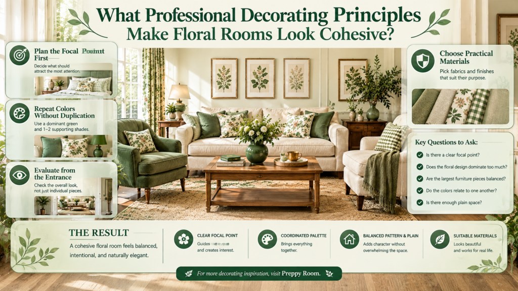
A cohesive floral interior begins with a clear focal point, a coordinated palette, and a deliberate balance between pattern and plain surfaces. Instead of buying decorative pieces independently, consider how each item contributes to the room’s overall appearance and practical use.
Plan the focal point first
Decide whether the wallpaper, sofa, bed, curtains, or artwork should attract the most attention.
This choice determines how much pattern the remaining elements should contain.
For example, a bedroom with elaborate floral wallpaper may benefit from plain bedding, while a room with cream walls can accommodate a more decorative bedspread.
Repeat colors without making everything identical
Select a dominant green and one or two supporting shades.
Repeat the dominant green in a few places, such as a cushion, a lampshade, or artwork. Use cream to connect the larger surfaces.
The objective is visual continuity, not an exact match between every item.
Evaluate the room from the entrance
Stand at the doorway and assess the arrangement as a whole.
Ask yourself:
- Is there a clear focal point?
- Does the floral design dominate too much?
- Are the largest furniture pieces balanced?
- Do the colors relate to one another?
- Is there enough plain space?
This review can reveal problems that are less noticeable when examining each object separately.
Choose practical materials
A decorative fabric should suit its intended purpose.
Dining chairs may require more durable upholstery than decorative cushions. Wallpaper should be suitable for the room’s conditions, and curtains should provide the required privacy and light control.
For a broader collection of decorating inspiration, visit Preppy Room. Use the ideas as a starting point, then adapt them to your own room dimensions, furnishings, and practical needs.
13. How Can You Create a Green and Cream Floral Interior Step by Step?
The easiest way to create a coordinated interior is to make the major decisions first and introduce smaller decorative details gradually. This approach helps prevent unnecessary purchases and makes it easier to maintain a clear design direction.
Step 1: Assess your room
Measure the walls, note window positions, and identify the furniture you intend to keep.
Consider how natural light changes throughout the day.
Why it matters: These details influence which colors, patterns, and materials will work best.
Step 2: Choose the main floral design
Select wallpaper, fabric, or artwork to establish the decorating direction.
Why it matters: A clear starting point helps you coordinate the remaining elements.
Step 3: Select complementary paint colors
Test cream and green shades against the chosen floral pattern.
Professional advice: Evaluate samples in daylight and under your normal evening lighting.
Step 4: Arrange the largest furniture pieces
Position the bed, sofa, or dining table before selecting smaller accessories.
If the walls have a strong pattern, choose relatively simple furniture. If the walls are plain, consider a patterned chair, cushions, or curtains.
Step 5: Add textiles and lighting
Introduce cushions, curtains, rugs, and lamps according to the room’s practical requirements.
Use these elements to repeat the selected colors and create a comfortable atmosphere.
Step 6: Introduce accessories gradually
Add botanical artwork, ceramic objects, or greenery only where they improve the overall composition.
Avoid buying every accessory at once. You may discover that the room already has sufficient visual interest after the furniture and textiles are in place.
Step 7: Review and edit
Remove anything that competes with the focal point or contributes unnecessary clutter.
A successful interior doesn’t need the maximum number of decorative objects. It needs a thoughtful balance of pattern, color, texture, and space.
How Do You Choose the Best Green and Cream Floral Wallpaper for Your Room?
The best green and cream floral wallpaper depends on your room’s size, natural lighting, existing furniture, and decorating style. Large botanical prints create a striking focal point, while delicate floral patterns provide a softer, more traditional appearance. Before selecting wallpaper, consider how its colors and pattern will work with your furniture, curtains, flooring, and other decorative elements.
For a coordinated result, examine the wallpaper sample in your actual room rather than relying entirely on online photographs. Lighting can change how green and cream shades appear, and the scale of a pattern may look different across an entire wall.
Professional tips:
Choose large floral motifs when you want a statement wall.
Select smaller, delicate prints for a subtle decorative effect.
Match the wallpaper’s green undertones with nearby fabrics and accessories.
Test samples in both daylight and evening lighting.
Check the wallpaper’s cleaning requirements before purchasing.
What Colors Go Best With Green and Cream Floral Interior Design?
Green and cream floral interiors work well with natural wood, warm beige, soft brown, muted gold, and carefully selected neutral shades. The best complementary colors depend on the particular green in your floral pattern. Sage often pairs beautifully with warm ivory, while olive green complements earthy beige tones. Forest green creates stronger contrast when combined with lighter cream furnishings.
Rather than introducing several unrelated colors, select a small palette that supports the floral design. This approach helps the room feel coordinated without making every item look identical.
Color combinations worth considering:
Sage green and warm ivory: A soft, relaxed combination for bedrooms and living rooms.
Olive green and beige: Suitable for traditional interiors and natural wood furniture.
Forest green and cream: Creates a richer, more dramatic appearance.
Mint green and pale cream: Works well for a light, delicate decorating scheme.
Green, cream, and natural wood: Adds warmth and balances decorative patterns.
Expert tip: Compare paint and fabric samples together before buying large items. Two shades that look similar individually may have different undertones when placed side by side.
How Can You Decorate a Small Room With Green and Cream Floral Patterns?
A small room can benefit from green and cream floral patterns when the design is used thoughtfully. Cream backgrounds can help separate the green motifs, while carefully selected furniture and simple accessories prevent the room from feeling overcrowded. You don’t necessarily need to avoid large floral patterns; the important consideration is how the pattern relates to the room’s proportions and lighting.
Start by choosing one main decorative feature, such as wallpaper behind the bed, floral curtains, or botanical artwork. Keep other large surfaces relatively simple so the pattern remains attractive without competing with numerous additional details.
Practical decorating ideas:
Use a floral feature wall instead of automatically covering every wall.
Choose cream bedding or upholstery to balance a detailed pattern.
Keep curtains relatively simple when the wallpaper is visually prominent.
Use appropriately sized furniture and maintain clear walking spaces.
Introduce texture through linen, cotton, wood, and ceramics instead of adding more prints.
Common mistake to avoid: Assuming that every small room must use only pale colors. A carefully placed dark green floral feature can add depth and character when the surrounding elements are balanced.
Can You Mix Green and Cream Floral Prints With Stripes and Gingham?
Mixing floral prints with stripes or gingham can create a layered, individual interior, provided the patterns share a compatible color palette and have different visual scales. Flowers and leaves introduce organic shapes, while stripes and checks provide structure. This contrast can make a room feel thoughtfully decorated rather than overly coordinated.
The easiest approach is to begin with one dominant floral pattern and introduce a simpler secondary print through cushions, curtains, or a small upholstered piece. Keep some surfaces plain to provide visual breathing room.
A practical pattern-mixing approach:
Use floral wallpaper with plain cream upholstery.
Introduce green striped curtains that pick up a color from the wallpaper.
Add a small gingham cushion for a subtle cottage-inspired detail.
Choose different pattern sizes so the designs don’t compete equally.
Repeat one or two colors across the patterns to create continuity.
Professional tip: If you’re uncertain about mixing patterns, start with two prints rather than three. Once the arrangement feels balanced, you can decide whether another patterned element would genuinely improve the room.
How Can You Make Green and Cream Floral Interior Design Look Modern and Timeless?
Green and cream floral interior design can look modern and timeless when traditional botanical details are balanced with simple furniture, suitable lighting, and understated accessories. You don’t need to avoid classic flowers to create a contemporary room. Instead, focus on the pattern’s scale, the simplicity of the surrounding furnishings, and the overall relationship between colors and textures.
For example, green floral wallpaper can look fresh alongside a streamlined cream sofa, natural wood furniture, and simple ceramic accessories. In a bedroom, botanical wallpaper can be paired with plain bedding, an uncomplicated headboard, and coordinated bedside lighting.
Design principles to follow:
Choose floral patterns that complement your preferred decorating style.
Combine detailed prints with simple furniture and plain fabrics.
Use natural materials to introduce warmth and texture.
Repeat selected green shades without matching every accessory exactly.
Avoid filling every wall and surface with decorative elements.
Prioritize comfortable, durable furnishings that suit everyday use.
Expert tip: Build the room around one feature you genuinely like, whether that’s floral wallpaper, a botanical fabric, or framed botanical artwork. Let the remaining choices support that feature instead of competing with it.
Conclusion: Creating a Timeless Green and Cream Floral Interior
Green and cream floral interior design offers a beautiful way to bring natural elegance, warmth, and personality into your home. The combination of botanical patterns, soft cream backgrounds, and refreshing green tones creates a balanced look that can feel traditional, romantic, modern, or comfortably preppy, depending on how you style the space. The key is to choose floral designs that complement your room rather than allowing patterns and accessories to compete for attention.
For a cohesive result, begin with a clear color palette, select one main floral pattern, and build around it with carefully coordinated furniture, textiles, wall finishes, and decorative accents. Cream can keep the interior feeling light and open, while green adds depth and a connection to nature. Smaller floral details work well in compact spaces, whereas larger botanical prints can become striking focal points in more spacious rooms.
Consider these final decorating principles when planning your design:
- Choose patterns with purpose: Match the scale and style of floral prints to the size, lighting, and overall character of your room.
- Balance bold and subtle elements: Pair statement floral wallpaper or upholstery with simpler furniture and understated accessories.
- Layer complementary patterns carefully: Introduce stripes, gingham, or botanical prints in different scales to create interest without visual clutter.
- Use natural textures: Wood, linen, cotton, woven materials, and ceramic accessories can make the green and cream palette feel warmer and more inviting.
- Maintain consistency: Repeat selected shades of green and cream throughout the space to create a connected, professionally styled appearance.
Whether you are refreshing a bedroom, updating a living room, or decorating an entire home, green and cream floral interiors provide plenty of flexibility for personal expression. Focus on practical choices, thoughtful pattern placement, and a balanced mix of color and texture to create a space that feels welcoming today and remains appealing over time.