Introduction
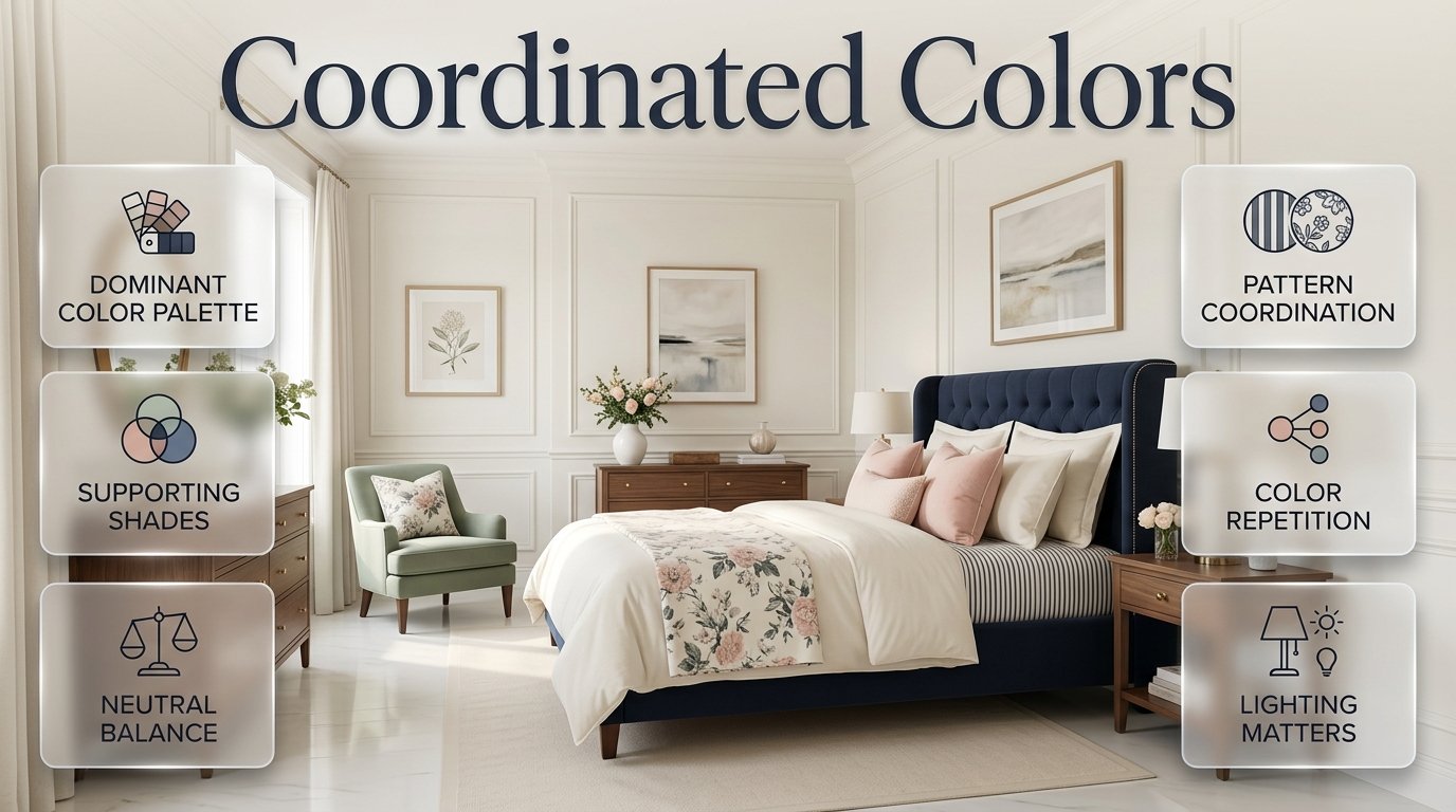
Coordinated Colors | Choosing colors for a room is one of those decorating decisions that looks easy until you actually have to make it.
You might fall in love with a navy bed, a blush cushion, a sage green chair, or a beautiful floral curtain. Each piece can look perfect on its own. But when you bring several different pieces into the same room, they don’t automatically create a beautiful interior.
Sometimes the colors feel disconnected. Sometimes there are too many strong shades competing for attention. Other times, everything matches so closely that the room feels flat and predictable.
The solution is learning how to use coordinated colors.
Color coordination isn’t about making every item exactly the same color. It’s about creating relationships between different shades so furniture, textiles, patterns, artwork, walls, and accessories feel as though they belong together.
This becomes especially important in a preppy room.
Preppy interiors often combine classic furniture with stripes, florals, checks, gingham, traditional details, colorful textiles, polished hardware, and playful accents. That combination gives the style its personality, but it can also become visually overwhelming if the colors aren’t organized carefully.
The good news is that you don’t need professional design software or an enormous decorating budget to create a coordinated palette.
You simply need to understand which color should lead, which colors should support it, where neutrals should be used, how patterns can share colors, and how lighting changes what you see.
This guide explains the entire process, from choosing your first color to coordinating furniture, walls, bedding, curtains, rugs, artwork, patterns, wood tones, and decorative accents.
What Are Coordinated Colors?
Coordinated colors are shades that work together visually to create harmony within a space.
They don’t have to be identical.
They don’t even have to come from the same color family.
For example, navy, ivory, sage green, and warm walnut can create a cohesive room even though they are very different visually.
Navy can provide depth.
Ivory can create brightness.
Sage can add softness.
Walnut can introduce warmth.
Each color performs a different job, but the combination feels intentional.
That’s the real purpose of color coordination.
Instead of asking whether every object “matches,” you’re asking whether every important color contributes to the overall design.
A coordinated palette often contains:
- A dominant color
- One or two supporting colors
- One or more neutral shades
- A small accent color
- Natural material tones
- Metallic finishes
The exact combination depends on the room.
A classic preppy bedroom might use navy, white, red, and walnut.
A softer room might use blush, sage, ivory, and light wood.
A luxury-inspired space might use emerald, navy, ivory, and brass.
There isn’t one correct palette.
The important thing is that each color has a purpose.
Why Do Coordinated Colors Matter in Interior Design?
Color creates one of the strongest first impressions in a room.
Before someone notices the exact shape of a nightstand or studies a decorative object, they experience the overall visual atmosphere.
If the colors are organized, the room feels intentional.
If the colors are unrelated, even expensive furniture can look randomly assembled.
Coordinated colors help connect separate elements.
Imagine a bedroom with:
- A navy upholstered bed
- White bedding
- Pale blue curtains
- A sage cushion
- Walnut nightstands
- Artwork containing navy and sage
- A cream rug
The room contains several colors, but the eye can connect them.
Navy appears in multiple places.
Sage appears more than once.
Cream and white provide breathing room.
Walnut introduces warmth.
Now imagine replacing the artwork with something containing bright purple, orange, and yellow, while adding a red chair and turquoise curtains.
The individual objects might still be attractive, but the room has lost its visual language.
Coordinated colors help you:
- Create visual harmony
- Establish a focal point
- Make furniture feel connected
- Combine patterns successfully
- Control visual clutter
- Make decorating decisions easier
- Create a recognizable style
- Give a room more depth
- Balance bold colors with neutrals
A coordinated palette is therefore less about following a rigid rule and more about controlling the visual relationships inside the room.
Does Coordinating Colors Mean Everything Has to Match?
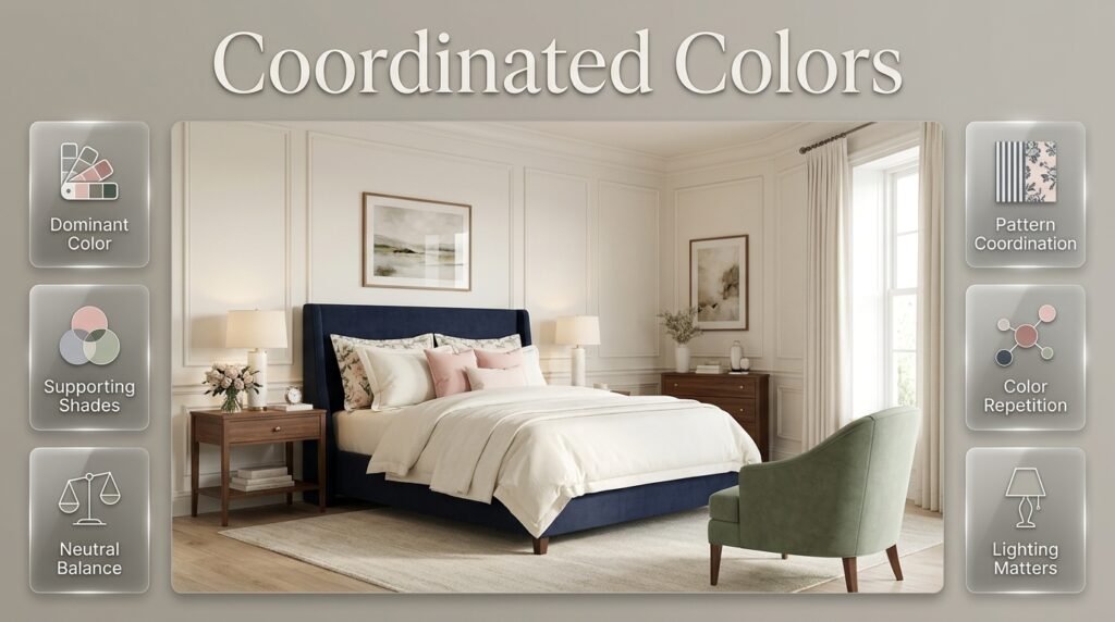
No.
This is one of the most important things to understand.
A room where every pillow, curtain, rug, chair, and accessory uses exactly the same shade can actually feel less sophisticated.
Good interiors often contain variation.
For example, a blue-focused bedroom might contain:
- Deep navy
- Dusty blue
- Powder blue
- Blue-gray
- White
These colors are different, but they still belong to a recognizable visual family.
The same idea works with green.
You might combine:
- Sage
- Olive
- Forest green
- Soft eucalyptus
You don’t need to find the exact same green for every object.
Think coordination instead of duplication
Rather than asking:
“Does this color exactly match?”
Ask:
“Does this color support the overall palette?”
That change in thinking makes decorating much easier.
How Do You Choose Coordinated Colors for a Room?
The easiest method is to start with one existing element or one color you genuinely love.
Don’t begin by trying to choose every color simultaneously.
That usually creates confusion.
Instead, choose a starting point.
It could be:
- A bed
- A rug
- A painting
- A wallpaper pattern
- A floral fabric
- A favorite cushion
- A chair
- A curtain
- A color you already know you want
Suppose your starting point is a navy upholstered bed.
Now ask:
What colors make navy look the way I want?
For a fresh look, you might choose:
Navy + White + Pale Blue
For a warmer look:
Navy + Cream + Walnut
For a feminine look:
Navy + Blush + Ivory
For a sophisticated look:
Navy + Emerald + Ivory
The starting color stays the same.
The supporting colors change the personality of the room.
What Is the Best Color Structure for a Room?
A simple color hierarchy makes decorating much easier.
Start with four roles:
1. Dominant color
This is the main visual color.
It may appear on walls, major furniture, curtains, or large textiles.
2. Secondary color
This supports the dominant shade.
It usually appears in medium-sized elements.
3. Neutral
The neutral gives the eye somewhere to rest.
Common examples include:
- White
- Ivory
- Cream
- Beige
- Taupe
- Soft gray
4. Accent
The accent is used in smaller amounts.
It can be a contrasting or stronger shade.
For example:
Navy → Pale Blue → Ivory → Brass
Or:
Sage → Blush → Cream → Walnut
This hierarchy prevents every color from competing equally.
Modern Preppy Room
A modern preppy room brings together the timeless charm of classic preppy style with the clean, refined feel of contemporary interiors. Start with a fresh color palette such as navy, soft blue, green, white, or warm neutrals, then balance traditional patterns with streamlined furniture and simple decorative details. Layering is key—combine patterned bedding, textured fabrics, elegant lighting, and carefully selected accessories without making the room feel overly busy. The result is a space that feels sophisticated yet comfortable, polished yet personal, with classic character presented through a fresh and modern perspective.
Discover how to blend timeless preppy charm with contemporary design by exploring our guide to Modern Preppy Room for fresh, stylish inspiration.
What Is the 60-30-10 Rule?
The 60-30-10 rule is a popular interior design guideline for distributing color.
The basic idea is approximately:
- 60% dominant color
- 30% secondary color
- 10% accent color
You don’t need to calculate these percentages literally.
They are better understood as a visual hierarchy.
For example, consider a bedroom with:
60% ivory
The ivory might appear through walls, bedding, curtains, and upholstery.
30% navy
Navy might appear on the headboard, cushions, rug details, and artwork.
10% blush
Blush might appear in a few cushions, flowers, or decorative accents.
The result feels colorful but controlled.
Why the rule is useful
It helps answer a common decorating problem:
“Why does my room feel too busy?”
Often, the answer is that too many colors have become dominant.
If navy, pink, green, yellow, and red are all present in large amounts, the room may not have a clear visual leader.
Reducing some colors to accent status can immediately improve the balance.
⭐ Expert Tip: Treat the 60-30-10 rule as a starting framework, not a strict decorating formula. Texture, contrast, lighting, and pattern can make a small amount of a dark color feel visually much heavier than a larger amount of a pale color.
What Colors Work Best in a Preppy Room?
Preppy design is particularly flexible because it can range from traditional and formal to colorful and playful.
Some color combinations naturally suit the style.
Navy and White
Navy and white are among the most reliable preppy combinations.
White creates brightness.
Navy provides structure and contrast.
The combination can look traditional, coastal, collegiate, or modern depending on the furniture and patterns.
Try:
- Navy upholstered bed
- White bedding
- Navy-and-white striped cushions
- Ivory curtains
- Walnut furniture
- Brass lighting
This combination works especially well when you want a timeless room that won’t quickly feel outdated.
Navy and Pale Blue
If navy feels too strong on its own, soften it with pale blue.
A palette of:
Navy + Pale Blue + White + Natural Beige
can create a relaxed coastal-preppy atmosphere.
Use navy for stronger visual elements and pale blue for larger textile layers.
Natural beige or light wood can prevent the blue palette from feeling too cold.
Blush Pink and Sage Green
Blush and sage create a softer preppy combination.
Instead of bright pink and vivid green, muted shades usually create a more balanced result.
Try:
Blush + Sage + Ivory + Light Wood
Blush can appear through:
- Cushions
- Bedding
- Artwork
- Small decorative accents
Sage can appear through:
- An accent chair
- Curtains
- Artwork
- Decorative textiles
Ivory keeps the combination calm.
Emerald and Navy
Emerald green and navy create a richer, more dramatic interior.
Because both shades are relatively deep, they should usually be balanced with lighter surfaces.
Try:
Emerald + Navy + Ivory + Brass
Emerald works particularly well as an accent.
A green chair or pair of cushions may have more impact than covering an entire room in emerald.
Pink, Blue, and Green
This is a more playful preppy palette.
The combination works particularly well with floral patterns, gingham, and traditional textiles.
The important thing is to choose a dominant base.
For example:
Ivory + Pale Blue + Blush + Sage
Here, ivory controls the background while blue, pink, and green provide personality.
How Do You Coordinate Colors With Patterns?
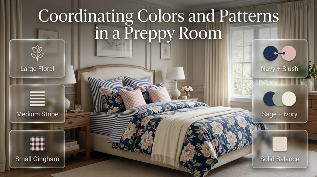
Pattern coordination is one of the most important skills for preppy interiors.
Preppy rooms often use:
- Stripes
- Florals
- Gingham
- Plaid
- Checks
- Geometric patterns
- Traditional motifs
You don’t have to avoid mixing them.
Instead, connect them through color.
Suppose your main floral fabric includes:
Navy + Blush + Sage + Ivory
You could then use:
- Navy-and-white stripe
- Sage solid
- Blush cushion
- Ivory curtain
- Small gingham accent
The patterns are different, but their colors connect them.
That’s what creates harmony.
Why Pattern Scale Matters
Color isn’t the only factor.
Pattern size also affects visual balance.
Imagine a room with:
- Large floral curtains
- Large geometric rug
- Large plaid bedding
- Large striped cushions
Even if all the colors coordinate, the room might still feel overwhelming.
Instead, vary the scale.
A useful sequence is:
Large pattern → medium pattern → small pattern → solid
For example:
- Large floral duvet
- Medium stripe pillow
- Small gingham cushion
- Solid cream throw
The eye can move between the patterns without becoming overloaded.
How Do You Use Stripes in a Coordinated Room?
Stripes are particularly useful in preppy interiors because they can introduce structure without overwhelming the room.
Navy-and-white stripes are especially versatile.
You can use them on:
- Pillows
- Bedding
- Curtains
- Upholstery
- Rugs
- Decorative boxes
If you already have a bold floral pattern, a simple stripe can act as a visual bridge.
The stripe doesn’t need to repeat the floral pattern.
It only needs to share one or more colors.
Cute Preppy Room
A cute preppy room combines playful charm with the polished details that define classic preppy style. Soft colors, cheerful patterns, cozy textiles, decorative accents, and thoughtfully chosen furniture can create a space that feels bright, welcoming, and full of personality. Consider incorporating pastel blues, pinks, greens, or creams alongside timeless patterns such as stripes, checks, or subtle florals. The key is to balance fun decorative elements with a clean, coordinated look, creating a room that feels youthful, stylish, comfortable, and uniquely personal without becoming overly cluttered.
Bring playful charm and timeless style together with our guide to Cute Preppy Room, featuring inspiring ideas for creating a cozy, colorful, and beautifully coordinated space.
How Do You Use Gingham With Coordinated Colors?
Gingham can create a playful, traditional preppy feeling.
Because gingham is usually based on a limited color combination, it can be easy to integrate.
For example:
Pink gingham + sage floral + ivory solid
The ivory separates the stronger colors.
Or:
Navy gingham + pale blue stripe + white
The colors belong to the same family, so the patterns can coexist naturally.
How Do You Coordinate Floral Patterns?
Florals can contain several colors, which makes them useful as a starting point for the entire palette.
If you have a floral fabric you love, don’t try to match every color in it.
Instead, select two or three important colors.
Suppose the floral includes:
- Navy
- Green
- Pink
- Yellow
- Ivory
You don’t have to use all five.
You could select:
Navy + Sage + Ivory
and allow pink or yellow to appear only as tiny details.
This keeps the room coordinated without making it visually loud.
How Do You Coordinate Wall Colors With Furniture?
Walls cover a large area, so their color should be chosen carefully.
The safest method is to look at your largest furniture pieces first.
If you have a dark navy bed, a light wall can create beautiful contrast.
Good options might include:
- Warm white
- Ivory
- Cream
- Very pale blue
- Soft gray
If your furniture is mostly light and neutral, you have more flexibility.
You might use:
- Sage
- Pale blue
- Soft blush
- Deeper accent walls
Don’t forget undertones
A white wall isn’t always neutral.
Some whites have:
- Blue undertones
- Yellow undertones
- Gray undertones
- Beige undertones
These undertones affect how nearby colors appear.
A warm ivory wall may make navy feel softer.
A cool white wall may make navy feel sharper.
Should Wall Color Match the Furniture?
Not necessarily.
In many cases, contrast creates more interest.
A navy headboard against a light wall creates a clear focal point.
A pale blue headboard against a slightly lighter blue wall creates a softer layered effect.
Both approaches can work.
The key is deciding whether you want:
Contrast or blending.
Contrast works well when:
- You want a strong focal point.
- The furniture is attractive.
- The room needs definition.
Blending works well when:
- You want a calm appearance.
- The room is small.
- You prefer a softer visual effect.
Cozy Preppy Room
A cozy preppy room combines classic preppy character with a warm, comfortable atmosphere that makes the space feel inviting from the moment you walk in. Soft bedding, layered textiles, plush rugs, warm lighting, and thoughtfully arranged cushions can add comfort while maintaining a polished appearance. Pair timeless colors such as navy, cream, soft blue, or green with subtle patterns, natural textures, and elegant decorative accents. By balancing structure with softness, you can create a cozy preppy room that feels refined, relaxing, personal, and effortlessly stylish.
Create a warm and inviting space with timeless character by exploring our guide to Cozy Preppy Room for practical ideas on layering soft textures, classic colors, and stylish details.
How Do Neutrals Help With Color Coordination?
Neutrals are essential because they create visual breathing room.
If a room contains several colors and patterns, the eye needs quieter surfaces.
This is where:
- White
- Ivory
- Cream
- Beige
- Taupe
- Soft gray
become valuable.
A neutral doesn’t mean the room is boring.
It simply gives stronger colors somewhere to exist.
For example, navy and blush can look much more sophisticated when separated by ivory.
Green and blue can feel more balanced when surrounded by cream.
White vs. Ivory in a Preppy Room
White and ivory are similar but create different moods.
White
White tends to feel:
- Crisp
- Clean
- Bright
- Fresh
- Modern
Ivory
Ivory tends to feel:
- Warm
- Soft
- Traditional
- Comfortable
- Refined
For a traditional preppy bedroom, ivory can work particularly well with:
- Walnut
- Navy
- Brass
- Floral fabrics
- Cream textiles
For a sharper contemporary preppy style, clean white may be more appropriate.
How Do Warm and Cool Colors Work Together?
Warm and cool colors can create a balanced room when their proportions are controlled.
Blue and green are generally perceived as cooler.
Wood, beige, brass, terracotta, and some pinks introduce warmth.
Consider:
Navy + Pale Blue + Ivory + Walnut
The blue shades provide the main color story.
Ivory keeps the room bright.
Walnut adds warmth.
Or:
Sage + Blush + Cream + Brass
Sage feels calm and cool.
Blush introduces warmth.
Cream creates balance.
Brass adds another warm layer.
Why Wood Tones Should Be Part of Your Color Plan
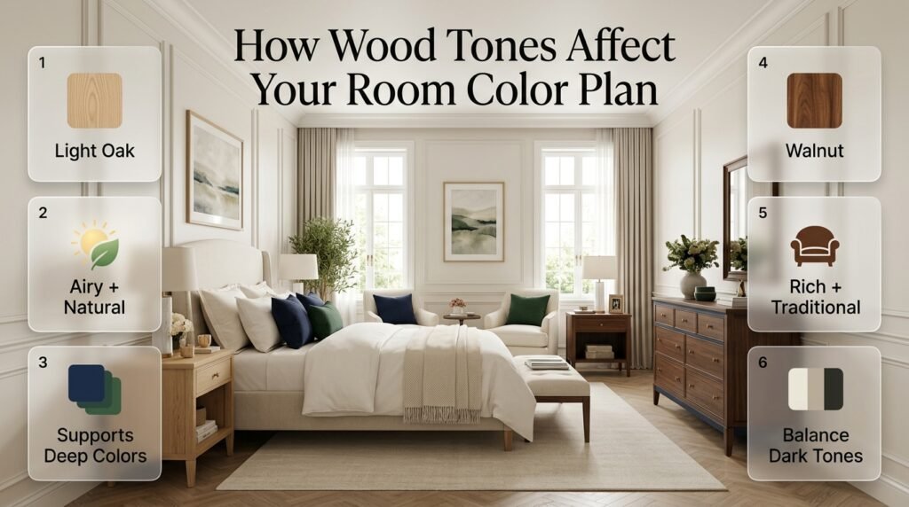
Wood is often overlooked during color planning.
But furniture can contain a large amount of visual color.
Light oak and walnut don’t create the same effect.
Light wood
Often feels:
- Airy
- Natural
- Casual
- Soft
Walnut
Often feels:
- Rich
- Traditional
- Deep
- Sophisticated
If your room already contains dark walnut furniture, adding several other very dark colors may make the room feel heavy.
On the other hand, light wood can help support deeper colors such as navy and forest green.
Always consider the wood when selecting your color palette.
How Do Metal Finishes Affect Coordinated Colors?
Metal finishes function almost like accent colors.
Common finishes include:
- Brass
- Gold
- Chrome
- Nickel
- Black
Brass and gold add warmth.
Chrome and nickel generally feel cooler.
Black creates contrast.
A preppy room with navy, ivory, and walnut can look particularly polished with small brass details.
You might repeat brass through:
- Bedside lamps
- Drawer pulls
- Picture frames
- Curtain hardware
- Small accessories
There’s no need to make every metal object brass.
A few repeated details can be enough.
Minimal Preppy Room
A minimal preppy room combines the timeless elegance of preppy design with a clean, uncluttered aesthetic. Focus on a refined color palette of white, cream, navy, soft blue, or muted green, then introduce classic patterns and decorative accents in a thoughtful way. Choose functional furniture with simple lines, keep accessories purposeful, and use texture through bedding, rugs, curtains, and subtle wall décor to add warmth without overwhelming the space. The result is a calm, sophisticated room that feels organized, comfortable, and effortlessly stylish while preserving the distinctive character of preppy interiors.
Create a clean, sophisticated, and beautifully balanced space with our guide to Minimal Preppy Room, featuring practical ideas for combining classic preppy details with a simple, uncluttered design.
How Does Lighting Change Your Color Choices?
One of the biggest decorating mistakes is choosing colors without considering lighting.
The same paint can look completely different under:
- Morning sunlight
- Afternoon daylight
- Warm evening bulbs
- Cool LED lighting
- Direct sunlight
- Shadow
A pale blue might appear almost white in bright daylight but much stronger at night.
A cream may look neutral during the day but become noticeably warm under yellow lighting.
This is why samples matter.
Test colors at different times
Look at your samples:
- In the morning
- During the afternoon
- At sunset
- At night
- With the lights switched on
If you’re choosing wall paint, don’t judge it based on a tiny screen image.
How Do You Coordinate Colors in a Small Bedroom?
Small rooms benefit from simplicity, but that doesn’t mean you have to avoid color.
The goal is to create a clear visual structure.
A useful small-room palette might be:
Ivory + Pale Blue + Navy + Natural Wood
Use ivory on larger surfaces.
Use pale blue for soft layers.
Use navy as the stronger accent.
Use natural wood for warmth.
This creates personality without making every surface compete.
Small-room tips
- Keep large surfaces relatively calm.
- Avoid too many unrelated accent colors.
- Repeat the same accent color.
- Use patterns selectively.
- Don’t make every object a focal point.
- Consider how natural light enters the room.
How Do You Coordinate Colors in a Large Bedroom?
Large rooms provide more space for experimentation, but they also need repetition.
Without repeated colors, different areas can feel disconnected.
Suppose one side of the room is navy while another side is green.
You can connect them through artwork, pillows, rugs, or patterns containing both colors.
For example:
Navy bed → navy artwork → green chair → green cushion → navy-and-green rug
The colors travel around the room.
This creates visual unity.
How Do You Coordinate Bedding?
Bedding is often one of the strongest visual elements in a bedroom.
It can therefore become the foundation of the entire palette.
Suppose you choose a floral duvet containing:
Navy + Sage + Blush + Ivory
You can build the room around those colors.
Example
Walls: Warm ivory
Bed: Navy upholstered headboard
Duvet: Navy, sage, blush floral
Pillows: Navy stripe + blush solid + ivory
Curtains: Cream
Rug: Beige with subtle navy
Furniture: Walnut
Artwork: Navy and sage
Hardware: Brass
Notice that not every item uses every color.
That’s exactly what makes the palette work.
How Do You Coordinate Curtains?
Curtains can either quietly support the room or become a statement.
If your bedding already has a strong pattern, quieter curtains are usually easier to manage.
If your furniture is mostly neutral, patterned curtains can add personality.
Consider:
Bold bedding → simpler curtains
Simple bedding → more expressive curtains
Colorful furniture → neutral curtains
Neutral furniture → colorful curtains
The goal is visual hierarchy.
How Do You Coordinate a Rug?
A rug can be an excellent connector because it often contains several colors at once.
Suppose your room contains:
- Navy
- Sage
- Ivory
- Walnut
A rug with subtle navy, cream, and green can visually connect the room.
It doesn’t have to contain every color.
Even a small amount of a secondary shade can create a relationship.
Look at rugs from a distance
A rug that seems subtle in a small sample may appear much stronger across the entire floor.
Always consider the full-scale effect.
How Do You Coordinate Artwork?
Artwork can reinforce your palette or introduce a controlled contrast.
If your room is navy and cream, artwork containing navy, pale blue, green, and beige can strengthen the existing color story.
You don’t need every artwork piece to contain every room color.
Instead, think about repetition.
A small amount of navy in artwork can connect it to a navy bed.
A small amount of green can connect it to a green chair.
This makes artwork feel intentional.
How Do You Coordinate Accessories?
Accessories should generally come toward the end of the decorating process.
Start with:
- Walls
- Flooring
- Large furniture
- Major textiles
- Curtains
- Rug
- Lighting
- Artwork
- Accessories
Accessories should reinforce what already exists.
For example, if navy appears in your bed and curtains, a small navy decorative object can repeat the shade.
You don’t need to introduce a completely new color just because an object looks attractive.
How Can You Make a Colorful Room Look Sophisticated?
Color itself doesn’t make a room unsophisticated.
Poor organization does.
A room can contain many colors and still feel polished if each shade has a clear role.
Focus on:
- Proportion
- Repetition
- Contrast
- Texture
- Pattern scale
- Neutral space
Suppose you love pink, green, blue, and yellow.
You don’t have to eliminate them.
Instead:
Ivory: dominant background
Blue: major supporting color
Green: secondary accent
Pink: small accent
Yellow: tiny decorative detail
Now the colors can coexist without fighting.
How Do You Use Different Shades of One Color?
Using multiple shades from one color family is one of the easiest ways to add depth.
Take blue.
You could use:
- Navy
- Medium blue
- Dusty blue
- Powder blue
- Blue-gray
A navy headboard with pale blue bedding and dusty blue artwork can feel much more layered than using one identical blue everywhere.
The same approach works with green.
You can combine sage and forest green if the rest of the palette provides enough balance.
What Is a Monochromatic Color Scheme?
A monochromatic scheme uses variations of one basic color.
For example:
Navy + Medium Blue + Powder Blue + Blue-Gray + White
This is a strong choice when you want a calm, sophisticated room.
Because the colors are closely related, texture becomes especially important.
You can add:
- Velvet
- Linen
- Cotton
- Woven fabric
- Wood
- Brass
The materials provide variation while the color palette remains controlled.
What Is an Analogous Color Scheme?
Analogous colors are located relatively close together on the color wheel.
Examples include:
- Blue + blue-green + green
- Yellow + yellow-green + green
- Pink + red + purple
These combinations often feel naturally connected.
For a preppy room, blue and green can work especially well.
You might use:
Navy + Teal + Sage + Ivory
The ivory prevents the related colors from becoming too intense.
What Is a Complementary Color Scheme?
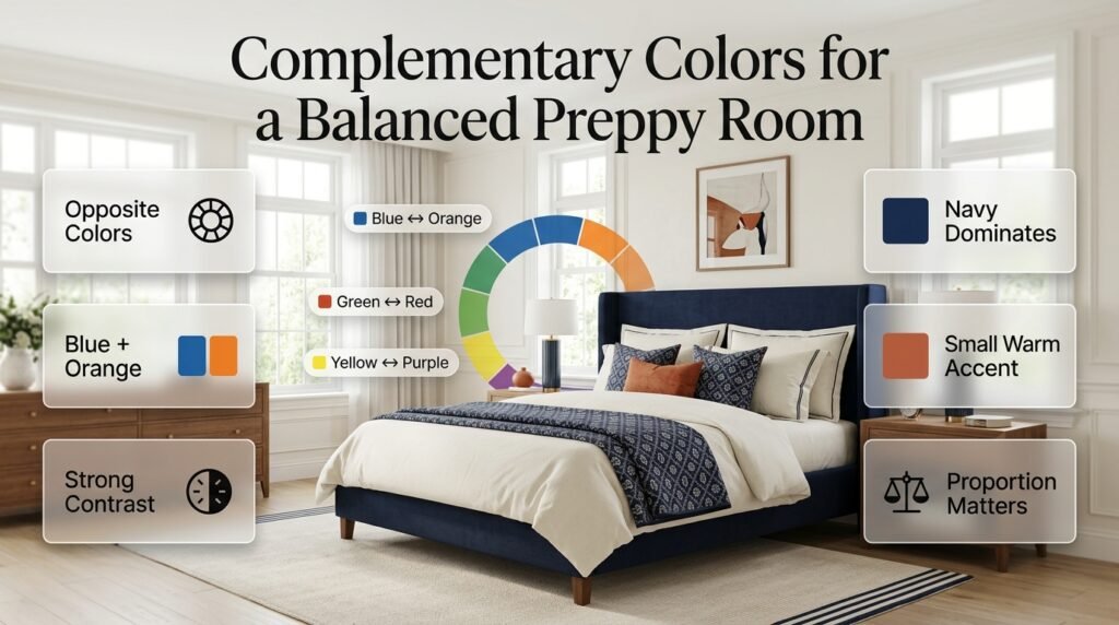
Complementary colors sit opposite one another on the color wheel.
Examples include:
- Blue and orange
- Green and red
- Yellow and purple
They create strong contrast.
You don’t have to use equal amounts.
For example, a navy room could contain a tiny amount of warm orange or terracotta.
That small contrast can make the blue appear more vibrant.
The key is proportion.
How Do You Create a Feminine Preppy Color Palette?
A feminine preppy room doesn’t have to be completely pink.
Softness can come from combining several gentle colors.
Try:
Blush + Sage + Ivory + Pale Blue + Light Wood
For example:
- Ivory walls
- Blush bedding
- Sage chair
- Pale blue artwork
- Light wood nightstands
- Cream rug
Floral patterns can naturally connect these colors.
This creates a feminine feeling without allowing pink to dominate every surface.
How Do You Create a More Traditional Preppy Palette?
Traditional preppy interiors often work well with deeper classic colors.
Try:
Navy + Forest Green + Ivory + Walnut
You can add small amounts of:
- Burgundy
- Brass
- Tan
Traditional furniture, stripes, plaid, and framed artwork can reinforce the look.
Keep ivory or cream visible so the darker shades don’t make the room feel too heavy.
How Do You Create a Luxury Preppy Color Palette?
Luxury is often associated with rich colors, strong materials, and controlled contrast.
Try:
Emerald + Navy + Ivory + Brass + Walnut
Use emerald and navy selectively.
Let ivory occupy some larger surfaces.
Add brass in small repeated details.
Use walnut to provide depth.
Then layer textures such as:
- Velvet
- Linen
- Upholstery
- Woven materials
The result can feel luxurious without requiring excessive decoration.
How Do You Create a Coastal Preppy Color Palette?
For a coastal interpretation, try:
Navy + Pale Blue + White + Sand + Natural Wood
The room can feel coastal without being filled with literal nautical decorations.
Use:
- Stripes
- Linen
- Woven textures
- Light wood
- Pale blue artwork
- White furniture
The palette itself creates the coastal character.
How Do You Create a Modern Preppy Palette?
Modern preppy interiors usually benefit from cleaner color relationships and fewer competing patterns.
Try:
Navy + Cream + Blush + Brass
Or:
Forest Green + Ivory + Black + Natural Wood
Keep the furniture shapes relatively clean.
Allow one or two patterns to provide traditional character while the overall composition remains contemporary.
What Are the Most Common Color Coordination Mistakes?
Understanding common mistakes can save you from expensive decorating changes.
Mistake 1: Using Too Many Dominant Colors
If every color appears in large quantities, the room loses hierarchy.
Solution
Choose one dominant shade.
Let the other colors support it.
Mistake 2: Matching Everything Exactly
Identical colors can make the room feel overly coordinated.
Solution
Use related shades with different:
- Textures
- Patterns
- Materials
- Intensities
Mistake 3: Ignoring Undertones
A warm cream and cool white may behave very differently.
Solution
Always compare samples together.
Mistake 4: Adding Random Accent Colors
A decorative object may look attractive but still feel disconnected.
Solution
Ask:
Where else does this color appear?
If the answer is nowhere, decide whether the new color genuinely improves the room.
Mistake 5: Making Every Pattern Bold
Multiple high-contrast patterns can compete.
Solution
Use:
Statement pattern + medium pattern + small pattern + solids
Mistake 6: Forgetting the Floor
The floor is a major visual surface.
Dark wood, light oak, carpet, and patterned flooring all affect the palette.
Solution
Include the floor when selecting your colors.
Mistake 7: Choosing Colors Only From Screens
Digital images aren’t always reliable for exact color selection.
Solution
Use physical samples when possible.
How Do You Build a Coordinated Palette From Scratch?
Here’s a practical process you can follow.
Step 1: Choose an inspiration piece
Find something you genuinely love.
It might be a rug, artwork, fabric, bed, or even a photograph.
Step 2: Identify three to five colors
Don’t start with ten.
Choose a manageable palette.
For example:
Navy + Blush + Sage + Ivory
Step 3: Select the dominant color
Decide which shade should have the strongest visual presence.
Step 4: Assign roles
Determine where each color will appear.
For example:
Ivory: walls and bedding
Navy: bed and curtains
Sage: chair and artwork
Blush: pillows and small accessories
Step 5: Choose patterns
Start with one main pattern.
Then add smaller patterns that repeat its colors.
Step 6: Choose materials
Select wood and metal finishes that support the palette.
Step 7: Test lighting
Look at the colors at different times of day.
Step 8: Add accessories last
Use accessories to reinforce the palette.
Step 9: Edit
Remove anything that creates unnecessary visual noise.
Sometimes subtraction improves a room more than adding another decorative object.
How Do You Know If Your Colors Are Actually Coordinated?
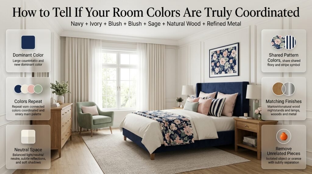
There are several simple tests.
Stand at the entrance of the room.
Don’t inspect individual objects.
Look at the entire space.
Then ask:
Is there a clear dominant color?
If not, you may have too many competing shades.
Do important colors repeat?
Repeated colors usually create stronger visual unity.
Is there enough neutral space?
If everything is colorful or patterned, the room may need calmer surfaces.
Do the patterns share colors?
Shared colors help different patterns belong together.
Do wood and metal finishes fit the palette?
If not, the room may feel disconnected.
Is one object completely unrelated?
If yes, consider whether it should be moved or replaced.
How Does Texture Affect Color Coordination?
Texture can change the appearance of color.
A navy velvet pillow can look much richer than a navy cotton pillow.
A sage linen curtain may look softer than a sage painted wall.
A cream woven rug may create more visual warmth than a smooth cream surface.
This means you can repeat colors without making the room repetitive.
Use texture to create variety
Try combining:
- Velvet
- Linen
- Cotton
- Wool
- Woven materials
- Wood
- Metal
This is especially useful when your palette contains only a few colors.
How Do Natural Materials Affect Coordinated Colors?
Natural materials can introduce subtle color variation.
Wood brings brown and golden undertones.
Woven materials may bring beige.
Plants introduce green.
Stone can add gray, cream, or tan.
These elements can make a room feel more organic.
You don’t necessarily need to treat every natural material as a new accent color.
Instead, look at how it fits into the overall warmth or coolness of the room.
How Do You Coordinate Colors on a Budget?
You don’t need to replace every piece of furniture.
In many cases, improving the palette is more effective than buying new items.
Start with what you already own.
You can change:
- Pillow covers
- Throws
- Curtains
- Artwork
- Lampshades
- Decorative objects
- Small rugs
You can also rearrange existing pieces.
If a room contains too many colors, removing a few mismatched objects can create a surprisingly large improvement.
A budget-friendly strategy
Choose one existing item you love.
Build the palette around it.
Then replace only the elements that clearly conflict with the new direction.
How Do You Coordinate Colors When You Already Have a Patterned Rug?
A patterned rug can become your color foundation.
Look at the major colors in it.
You don’t need to use every shade.
Choose two or three.
For example, if your rug contains:
Navy + Cream + Sage + Gold
You could create:
Cream walls + navy bed + sage cushions + brass lighting
Now the rug connects everything.
This approach is much easier than trying to find furniture that exactly matches the rug.
How Do You Coordinate Colors With Existing Furniture?
Start with the largest pieces.
If you already have walnut furniture, consider warm neutrals and richer colors.
If you have light wood, you can introduce deeper shades for contrast.
If your bed is navy, use lighter surrounding surfaces.
If your furniture is neutral, you have more freedom with textiles.
The goal isn’t to replace furniture just because it doesn’t belong to a perfectly matched set.
Mixed furniture can actually make a room feel more collected and personal.
How Can You Use Accent Colors Without Overdoing Them?
Accent colors are most effective when they remain accents.
Suppose your main palette is:
Navy + Ivory + Pale Blue
You might add blush.
But don’t suddenly make blush appear on the walls, curtains, bed, rug, and chair.
Instead, use it in:
- One cushion
- Small artwork detail
- Flowers
- A decorative object
- A throw
The limited use gives the color more impact.
How Do You Coordinate Colors Across an Entire Home?
If you’re decorating multiple rooms, you don’t have to use the same colors everywhere.
Instead, create a subtle connection.
For example:
Bedroom
Navy + Ivory + Sage
Living Room
Cream + Forest Green + Walnut
Study
Navy + Tan + Brass
The rooms are different, but navy, green, cream, or warm wood can appear across the home.
This creates continuity without making every room identical.
Can Coordinated Colors Work With Different Decorating Styles?
Yes.
Color coordination is not limited to preppy interiors.
The same principles can support:
- Traditional
- Coastal
- Modern
- Transitional
- Cottage
- Minimalist
- Eclectic
- Contemporary
- Luxury interiors
The difference is how the palette is used.
Preppy design tends to allow more pattern and playful contrast.
Minimalist design may use fewer colors.
Traditional rooms may use deeper tones.
Coastal rooms often use lighter colors.
The underlying principle remains the same:
Create relationships between colors.
For more inspiration on building a complete preppy interior, visit the Preppy Room homepage.
How Can Coordinated Colors Make a Room Feel Larger?
Color can influence visual perception.
Lighter colors generally create an airier appearance, particularly when used across larger surfaces.
A small room with:
Ivory walls + light bedding + pale blue textiles
may feel more open than one with very dark colors covering every surface.
That doesn’t mean dark colors are wrong.
A small room can still use navy or emerald.
The trick is to control where those darker shades appear.
A navy headboard can create a beautiful focal point without making the entire room dark.
How Can Coordinated Colors Make a Room Feel Cozier?
Warm colors and deeper tones can create a more intimate atmosphere.
Consider:
- Cream
- Beige
- Walnut
- Blush
- Forest green
- Deep navy
Layering these shades through textiles and furniture can make a room feel comfortable.
Texture also matters.
Velvet, woven fabrics, layered bedding, and wood can reinforce the cozy feeling.
How Can Coordinated Colors Create a More Elegant Room?
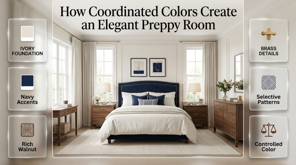
Elegance often comes from restraint.
You don’t necessarily need more color.
You need better control of color.
Try:
Ivory + Navy + Walnut + Brass
Then add texture and pattern selectively.
Keep the strongest colors concentrated in important areas.
Avoid covering every surface with decoration.
A controlled palette can make even simple furniture feel more refined.
How Can Coordinated Colors Make a Room Feel More Playful?
A playful room can use stronger colors and patterns.
Try:
Pink + Blue + Green + White
Add:
- Gingham
- Floral prints
- Stripes
- Colorful artwork
But keep white or ivory visible.
That neutral background prevents the stronger colors from becoming overwhelming.
How Can You Use Color Repetition Like a Professional?
One of the easiest professional-looking techniques is to repeat the same color in unexpected places.
For example:
Navy
- Headboard
- Small pillow
- Artwork frame
Sage
- Chair
- Floral pattern
- Decorative vase
Ivory
- Walls
- Bedding
- Curtains
The colors appear at different heights and in different materials.
This creates movement.
Your eye naturally travels through the room.
Why Is Visual Hierarchy So Important?
A room needs a focal point.
Without one, everything competes.
Your focal point could be:
- A dramatic bed
- A colorful accent chair
- A large artwork
- A patterned wall
- A beautiful rug
Once you’ve selected it, supporting colors should help emphasize it.
For example, if the bed is the focal point, avoid making the curtains, rug, and artwork equally dramatic.
Let the bed lead.
How Do You Coordinate Colors With a Statement Wall?
A statement wall can introduce a strong color.
If you use navy or emerald on one wall, the rest of the room should usually support it.
For example:
Emerald statement wall + ivory bed + cream bedding + walnut furniture
The wall becomes the focal point.
If you also use a bright patterned rug and dramatic curtains, the room may become too visually competitive.
Should the Ceiling Be Part of the Color Palette?
Yes.
The ceiling is often ignored, but it affects the overall room.
A bright white ceiling creates a strong contrast with darker walls.
A warm white ceiling can create a softer effect.
For a more dramatic room, a ceiling color can also be used intentionally.
However, if you’re uncertain, keeping the ceiling light is usually easier to coordinate.
How Do You Coordinate Colors in a Room With Lots of Natural Light?
Natural light can make colors appear brighter.
If the room receives strong sunlight, very saturated colors may become more intense.
You may prefer:
- Dusty blue
- Sage
- Soft cream
- Muted pink
If the room receives limited natural light, warmer colors can help create a more welcoming feeling.
Always test colors before making major decisions.
How Do You Coordinate Colors in a Dark Room?
Dark rooms don’t automatically require white walls.
You can use rich colors if you balance them correctly.
For example:
Navy + Cream + Walnut + Brass
Instead of:
Navy + Black + Dark Green + Dark Brown
The first combination contains enough light and warmth to maintain balance.
Mirrors, reflective surfaces, lighter bedding, and warm lighting can also help.
What Are the Best Coordinated Colors for a Classic Preppy Bedroom?
A classic combination is:
Navy + White + Red + Walnut
Use red as a controlled accent.
For example:
- Navy bed
- White bedding
- Walnut nightstands
- Small red details in artwork or cushions
You don’t need large amounts of red.
A small amount can create the traditional preppy feeling.
What Are the Best Coordinated Colors for a Soft Preppy Bedroom?
Try:
Sage + Blush + Ivory + Light Wood
This palette is gentle and versatile.
Use sage for furniture or larger accents.
Use blush for textiles.
Use ivory for walls and bedding.
Use light wood for warmth.
What Are the Best Coordinated Colors for a Coastal Preppy Bedroom?
Try:
Navy + Pale Blue + White + Sand
Add natural wood.
Use stripes and linen textures.
Keep the decorative details simple.
This gives the room a coastal feeling without making it look like a themed space.
What Are the Best Coordinated Colors for a Luxury Preppy Bedroom?
Try:
Emerald + Navy + Ivory + Brass + Walnut
Keep the deeper colors controlled.
Use ivory generously.
Repeat brass subtly.
Use rich textures.
This creates depth without making the room excessively dark.
What Are the Best Coordinated Colors for a Modern Preppy Bedroom?
Try:
Navy + Cream + Blush + Brass
Use fewer traditional patterns.
Focus on clean furniture.
Use blush as a small accent.
Allow navy to create structure.
Cream keeps the room light.
Practical Color Coordination Checklist
Before finishing your room, review these questions.
Palette
- Do I have one dominant color?
- Do my supporting colors make sense together?
- Is there enough neutral space?
- Are my accents controlled?
Furniture
- Does my largest furniture fit the palette?
- Do the wood tones work together?
- Are the metal finishes compatible?
Patterns
- Do my patterns share colors?
- Are the pattern scales different?
- Do I have enough solid surfaces?
Lighting
- Have I checked the colors during daylight?
- Have I checked them at night?
- Do the colors work under artificial lighting?
Accessories
- Do accessories repeat existing colors?
- Have I introduced unnecessary colors?
- Is there enough empty visual space?
Final Look
- Does one color lead?
- Do important colors repeat?
- Does the room feel connected?
- Does it still feel personal?
Expert Advice: Don’t Choose Colors in Isolation
One of the biggest differences between beginner decorating and professional-looking decorating is the way colors are evaluated.
Beginners often look at one object at a time.
Professionals look at relationships.
A beautiful navy pillow isn’t automatically a good choice.
It becomes a good choice when it works with:
- The bed
- The curtains
- The rug
- The artwork
- The lighting
- The wall
- The furniture
The same principle applies to every color.
Instead of asking whether an object is beautiful by itself, ask:
Does it improve the entire room?
That question can prevent many unnecessary purchases.
Another Expert Tip: Use Your Largest Surface Areas First
Large surfaces determine the foundation of the room.
These include:
- Walls
- Flooring
- Large rugs
- Beds
- Sofas
- Curtains
Choose the general palette around these elements first.
Then use small objects to refine the design.
If you do the opposite, you may end up with a collection of attractive accessories that don’t work together.
Another Expert Tip: Repeat Colors at Different Heights
Color repetition becomes more effective when it isn’t concentrated in one area.
For example:
Navy headboard
Navy cushion
Navy artwork
Now the color exists at low, medium, and high visual levels.
This creates a stronger sense of unity.
Another Expert Tip: Let Some Colors Appear Only Once
Not every color has to be repeated.
A very small accent can work as a surprise.
For example, a tiny amount of gold or red might appear only in artwork.
The key is that it remains visually small.
If it becomes large, it may need to be repeated elsewhere.
Another Expert Tip: Don’t Forget Negative Space
Empty space is part of design.
If every surface is covered with:
- Color
- Pattern
- Objects
- Artwork
- Furniture
the room may feel crowded.
Neutral surfaces and open areas allow stronger colors to stand out.
A coordinated room isn’t necessarily a room with more decoration.
Sometimes it’s a room with better editing.
What are the best coordinated color combinations for a room?
The best coordinated color combinations are those that create contrast while still sharing a visual connection. For a preppy room, classic combinations such as navy and ivory, navy and pale blue, green and cream, blush and navy, or navy, green, and ivory are particularly versatile. You don’t need every color to match exactly; instead, choose one dominant shade, one supporting color, and a smaller accent that can be repeated throughout the room.
A professional-looking palette usually works best when the colors have different jobs rather than competing equally.
Dominant color: Used across the largest visual areas.
Supporting color: Adds depth through furniture, bedding, curtains, or rugs.
Accent color: Provides personality through smaller decorative pieces.
Neutral: Creates breathing room between stronger colors.
Repeated shades: Connect separate parts of the room visually.
For example, an ivory, navy, and soft green palette can use ivory for walls and bedding, navy for the headboard and rug, and green through pillows, artwork, or plants. The colors don’t have to be identical in every application. Slight variations in tone often make the room feel more natural and layered.
How do you choose colors that coordinate with each other?
Start with something already present in the room rather than choosing colors randomly. A rug, artwork, upholstered bed, wallpaper, or favorite fabric can provide the foundation for the entire palette. Identify its main color, secondary color, and one interesting accent, then use those shades selectively across the rest of the room.
A useful professional approach is to build the palette in layers:
Choose your anchor: Start with the largest or most important item.
Find supporting colors: Look for shades already appearing in that item.
Add a controlled accent: Select one color that provides contrast.
Introduce a neutral: Use ivory, cream, beige, or another compatible neutral.
Repeat the colors: Bring each important shade into at least two or three areas.
Don’t choose paint first simply because you like the color on a screen. The permanent elements of a room—such as flooring, furniture, and large textiles—can influence how paint and accessories actually look.
Expert approach: If you’re unsure whether two colors work together, put physical samples next to each other in the room’s actual lighting. Natural daylight and artificial lighting can change the appearance of a color significantly.
What colors work best for a preppy bedroom?
Preppy bedrooms work particularly well with navy, ivory, white, pale blue, green, blush, red, and carefully selected warm neutrals. The strongest combinations usually balance a traditional anchor color with lighter shades and a small amount of contrast. Navy and ivory remain an especially reliable foundation because they work naturally with stripes, checks, florals, and other classic patterns.
For a softer modern-preppy bedroom, consider:
Ivory + pale blue + navy
Cream + sage green + navy
Ivory + blush + navy
Warm white + muted green + natural wood
Navy + cream + soft red
For a more contemporary interpretation, current interior color direction is moving toward warmer neutrals, earthy greens, richer browns, and more intentional color layering rather than relying exclusively on cool gray or stark white.
The important point is to avoid turning the room into a collection of unrelated “preppy” colors. Pick a clear palette first, then use traditional patterns and decorative details to reinforce it.
How many colors should you use in a coordinated room?
There is no strict number of colors that every room should contain. A better approach is to control visual hierarchy. As a starting point, use one dominant color, one or two supporting shades, one accent color, and a neutral. This gives you enough variety to make the room interesting without allowing every color to compete for attention.
A simple planning structure looks like this:
60% — Foundation
Walls, large furniture, major bedding, or other large surfaces.
30% — Supporting color
Rug, curtains, secondary furniture, bedding layers, or larger accessories.
10% — Accent
Pillows, artwork, decorative objects, books, or small accessories.
These percentages don’t need to be mathematically exact. They’re simply a useful way to prevent a room from becoming visually chaotic.
Also remember that patterns can contain several colors. A floral pillow might technically introduce four or five shades, but if those colors are subtle and connected to the rest of the room, the space can still feel highly coordinated.
The real mistake isn’t having “too many colors.” It’s having too many unrelated strong colors.
What are the trending coordinated color palettes for 2026?
The strongest 2026 interior color direction is moving toward warmer, more grounded, nature-connected palettes, while designers are also embracing stronger colors when they’re deliberately balanced. Industry trend reports point to restorative greens, warm neutrals, khaki, deeper browns, earthy reds, and richer accent colors, while blue remains important in several contemporary palettes.
For coordinated interiors, some useful 2026-inspired combinations include:
Warm khaki + cream + deep green
Olive green + warm white + natural wood
Navy/charcoal blue + ivory + walnut
Terracotta + cream + muted green
Dusty rose + brown + soft cream
Deep green + warm neutral + brass
Pale blue + cream + deeper blue
Sherwin-Williams’ 2026 palette, for example, highlights Universal Khaki as a warm neutral and pairs it with shades including cream, dark auburn, garden-inspired greens, and natural walnut tones.
For a preppy room, however, you don’t have to abandon classic combinations just because color trends change. A smarter approach is to modernize them. For example, instead of using bright green and pure white, try muted green with warm ivory and natural wood. Instead of an extremely bright accent red, use a deeper burgundy or restrained red detail.
That gives the room a current feeling while keeping the classic preppy character intact.
Conclusion
Creating a beautiful room isn’t about finding colors that match perfectly. It’s about choosing coordinated colors that work together, create balance, and give every part of the space a clear visual role. When the main color, supporting shades, neutrals, furniture, textiles, and decorative accents connect naturally, the room feels intentional and complete.
For a preppy room, start with a dependable foundation such as ivory, cream, white, or soft blue, then introduce classic colors like navy or green. Add one carefully chosen accent color and repeat it through smaller details such as pillows, artwork, rugs, or accessories. Patterns can add even more personality when they share colors and vary in scale.
The most important thing is not to follow a rigid color formula. Look at the room as a whole, consider its natural lighting and existing materials, and choose colors that create the atmosphere you actually want to live with.
When every color has a purpose and the palette has enough repetition to feel connected, even different shades and patterns can come together beautifully.
The goal isn’t to make everything match. The goal is to make everything belong.
Leave a Reply