
Introduction
Green and Cream Striped Interior Ideas | Green and cream stripes can transform an ordinary room into a space that feels coordinated, fresh, and full of character. However, choosing the right stripe width, green shade, and placement can be challenging. A pattern that looks elegant in one room may feel overwhelming in another, especially when the walls, furniture, and accessories compete for attention.
The best green and cream striped interior ideas focus on balance. Instead of covering every surface with the same pattern, you can use stripes to highlight architectural features, introduce visual height, decorate furniture, or create a distinctive focal point.
Whether you prefer traditional interiors, modern decorating, or a classic preppy aesthetic, thoughtful pattern selection makes a significant difference. At Preppy Room, you can explore broader decorating inspiration while using the ideas in this guide to create a striped interior that suits your own space.
This article explains how to select stripe patterns, coordinate colors, decorate different rooms, combine stripes with other prints, paint stripes accurately, and avoid mistakes that can make a carefully planned interior feel crowded.
1. Why Are Green and Cream Striped Interiors So Popular?
Green and cream stripes combine the natural character of green with the softness of cream. The contrast creates definition without the sharpness of some high-contrast color combinations. Depending on the shade and pattern, the same palette can look traditional, relaxed, contemporary, or playful.
Green also works naturally with wood, linen, rattan, ceramics, and other textured materials. Cream provides a neutral background that allows these finishes to remain visible without competing with the stripes.
What makes this color combination effective?
There are three main reasons to consider it.
First, it creates visual structure. Stripes introduce a clear pattern that can organize a room visually. They can emphasize a wall, frame a bed, or give a plain seating area a more intentional appearance.
Second, the palette offers flexibility. Pale sage and warm cream create a gentle combination, while forest green and ivory produce a stronger contrast. This flexibility allows you to adjust the mood without abandoning the basic color scheme.
Third, the colors work with different decorating styles. Stripes can look equally appropriate in a cottage-inspired bedroom, a traditional sitting room, or a modern reading corner when the furniture and accessories are selected carefully.
Which green and cream shades should you consider?
| Color combination | Decorating effect | Suitable applications |
|---|---|---|
| Sage green and warm cream | Soft and relaxed | Bedrooms, reading corners |
| Olive green and creamy beige | Earthy and grounded | Living rooms, dining spaces |
| Forest green and ivory | Rich and traditional | Studies, formal sitting rooms |
| Mint green and pale cream | Light and cheerful | Guest rooms, casual interiors |
| Muted emerald and soft cream | Distinctive and refined | Accent walls, occasional furniture |
Practical tip: Do not choose a green shade from a photograph alone. Test a sample beside your existing flooring, curtains, and furniture. The same green can look different under daylight and artificial lighting.
2. Which Stripe Width Is Best for Your Interior?
Stripe width determines how noticeable the pattern becomes. Wide stripes create a stronger visual statement, while narrow stripes offer more detail. Pinstripes produce a particularly subtle effect, and irregular stripes can give a room a relaxed, handcrafted appearance.
The right choice depends on the size of the surface, the room’s existing decoration, and how much attention you want the pattern to receive.
Wide green and cream stripes
Wide stripes are suitable when you want the pattern to become a major design feature. They can work particularly well behind a bed, along a living room focal wall, or on a piece of upholstered furniture.
Choose a relatively simple arrangement around wide stripes. Plain curtains, uncomplicated furniture, and restrained accessories allow the pattern to remain clear.
Wide stripes can also look attractive on larger walls because their proportions are easier to appreciate from a distance.
Common mistake: Using wide, high-contrast stripes on every wall before checking how the room feels at full scale. Test one wall or use removable tape to visualize the proportions first.
Narrow stripes for a tailored appearance
Narrow stripes create a finer pattern that can suit traditional interiors, guest bedrooms, and rooms with a classic preppy influence.
They work particularly well when the two colors have moderate contrast. For example, muted sage and warm cream create a softer result than dark green and bright white.
However, very narrow stripes with strong contrast may appear visually busy when repeated across a large surface. Choose the spacing according to the room’s dimensions and the amount of existing pattern.
Pinstripes for understated decoration
Pinstripes are especially useful when you want a patterned wall that remains relatively subtle. They can complement a wooden desk, simple upholstered seating, traditional lamps, and neutral bedding.
Use them where you want a tailored appearance without making the walls the only noticeable feature.
Irregular stripes for a relaxed atmosphere
Hand-painted or slightly irregular stripes can make an interior feel less formal. They suit rooms with natural materials, handmade accessories, and relaxed furniture arrangements.
The lines do not need to be perfectly identical to look intentional. However, the spacing and color distribution should still be planned so the finished design feels controlled rather than accidental.
3. How Can You Choose the Right Direction for Striped Walls?
Stripe direction affects how the eye moves around a room. Vertical stripes draw attention upward, while horizontal stripes encourage the eye to travel across the wall.
Neither direction automatically makes every room look larger. The effect depends on ceiling height, wall dimensions, furniture placement, and the strength of the color contrast.
Vertical stripes for visual height
Vertical green and cream stripes can emphasize a wall’s height and work particularly well behind a bed, along a narrow hallway, or in a room with relatively low furniture.
For a softer result, choose muted colors and moderate stripe widths. A very strong pattern may become the dominant feature, so keep other large surfaces relatively simple.
Vertical stripes can also coordinate with tall bookcases, floor-length curtains, and furniture with clean upright lines.
Horizontal stripes for visual width
Horizontal stripes create a different visual rhythm. They can emphasize the width of a wall and work well behind a sofa, above a low console, or in a room with a long, narrow layout.
They are especially effective when the furniture arrangement follows the same horizontal direction.
For example, a low sofa against a horizontally striped feature wall can create a connected composition. Keep nearby accessories simple enough to avoid competing with the lines.
How should you decide between the two?
Before selecting a direction, consider the wall you want to decorate, the main furniture piece, and the effect you want to achieve.
If the room already contains strong vertical features, horizontal stripes may introduce useful contrast. If the furniture is mostly low and wide, vertical stripes may provide a different visual rhythm.
Always consider the entire room rather than treating the wall as an isolated surface.
4. How Can You Use Green and Cream Striped Wallpaper?

Striped wallpaper provides consistent spacing and a finished pattern without requiring you to measure and paint every line manually. It is a useful option when you want a precise, repeatable design.
The most suitable wallpaper depends on the wall condition, room use, stripe contrast, and how much pattern you want to introduce.
Create a feature wall
A single striped wall is often the easiest way to introduce the pattern. In a bedroom, the wall behind the headboard provides a natural focal point. In a living room, a wall behind the main sofa can help establish the seating area’s visual center.
Keep the remaining walls in a coordinating neutral. This approach lets the striped surface provide interest without requiring additional large patterns.
Use wallpaper throughout the room
Full-room striped wallpaper can create a more traditional and immersive appearance. It works best when the stripe scale suits the room and the furniture does not compete excessively with the walls.
Consider using cream trim around doors, windows, and skirting boards to give the pattern a defined edge.
Before choosing this approach, examine the wallpaper sample at different distances. A pattern that looks delicate in a small sample may feel much stronger when repeated around an entire room.
Decorate alcoves and smaller architectural features
Striped wallpaper can also be used inside a reading nook, behind open shelving, or within an alcove.
These smaller applications are helpful when you want a distinctive detail without committing to a large feature wall.
For additional ideas about coordinated surfaces, explore Green and Cream Painted Wall Designs. Painted stripes are particularly useful when you need control over exact colors, spacing, and line direction.
Check the practical requirements
Before installation, make sure the wallpaper is suitable for the wall and the conditions in the room.
- Check whether the surface needs filling, sanding, or priming.
- Follow the manufacturer’s instructions for adhesive and installation.
- Consider washability in areas that receive frequent contact.
- Choose products rated for humid conditions where required.
- Calculate the quantity carefully, allowing for pattern matching and installation waste.
Good preparation helps the finished stripes look consistent and reduces avoidable installation problems.
5. What Are the Best Green and Cream Striped Living Room Ideas?
A living room offers several ways to introduce stripes without making the entire space revolve around one pattern. You can use striped walls, furniture, curtains, or smaller accessories according to the room’s existing decoration.
Create a striped wall behind the sofa
A striped wall behind the main sofa can establish a clear focal point. Sage and cream work well for a softer appearance, while forest green and ivory create a stronger, more traditional contrast.
Choose solid-colored upholstery if the wall already contains a prominent pattern. A wooden coffee table, cream rug, and a few green accessories can connect the palette without repeating the stripes everywhere.
The key is to make the striped wall feel connected to the furniture rather than like a separate decorative feature.
Introduce a striped armchair
A green and cream striped armchair can become the main accent in a neutral living room.
This approach is useful when you want to experiment with the pattern but prefer not to change the walls. It also gives you more flexibility if your decorating preferences change later.
Pair the chair with a plain sofa, a simple side table, and restrained cushions. The chair should remain visually distinct without making the rest of the room feel unfinished.
Use striped curtains
Striped curtains add pattern around windows and can connect the wall colors with the furniture.
For a balanced arrangement:
- Choose a stripe color that already appears somewhere in the room.
- Consider the curtain fabric’s weight and how it will hang.
- Keep the curtain hardware relatively simple.
- Avoid combining strongly striped curtains with multiple large striped surfaces.
If your room already has patterned upholstery, plain cream curtains may provide a more harmonious result.
Add striped cushions and throws
Small textiles offer an easy way to test the palette. Green and cream striped cushions can be placed on a plain sofa or chair, while a solid green throw can introduce another layer without repeating the pattern.
Vary the textures rather than adding numerous competing prints. Linen, cotton, and woven fabrics can make the combination feel more complete.
6. How Can You Decorate a Bedroom With Green and Cream Stripes?
Bedrooms benefit from patterns that feel coordinated and comfortable. Green and cream stripes can establish a focal point while allowing bedding, furniture, and lighting to remain relatively simple.
Use stripes behind the headboard
A striped wall behind the bed gives the room a clear visual anchor. Wide stripes create a more prominent statement, while narrow stripes produce a finer, tailored appearance.
Choose bedding that relates to the wall without copying it exactly. For example, cream sheets, a solid sage duvet, and a textured throw can create a cohesive arrangement.
If the wallpaper is dark or strongly contrasting, lighter bedding can prevent the bed area from feeling visually heavy.
Introduce striped bedding
Striped bedding is a flexible alternative to wallpaper. It can be changed seasonally or replaced when you want to update the room.
Choose one main striped textile, such as a duvet cover or quilt, and coordinate it with plain pillowcases and a solid blanket.
Avoid using several different stripe scales unless you have deliberately planned the combination. A consistent palette and varied textures usually create a more restful appearance.
Design a guest bedroom with subtle stripes
A guest bedroom often benefits from a simple color scheme that feels welcoming without being overly personal.
Pale sage and warm cream stripes can complement neutral furniture, natural wood, and soft lighting. Add practical bedside surfaces and accessible storage so the room works well for visitors.
For a more specific decorating direction, visit Green and Cream Guest Bedroom Ideas.
Coordinate stripes with bedroom furniture
The furniture does not need to match the wall pattern. Instead, select finishes that support the overall palette.
Light wood can create an airy appearance, while darker wood adds depth. Cream upholstery provides a visual break, and small green accessories help repeat the wall color around the room.
Consider the bedroom as a complete arrangement. The wall, bed, curtains, rug, and bedside furniture should work together without every item competing for attention.
7. How Can You Combine Stripes With Botanical Prints and Gingham?
Mixing patterns can add individuality to a green and cream interior. However, successful combinations require differences in scale, shape, or visual intensity.
Stripes are linear, botanical prints contain organic forms, and gingham introduces a checked pattern. These differences make the designs potentially complementary when the colors remain coordinated.
Combine stripes with botanical prints
Botanical prints introduce leaves, stems, and natural shapes that contrast with the straight lines of stripes.
For example, use striped wallpaper with a botanical cushion, or introduce framed botanical artwork against a plain cream wall near striped furniture.
Keep the botanical pattern in a supporting role if the stripes already dominate the room. This helps the two patterns remain distinct.
Explore Green and Cream Botanical Print Decor for more ideas about incorporating botanical motifs into the same palette.
Pair stripes with gingham
Gingham provides a checked pattern that works particularly well in traditional, cottage-inspired, and preppy interiors.
Try striped wallpaper with small gingham cushions, or use striped bedding with a checked throw.
The patterns do not need to have identical proportions, but they should share compatible colors. Green and cream gingham is often easier to coordinate with green and cream stripes than a check using several unrelated colors.
For further inspiration, see Green and Cream Gingham Room Decor.
Use different pattern scales
One practical approach is to combine a large pattern with a smaller one.
If the wall has broad stripes, choose smaller botanical motifs or gingham details. If the stripes are fine, a larger floral design may provide useful contrast.
Keep the number of prominent patterns under control. A room with striped wallpaper, patterned curtains, checked bedding, and large floral upholstery may lack a clear focal point.
For a wider look at coordinating different prints, explore Green and Cream Patterned Room Ideas.
8. Which Furniture and Materials Complement Striped Interiors?

Furniture and material choices determine whether green and cream stripes feel modern, rustic, formal, or relaxed.
Instead of matching every item to the exact colors on the wall, choose finishes that complement the palette and add useful contrast.
| Material | Visual effect | Suggested application |
|---|---|---|
| Light oak | Airy and natural | Bed frames, shelves, tables |
| Dark walnut | Rich and traditional | Desks, cabinets, side tables |
| Natural linen | Soft and relaxed | Curtains, cushions, upholstery |
| Rattan and wicker | Casual and textured | Baskets, occasional chairs |
| Brass or aged gold | Warm and classic | Lamps, handles, frames |
| Matte ceramic | Understated and simple | Vases, planters, accessories |
Choose wood tones that suit the green
Warm olive and cream often work naturally with oak, walnut, and other warm wood finishes. Cooler sage shades may also coordinate well with lighter, neutral woods.
The actual finish matters more than the wood name alone. Compare samples with the striped surface before committing to a large furniture purchase.
Use texture to add depth
A striped room can feel flat when every surface is smooth and every accessory has the same finish.
Introduce a few contrasting textures, such as linen curtains, a woven rug, a wooden table, or a ceramic lamp.
These materials add depth without requiring additional colors or stronger patterns.
Keep decorative hardware consistent
Small details such as curtain rods, handles, lamp bases, and picture frames can influence the overall style.
Warm brass or aged gold may complement a traditional green and cream room, while simpler metal finishes can support a more contemporary look.
You do not need to match every metal perfectly, but avoid introducing numerous competing finishes without a clear reason.
9. How Can You Paint Green and Cream Stripes on a Wall?
Painted stripes offer control over width, spacing, and color. They can be particularly useful when you want a custom pattern that does not depend on the designs available in wallpaper collections.
Step 1: Select the wall and direction
Choose the wall you want to decorate and decide whether vertical or horizontal stripes suit the space.
Consider the location of windows, doors, furniture, and architectural features before marking the pattern.
Why it matters: Planning the layout first helps you avoid awkwardly narrow stripes at the edges or around openings.
Step 2: Choose the paint colors
Select a green that complements the room’s existing finishes and a cream that works with the flooring and trim.
Test both colors side by side. The contrast between them determines how strongly the stripes will stand out.
Professional advice: Sample the actual paint products rather than relying entirely on digital color charts. Screen colors may not accurately represent the finished surface.
Step 3: Measure the wall
Measure the relevant wall dimension and divide it into the desired number of stripes.
Mark the boundaries lightly with a pencil and check the spacing with a level. If the wall contains doors, windows, or alcoves, plan how the pattern will continue around these features.
Common mistake: Measuring the first few stripes accurately and estimating the rest. Small errors can accumulate and leave the final stripe visibly uneven.
Step 4: Prepare the surface
Clean the wall and complete any required filling, sanding, or priming. Allow the surface to dry according to the paint manufacturer’s instructions.
Use suitable painter’s tape to mark the boundaries. Press the edges down carefully to help prevent paint from bleeding underneath.
Step 5: Apply the paint
Follow the recommended application and drying instructions for the chosen paint.
Apply additional coats when needed and remove the tape at the stage recommended by the product instructions. Avoid assuming that every paint behaves identically during removal.
Step 6: Inspect and correct the finished lines
Once the paint has dried sufficiently, examine the stripes from different positions in the room.
Touch up minor imperfections with a fine brush if needed. Check the edges around trim, outlets, and corners so the finished pattern looks consistent.
A careful layout and patient preparation usually make a greater difference than purchasing expensive decorating tools.
10. How Can You Make Green and Cream Stripes Work in a Small Room?
Striped interiors can work in compact rooms when the design is proportionate and the rest of the decoration remains controlled.
The objective is not to eliminate pattern. It is to make sure the pattern supports the room rather than competing with furniture and everyday activities.
Choose moderate color contrast
Pale sage and warm cream provide a gentler appearance than deep green and bright white.
This can be useful when the room has limited daylight or when you prefer the walls to remain a background rather than a dominant feature.
However, a dark green stripe can still work in a small room when used selectively and balanced with suitable lighting and lighter finishes.
Limit the pattern to one main area
Consider a feature wall, an alcove, striped curtains, or a single upholstered chair.
Using the pattern in one prominent area gives the eye a clear focal point and leaves room for furniture, storage, and practical features.
Keep furniture and accessories purposeful
Choose furniture that fits the room’s dimensions and avoid filling every available surface with decoration.
A striped wall, plain bedding, one green cushion, and a natural wood finish may provide enough visual interest for a compact bedroom.
Test the pattern at full scale
Before painting or ordering wallpaper, use removable tape to mark the proposed stripe boundaries.
View the arrangement from the doorway and from the positions where you usually sit or stand. This helps you judge the actual proportions rather than relying on a small sample.
11. What Are the Most Common Green and Cream Striped Decorating Mistakes?
A well-chosen color palette can still look unbalanced if the pattern, lighting, or furniture arrangement is poorly planned.
Mistake 1: Repeating stripes on every surface
Why it happens: Matching striped wallpaper, curtains, cushions, and bedding can seem like an easy way to create a coordinated room.
Why it causes problems: Repeated patterns with similar widths and contrast can make the room feel visually crowded.
How to avoid it: Choose one dominant striped feature and support it with solid-colored fabrics and a limited number of smaller patterns.
Mistake 2: Ignoring the room’s lighting
Why it happens: The selected green looks attractive in a shop or online photograph, so its appearance at home is not considered carefully.
Why it causes problems: The color may look darker, cooler, or more yellow under the room’s actual lighting.
How to avoid it: Test samples at different times of day and beside existing furniture, flooring, and trim.
Mistake 3: Choosing stripes without measuring
Why it happens: The design seems simple enough to estimate by eye.
Why it causes problems: Uneven spacing can become noticeable across the wall, particularly when the lines have strong contrast.
How to avoid it: Measure the surface, mark the boundaries, and use a level before painting or installing wallpaper.
Mistake 4: Adding too many accent colors
Why it happens: The green and cream palette inspires several additional colors that look attractive individually.
Why it causes problems: Too many strong accents can weaken the visual connection between the stripes and the rest of the room.
How to avoid it: Begin with green, cream, and a small selection of supporting materials. Add another accent only when it contributes something useful.
Mistake 5: Overlooking maintenance
Why it happens: Decorative appearance receives more attention than the room’s daily use.
Why it causes problems: Delicate wallpaper or difficult-to-clean upholstery may not suit a busy household or frequently used seating area.
How to avoid it: Choose paint, wallpaper, and fabrics according to the room’s cleaning needs and level of activity.
Mistake 6: Choosing furniture after the pattern without checking proportions
Why it happens: The wall treatment is selected first, and the furniture is expected to fit around it.
Why it causes problems: Large furniture may cover the pattern awkwardly or compete with it for attention.
How to avoid it: Plan the main furniture positions before finalizing the stripe layout. Consider how much of the pattern will remain visible after the room is furnished.
12. What Professional Decorating Tips Help Create a Cohesive Result?
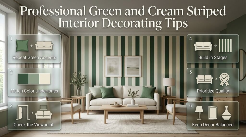
A successful striped interior depends on the relationship between the pattern and the rest of the room. The following principles help make the finished design look intentional.
Repeat the green in a few selected places
If the wall has green and cream stripes, repeat the green in two or three supporting details, such as a cushion, lamp base, artwork, or small accessory.
This creates continuity without making every object identical.
Coordinate color undertones
Cream can have yellow, pink, or neutral undertones, while green can lean toward yellow, blue, or gray.
A warm olive may pair naturally with a warm cream and oak furniture. A cooler sage may work better with a neutral cream and lighter wood finishes.
Always compare the actual colors together before making a final choice.
Consider the room from the entrance
Stand in the doorway and look at the overall composition. Notice whether the stripes guide attention toward the bed, sofa, or another intended focal point.
If the pattern competes with several other prominent features, simplify the surrounding decoration.
Build the room in stages
Start with the wall treatment or the main striped textile. Next, position the furniture, then add curtains, lighting, rugs, and accessories.
Review the room after each stage. This makes it easier to recognize when the pattern already provides enough visual interest.
Choose quality and practicality over unnecessary decoration
A well-planned room does not need numerous accessories to feel complete.
Prioritize suitable materials, comfortable furniture, useful lighting, and a balanced arrangement. These decisions contribute more to everyday satisfaction than adding decorative objects simply to fill empty space.
13. How Can You Choose a Green and Cream Striped Style for Your Home?
The most suitable approach depends on your decorating preferences, available space, and how permanent you want the changes to be.
| Your preference | Recommended approach | What to prioritize |
|---|---|---|
| Classic and traditional | Wide wallpaper stripes | Coordinated wood and restrained accessories |
| Soft and relaxing | Pale sage pinstripes | Natural fabrics and warm lighting |
| Modern and simple | Clean painted stripes | Minimal furniture and limited patterns |
| Cottage-inspired | Irregular stripes and gingham | Natural textures and gentle contrast |
| Preppy and tailored | Narrow stripes and selected checks | Clear pattern hierarchy |
| Flexible and changeable | Striped cushions or bedding | Easy-to-replace textiles |
If you want a traditional appearance
Consider forest green, ivory, broad stripes, and carefully selected wooden furniture. Keep accessories relatively restrained so the room feels established rather than overly decorated.
If you prefer a softer interior
Choose sage green and warm cream, then introduce linen, light wood, and subtle textures. Narrow stripes or a single feature wall can provide interest without dominating the room.
If you prefer a preppy style
Combine carefully proportioned stripes with selected gingham details, polished wood, and a small number of coordinated accessories.
The aim is to maintain a clear relationship between the patterns rather than making every item equally prominent.
For more inspiration across this style, explore Green and Cream Preppy Room Ideas.
How do you choose the right shade of green for cream striped walls?
Choosing the right green depends on your room’s natural light, existing furniture, flooring, and the atmosphere you want to create. Sage green and warm cream produce a soft, relaxed combination, while olive green adds an earthy character. Forest green creates stronger contrast and works well when you want the stripes to become a prominent design feature.
Before committing to a color, compare paint or wallpaper samples against your existing finishes. A shade that looks balanced in a brightly lit showroom may appear considerably darker in a room with limited daylight.
Practical tips:
Choose sage green for a softer, understated appearance.
Consider olive green when your room features warm wood and natural textures.
Use forest green when you want a more dramatic, traditional look.
Check the colors in both daylight and evening lighting.
Match the cream undertone with your flooring, curtains, and furniture.
The best combination is one that looks cohesive throughout the day rather than attractive under only one lighting condition.
Are green and cream striped walls suitable for small rooms?
Green and cream striped walls can work beautifully in small rooms when the stripe width, color contrast, and placement are carefully considered. Vertical stripes can draw the eye upward, while horizontal stripes can emphasize the width of a wall. However, neither direction guarantees that a room will look larger; the overall layout and lighting also influence the result.
For a compact bedroom or living room, consider soft sage and cream rather than very dark, high-contrast colors. A single striped feature wall can introduce personality without making every surface compete for attention.
Practical tips:
Use one main striped surface instead of automatically covering every wall.
Keep curtains and large furniture pieces relatively simple.
Choose stripe widths that suit the wall’s actual dimensions.
Maintain adequate lighting and avoid unnecessary clutter.
Test the proposed pattern with removable tape before painting.
A carefully planned feature wall can give a small room character while leaving enough visual space for furniture and everyday activities.
How can you mix green and cream stripes with floral prints or gingham without making a room look busy?
The most effective way to combine stripes with floral prints or gingham is to vary the pattern scale while keeping the colors coordinated. Stripes provide linear structure, floral prints introduce organic shapes, and gingham adds a checked pattern. These differences can create a layered interior when each design has a clear role.
For example, broad green and cream stripes can work with small botanical cushions or subtle gingham accessories. If the walls already feature a strong pattern, keep the remaining large surfaces relatively plain.
Practical tips:
Choose one dominant pattern and let the others play supporting roles.
Repeat green or cream across the different patterns to create continuity.
Combine large stripes with smaller checks or floral motifs.
Use solid-colored upholstery to provide visual breathing room.
Avoid introducing several unrelated accent colors at once.
For more coordinated pattern inspiration, explore Green and Cream Patterned Room Ideas and Green and Cream Botanical Print Decor.
The aim is to create variety without losing the visual connection between the different elements.
Is painted green and cream striping better than striped wallpaper?
Painted stripes and striped wallpaper can both produce attractive results, but they suit different decorating needs. Painted stripes give you greater control over the exact colors, stripe width, direction, and spacing. Wallpaper provides a consistent pattern and can be a convenient choice when you find a design that suits the room.
Your decision should depend on the wall’s condition, the complexity of the pattern, installation requirements, and how easily you may want to change the decoration later.
Practical tips:
Choose painted stripes when you want custom dimensions or a specific color combination.
Consider wallpaper when you prefer a precise, repeated pattern.
Prepare the wall properly before either application.
Measure carefully to prevent uneven spacing in painted designs.
Check wallpaper suitability, cleaning requirements, and installation instructions before purchasing.
For painted walls, accurate measurements and careful tape application help produce cleaner lines. With wallpaper, correct pattern matching and surface preparation are essential for a consistent finish.
Neither option is universally better. The right choice is the one that fits your design goals, available time, and maintenance preferences.
How do you create a timeless green and cream striped interior without following short-lived trends?
A timeless striped interior relies on balanced proportions, coordinated colors, practical materials, and furniture that remains useful as your preferences change. Green and cream provide a versatile foundation, but the finished room will feel more enduring when the pattern is supported by simple furniture and carefully chosen accessories.
Sage and cream can create a relaxed atmosphere, while olive and warm cream work well with natural wood. Forest green and ivory offer a stronger traditional appearance. Rather than building the entire room around a single trend, use stripes as one part of a broader decorating scheme.
Practical tips:
Select colors that complement permanent finishes such as flooring and cabinetry.
Use one prominent stripe pattern instead of repeating it on every surface.
Choose durable, practical materials for frequently used spaces.
Introduce personality through changeable cushions, artwork, and accessories.
Combine classic stripes with natural textures and uncomplicated furniture.
This approach makes it easier to refresh the room later without replacing every major element. A well-balanced interior should reflect your personal style while remaining comfortable and functional for everyday living.
Conclusion
Green and cream striped interior ideas offer a timeless way to bring balance, warmth, and visual interest into your home. The combination of green’s natural character and cream’s soft, neutral appearance creates a welcoming foundation that works across living rooms, bedrooms, guest spaces, and other areas. The key is choosing stripe widths, directions, and shades that complement the room rather than overwhelm it.
For the most successful result, consider the room’s natural light, wall dimensions, existing furniture, and overall decorating style before selecting a striped design. Wider stripes can create a bold focal point, while narrow stripes provide a more subtle and detailed finish. You can also introduce botanical prints, gingham fabrics, natural wood, and textured accessories to add depth without making the interior feel busy.
Keep these essential principles in mind:
- Choose complementary shades: Pair muted sage or olive green with a warm cream for a relaxed, cohesive look.
- Use stripes purposefully: Apply them to a feature wall or selected area when you want visual interest without overwhelming the space.
- Balance patterns carefully: Combine stripes with florals or gingham by varying pattern scale and keeping the colour palette consistent.
- Prioritize long-term appeal: Select practical materials, comfortable furnishings, and colours that suit your home rather than relying entirely on short-lived trends.
Ultimately, a successful green and cream striped interior is not about adding more patterns or decoration; it is about creating the right balance between colour, proportion, texture, and comfort. With thoughtful planning and carefully chosen details, you can create a space that feels polished, personal, and inviting. Explore more inspiration at Preppy Room to discover complementary green and cream decorating ideas and develop a cohesive look throughout your home.