Introduction
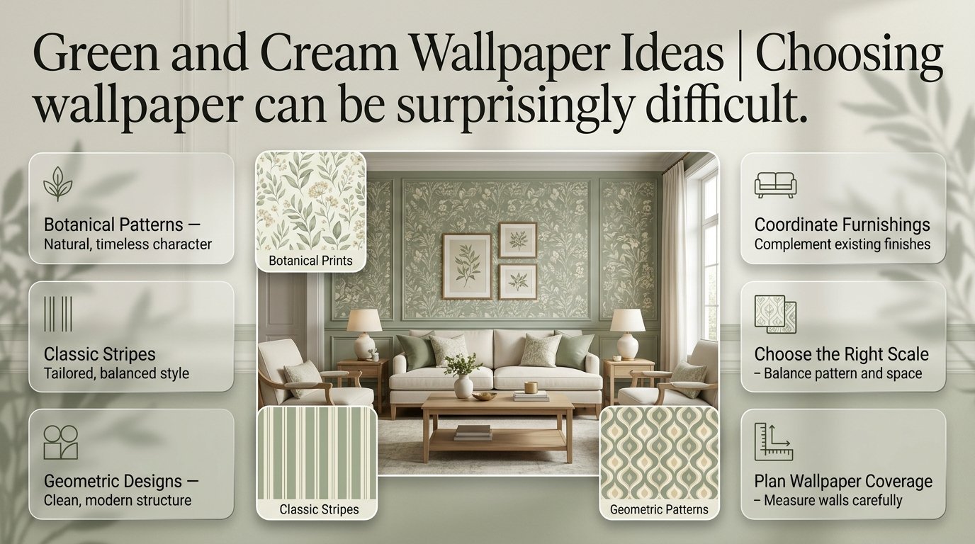
Green and Cream Wallpaper Ideas | Choosing wallpaper can be surprisingly difficult. You may find a green floral print that looks beautiful in a shop, but once you imagine it behind your bed or sofa, you start wondering whether it will make the room feel too busy. Perhaps you prefer something classic, but stripes seem too formal and botanical patterns feel too casual. The right choice depends on more than simply liking two colors.
Green and cream wallpaper ideas offer a practical way to introduce color, pattern, and personality into a home without making the interior feel overwhelming. From delicate botanical prints to sophisticated geometric designs, this combination works across traditional, modern, cottage, and preppy decorating styles.
At Preppy Room, the goal is to help readers discover practical interior ideas that combine classic style with fresh, beautiful details. In this guide, you’ll learn how to choose wallpaper patterns, coordinate furnishings, decorate different rooms, calculate wallpaper requirements, and avoid mistakes that can make a carefully planned interior look unbalanced.
1. Why Are Green and Cream Wallpaper Ideas So Popular?
Green and cream wallpaper is popular because it combines the natural character of green with the softness of cream. Green introduces color and visual interest, while cream prevents the overall design from feeling too heavy. Together, they can create anything from a quiet botanical interior to a bold, traditional statement wall.
The combination is also flexible. It doesn’t depend on a single decorating trend, and it can work with wood furniture, upholstered seating, traditional accessories, and contemporary furnishings.
A balance between color and pattern
Wallpaper introduces two important design elements at once: color and pattern. Green and cream allow you to use both without necessarily creating strong contrast.
For example, sage leaves printed on a warm cream background create a subtle design that feels relatively quiet from a distance. Deep green shapes against pale cream produce a more noticeable pattern, making the wall a stronger focal point.
The important distinction is the amount of contrast. A low-contrast design blends into the room, while a high-contrast design attracts attention.
Consider your preferred result before shopping:
- Choose delicate prints if you want a soft decorative background.
- Choose bold botanical designs if you want the wall to become a focal point.
- Choose stripes if you prefer an orderly, tailored appearance.
- Choose geometric patterns if you want a more contemporary finish.
- Choose traditional floral or toile-inspired designs if you appreciate classic interiors.
A versatile alternative to plain walls
Plain painted walls are useful when you want a simple interior, but they may not provide enough character for every decorating style. Wallpaper adds detail without requiring a large collection of accessories.
A single patterned wall behind a bed, sofa, or console table can give a room a finished appearance. Alternatively, a small repeating print across all four walls can create a consistent decorative theme.
Wallpaper is particularly useful when you want a recognizable design style without replacing your existing furniture.
Suitable for different budgets
Green and cream wallpaper is available in many materials, finishes, and price ranges. You don’t need to cover every wall to achieve a noticeable result.
A feature wall can reduce material requirements, while a small-scale repeating pattern may be easier to coordinate with affordable furniture and accessories.
However, compare the total project cost rather than looking only at the price per roll. Pattern matching, wall preparation, additional material, and professional installation can affect the final expense.
2. Which Green and Cream Wallpaper Patterns Should You Choose?
The best pattern depends on the atmosphere you want to create, the size of the wall, and the furniture surrounding it. Botanical wallpaper feels natural, floral designs add decorative softness, stripes provide structure, and geometric prints offer a contemporary alternative. The pattern should complement the room rather than compete with every other visual element.
Botanical leaf wallpaper
Botanical wallpaper features leaves, vines, branches, and other plant-inspired motifs. It is an excellent choice when you want a natural design that feels decorative without relying on bright colors.
Sage green leaves on a cream background create a gentle appearance. Olive branches offer a warmer, more traditional look, while oversized forest green foliage produces a stronger visual statement.
Botanical wallpaper works particularly well on walls behind beds, sofas, and reading chairs because these areas naturally attract attention.
To style the pattern successfully, consider:
- Light or medium wood furniture.
- Plain cream curtains.
- Neutral upholstery.
- Woven baskets and natural textures.
- A limited number of decorative plants.
Avoid choosing wallpaper with extremely detailed foliage if the room already contains many competing patterns. A simpler leaf design may provide the same natural character with less visual clutter.
Floral wallpaper for a decorative interior
Floral wallpaper ranges from delicate, widely spaced flowers to dense prints with large blooms and detailed leaves.
Small floral patterns often suit traditional bedrooms, guest rooms, and cottage-inspired spaces. Larger flowers can make a statement in a dining area or behind a bed.
The background color makes a considerable difference. Cream backgrounds with green flowers usually feel lighter, while green backgrounds with cream flowers create greater contrast.
For a balanced interior, repeat the wallpaper’s cream shade in bedding, curtains, or upholstery. Add green through a few cushions or accessories rather than matching the entire room to the print.
Floral wallpaper can also work with contemporary furniture. A simplified flower motif with clean lines can look modern when combined with plain fabrics and uncluttered furnishings.
Green and cream striped wallpaper
Striped wallpaper offers a classic alternative to floral and botanical designs. It suits traditional, preppy, transitional, and modern interiors, depending on the width, contrast, and direction of the stripes.
Fine stripes create a subtle, tailored appearance. Wider stripes are more noticeable and can become the defining feature of a wall.
Vertical stripes may emphasize a room’s height, while horizontal stripes can draw attention across a wall. These effects depend on the pattern and room proportions, so they should be treated as visual design techniques rather than guaranteed changes in perceived dimensions.
Use striped wallpaper with solid-color curtains, simple furniture, and restrained accessories.
For a traditional look, consider deep green stripes on cream. For a softer appearance, choose narrow sage stripes with a warm cream background.
Geometric wallpaper
Geometric wallpaper includes arches, diamonds, grids, repeating lines, and abstract shapes.
This style works well when you want a structured pattern rather than a natural or floral design. It can complement contemporary bedrooms, home offices, and living rooms with streamlined furniture.
Muted green shapes against cream provide a balanced appearance, while darker green geometric patterns create more contrast.
Consider the size of the shapes before purchasing. Small repeating motifs can look almost textured from a distance, whereas large shapes become more prominent and may require careful positioning around furniture and architectural features.
Gingham and checked wallpaper

Gingham and checked wallpaper brings a relaxed, classic character to bedrooms, informal sitting rooms, and cottage-inspired interiors.
Small checks are generally easier to combine with other patterns than oversized checks. Sage and cream gingham can look particularly attractive with cream bedding, simple wood furniture, and restrained decorative accessories.
For a preppy interior, add a few navy details or tailored cushions. Keep the remaining patterns relatively simple so the checks remain recognizable.
Toile-inspired wallpaper
Toile-inspired wallpaper features detailed scenes, landscapes, architectural illustrations, or decorative figures arranged in a repeating pattern.
Green and cream toile designs are suitable for traditional interiors, guest bedrooms, reading spaces, and dining rooms.
Because toile can contain considerable detail, it often works best when the surrounding furniture has relatively simple shapes. Cream upholstery, traditional wood furniture, and understated metallic finishes can complement the design without competing with it.
Abstract and textured-look wallpaper
Abstract wallpaper uses irregular shapes, painterly marks, or less recognizable patterns. It offers an alternative to traditional motifs while preserving the green-and-cream color combination.
Textured-look wallpaper can also create the impression of linen, plaster, or another surface without requiring the same decorative materials.
These designs are useful when you want a contemporary interior that feels more interesting than a plain wall but less decorative than a dense floral print.
When evaluating textured wallpaper, distinguish between a printed texture and a genuinely raised surface. Their appearance, cleaning requirements, and installation considerations may differ.
3. How Do You Choose the Right Green and Cream Wallpaper Shades?
Selecting the right shade is just as important as selecting the pattern. Sage and cream create a muted appearance, olive and ivory feel earthy, and forest green with pale cream produces stronger contrast. Compare wallpaper samples with the room’s existing finishes and lighting before deciding which combination works best.
Sage green and warm cream
Sage green is a muted shade that often contains gray undertones. It works well when you want a gentle pattern rather than a dramatic statement.
Warm cream softens the combination and can complement oak furniture, beige upholstery, and natural fabrics.
This pairing is particularly suitable for delicate botanicals, fine stripes, and small geometric prints.
It also provides flexibility if you plan to change accessories later. Neutral curtains, cream bedding, and simple wood furniture can remain in place even when you introduce different accent colors.
Olive green and ivory
Olive green has an earthy character that suits traditional and nature-inspired interiors.
When combined with ivory, it can create a more mature and grounded appearance than pale sage. This makes it a useful option for dining rooms, studies, traditional bedrooms, and living spaces with walnut furniture.
Olive wallpaper can look darker in rooms with limited natural light. If the pattern contains large areas of olive, examine the sample under the room’s actual lighting before ordering.
Forest green and pale cream
Forest green offers deeper contrast and a stronger decorative presence.
A forest green background with cream motifs can create an effective feature wall behind a bed, sofa, or dining table. The design often works best when the surrounding surfaces are relatively light.
Cream upholstery, pale curtains, and natural wood can prevent the wall from dominating the entire interior.
This combination is especially useful when you want the wallpaper to be the main decorative feature rather than a subtle background.
Mint green and soft cream
Mint green has a lighter, fresher appearance than olive or forest green. It can work well in bright bedrooms, informal living spaces, and contemporary interiors.
Choose a muted mint if you want the wallpaper to coordinate with beige, ivory, or natural wood.
Highly saturated mint patterns may attract more attention and can be harder to coordinate with existing furnishings. A softer shade provides more flexibility.
Comparing popular shade combinations
| Green shade | Cream shade | Overall appearance | Suitable patterns |
|---|---|---|---|
| Sage | Warm cream | Soft and natural | Botanical, stripes |
| Olive | Ivory | Earthy and traditional | Floral, toile |
| Forest green | Pale cream | Dramatic and elegant | Geometric, large leaves |
| Mint | Soft cream | Fresh and light | Small motifs, abstract |
| Moss green | Neutral cream | Relaxed and grounded | Botanical, textured |
| Dark emerald green | Warm ivory | Rich and decorative | Damask, large-scale motifs |
Remember that names such as sage, olive, and moss are not standardized color specifications. Manufacturers may use the same name for noticeably different shades. Always compare the actual product sample.
4. Which Wallpaper Patterns Work Best in Different Rooms?
Different rooms have different practical and decorative needs. A bedroom may benefit from a quiet pattern, while a living room can accommodate a stronger focal wall. Hallways and compact spaces require additional attention to lighting, wall dimensions, and the amount of pattern visible.
Green and cream wallpaper for a bedroom
The wall behind the bed is often a natural starting point because it provides a clear focal area.
Botanical prints, small florals, and understated geometric patterns work well when you want a decorative background that doesn’t compete with the bedding.
For example, sage botanical wallpaper can be paired with an upholstered cream headboard, plain bedding, and light wood nightstands.
If you prefer a more traditional appearance, consider narrow green stripes or a small repeating floral pattern. For a stronger statement, choose a forest green design and balance it with pale bedding.
The key is to avoid repeating the wallpaper pattern across every textile. Coordinating the colors is usually enough.
Green and cream wallpaper for a living room
A living room offers several opportunities for wallpaper placement.
You can highlight the wall behind a sofa, create a focal point around a fireplace, or use a subtle print throughout the room.
Large botanical designs work well when the furniture is relatively simple. Geometric wallpaper suits contemporary interiors, while stripes and traditional motifs complement classic furnishings.
Before choosing a pattern, consider the furniture arrangement. A large sofa may conceal much of a small print, while a bold design may remain visible above the sofa and attract attention.
Choose the wallpaper according to the part of the wall that will actually be visible.
Green and cream wallpaper for a guest room
Guest rooms benefit from designs that feel welcoming without being overly personal or visually demanding.
A delicate floral, muted botanical print, or small geometric pattern can create a finished appearance while remaining easy to coordinate with different bedding.
Use cream bedding, a simple bedside lamp, and one or two green accessories. Leave enough uncluttered space for guests to place their belongings.
For more ideas focused specifically on guest-room decorating, explore Green and Cream Guest Bedroom Ideas.
Green and cream wallpaper for a dining room
Dining rooms can accommodate more decorative patterns because the wallpaper is often viewed from a relatively fixed seating position.
Traditional floral designs, toile prints, and structured stripes can create a distinctive backdrop for a dining table.
For a classic look, pair olive-and-ivory wallpaper with a wood dining table and simple upholstered chairs. For a contemporary setting, choose a restrained geometric design with clean-lined furniture.
Consider the wall’s relationship to the table, lighting, and artwork. Avoid placing several strong decorative features directly beside one another unless they are carefully coordinated.
Green and cream wallpaper for a home office
A home office benefits from wallpaper that adds personality without becoming a distraction.
Small geometric prints, fine stripes, and restrained botanical designs are useful options. They create visual interest while allowing the desk, shelving, and task lighting to remain functional.
If the wallpaper will appear in video calls, test how the pattern looks on camera. Very fine repeating lines can sometimes create distracting visual effects on screens.
A feature wall behind the desk can provide a defined backdrop without covering every wall in a small office.
Green and cream wallpaper for a hallway
Hallways often have limited natural light and little room for additional furniture.
Fine vertical stripes, small botanical motifs, and subtle geometric patterns can introduce character without making the walls feel excessively busy.
Cream backgrounds can help maintain a lighter appearance, particularly when the hallway has limited daylight.
If you want a darker pattern, consider using it on one wall and keeping the remaining surfaces relatively simple.
Check the wallpaper’s durability and cleaning instructions before using it in a busy entrance where walls may receive frequent contact.
Green and cream wallpaper for a small room
Small rooms can benefit from patterned wallpaper when the design is selected carefully.
Light backgrounds, muted green details, and low-contrast patterns are practical starting points. They introduce decorative interest without necessarily creating a strong visual boundary.
However, you do not have to avoid dark wallpaper in a small room. A dramatic design can work when you deliberately want a focal point.
The important considerations are lighting, pattern scale, and how much of the wallpaper remains visible after furnishing.
Test a sample from the doorway rather than judging it only at close range.
5. Should You Wallpaper One Wall or the Entire Room?

A feature wall is a practical choice for bold prints, while wallpapering the entire room can create a more immersive look with subtle patterns. The right approach depends on contrast, pattern scale, room proportions, and existing furniture. Consider how the design will appear across the complete room before deciding how much wallpaper to use.
When is a feature wall the better choice?
A feature wall works well when the wallpaper has large leaves, prominent flowers, strong stripes, or a dark background.
Choose a wall that already has a clear purpose, such as the area behind a bed or sofa.
A feature wall can reduce the amount of wallpaper required, but it still needs careful planning. The pattern should relate to the room’s focal point rather than appearing as an isolated decorative patch.
Keep the surrounding walls relatively simple so the wallpaper remains noticeable.
When should you wallpaper all four walls?
Full-room wallpaper is worth considering when the design is delicate, low-contrast, and relatively easy to look at across a large area.
Small botanical prints, fine stripes, and subtle repeating motifs can create a connected appearance throughout a room.
This approach can be particularly effective in guest rooms, traditional bedrooms, and studies.
Before committing, examine the wallpaper in relation to doors, windows, corners, and built-in furniture. Large pattern repeats may require additional material to align the design.
Can you wallpaper only part of a wall?
Yes. Wallpaper can be used above a chair rail, within decorative wall moulding, or inside carefully measured panels.
This technique can create a framed appearance and may be useful when you want a decorative finish without covering the entire wall.
For a traditional interior, a botanical print inside simple wall mouldings can look particularly effective. In a contemporary room, clean rectangular panels can provide a more structured result.
Measure each section carefully and consider how the pattern will align within each panel.
6. How Do You Match Furniture and Accessories With Green and Cream Wallpaper?
Furniture and accessories should support the wallpaper’s color and pattern rather than compete with it. Warm wood, cream upholstery, natural textures, and restrained metallic details are dependable choices. Repeat the wallpaper’s colors selectively across the room, but avoid matching every textile or introducing too many unrelated patterns.
Choose furniture that balances the print
If the wallpaper contains large flowers or leaves, simple furniture can help maintain a balanced appearance.
A plain upholstered sofa, an uncomplicated bed frame, or a clean-lined dining table provides visual space around the pattern.
If the wallpaper is subtle, you have more flexibility to introduce furniture with decorative details, carved wood, or interesting silhouettes.
The goal is to distribute visual interest rather than concentrating it everywhere.
Select curtains carefully
Plain cream curtains are a dependable choice when the wallpaper is prominent.
Muted green curtains can also work, provided their shade relates to the wallpaper and the room’s other finishes.
Natural linen, warm beige, and simple woven fabrics are useful alternatives when you want texture without introducing another print.
Patterned curtains can work in a carefully planned interior, but the patterns should differ in scale or structure. Two equally bold designs may compete for attention.
Coordinate bedding and cushions
When wallpaper is placed behind the bed, bedding becomes an important part of the overall composition.
With sage botanical wallpaper, try cream bedding and a few green cushions. With dark geometric wallpaper, mostly cream bedding can provide a clearer contrast.
You can introduce another pattern through cushions, but choose one that complements the wallpaper rather than repeating it exactly.
A striped cushion may work with a small floral print if the colors are coordinated and the scales are different.
Choose suitable wood finishes
Light oak, walnut, medium brown wood, and natural rattan can all work with green and cream wallpaper.
Light wood often supports a relaxed, airy appearance. Walnut introduces depth and a more traditional character, while rattan adds texture to cottage-inspired interiors.
Consider the undertones of the wood. Yellow-toned finishes may look different beside cool gray-green wallpaper than they do beside warm olive.
Compare the materials together before making a final decision.
Add a third color with purpose
Green and cream do not have to be the only colors in the room.
Navy can introduce a classic, tailored contrast. Muted pink can soften floral designs, while terracotta adds warmth to earthy greens. Brass and gold-colored details can complement traditional patterns.
Use a third color in a few deliberate places rather than distributing it randomly throughout the room.
For a broader discussion of coordinating the surrounding finishes, see Green and Cream Wall Color Ideas.
7. How Does Lighting Affect Green and Cream Wallpaper?
Lighting affects the way wallpaper colors appear throughout the day. Natural daylight, shadows, and artificial bulbs can change how warm or cool a green or cream shade looks. Testing a physical sample in the actual room helps you identify unwanted undertones before committing to a full installation.
Wallpaper in bright rooms
Bright rooms can accommodate a wider range of green shades because daylight helps reveal pattern details.
Sage, olive, and forest green may all work, depending on the desired effect.
However, direct sunlight can make pale colors appear washed out at certain times. Check the sample when sunlight reaches the wall, as well as when the room is shaded.
If the wall receives strong sunlight, consider the manufacturer’s guidance about color stability and suitability for that environment.
Wallpaper in darker rooms
In rooms with limited daylight, a cream background with muted green details may be easier to coordinate than a design dominated by deep green.
This does not mean dark wallpaper is unsuitable. A dark feature wall can look intentional when paired with adequate lighting and carefully selected furnishings.
Consider the room’s existing lamps and ceiling fixtures before choosing a design. Wallpaper should complement the lighting rather than be expected to compensate for a poorly illuminated space.
Warm and cool artificial lighting
Warm bulbs may emphasize yellow undertones in cream wallpaper. Cooler lighting can make certain greens appear grayer or bluer.
To evaluate the combination properly, place the sample beside your flooring and furniture under the lighting you normally use.
Check it during daylight and again in the evening.
Do not rely entirely on online photographs or phone-screen previews because camera settings and display brightness can distort colors.
8. How Do You Measure and Install Wallpaper Correctly?
Successful wallpaper installation begins with accurate measurements, suitable wall preparation, and careful pattern alignment. Even an attractive design can look untidy when seams are uneven or motifs do not line up. Check the product instructions before starting because wallpaper materials differ in their application methods, adhesive requirements, and maintenance needs.
Step 1: Measure the walls
Measure each wall’s width and height.
Calculate the total wall area, then review the dimensions and coverage stated on the wallpaper packaging.
Doors and windows can reduce the area that needs covering, but do not assume their full area translates directly into savings. Cutting around openings and matching patterns can still produce waste.
Step 2: Calculate the number of rolls
Check the usable coverage of each roll and the pattern repeat.
Large patterns often require additional material because each strip must be positioned to align with the preceding one.
For a straightforward rectangular wall, a rough estimate can help you begin planning:
Wall area = wall width × wall height
For example, a wall measuring 4 metres wide and 2.5 metres high has an area of 10 square metres.
This figure does not determine the final number of rolls by itself. Roll width, roll length, pattern repeat, and installation waste must also be considered.
Use the manufacturer’s calculator or ask the supplier to confirm the quantity.
Step 3: Prepare the surface
Inspect the wall for loose paint, holes, dust, grease, and uneven areas.
Repair and prepare the surface according to the wallpaper manufacturer’s instructions. Allow repairs to dry completely, and use an appropriate primer when required.
Poor preparation can lead to adhesion problems or visible imperfections.
Step 4: Check the pattern alignment
Before installing multiple strips, identify the pattern repeat and matching type.
Straight-match designs align at the same height across adjacent strips. Offset-match designs require the pattern to be shifted. Other designs may have different alignment requirements.
Pay particular attention to stripes, large leaves, geometric shapes, and symmetrical motifs.
Step 5: Follow the correct application method
Some wallpaper products require adhesive on the paper, others require paste on the wall, and some use a self-adhesive backing.
Follow the instructions for the exact product rather than assuming every wallpaper is installed in the same way.
If the pattern is expensive, complicated, or intended to cover several prominent walls, professional installation may be worthwhile.
Step 6: Inspect the finished result
Check seams, corners, edges, and alignment as the work progresses.
Correct minor issues according to the product instructions before the adhesive sets.
Retain spare wallpaper and product details where possible. This can be useful for future repairs, particularly if the design is discontinued.
9. What Are the Most Common Green and Cream Wallpaper Mistakes?

The most common mistakes include choosing colors without testing them, selecting a pattern that overwhelms the room, ignoring furniture placement, and overlooking wallpaper maintenance. These problems can make an otherwise attractive combination feel unbalanced. Careful sampling, planning, and pattern coordination help prevent unnecessary expense and disappointment.
Choosing wallpaper before considering existing finishes
A green that looks attractive in a product photograph may clash with the undertones of your flooring, wood furniture, or upholstery.
This happens because colors rarely appear in isolation. The surrounding materials influence how a shade is perceived.
How to avoid it: Collect samples of the existing finishes and compare them directly with the wallpaper. Check the combination under different lighting conditions before purchasing.
Using too many prominent patterns
Floral wallpaper, striped curtains, checked cushions, and patterned bedding can all compete for attention.
The problem is not that different patterns cannot be combined. It is that several designs with similar visual strength can make the room feel disorganized.
How to avoid it: Choose one dominant pattern, then use solid fabrics or smaller, more restrained designs elsewhere. Keep the colors connected so the patterns feel intentional.
Choosing the wrong pattern scale
A small print may become almost invisible behind furniture, while a large design may dominate a narrow wall.
Pattern scale should be judged according to the visible wall area, viewing distance, and surrounding furniture.
How to avoid it: Test a sample from the doorway and from the main seating position. Consider whether the pattern will remain visible after the room is furnished.
Ignoring pattern repeats
Wallpaper with large leaves or symmetrical shapes may require careful alignment between strips.
If the pattern repeat is ignored when calculating material, you may not have enough wallpaper to complete the project.
How to avoid it: Check the manufacturer’s pattern-repeat information before purchasing and allow for additional material where necessary.
Buying wallpaper without checking maintenance requirements
Some wallpaper finishes are easier to clean than others. A delicate paper finish may not be suitable for a busy entrance or an area exposed to frequent splashes.
How to avoid it: Read the manufacturer’s cleaning and moisture-resistance guidance. Choose a product appropriate for the intended location, and avoid using ordinary wallpaper in unsuitable wet areas.
Forgetting about furniture placement
A beautiful design can lose its impact if a large wardrobe, headboard, or sofa hides the main pattern.
This is especially important with oversized motifs and symmetrical designs.
How to avoid it: Plan the furniture arrangement before selecting the wallpaper. Identify the part of the wall that will remain visible and position the pattern accordingly.
Ordering rolls from different batches
Color variations between manufacturing batches may become noticeable when strips are installed side by side.
How to avoid it: Purchase rolls from the same batch when possible. Check the product details and inspect the rolls before installation.
10. Professional Tips for a More Polished Wallpaper Design
A professional-looking result depends on proportion, placement, and coordination rather than on choosing the most expensive wallpaper. Begin with the room’s existing features, decide where the eye should be drawn, and use the green-and-cream combination consistently without repeating the same pattern everywhere.
Plan the focal point before choosing the pattern
Decide which wall should attract attention.
In a bedroom, this may be the wall behind the bed. In a living room, it could be the area behind the sofa or around a fireplace.
The wallpaper should support the focal point rather than compete with several other prominent features.
Consider the architecture
Doors, windows, alcoves, built-in shelving, and wall mouldings can affect how a repeating pattern looks.
A symmetrical motif may look particularly effective when centered on a clear wall, but this is not always possible in rooms with multiple openings.
Measure the space and consider how the pattern will fall at the edges before ordering.
Balance pattern with texture
A room does not need several different prints to feel interesting.
Wood grain, woven fabrics, linen curtains, textured upholstery, and ceramic accessories can provide depth without competing with the wallpaper.
This is particularly useful when the wall design already contains detailed leaves, flowers, or geometric shapes.
Test the design at different distances
Wallpaper often looks different close up than it does across a room.
A subtle print may appear almost plain from the doorway, while a busy pattern can become visually dominant at a distance.
Examine samples from several viewing positions and under the room’s normal lighting.
Consider future decorating changes
If you plan to replace cushions, bedding, or curtains regularly, choose wallpaper that can work with more than one accessory combination.
A muted green print on cream often provides greater flexibility than a highly specific, high-contrast design.
However, if you want a distinctive statement wall and expect to keep it for years, a bolder pattern may be the more satisfying choice.
Keep practical requirements in mind
Consider whether the room receives strong sunlight, frequent contact, or occasional moisture.
Check the manufacturer’s recommendations for cleaning, installation, and suitable locations. Do not assume that a decorative finish is appropriate for every room.
Good planning includes both appearance and long-term maintenance.
11. How Do You Choose the Best Wallpaper for Your Budget?
The best wallpaper is one that meets your design needs and practical requirements without creating unnecessary installation costs. Compare material, coverage, pattern repeat, cleaning requirements, and installation complexity rather than choosing solely by the price per roll.
Compare the complete project cost
A wallpaper roll may appear affordable until you account for the quantity required and the cost of installation.
Include the following in your budget:
- Wallpaper rolls and additional material.
- Adhesive or other required installation products.
- Wall preparation and primer.
- Professional installation, if needed.
- Cutting waste caused by pattern matching.
- Potential repairs or future replacement.
A feature wall may be a practical way to control costs when you want a bold pattern.
Choose the material according to the room
Wallpaper products vary in their surface, durability, cleaning requirements, and installation methods.
Some are easier to maintain than others, but suitability depends on the exact product rather than its general category alone.
Read the manufacturer’s specifications and confirm that the product is appropriate for the intended room.
Avoid buying based on a photograph alone
Online photographs can help you discover patterns, but they are not reliable substitutes for physical samples.
Screen settings, room lighting, and photography can change how colors appear.
Whenever possible, order a sample before committing to multiple rolls.faq
What are the best green and cream wallpaper ideas for a stylish and timeless home?
The best green and cream wallpaper ideas combine a suitable pattern with colors that complement your furniture, lighting, and overall interior style. Sage green botanical prints create a relaxed atmosphere, while olive and cream florals offer a more traditional appearance. For a classic, polished interior, green and cream stripes are an excellent choice. Modern homes can benefit from subtle geometric patterns or abstract designs.
The most important factor is choosing wallpaper that enhances the room rather than competes with its existing features. A delicate print works well when you want a subtle decorative background, while a larger pattern can create an attractive focal point.
Professional tips:
Choose sage and warm cream for a soft, versatile appearance.
Consider olive green and ivory for traditional interiors.
Use forest green with pale cream when you want stronger contrast.
Match the wallpaper’s undertones with your flooring and furniture.
Choose a pattern that will remain attractive even if you update your accessories.
Does green and cream wallpaper make a small room look bigger?
Green and cream wallpaper can work beautifully in a small room when the pattern, contrast, and lighting are carefully considered. Designs with a light cream background and muted green details can maintain a visually open appearance without making the walls feel completely plain. Small botanical prints, fine stripes, and understated geometric patterns are practical choices for compact bedrooms, hallways, and home offices.
However, wallpaper alone cannot change the actual dimensions of a room. Dark backgrounds, large motifs, and strong contrasts can make a wall more visually prominent, which may be desirable when creating a feature wall. The best decision depends on whether you want the room to feel subtle and open or more dramatic and decorative.
Professional tips:
Select light backgrounds when maintaining a bright appearance is important.
Use vertical stripes to emphasize the wall’s height visually.
Consider a feature wall instead of covering every surface with a bold print.
Keep curtains and larger furniture pieces relatively simple.
Test a wallpaper sample from the doorway before purchasing multiple rolls.
Which furniture, curtains, and accessories match green and cream wallpaper?
Green and cream wallpaper coordinates well with natural wood, cream upholstery, neutral curtains, and carefully selected decorative accents. Light oak and rattan support a relaxed, natural style, while walnut furniture and brass details create a richer, more traditional appearance. Cream sofas, bedding, and curtains are particularly useful because they repeat the lighter wallpaper color without introducing another competing pattern.
The key is to create a relationship between the wallpaper and the rest of the room. You do not need to match every accessory exactly. Repeating the green in a few cushions, a lampshade, or a decorative object can be enough to make the design feel cohesive.
Professional tips:
Pair botanical wallpaper with natural textures and simple furniture.
Use plain cream curtains when the wallpaper contains a prominent pattern.
Introduce navy for a classic preppy appearance.
Consider muted pink or terracotta for a warmer decorative accent.
Avoid combining several large patterns unless their colors and scales are carefully coordinated.
Should you use green and cream wallpaper on one accent wall or throughout the room?
The choice depends on the wallpaper’s pattern, the room’s proportions, and the visual effect you want. A single accent wall is often suitable for bold botanical prints, large florals, and dark geometric designs because it creates a focal point without making every wall visually dominant. Wallpapering the entire room can work better with delicate patterns, fine stripes, and low-contrast designs that remain comfortable to look at across a larger area.
For example, forest green wallpaper behind a bed can provide a striking contrast with cream bedding and neutral walls. In contrast, a subtle sage botanical print across all four walls can create a more continuous decorative appearance in a guest bedroom.
Professional tips:
Choose a wall behind a bed, sofa, or dining table for a natural focal point.
Use low-contrast patterns when considering full-room wallpaper.
Check how furniture will cover or reveal the pattern.
Measure doors, windows, and corners before planning the layout.
Account for pattern repeats and additional material when estimating the total cost.
Which furniture, curtains, and accessories match green and cream wallpaper?
Choosing durable green and cream wallpaper involves more than selecting an attractive design. You should consider the material, surface finish, installation requirements, cleaning instructions, and suitability for the intended room. A wallpaper that works well in a bedroom may not be appropriate for a humid bathroom or a busy entrance. Checking these details before purchasing helps you avoid unnecessary maintenance and replacement costs.
It is also important to evaluate the actual colors rather than relying entirely on product photographs. Cream can appear warmer under certain bulbs, while green may look grayer or darker in different lighting conditions. Requesting a sample and checking the manufacturer’s specifications can help you make a more informed decision.
Professional tips:
Check the manufacturer’s cleaning and durability guidance.
Choose a finish suitable for the room’s expected conditions.
Compare physical samples with your flooring and furniture.
Confirm that wallpaper rolls come from the same batch where possible.
Calculate the required quantity while allowing for pattern matching and installation waste.
Follow the specified wall-preparation and installation instructions for a cleaner finish.
Conclusion: Green and Cream Wallpaper Ideas
Green and cream wallpaper offers a versatile way to create a room that feels fresh, balanced, and timeless. From delicate botanical prints and elegant floral patterns to classic stripes, gingham designs, and subtle textures, this color combination works beautifully across bedrooms, living rooms, guest rooms, dining areas, and home offices. The key is choosing a wallpaper pattern that complements the room’s size, natural lighting, furniture, and overall decorating style.
For a calm and understated look, sage green paired with warm cream creates a soft, welcoming atmosphere. Olive green and ivory introduce a richer, more natural character, while deeper forest-green patterns can add sophistication and visual depth. Small-scale prints and lighter backgrounds are particularly useful in compact spaces, whereas bold botanical designs can make a striking statement on a feature wall.
Before choosing your wallpaper, consider how it will work with existing wall colors, curtains, flooring, and furniture. Order samples when possible, view them under different lighting conditions, and select a suitable wallpaper material for the room’s needs. Thoughtful coordination will help the design feel intentional rather than overwhelming.
Whether you prefer traditional elegance, modern simplicity, or playful preppy details, the right wallpaper can transform an ordinary interior into a beautifully coordinated space. Explore more inspiration through Preppy Room and discover creative ways to bring green and cream together for a home that reflects your personal style.
conclusion
Conclusion
Green and cream wallpaper is a timeless decorating choice that brings warmth, freshness, and visual balance to any interior. Whether you prefer delicate botanical prints, elegant florals, classic stripes, or modern geometric patterns, this versatile color combination can complement a wide range of decorating styles. The key is to select a design that suits your room’s size, lighting, furniture, and overall atmosphere.
For a soft and relaxing look, sage green and warm cream create a welcoming backdrop. Olive green adds natural richness, while deeper forest-green patterns introduce depth and sophistication. In smaller rooms, lighter backgrounds and subtle prints can help maintain an open, airy feeling, while bold patterns can create an attractive focal point in larger spaces.
Before making your final choice, consider how the wallpaper will coordinate with curtains, flooring, furniture, and decorative accessories. Choosing complementary shades and balanced patterns will help create a cohesive interior that feels thoughtfully designed rather than overcrowded.
Ultimately, the best green and cream wallpaper is one that reflects your personal taste while supporting the room’s function and comfort. With the right pattern, color balance, and styling details, you can create a beautiful space that remains appealing for years to come.