
Introduction
Green and Cream Room Inspiration | Have you ever decorated a room with attractive furniture and carefully chosen accessories, only to feel that something still doesn’t look right? Sometimes the problem isn’t the furniture or the amount of decoration. It’s the way the colors work together. Choosing a balanced color palette can make a room feel more connected, comfortable, and inviting without requiring an expensive makeover.
Green and cream room inspiration offers a practical solution for anyone who wants a fresh, timeless interior that doesn’t feel too bright, too dark, or overly decorated. Green brings natural character and visual depth, while cream creates a warm background that allows furniture, fabrics, and decorative details to stand out. Together, these colors can suit bedrooms, living rooms, reading corners, guest rooms, and many other spaces.
The beauty of this combination is its flexibility. You can choose soft sage green for a peaceful atmosphere, olive green for an earthy appearance, or forest green for a richer and more traditional look. Cream can be used on walls, bedding, upholstery, curtains, or rugs to balance the stronger color.
If you are planning a complete room refresh, Preppy Room provides a starting point for exploring classic interior styling and coordinated color ideas.
In this guide, you’ll learn how to select the right green and cream shades, combine furniture and accessories, create a balanced layout, decorate different rooms, avoid common mistakes, and make thoughtful improvements without spending more than necessary. The aim is to help you create a room that looks attractive in photographs but also feels comfortable and practical in everyday life.
1. Why Is Green and Cream a Good Color Combination?
Green and cream work well together because they offer a balance between color and neutrality. Green introduces freshness, depth, and a connection to nature, while cream softens the overall appearance. This makes the combination suitable for both simple interiors and more decorative spaces.
Unlike a palette built around several strong colors, green and cream allow you to create visual interest without making every wall, furniture piece, or accessory compete for attention.
What makes this combination so versatile?
A natural appearance: Green is associated with plants, landscapes, and outdoor environments. Cream complements this quality by adding warmth without competing with the green.
A comfortable atmosphere: Soft greens and warm creams can create a relaxed setting for bedrooms, family rooms, and quiet corners.
Flexible decorating options: You can use green as the main color, cream as the main color, or distribute them more evenly across the room.
Long-term adaptability: If you eventually want a different look, you can replace smaller accessories or textiles without changing the entire interior.
For example, a living room with cream walls, a sage-green sofa, and light wood furniture creates a soft, coordinated appearance. Changing the sofa to forest green and adding darker wood introduces a more traditional mood without abandoning the original palette.
The important point is that the colors should work with the room’s existing conditions. Natural light, flooring, furniture finishes, and room proportions all influence the final result.
2. Which Shades of Green and Cream Should You Choose?
The best green and cream shades depend on the atmosphere you want to create and the conditions of your room. Sage and warm cream offer a gentle combination, olive and beige-cream create an earthy appearance, and forest green with cream provides stronger contrast.
Before purchasing paint or furniture, decide whether you prefer a light, warm, cool, or dramatic interior.
Sage green and cream
Sage green is a muted shade that often contains gray undertones. It works particularly well in bedrooms, small living rooms, and spaces where you want a calm, understated appearance.
Pair sage with warm cream walls, natural wood, simple fabrics, and understated decorative accessories. This combination is also useful when you want green to remain noticeable without becoming the dominant visual feature.
A practical example is a bedroom with cream walls, sage bedding, a pale wood bedside table, and a textured cream throw.
Olive green and cream
Olive green has earthy, often yellow-based undertones. It can create a grounded and welcoming atmosphere, especially when combined with medium-toned wood, woven materials, and warm cream textiles.
Use olive on upholstered furniture, curtains, cushions, or a selected wall. Because some olive shades are relatively deep, balance them with lighter surfaces when the room receives limited daylight.
Olive and cream are especially useful when you want an interior that feels connected to natural materials rather than polished or highly decorative.
Forest green and cream
Forest green provides depth and a strong visual presence. It suits traditional living rooms, bedrooms with upholstered headboards, and interiors featuring darker wooden furniture.
Cream helps prevent the deeper green from dominating every part of the room. Consider forest-green curtains with cream walls, a dark green accent wall behind a cream sofa, or a deep green bedspread with lighter bedding.
If you choose forest green for a large surface, test it in the actual room before committing. A shade that looks balanced in a bright showroom may feel substantially darker in a room with limited daylight.
Emerald green and cream
Emerald green is more saturated and expressive than sage or olive. It can introduce a polished, decorative quality when used on a statement chair, cushions, artwork, or a sofa.
Cream offers a neutral contrast that helps the emerald remain the main feature. Brass-colored details and carefully chosen lighting can complement this combination, but additional accents should remain limited.
Mint green and cream
Mint green is a lighter, fresher option that works well in bright bedrooms, creative spaces, and playful interiors.
Combine it with ivory-cream bedding, pale wood furniture, and simple decorative details. If the mint is particularly bright, use cream and natural materials to soften its visual intensity.
How should you select the right cream?
Cream isn’t one universal color. Some shades have yellow undertones, others appear beige, and some look closer to neutral off-white.
Compare cream samples with your chosen green, flooring, and furniture. Look at them in morning daylight, afternoon light, and evening artificial lighting.
Professional tip: Never select a wall color solely from a small online photograph. Screen settings and lighting can change how colors appear. Physical samples provide a more reliable basis for decisions.
3. How Can You Balance Green and Cream Throughout a Room?
A balanced green and cream room needs a clear visual structure. Decide which color will cover the largest surfaces, which will provide the main focal point, and which materials will connect the two.
A useful starting point is the 60-30-10 decorating principle. This approach allocates approximately 60% of the visual palette to a dominant color, 30% to a secondary color, and 10% to an accent. These percentages are flexible guidelines rather than strict requirements.
For example, you might use cream for walls and large areas, green for upholstery and textiles, and natural wood or a restrained metallic finish for smaller details.
Option 1: Cream as the dominant color
This approach works well when you want a light background and flexible decorating options.
Use cream on the walls, larger curtains, or main upholstered furniture. Introduce green through cushions, bedding, artwork, a chair, or selected accessories.
The main advantage is adaptability. You can change the intensity of the green over time without repainting the room.
Option 2: Green as the dominant color
Choose this approach when you want the room to have a stronger identity.
Green may appear on the walls, sofa, bedspread, or curtains, while cream provides contrast through upholstery, rugs, bedding, and decorative objects.
This arrangement can feel rich and coordinated, but it requires attention to lighting and proportions. Deep greens across several large surfaces may make a room feel visually heavy if the surrounding elements offer little contrast.
Option 3: A balanced distribution
You can also distribute green and cream more evenly through furniture, textiles, and accessories.
For example, combine cream walls, green curtains, a cream sofa, green cushions, and a patterned rug that includes both colors.
This arrangement is particularly effective when neither color needs to dominate the entire room.
How do you know whether the balance is right?
Stand back and look at the room as a whole rather than judging individual objects. Notice whether one feature attracts too much attention, whether the room feels disconnected, or whether everything blends together without a focal point.
If the room looks too busy, remove a few competing accessories. If it feels plain, introduce texture, contrast, or one carefully selected pattern before adding another color.
4. Green and Cream Living Room Inspiration
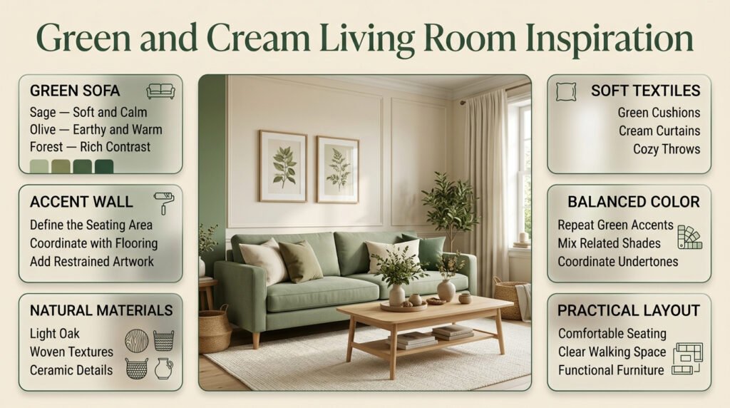
A living room needs to balance appearance with everyday use. Furniture should support comfortable movement, the main seating area should feel connected, and the color scheme should work with the room’s lighting and existing finishes.
Green and cream provide several ways to achieve this without relying on excessive decoration.
Create a cream backdrop with a green sofa
A green sofa can become the main focal point of a living room with cream walls.
Choose sage for a softer appearance, olive for an earthy atmosphere, or forest green for stronger contrast. Add a neutral rug, a wooden coffee table, and a few cushions that connect the two main colors.
The sofa should remain the strongest feature rather than competing with several equally prominent pieces.
Use a green accent wall
A green accent wall can help define a seating area, especially in an open-plan living room.
Consider placing it behind the sofa or another important feature. Choose the shade according to the furniture and flooring rather than selecting a color that looks attractive in isolation.
A single large artwork or a restrained arrangement of frames can complete the wall without making it unnecessarily busy.
Add green through cushions and curtains
If your main furniture is already cream, introduce green through smaller textile changes.
Cushion covers, curtains, throws, and lampshades can create a noticeable difference without requiring a major investment. This is a practical approach for renters or people who prefer gradual decorating.
Repeat the chosen green in several locations so the color feels intentional. However, you don’t need every green accessory to match perfectly. Related shades can create depth when their undertones work together.
Introduce natural materials
Wooden coffee tables, woven baskets, textured rugs, and ceramic accessories help prevent a green and cream living room from feeling flat.
Choose materials that suit your existing furniture. Light oak supports a softer, contemporary appearance, while darker wood can reinforce a traditional or more formal style.
For a broader collection of room-specific decorating approaches, explore Green and Cream Room Ideas.
5. Green and Cream Bedroom Ideas for a Comfortable Atmosphere
A bedroom should feel comfortable, practical, and visually balanced. Green and cream can create this atmosphere through bedding, wall color, curtains, furniture, and soft lighting.
The most effective approach is to begin with the bed and the largest surfaces before choosing smaller decorative details.
Layer sage-green bedding with cream textiles
Sage-green bedding creates a gentle focal point against cream walls or a neutral headboard.
Combine a sage duvet cover with cream sheets, pillowcases, and a textured throw. Different materials, such as cotton, linen, and knitted fabrics, provide visual interest without requiring more colors.
This is an easy way to refresh a bedroom while keeping the existing furniture.
Choose a cream upholstered headboard
A cream headboard creates a light contrast against a green wall or green bedding.
Complete the arrangement with wooden bedside tables, simple lamps, and a small number of decorative objects. The headboard provides a clear focal point while the remaining elements support the main color scheme.
If you already have a wooden headboard, you don’t necessarily need to replace it. Cream bedding and green cushions may be enough to create the desired effect.
Introduce botanical and floral patterns
Botanical artwork, floral curtains, and patterned cushions can connect the interior with the natural quality of green.
Consider the scale of the print before purchasing it. Large botanical patterns can become a strong feature, while smaller floral designs usually create a more traditional and delicate appearance.
If the bedding already includes a noticeable pattern, keep the curtains and rug relatively simple.
Make a small bedroom feel more open
Use cream on the walls and larger surfaces, then introduce green through bedding, cushions, or one selected piece of furniture.
A lighter palette may help a compact room feel visually open, although furniture proportions, window placement, storage, and circulation space also matter.
Avoid overcrowding bedside tables with decorative objects. A lamp, a small tray, and one useful accessory may be more effective than a collection of unrelated items.
Choose bedroom lighting carefully
A bedside lamp with warm-white light can complement warm cream and muted green. However, check the actual colors under the bulb you intend to use.
If you read in bed, prioritize useful task lighting rather than choosing a lamp only for its appearance.
The goal is to make the room comfortable after dark as well as attractive during daylight.
6. How Can You Create a Green and Cream Preppy Room?
A preppy interior uses classic patterns, coordinated colors, tailored furniture, and carefully arranged decorative details. Green and cream provide a flexible foundation for this style because the palette can support stripes, gingham, plaid, botanical prints, and traditional artwork without requiring a large number of colors.
The key is to use patterns with different visual strengths.
Introduce green-and-cream stripes
Striped cushions, bedding, or curtains can add structure to a room.
For a subtle look, choose narrow stripes and combine them with solid cream fabrics. Wider stripes create a stronger statement and are best used on one prominent feature.
If the curtains have bold stripes, avoid introducing another large striped feature directly beside them.
Use gingham for a traditional touch
Green-and-cream gingham can introduce a playful, classic quality through cushions, bedding, or small textile accessories.
Because gingham is already visually distinctive, balance it with plain fabrics and simple furniture. This allows the pattern to remain noticeable without overwhelming the room.
Combine patterns with different scales
A useful starting point is to choose one main pattern, one smaller supporting pattern, and several solid-colored surfaces.
For example:
- A medium-scale striped duvet.
- A small gingham cushion.
- Cream bedding and a plain green throw.
- Understated botanical artwork.
The shared colors help the different designs feel connected.
Add traditional furniture and decorative details
Wooden furniture, framed botanical illustrations, pleated lampshades, and brass-colored accents can strengthen the classic character of a green and cream preppy room.
You don’t need to purchase every item at once. Start with one patterned textile and a few supporting details. Add more only when the room genuinely needs them.
Keep the style organized
Preppy decorating can become visually busy when every surface includes a pattern or decorative object.
Leave some walls and furniture surfaces relatively simple. A clear focal point, coordinated colors, and a few well-chosen patterns usually create a stronger result than filling every available space.
Simple Ways to Master Green and Cream Room Styling
A well-styled room combines colors, furniture, lighting, and accessories in a way that feels balanced and practical. Green and cream make an excellent pairing because green brings a natural touch, while cream keeps the space light and versatile. Begin with cream walls, neutral furniture, or a soft rug, then add green through cushions, curtains, bedding, indoor plants, or decorative artwork. To create more visual interest, mix different textures, such as knitted throws, linen fabrics, and wooden accents, while keeping patterns coordinated. The key is to distribute both colors thoughtfully rather than allowing one shade to dominate the entire room. For more practical tips and decorating inspiration, explore our guide to Green and Cream Room Styling to learn how to create a cohesive, comfortable, and timeless interior.
7. How Can Texture Make Green and Cream Interiors More Interesting?

Texture adds depth when a room relies on a limited color palette. Two objects may have almost identical colors but look different because one has a smooth finish and the other has a woven, knitted, or soft surface.
This is particularly important when green and cream are the only dominant colors.
Combine different fabric textures
A velvet cushion, a linen curtain, and a knitted throw can create contrast without introducing additional colors.
Use materials that suit the room’s practical needs. Cotton and washable fabrics may be useful for frequently used spaces, while more delicate materials may require additional care.
Add wood and woven materials
Wooden furniture introduces warmth, while woven baskets and natural-fiber rugs can provide a relaxed, tactile quality.
Light wood generally supports a lighter palette, while darker wood adds stronger contrast. Neither option is universally better; the choice depends on the furniture already in the room.
Use ceramics and glass selectively
Ceramic lamps, decorative bowls, and glass accessories can introduce different surface finishes.
Choose a few pieces that serve a purpose or support the overall design. Decorative items should not obstruct useful surfaces or make everyday cleaning unnecessarily difficult.
Avoid introducing too many competing materials
Texture is helpful, but every object doesn’t need to have a different finish.
Choose two or three principal material families and repeat them throughout the room. For example, wood, linen, and ceramic can provide enough variation without making the interior feel disconnected.
8. Which Furniture and Accessories Work Best?
Furniture and accessories should support the chosen color scheme rather than compete with it. Begin with the largest pieces and select smaller items that connect the green, cream, and existing finishes.
Furniture finishes
Light wood: Complements sage, mint, and warm cream. It suits contemporary and relaxed interiors.
Medium-toned wood: Works naturally with olive and traditional green palettes.
Dark wood: Creates a stronger contrast against cream and deep green. It is useful for classic or more formal spaces.
Cream upholstery: Provides a light visual counterpoint to green walls or curtains.
Green upholstery: Establishes a clear focal point against cream walls and neutral flooring.
Rugs that connect the colors
A rug can combine green and cream in a single feature.
Choose understated geometric patterns, stripes, botanical designs, or traditional motifs according to the rest of the room. If your sofa and curtains already feature bold patterns, a simpler rug may provide better balance.
Practical requirements matter too. Consider cleaning, durability, and the amount of foot traffic before selecting a material.
Artwork and decorative objects
Botanical illustrations, landscapes, abstract artwork, and framed prints can introduce green in a controlled way.
Choose artwork according to the room’s overall color balance rather than searching for an exact match to every cushion or fabric. Related shades can look more natural than perfectly identical colors.
Curtains and window treatments
Cream curtains create a softer background, while green curtains can strengthen the palette.
Consider how much daylight you want to preserve, whether privacy is important, and how the curtains relate to the flooring and furniture. A thick, dark curtain may have a different visual effect from a lightweight green fabric.
Practical recommendation: If you’re furnishing an empty room, choose the largest essential piece first. It’s usually easier to coordinate the wall color, rug, and accessories around a sofa or bed than to find a large furniture item that perfectly matches decorations purchased earlier.
Green and Cream Living Space Ideas for a Stylish, Comfortable Home
Designing a welcoming living room involves choosing colors and furnishings that complement each other while supporting everyday comfort. Green and cream create a versatile palette that works with classic, modern, and preppy interior styles. Start with cream walls, a neutral sofa, or a light-colored rug, then introduce green through accent chairs, cushions, curtains, indoor plants, or decorative artwork. Incorporating wooden furniture, soft throws, and layered lighting can add warmth and depth without making the room feel crowded. For a more cohesive result, repeat each color in a few carefully selected places and keep patterns balanced. Explore our guide to Green and Cream Living Space Ideas for practical furniture arrangement tips, creative decorating inspiration, and color coordination ideas to help you design a beautiful and functional living space.
9. How Does Lighting Affect Green and Cream Room Inspiration?
Lighting can change the appearance of both green and cream. Warm artificial light may make cream look more yellow, while cooler daylight can emphasize gray or blue undertones in certain greens.
This is why colors should always be evaluated under the lighting conditions of the actual room.
Make the most of natural light
Rooms with generous daylight can often accommodate deeper greens without feeling excessively dark.
In rooms with limited daylight, lighter greens and cream backgrounds may help maintain a brighter appearance. However, the direction of the windows, nearby obstructions, and existing finishes all influence the result.
Don’t assume that a small room must always use pale colors. A carefully planned darker feature can work when the overall arrangement provides enough contrast and useful lighting.
Layer different types of lighting
Use ambient lighting for the general room, task lighting for reading or working, and accent lighting to highlight artwork or decorative features.
A single ceiling light may illuminate the space adequately but fail to create the comfortable atmosphere you want in the evening.
Consider the purpose of each area before selecting fixtures.
Test colors during the day and evening
Compare paint and fabric samples in the morning, afternoon, and evening.
If the cream becomes too yellow under your evening bulbs or the green looks much darker than expected, adjust the combination before making permanent changes.
This simple step can prevent costly repainting and unnecessary purchases.
10. How Can You Decorate on a Budget?
A green and cream room doesn’t require a complete furniture replacement. You can often achieve a coordinated appearance by working with the items you already own and making a few deliberate changes.
Refresh existing textiles
Cushion covers, throws, bedding, and table linens can introduce green without changing the main furniture.
If your existing sofa is cream, add a few green cushions and a textured throw. If the sofa is already green, use cream textiles to create balance.
Rearrange existing furniture
Consider whether the furniture arrangement supports conversation, movement, and access to natural light.
Moving a chair closer to a window, clearing a crowded surface, or repositioning artwork can improve the room without requiring new purchases.
Update artwork and frames
Existing frames can be reused for botanical prints, landscapes, or other artwork that suits the palette.
A coordinated arrangement can look more deliberate than several unrelated decorative objects spread across different walls.
Paint a selected feature
If the walls need refreshing, consider whether one accent wall will provide enough change.
Test the color first and check how it works with the flooring, furniture, and lighting. Painting every wall may not be necessary if the room already has a suitable neutral background.
Make a simple purchasing plan
Before shopping, write down the changes that would make the biggest difference.
Prioritize essential improvements, such as replacing unsuitable curtains or updating worn bedding, before buying optional accessories.
A clear plan helps prevent small purchases from accumulating without improving the overall room.
11. What Are the Most Common Green and Cream Decorating Mistakes?

Most decorating problems occur when colors are selected independently, patterns compete for attention, or purchases are made without considering the entire room.
Understanding these mistakes helps you make more confident choices and avoid unnecessary expense.
Mistake 1: Ignoring color undertones
Why it happens: Paint, fabric, and furniture are often selected from separate photographs.
Why it can be a problem: A cool gray-green and a strongly yellow cream may appear disconnected under certain lighting conditions.
How to avoid it: Compare samples side by side and evaluate them with the existing flooring and furniture.
Mistake 2: Using too much dark green
Why it happens: Deep green often looks dramatic and attractive in inspiration photographs.
Why it can be a problem: Several large dark surfaces can make a room feel heavier than intended, particularly when daylight is limited.
How to avoid it: Balance darker green with cream upholstery, lighter textiles, and layered lighting. You can still use deep green across multiple surfaces if the room’s proportions and lighting support it.
Mistake 3: Combining too many patterns
Why it happens: Stripes, gingham, florals, and plaid all work with classic interiors.
Why it can be a problem: When several patterns have similar visual strength, the room can become busy.
How to avoid it: Choose one dominant pattern, add a smaller supporting pattern, and use solid colors to provide visual rest.
Mistake 4: Forgetting existing furniture
Why it happens: A new palette is selected before considering large items that are already in the room.
Why it can be a problem: New paint, curtains, or accessories may clash with furniture that is expensive or difficult to replace.
How to avoid it: Treat existing flooring, sofas, wardrobes, and headboards as part of the color scheme from the beginning.
Mistake 5: Buying accessories without a plan
Why it happens: Small decorative items are easy to purchase individually.
Why it can be a problem: Several attractive objects may fail to create a coherent interior.
How to avoid it: Decide on the dominant color, main focal point, and supporting materials before shopping.
Mistake 6: Neglecting practical maintenance
Why it happens: The visual appearance of a material receives more attention than its everyday use.
Why it can be a problem: Delicate fabrics, difficult-to-clean rugs, or pale upholstery may not suit a busy household.
How to avoid it: Consider cleaning requirements, durability, and how the room will be used before selecting finishes.
12. What Do Interior Design Professionals Recommend?
A successful interior is planned around the room’s real conditions rather than copied directly from an inspiration photograph. Lighting, furniture proportions, practical needs, and material choices all influence the final result.
Establish a clear focal point
Decide which feature should attract attention first. It might be a green sofa, a statement bed, an accent wall, or a patterned rug.
Let the other elements support that feature. This creates a clear visual hierarchy and reduces the temptation to decorate every surface.
Use physical samples
Compare green paint, cream textiles, flooring, and wood finishes together. A color that looks attractive in isolation may behave differently beside another material.
Testing samples before purchasing large quantities is one of the simplest ways to reduce mistakes.
Consider the room’s purpose
A living room needs comfortable seating and practical surfaces. A bedroom needs suitable bedding, useful bedside lighting, and accessible storage.
The same color combination can work in both rooms, but the furniture and materials should reflect how each space is used.
Prioritize quality where it matters
You don’t need expensive furniture throughout the room. Focus your budget on the items that receive the most use or have the greatest visual impact.
A durable sofa, comfortable bedding, or well-made curtains may provide more long-term value than a large collection of decorative accessories.
Keep the design adaptable
Use smaller pieces to introduce personal preferences and seasonal changes. Cushions, throws, artwork, and lampshades can be updated more easily than permanent finishes or large furniture.
This allows the room to evolve without losing its overall identity.
13. How Can You Plan Your Green and Cream Room Step by Step?
A clear decorating sequence makes decisions easier and helps prevent unnecessary spending.
Step 1: Assess the existing room
Look at the windows, natural light, flooring, furniture, and available space.
Identify the elements that will remain and the areas that genuinely need improvement.
Step 2: Select the green shade
Choose sage, olive, forest, emerald, or mint according to the atmosphere you want.
Compare samples with the room’s existing finishes before committing.
Step 3: Choose the cream
Decide whether a warm, beige-based, or more neutral cream works best with your green.
Evaluate both colors together under the room’s normal lighting.
Step 4: Plan the largest surfaces
Decide which color belongs on the walls, furniture, bedding, curtains, or rug.
A written plan can help you avoid buying pieces that don’t support the intended arrangement.
Step 5: Establish the furniture layout
Make sure the main furniture supports comfortable movement and the room’s everyday activities.
Leave sufficient space around frequently used areas and avoid overcrowding the main focal point.
Step 6: Introduce texture and patterns
Choose materials that complement the palette and add interest without creating unnecessary visual competition.
If you want a preppy look, introduce stripes or gingham carefully. For a quieter interior, rely more on texture and natural materials.
Step 7: Add accessories gradually
Start with essential lighting, practical textiles, and a few decorative details.
Live with the arrangement for a while before deciding whether additional accessories are necessary.
Step 8: Review the finished room
Observe the room during daylight and after dark.
Remove anything that feels distracting, adjust lighting where needed, and make sure the final arrangement supports everyday comfort.
What is the best shade of green to use with cream in a room?
The best shade of green depends on the room’s lighting, existing furniture, and the atmosphere you want to create. Sage green is an excellent choice for a soft, relaxed interior, while olive green adds an earthy character. Forest green creates a richer appearance, and emerald green works well when you want a more noticeable decorative feature. The cream shade matters just as much because its undertones can influence how the green appears.
Professional tips:
Choose sage green with warm cream for a gentle, balanced bedroom.
Pair olive green with natural wood and beige-toned cream for an earthy interior.
Use forest green with cream upholstery to create contrast in a living room.
Test paint and fabric samples under both natural and artificial lighting before making a final decision.
How do you decorate a green and cream living room without making it look boring?
A green and cream living room can look sophisticated when you combine different textures, furniture finishes, and carefully selected patterns. Using only plain green and cream surfaces may make the space feel flat, so introduce materials such as linen, wood, woven fabrics, and ceramics. A green sofa against cream walls, for example, creates a focal point, while patterned cushions and a textured rug add depth without overwhelming the room.
Practical decorating ideas:
Combine solid-colored upholstery with striped or botanical cushions.
Introduce natural wood through coffee tables, shelving, or side tables.
Use layered lighting to create a comfortable atmosphere after dark.
Repeat the main green shade in two or three areas to establish visual continuity.
Add one statement feature instead of filling every surface with decorative objects.
What colors go best with green and cream for a stylish interior?
Green and cream pair particularly well with natural wood, muted brown, brass, and selected neutral shades. The most suitable accent depends on whether your main green is warm, cool, light, or dark. For example, sage green and cream work beautifully with light oak, while forest green and cream can complement darker wood and restrained metallic details. Using a small number of supporting colors helps preserve the balance of the original palette.
Recommended color combinations:
Green, cream, and light oak: A natural, relaxed appearance.
Green, cream, and brass: A polished, traditional finish.
Green, cream, and soft brown: A warm, earthy atmosphere.
Forest green, cream, and dark wood: A classic, contrasting interior.
Choose one supporting accent and repeat it selectively rather than introducing several competing colors.
How can you make a small room look bigger with green and cream?
Cream can help a small room feel visually open, particularly when used on walls and other large surfaces. Green can then provide character through bedding, cushions, artwork, curtains, or a carefully selected furniture piece. However, the perceived size of a room also depends on furniture proportions, natural light, storage, and the amount of visual clutter.
Space-saving decorating tips:
Use cream on larger surfaces to maintain a light background.
Choose furniture that fits the room instead of oversized statement pieces.
Keep walking routes clear and avoid overcrowding shelves or bedside tables.
Use a consistent color palette across adjoining areas to create visual continuity.
Introduce darker green selectively if you want contrast without making every surface visually heavy.
A small room doesn’t have to avoid dark green completely. The key is to consider its placement, lighting, and relationship with the other furnishings.
How do you create a timeless green and cream room on a budget?
A timeless green and cream room starts with a coordinated palette and practical furniture choices rather than expensive decorations. You can often achieve a noticeable improvement by updating textiles, rearranging existing furniture, and introducing a few accessories that connect the colors. Keeping large purchases relatively versatile also makes it easier to refresh the room later without starting again.
Budget-friendly recommendations:
Reuse suitable furniture and coordinate it with the new color scheme.
Update cushion covers, throws, or bedding before purchasing larger items.
Consider painting one feature wall instead of repainting the entire room.
Choose durable, easy-to-maintain fabrics that suit your everyday needs.
Introduce affordable botanical artwork, simple ceramics, or secondhand wooden accessories.
Plan purchases in advance to avoid collecting decorative pieces that don’t work together.
The most important principle: Spend on the items that have the greatest visual or practical impact, and use smaller accessories to complete the design. A carefully planned room can feel polished and personal without an expensive makeover.
Conclusion: Create a Beautiful and Balanced Green and Cream Room
Green and cream room inspiration offers a timeless way to create an interior that feels fresh, comfortable, and visually balanced. Green introduces a connection to nature, while cream softens the overall palette and helps the space feel warm and inviting. Whether you prefer a classic preppy bedroom, a modern living room, or a cozy and understated interior, these two colors can work together beautifully when their shades, textures, and proportions are chosen carefully.
The key to a successful green and cream room is to develop a clear decorating plan rather than selecting individual items without considering the complete space. Start with a suitable green shade, establish cream as a balancing color, and introduce furniture, fabrics, lighting, and accessories that complement the overall design.
Keep these practical principles in mind:
- Choose complementary shades: Pair sage or olive green with warm cream for a softer atmosphere, or use emerald and deeper greens when you want more visual depth.
- Balance the color proportions: Use cream on larger surfaces when you want an open, airy appearance, and introduce green through accent walls, upholstery, bedding, or decorative accessories.
- Combine different textures: Natural wood, cotton, linen, woven materials, and carefully selected patterns can make the palette more interesting without overwhelming the room.
- Consider lighting: Test paint and fabric samples under your room’s actual lighting before making final decisions.
- Decorate with purpose: Choose accessories that support your preferred style instead of adding unnecessary decorative elements.
- Plan within your budget: Updating cushions, bedding, curtains, artwork, or smaller accessories can refresh a room without requiring a complete renovation.
Most importantly, your green and cream interior should reflect your personal preferences and the way you use the space. A successful design does not depend on expensive furniture or an abundance of decorations. It comes from thoughtful color coordination, practical choices, and a consistent visual direction.
With the right balance of green, cream, natural textures, and carefully chosen details, you can create a room that feels welcoming today and remains appealing as your decorating preferences evolve.