Introduction
Layered Color Schemes for Rooms | A room can contain beautiful furniture, attractive colors, and carefully chosen accessories and still feel unfinished. One of the most common reasons is that the colors have been selected individually instead of being planned as a complete visual system. The walls may look right on their own, the bedding may look beautiful, and the artwork may be interesting, but nothing seems to connect.
This is where layered color schemes for rooms become useful.
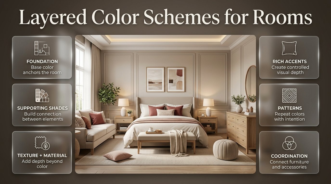
Color layering is about building a room gradually, starting with a foundation and then introducing supporting shades, deeper accents, patterns, materials, and small decorative details. Instead of forcing everything to match, you create relationships between colors so the room feels naturally coordinated.
The approach is particularly useful for colorful and preppy interiors, where several shades may appear together without making the space feel chaotic. Current interior design guidance is also placing more emphasis on warmer neutrals, richer accents, texture, natural materials, and personalized spaces rather than flat, single-color rooms.
If you’re developing your own room style or simply looking for practical inspiration, Preppy Room offers a broader collection of ideas for creating rooms that feel colorful, coordinated, and personal.
In this guide, you’ll learn how layered color schemes work, how to choose your base color, how to combine several shades, where to place accent colors, how to work with furniture and patterns, and how to avoid the mistakes that make a colorful room feel disconnected.
What Are Layered Color Schemes for Rooms?
Layered color schemes use a hierarchy of colors throughout different parts of a room instead of giving every color equal importance. One color usually acts as the foundation, another provides the main visual personality, and smaller accents add contrast, detail, and depth.
Think of the room as a series of visual layers.
The wall might provide the largest color field. Furniture introduces the next level. Curtains, rugs, bedding, and upholstery add another layer. Artwork and accessories then repeat or slightly modify those colors.
For example:
Warm white walls → sage furniture → powder-blue textiles → navy artwork → brass details
The colors don’t need to match exactly.
They simply need to relate.
This distinction is important because a professionally coordinated room rarely depends on identical colors everywhere. Instead, it often uses different values, undertones, textures, and proportions to create a sense of continuity.
Why Does Color Layering Make a Room Look Better?
A flat palette can make a room feel unfinished because there isn’t enough variation in visual weight.
Imagine a bedroom with:
- White walls
- White furniture
- White bedding
- White curtains
- White accessories
The room may look clean, but it can also lack depth.
Now imagine:
- Warm white walls
- Cream bedding
- Light wood furniture
- Sage cushions
- Powder-blue curtains
- Navy artwork
The colors are still relatively soft, but the differences between them create depth.
That’s the power of layering.
How Does a Layered Color Scheme Work?
A successful layered palette usually has a dominant color, supporting colors, accent colors, and visual neutrals.
Each role should have a clear purpose.
1. Dominant Color
The dominant color occupies the largest area.
It may appear on:
- Walls
- Large rugs
- Major upholstery
- Large curtains
- Built-in furniture
Common choices include:
- Warm white
- Cream
- Ivory
- Beige
- Soft blue
- Muted sage
- Pale gray
The dominant color doesn’t necessarily need to be neutral.
A muted blue or sage wall can also become the foundation of a layered room.
2. Supporting Color
The supporting color gives the room its personality.
It might appear on:
- A sofa
- Headboard
- Accent chair
- Bedding
- Curtains
- Rug
- Larger artwork
For example:
Cream + sage
creates a calm foundation.
Adding powder blue gives the palette another dimension.
3. Accent Color
The accent color should be used more selectively.
Examples include:
- Navy
- Burgundy
- Terracotta
- Forest green
- Dusty rose
- Deep teal
- Muted gold
Because accents have stronger visual weight, they don’t need to occupy large areas.
A navy frame, a few cushions, or a small lamp can be enough.
4. Neutral Connector
A neutral connector helps separate colors.
Good options include:
- Ivory
- Cream
- Warm white
- Beige
- Taupe
- Soft gray
- Natural wood
These colors prevent stronger shades from competing with one another.
How Many Colors Should a Layered Room Have?
There is no universal maximum number of colors, but three major color roles are a practical starting point.
A room could contain:
Foundation: Cream
Main color: Sage
Supporting color: Powder blue
Accent: Navy
Metallic detail: Brass
Technically, that’s five visual colors.
But because each one has a different role, the room can still feel organized.
The problem begins when every color is given equal importance.
For example:
Bright pink walls + orange sofa + purple curtains + green rug + yellow furniture + blue accessories
may contain attractive colors individually, but there is little hierarchy.
Instead, choose one color to dominate.
Then allow the other colors to support it.
| Color Role | Typical Placement | Visual Purpose |
|---|---|---|
| Foundation | Walls, large surfaces | Creates stability |
| Main color | Furniture, textiles | Establishes personality |
| Supporting color | Rugs, curtains, bedding | Builds variety |
| Accent | Art, cushions, accessories | Adds contrast |
| Neutral | Small or large surfaces | Creates breathing space |
The exact proportions can change depending on the room.
The important thing is that the eye should be able to identify a visual hierarchy.
How Do You Choose the Foundation Color?
The foundation should be chosen before buying smaller decorative pieces.
Start by looking at the permanent elements of the room.
Consider:
- Flooring
- Wall color
- Doors
- Window frames
- Large furniture
- Cabinetry
- Natural light
If your floor is warm oak, a cool gray foundation may create an unintended temperature contrast.
If your furniture is dark walnut, warm cream or muted beige may create a more harmonious background.
If your room receives strong natural sunlight, test colors before committing because lighting can significantly alter how a color appears.
This matters particularly in homes where natural light changes substantially throughout the day.
Warm Foundations
Try:
- Cream
- Warm white
- Beige
- Taupe
- Soft sand
These work well with:
- Sage
- Terracotta
- Blush
- Brown
- Navy
- Olive
Cool Foundations
Try:
- Soft white
- Pale blue
- Cool gray
- Blue-gray
These can work with:
- Powder blue
- Lavender
- Mint
- Navy
- Soft green
Colorful Foundations
You can also begin with a muted color.
Examples:
Sage walls + cream furniture + blush textiles
or
Powder-blue walls + ivory furniture + navy accents
The key is controlling the intensity.
How Do You Layer Different Shades of the Same Color?
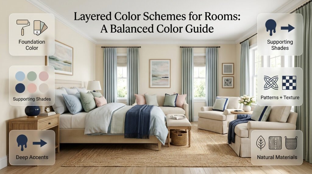
One of the easiest ways to create a sophisticated layered room is to stay within one color family.
Instead of choosing completely unrelated colors, choose several versions of one color.
For example:
Pale blue → powder blue → medium blue → navy
This creates a monochromatic or near-monochromatic effect.
The advantage is that the colors already have a natural relationship.
You can use the lightest version on large surfaces and progressively deeper shades in smaller elements.
Example: Layered Blue Room
Walls: Misty blue
Sofa: Pale gray-blue
Curtains: Powder blue
Cushions: Medium blue
Artwork: Navy
Accessories: Small navy details
This creates depth without requiring a large number of unrelated colors.
Current color guidance also shows how multiple shades within a blue family can be used to change the mood of a living room while maintaining visual continuity.
If you want a practical step-by-step approach to combining colors throughout a space, explore this guide on how to layer colors in a room for useful techniques to build depth, balance, and a cohesive interior.
What Is Gradient Color Layering?
Gradient layering is a more refined version of using one color family.
Instead of applying the same color everywhere, you move gradually from lighter to darker tones.
For example:
Ceiling: very pale blue
Walls: soft blue
Furniture: medium blue
Accessories: deep navy
The effect is subtle but sophisticated.
A similar approach can work with:
- Sage
- Beige
- Cream
- Pink
- Lavender
- Terracotta
- Brown
Gradient layering has also become a notable interior approach because it introduces richness while keeping the overall palette restrained.
How Do You Combine Different Colors Without Making the Room Busy?
The key is to control saturation, proportion, and repetition.
Suppose you want:
Sage + blush + powder blue
You don’t have to give all three colors equal space.
Instead:
- Cream = foundation
- Sage = main color
- Powder blue = supporting color
- Blush = accent
This hierarchy makes the palette easier to control.
A Useful Example
Imagine a bedroom.
The walls are cream.
The bed has sage bedding.
The curtains are powder blue.
A patterned cushion contains sage, powder blue, and blush.
A small blush vase sits on the nightstand.
Now the three colors are connected through the patterned cushion.
That’s more effective than adding random blush objects throughout the room.
How Do You Use Patterns in Layered Color Schemes?
Patterns can be one of the most useful tools for connecting colors.
A patterned item can contain several colors simultaneously.
For example, a floral duvet might contain:
- Cream
- Sage
- Powder blue
- Blush
Instead of treating the duvet as an isolated piece, use it as the palette reference.
Pull one color into the curtains.
Pull another into the artwork.
Use the third as a small accent.
This creates a coordinated room without requiring identical fabrics.
Where Can You Use Patterns?
Patterns work particularly well on:
- Rugs
- Curtains
- Bedding
- Cushions
- Upholstery
- Wallpaper
- Artwork
However, pattern scale matters.
If you have a large floral rug, you may not need another large patterned element.
Allow some surfaces to remain quieter.
How Do You Layer Colors With Furniture?
Furniture often determines whether a color scheme feels balanced.
Large furniture has significant visual weight, so it should be considered before smaller accessories.
White Furniture
White furniture provides a flexible foundation.
It works well with:
- Sage
- Blush
- Powder blue
- Lavender
- Pale yellow
- Navy
A white bed, for example, gives you more freedom to experiment with colorful bedding.
Light Wood Furniture
Light wood adds warmth and texture.
Try:
Cream + sage + light wood + powder blue
or:
Ivory + blush + pale yellow + light wood
Wood can function almost like a neutral because it connects naturally with many muted colors.
Dark Wood Furniture
Dark wood introduces stronger visual weight.
Pair it with lighter colors such as:
- Cream
- Pale blue
- Blush
- Soft green
- Ivory
If you combine dark wood with several dark colors, the room may become visually heavy.
Instead, let lighter colors occupy larger areas.
Gray Furniture
Gray can work with both warm and cool palettes.
Cool gray works well with:
- Blue
- Lavender
- Mint
- Cool green
Warm gray works better with:
- Cream
- Beige
- Blush
- Terracotta
- Warm wood
Always inspect the undertone before building the rest of the palette.
How Do You Layer Colors With Curtains?
Curtains are often larger than people realize.
Because they occupy significant vertical space, they can influence the entire room.
Curtains don’t have to match the walls.
In fact, slightly different colors often create more depth.
Example 1
Cream walls + powder-blue curtains
This creates gentle contrast.
Example 2
Warm white walls + sage curtains
This creates a natural connection with green furniture or artwork.
Example 3
Pale blue walls + navy curtains
This creates a stronger, more classic effect.
If the room already contains several colors, choose curtains that repeat an existing shade rather than introducing an entirely new color.
How Do You Layer Colors With Bedding?
Bedding gives you one of the easiest opportunities to experiment.
You can change:
- Duvet
- Sheets
- Pillowcases
- Throws
- Cushions
- Bed runner
without changing the permanent structure of the room.
For example:
Cream walls + light wood bed + sage duvet + powder-blue throw + navy cushion
The bedding becomes the bridge between the wall color, furniture, and accessories.
For a softer palette, keep all the colors muted.
For a classic preppy look, introduce one deeper shade such as navy, burgundy, or forest green.
How Do You Use Artwork to Connect Layered Colors?
Artwork can act as a visual bridge.
Suppose your room contains:
- Cream
- Sage
- Powder blue
- Navy
Choose artwork containing two or three of those colors.
You don’t need artwork that perfectly matches the room.
In fact, slightly varied shades can make the room feel more collected.
The artwork should reinforce the palette rather than dictate every detail.
A Professional Approach
Choose the room’s main colors first.
Then select artwork.
After that, pull one or two smaller colors from the artwork into cushions, accessories, or textiles.
This creates a subtle connection.
How Do You Use Texture in a Layered Color Scheme?
Color isn’t the only way to create depth.
Texture can make a palette feel much richer.
A room containing several shades of cream, for example, can look sophisticated when those shades appear in different materials.
Try:
- Linen curtains
- Bouclé chair
- Woven rug
- Wood furniture
- Ceramic accessories
- Cotton bedding
- Velvet cushion
The colors may be similar, but the surfaces feel different.
Interior design guidance in 2026 has increasingly emphasized texture as a separate layer of visual depth rather than relying on color alone.
Expert Tip: If your palette feels too flat, don’t automatically add another color. First ask whether the room needs more texture.
How Do You Create Soft Layered Color Schemes?
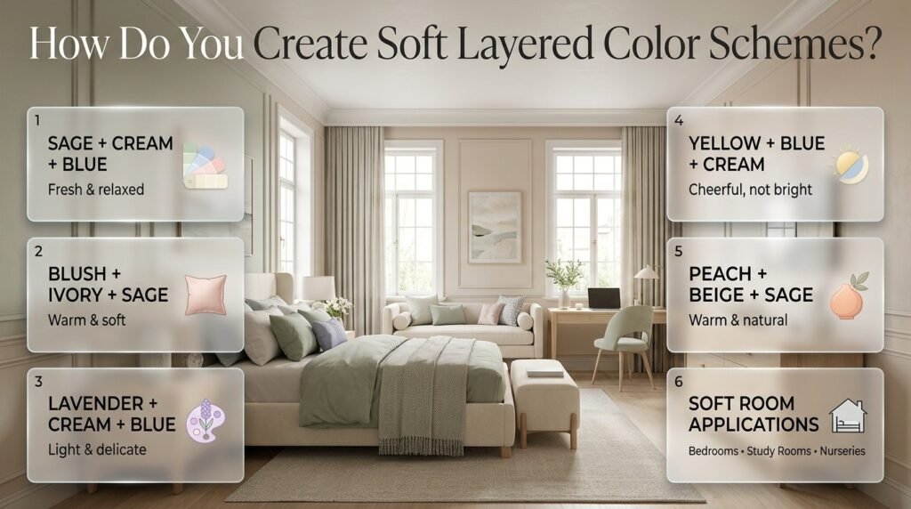
Soft palettes rely on muted colors and gentle transitions.
Popular combinations include:
Sage + Cream + Powder Blue
Fresh and relaxed.
Blush + Ivory + Sage
Warm and soft.
Lavender + Cream + Pale Blue
Light and delicate.
Pale Yellow + Powder Blue + Cream
Cheerful without becoming overly bright.
Soft Peach + Beige + Sage
Warm and natural.
These combinations work particularly well in bedrooms, study rooms, nurseries, and relaxed living spaces.
If you want more ideas in this direction, Soft Multicolor Room Palettes can be used as a natural next step for exploring softer combinations.
How Do You Create Richer Layered Color Schemes?
Layering doesn’t always mean pale colors.
You can build depth with richer shades too.
For example:
Warm cream + olive green + walnut + burgundy
or:
Camel + deep teal + soft pink + dark wood
or:
Terracotta + warm white + moss green + brown
The trick is to use stronger colors strategically.
Current 2026 interior coverage has highlighted warmer earth tones, richer greens, muted teals, deeper blues, and personalized combinations as alternatives to flat cool-neutral rooms.
A rich palette doesn’t mean every surface should be dark.
A cream wall can provide plenty of breathing space while a deep green chair and burgundy artwork add depth.
How Do You Use Warm and Cool Colors Together?
Warm and cool colors can work beautifully together when their proportions are controlled.
Consider:
Warm cream + light wood + powder blue + navy
The cream and wood create warmth.
The blue adds freshness.
Another example:
Beige + terracotta + muted teal
The terracotta is warm.
The teal is cooler.
The beige acts as the bridge.
The Important Question
Don’t simply ask:
“Are these colors warm or cool?”
Ask:
“Which color should dominate?”
If warm colors dominate, use cool colors as accents.
If cool colors dominate, warm materials and accents can prevent the room from feeling too cold.
How Do You Layer Colors in a Small Room?
Small rooms don’t need to be completely white.
They simply need good visual distribution.
A useful approach is:
Light foundation + medium main color + controlled dark accents
For example:
- Warm white walls
- Light wood desk
- Sage chair
- Powder-blue curtains
- Cream rug
- Navy artwork
The room contains multiple colors, but the largest surfaces remain relatively light.
Avoid Large Blocks of Dark Color
A large dark wall can work in a small room, but it should be intentional.
If you already have dark flooring and furniture, another dark surface may create too much visual weight.
Repeat Instead of Add
If you already have three colors, repeat them.
Don’t introduce a fourth or fifth color simply because a corner feels empty.
Quick Tip: Before buying another decorative object, look at your existing palette. You may be able to solve the problem by repeating an existing color instead.
How Do You Layer Colors in a Bedroom?
Bedrooms benefit from calm color relationships.
Start with the largest elements:
- Walls
- Floor
- Bed
- Curtains
- Bedding
- Rug
- Artwork
- Accessories
For a soft preppy bedroom:
Cream walls + white bed + sage bedding + powder-blue curtains + navy artwork
For a warmer bedroom:
Warm beige walls + light wood + dusty rose bedding + sage accents
For a classic bedroom:
Ivory walls + navy headboard + cream bedding + burgundy accents
A 2026 bedroom palette can also combine blue, green, and white for a fresh, calming effect, showing how related cool colors can be layered without making the space feel visually chaotic.
How Do You Layer Colors in a Living Room?
Living rooms contain more large-scale furniture, so color distribution becomes especially important.
Start with the sofa.
Then consider:
- Rug
- Curtains
- Accent chair
- Coffee table
- Cushions
- Artwork
- Accessories
Example
Warm white walls
↓
Beige sofa
↓
Sage rug
↓
Powder-blue cushions
↓
Navy artwork
↓
Brass and wood accessories
The palette moves gradually from neutral to colorful and then toward deeper accents.
This gives the room structure.
For a stronger look, reverse the proportions:
Sage walls + cream sofa + navy chair + patterned rug + burgundy accents
Here the wall becomes the major color statement, so the remaining pieces need more restraint.
How Do You Layer Colors in a Study Room?
Study rooms benefit from enough visual interest to feel personal without becoming distracting.
A useful palette could be:
Cream + sage + navy + natural wood
Use:
- Cream walls
- Natural wood desk
- Sage chair
- Navy desk accessories
- Small artwork containing all three colors
For a softer study:
Warm white + powder blue + lavender + light wood
Keep the largest surfaces calm and let the smaller details carry personality.
How Do You Layer Colors in a Preppy Room?
Preppy interiors naturally lend themselves to layered color because the style often combines classic contrasts, patterns, traditional details, and repeated accent colors.
Start with a classic foundation:
- Cream
- White
- Beige
- Light blue
Then introduce:
- Navy
- Sage
- Blush
- Burgundy
- Forest green
Patterns such as stripes, checks, florals, and traditional motifs can then connect the colors.
For example:
Cream walls + navy headboard + blue-and-white striped bedding + sage cushions + framed artwork
The result feels coordinated without looking like every item came from the same set.
How Do You Use Color Layering in an Open-Plan Space?
Open-plan rooms require transitions between different zones.
You don’t necessarily need different palettes for every area.
Instead, choose a common connecting color.
For example:
Living area: Cream + sage + navy
Dining area: Cream + wood + navy
Study corner: Cream + powder blue + navy
Navy becomes the visual thread.
This helps different areas feel like parts of one larger room.
Using color to create continuity between spaces is also a practical approach in current color guidance, particularly where adjacent areas need to feel connected.
How Can You Layer Colors Without Making Everything Match?
This is one of the most important principles.
Coordination does not mean duplication.
Instead of:
Sage curtains + sage cushions + sage rug + sage chair
try:
Sage chair + cream rug + powder-blue curtains + patterned cushions containing sage
Now sage remains important without dominating every surface.
The room feels collected rather than manufactured.
A mix of complementary furniture, varied textures, and personal objects is also being emphasized in current interior design guidance as a way to avoid overly generic spaces.
How Do You Choose Accent Colors?
Accent colors should solve a visual problem.
If the room feels too pale, a deeper accent can provide contrast.
If it feels too warm, a cooler accent can refresh it.
If it feels too serious, a softer accent can add personality.
For Cream Rooms
Try:
- Sage
- Navy
- Blush
- Terracotta
For Blue Rooms
Try:
- Cream
- Sage
- Warm wood
- Soft pink
For Green Rooms
Try:
- Cream
- Pale blue
- Blush
- Warm beige
For Pink Rooms
Try:
- Sage
- Cream
- Burgundy
- Soft blue
Don’t introduce an accent simply because you like the color.
Ask whether it belongs to the existing palette.
What Are the Most Common Layering Mistakes?
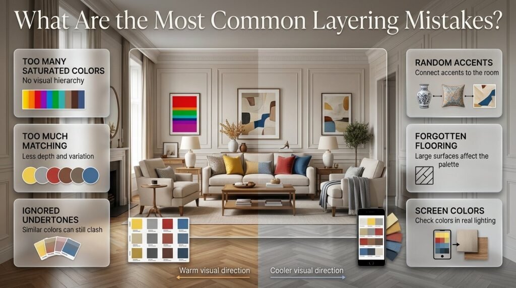
Using Too Many Colors at Full Saturation
A room can become visually exhausting when every shade is intense.
Why it happens
The decorator wants the room to feel colorful.
Why it doesn’t work
There is no visual hierarchy.
Better solution
Choose one stronger color and keep supporting colors softer.
Making Everything the Same Color
The opposite problem is excessive matching.
Why it happens
People assume coordination means identical colors.
Why it doesn’t work
The room loses depth.
Better solution
Use variations of the same family and introduce contrasting supporting colors.
Ignoring Undertones
Cream isn’t always cream.
Blue isn’t always blue.
Green isn’t always green.
Some shades contain:
- Yellow
- Gray
- Red
- Brown
- Blue
Two colors can technically belong to the same family but still clash because their undertones behave differently.
Adding Accent Colors Randomly
A colorful vase doesn’t automatically make a palette cohesive.
The accent should have a relationship with something else in the room.
Forgetting the Floor
Flooring can occupy a huge visual area.
Warm wood can make a room feel warmer.
Cool gray flooring can shift a palette in a cooler direction.
Always include flooring when evaluating your colors.
Choosing Colors Only From a Screen
Digital color previews are useful for inspiration but aren’t enough for final decisions.
Lighting, surrounding colors, finish, and material can all change how a color appears.
How Can You Fix a Room That Already Has Too Many Colors?
You don’t necessarily need to start over.
First, identify the colors that are already working.
Choose:
One foundation + two main colors + one accent
Then reduce the visual presence of unrelated colors.
For example, suppose your room contains:
- Blue
- Pink
- Green
- Yellow
- Orange
- Gray
You might decide that blue, pink, and green work together.
Then use cream or warm white as the foundation.
The yellow and orange pieces can be removed, moved elsewhere, or visually minimized.
This is often much easier than replacing the entire room.
How Can You Create a Layered Palette From One Existing Item?
This is a particularly useful technique when you’re decorating on a budget.
Start with something you already love.
It could be:
- A patterned rug
- A duvet
- Artwork
- Curtains
- A chair
- Wallpaper
Identify three colors in that item.
For example:
Cream + sage + navy
Then build the room around them.
Use cream on large surfaces.
Use sage for furniture or textiles.
Use navy as an accent.
This creates a coherent palette without requiring you to buy everything at once.
How Do You Use the 60-30-10 Rule?
The 60-30-10 concept can be useful as a starting framework, but it shouldn’t be treated as a strict design law.
A simplified version is:
60% — dominant color
30% — supporting color
10% — accent
For example:
60% cream
30% sage
10% navy
You don’t need to calculate the exact square footage.
Think visually.
If cream occupies most of the room, sage should have noticeable but secondary presence, while navy should remain controlled.
When Should You Break the Rule?
You can break it when:
- The room has unusual architecture.
- The walls are already strongly colored.
- A large patterned rug contains several colors.
- The furniture is visually dominant.
- You want a maximalist look.
The purpose of the framework is to establish hierarchy, not restrict creativity.
How Do Texture and Materials Affect Color Layering?
The same color can look completely different depending on its material.
Sage velvet is visually richer than sage cotton.
Cream linen looks different from cream paint.
Blue ceramic looks different from blue upholstery.
This is why professional-looking rooms rarely rely on color alone.
Use material contrast.
For example:
Cream wall paint + cream linen curtains + cream boucle chair + cream woven rug
Even though the colors are similar, the textures create separation.
Add one sage cushion and the palette suddenly has more depth.
How Do You Make a Neutral Layered Room More Interesting?
You don’t have to add several bright colors.
Try layering neutral shades.
For example:
Warm white + cream + beige + taupe + walnut
Then introduce a small accent such as:
- Olive
- Terracotta
- Dusty blue
- Muted pink
This creates a sophisticated palette without turning the room into a highly colorful space.
Current interior trends have increasingly moved toward warmer, nuanced neutrals instead of relying exclusively on stark white and cool gray.
How Do You Create a Layered Room on a Budget?
Start with what you already own.
You don’t need to replace an entire room.
Step 1
Choose your existing dominant color.
Step 2
Find two colors already present in the room.
Step 3
Move unrelated accessories out.
Step 4
Add inexpensive textiles.
Step 5
Repeat colors through small accessories.
Good low-cost layering opportunities include:
- Cushion covers
- Throws
- Artwork
- Small rugs
- Lampshades
- Curtains
- Vases
- Decorative boxes
Textiles are particularly useful because they can change the palette without requiring permanent renovations.
How Do You Know When a Layered Color Scheme Is Finished?
A room is usually ready when adding another color no longer solves a problem.
Stand at the doorway.
Look at the whole room.
Ask:
- Is one color clearly dominant?
- Are supporting colors repeated?
- Are dark accents distributed?
- Does the room have enough neutral space?
- Do the furniture and flooring belong to the palette?
- Are patterns competing?
- Does anything look visually disconnected?
If the answer is mostly yes, stop.
One of the most common decorating mistakes is continuing to add accessories after the palette is already working.
Sometimes the best final design decision is simply leaving enough empty space.
Expert Advice for Creating More Professional Layered Color Schemes
Start With Relationships, Not Individual Colors
Don’t ask:
“What colors look good?”
Ask:
“How will these colors behave next to one another?”
A beautiful color can become problematic when placed beside the wrong undertone.
Control Visual Weight
Dark, saturated, or highly contrasting colors attract attention.
Use them deliberately.
If you place a deep navy chair in one corner, consider repeating a smaller amount of navy somewhere on the opposite side.
This distributes the visual weight.
Use Repetition
Repetition is one of the simplest ways to create cohesion.
If sage appears once, it may look accidental.
If sage appears in:
- Chair
- Cushion
- Artwork
it begins to feel intentional.
Don’t Ignore Negative Space
A room needs quiet areas.
If every surface contains color, pattern, or decoration, the eye has nowhere to rest.
Cream walls, simple furniture, open shelving, and uncluttered surfaces can provide breathing room.
Use One Strong Focal Point
A layered palette doesn’t mean everything needs to attract attention.
Choose one major focal point.
It could be:
- A colorful headboard
- A patterned rug
- A gallery wall
- A feature wall
- A statement chair
- A large artwork
Then let the rest of the room support it.
Practical Layered Color Scheme Examples
Example 1: Soft Preppy Bedroom
Foundation: Warm white
Main color: Sage
Supporting color: Powder blue
Accent: Navy
Materials: Light wood and cotton
Result: Calm, fresh, classic
Example 2: Colorful Study Room
Foundation: Cream
Main color: Pale blue
Supporting color: Lavender
Accent: Deep navy
Materials: White furniture and light wood
Result: Light, organized, youthful
Example 3: Warm Living Room
Foundation: Warm beige
Main color: Terracotta
Supporting color: Olive
Accent: Deep brown
Materials: Walnut, linen, woven textiles
Result: Warm and grounded
Example 4: Classic Preppy Living Room
Foundation: Ivory
Main color: Navy
Supporting color: Sage
Accent: Burgundy
Materials: Dark wood and brass
Result: Traditional and sophisticated
Example 5: Soft Multicolor Bedroom
Foundation: Cream
Main color: Blush
Supporting color: Lavender
Accent: Sage
Materials: White furniture and soft textiles
Result: Gentle and colorful
How Do You Layer Colors in a Room Without Making It Look Too Busy?
The easiest way to layer several colors without creating visual clutter is to give each color a specific role. Instead of using multiple strong colors across large surfaces, choose one dominant shade, one or two supporting colors, and a smaller accent. This creates hierarchy and allows the eye to move naturally around the room.
For example, warm white walls can provide the foundation, sage can become the main furniture or textile color, powder blue can appear in curtains or bedding, and navy can be reserved for artwork and small accessories. The room feels colorful, but no single element competes with everything else.
A professional approach is to repeat colors rather than continually introduce new ones. If sage appears on a chair, echo it in artwork or cushions. This creates continuity while keeping the overall palette controlled.
Key points:
Choose one dominant color for the largest surfaces.
Use supporting colors on furniture and textiles.
Keep stronger accents relatively small.
Repeat important colors in different areas.
Leave some neutral or quiet surfaces for visual breathing space.
What Is the Best Color Layering Method for a Small Room?
For a small room, start with a lighter foundation and build color through medium-sized furniture, textiles, and carefully selected accents. This doesn’t mean every small room needs to be white. The goal is to prevent too many dark or highly saturated colors from occupying large visual areas.
A practical combination could be warm white walls, light wood furniture, sage bedding, powder-blue curtains, and a few navy details. The lighter colors keep the room visually open, while the darker accent provides enough contrast to prevent the design from feeling flat.
The placement of color matters just as much as the color itself. A dark shade spread across several small objects can feel balanced, whereas the same shade covering one very large surface may dominate the room.
Key points:
Keep the foundation light or moderately soft.
Use medium colors through furniture and textiles.
Reserve dark shades for controlled accents.
Repeat colors instead of adding too many new shades.
Consider the amount of natural light before choosing darker colors.
Avoid concentrating all strong colors in one corner.
How Do You Choose Colors That Work Together in a Layered Room?
Choose colors based on their undertones, intensity, temperature, and visual weight, rather than simply selecting colors that look attractive individually. Two beautiful colors can clash when one is warm and muted while the other is extremely cool or saturated.
A reliable approach is to begin with one color you already love and build around it. For example, if sage is your starting point, cream can provide the foundation, powder blue can add a cooler supporting shade, and navy can provide controlled contrast. This creates a relationship between the colors rather than making them appear randomly selected.
Physical samples are particularly useful because colors can change considerably under different lighting conditions. Check your palette during both daylight and evening artificial lighting before making permanent decisions.
Key points:
Check warm and cool undertones.
Compare colors in the actual room.
Consider natural and artificial lighting.
Avoid combining several highly saturated shades.
Use a neutral to connect stronger colors.
Test fabric, paint, and furniture samples together.
How Can You Make a Layered Color Scheme Look More Sophisticated?
Sophisticated color layering usually comes from controlled variation, not from adding more colors. Use different shades of related colors, introduce texture, and vary the scale at which each color appears. A room becomes more refined when the palette feels intentional but not overly matched.
For example, a cream, sage, and navy room can become much richer when cream appears as painted walls and linen curtains, sage appears on upholstered furniture and cushions, and navy appears in artwork and small decorative details. The colors repeat, but the materials and proportions change.
Texture is equally important. Linen, wood, woven materials, cotton, ceramic, and velvet can make similar shades feel visually different. This allows you to create depth without constantly introducing additional colors.
Key points:
Use different shades within the same color family.
Mix textures instead of adding unnecessary colors.
Repeat colors in different materials.
Keep the strongest accent controlled.
Use artwork to connect several shades.
Allow some areas to remain visually quiet.
How Do You Layer Colors When Your Room Already Has Furniture and Decor?
When a room is already furnished, don’t start by choosing a completely new palette. Instead, identify the colors that already exist in your largest and most permanent pieces, then build the layered scheme around them.
Start with the floor, sofa, bed, curtains, large rug, cabinetry, or other major elements. Select the two or three colors that work together most naturally. Then use smaller accessories to strengthen those relationships.
For example, if you already have a cream sofa, sage chair, and natural wood furniture, there’s no need to introduce several new colors. You could add powder-blue cushions and a small amount of navy through artwork or decorative objects. The existing furniture becomes the foundation, while the new pieces complete the color hierarchy.
This approach is also more practical because you can refresh the room gradually instead of replacing everything.
Key points:
Start with permanent furniture and flooring.
Identify colors that already work together.
Choose one foundation color.
Add supporting shades through affordable textiles.
Use artwork and accessories to connect the palette.
Remove or relocate colors that don’t fit instead of replacing the entire room.
Reuse existing pieces whenever possible.
Conclusion
Layered color schemes are one of the most effective ways to make a room feel balanced, intentional, and visually interesting. Instead of relying on one dominant color, layering allows you to combine a foundation shade with supporting colors, accents, patterns, and neutral elements to create depth without making the space feel chaotic.
The key is not to use more colors simply for the sake of variety. Choose colors that share a clear relationship through undertones, temperature, saturation, or repetition. Let the largest surfaces establish the foundation, use furniture and textiles to build the middle layer, and introduce stronger accents through artwork, accessories, cushions, or smaller decorative details.
For a softer look, muted shades such as cream, sage, powder blue, blush, and lavender can create a calm and welcoming atmosphere. For a more expressive room, deeper accents such as navy, forest green, terracotta, or burgundy can add contrast while still maintaining structure.
Most importantly, consider how every color interacts with the room’s natural light, furniture, flooring, and existing decor. A successful layered palette should feel connected rather than perfectly matched.
When each color has a purpose and is repeated thoughtfully throughout the space, layered color schemes can turn an ordinary room into a cohesive, comfortable, and personality-filled interior.