Introduction
Bright Preppy Room Colors | A colorful room can look amazing in an inspiration photo and still feel completely different when you try to recreate it at home. Maybe the pink looks too strong, the yellow competes with the blue, or several bright accessories make the room feel crowded. The problem usually isn’t bright color itself. It’s the way the colors are distributed.
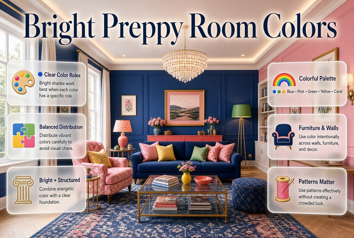
Bright preppy room colors work best when energy is combined with structure. Preppy interiors naturally give you room to experiment with blue, pink, green, yellow, coral, red, turquoise, and other lively shades, but the strongest results usually come from choosing a clear foundation and allowing each color to have a specific role.
If you’re starting your room from scratch, Preppy Room is a useful place to explore different decorating directions, color families, patterns, and room styles before settling on one palette.
In this guide, we’ll look at how to choose bright colors, combine them without creating visual chaos, use patterns effectively, select colors for walls and furniture, decorate on a budget, and build a colorful preppy room that feels intentional rather than overdecorated.
What Are Bright Preppy Room Colors?
Bright preppy room colors are energetic shades used within a coordinated decorating scheme that still maintains the structured, classic, and polished character associated with preppy interiors.
Popular choices include:
- Bright blue
- Cobalt blue
- Navy
- Coral
- Bright pink
- Emerald green
- Kelly green
- Sunny yellow
- Turquoise
- Cherry red
- Lavender
- Peach
- Crisp white
The important distinction is that bright does not mean every color should be equally strong.
A room with navy walls, bright pink bedding, emerald curtains, yellow furniture, coral artwork, and turquoise accessories may contain beautiful colors individually but still feel disconnected when everything competes for attention.
A more successful approach might be:
White + navy + bright pink + small green accents
Here, white creates breathing room, navy provides depth, pink creates energy, and green adds a secondary layer.
This principle is consistent with PreppyRoom’s broader approach to color: establish a dominant color, supporting shade, and accents instead of allowing unrelated colors to compete.
Why Do Bright Colors Work So Well in Preppy Rooms?
Bright colors are naturally compatible with preppy decorating because the style often combines classic structure with playful details.
You can have traditional furniture and still introduce a vivid cushion.
You can have white walls and still use colorful artwork.
You can have navy bedding and brighten the room with coral or pink.
This flexibility makes preppy decorating especially useful for people who want personality without abandoning a polished appearance.
Bright Colors Add Personality
A room without color can sometimes feel unfinished even when the furniture is attractive.
Color gives the space a visual identity.
For example, compare these approaches:
Classic:
White + navy + brass
Playful:
White + pink + blue + green
Energetic:
Cream + cobalt + coral + yellow
Fresh:
White + turquoise + green + light blue
The furniture could remain almost identical. The color palette changes the personality.
Bright Colors Create Focal Points
A bright color can direct attention toward something important.
You might use bright pink on a headboard cushion, yellow on a desk chair, or coral in artwork.
The eye naturally notices stronger contrast.
That means you don’t need to make the entire room colorful.
Sometimes one well-positioned bright element does more than ten small decorative objects.
Bright Colors Make Traditional Preppy Elements Feel Fresh
Stripes, checks, plaid, floral prints, and classic furniture can sometimes feel very traditional.
Adding a stronger contemporary color can update them.
For example:
Traditional navy-and-white stripes + bright coral
feels more energetic than navy and white alone.
Likewise:
Classic green + cream + bright pink
can feel playful without abandoning the preppy foundation.
What Are the Best Bright Colors for a Preppy Room?
There isn’t one perfect bright color. The right choice depends on the atmosphere you want.
| Color | Useful Pairings | Visual Character |
|---|---|---|
| Bright Blue | White, navy, cream | Fresh and energetic |
| Coral | Navy, white, pale blue | Warm and lively |
| Bright Pink | Navy, green, white | Playful and expressive |
| Emerald Green | Pink, cream, navy | Rich and confident |
| Yellow | Blue, white, green | Cheerful |
| Turquoise | White, coral, navy | Fresh and youthful |
| Red | Navy, white, cream | Strong and traditional |
| Lavender | White, blue, pink | Soft and playful |
| Orange | Blue, cream, white | Warm and energetic |
| Kelly Green | Pink, navy, white | Classic and lively |
You don’t need to choose several.
Start with the color that naturally attracts you, then build around it.
How Do You Choose a Bright Preppy Color Palette?
The easiest way to avoid color confusion is to assign each shade a job.
A useful starting formula is:
Dominant color + supporting color + neutral + accent
For example:
White + navy + coral + light blue
Or:
Cream + emerald + pink + navy
Or:
White + cobalt blue + yellow + natural wood
The percentages don’t need to be exact. The formula simply prevents every color from becoming a main character.
Step 1: Choose the Foundation
Your foundation can be:
- White
- Cream
- Ivory
- Beige
- Pale blue
- Light gray
- Natural wood
White is particularly useful when you’re working with several bright shades because it gives the eye somewhere to rest.
Step 2: Choose the Main Color
The main color should appear several times throughout the room.
For example, if you choose navy, it could appear in:
- Bedding
- Curtains
- Artwork
- Cushions
- A rug pattern
You don’t need all of these.
Even two or three repeated appearances can create cohesion.
Step 3: Choose a Supporting Color
This color should work with the main shade without taking over.
For navy, possible supporting colors include:
- Light blue
- Green
- Pink
- Coral
- Red
- Yellow
Step 4: Add a Small Accent
This is where you can introduce something more unexpected.
A mostly blue room might benefit from small touches of coral.
A green room might use pink.
A pink-and-white room might use navy.
The accent doesn’t need to cover much space.
How Many Bright Colors Should a Preppy Room Have?
There is no strict limit, but beginners usually find it easier to work with two main colors, one neutral, and one small accent.
For example:
White + navy + pink + green
This gives you plenty of personality without requiring every object to introduce another shade.
However, more colorful palettes can work when the colors are connected.
PreppyRoom’s multicolor palette guidance emphasizes the same principle: several colors don’t need to receive equal visual importance.
A multicolor room can therefore include:
- Navy
- Pink
- Green
- Yellow
- Coral
- White
while still feeling organized.
The secret is distribution.
Think of Color Like a Team
One color is the leader.
Another supports it.
The remaining shades appear occasionally.
If everyone tries to lead, the room becomes visually noisy.
💡 Pro Tip: Before buying anything, write down your four main colors. If a new item introduces a fifth or sixth unrelated shade, ask whether it genuinely improves the room before adding it.
What Are the Best Bright Preppy Color Combinations?
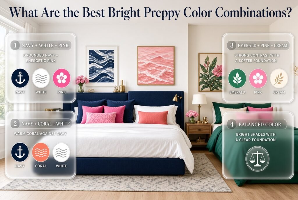
1. Navy, White, and Bright Pink
This is one of the easiest palettes for creating a cheerful preppy bedroom.
Use:
- White walls
- Navy bedding
- Pink cushions
- Navy-and-white artwork
- Small pink decorative details
The navy keeps the palette grounded while pink brings energy.
For a more dramatic version, increase the amount of pink in the textiles.
For a calmer version, use blush or dusty pink instead of a highly saturated shade.
2. Navy, Coral, and White
Coral adds warmth to navy.
It works particularly well when the room already contains blue furniture or bedding.
Try:
- White walls
- Navy upholstered headboard
- Coral throw pillow
- White bedding
- Coral artwork
- Small brass details
The result can feel bright without becoming childish.
3. Emerald Green, Pink, and Cream
Green and pink create strong contrast.
Cream is useful because it softens the transition between the two stronger colors.
You could use:
- Cream walls
- Green bedding
- Pink cushions
- Botanical artwork
- Natural wood furniture
This palette works especially well when you want color without relying heavily on blue.
4. Blue, Yellow, and White
Yellow is naturally energetic.
Blue gives it structure.
White keeps the combination fresh.
A practical example would be:
- White walls
- Blue curtains
- Yellow desk chair
- Blue-and-white bedding
- Small yellow accessories
Don’t make every accessory yellow. Let the color appear selectively.
5. Red, Navy, and White
Red is strong, so it often works best as an accent.
Use navy and white for the main structure and bring in red through:
- Cushions
- Artwork
- Books
- Small decorative objects
- Patterned textiles
This creates a classic palette with a lively accent.
6. Turquoise, Coral, and White
This combination feels brighter and more playful.
Turquoise provides a cool foundation while coral introduces warmth.
White separates the two.
This is particularly useful for a room that receives plenty of daylight.
7. Green, Navy, and Pink
Green and navy create depth while pink provides contrast.
Try:
Navy bedding + green cushions + pink artwork + white walls
This keeps all three colors visible without making the room feel overloaded.
How Can You Use Bright Colors Without Making the Room Look Busy?
The most important skill is controlling visual weight.
A color becomes visually powerful when it is:
- Very saturated
- Used over a large area
- Highly contrasted against its surroundings
- Repeated frequently
- Combined with strong patterns
So if you’re using a highly saturated color, you can balance it by reducing one or more of those factors.
For example, instead of using bright pink on an entire wall, use it on:
- Two cushions
- A piece of artwork
- A small lamp
- A decorative object
The color still appears clearly, but it doesn’t dominate.
Use Neutral Space
White and cream aren’t boring when you’re using them correctly.
They create pauses between stronger colors.
Imagine:
Pink → white → blue → white → green
The white areas prevent the colors from blending into one large visual block.
Repeat Colors Strategically
Suppose you choose coral.
Use it in three locations:
- Pillow
- Artwork
- Small decorative accessory
Now the color feels intentional.
It isn’t necessary to use coral in ten different places.
Control Pattern Size
A large colorful floral pattern already carries substantial visual weight.
If you place another large geometric pattern beside it, the room may feel crowded.
Instead, pair:
Large floral + small stripe
or:
Large check + subtle solid
This gives the eye different levels of activity.
How Does the 60–30–10 Rule Help With Bright Colors?
The 60–30–10 approach is a useful decorating framework, not a strict mathematical requirement.
You can think of it as:
60% foundation
30% supporting color
10% accent
For example:
60% white or cream
30% navy
10% coral
Or:
60% cream
30% green
10% pink
The idea is simple: not every color needs equal space.
This principle is especially useful with bright shades because strong colors become visually powerful very quickly.
Should You Use Bright Colors on the Walls?
You can, but it depends on how much other color the room already contains.
A bright wall can become a beautiful focal point.
However, if you already have:
- Patterned bedding
- Colorful curtains
- A bright rug
- Bold artwork
- Colorful furniture
then a neutral wall may provide better balance.
Bright Wall Strategy
If you want a colorful wall, consider making it the room’s primary statement.
Then keep several other elements quieter.
For example:
Bright blue wall + white bedding + navy accents + small coral details
This is easier to manage than:
Bright blue wall + pink bedding + yellow curtains + green rug + red artwork
The second palette might work in a very carefully designed room, but it requires much more control.
Neutral Wall Strategy
If you prefer flexibility, use:
- White
- Warm white
- Cream
- Soft beige
- Pale blue
Then introduce bright color through removable items.
This makes future updates easier.
How Does Lighting Affect Bright Preppy Room Colors?
Color doesn’t exist independently from light.
A bright blue wall can look different in:
- Morning sunlight
- Afternoon daylight
- Cloudy weather
- Warm evening lighting
- Cool LED lighting
This is why a color that looks perfect online may look different in your room.
Before committing to a large painted surface, test the shade in the actual room.
Observe it at different times.
⭐ Expert Tip: Don’t judge a color from one photograph or one moment of the day. Natural and artificial lighting can change how saturated, warm, cool, or muted a color appears.
Lighting also affects whether a room feels energetic or relaxing.
A bright palette under strong daylight can feel lively.
The same palette under softer evening lighting may feel warmer and more intimate.
How Do Patterns Work With Bright Preppy Colors?
Patterns are one of the strongest tools for making a preppy room recognizable.
Common choices include:
- Stripes
- Plaid
- Gingham
- Checks
- Florals
- Geometric patterns
- Small repeated motifs
The important thing is to connect the colors inside your patterns to the rest of the room.
Suppose your floral pillow contains:
Pink + green + blue + white
You can repeat those colors elsewhere.
Use:
- Blue bedding
- Green accessory
- Pink artwork
- White walls
Now the pattern becomes a visual bridge.
This is much more effective than adding a pattern simply because you like its design.
How Can You Mix Bright Colors and Patterns?
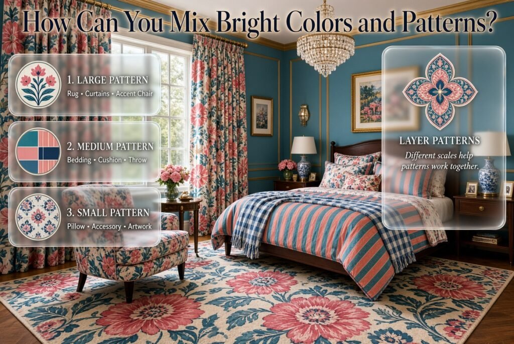
A useful approach is to vary pattern scale.
For example:
Large Pattern
A large floral or geometric design on:
- Rug
- Curtains
- Accent chair
Medium Pattern
A stripe or check on:
- Bedding
- Cushion
- Throw
Small Pattern
A subtle pattern on:
- Decorative pillow
- Small accessory
- Artwork detail
This creates layers without forcing every pattern to compete.
Current decorating guidance also emphasizes the importance of combining color and pattern thoughtfully rather than treating each decorative element independently.
How Can You Make Bright Colors Look More Sophisticated?
Bright color doesn’t automatically make a room childish.
Sophistication comes from proportion and supporting materials.
Add Deeper Colors
Navy, forest green, burgundy, or deep blue can give bright colors more visual depth.
For example:
Bright pink + navy + white
often feels more structured than:
Bright pink + white alone
Use Natural Materials
Natural wood can soften bright colors.
Other useful materials include:
- Rattan
- Woven fibers
- Cotton
- Linen
- Wool
- Cane
- Natural wood
These materials introduce texture without necessarily adding another strong color.
Add Metallic Details Carefully
Small brass or gold details can complement a colorful palette.
Consider:
- Lamp base
- Picture frame
- Drawer hardware
- Small decorative object
The metallic element should support the palette rather than become another dominant color.
Bright Preppy Room Colors for Different Decorating Styles
Classic Bright Preppy
Try:
Navy + white + red + light blue
Use stripes, traditional furniture, framed artwork, and polished details.
Keep red controlled so the room doesn’t become visually heavy.
Modern Bright Preppy
Try:
Cobalt blue + white + emerald + coral
Use cleaner furniture shapes and fewer decorative objects.
Let the colors create the personality.
Cute Bright Preppy
Try:
Bright pink + white + lavender + light blue
Use colorful bedding, playful artwork, and small decorative accessories.
Keep the furniture relatively simple so the palette remains the focus.
Cozy Bright Preppy
Try:
Cream + green + coral + muted blue
Introduce:
- Soft blankets
- Layered cushions
- Warm wood
- Textured rugs
- Gentle lighting
The result can feel colorful while still comfortable.
Bold Colorful Preppy
Try:
Navy + pink + green + yellow + white
This is where a stronger color hierarchy becomes essential.
Keep navy and white as the foundation and use pink, green, and yellow in controlled amounts.
If you’re interested in a more dramatic palette, Bold Preppy Color Combinations offers a useful direction for combining stronger shades without abandoning the organized character of preppy design.
How Can You Create a Bright Preppy Room on a Budget?
You don’t need to replace everything.
In fact, changing too many things at once makes it harder to understand which choices actually improved the room.
Start with inexpensive, flexible elements.
Change the Bedding
Bedding covers a large visual area.
A new duvet or comforter can instantly change the room’s color direction.
Add Colorful Cushions
Cushions are useful because you can test a color without committing to it permanently.
Try two or three colors first.
Update Artwork
Artwork can introduce several colors simultaneously.
This makes it useful for connecting different parts of the room.
Add a Small Rug
A rug can establish the color palette while adding texture.
If your rug contains blue, pink, green, and white, those colors can guide your other choices.
Change Small Accessories
Try:
- Desk organizers
- Vases
- Lamps
- Picture frames
- Decorative trays
- Storage boxes
These small details can repeat your main colors.
How Do You Build a Bright Preppy Room Step by Step?
Step 1: Decide the Mood
Before buying anything, decide whether you want:
- Cheerful
- Classic
- Playful
- Sophisticated
- Fresh
- Cozy
- Energetic
Your answer will influence the palette.
Step 2: Examine the Existing Room
Look at:
- Walls
- Flooring
- Furniture
- Curtains
- Bedding
- Lighting
- Existing artwork
Don’t choose colors in isolation.
Step 3: Select Your Foundation
Choose white, cream, pale blue, beige, or another neutral.
Step 4: Choose One Dominant Color
Pick the shade you want people to notice first.
Step 5: Add One Supporting Color
Choose a shade that works naturally with the dominant color.
Step 6: Introduce One Small Accent
This can be your brightest or most unexpected shade.
Step 7: Repeat the Colors
Use each important color at least two or three times.
Step 8: Add Patterns
Choose one dominant pattern and perhaps one smaller secondary pattern.
Step 9: Add Texture
Use fabric, wood, woven materials, rugs, and other tactile elements.
Step 10: Remove Anything That Feels Unnecessary
This final step is surprisingly important.
Sometimes the room becomes better not because you add another decoration, but because you remove one that doesn’t belong.
What Are the Most Common Mistakes With Bright Preppy Room Colors?
Using Too Many Strong Colors
This happens because colorful inspiration rooms can make every shade look attractive.
But copying every color from an inspiration image can create visual confusion.
Better Approach
Choose your main palette first.
Then introduce additional colors only when they support it.
Making Every Color Equally Important
A room with six colors doesn’t need six focal points.
Better Approach
Choose:
One dominant
One supporting
One or two accents
Ignoring Neutral Space
Some people think a colorful room should have color everywhere.
That’s usually unnecessary.
White and cream can make bright colors look stronger because they create contrast.
Using Too Many Large Patterns
A colorful floral curtain, bold geometric rug, plaid bedding, and striped chair can compete.
Better Approach
Choose one pattern to lead.
Let the others become quieter.
Choosing Colors Only From Online Images
A color’s appearance depends on lighting, surroundings, screen settings, and materials.
Better Approach
Test colors in the actual room before committing.
Matching Everything Too Precisely
A room doesn’t need every shade to be identical.
Different blue tones can work together.
Different greens can work together.
Pink can vary slightly between artwork and fabric.
Coordination is more natural than perfect matching.
How Can You Use Bright Colors in a Small Room?
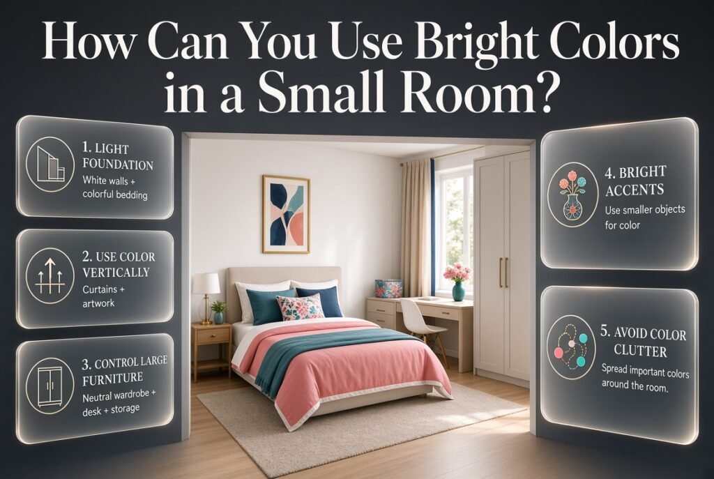
Small rooms benefit from visual organization.
That doesn’t mean they need to be completely neutral.
Try:
White walls + colorful bedding + one bright accent + simple furniture
This keeps the background light while allowing the colors to stand out.
Use Color Vertically
Curtains and artwork can draw the eye upward.
Keep Large Furniture Controlled
If the room is small, consider keeping wardrobes, desks, and large storage pieces neutral.
Use smaller objects for bright accents.
Avoid Color Clutter
Five colorful objects grouped together can appear heavier than five colors distributed around the room.
Spread important colors throughout the space.
How Can You Use Bright Colors in a Larger Room?
Larger rooms can handle stronger color blocks.
You might use:
- A colorful accent chair
- Large patterned rug
- Bold curtains
- Bright bedding
- Colorful artwork
But size doesn’t eliminate the need for hierarchy.
A large room can still look disconnected if every wall and object uses a different dominant color.
How Do You Choose Bright Colors for a Preppy Bedroom?
Bedrooms require a slightly different approach because the room should feel visually interesting without becoming uncomfortable.
Start with a calming foundation.
Then add bright color through:
- Bedding
- Cushions
- Artwork
- Lamps
- Small furniture
- Throws
For example:
White walls + navy bedding + bright pink cushions + green artwork
This gives you color while keeping the largest background areas relatively controlled.
For broader bedroom-specific decorating ideas, you can explore Preppy Room Bedroom and related bedroom inspiration on the site.
How Can Artwork Help Connect Bright Colors?
Artwork is one of the easiest ways to connect several colors.
Imagine you have:
- Navy bedding
- Pink cushion
- Green plant
- White furniture
A piece of artwork containing navy, pink, green, and white can visually connect all four elements.
This is called color repetition.
Instead of every object matching another object directly, the artwork creates a relationship between them.
That makes the room feel more intentional.
How Can You Use Bright Colors With Neutral Furniture?
Neutral furniture is actually an advantage.
White, beige, cream, light wood, or natural finishes provide a flexible foundation.
You can then change the accent palette without replacing major pieces.
For example, the same neutral desk can work with:
Blue + pink
later with:
Green + yellow
and later with:
Navy + coral
This is especially useful if you enjoy changing your room’s appearance.
How Can You Create a Multicolor Preppy Room Without Losing Balance?
Start by identifying a visual anchor.
For example:
White walls + navy bedding
Then build around it:
Pink cushion
Green artwork
Yellow decorative detail
Coral flower arrangement
Now the colors have a hierarchy.
Instead of seeing five competing colors, the eye sees a navy-and-white foundation with colorful accents.
This is the key difference between a multicolor room and a randomly colorful room.
For readers who want to explore this concept more deeply, Multicolor Preppy Palettes is particularly useful because it focuses on creating relationships between several colors rather than treating each shade separately.
How Do You Make Bold Colors Feel Cohesive?
Cohesion comes from repetition.
Suppose you choose emerald green.
Repeat it in:
- One cushion
- Artwork
- Small vase
- Decorative object
Then introduce pink.
Repeat pink in:
- Bedding
- Artwork
- Small accessory
Finally, use cream or white throughout the room.
Suddenly the palette has a system.
The colors don’t have to appear in identical quantities.
They simply need to have relationships.
What Bright Color Should You Use as an Accent?
The answer depends on your foundation.
| Main Palette | Accent Possibilities |
|---|---|
| Navy + White | Pink, coral, yellow |
| Green + Cream | Pink, blue, navy |
| Blue + White | Coral, yellow, green |
| Pink + White | Navy, green, blue |
| Cream + Navy | Coral, red, pink |
| Blue + Cream | Yellow, coral, green |
When uncertain, use the accent in a small quantity first.
It’s much easier to add another cushion than repaint an entire wall.
Expert Advice for Decorating With Bright Preppy Colors
Begin With Something You Already Love
Don’t necessarily begin with paint.
Start with:
- A favorite blanket
- Artwork
- Bedding
- Rug
- Cushion
- Furniture fabric
Pull colors from that item.
This gives your palette a natural starting point.
Don’t Chase Perfect Color Matching
Real rooms contain variations.
Fabric, paint, wood, and artwork reflect light differently.
A slightly different blue can actually create depth.
Think About the Whole Room
Don’t choose a color based only on the bed.
Look at the room from the doorway.
Consider how the colors interact across the entire space.
Use Bright Color Where You Want Attention
If you want people to notice your artwork, make the artwork more colorful.
If you want the bed to be the focal point, use stronger color there.
Color is a visual tool.
Use it intentionally.
Remember That Trends Change
A bright palette should ultimately work for your own space rather than simply copying whatever is currently popular.
Recent interior-design coverage continues to highlight classic blue-and-white foundations alongside stronger accents such as green, red, yellow, and pink, while also emphasizing natural materials and thoughtful pattern combinations.
That makes a flexible palette more useful than designing a room around one temporary trend.
Bright Preppy Color Ideas for Different Moods
For a Cheerful Room
Try:
Yellow + blue + white
Use yellow in small-to-medium accents.
For a Playful Room
Try:
Pink + turquoise + white
Keep the furniture simple.
For a Sophisticated Room
Try:
Emerald + navy + cream
Add natural wood or brass details.
For a Fresh Room
Try:
Light blue + white + green
Use natural textures.
For a Warm Room
Try:
Coral + cream + navy
Add warm wood.
For a Bold Room
Try:
Cobalt + pink + green + white
Make white the breathing space.
A Practical Bright Preppy Room Checklist
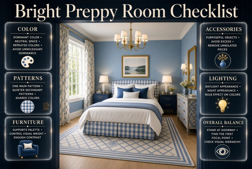
Before you finish decorating, ask:
Color
- Do I have a clear dominant color?
- Is there enough neutral space?
- Are the bright colors repeated?
- Does one color dominate unnecessarily?
Patterns
- Is there one main pattern?
- Are secondary patterns quieter?
- Do the patterns share colors with the rest of the room?
Furniture
- Does the furniture support the palette?
- Are large pieces too visually heavy?
- Is there enough contrast?
Accessories
- Are there too many small colorful objects?
- Does each accessory have a purpose?
- Can I remove anything that feels unrelated?
Lighting
- How does the palette look during daylight?
- How does it look at night?
- Do the bulbs change the appearance of the colors?
Overall Balance
Stand at the doorway and look at the room for a few seconds.
Ask:
What do I notice first?
If the answer is the intended focal point, your color hierarchy is probably working.
If your eye immediately jumps between five different areas, consider reducing visual competition.
12 Bright Preppy Room Color Palettes to Try
1. Classic Energy
Navy + White + Coral
2. Playful Pink
Pink + Navy + White
3. Garden Inspired
Emerald + Pink + Cream
4. Sunny Classic
Yellow + Blue + White
5. Coastal Bright
Turquoise + White + Coral
6. Traditional Bold
Red + Navy + White
7. Fresh Green
Kelly Green + White + Navy
8. Soft Bright
Lavender + White + Blue
9. Warm Color
Coral + Cream + Blue
10. Colorful Classic
Navy + Pink + Green + White
11. Modern Energy
Cobalt + Emerald + White
12. Cheerful Multicolor
Blue + Pink + Yellow + Green + White
These are starting points, not rules. Adjust the saturation, quantity, and placement according to the room.
What Are the Best Bright Colors for a Preppy Room?
The best bright colors for a preppy room are shades that bring energy while still working with the classic, organized character of preppy design. Bright blue, coral, pink, emerald green, yellow, turquoise, and red can all work beautifully when they are balanced with colors such as white, cream, or navy. The goal isn’t to use every bright shade at once, but to create a palette where each color has a clear purpose.
For example, navy and white can establish the foundation, while bright pink or coral adds personality. Emerald green can create a richer appearance, while yellow or turquoise can make the room feel more energetic. The final choice should also consider your furniture, natural lighting, flooring, and existing patterns.
Practical points:
Use white or cream to create visual breathing space.
Choose one dominant bright color before adding accents.
Repeat important colors in at least two or three areas.
Use navy when a bright palette needs more depth.
Test strong colors in the room before committing to large surfaces.
How Do You Mix Bright Colors in a Preppy Room Without Making It Look Too Busy?
The key to mixing bright colors successfully is giving each shade a different visual role. Instead of allowing several strong colors to compete equally, choose one dominant color, one supporting color, and one or two smaller accents. This creates a hierarchy that makes the room feel coordinated rather than random.
For instance, a room with white walls, navy bedding, bright pink cushions, and small green accessories can feel colorful without becoming overwhelming. The white provides breathing space, navy creates structure, pink supplies the main burst of energy, and green connects smaller decorative details.
Practical points:
Don’t give every bright color the same amount of space.
Use neutral walls when bedding and accessories are already colorful.
Repeat colors through artwork, cushions, rugs, or small accessories.
Limit the number of large, highly saturated patterns.
Step back and look at the entire room rather than judging individual pieces separately.
What Colors Go Best With Navy in a Bright Preppy Room?
Navy is one of the most versatile foundation colors for bright preppy interiors because it provides depth while maintaining a classic appearance. It pairs particularly well with bright pink, coral, yellow, emerald green, turquoise, red, and lighter shades of blue. White and cream can then be used to separate the stronger colors and keep the overall palette fresh.
For a cheerful room, navy with bright pink and white creates a playful combination. Navy, coral, and cream feel warmer, while navy, emerald, and white can create a richer and more sophisticated atmosphere. The amount of each accent color should depend on its intensity and the amount of pattern already present.
Practical points:
Use navy on larger or visually important elements.
Add pink or coral when you want a warmer, playful contrast.
Choose yellow for a more energetic atmosphere.
Pair navy with emerald for a deeper, richer palette.
Use white or cream to prevent the combination from feeling too heavy.
Can You Use Multiple Bright Colors in a Small Preppy Bedroom?
Multiple bright colors can work in a small preppy bedroom, but they need to be distributed carefully. Instead of covering every large surface with a different strong shade, keep the room’s foundation light and introduce brighter colors through bedding, artwork, cushions, rugs, and smaller furniture pieces. This allows the room to feel colorful without visually closing in the space.
A practical combination could be white walls, navy bedding, bright pink cushions, and small green or yellow accents. Because the largest background surface remains light, the brighter colors become intentional focal points rather than making the entire room feel crowded.
Practical points:
Keep walls light if the room already contains several strong colors.
Use bright shades mainly for focal points and accessories.
Avoid combining several large-scale patterns in a small space.
Repeat colors instead of introducing a new shade with every item.
Keep large furniture relatively simple when the accessories are colorful.
How Can You Make Bright Preppy Room Colors Look Sophisticated?
Bright colors look sophisticated when they are supported by thoughtful proportions, classic patterns, quality-looking textures, and grounding shades. Instead of removing bright colors, control how much of each color appears. Deep navy, emerald green, cream, natural wood, and white can provide structure around stronger shades such as pink, coral, yellow, or turquoise.
For example, bright pink can feel more refined when used with navy, white, classic stripes, and natural wood rather than being surrounded by several other equally bright colors. Similarly, coral can look polished when used as a controlled accent within a navy-and-cream palette.
Practical points:
Combine bright shades with deeper colors such as navy or emerald.
Use classic preppy patterns like stripes, checks, gingham, and plaid.
Introduce natural wood and textured fabrics for warmth.
Keep one color visually dominant instead of making everything equally bright.
Use brass or other subtle metallic details sparingly.
Leave some neutral space so the brighter colors stand out intentionally.
Conclusion
Bright preppy room colors can make a space feel cheerful, personal, and full of character without making it look chaotic. The key is not to use as many bright shades as possible, but to create a clear relationship between colors, patterns, furniture, and neutral space.
Start with a dependable foundation such as white, cream, soft blue, or another light neutral. Then introduce brighter shades like pink, coral, emerald, yellow, turquoise, or red through bedding, artwork, cushions, rugs, curtains, and decorative accessories. Deeper colors such as navy can add contrast and help the brighter shades feel more polished.
The most successful bright preppy rooms usually have one dominant color, one supporting shade, and a few carefully repeated accents. Classic patterns such as stripes, checks, gingham, and plaid can strengthen the preppy character while keeping the overall design organized.
Whether you are decorating a small bedroom or creating a colorful statement space, focus on balance, repetition, and personal style. With the right proportions and thoughtful color choices, bright colors can create a preppy room that feels energetic, comfortable, stylish, and visually cohesive.